This time, another automaker logo, some automotive and architecture photography, and the special bonuses that have all become a regular part of the Beautifully Briefed standard. But we’re going to start with some generated content.
AI Book “Design”
From the “We knew this was going to happen” category, we have the first — that I’ve seen, anyway — “let AI do the work” research paper suggesting that book design is something that can be automated.
We have presented a novel approach to computationally design books. The presented system implements a generative design process which takes advantage of the scripting capabilities of Adobe InDesign to procedurally typeset books from content provided by the user. We have shown the ability of the system to (i) create book designs that consistently comply with a series of typographic rules, styles and principles identified in the literature; (ii) produce visually diversified books from the same input content; and (iii) produce visually coherent books with different contents.
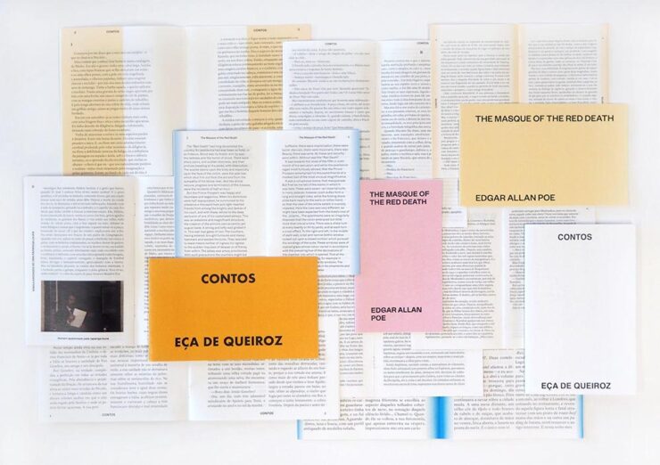
Let’s please remember that “AI” as the term is currently used is actually “applied machine learning;” in this case, specific rules within specific containers in a specific application. It’s a first step towards something, as most “AI” is in 2024.
But it’s absolutely not the only step. It’s inevitable that the necessary subsequent steps will be taken, probably sooner than later.
As usual where someone is seriously discussing replacing a human worker with a computer, there’s a pitch for the upside:
The work presented in the paper may challenge the typical roles of both the tool and the designer. First, by automatically creating and suggesting design alternatives, the tool ends up playing a more active role in the design process. Then, by modifying and developing custom tools, the designer is no longer a mere tool user and becomes the author of tools tailored to specific needs. We believe this shift can be fruitful since it enables the exploration and discovery of new technical and creative possibilities.
In other words, the designer is now responsible for creatively writing the rules then policing the output — like so many things in the machine-learning, or “AI” space — rather than the actual drudgery of directly designing the output. “Design great rules, get great design.”
And there is room for this. Amazon, especially, is going to jump on book design generated this way; never mind those folks in China or India earning (a paltry few) dollars a day, the computer can do it better for less . . . . Poof! With no human interaction whatsoever, your book is ready to publish. Indeed, for some, the bar to publish has just been lowered made easier. Perhaps even Adobe, who trumpets “AI” at every turn these days, they may choose to take this up. (Probably for a surcharge to the already-high subscription pricing.)
Let’s not even speculate about the major publishing houses for now.
But like AI-generated anything, getting actual art requires hand-tuning the input by an artist. For what amounts to “slop” — see this fantastic PixelEnvy discussion — the generated approach to book design might even be appropriate. But for book design that’s artistic, cared-for, or even “just” thoughtful, you’re going to need a human for a long time yet to come.
The paper is available on Cornell University’s arxiv under CC BY-NC-SA 4.0 DEED license. (Via Hackernoon.)
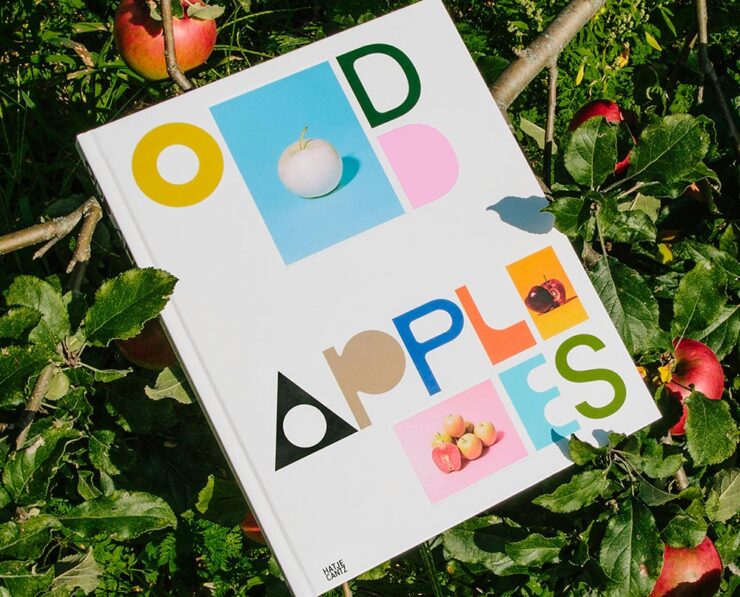
Special Bonus #1: I had the occasion to recently flip through Pentagram’s book design section. Some seriously interesting, seriously artistic work. (See the Odd Apples listing specifically.)
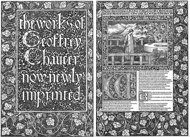
Special Bonus #2: CreativeBoom links to three free archives on Victorian illustration to inspire — or perhaps use creatively in a book.
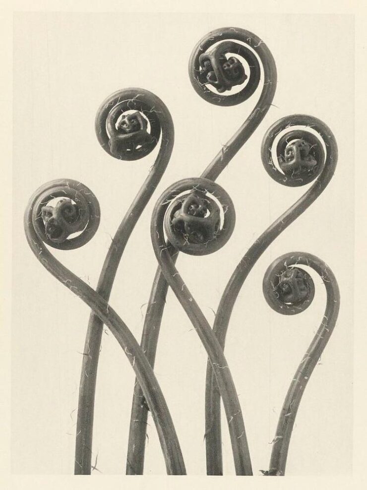
Special Bonus #3: The ever-great Kottke.org. points us at Public Work, “an image search engine that boasts 100,000 “copyright-free” images from institutions like the NYPL, the Met, etc. It’s fast with a relatively simple interface and uses AI to auto-categorize and suggest possibly related images (both visually and content-wise).” As Jason Kottke points out, not great in the attribution department, but good stuff nonetheless.
Mazda’s New Logo
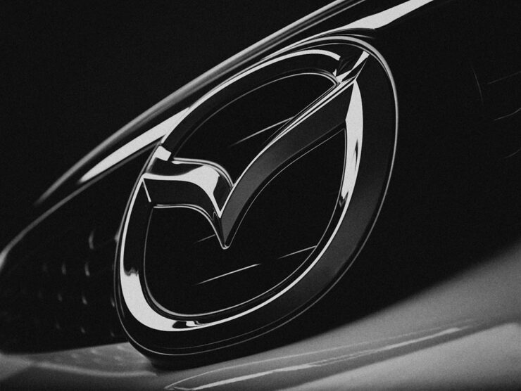
From the automotive logo thread (previously), we have to note Mazda’s new look, reduced from the current 3D-style grayscale to flat and black and white. This one gets some criticism from me: it lacks grace, pace, or space. (Hmph. That might be someone else.)

Then again, Mazda has not always been successful with logos. Anyone remember the 1991–1997 version?
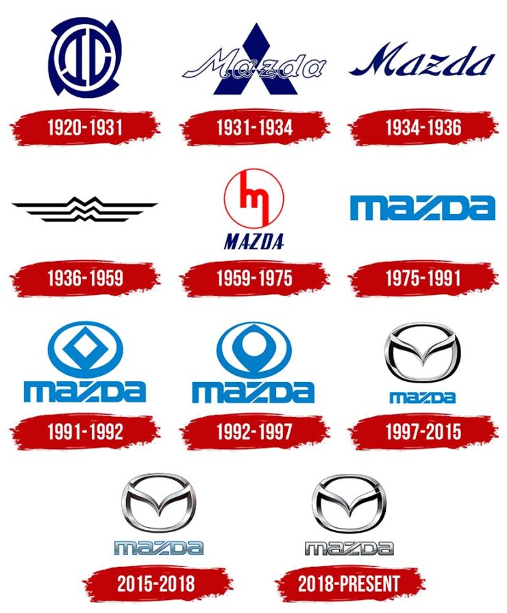
The 1931–1934 version lays the name over Mitsubishi’s logo, which was responsible for sales. The 1975–1991 version is the one I remember best, but that’s likely a youth/rose-colored glasses sort of thing. See Wiki for more information.
Meanwhile, Mazda is trying to move upmarket right now, and the new “look” isn’t really in keeping with that. Curious to see where this goes. (Via The Autopian.)
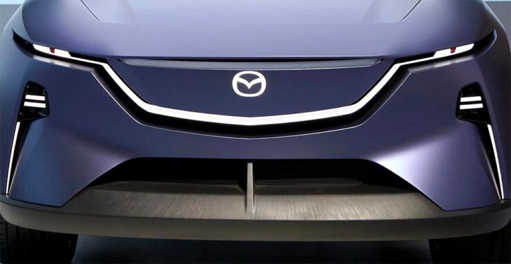
Special Bonus #3: BrandNew points us at the 2024 Logo Trends report, the annual fun item from Logo Lounge that looks at what’s hot in this year’s crop of — you guessed it!

Some of my favorites are above, but the whole report is worth a look. (Spoiler: more than flattening is on trend.)
Auto, Auto+Arch, Arch
Auto Photo Manual
Via Wallpaper*, we have Auto Photo Manual, a new monograph from Benedict Redgrove that “explores the art and science of photographing the world’s most striking cars:”
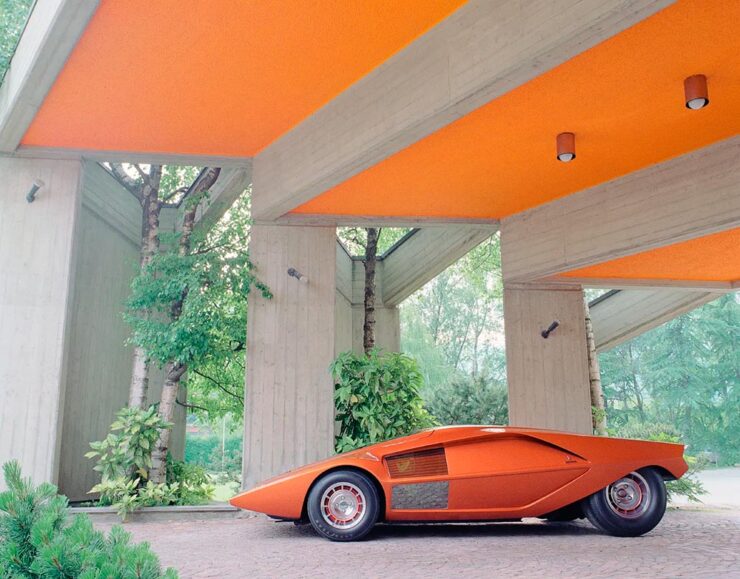
Always a sucker for a Saab, especially this concept:

Auto Photo Manual is a Kickstarter item that could use some love — stop by if you can. Wallpaper* has the full story.
A Time • A Place (Vol. 1)
Also via Wallpaper*, we have a “celebration of the European Car of the Year and changing perceptions of modern design, pairing the best buildings of the age with their automotive contemporaries:”
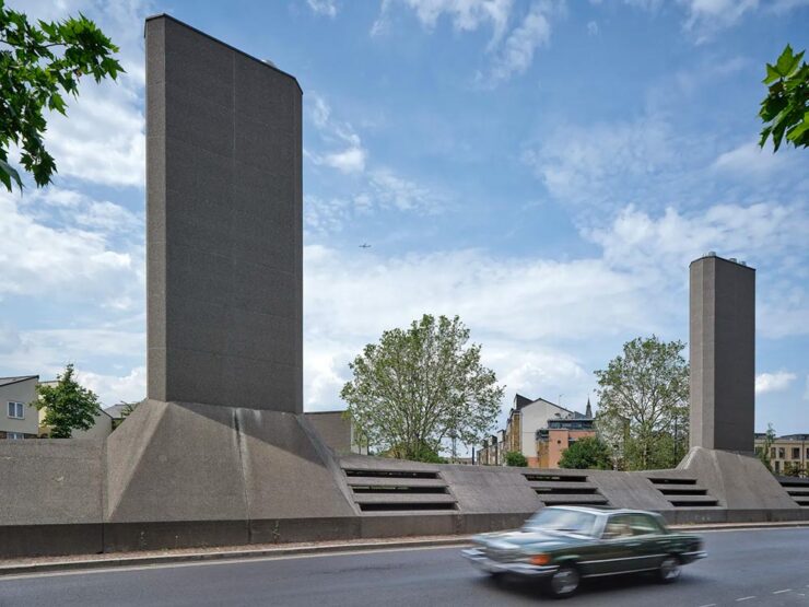
“Through the lens of time, both [cars and buildings] have become highly symbolic of their eras and hindsight will allow us to trace the roots of each design to determine how it is viewed from a 21st century perspective,” says Holroyd, noting that over this period architecture underwent a stylistic retreat, just as car design became emboldened and more avant-garde.
Great stuff in this new title, available now from The Modernist. Read more at Wallpaper*.
World Architecture Festival 2024 Shortlist
Via The Guardian, we have The World Architecture Festival’s 2024 shortlist, revealing projects from around the world spanning categories such as childcare, energy, transport and science. A couple of faves:
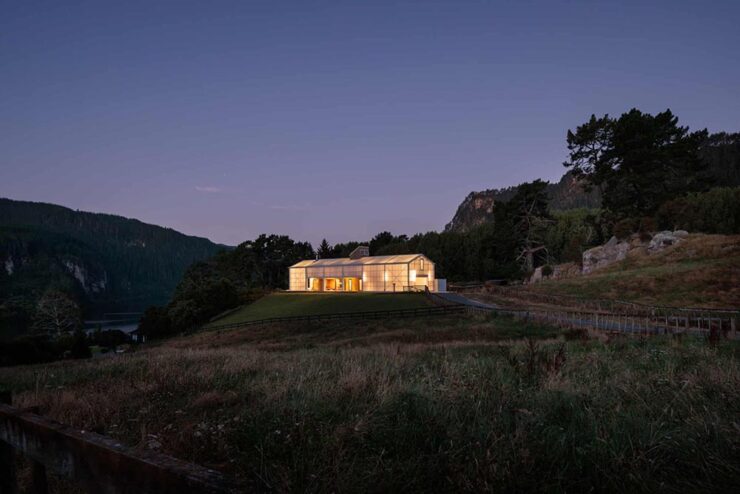
The live awards event will take place in Singapore from November 6-8. This year’s finalists represent 71 countries.
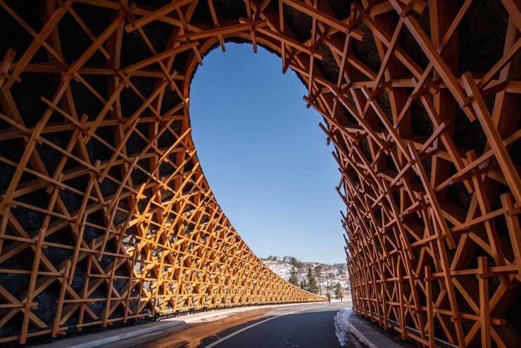
See more at The Guardian, or the complete shortlist at The World Architect Festival.
Special Bonus #4: This is Colossal brings us the drone photography of Eric Waider, shot in Iceland:
As glaciers expand and recede, they have the capacity to grind rock so fine that geologists refer to the pulverized material as glacial flour. It slips down rivers and into lakes, carrying the otherworldly turquoise hue through a unique and resilient ecosystem. In Iceland, the blue-green color is complemented by rivers that flow yellow, thanks to sulfur from nearby volcanoes, or red from dissolved ferrous iron—also known as bog iron. Coursing over rock and black sand, the streams take on dazzling, rhythmic patterns.

Brilliant. See his website (“Abstract Landscapes of the distant North”) and enjoy that series and more — including faves such as Ocean Blues and Glacial Macro.

