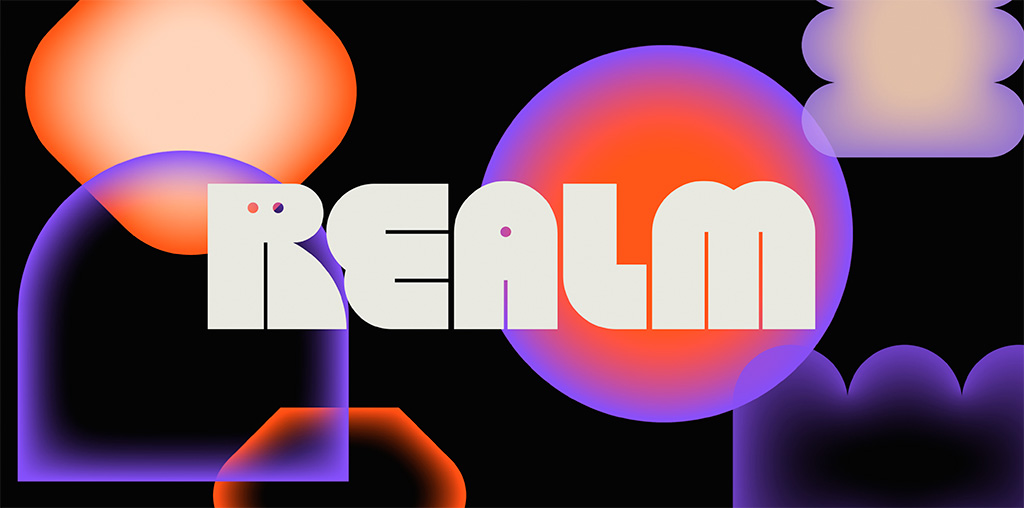
Three items for your update this month, starting with one of the best logos I’ve seen in a long while: Realm. Check this out:

Just … wow. Colors aplenty in the supporting materials, but the logo itself in beautiful black and white — and that GIF. (Update: the GIF isn’t working here, which lessens its appeal. CRAP. See it at either link below, but either way, see it. So worth it!) Congrats to Mother Design on this triumph.
Read the story at It’s Nice That or visit the source at Realm.fm.
Update, May 4: Brand New says, “A Nightmare on Realm Street.” Frankly, I’m surprised:
The animations for both the full wordmark and monogram are a little clunky. Maybe it’s on purpose, maybe not, but something about them feels half-cooked. Some killer animations would have really taken this to the next level.
Hmph. Read the rest.
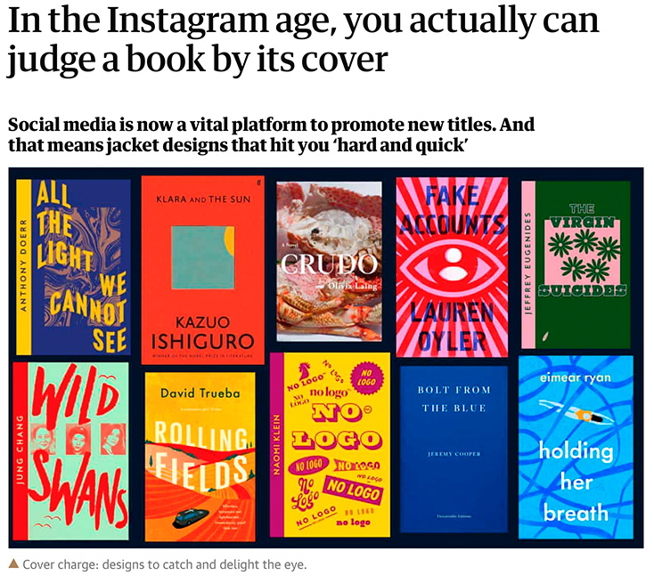
Next. a Guardian item on book covers — and how being “Instagrammable” is now, thanks to Covid and bookstores being less accessible, what’s expected:

I’ve famously chosen to boycott social media, so it’s probably not a surprise that I’m not 100% in agreement with the sentiment that Instagram is necessary for successful cover design. Nonetheless, supporting quality design — and acknowledging that more than a few do, in fact, judge a book by its cover — is a good thing. Read the rest.
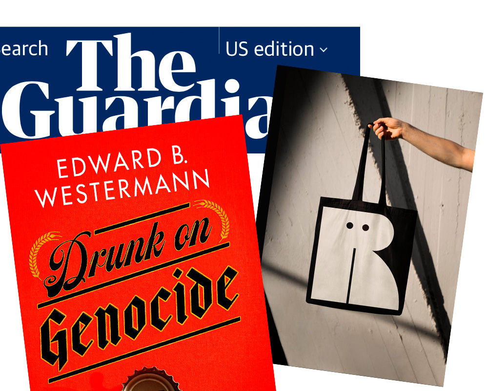
Last but not least, from Spine’s fantastic University Press Cover Round-Up, this:

Check the shadow of the bottle cap. Now, go to Spine and check the texture in the background. Revel. Repeat.

