From AUPresses:
“Since 1965, the Association of University Presses (AUPresses) Book, Jacket, and Journal Show has fulfilled its mission to “honor and instruct”: honoring the design and production teams whose work furthers a long tradition of excellence in book design […]. The Book, Jacket, and Journal Show recognizes meritorious achievement in design, production, and manufacture of books, jackets, covers, and journals by members of the university press community. It also provides an evaluation of their work and serves as a focus of discussion and a source of ideas for intelligent, creative, and resourceful bookmaking.”
Credit where credit is due: Spine, in their excellent way, has already covered this. Head on over there, knowing that I largely agree with their post in its entirety. However, there are a number of covers I like that they didn’t talk about — and they didn’t talk about interior design at all.
So, without further ado, let’s start with the covers and jackets. Interiors follow, then items that are in both categories.
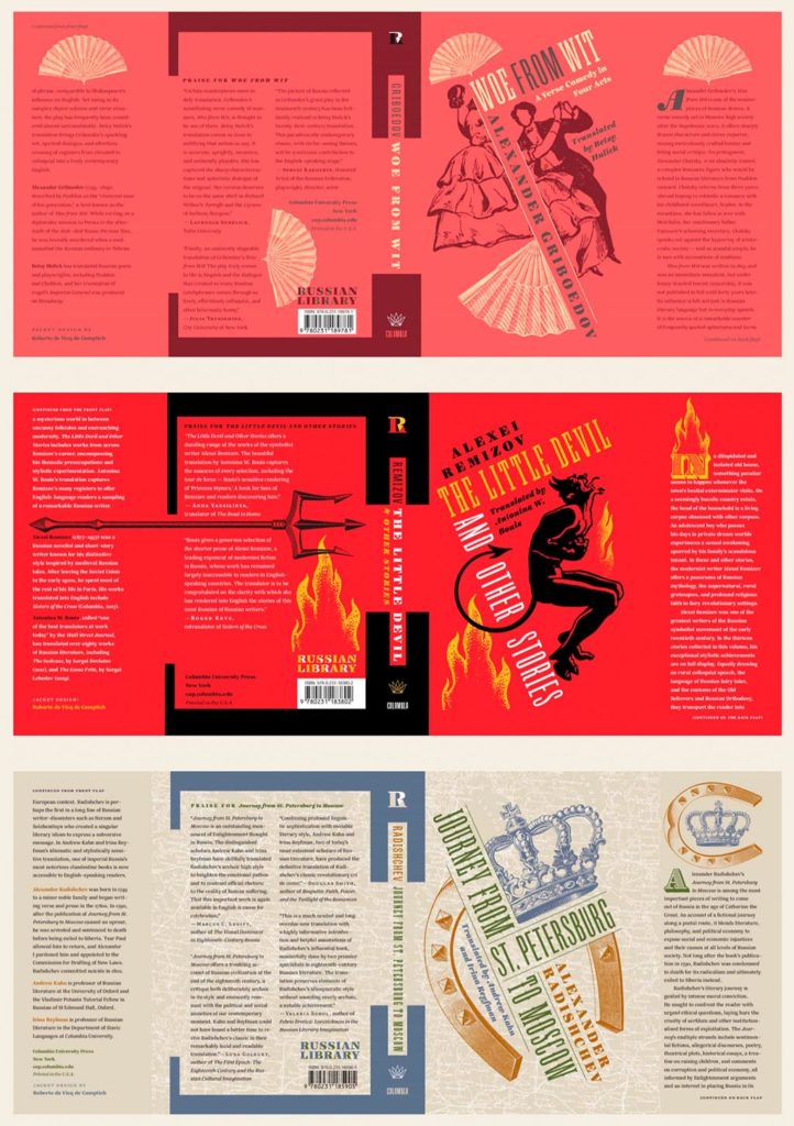
Columbia University Press with a series (in order, top to bottom): Woe from Wit, The Little Devil and Other Stories, and Journey from St. Petersburg to Moscow. Each is great on their own, but put ’em together and the series stands tall. Excellent design by Roberto de Vicq de Cumptich.
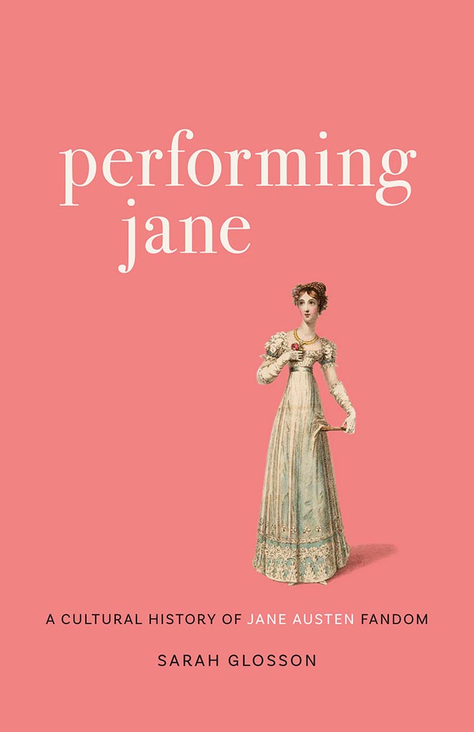
Louisiana State University brings us Performing Jane, with design by Barbara Neely Bourgoyne. Simplicity wins.
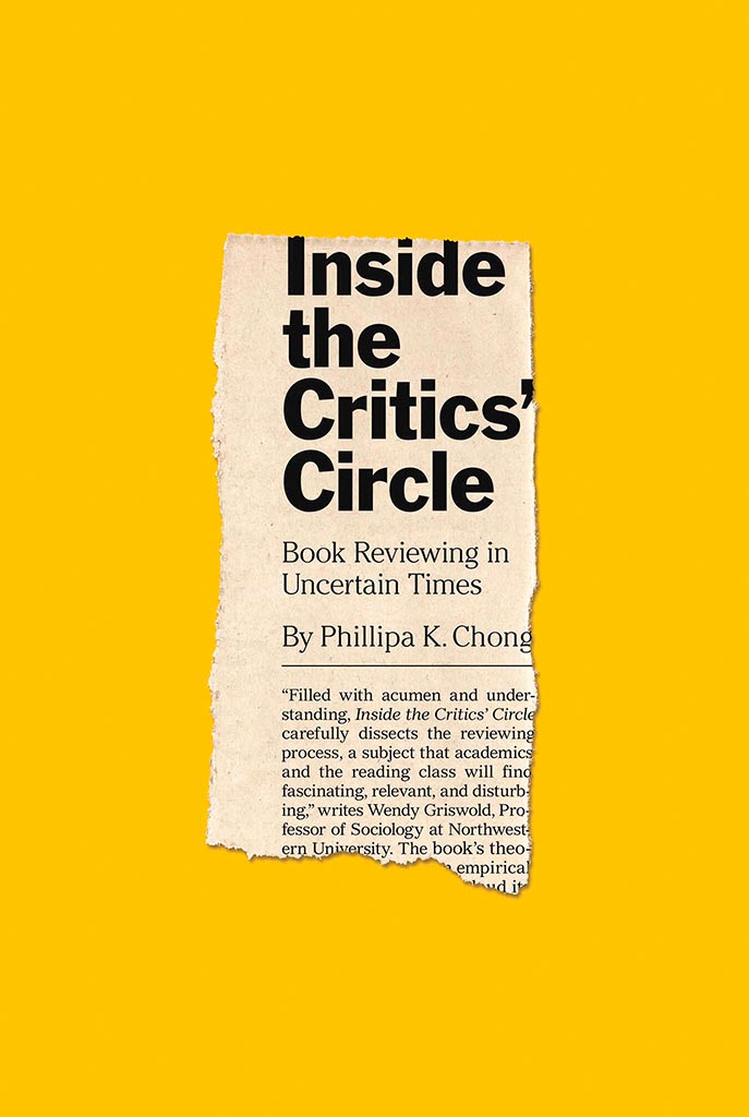
On the subject of simplicity, Inside the Critic’s Circle brings a seemingly-casual-yet-carefully-designed newspaper clipping onto a yellow background. Together, they’re attention-getting and just right. Nice. Design by Chris Ferrante for Princeton University Press.
Vénus Noire is about as far from a bust as can be — except not really:

Another example of simpler-is-better, yet something so much more. Design by Kaelin Chappell Broaddus.
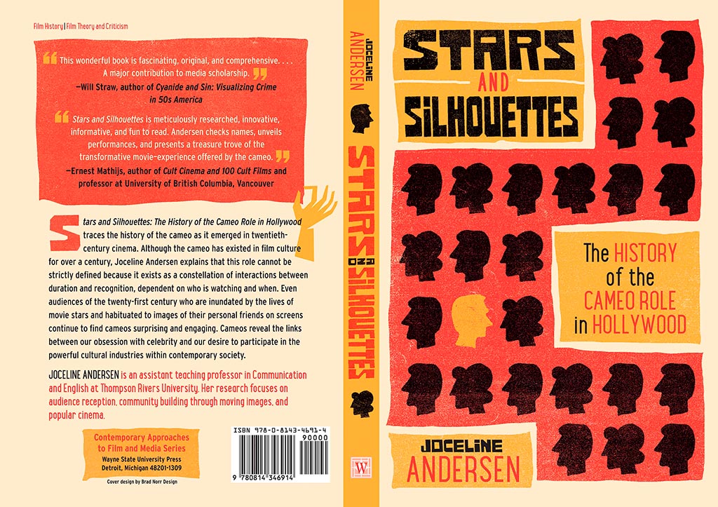
Wayne State University Press brings us Stars and Silhouettes, in all its hand-drawn glory. Love the design by Brad Norr.
My favorite of the stand-alone cover designs, however, contains a wrinkle or two:

Lovely. The illustration and paper photograph combine into something really special. Design by Derek Thornton — whose website, by the way, has a bunch of other great stuff. Nice!
On to some interior design, with Pinceton’s Dante:
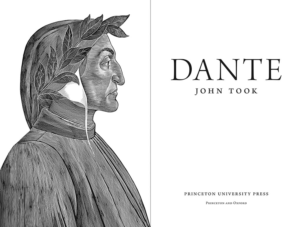
Puts “boring academic title [page]” to rest. Design by Chris Ferrante.
Next, a title on “knowing what not to know in contemporary China”, called Negative Spaces:
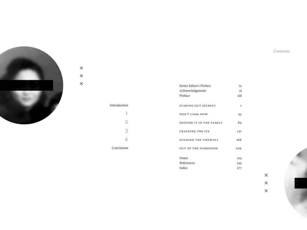
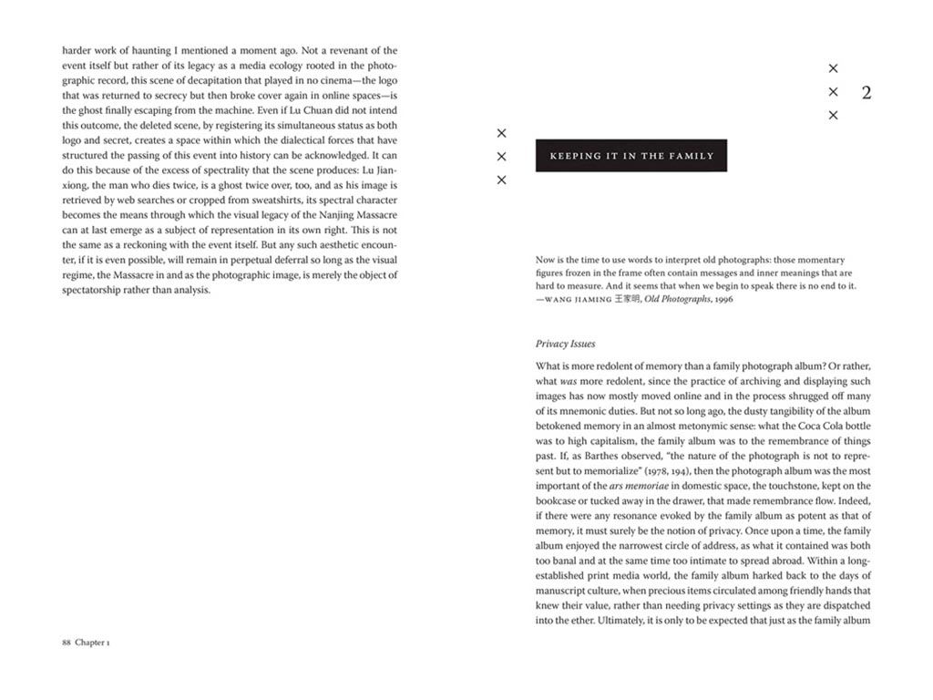
Design by Courtney Leigh Richardson for Duke University Press.
Next, stories from “the people of the land”:

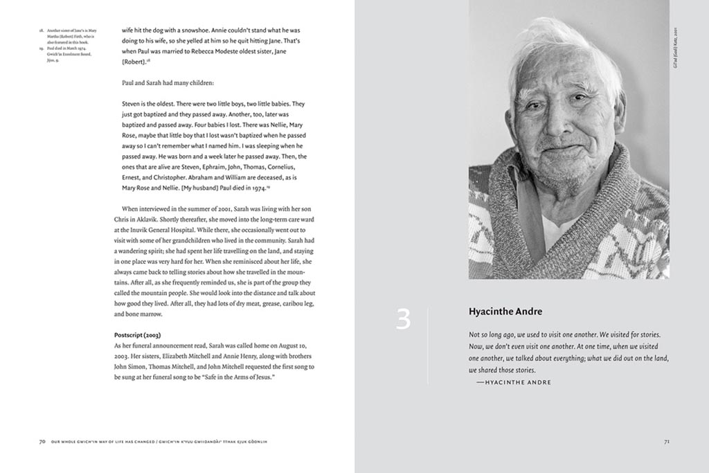
Our Whole Gwich’in Way of Life Has Changed / Gwich’in K’yuu Gwiidandài’ Tthak Ejuk Gòonlih, with design by Alan Brownoff for the University of Alberta Press.
Next, a couple where both the cover and interior excel, starting with Horace Kephart from the University of Tennessee Press:
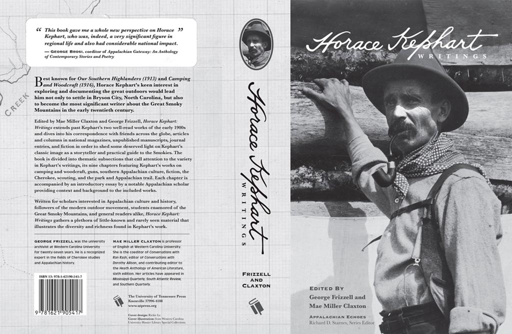
UTenn Press has a cool logo, too.
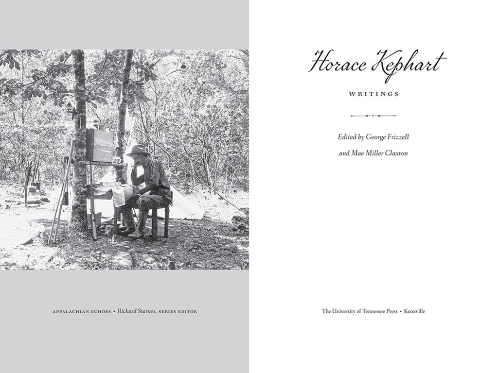
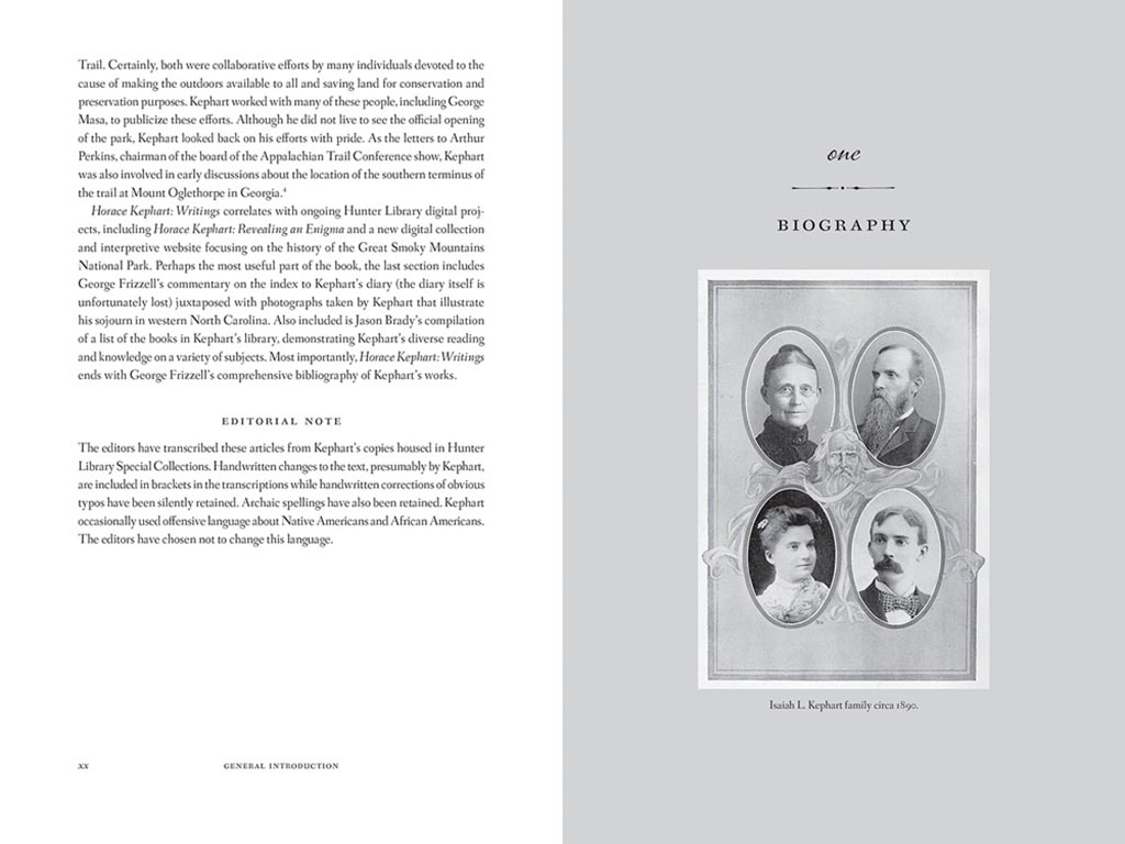
Lovely detailing in this design by Mindy Basinger Hill. Only one question here: Why doesn’t the script on the cover match that used inside? Both are nice — I prefer the one used on the cover — but either way, pick one!
Last but certainly not least, perhaps the best designed of all the projects in the AUPresses 2021 Show, Duke’s Sentient Flesh:

Fantastic. And check the interior:
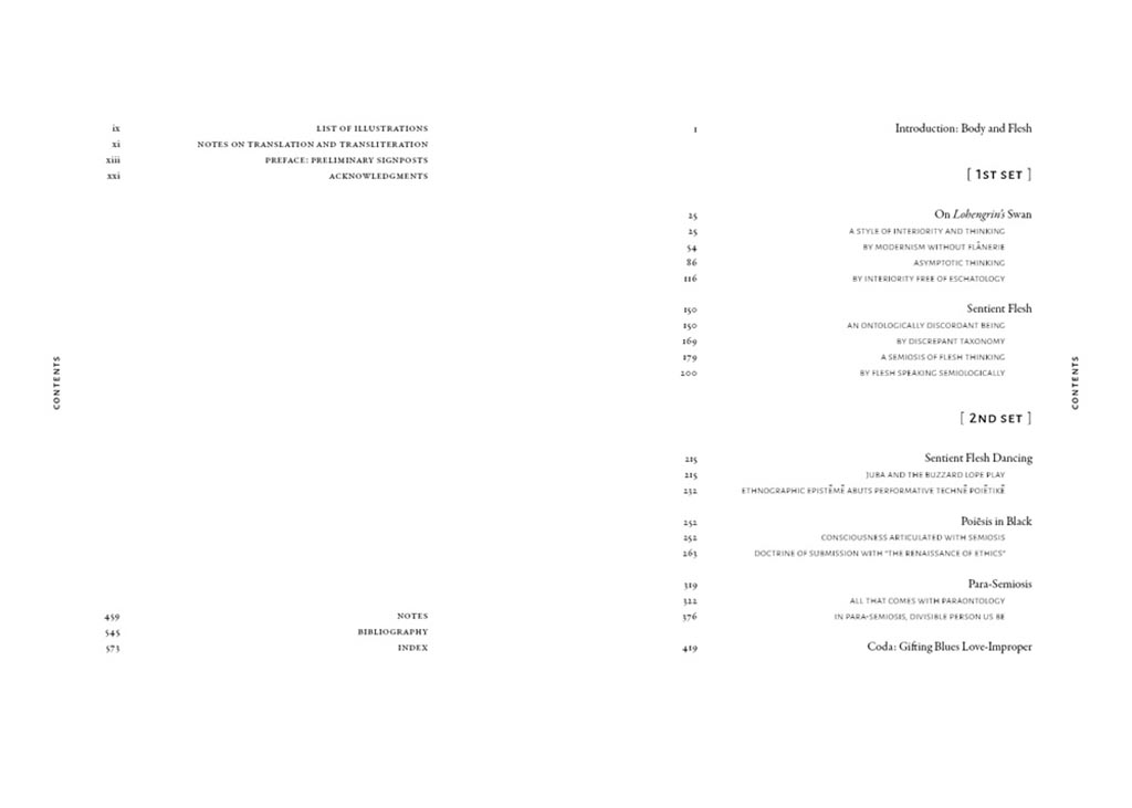
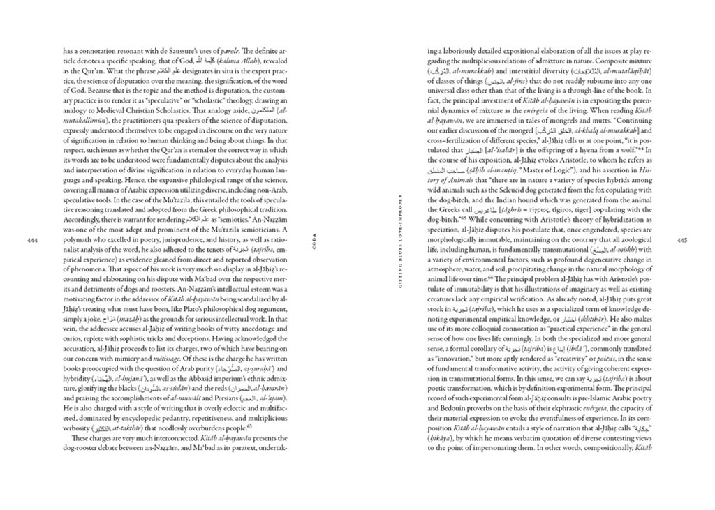
Kudos to designer Matthew Tauch for a “best in show,” at least as far as I’m concerned!

