
The “Iron Mark” has been given a makeover, and the result is … interesting. First, as a reminder, here’s the logo as it appeared previously — no, the one previous to that:
The blue has been associated with Volvo’s logo for a long while now, and it’s slowly been disappearing from the lineup (in favor of black in the same location). However, they’ve decided — they being both Volvo Cars and Volvo Group, two distinct entities (the latter including Volvo Trucks, the Volvo construction folks, Volvo Penta [marine], etc.) — to change to this new, more austere logo and word mark simultaneously. Aaaaaand:
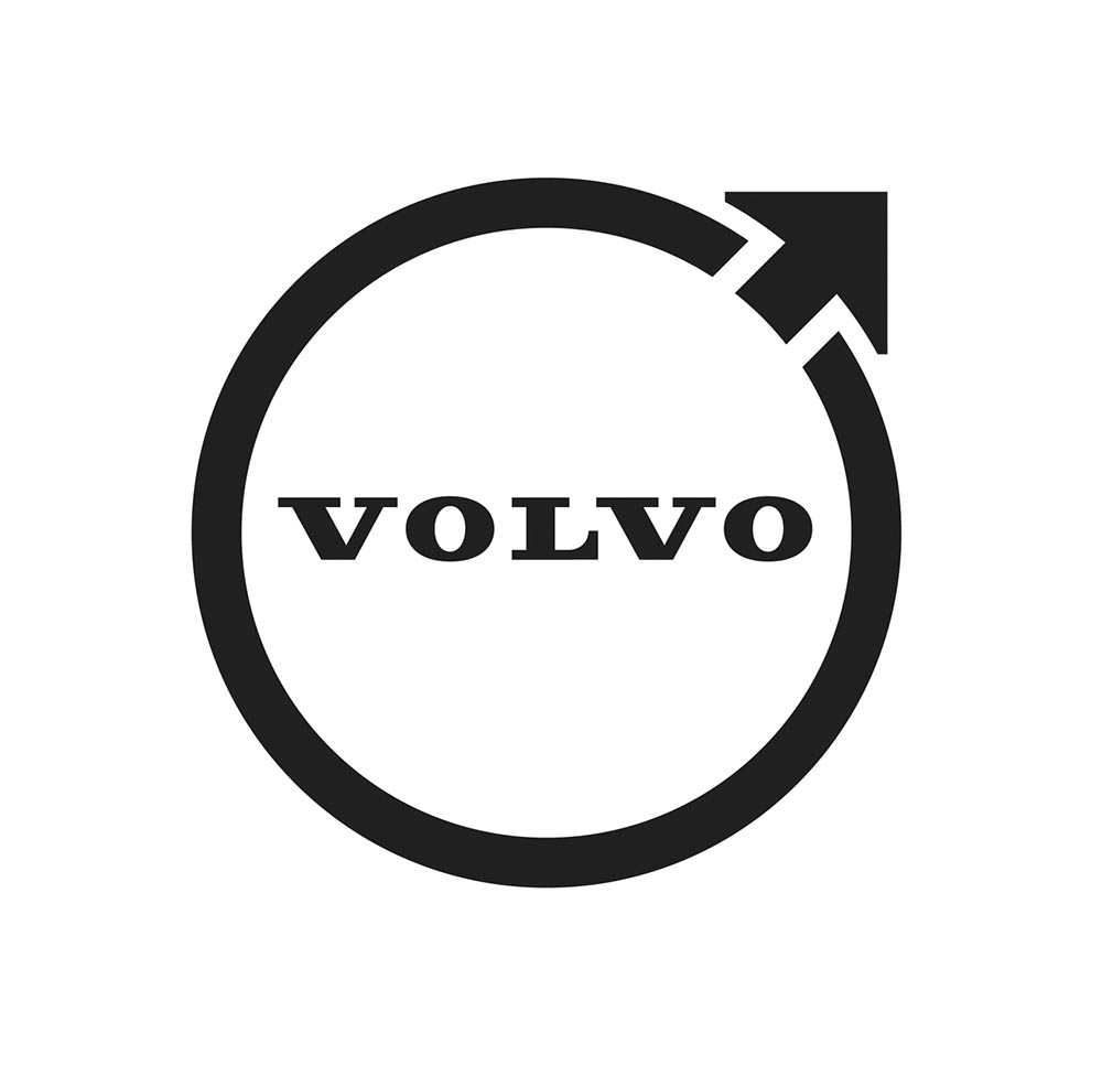
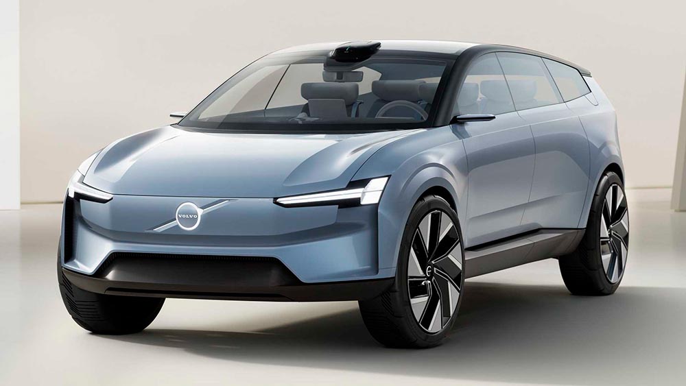
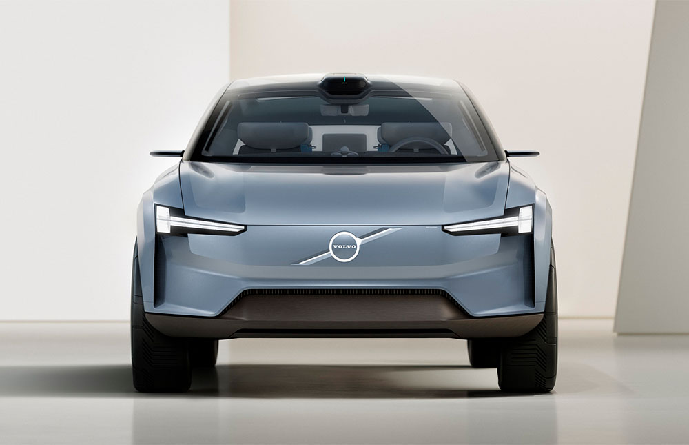
Words fail me. Thankfully, there’s been plenty of coverage. See Brand New (subscription), CarScoops, and The Drive. What’s interesting — and largely gone under the radar — is that the logo debuted on a concept car back in June.
It’s part of a trend, too:
See the previous coverage on Foreword. Can’t go, however, without a hat tip to Kristen Shaw at The Drive, who dug out this 1937 version — which, I’d argue, beats ’em all. Kudos.