

This time, book design times two, book cutouts, album covers, and a reflection on my 2023 photographs. It’s one of those Februaries, so let’s leap into it.
Jodi Hunt’s Great British Design
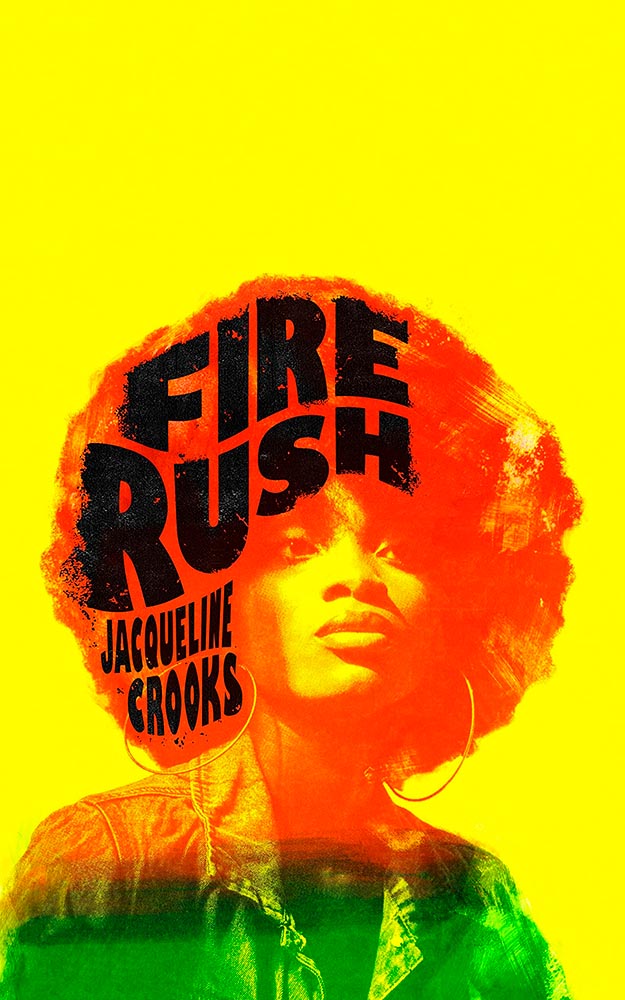
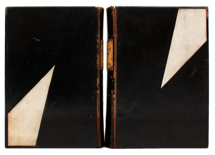
You might recognize the above book cover from my 2023 Favorite Book Covers post, a fantastic series of choices that speak to all colors while definitively saying, “Black.” It’s Nice That has a short post talking about Jodi Hunt, who designer that cover — and more.
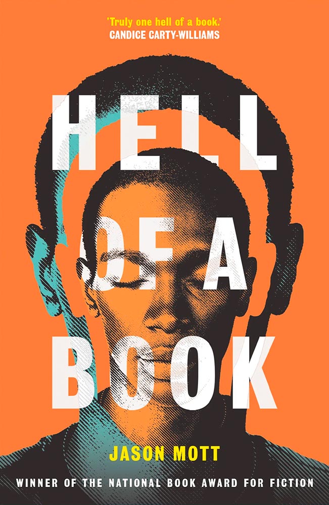
The screen printing is prominent here, too, and the interaction between that and title are, to borrow a Britishism, “ace.” And the below, with its slightly haunting image treatment (and that great text, lower left), also earns kudos:
Great design, deservedly highlighted. See the other examples here.
The original Book Design
Before there was book design, or even graphic design — that is, when books and pages were thought of as art instead of design — folks were still coming up with great book covers. The Grolier Club, “America’s oldest and largest society for bibliophiles and enthusiasts,” has a wonderful exhibit of cover design . . . made up exclusively of antiques.
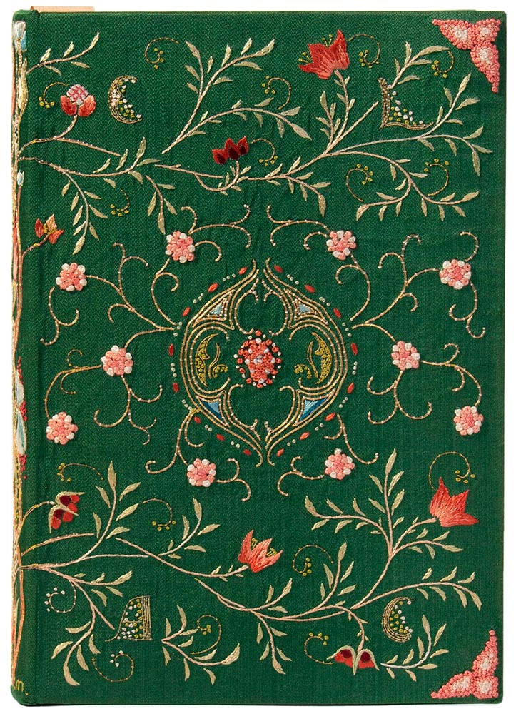
One of the most memorable artworks […] is a sumptuous but comparatively delicate volume, a 1643 book of psalms created in London. Atmospheric exposure usually turns white silk-bound editions tan and brown, but this cover is a shiny cream color. The polychrome silk and gold metallic threads, which wind around one another to form a colorful floral pattern, maintain an eye-catching vibrancy. The only sign of the book’s age is the oxidized silver “stumpwork,” a type of raised embroidery that in this case resembles beading.
— Elaine Velie, Hyperallergic
The quote above refers to the book in this month’s cover image, second from left, and is but one where what you see isn’t necessarily what you think it is — it’s more complex, more interesting, made with what the artist had available in the day. Great reminders, all, that book design has a much longer history than what we think of when we hear the term.
Check out that Hyperallergic article, another on This is Colossal, or, if you’re near NYC, go to the exhibit at the Grolier, 66th and Park. If, like me, you’re not able to visit in person, give them props for also posting the exhibit online.
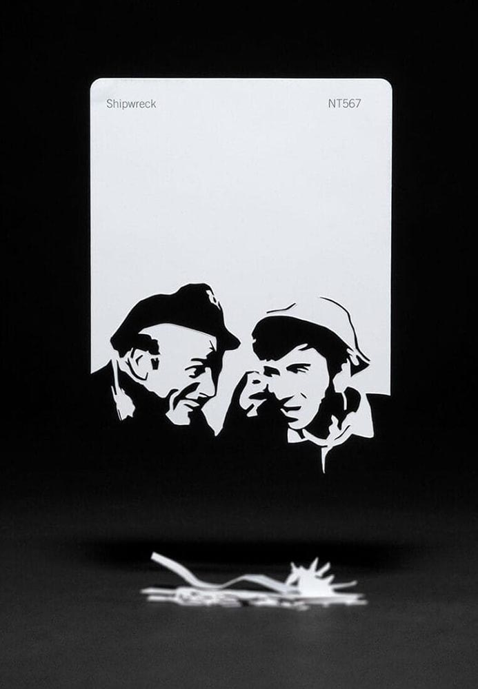
Books Manufacture Realities
“Meticulous incisions and methodical folding allow scenes to arise from aged books and color swatches in Thomas Allen’s paper cutouts,” This is Colossal notes — but a picture is worth a thousand words:
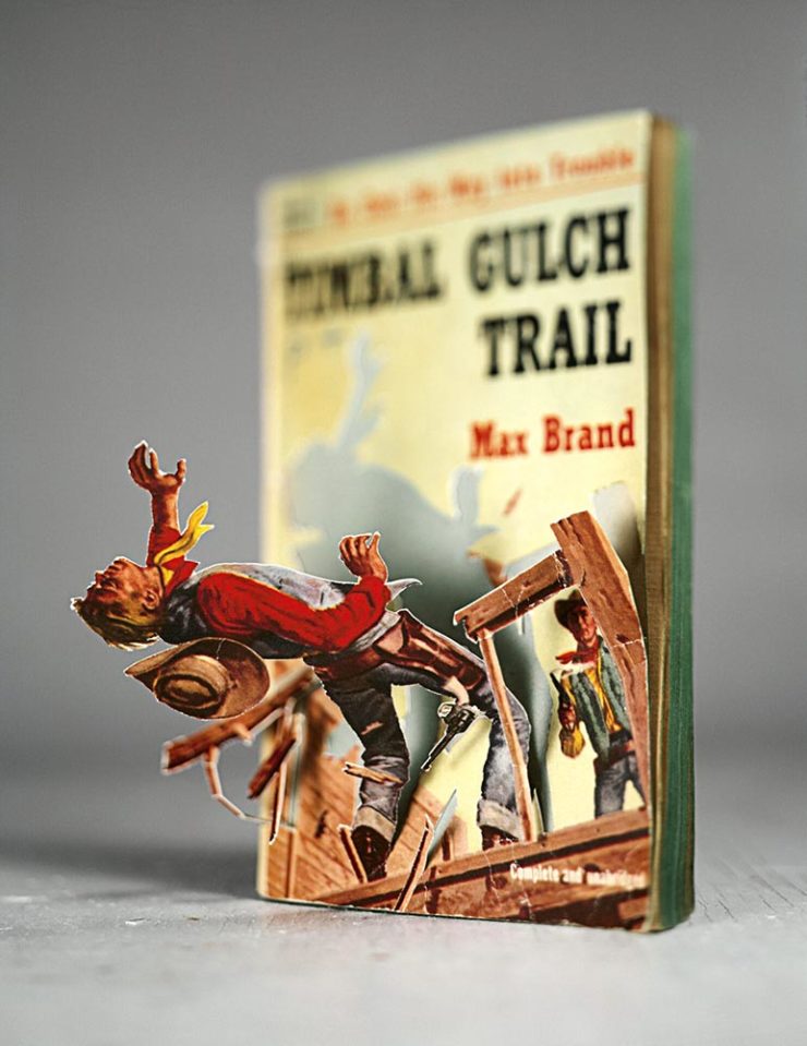
The vintage paperback work happened by complete accident. I was cutting into a pulp novel one afternoon with the intent of removing the illustration completely when I noticed that if I left some areas attached, folded the parts carefully, and looked at them from a single vantage point so that everything aligned, they created the illusion of 3D pop-ups. Everything snowballed from there.
— Thomas Allen, via This is Colossal
Here’s his desk — whoa:
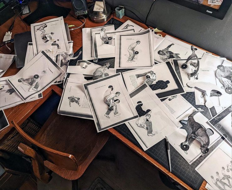
The article is a must-read. Awesome stuff.
The Article’s Great — but the Headline is the Point.
“Virality over Creativity.” Few things summarize the last few years more — it’s always about getting eyeballs, not about truth or quality. It’s satisfying the algorithm. Because, of course, these days, media is social.
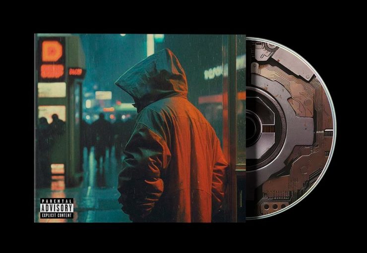
POV, a new series of articles from It’s Nice That examines, in this case, creativity and AI in design for the music industry. “If an artist isn’t putting a piece of themselves and their experience into the work,” it asks, “why should anyone care?”
All valid questions, yes. But it’s the headline that provides another potential word of the year: virality.
The times we live in . . . .
Some of my Favorite 2023 Photographs
I’ve updated my photography page with my favorites of 2023, including these two:
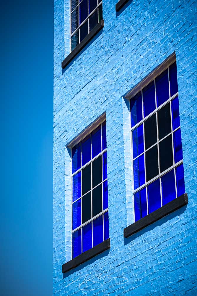
The above, taken in Augusta, is architecture that doesn’t make me feel blue, while the below, taken on the main street in Sparta, does:
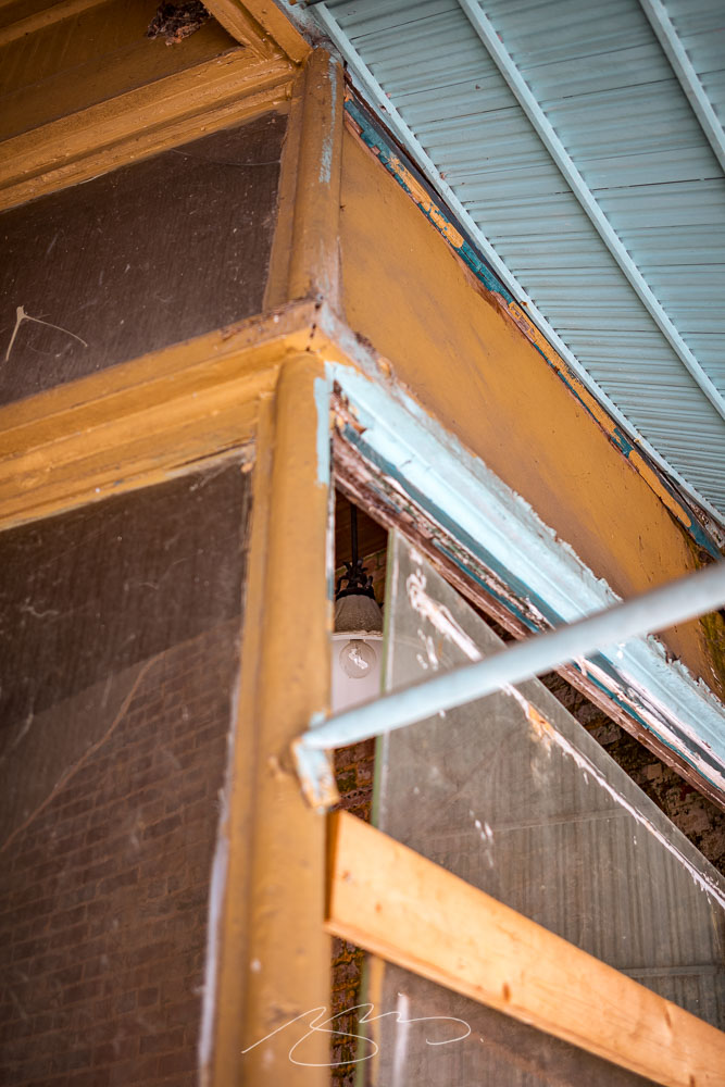
A couple of reflections: I didn’t get out as much as I did in 2022, and regret it, and have somehow pretty much eschewed both black-and-white and effects (film grain, light leaks, etc.), and kind of regret that, too. Both things to do differently in 2024.
That said, six years after investing in a different style of photography, I’m settling in — and looking forward to the future. I hope you are, too.