AIGA’s annual deep dive into great book design is out — later this year, for some reason — and brings deep satisfaction with a huge variety of titles, foreign and domestic.
“One hundred years into this competition, the book seems to be as protean and chimeric as ever. At times confounded and delighted, we asked ourselves [during the judging process], Is this a course packet or a manifesto? A sculpture or a monograph? A glossary or a guidebook? Is this book contemporary or retro? Gauche or chic? We debated books that blended the grotesque with the goofy alongside books that were delicate, subtle, and difficult to emotionally classify. In the end, we felt we found some of the best of this year’s offerings, books that in every case seem to show what design can do to bring the experience of reading to riskier-yet-more-rewarding places.”
— Rob Giampietro, AIGA 50 Books | 50 Covers Chair
As pointed out above, it’s the 100th year of the competition, this time with 542 book and cover designs entered from 28 countries. In order to be eligible, submitted designs had to have been published and used in the marketplace in 2023.
Some of my favorites, in alphabetical order:
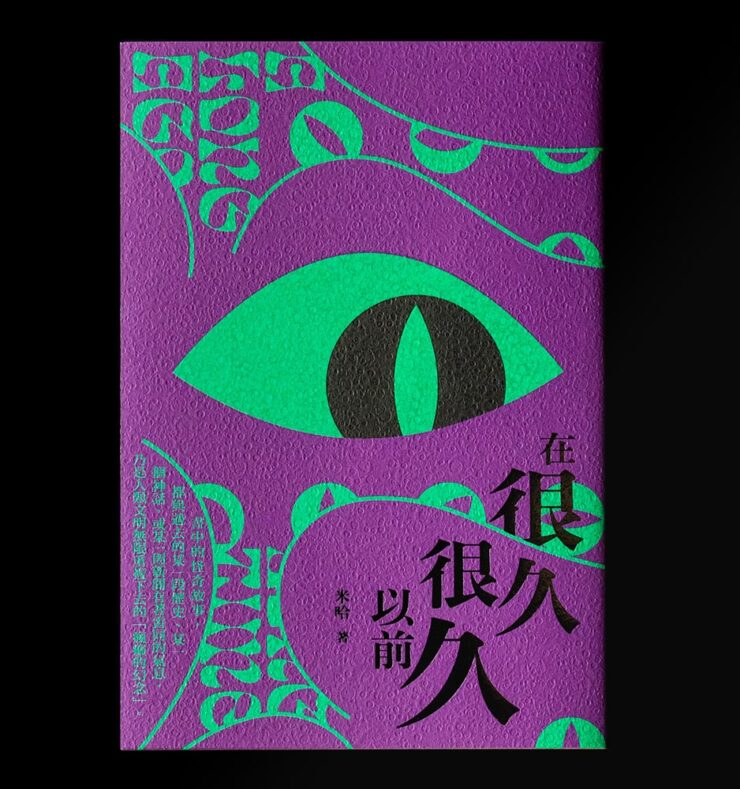
Great texture, great graphics — on the theme of “observer.” Indeed.
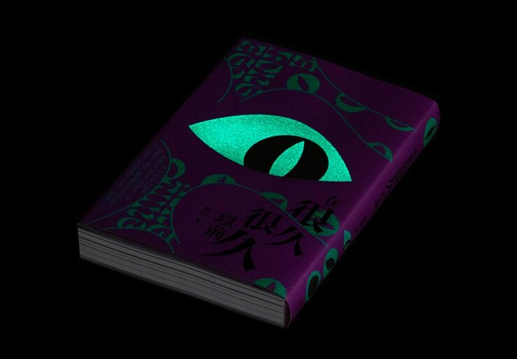
But wait: there’s more. This one observes more dramatically than it might seem, uh, at first glance.

I want to get a copy just so one of my bookshelves will have this moment. Fantastic.
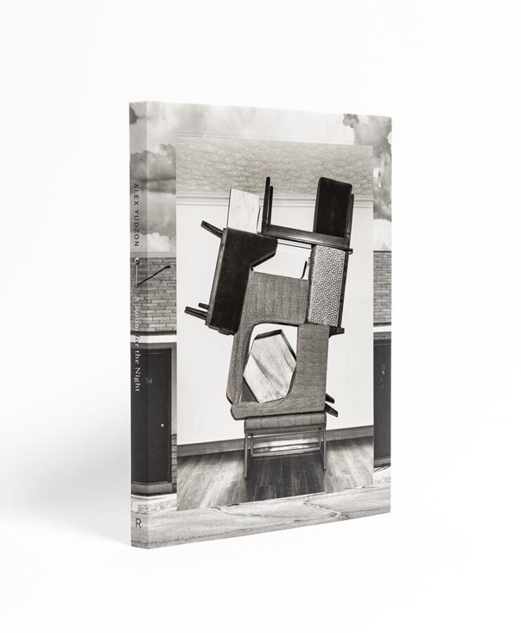
“Yudzon stacks, leans, and balances furniture [in the hotel rooms where he’s a guest] in configurations that transform these generic interiors into hallucinatory worlds where the laws of physics are suspended and dormant emotions released.” (After the installations are documented, crime-scene style, they are dismantled and the rooms returned to their original condition.) Really: who could resist? The compelling design isn’t even the icing on that cake — we’re well past that — it’s a fancy fork, ready to dig in.

I’m glad we have the whole cover here; the spine definitely adds to the overall, and the illustrations on the front add so much.
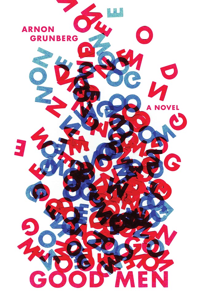
“I cut the letters of the title out of paper and arranged them in a way that is reminiscent of a fire – as if the words “GOOD MEN” are going up in flames. The letters rise up in a smoke-like form. Blue and red is used to emphasize the visual association with fire. The result is a visual metaphor for “GOOD MEN” blazing into entropic chaos,” designer Anna Jordan says of this novel about a firefighter, “an ordinary, sympathetic guy lost in a turbulent existence.”

Nice.
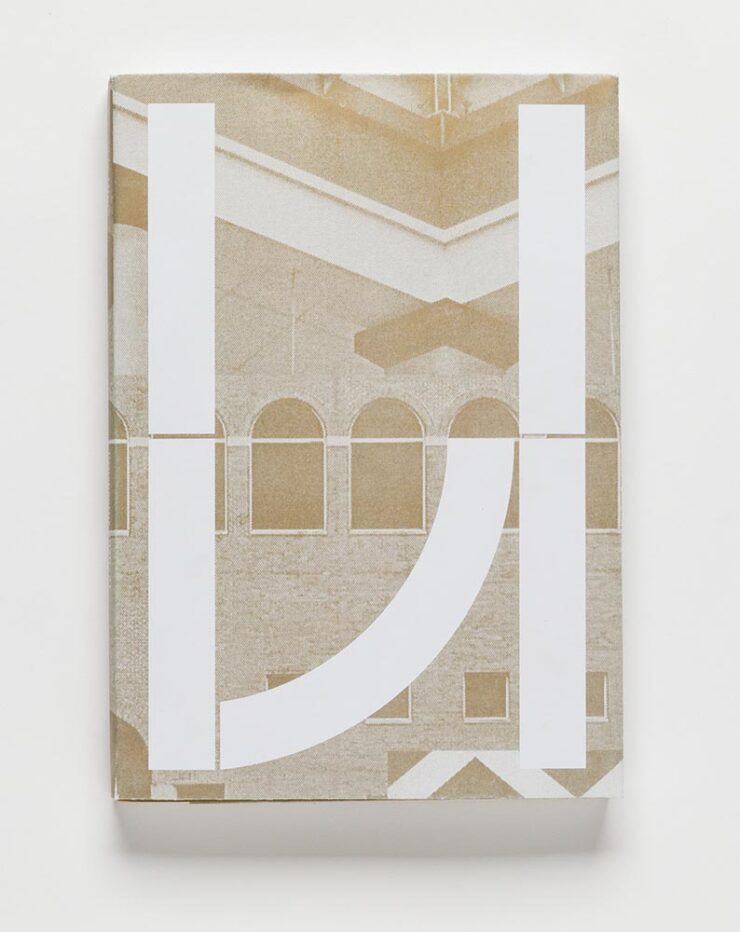
This prospectus for the University of Houston has a special bonus:
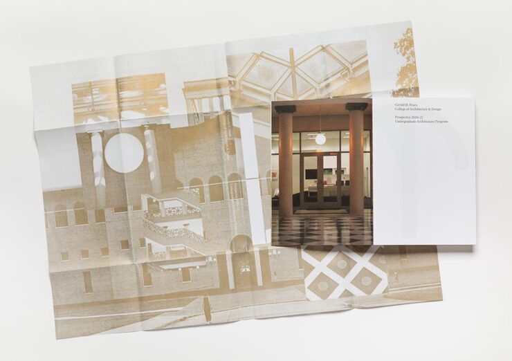
Design-driven impact, the dean says. Yep.
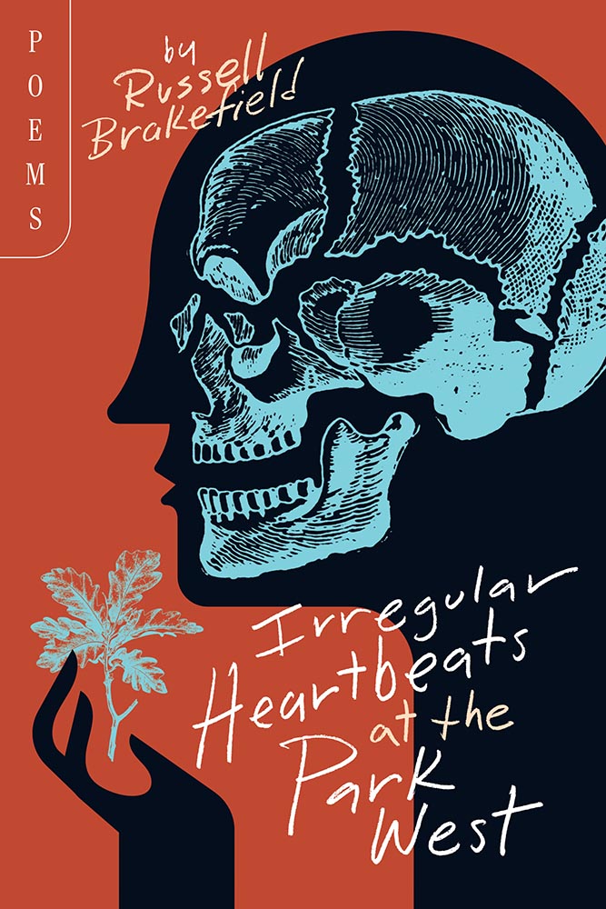
“Rural gothic,” they say. “Goodness,” I append.

Each year, 50 Books seems to latch onto a particular theme. Last year, it was irregular page sizes (often multiple sizes in the same book); this year, it’s irregular, often hand-sewn bindings, seen here with a slip jacket starring the other recurring theme this year: translucency.
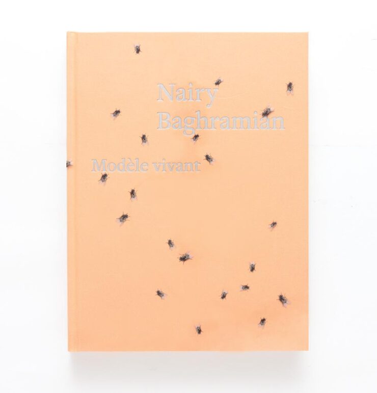
Speaking of translucency, this jacket is that … and something more, shall we say, eye-catching. Compelling, but does it make you want to pick it up?
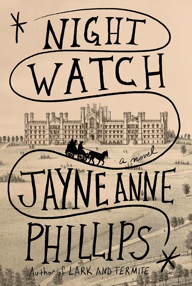
This title was in my folder of finalists for Foreword‘s Favorite Book Covers of 2023 but ultimately not selected. Glad to see it get some recognition. (Note that The Guest Lecture and The Nursery, two other 50 Covers winners, did make my list.)
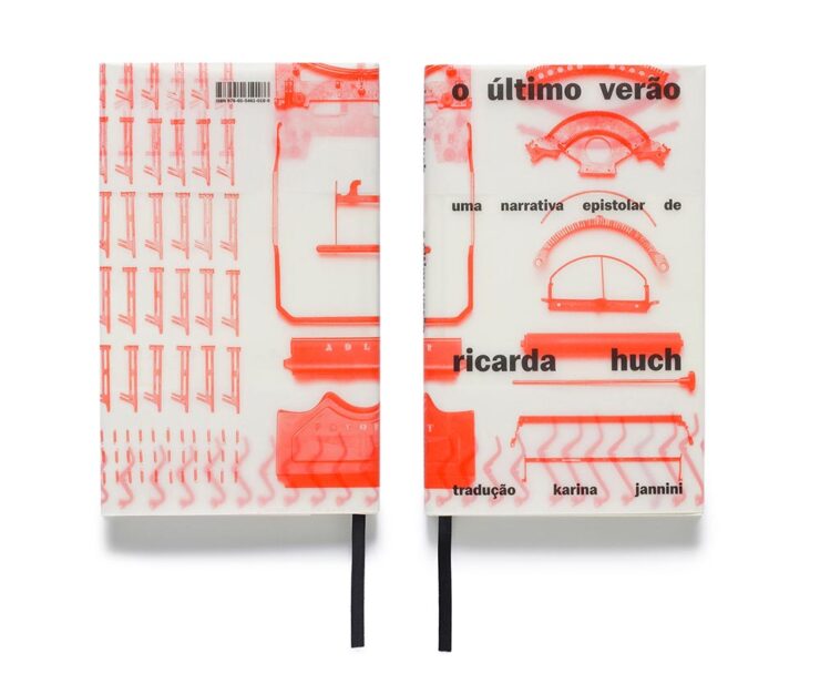
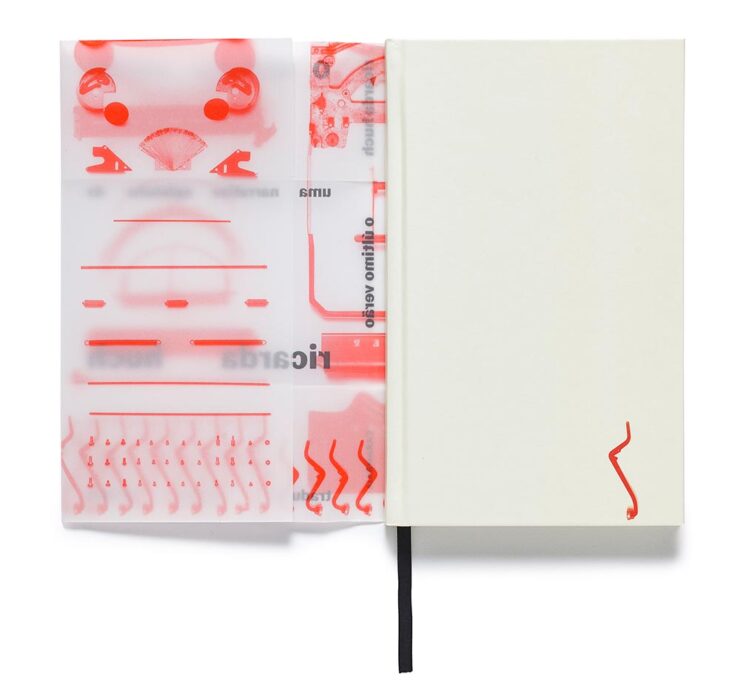
The translucency is back, this time covering — well, jacketing — a newly-republished 1910 detective novel set in pre-revolutionary Russia.
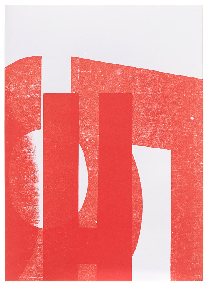
“Printing legend Jack Stauffacher’s experimental make-ready sheets informed both the cover and the jacket for the regular edition,” 50 Books says, in another red-and-white triumph.

Great three-dimensionality on this cover, with an equally compelling interior:
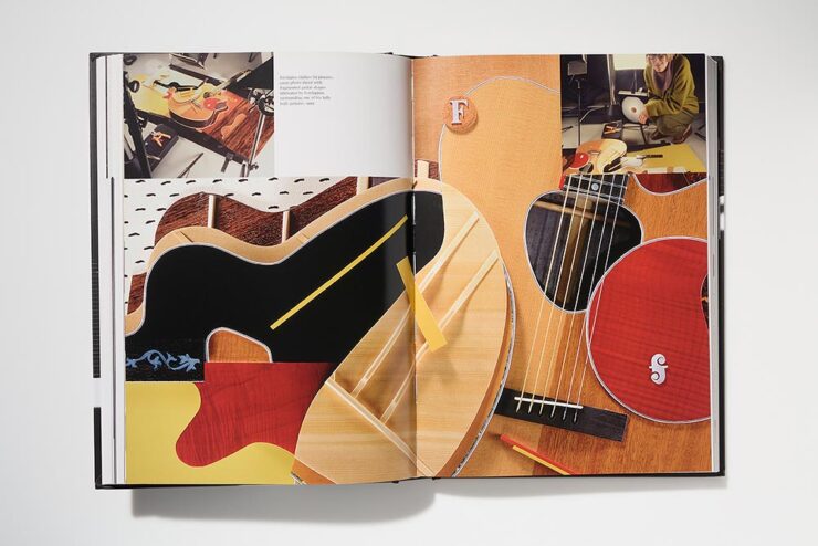
“We set up compositional frameworks to express harmony, conflict, resolution, or both,” the designers write. “For us there is never one perfect design solution, but the process generates one idea that overlaps and dissolves into the next.”
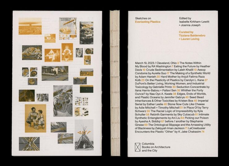
Sketches on Everlasting Plastics, which “explores the infinite ways in which plastic permeates our bodies and our world,” accompanied the exhibition Everlasting Plastics at the 2023 Venice Architecture Biennale. (Note the binding.)

Debossed type, linen spine, great photographs. Nice.
And, last but certainly not least:
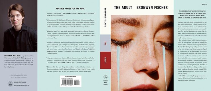
Simple at first glance, yet brings more on multiple levels. Great.
Each of the 2023 winners can be viewed through AIGA’s online gallery, and will become part of the AIGA collection at the Rare Book and Manuscript Library at Columbia University’s Butler Library in New York.
Via, as is often the case, PRINT Magazine.

