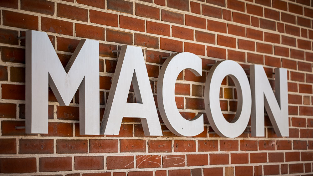
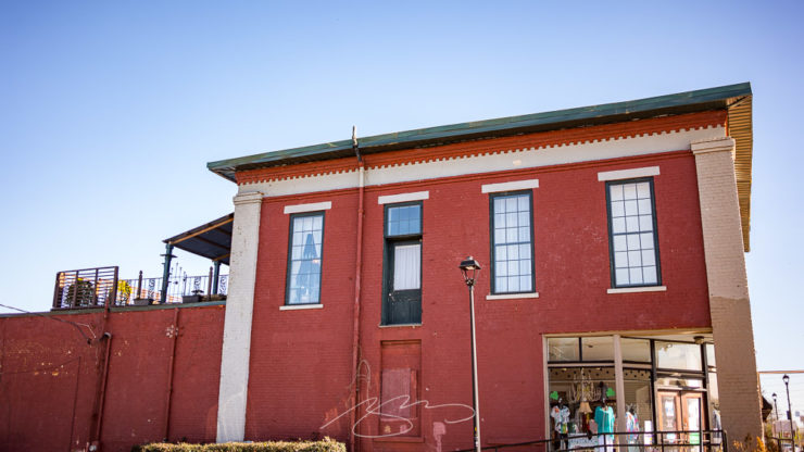
As is typical in July in Georgia, it was hot yesterday — but not so much that I didn’t spend a few minutes wandering around with the camera and superb 90mm. Especially since I was down on MLK, an area of downtown Macon I don’t frequent as much as, say, 2nd St.
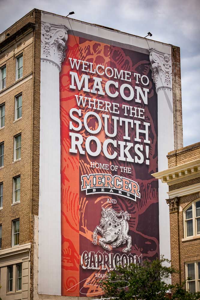
Macon Rocks Mural (401 Cherry St.)Music Marker (MLK and Mulberry)
Some detail shots (as usual):
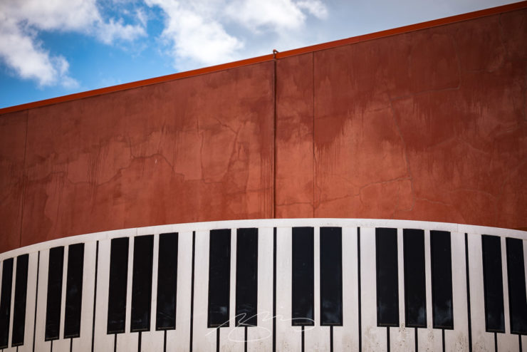
Studio Door, Serenity Entertainment, Cherry St. Ln.Visit Macon’s Keyboard Building Detail, 450 MLK Blvd.Decorated Transit, MLK and Cherry
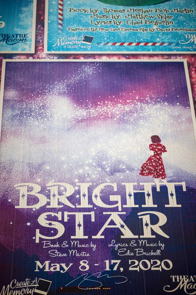
Side note: I was completely unaware that Steve Martin and Edie Brickell had teamed up for Bright Star, a musical set in the Appalachians. (I presume, unfortunately, that the 2020 season at Theatre Macon might not have shown.) It probably won’t surprise that I enjoy a musical now and than — and am a big fan of both Martin and Brickell — so was glad to find it on Tidal.
Bright Star (Painted) Poster, Theatre Macon, 3rd St. Ln.
This time, several items related to books and bookstores; two more — possibly the last two — from the automotive logo category; and PRINT Magazine’s 2023 roundup of great design.
Book Four-For
AI book covers? Here, now.
Creative Bloq, which I wasn’t familiar with, has a post up that’s only here because it’s the first I’ve seen of what is sure to be a trend: AI imagery on a book cover.
Image: Bloomsbury UK (Also: Where’s the body to go with the head?)
“Causing controversy,” they say, in that…:
[F]or a while now, with concerns over copyright and ethics plaguing text-to-image generators. Perhaps the most existential worry of all is the idea that AI could put human artists out of work – and while many still find the idea fanciful, we’re already seeing examples of AI-generated art being used commercially.
— Daniel Piper, Creative Bloq
The article itself has a hint of click-bait about it, what with Twitter users spotting a NY Times bestseller but complaining about the UK version of the cover design . . . but the larger question of AI coming for the book designers everywhere is valid.
Then again, AI imagery has the potential to reshape much of the creative landscape. Let’s hope — hope! — that it’s deployed ethically.
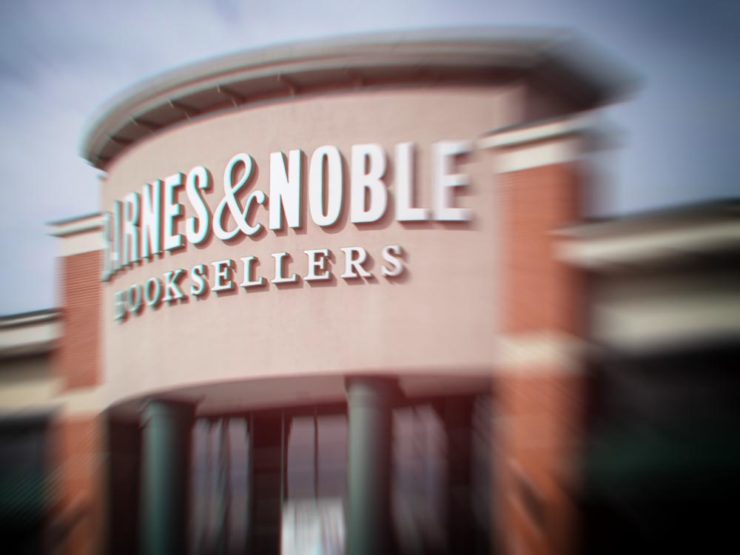
B&N’s Market Repositioning
Image: NYTimes (modified)
BookRiot asks whether Barnes & Noble’s new presentation as “a local bookstore” — something that’s part of the community in a way that Amazon can never be —is genuine, let alone successful. (We have a B&N here in Macon, which I visit infrequently, and which doesn’t feel “local.”)
Background: The BookRiot article (and the image) above ultimately stem, I believe, from a NY Timesoption piece from 2018.
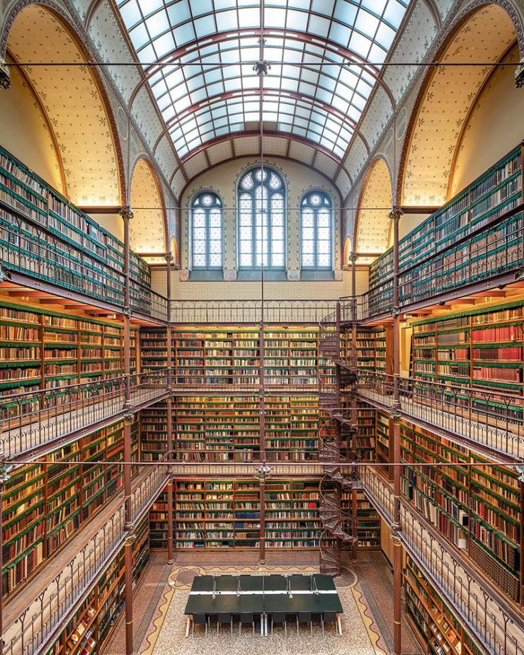
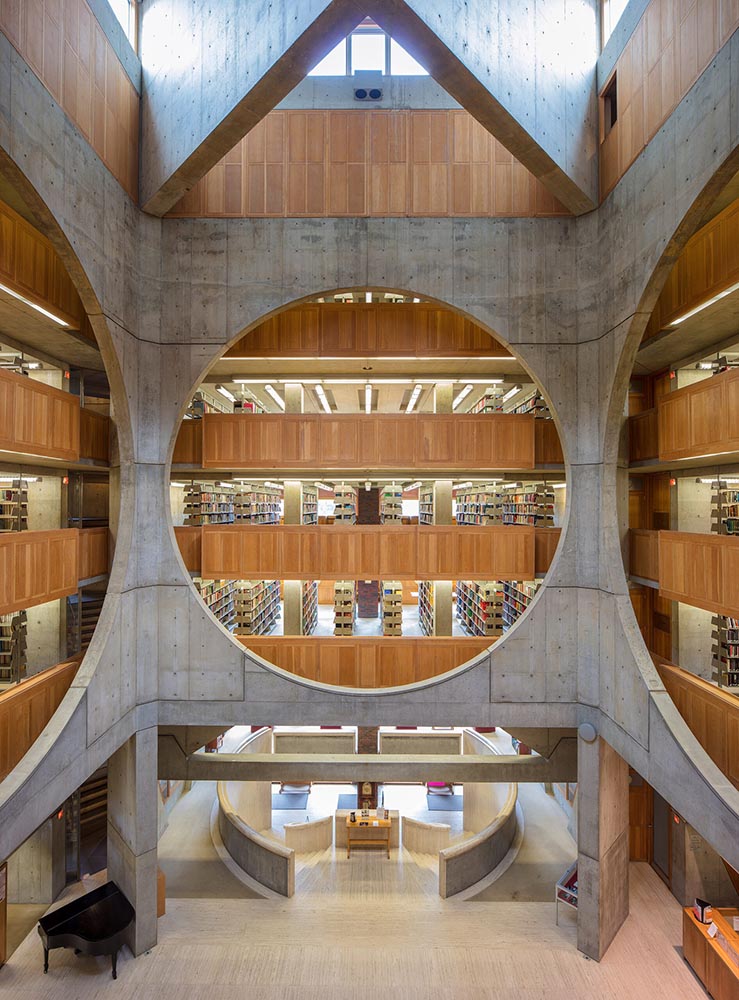
Temples of Books
As regular readers know, I’m a huge fan of combining books and photography. Naturally, great photographs of great libraries strike just the right chord:
Phillips Exeter Academy Library, Exeter, New Hampshire
Positioning these spaces as intellectual havens, Temples of Books highlights their wide array of offerings, including botanic gardens, archival repositories, and of course, room to read. “As an institution that can curate knowledge, scrutinize the status quo, and encourage education, the library is more important today than ever,” a statement says. “This responsibility is only growing as the freedom to publish on all manner of channels increases.”
— Grace Ebert, This is Colossal
Instant wishlist item!
Take Action for Libraries
Image: everylibrary.org
Simple brilliance: a handy step-by-step guide on what to do if you don’t like a book at your local library.
Carmaker Logo Updates: Porsche and JLR
Jaguar Land Rover > JLR
No, that’s really it.
Formerly Jaguar Land Rover, but generally known in the industry as JLR, the British company1Technically, it’s an Indian company, as JLR is a subsidiary of the TATA conglomerate. decided to have a FedEx moment and rebranded. Alas, Paul Rand was unavailable, so there’s no brilliance in the execution. (We’ll absolutely leave whether walking away from Land Rover as a brand is a smart move for another, longer discussion.) Motor1 has the details.
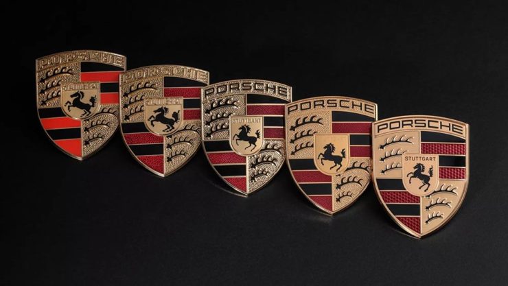
Porsche > Almost all other mainstream car brands
There’s a new Porsche logo!
The new 2023 version of the Porsche logo. (Image: Porsche)
That’s right: it’s a very subtle change. But it’s a significant one, perhaps because it’s only the fifth in the company’s 75-year history:
All five Porsche badges. (Image: Porsche)
The biggest changes are the backgrounds and the prancing horse in the middle, which is completely redrawn. (And, yes, has more than a passing — heh — resemblance to Ferrari’s.)
PRINT reminds us that not everything is digital these days — so much of the work still goes on paper or packaging — in their 2023 roundup of great stuff:
The 2023 PRINT Awards celebrated outstanding design in every shape and form, from the delicate texture and exquisite form of print to digital design that married technical skill with precise craftsmanship.
— PRINT Magazine
The best in show is a brilliant environmental design, the annual reports category is oddly satisfying (I didn’t know that Land O’ Lakes is a cooperative that owns Purina, for instance), the editorial category contains brilliance, and many, many more worthy of a design lover’s attention.
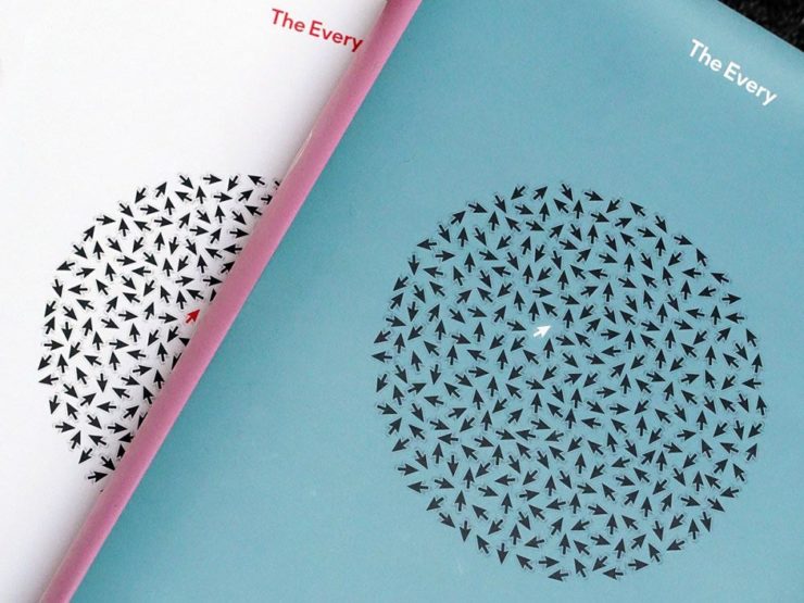
Sadly, their book design category is a bust. I like “The Every,” but pretty much any of my Best of 2022 picks run circles around it (and the other two choices):
The Every as photographed by PRINT.
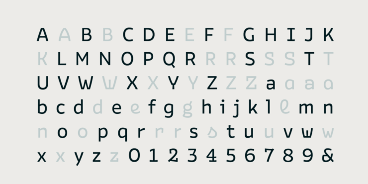
But there are gems. I really like Bakemono, for instance, a winner in the fonts category and the best monospaced font I’ve seen:
Italian foundry Zetafonts brings us Bake Mono.
It’s a long article (they call it a 74-minute read!), but when you have a moment, grab a drink and an iPad and enjoy — hopefully as much as I did.
And that’s it! Settle into summer, and stay tuned for more soon.
1
Technically, it’s an Indian company, as JLR is a subsidiary of the TATA conglomerate.
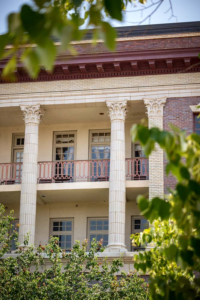
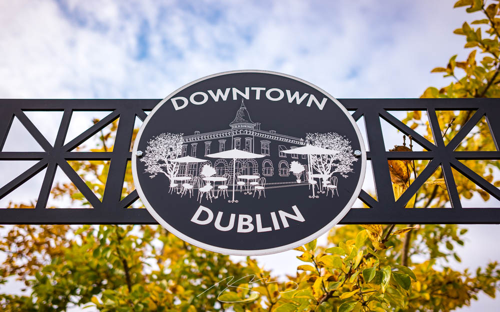
It’s hard to understate how much downtown Macon has changed for the better in the last fifteen years: new residents (and lofts), new restaurants, new shops, a high-end hotel, and more — all without losing its feeling of an historic Southern city.
Balconies, 389 1st St.(Sign of) Hotel Forty-Five, 401 Cotton Ave.
On the subject of Southern, I’m glad to see the completion of the new Cotton Avenue Plaza, a pocket park that replaces not only an awkward intersection but one that had, at its center, a Confederate celebratory statue. Something everyone can share is a big upgrade:
Cotton Avenue Plaza (with Lawrence Mayer Building)
Meanwhile, it wouldn’t be a gallery post without some of my signature detail photographs:
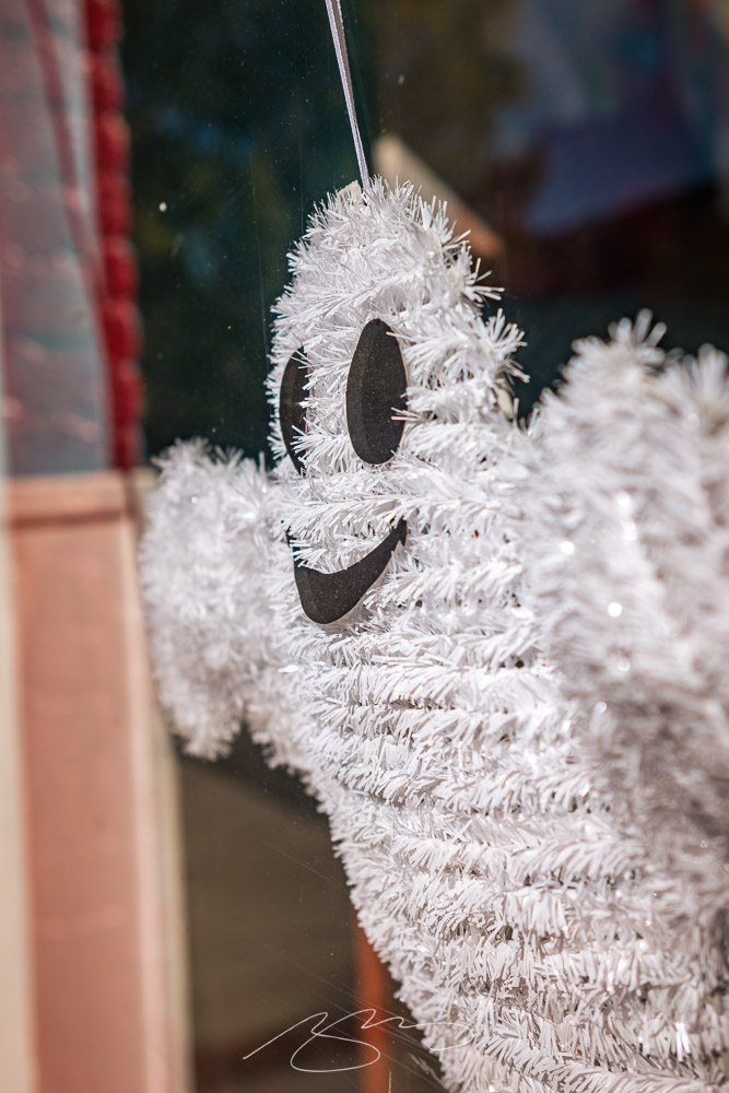
Flower Detail #2, Mulberry St.Eyes on Cherry St. (Window)
The downtown gallery (2022–23) is now up to 132 photographs — check ’em out. (Once you’ve followed the link, click on any photograph for a larger, captioned version.) And, if you’re interested in the city’s downtown evolution, see also the 2020–21 and 2008–2018 galleries.
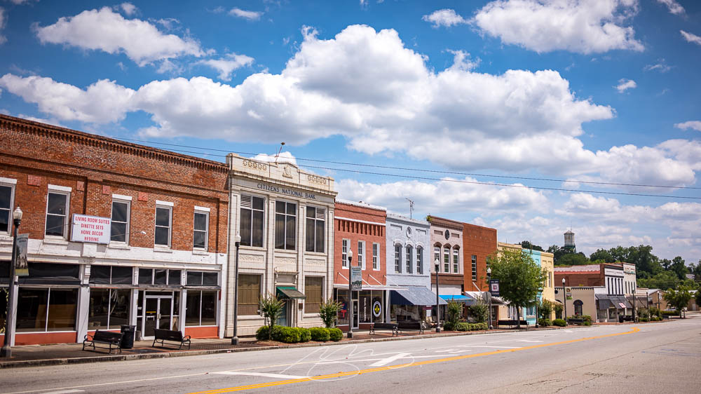
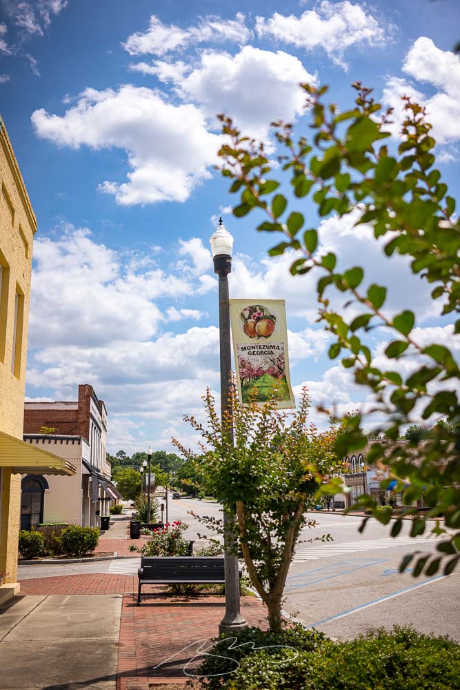
Macon County, Georgia, hosts Montezuma, a railroad crossroads on the Flint River. Officially dating to 1851, it was named after the Aztec leader by soldiers returning from the Mexican-American War.
Montezuma Sign (Crepe Myrtles), S. Dooly St.
I’ve been meaning to stop with a camera for a while, but it’s always been a pass-through on the way elsewhere — the route from Macon to Andersonville, Americus, and all points southwest go through Montezuma — but it’s taken until now to actually stop.
Bench Detail, Montezuma Methodist, N. Dooly St.
Like a substantial part of rural Georgia, Montezuma has fallen on increasingly hard times; the population continues to drop1See Wiki’s article., the empty storefronts multiply, and many of the beautiful old Southern houses need some attention:
Slight Repairs Needed, 510 S. Dooly St.
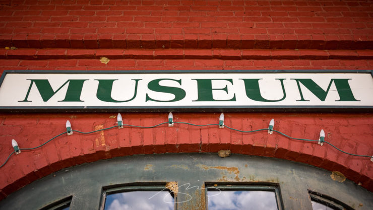
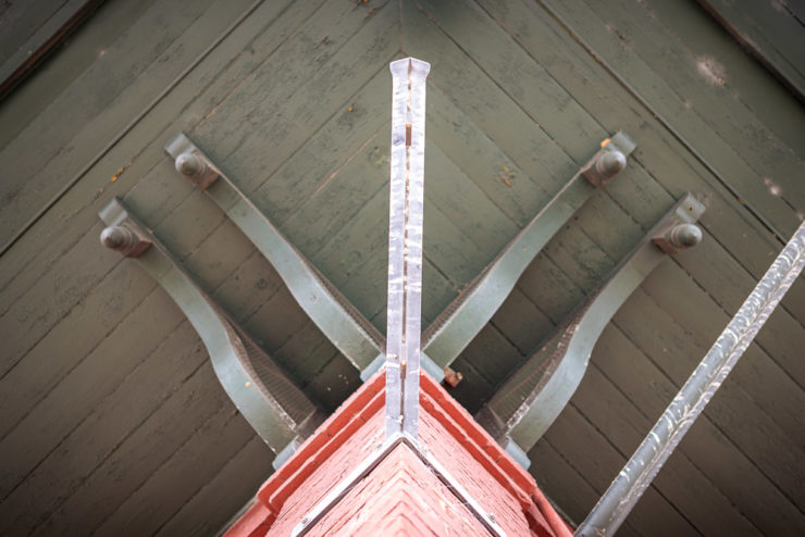
There’s an attractive downtown, though, with old brick buildings and a wonderful historic railroad depot:
Museum Sign, Old Railroad Depot, Dooly & E. Railroad Sts.Bracket Detail #1, Old Railroad Depot, Dooly & E. Railroad Sts.
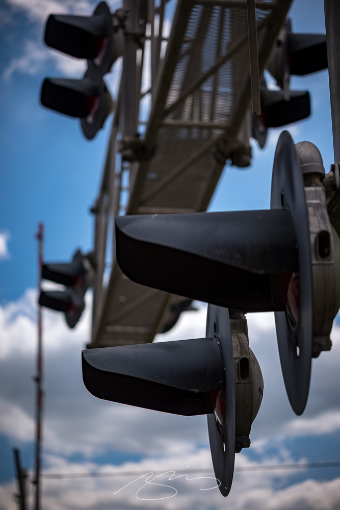
Did I mention that it’s a railroad crossing? There are two sets downtown:
Railroad Apparatus #4, Dooly & E. Railroad Sts.
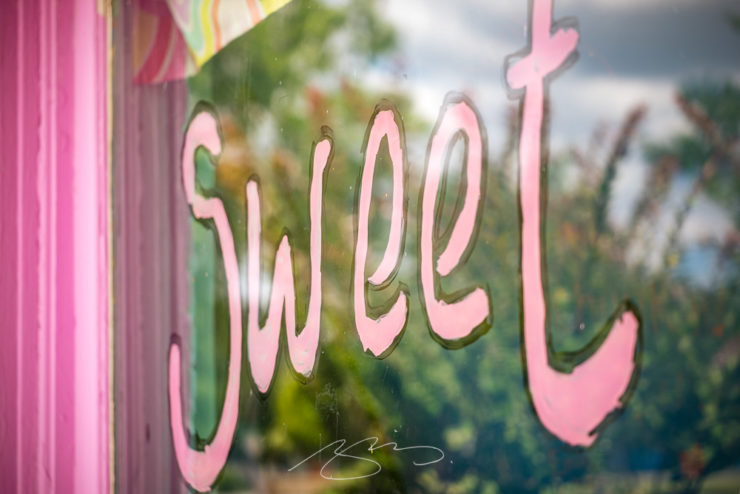
Despite the population loss and storefronts marked “for rent,” however, all isn’t lost. There are some new businesses opening:
Sweet Window, 127 Cherry St.
I’ve posted 55 photographs in the new Montezuma gallery — peruse and enjoy. And, as always, thanks for stopping by.
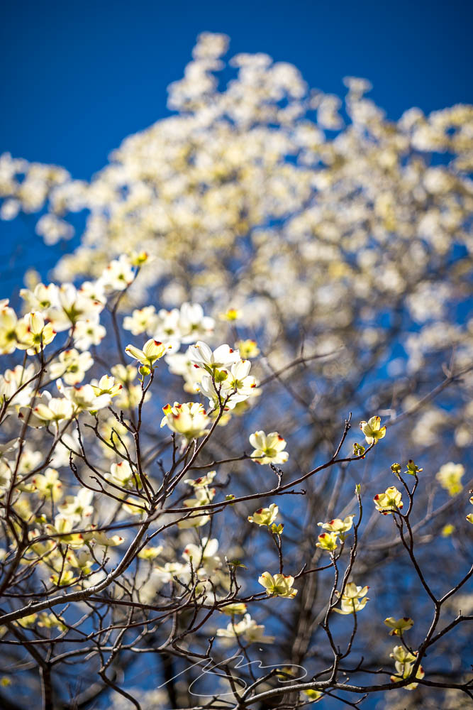
I had the occasion to have lunch downtown yesterday, a day of simply beautiful spring weather — which I absolutely used as an excuse to take the camera for a spin.
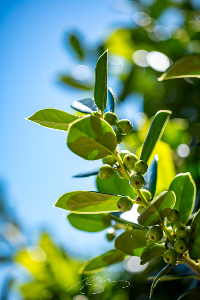
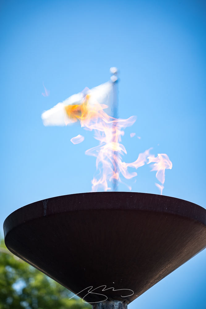
The vast majority of the time, I use what I call my standard lens: 35mm. (Some would argue that 50mm is the “standard,” but I really prefer the wider angle of view due to its additional context.) This time, however, I was using Leica’s superb — and, sadly, no longer available — 90mm macro. The detail, the color, everything about this lens excels:
Leaves and Berries, Poplar & New Sts.Veteran’s Flame and Flag, Macon-Bibb Government Center, 700 Poplar St.
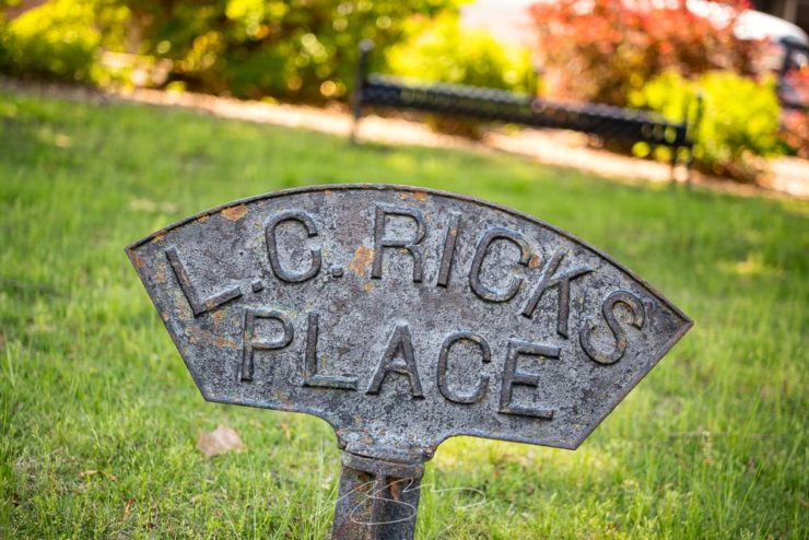
It’s sometimes a challenge to be creative in an area you’ve photographed often, but I enjoy trying to spy new details:
L.C. Rick’s Place, D.T. Walton Sr. Way & Poplar St.Kudzu Signs and Building Cornice, 512 Poplar St.
Confession: For the last several years, I’ve been avoiding Eatonton. Its four-lane bypass is notorious as a revenue generator for Putnam County, so when heading north to Madison or Athens I have been taking the prettier Monticello route instead.
My mistake. In almost twenty years of living less than fifty miles from this gem — and perhaps because of that bypass — I’d not explored downtown. It’s definitely earned another visit.
Residence Above Maggie Lane (Mind Your Step)Putnam County Courthouse (Tree)
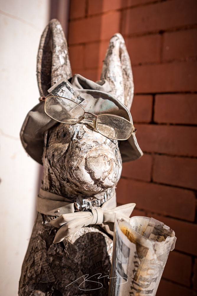
I also wasn’t aware that Alice Walker (The Color Purple) and Joel Harris (Uncle Remus) were locals — the latter explaining the prevalence of rabbits hopping about:
Rabbit (Paper Jeff)
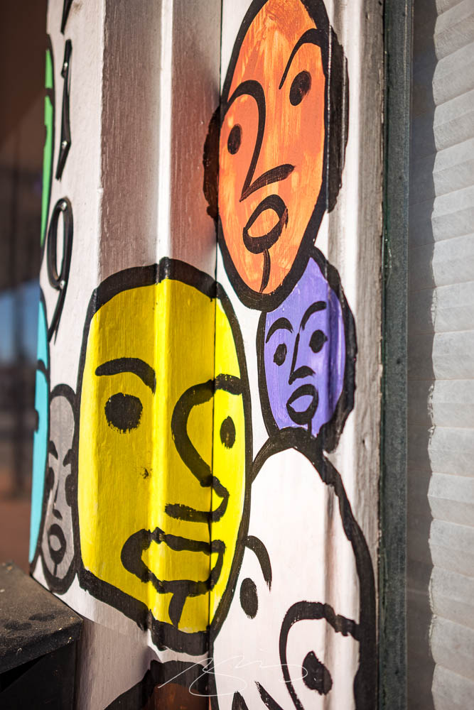
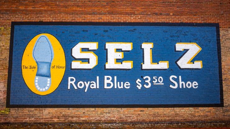
Interesting art, too:
The FolksArt, 119 S. JeffersonSelz (The “Sole” of Honor), 107 N. Madison
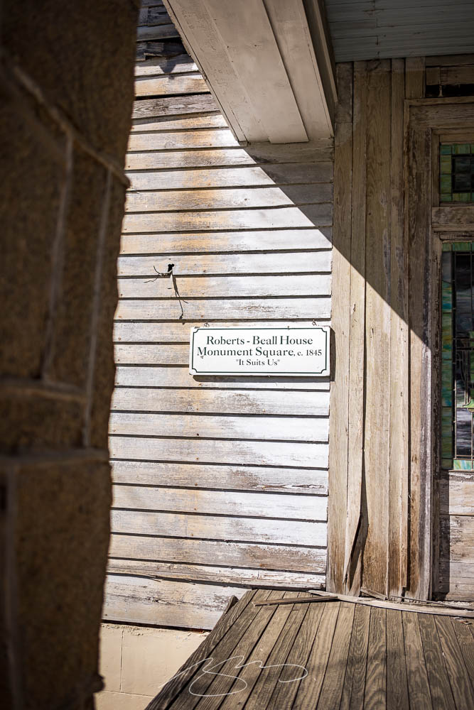
I’ve been meaning to take a camera to Sparta for a minute now; its downtown is small yet old and photogenic in a distinctly Southern way.
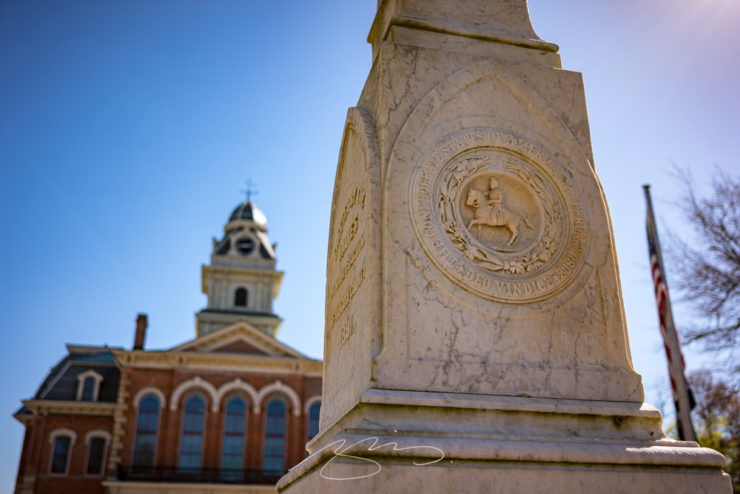
Confederate State of Hancock County
On that subject: let’s get the elephant in the room out front and center. Sparta is 85% Black, arguably economically and socially suffering, and yet this monument stands front and center. Why?
Neglect: “It Suits Us”Lightbulb Moment, 12745 Broad St.
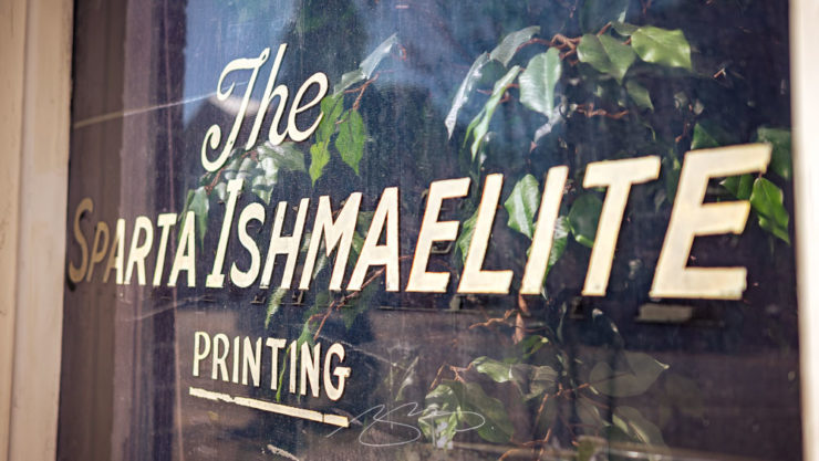
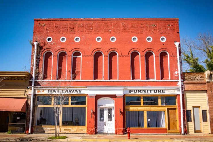
However, there are signs of hope. More than one building downtown is being refurbished, and there are at least a couple of businesses that are surviving — perhaps even thriving — by providing a sense of community:
The Sparta Ishmaelite (Printing)Hattaway Furniture, 12755 Broad St.
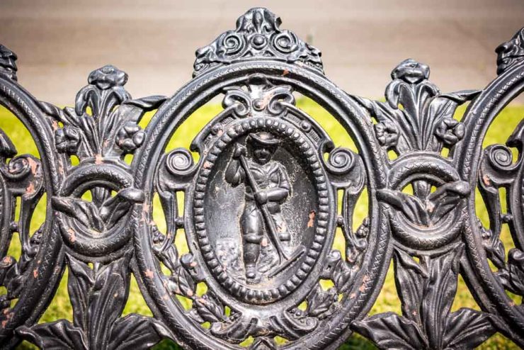
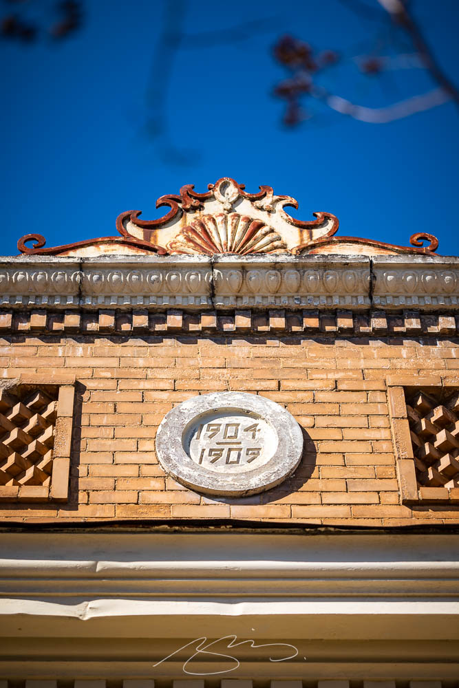
By the way, those old buildings often have beautiful cast iron details:
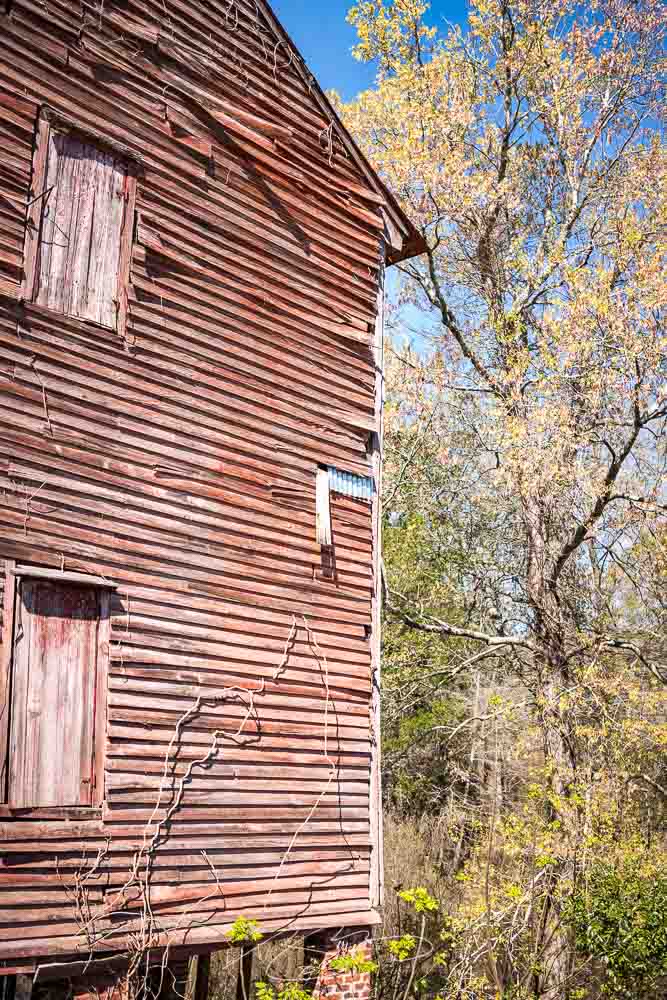
Gerald and I took advantage of a warm and cloudless March day for a lengthy photostroll which started in Milledgeville — lunch — and wandered northeast, starting at the nearby O’Quinn Mill:
Old O’Quinn Mill (Wheel)Old O’Quinn Mill (Siding Detail #2)
The old mill building is situated on, natch, O’Quinn pond — a man-made addition to Town Creek:
O’Quinn Pond Dam (Town Creek)
There’s a dock and old farm buildings in the complex, which these days is a picturesque event venue:
O’Quinn Mill on Town Creek
We continued on to Sparta, then returned through Eatonton, stopping in both towns for photographs. (Updates coming tomorrow and Wednesday: stay tuned.)
Meanwhile, take a look at the updated Milledgeville gallery, now up to 100 photographs spanning the last twelve years. Enjoy!
Look out, look up, look forward, and look through in this edition of brief, link-filled goodness.
“You May Now Enter”
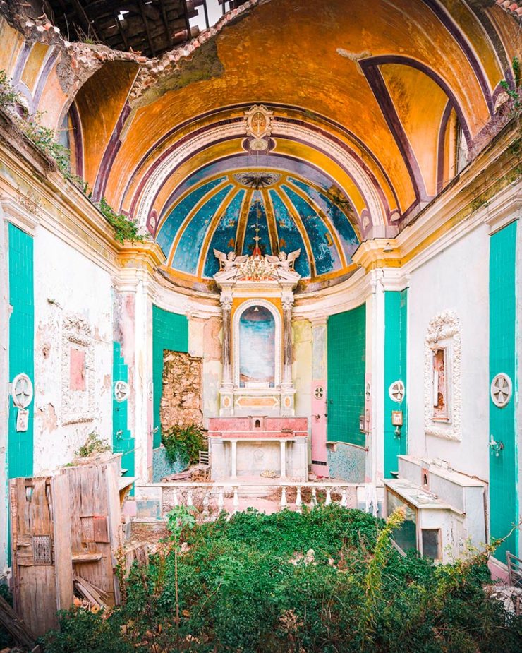
PRINT covers, uh, covers:
While the book blob dominated the discourse for the last few years, we’ve recently identified another trend splashing its way across new releases: the recurring symbol of doorways, open windows, and mysterious portals.
—Charlotte Beach and Chloe Gordon, PRINT
A couple of the examples they cite:
Not only a portal but a shelf. Cool.Not only a portal but also stairs. Nice.
Unlike the blob, I’m in favor of this one — the hint of the unknown is appealing in a visceral way that offers more while simultaneously offering more sales by asking potential readers to speculate and, thus, engage. Nice call, PRINT.
Here’s a question you’ve been absolutely asking yourself: what are the origins of the infamous Lorem Ipsum?
The lack of placeholders on the shelf is remarkably appropriate. (Photo: Scott Keir.)
Turns out it’s not as simple as Aldus [known as Adobe these days —Ed.] — or the even-more-infamous annonymous. Tim Carmody, the very capable guest chair at Kottke.org, fills it in: it’s Cicero. No kidding: Slate says so.
De finibus, indeed.
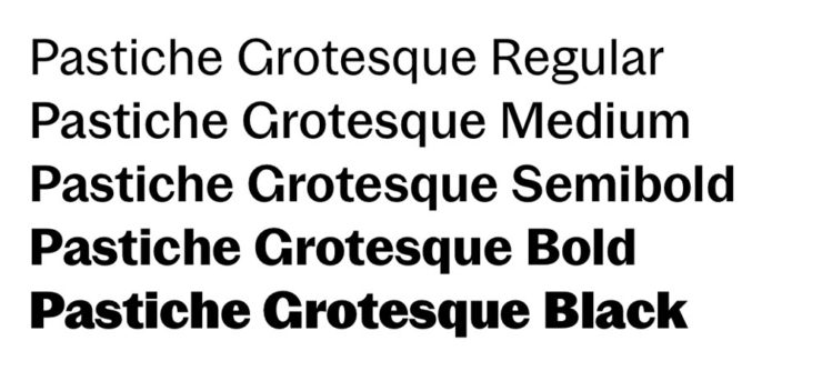
Fourteen Fonts to Follow
Creative Boom, where having eyes on you is actually fun, celebrates “14 Fonts to Fall in Love With” for Valentine’s Day. While Foreword may be late to the party, a couple of the type choices are first rate:
Irregardless1I absolutely want to steal their website design: the menu system is brilliant. and Pastiche, in order. (And no, I didn’t put those two together to be funny.) Read the article and pick your faves.
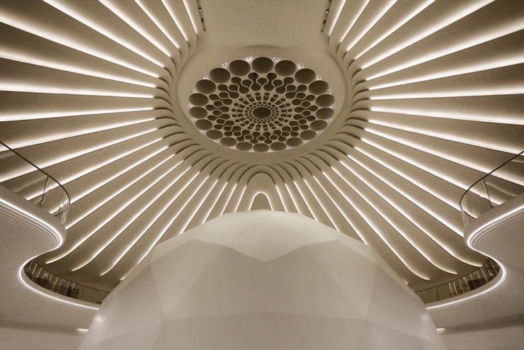
Art of Building Photography
I wasn’t aware of the Chartered Institute of Building, or their Art of Building photography contest:2Their terms are good, too — something remarkably rare in contests.
“White Constellation,” by Francesca Pompei.
Since architecture and photography very much intersect in my camera, brain, and work, I’m glad to have found this great source of inspiration:
“House of God,” by Roman Robroek.“My own little cosmos within reach,” by Pati John.
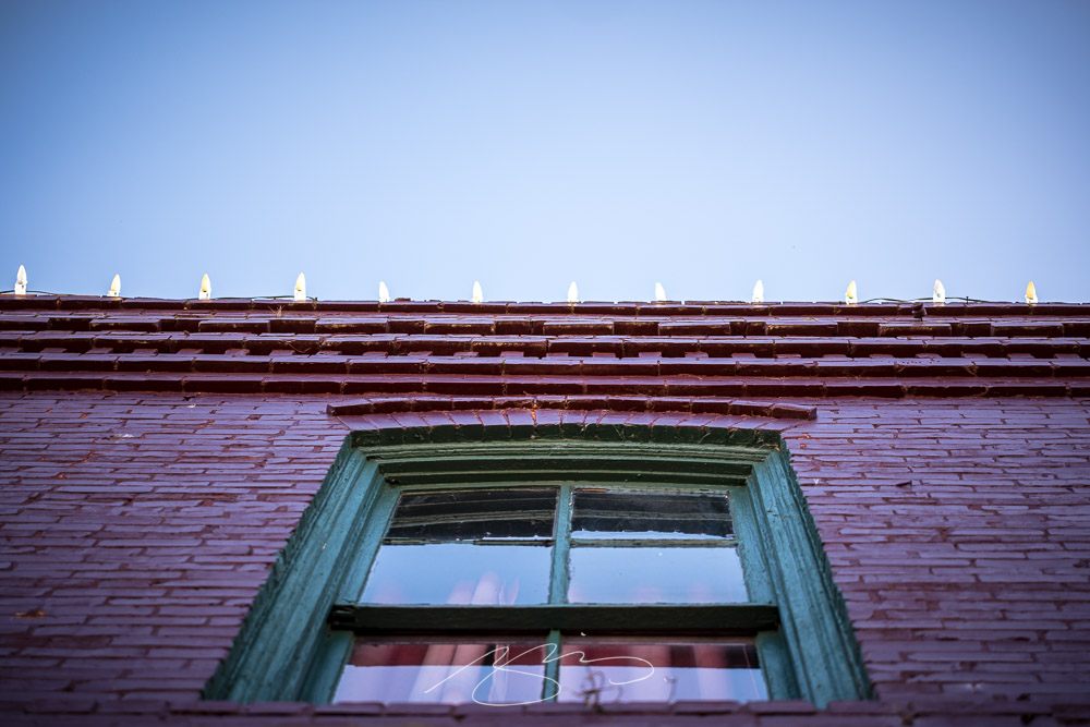
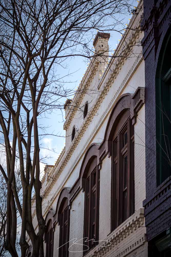
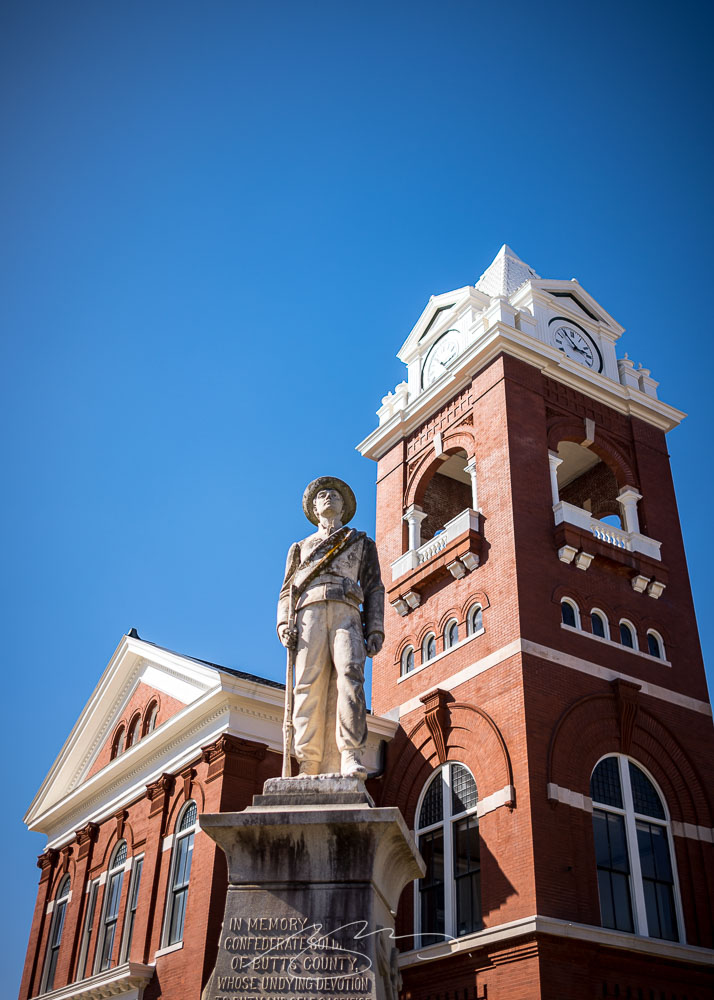
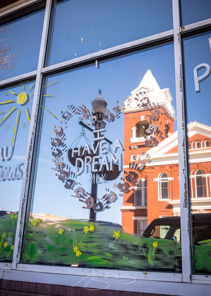
Spring is beginning to blossom here in Middle Georgia, which means it’s time to restart the traditional Sunday drive and photostroll. This week’s destination was the small city of Jackson, seat of Butts County, and home to a typically pretty downtown square:
Jackson Historic Square (20 Oak St.)
The courthouse, as is often the case in Georgia, takes center stage:
Confederate Butts Forever“Dream,” Not Necessarily Reflected
No, I usually don’t make political commentary. Why do you ask?
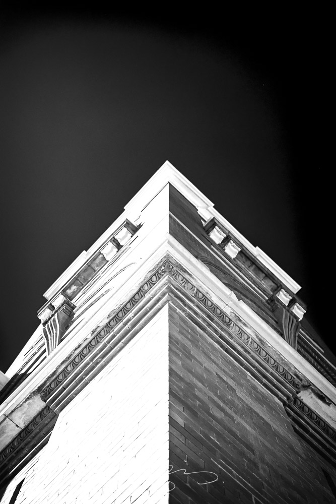
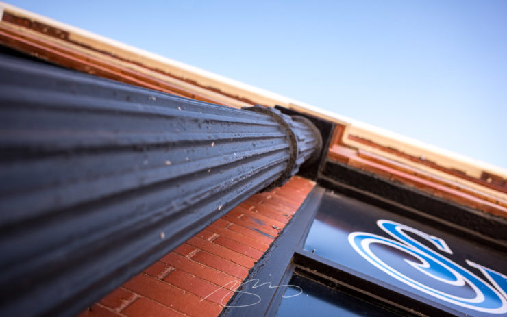
Anyway, there are several examples of my architectural studies, including these:
Butts County Courthouse Tower (B&W Study)Smoking Column Detail, 10 3rd St.
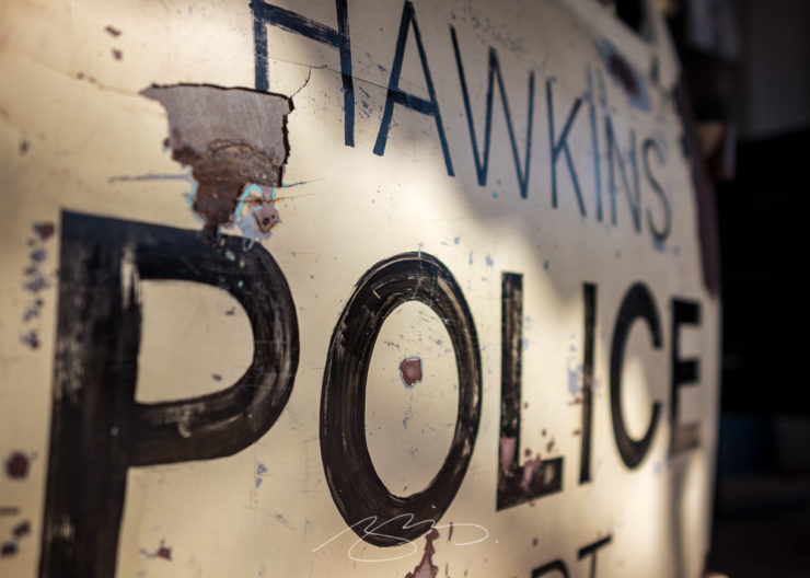
I didn’t realize that Jackson was the filming location for Stranger Things — a stand-in for Hawkins, Indiana:
Jackson is Hawkins (Police)
Check out the full gallery for Jackson, including yesterday’s photographs and those from last year, which include some from nearby Jackson Lake, in the updated gallery.
From book design and minimalist photography to … well, book design and what absolutely isn’t minimalist photography, plus some street signs and another warning about Adobe. Let’s dig in.
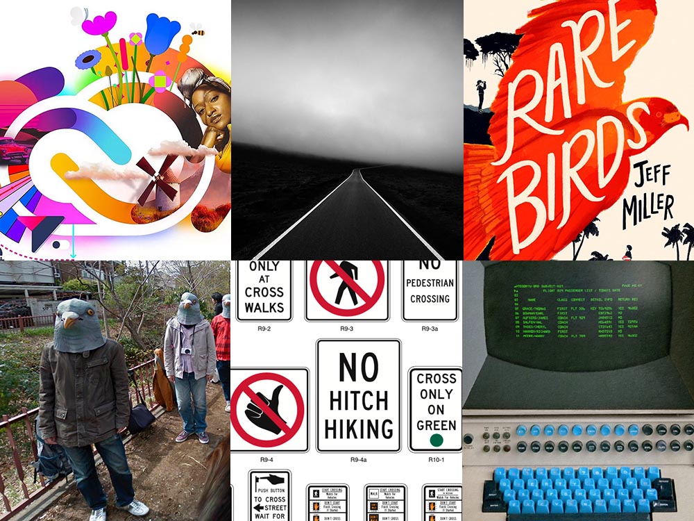
Book Design #1: People Really Do Judge a Book by its Cover
From University College Cork — that’s Ireland, folks — we have something that, on the surface, seems obvious: a book cover“is the most likely factor to convince a person to read a book if they are unfamiliar with the work or its author.” Maria Butler, a PhD candidate in the School of English and Digital Humanities at UCC, reminds us why.
Design by Kimberly Glyder.
You’re reading Foreword, so you likely agree — and shown above is one of those worth-a-thousand-words images: the first of the 2023 titles I’ve set aside for my favorites of the year, and absolutely something good enough to make me pluck it off the shelf without knowing anything about either the title or author.
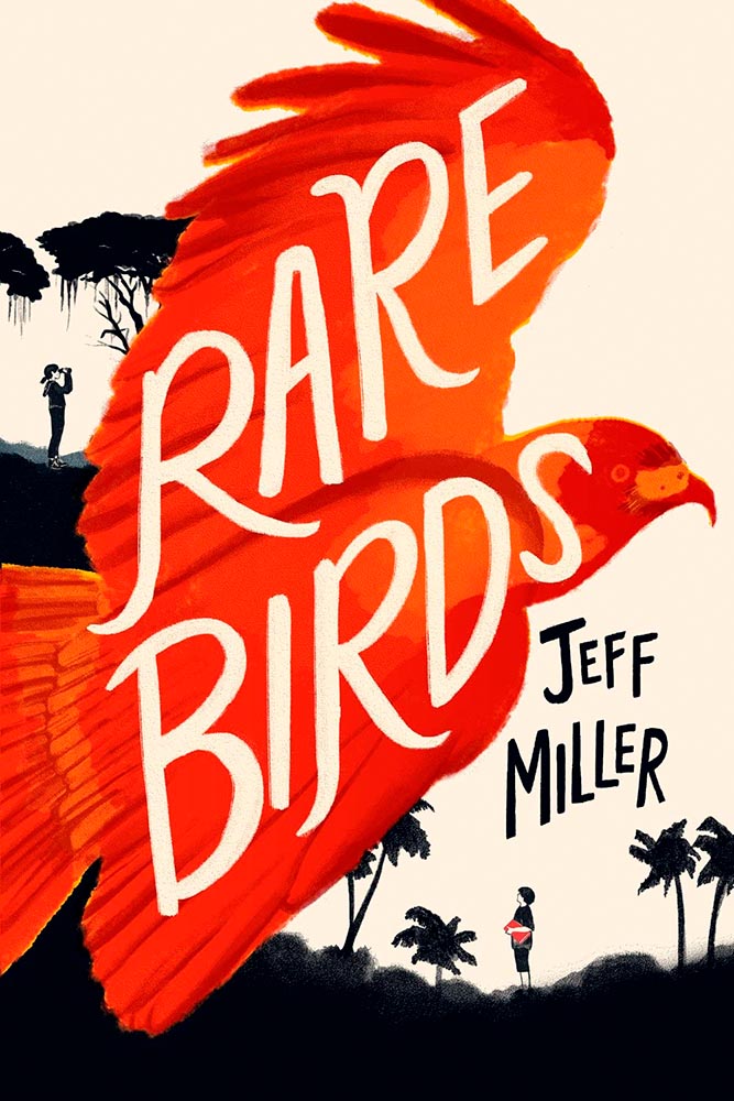
A screenshot from the Shift Happens website. Great stuff.
This project not only scores with great web design — check the interactive version of the book, pictured above — but what also seems like great book design. It’s a Kickstarter project (or will be, next month), so the usual cautions apply, but I might just go ahead and take the leap.
Couple of interesting book design items, by the way: the TOC is at the back, the endpapers are awesome, and the macro photography is tops. The book design reminds me of The Playmakers, still my favorite book design project ever.
Bonus: Tim Walsh, author of The Playmakers, is still going strong. Nice.
Photography #1: Minimalism
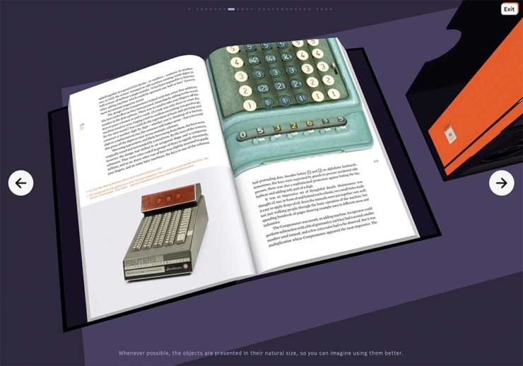
The winners of the Minimalist Photography of 2022 awards are in, some are fantastic. Here are a couple of favorites, from the architecture category:
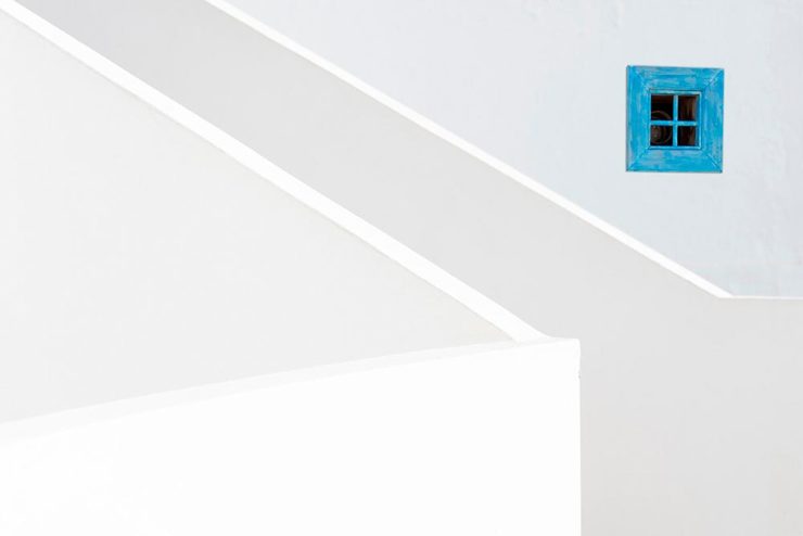
“Prince Claus Bridge in the Netherlands,” by Arthur van Orden“Blue Window,” by Andrea Richey
The Minimalist Photography Award is the only foundation that deals extensively and professionally with minimalist photography as a branch of photography in which the photographic artistic vision takes the lead.
Milad Safabakhsh, President of Minimalist Photography Awards
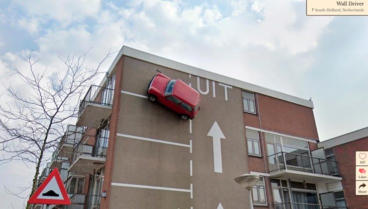
Direct quote, just because: “A man with three legs, a vintage car scaling a building, and an unsettling formation of people donning bird masks are a few of the scenarios highlighted in the terrifically bizarre Wonders of Street View.”
I didn’t know it was a thing to dress up and pose for the Google cameras. Perfect.
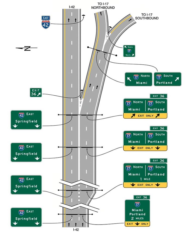
Street Sign Style Guide
Speaking of street views, did you know there’s a style guide for highway signs? Would you believe that I’m a fan?
Interestingly, there is an I-42/I-17 interchange in Phoenix, but this ain’t it: these signs are representational.
As with most things government, there’s confusion, too many regulations, and yet it’s based around good ideas. Beautiful Public Data has a guide to the guide.
Adobe Steps in it, Again
From DPReview: “If you’re an Adobe Creative Cloud subscriber, you might want to go and turn off a new setting immediately. It’s been discovered that Adobe has automatically opted users into a ‘Content analysis’ program that allows Adobe to analyze your media files […] for use in its machine learning training programs.”
It’s important to note that Adobe only uses the files saved in the “Creative Cloud,” something I don’t do as a matter of course, but even still, this is yet another example of Adobe using its monopoly position in the creative field to take advantage of its paying customers.
Adobe, unsurprisingly, didn’t return DPReview’s request for a comment/clarification.
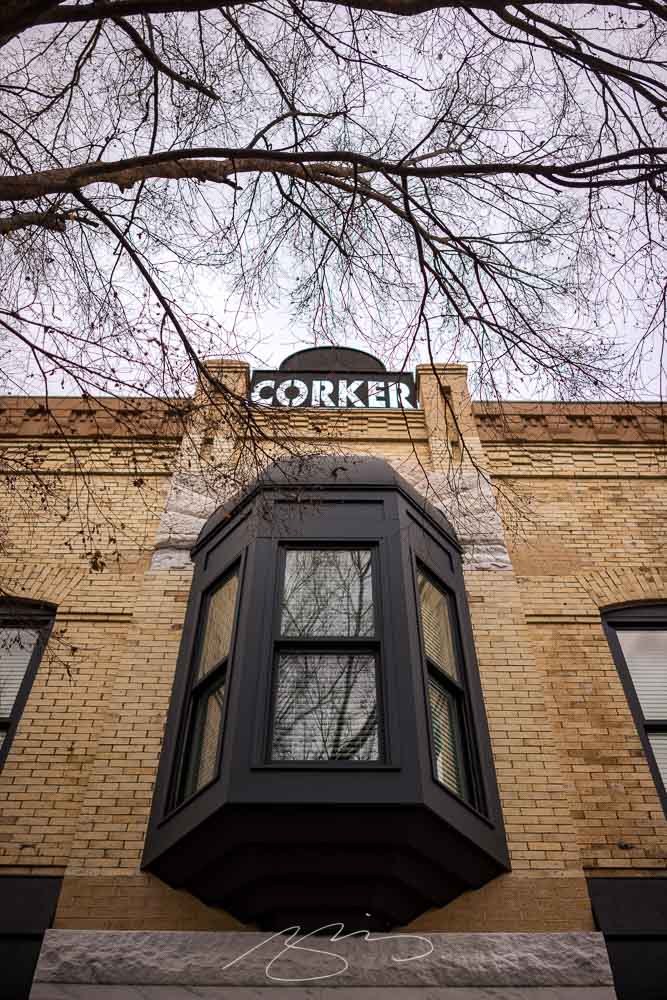
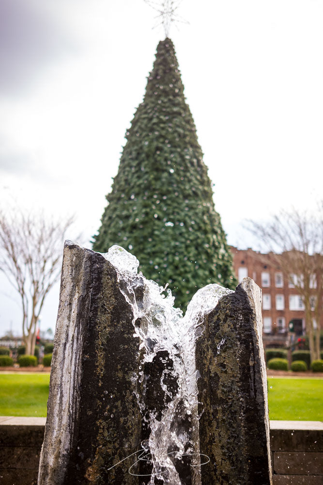
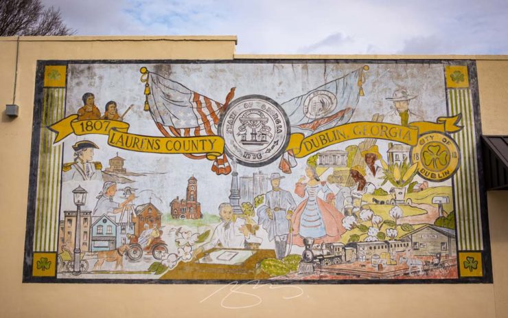
Named for the city in Ireland, Dublin in Georgia is an hour or so southeast of Macon. It’s my third trip there, and, like last time, I enjoyed Gerald’s company.1He seemed to enjoy the trip, rain notwithstanding, but apparently the creative juices didn’t flow. (Sorry, man.) Details here.
It has a photogenic downtown, too:
Corker (of a) Building, W. Jackson St.Fountain and Holiday Tree, N. Monroe St. and Bellevue Ave.
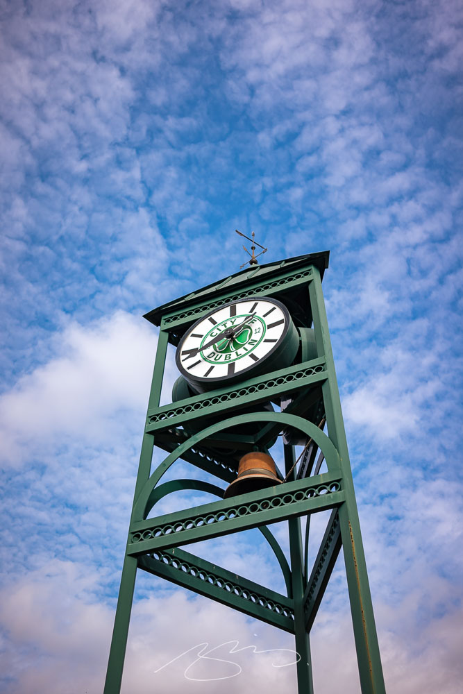
The Welcome Park includes a clock and bell complete with clover, reminding visitors that the name is, in fact, a tribute:
Dublin Welcome Tower #1
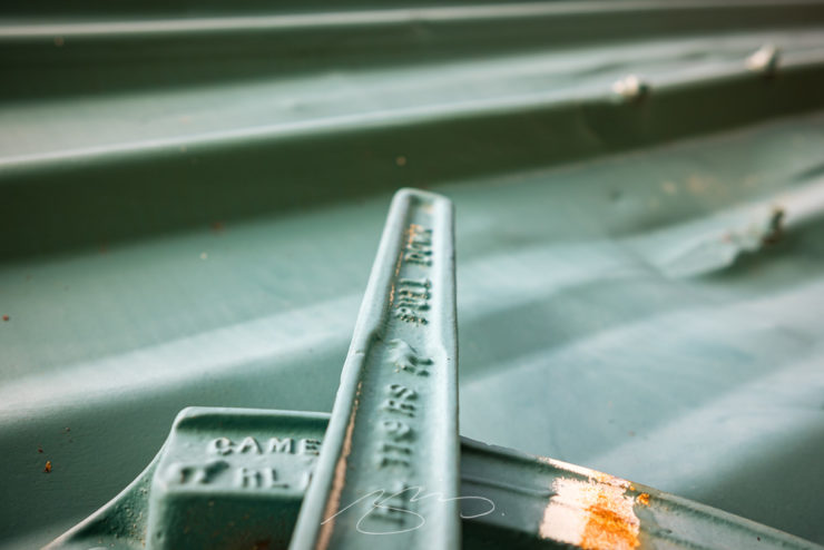
As has become typical, my favorite — “best” is debatable, of course — shot is a close-up that’s almost an abstract. In this case, a turquoise box car in the appropriately-named Railroad Park:
Pull Down for Camel, Dublin Railraod Park
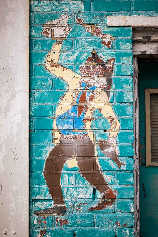
Just off the main drag we found an item thankfully not yet painted over:
Aqua Fox, Jefferson and Madison
. . . Which may, in fact, be a holdover from a bygone era. In fact, I’d be remiss if I didn’t call this subject out:
Laurens and Dublin Mural (No Biases Shown), S. Lawrence St.
The only people of color depicted here are Native Americans, relegated to viewing (probably from afar), and two Blacks, very much shown “in their place.” (Dublin still prominently features a Confederate memorial, as well.) Let’s hope that this small city continues its journey into the 21st century, one step at a time.
See the updated gallery here. As always, once in the gallery, click on any photograph to start a slide show.
1
He seemed to enjoy the trip, rain notwithstanding, but apparently the creative juices didn’t flow. (Sorry, man.) Details here.
This time, art from old encyclopedias, architectural art, and an appeal to add art to your post-holiday shopping and giving plans.
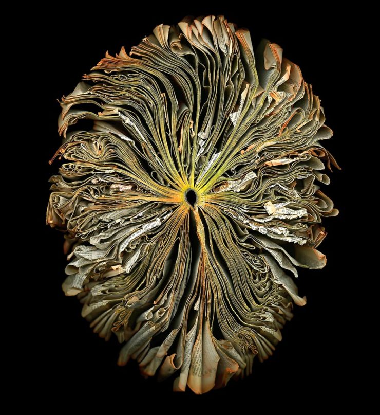
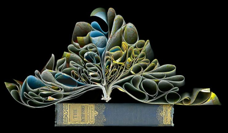
Books as Art — In a Different Way
Cara Barer says, “Books, physical objects and repositories of information, are being displaced by zeros and ones in a digital universe with no physicality. Through my art, I document this and raise questions about the fragile and ephemeral nature of books and their future.”
It’s more than that, though:
As This is Colossal puts it: “With cracked spins and crinkled pages, the manipulated objects reference the relationship between the natural and human-made as they evoke flowers at peak bloom.”
As a book designer, I’m glad that the titles used aren’t something a designers labored over but rather mostly instruction manuals and old encyclopedias. Either way, they’re a beautiful way to make commentary.
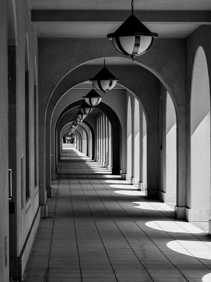
“Photographic escapades in arcades and colonnades”
Liberty Station, San Diego by Keith James
Few scenes set my photographic heart aflutter as does the view down a long covered walkway towards a distant, barely visible vanishing point. As a self-confessed symmetry addict drawn to architectural images in black and white, photographing these vistas scratches a deep creative itch.
Keith James, MacFolios
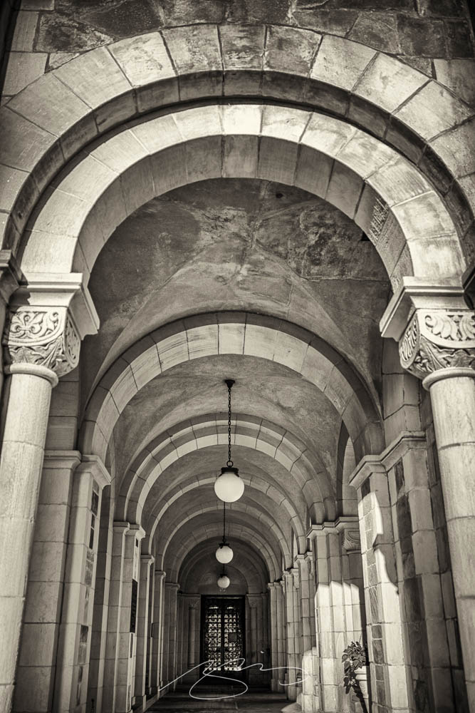
His article is well-illustrated, informative, and speaks to my heart: I love a good arcade — although, in some cases, I feel like an entry or exit makes the point:
Vassar College Chapel Arcade, September 2021
This is not the first time I’ve admired Keith’s work. His “Architecture Meets Sculpture in Black and White: the Interplay of Light and Form” was great work. Both articles are highly recommended.
Artist Sunday
For those of you in the United States, this weekend is the Thanksgiving holiday. It’s also that most American of traditions: a shopping weekend. I have spent recent years boycotting Black Friday and Cyber Monday, and am encouraged by the emergence of Giving Tuesday. Here’s something to add to that list:
Photographer Chris Sherman developed the concept of “Artists Sunday” in 2019, after noticing a bump in sales on that day in November. “The idea struck,” Sherman told Hyperallergic. “What a great time to patronize artists — during the busiest shopping weekend of the year.”
In 2020, Sherman launched the project alongside Cynthia Freese, a fellow artist who has also spent extensive time on the boards of arts nonprofits. On a dedicated website, Sherman and Freese provide artists and arts organizations with free marketing materials to promote the event. Now in its third year, over 4,000 artists and more than 600 towns and cities across the country have signed onto the initiative, which takes advantage of special events and partnerships (with nonprofits, individual artists, and businesses) to spread the message.
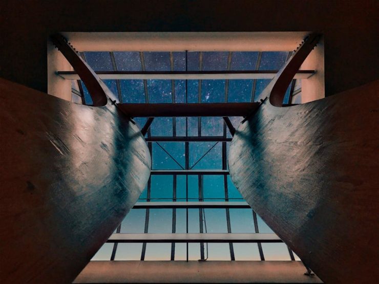
As most of you know, I’m not a huge fan of photography competitions. Like I did last year, though, there’s an exception for this one: not because it’s better than some — there’s still the problem with rights, methods of compensation, etc. — but because it’s so up my alley. (Pun intended.)
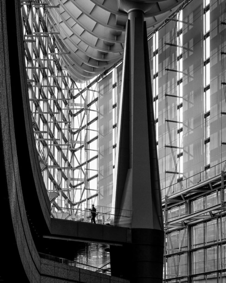
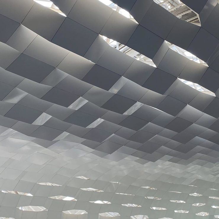
If you’ll pardon the cliché, great architectural photography is more than the sum of the building’s parts. These great shots show just that:
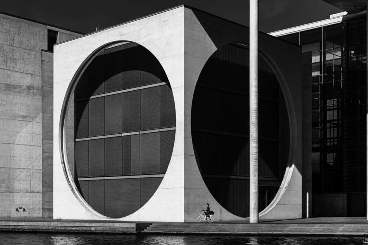
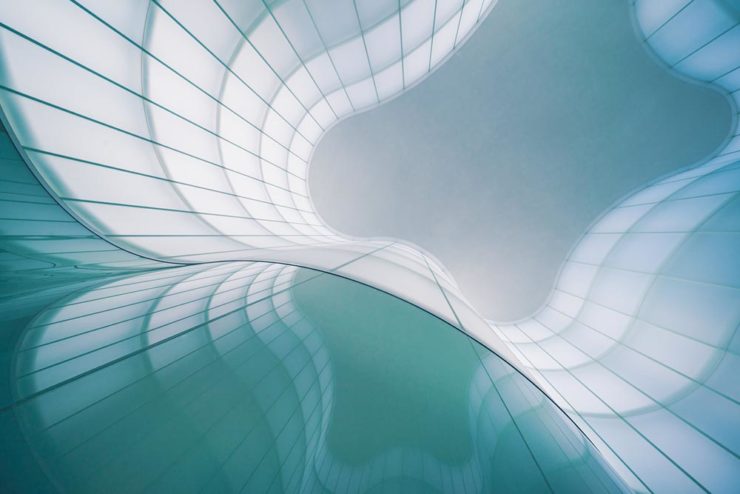
Cycling Under the Circles, Berlin, Germany, by Marco Tagliarino (Exterior)Shapes of Soul, Milan, Italy, also by Marco Tagliarino (Interior)
Entry photographs are divided into six categories: Exterior, Interior, Sense of Place, Buildings in Use, Mobile (with Bridges being this year’s theme), and Portfolio (focusing on the theme of Transport Hubs).
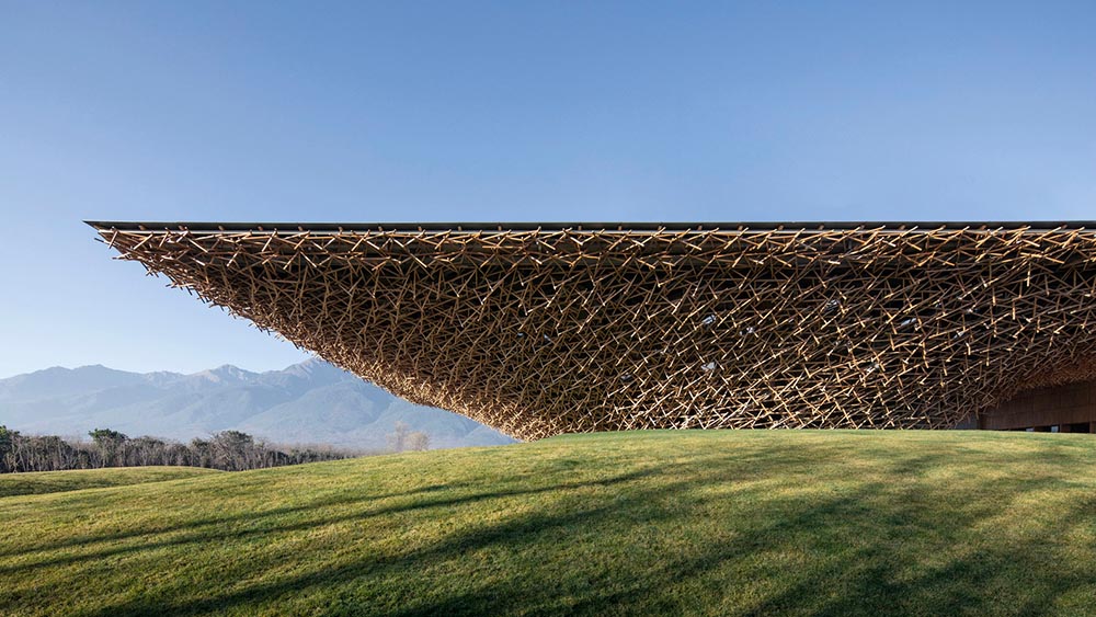
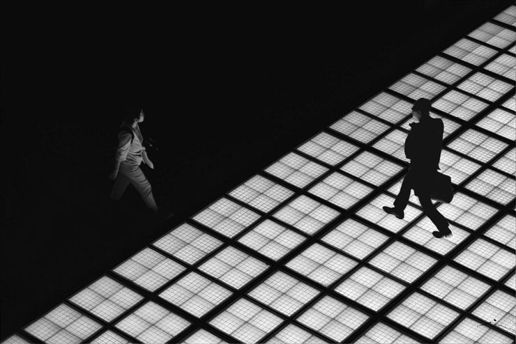
Glass Floor, Tokyo, Japan, by Tom Ponessa (Buildings in Use)Architecture 1, location not listed (but pretty cool, IMHO), by Stephane Navailles (Bridges)Shenzhen Bao’an International Airport, China, by Kangyu Hu (Transport Hubs)
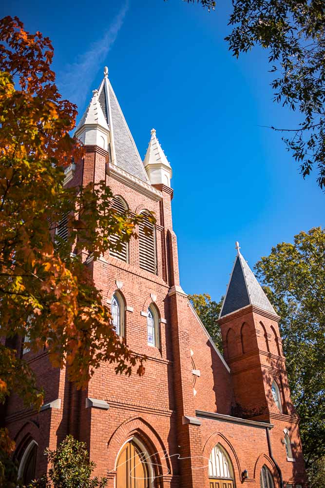
The small city of Milledgeville, on the banks of the Oconee River in nearby Baldwin County, is a favorite for photography. In this case, Gerald and I stopped on our way home from Sandersville, and spent some time wandering the historic district.
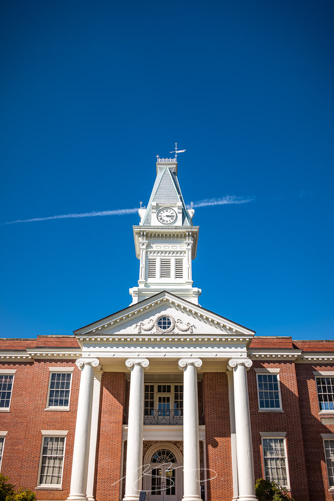
Aged Signage, 101 W. Mcintosh St., Circa 1911Fall Color, First Presbyterian Church (#1), S. Wayne St.(Extended) Weathervane, Old Courthouse Building, 201 W. Hancock St.
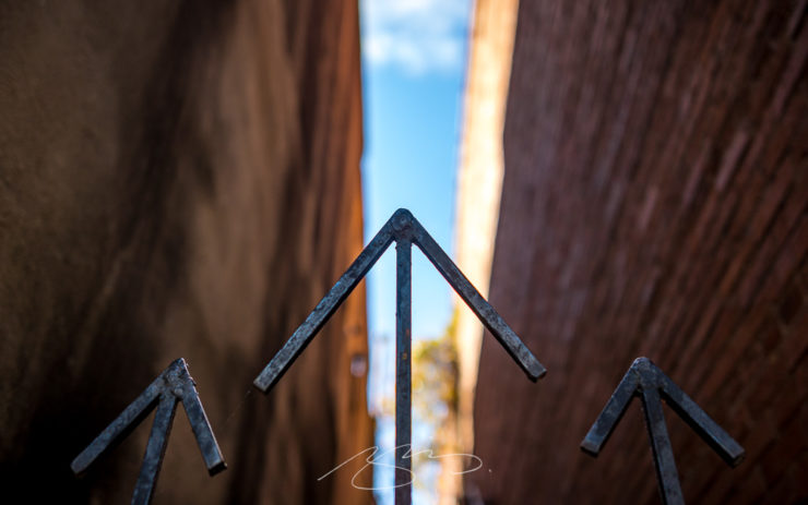
I especially liked this gate:
Gate and Stairs (Going Up), 129 S. Wayne St.
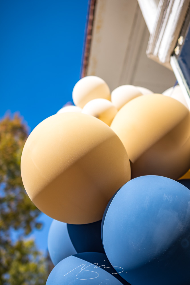
We were these the day after (part of) the Deep Roots Festival, which meant some street decorations lingered: