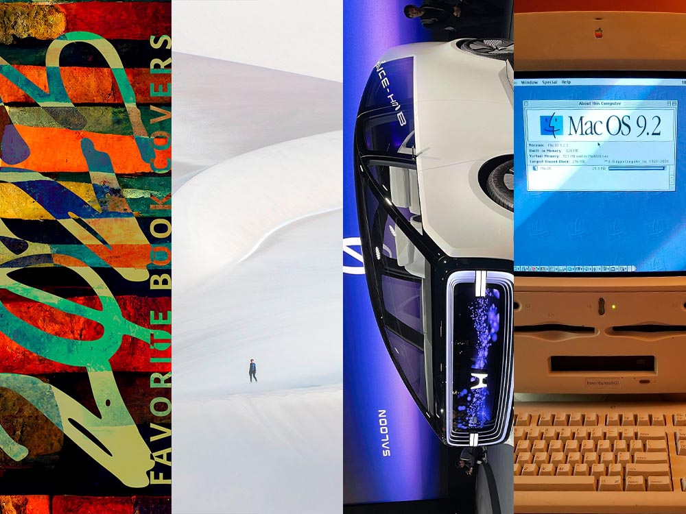
A huge stack of items for the March wrap-up, from libraries and type to a bunch of photography items, with a brief stop in the land of Jaguar that is … Paris. (Yes, the world’s gone all wonky. But you knew that already.) However, first, a quick discussion of what we’re not going to usually talk about.
On Seriousness
I’m going to keep my coverage of current events to a minimum; this is not the place, and I am not qualified to write about it with any authority (other than as a concerned citizen). But there are some items I think are worth sharing.
Techdirt, for instance — like Kottke and others — have posted extensively on the political and culture shift in the United States, but in this case, specifically how it intersects with technology.

We’ve always covered the intersection of technology, innovation, and policy (27+ years and counting). Sometimes that meant writing about patents or copyright, sometimes about content moderation, sometimes about privacy. […] But there’s more to it than that. […] When you’ve spent years watching how some tech bros break the rules in pursuit of personal and economic power at the expense of safety and user protections, all while wrapping themselves in the flag of “innovation,” you get pretty good at spotting the pattern.
— Mike Masnick, Techdirt
“Connecting these dots is basically what we do here at Techdirt,” they argue, and I find it convincing. As some of us struggle with how to source actual news these days, Techdirt has earned a spot in my list of daily reads.
Of course, it’s not just the United States. Arguably, the United Kingdom led with Brexit:
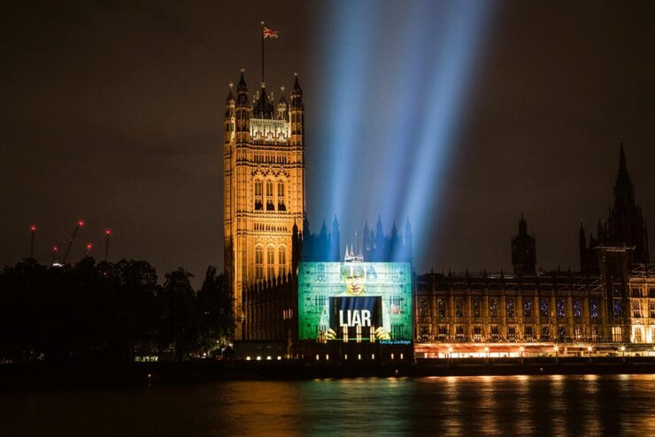
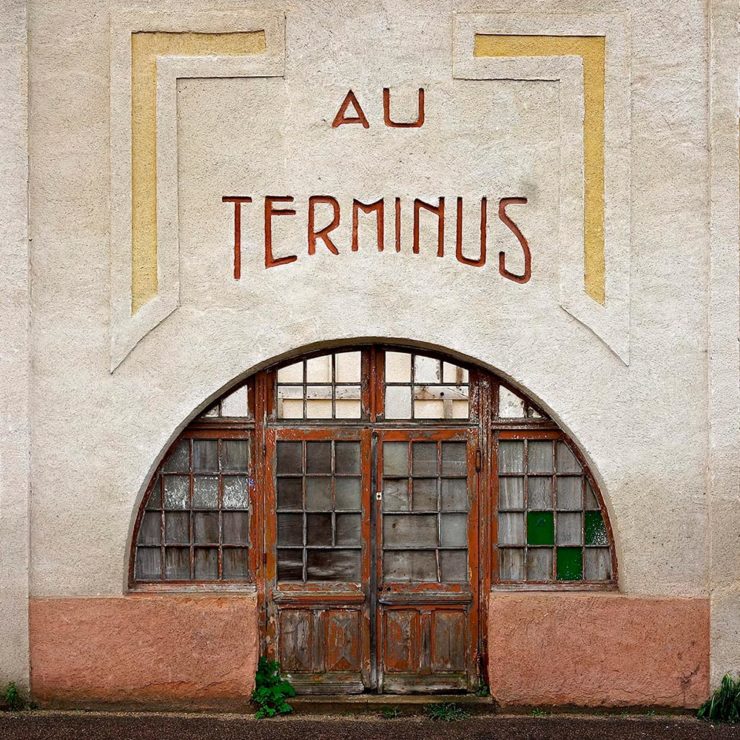
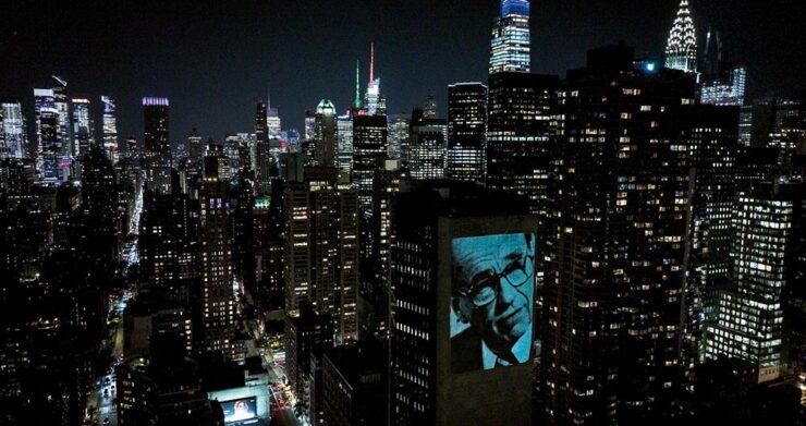
ArchDaily brings us the story of Led by Donkeys, which started out “as a witty response to Brexit” and morphed into a visual tour de force. (Their name is a historical reference to World War I, where German commanders reportedly described British soldiers as “lions led by donkeys,” a critique of incompetent leadership — and not at all a reference to the U.S. Democratic party as it currently, uh, stands.)
Light Matters, a column on light and space, is a regular item at ArchDaily.
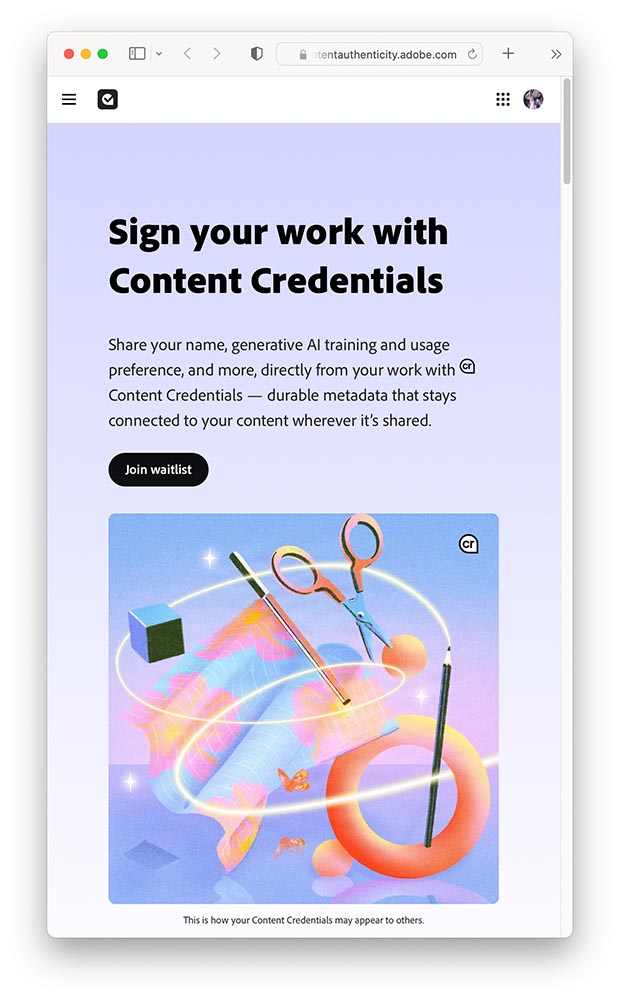
Then there’s AI and its current leap to the fore. While it’s been discussed here before, what hasn’t been is the effect on “the free.” What about the Wikis and free-as-in-beer intellect that isn’t property?
From Citation Needed:
But the trouble with trying to continually narrow the definitions of “free” is that it is impossible to write a license that will perfectly prohibit each possibility that makes a person go “wait, no, not like that” while retaining the benefits of free and open access. If that is truly what a creator wants, then they are likely better served by a traditional, all rights reserved model in which any prospective reuser must individually negotiate terms with them; but this undermines the purpose of free, and restricts permitted reuse only to those with the time, means, and bargaining power to negotiate on a case by case basis. […] The true threat from AI models training on open access material is not that more people may access knowledge thanks to new modalities. It’s that those models may stifle Wikipedia and other free knowledge repositories, benefiting from the labor, money, and care that goes into supporting them while also bleeding them dry. It’s that trillion dollar companies become the sole arbiters of access to knowledge after subsuming the painstaking work of those who made knowledge free to all, killing those projects in the process.
— Molly White, Citation Needed
The whole essay is excellent and absolutely worth a read. (Via Pixel Envy.)
Update, 2 April 2025: ArsTechnica reports on a 50% rise in Wikimedia bandwidth usage as LLMs “vacuum up” terabytes of data for AI training purposes. “Wikimedia found that bots account for 65 percent of the most expensive requests to its core infrastructure despite making up just 35 percent of total pageviews.”
Special Bonus #1: David Opdykes vintage postcard paintings, described at This is Colossal as “[o]ccasionally darkly humorous yet steeped in a sense of foreboding.”
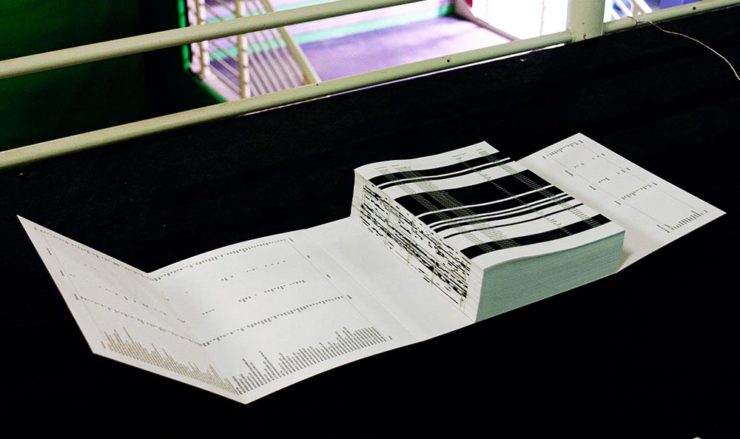
On Libraries, Type, and Type Libraries
Museums and Libraries
Kottke isn’t just about politics, though; he’s tried to keep up with some of the things necessary in today’s world — the projects that bring light or even delight. So, while we’re on the subject of Wikipedia, let’s highlight his link to the Museum of All Things:
A “nearly-infinite virtual museum generated from Wikipedia,” this program is made possible by the images associated with an article. Better still, there are exits from the galleries that follow the links in those articles, leading to … well, lots to see.
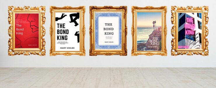
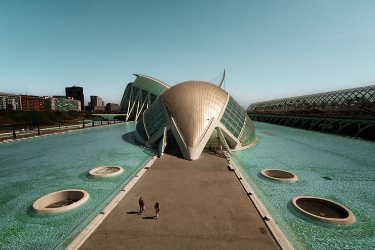
Meanwhile, Cultured magazine brings us a great article on four great libraries in the U.S. — I mean, a slide!? Awesome:
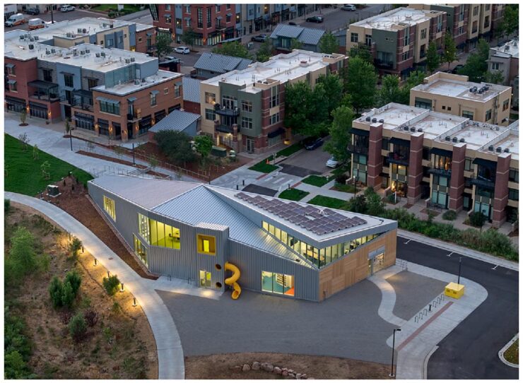
Visit Seattle, Scottsdale (AZ), Eastham (MA), and, as shown above, North Boulder, Colorado, and read a brief item with the architect that designed them.
Print magazine brings us an article the New York Public Library’s celebration of 100 years of the New Yorker magazine — another institution continuing to do great work in the face of today’s realities:
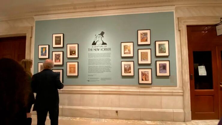
The exhibition, which “charts the magazine’s evolution from the roaring twenties to the digital age, drawing from NYPL’s vast archives and supplemented by treasures from The New Yorker itself,” is up through February 21st, 2026. Or, if you’re not able to make it to the Big Apple, check out the film on Vimeo.
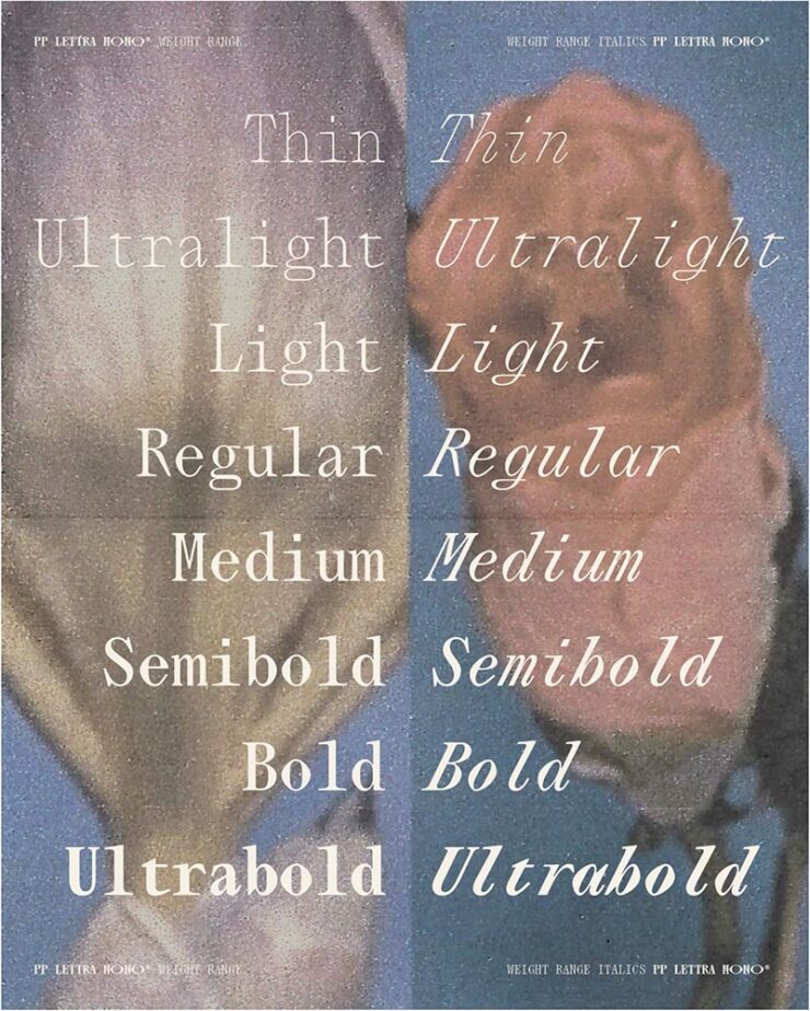
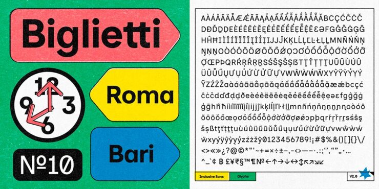
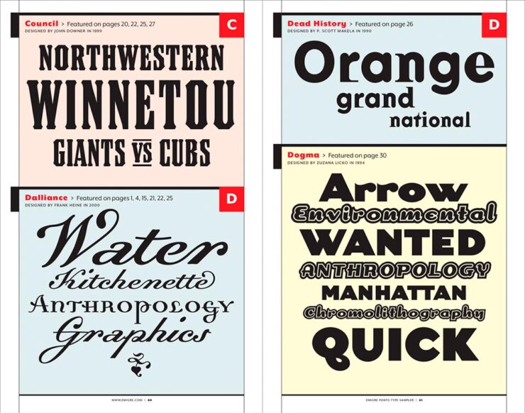
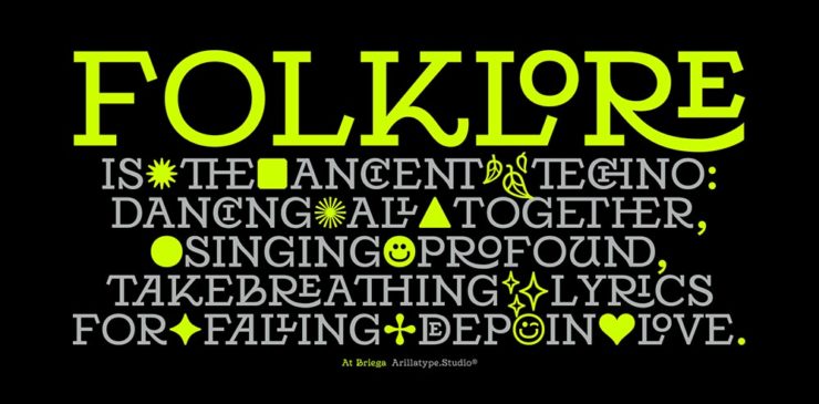
Type and Typography
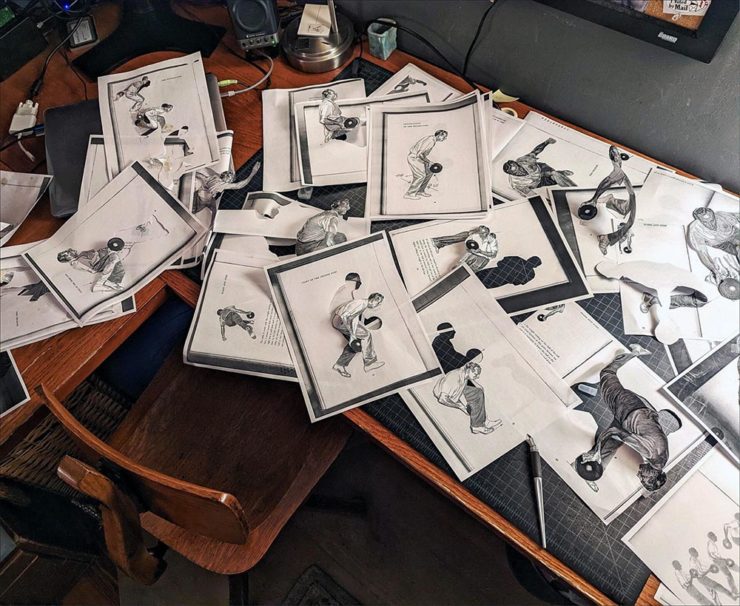
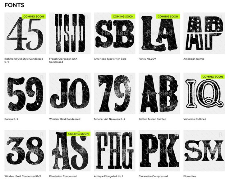
Feckled offers “150+ hand-orinted letterpress fonts for digital download,” This is Colossal highlights, mentioning creative director Jason Pattinson’s new venture. It’s not perfect — those letterpress fonts are JPG files, not installable typefaces — but nonetheless, worth a look if you need something unique for a Photoshop project:
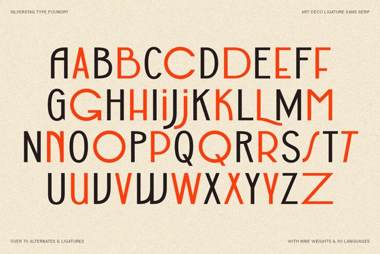
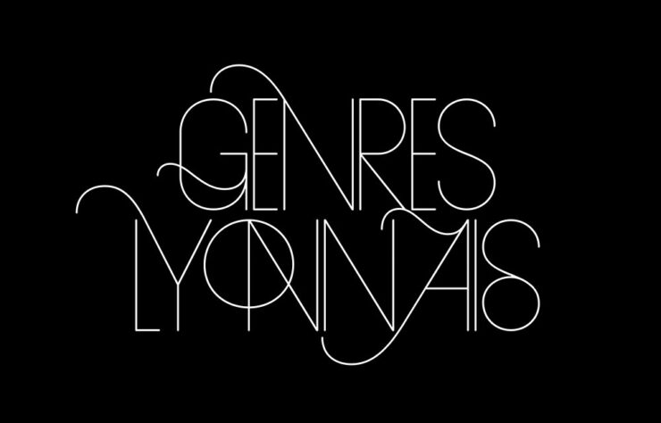
CreativeBoom brings us their monthly feature on type, with two I’d like to highlight. Naancy, new from French foundry 205tf, is Art Nouveau in all the right ways:

But it’s Aktinson Hyperlegible Next that gets the prize from me:
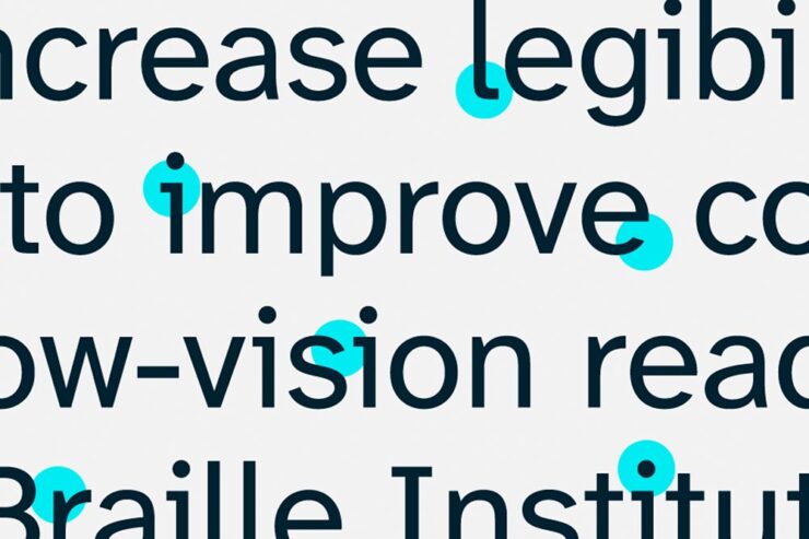
First introduced in 2019, it’s now been expanded to different weights and styles, with new glyphs (individual characters, that is) for different languages and situations. As before, it’s free from the Braille Institute. Fantastic.
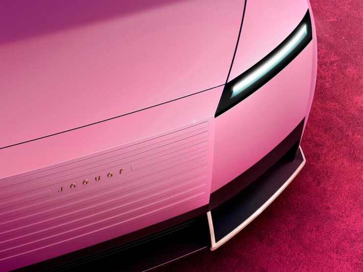
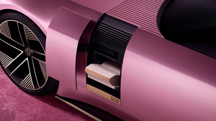
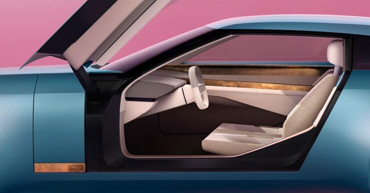
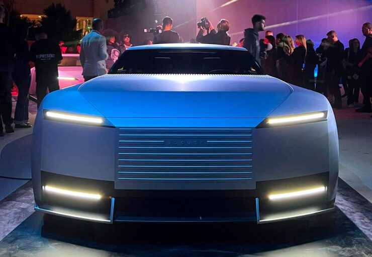
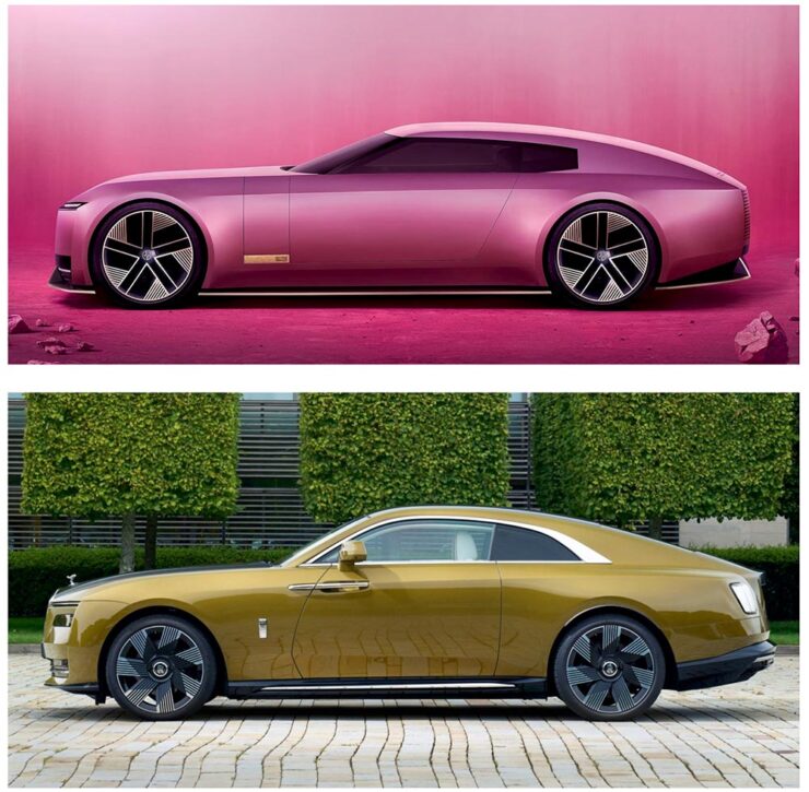
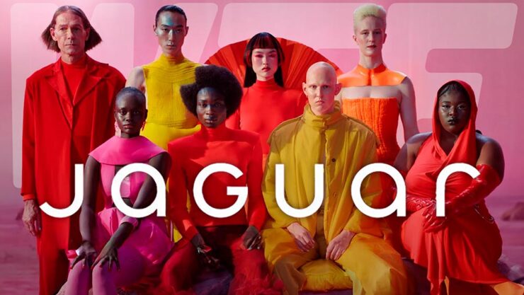
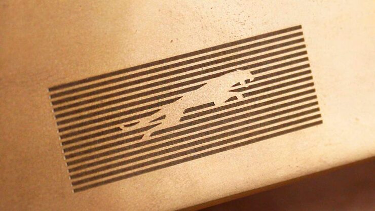
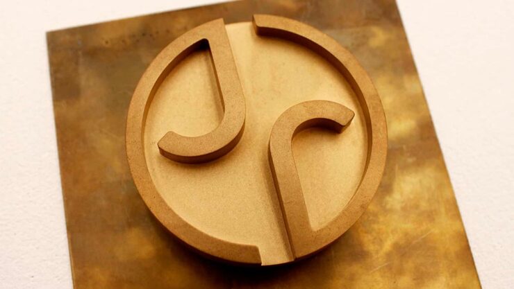
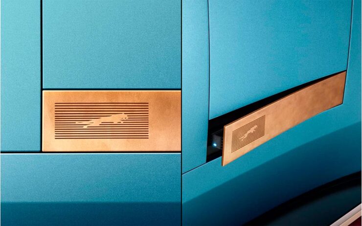
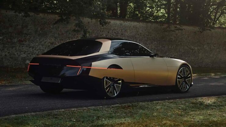
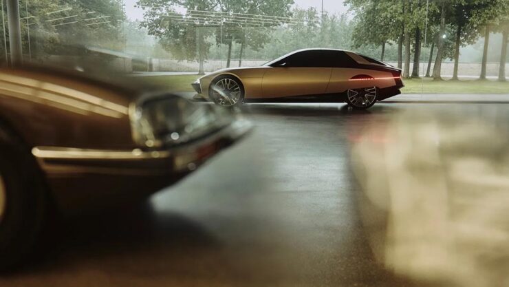
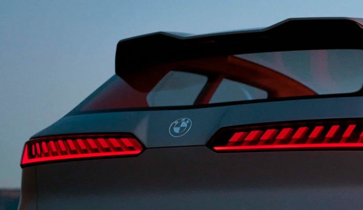
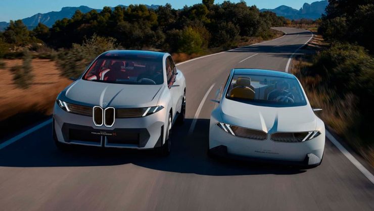
On A Wild Jaguar
Back in December, Jaguar made a huge splash — not necessarily the graceful skipping stone we think of from the glory days, but lots of waves nonetheless — with its Type 00 concept, highlighted here on Foreword (along with literally everywhere else).
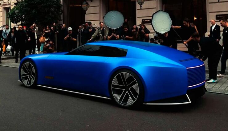
On March 10th, it was, um, spotted in the wild, in what was certainly a choreographed event — given the huge influencer paparazzi presence — but not gained a ton of traction (sorry) in the mainstream press. (Motor1 caught a whiff, and decided it “doesn’t even look real….”)
However, I mentioned in December that it’s too early to call a strike — a position The Autopian‘s Jason Torchinsky almost agrees with: “Holy crap, I think I like it.” Shown in Paris, and described as “gliding around and looking like it somehow doesn’t exactly fully exist as part of our reality,” it might be starting to bring people around.
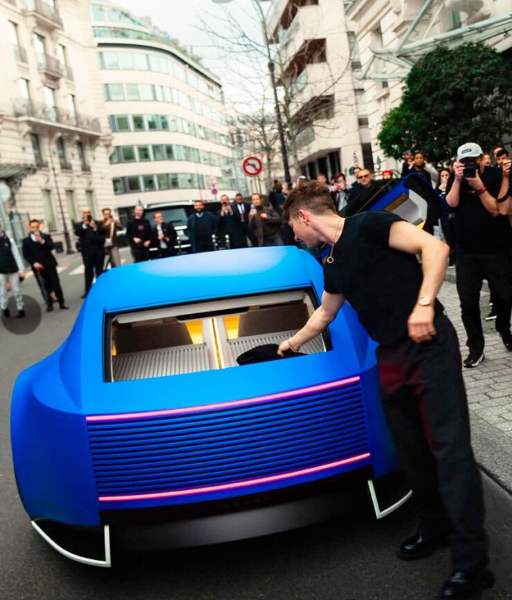
The sedan this concept previews will debut this year. Let’s see how it shakes out.
On Wild Photography
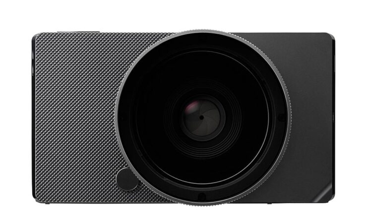
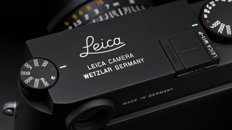
Leica Turns 100
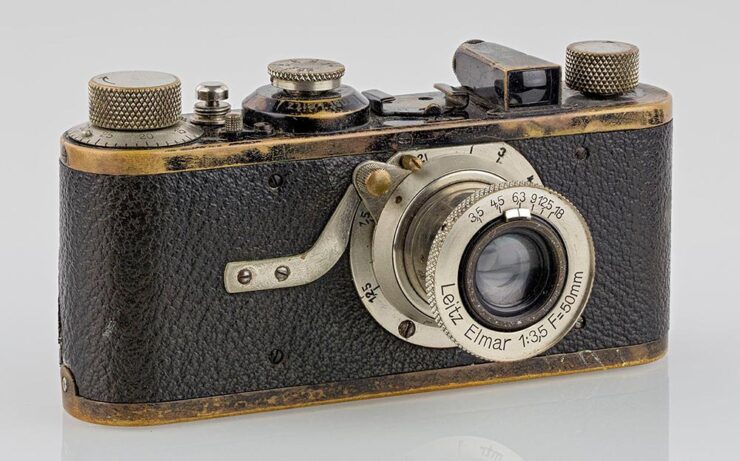
“The Leica I, the first mass-produced 35mm Leica camera, is widely celebrated for its influence on photography,” PetaPixel notes with dry understatement. (Thankfully, they use the word “revolutionary” farther down in the article.)
“I hereby decide: we will take the risk,” Ernst Leitz II said in 1925 when he decided to mass-produce the famed Oskar Barnack’s Ur-Leica invention, and modern photography was born. From the front in World War II to the weblog you’re reading and literally everything in between, Leica has led in ways large and small.
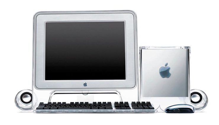
Their M system is a direct descendant of that Leica I and still produced today, to great acclaim; the Q all-in-one cameras are huge hits despite the luxury price tags; and even their missteps seem to find their place, as MacFolios highlights in “Two Leica digital cameras with legacies that defied initial criticism.”
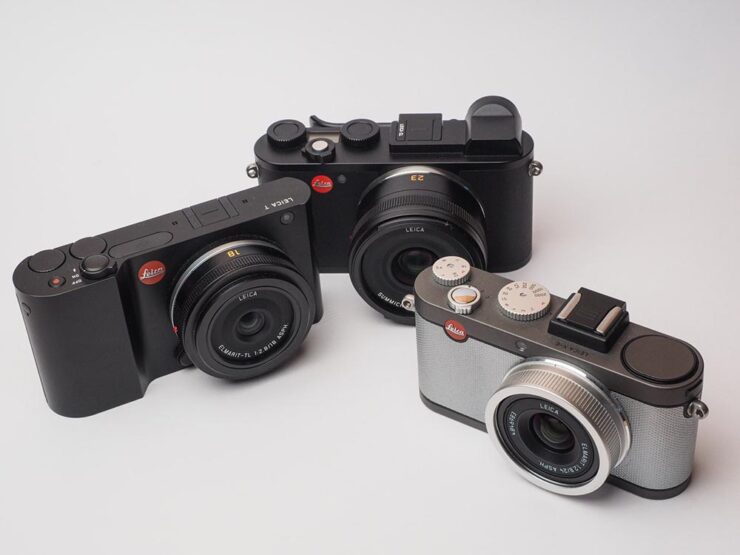
One of those, the CL, is my camera of choice — and despite being six years old and discontinued, is still getting software updates and a growing selection of lenses thanks to the L-Mount lens system. (Another is the T/TL mentioned last month when Sigma introduced the BF.) May it live for a good long while yet, as Leicas tend to do.
Special Bonus #2: PetaPixel bring us another interview with Sigma’s personable CEO, Kazuto Yamaki, on why he is “so passionate and driven for the success of his family business.”
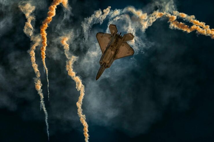
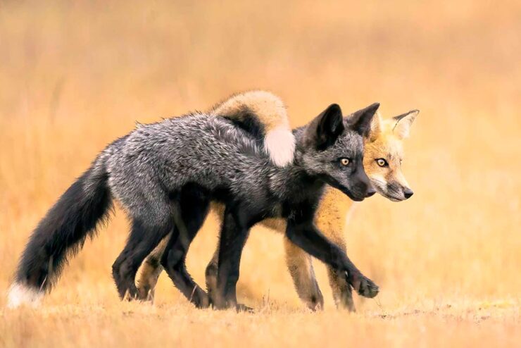
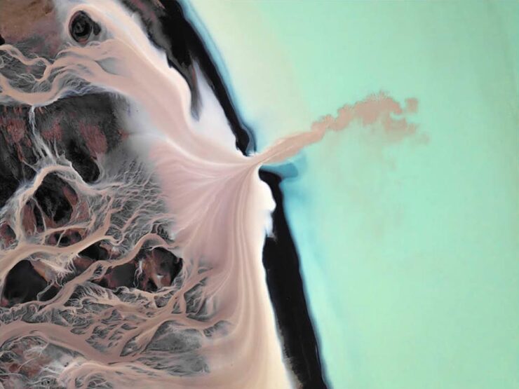
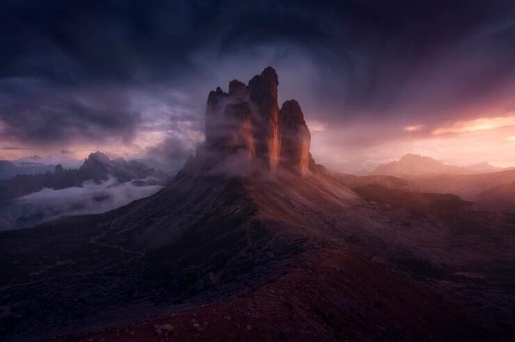
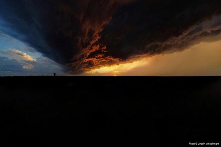
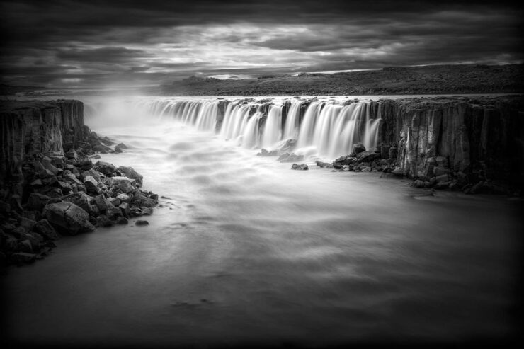
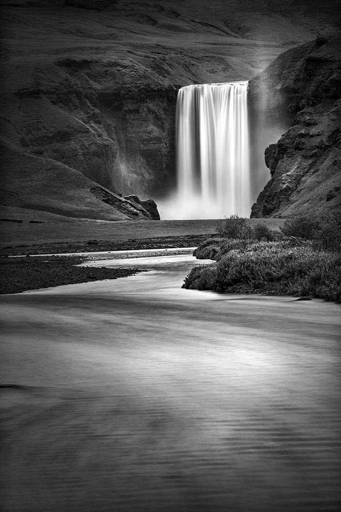
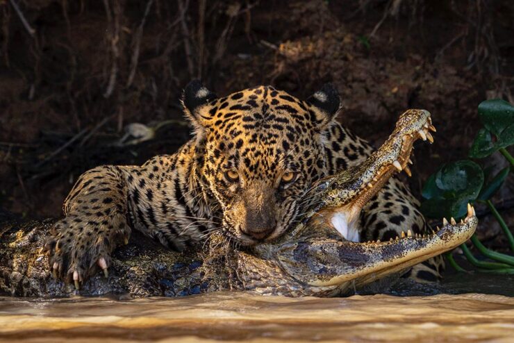
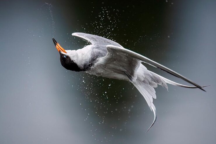
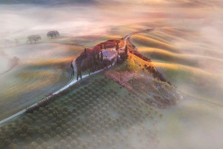
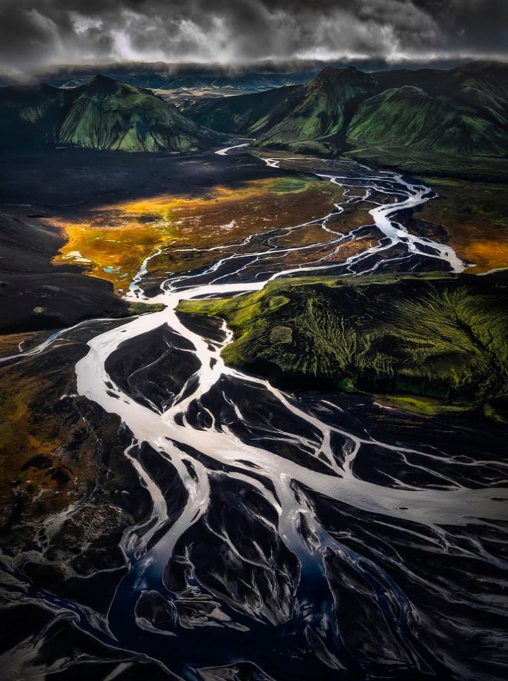
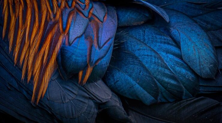
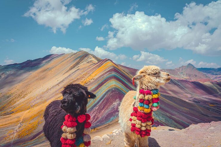
Nature and Wildlife Photography Awards
Highlighting the “endless wonders of our planet,” This is Colossal brings us the fantastic results of the 2025 World Nature Photography Awards, a contest whose photography can “influence people to see the world from a different perspective and change their own habits for the good of the planet.”
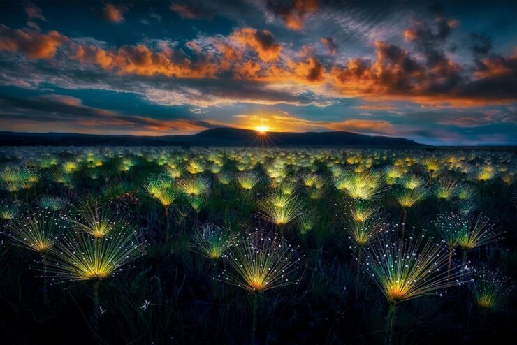
Of course, it’s impossible to mention today’s wildlife without mentioning the “vulnerability of the earth’s inhabitants and juxtapositions between nature and the human-built environment,” as Colossal notes.

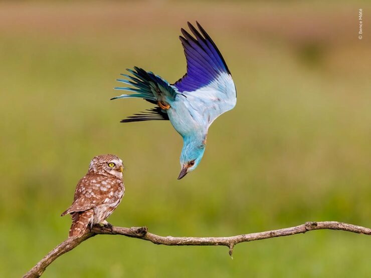
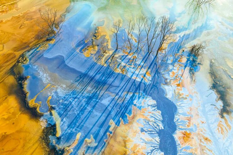
Meanwhile, there’s also the (unrelated) 2024 Nature Photography Awards, as highlighted by PetaPixel:
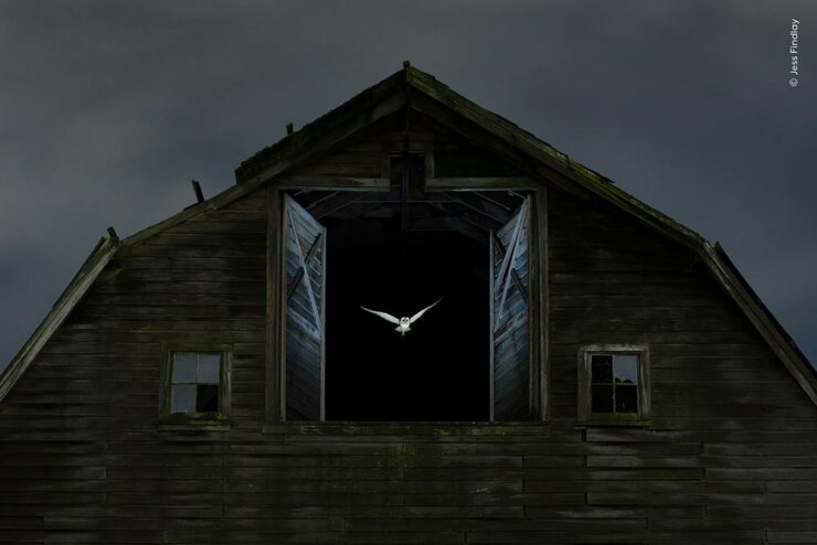
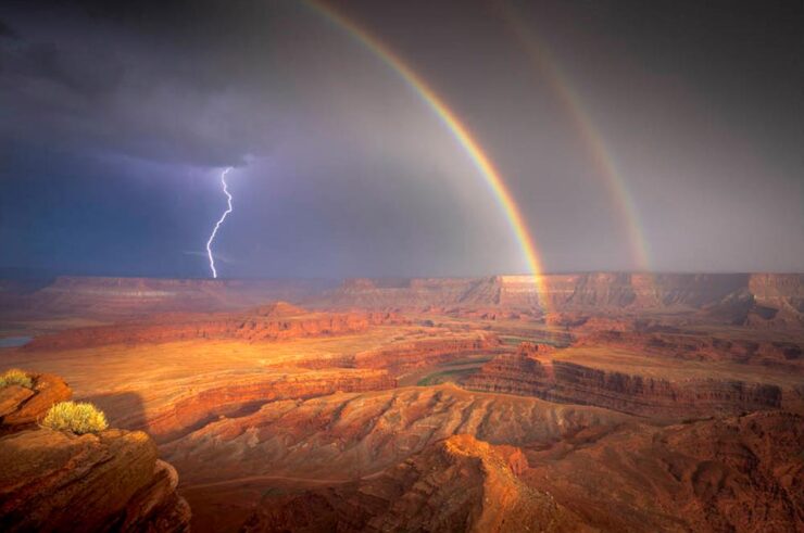
There are also the 2025 British Wildlife Photography Awards, as noted by This is Colossal:
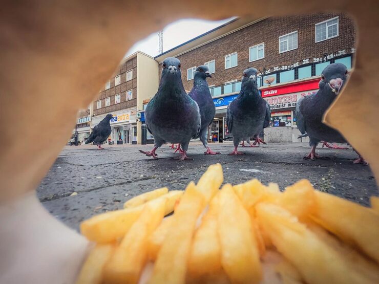
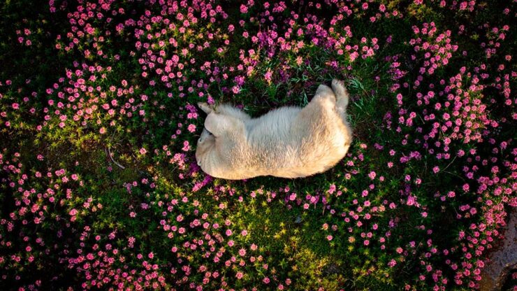
We do, in fact, run into too many of these contests; while I can’t argue with that, I can suggest that nature and wildlife are worthy subjects. Even in fun:

Crooning, almost — Squirrel Sinatra. See more of the Nikon Comedy Wildlife Awards at PetaPixel.
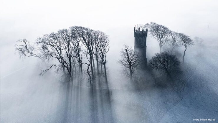
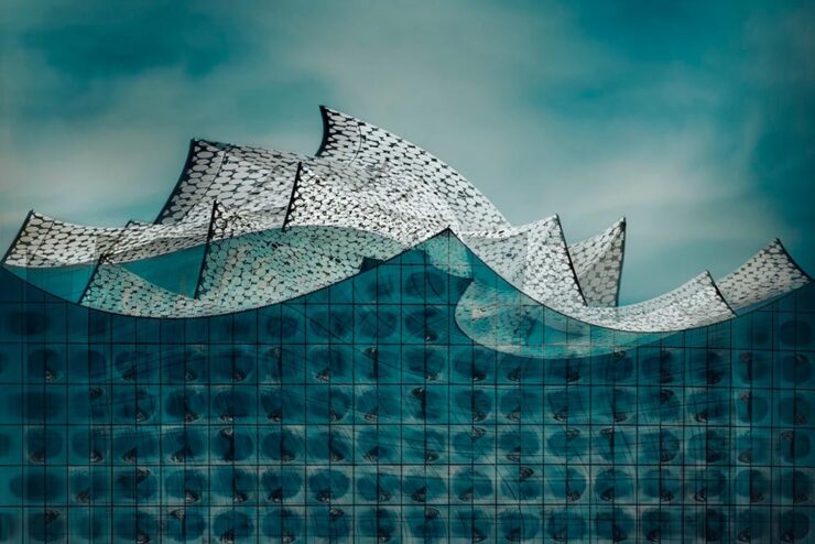
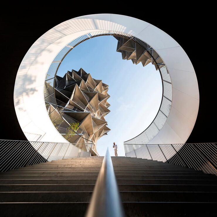
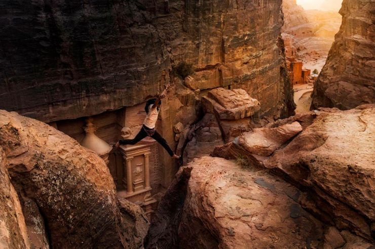
2025 Sony Photography Awards
Another contest, yes, but one that’s gained a stature — almost a half a million entries this year — and one that covers a huge variety of subjects:
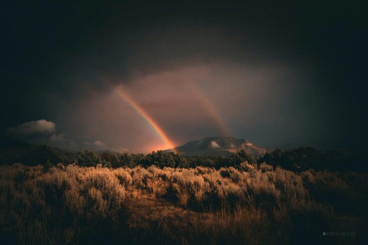
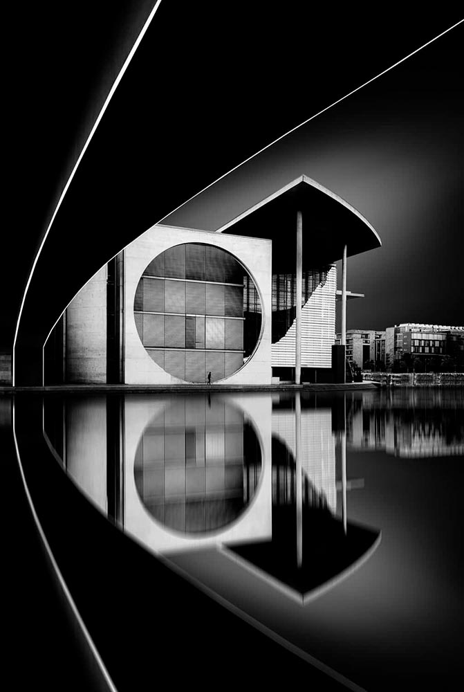
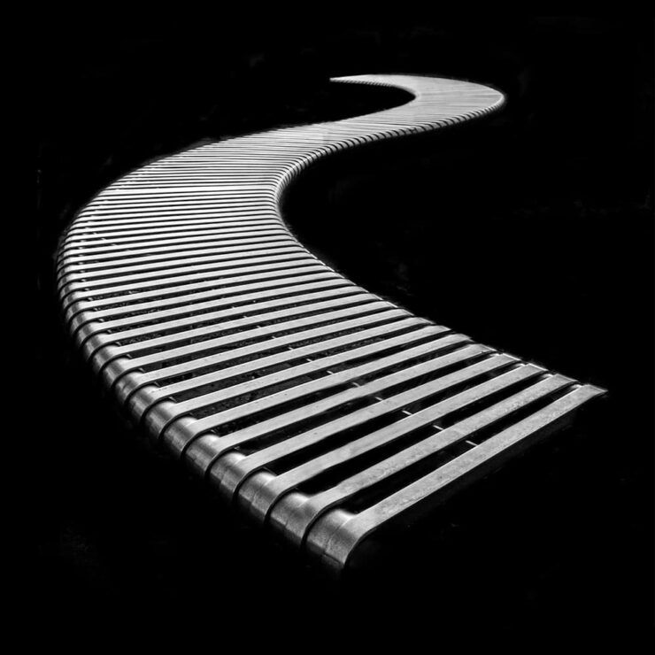
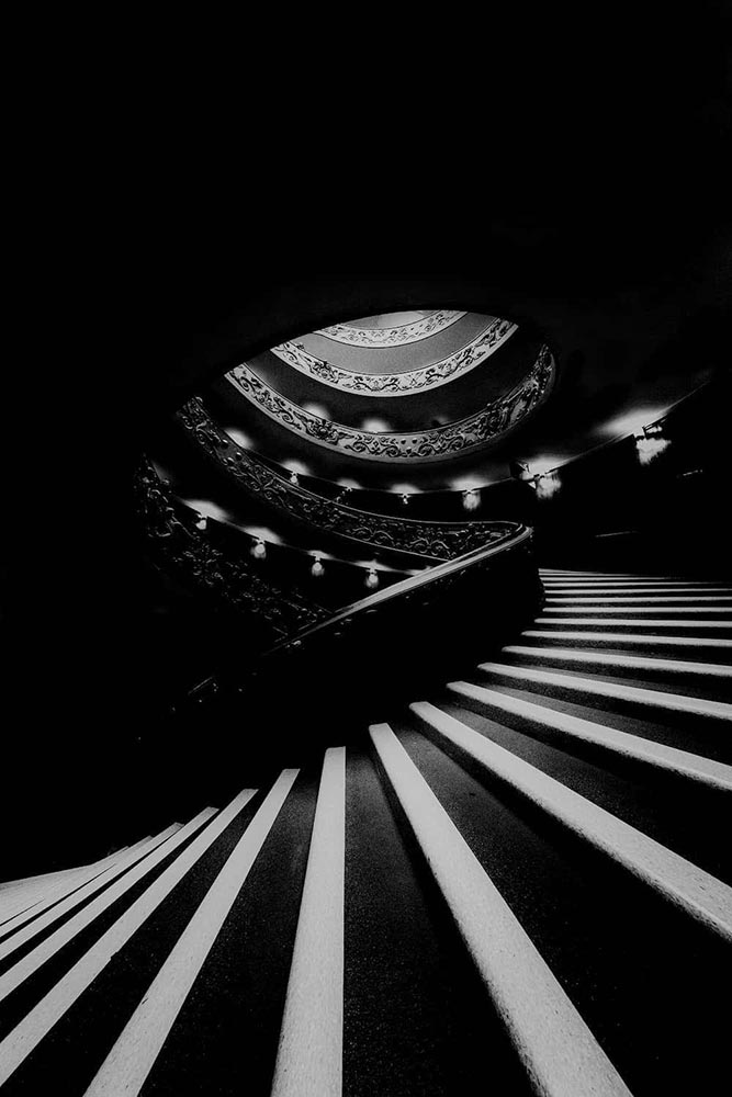
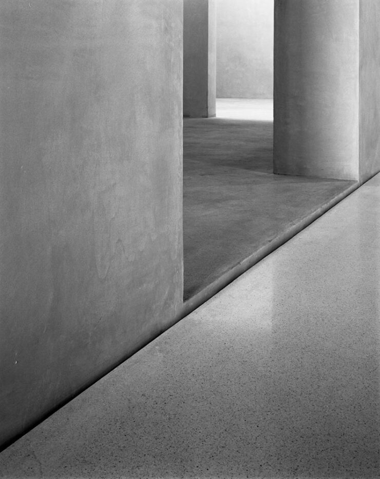
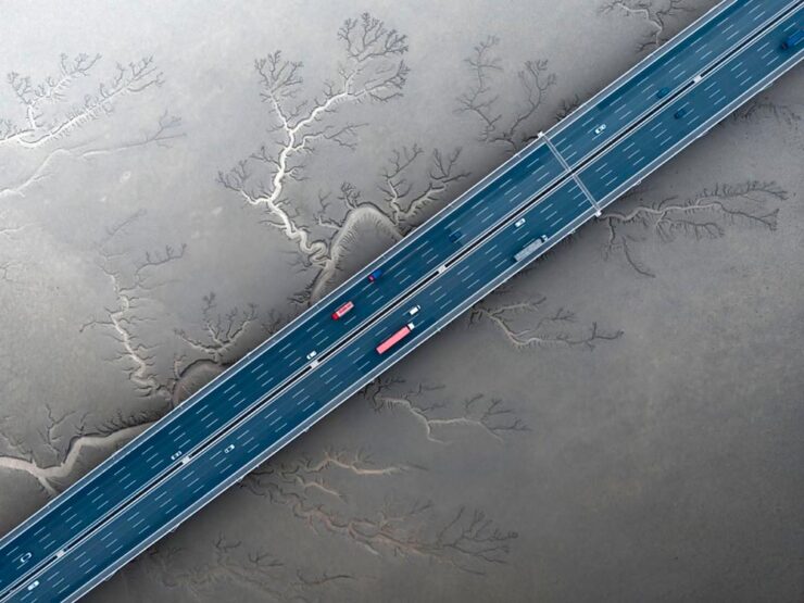
Naturally, I gravitate towards the architecture category:
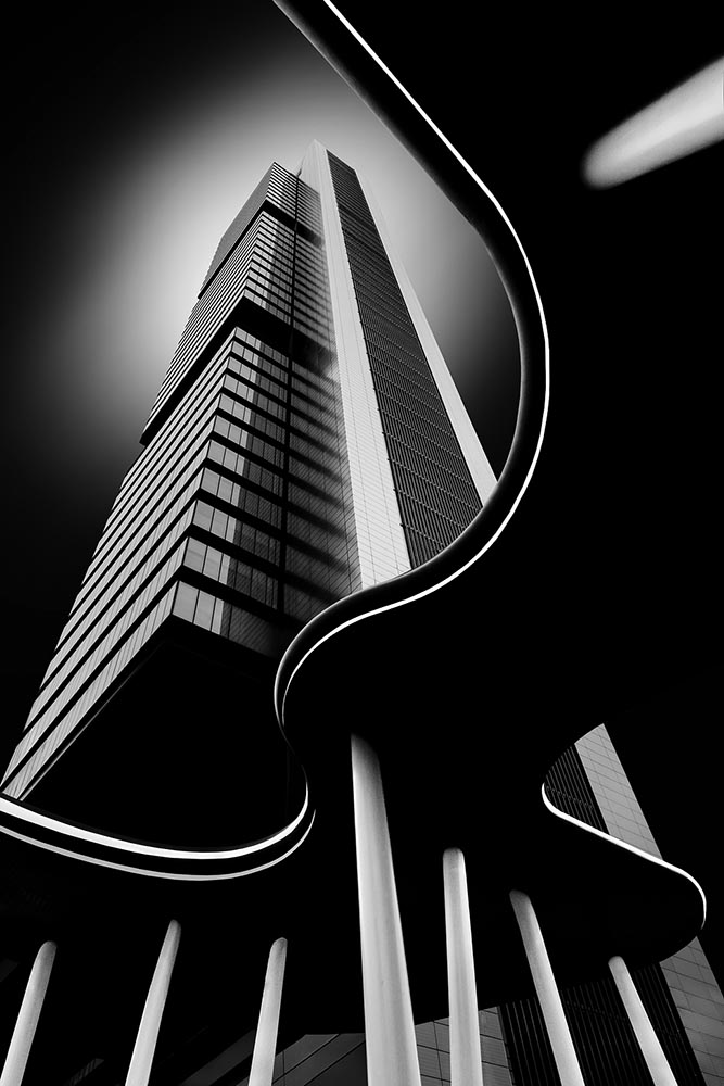
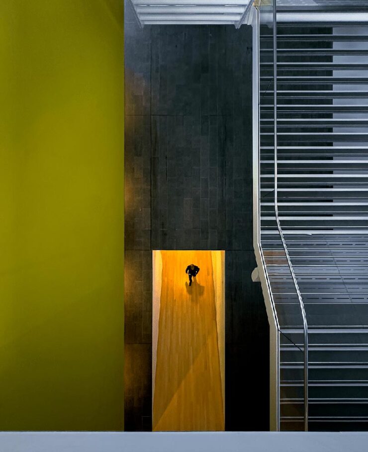
Read More at This is Colossal and Archinect or visit the World Photography Organisation.
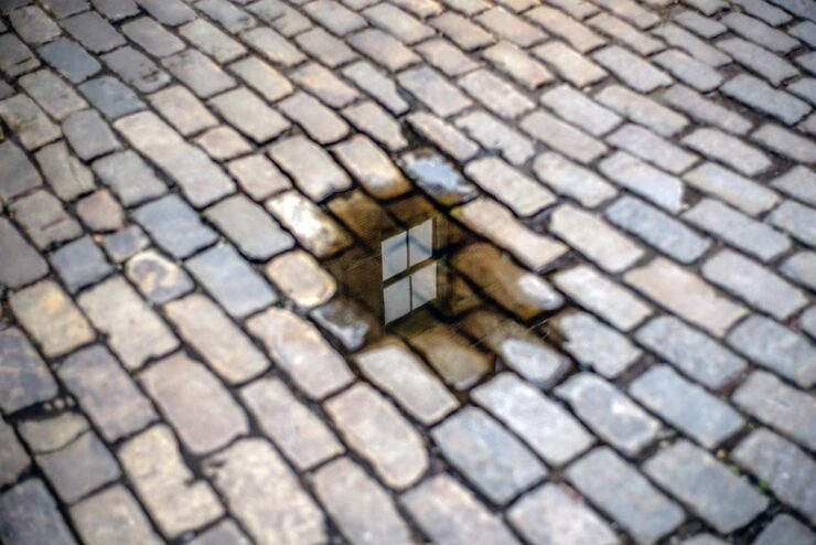
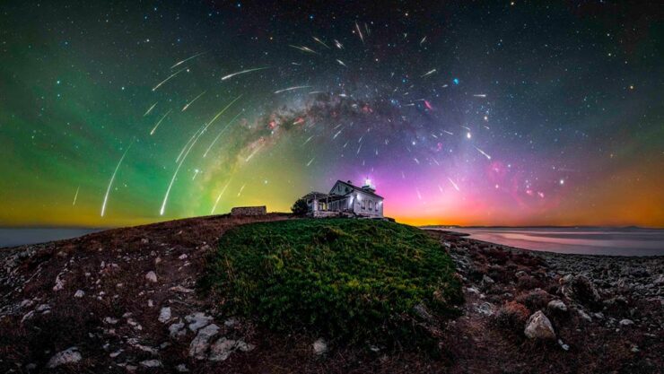
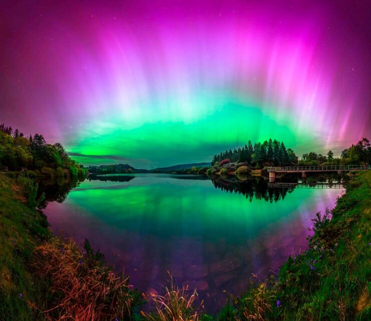
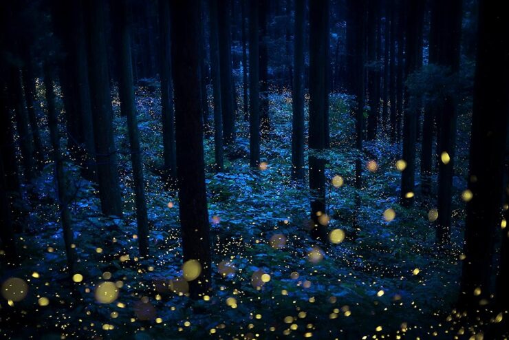
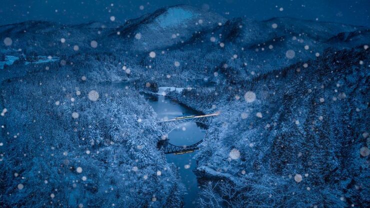
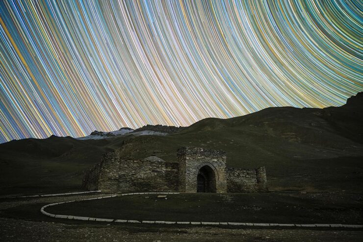
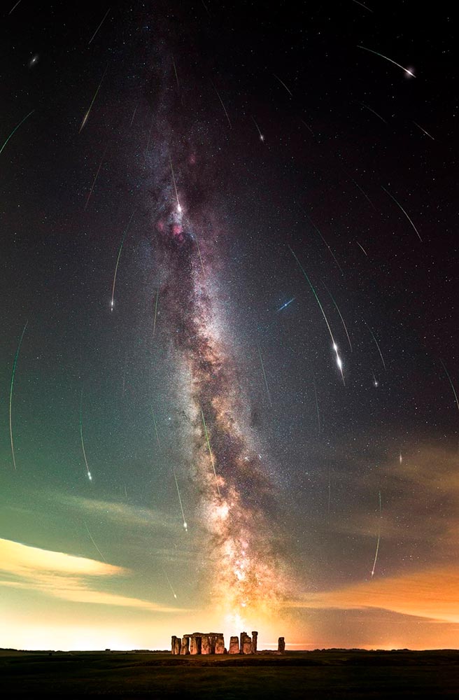
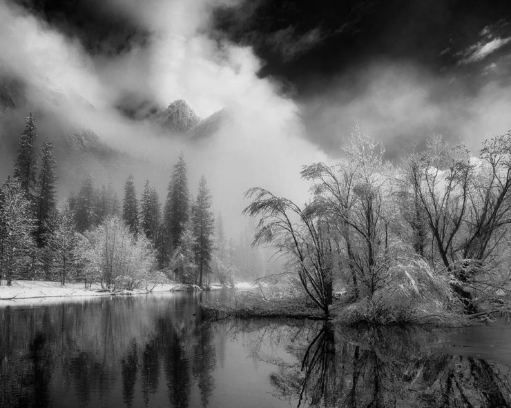
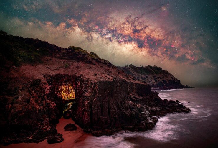
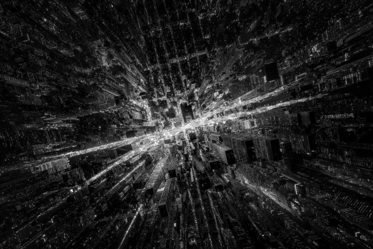
The Darkest Skies
PetaPixel also brings us photography from Mihail Minkov, who spent nearly six months traveling to “dark sky” locations — those not suffering from the ever-increasing effects of artificial light — and brought home some spectacular results:

Special Bonus #3: Lego F1 action photography!
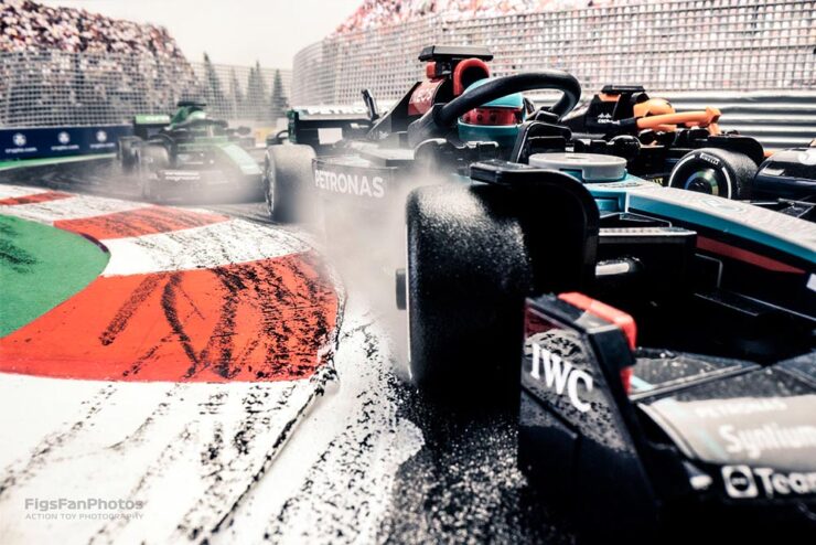
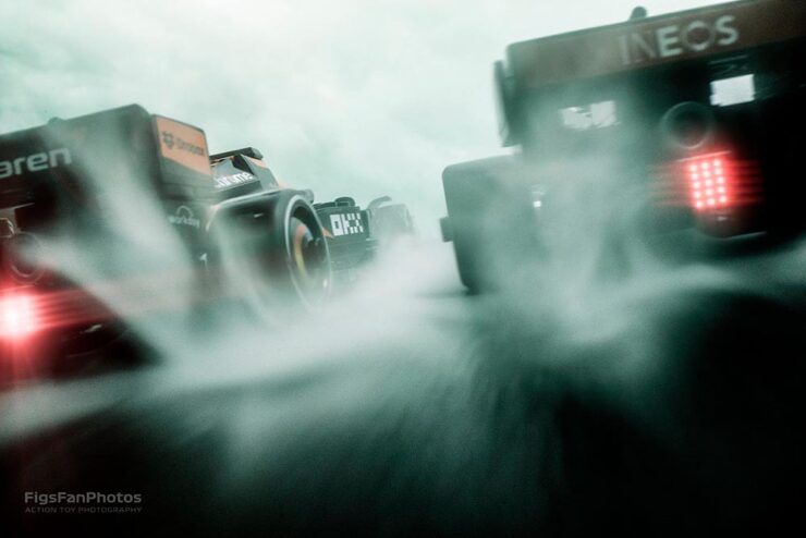

Great stuff from Hungarian photographer Benedek Lampert. (See his Star Wars Lego photographs, too.)