This month’s favorites cover a delightful new extension of the typeface DaVinci, Google’s updated mega-font, Noto, photographs of a desert aircraft boneyard from above, and mega-photographs of the Milky Way.
Before we get there, however, I wanted to wish Jason Kottke — whose 24 years of web sleuthing has been a source for items here on Foreword dating back to its original iteration in the ’90s — good luck on his sabbatical:
“I need some space to think and live and have generative conversations and do things, and then I’ll make something, but I can’t tell you what it is just yet.”1Alexandra Bell, NYT That’s the sort of energy I need to tap into for a few months.
Hear, hear.
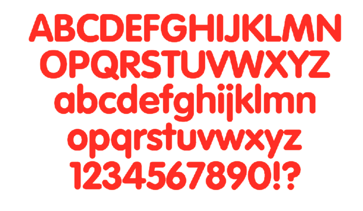
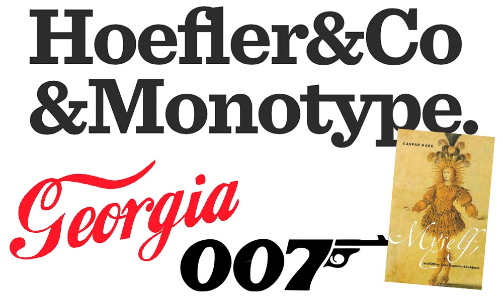
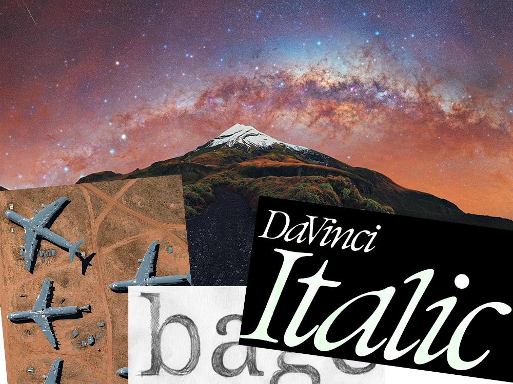
The Beautiful DaVinci Italic
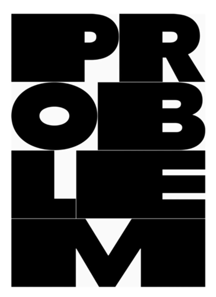
It’s Nice That points us to a new, extended version of the font DaVinci, done for Sydney’s Biennale:
“When you do this sort of type exercise — based on printed letters — it gives a very organic shape and form, in opposition to the very metallic sharp shape from type materials.” Furthering this organic look by pushing the fluidity curse at its maximum, Virgile ended with a design “which is very historical, yet with a contemporary twist.”
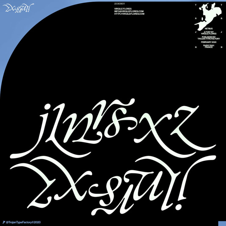
Makes you want to find an excuse to use it. But that’s not all: Flores is an incredibly diverse artist whose work both challenges and inspires. See more.
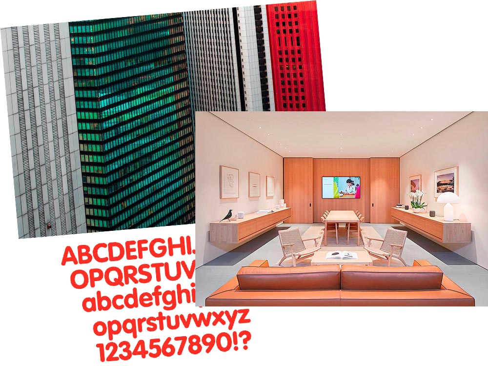
Google’s Noto
Called “A Typeface for the World,” Google’s Noto defines “megaproject.”
Noto is a collection of high-quality fonts with multiple weights and widths in sans, serif, mono, and other styles. The Noto fonts are perfect for harmonious, aesthetic, and typographically correct global communication, in more than 1,000 languages and over 150 writing systems.
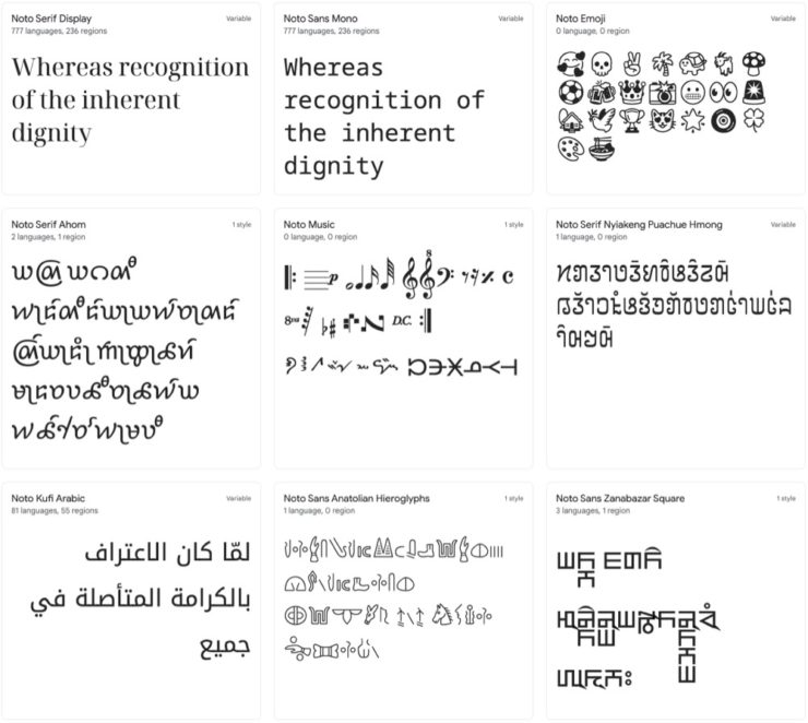
According to Google,
“Noto” means “I write, I mark, I note” in Latin. The name is also short for “no tofu”, as the project aims to eliminate ‘tofu’: blank rectangles shown when no font is available for your text.
While the font itself has been around for a few years — 2013 seems like yesterday in so many ways! — it’s updated regularly, cover 150 out of the 154 scripts defined in Unicode, and deserves attention from every web designer and type nut. Read more at Google or Wikipedia. (Via Kottke.)
Aircraft Boneyard, From an Aircraft
This is Colossal introduces us to Davis-Monthan Air Force Base in Tucson, Arizona, whose desert conditions are ideal for storing — and scrapping — aircraft:
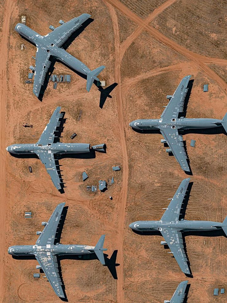
The photographs are by Bernhard Lang — whom Colossal has highlighted before — and who has an incredible talent for finding patterns from above. See many more at his website.
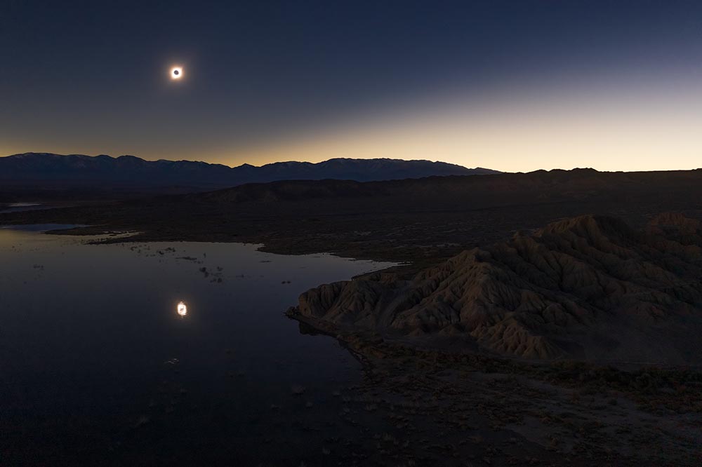
Milky Way Photography
We don’t get many opportunities here in Middle Georgia, but in other, less populous (read: less light-polluted) places in the world, the Milky Way shines forth from the heavens:
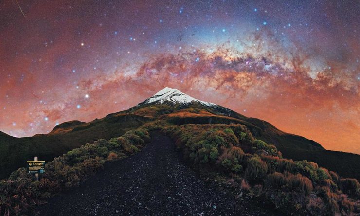
The Guardian points us to the 2022 Milky Way Photographer of the Year, and many just wow:
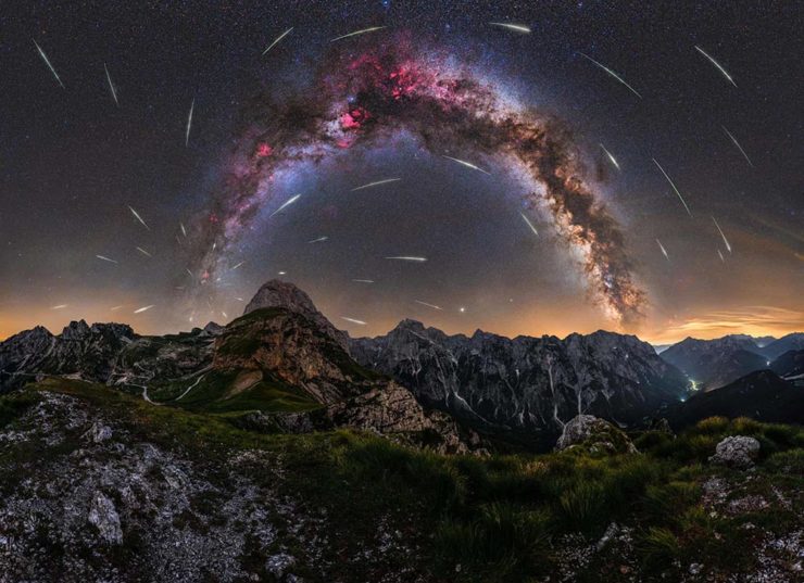
Check ’em all out, be inspired to take one of your own, or simply be reminded just how big this system we’re a part of is. Enjoy.
- 1