From book design and minimalist photography to … well, book design and what absolutely isn’t minimalist photography, plus some street signs and another warning about Adobe. Let’s dig in.
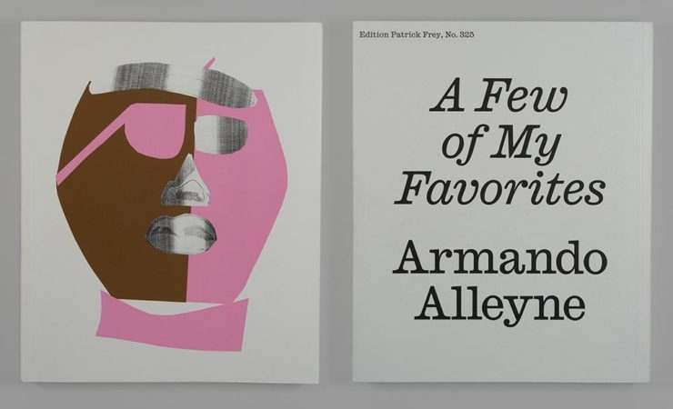
Book Design #1: People Really Do Judge a Book by its Cover
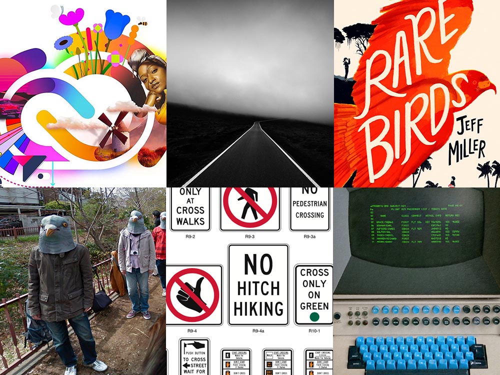
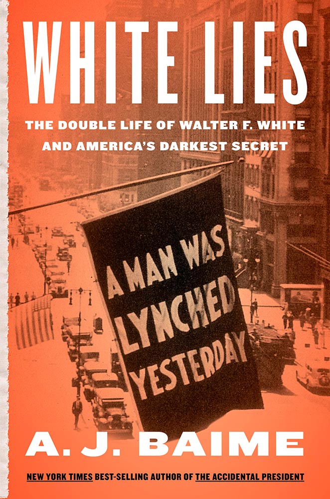
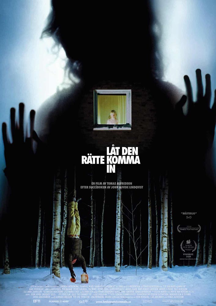
From University College Cork — that’s Ireland, folks — we have something that, on the surface, seems obvious: a book cover“is the most likely factor to convince a person to read a book if they are unfamiliar with the work or its author.” Maria Butler, a PhD candidate in the School of English and Digital Humanities at UCC, reminds us why.
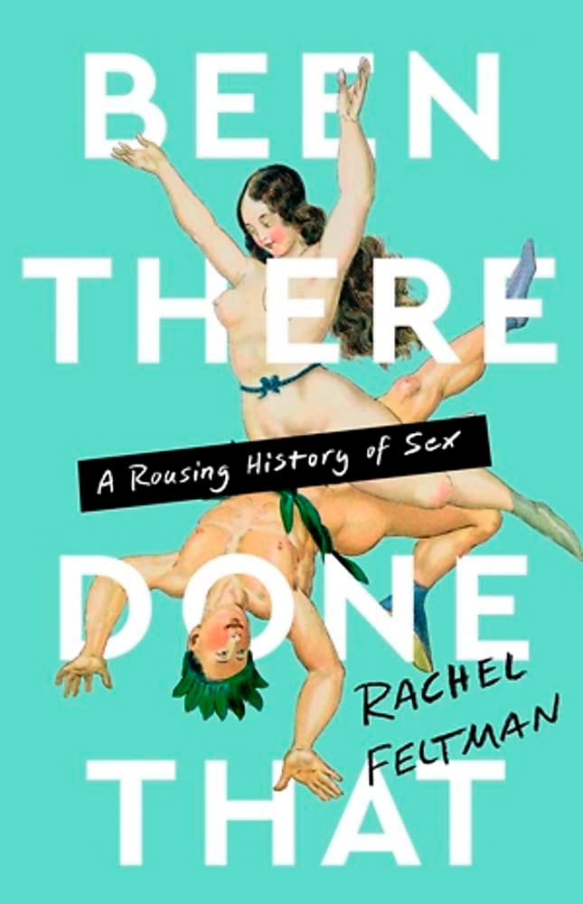
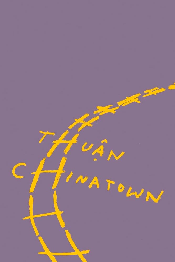
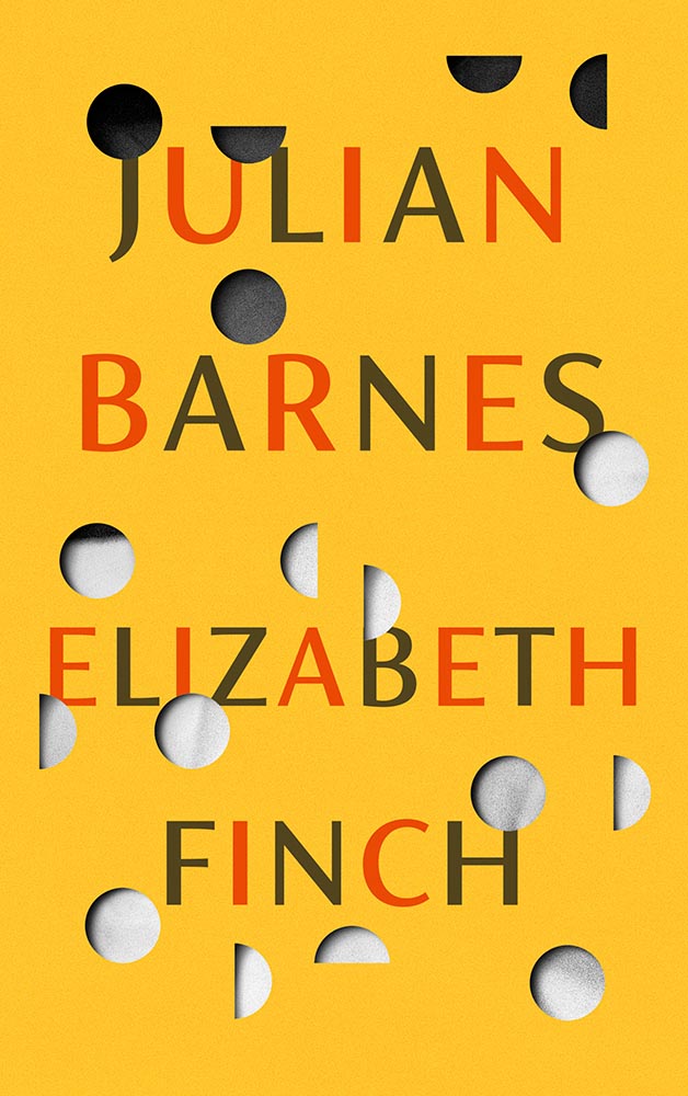
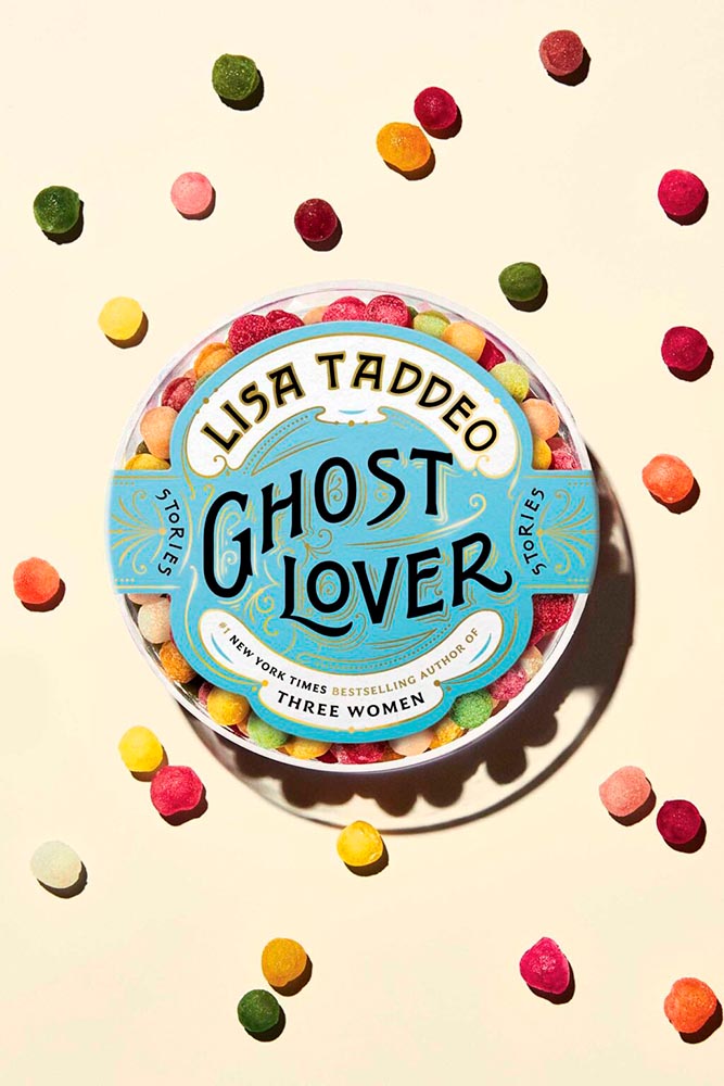
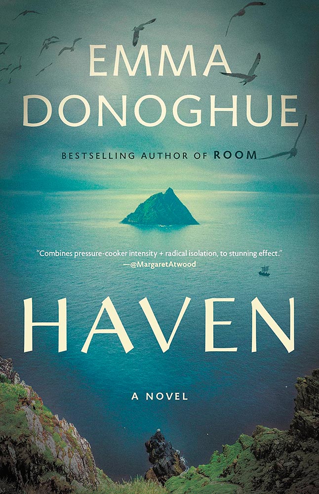
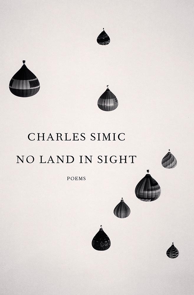
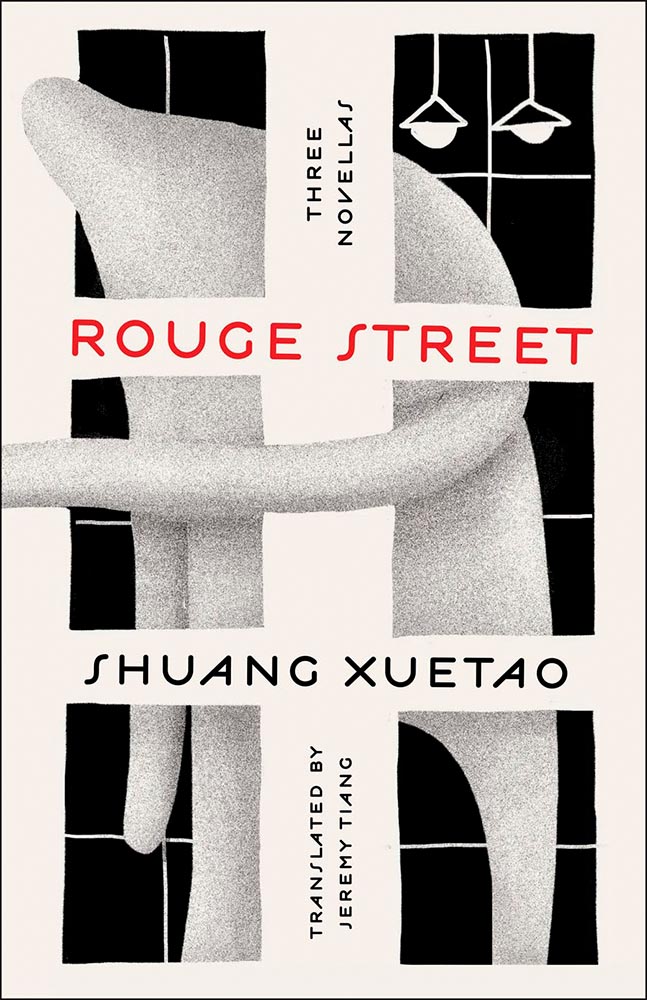
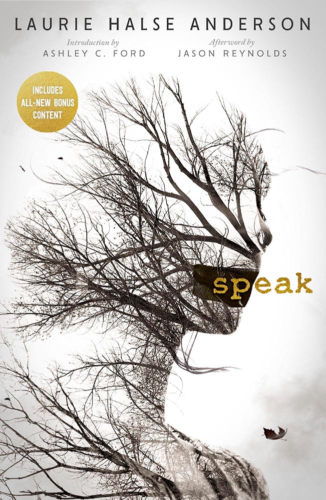
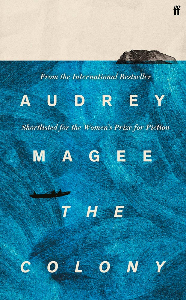
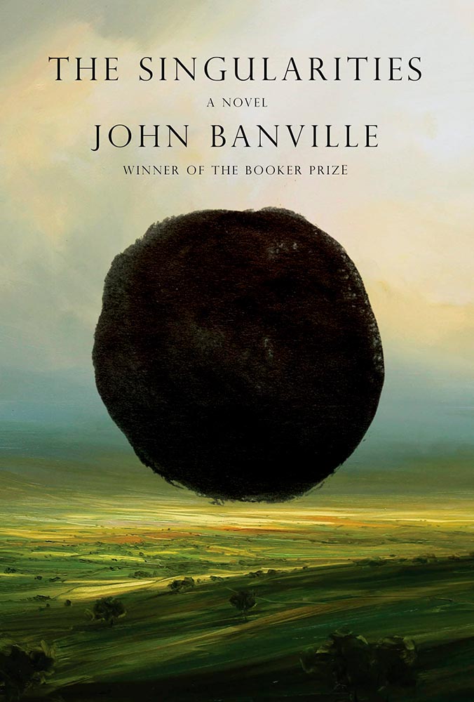
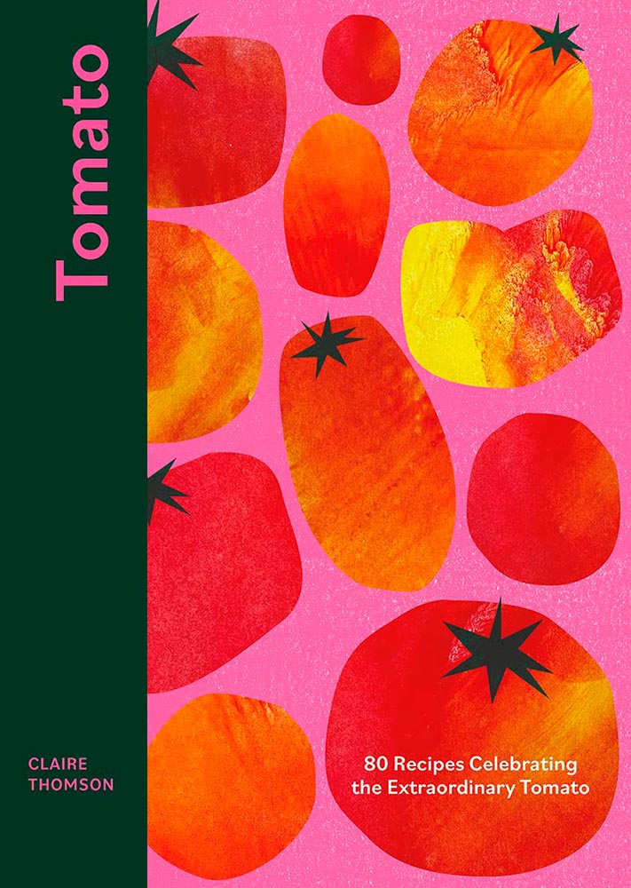
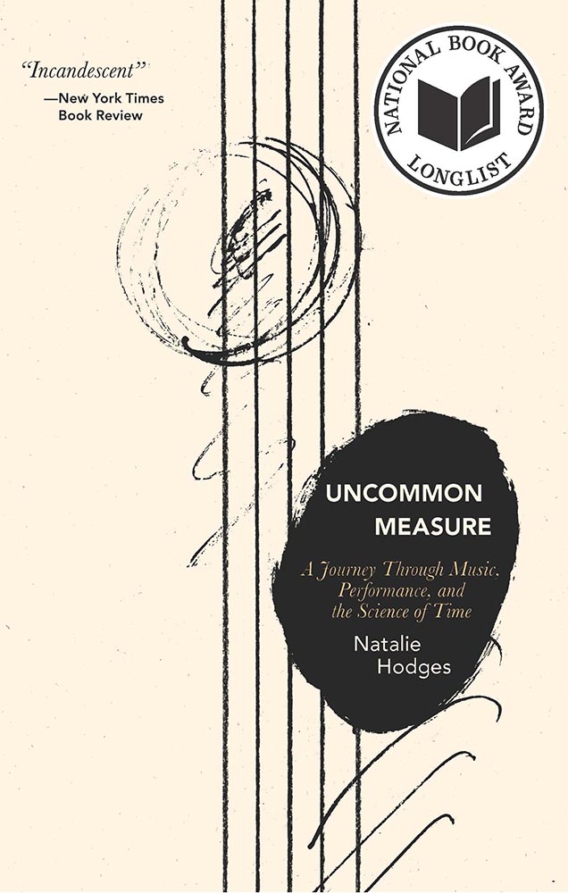
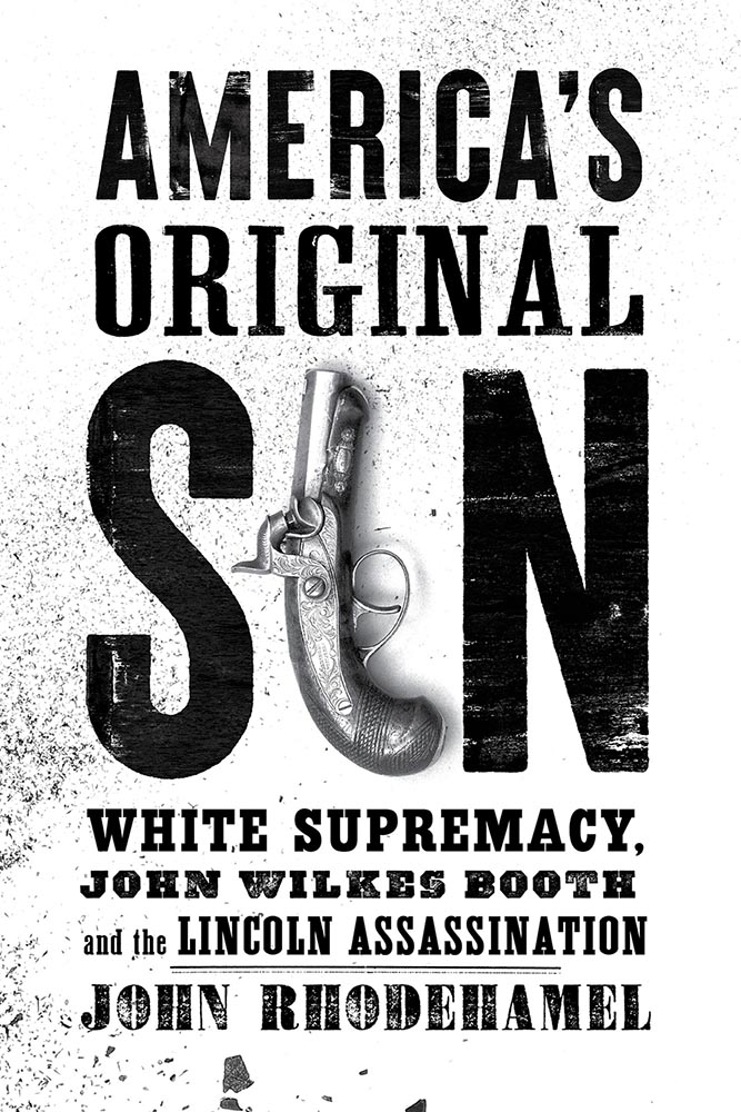
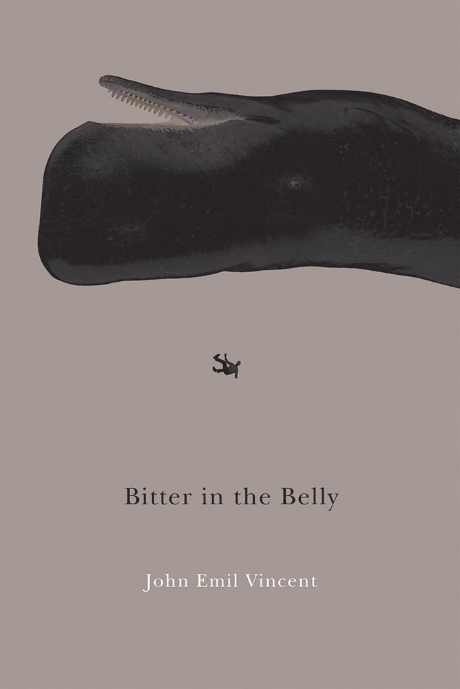
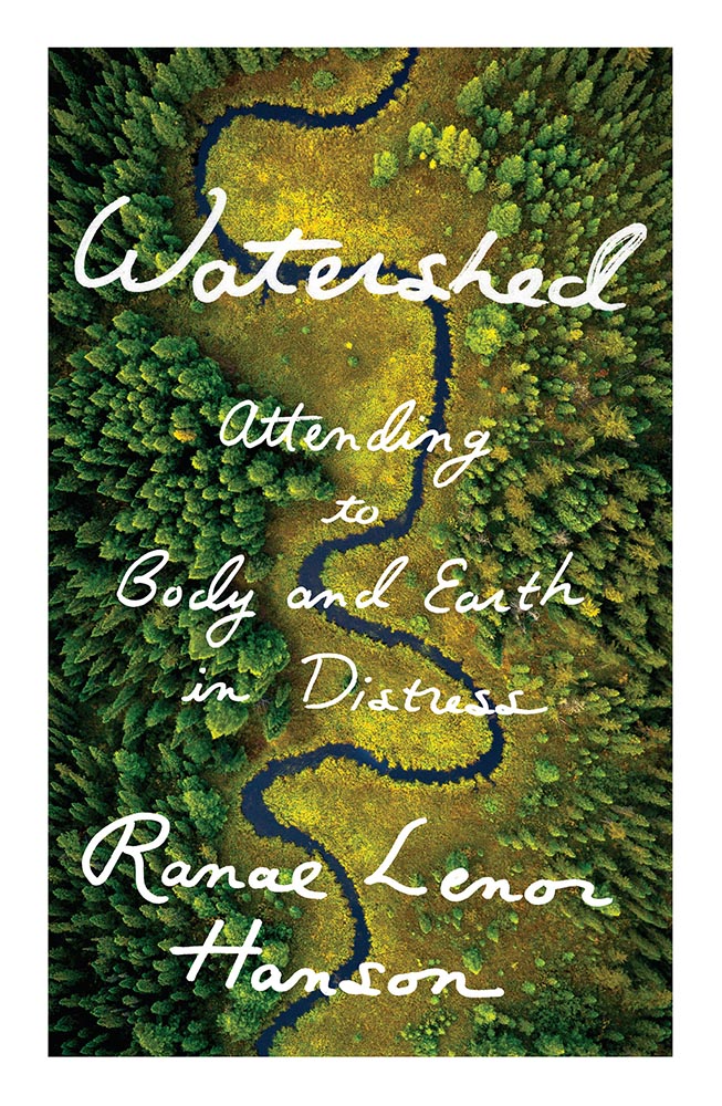
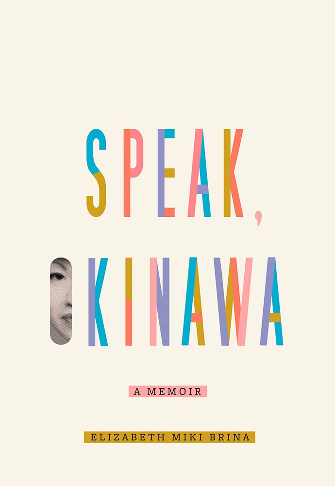
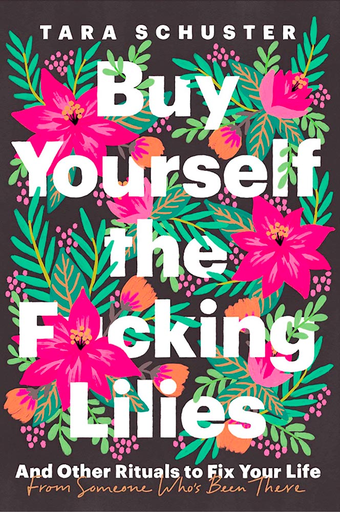
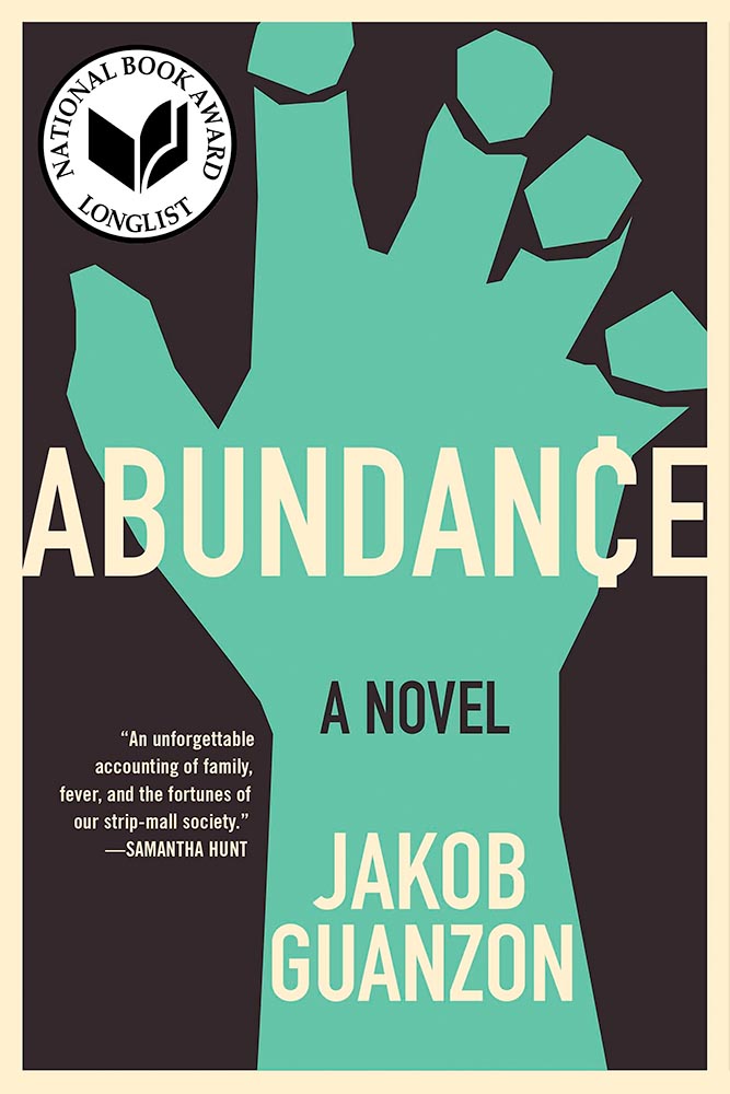
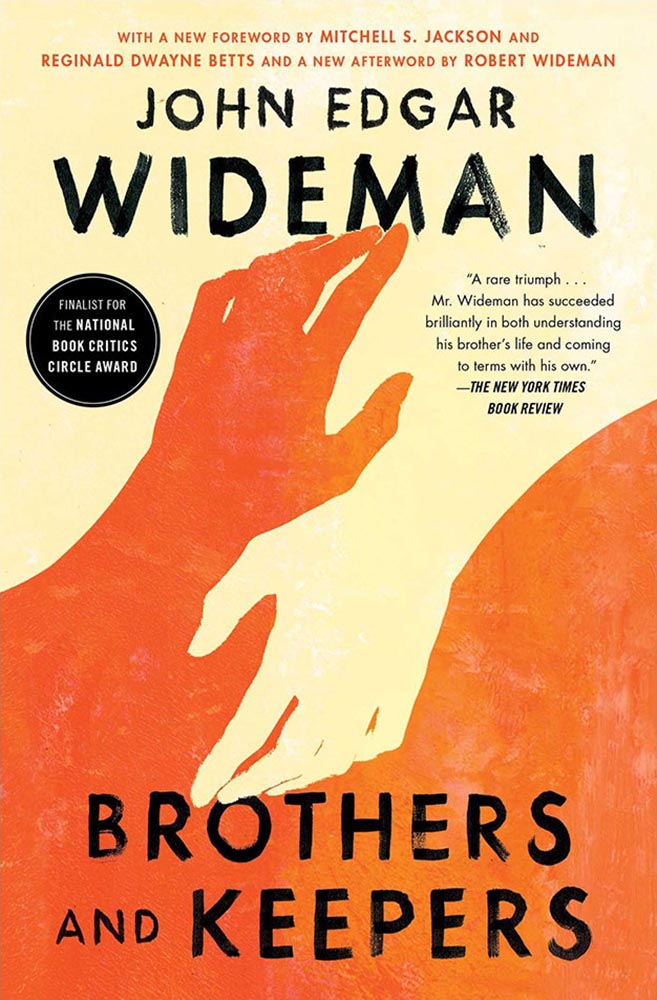
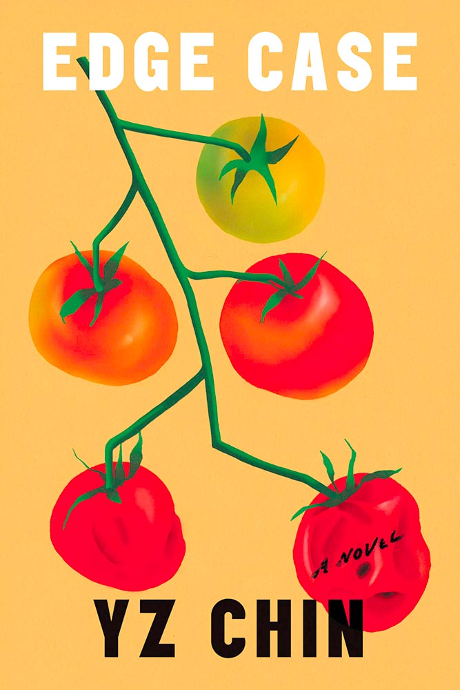
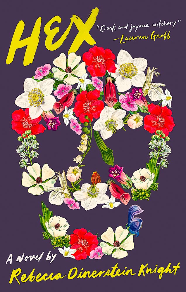
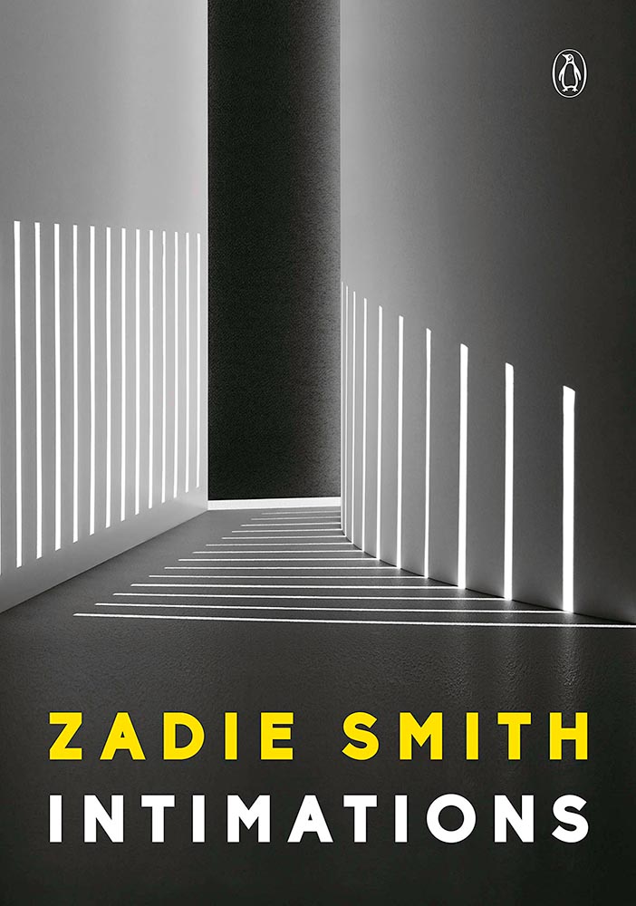
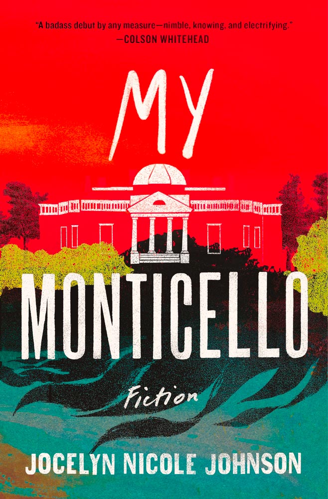
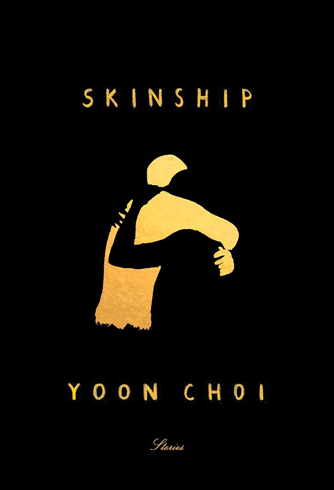
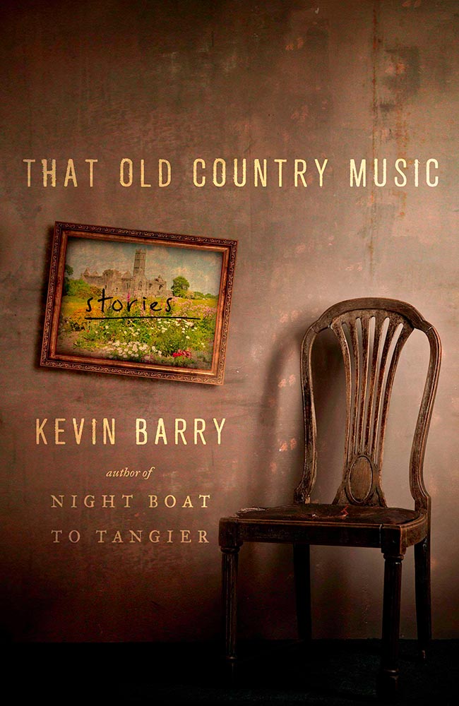
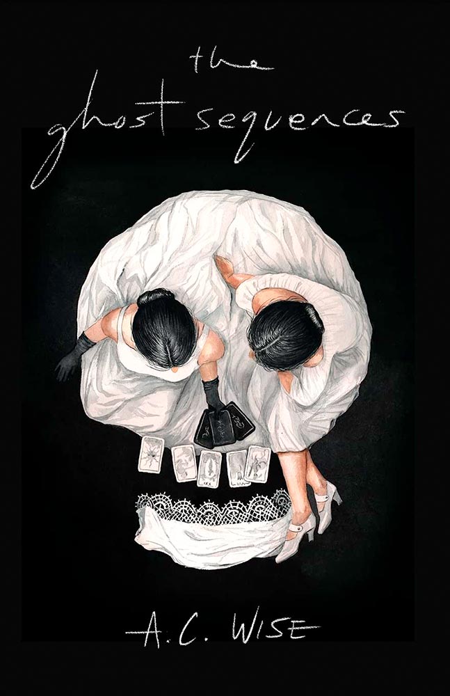
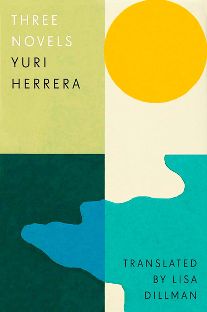
Design by Kimberly Glyder.
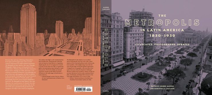
You’re reading Foreword, so you likely agree — and shown above is one of those worth-a-thousand-words images: the first of the 2023 titles I’ve set aside for my favorites of the year, and absolutely something good enough to make me pluck it off the shelf without knowing anything about either the title or author.
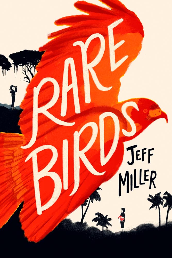
A screenshot from the Shift Happens website. Great stuff.
This project not only scores with great web design — check the interactive version of the book, pictured above — but what also seems like great book design. It’s a Kickstarter project (or will be, next month), so the usual cautions apply, but I might just go ahead and take the leap.
Couple of interesting book design items, by the way: the TOC is at the back, the endpapers are awesome, and the macro photography is tops. The book design reminds me of The Playmakers, still my favorite book design project ever.
Bonus: Tim Walsh, author of The Playmakers, is still going strong. Nice.
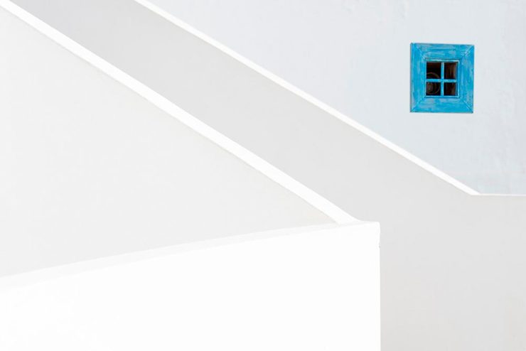
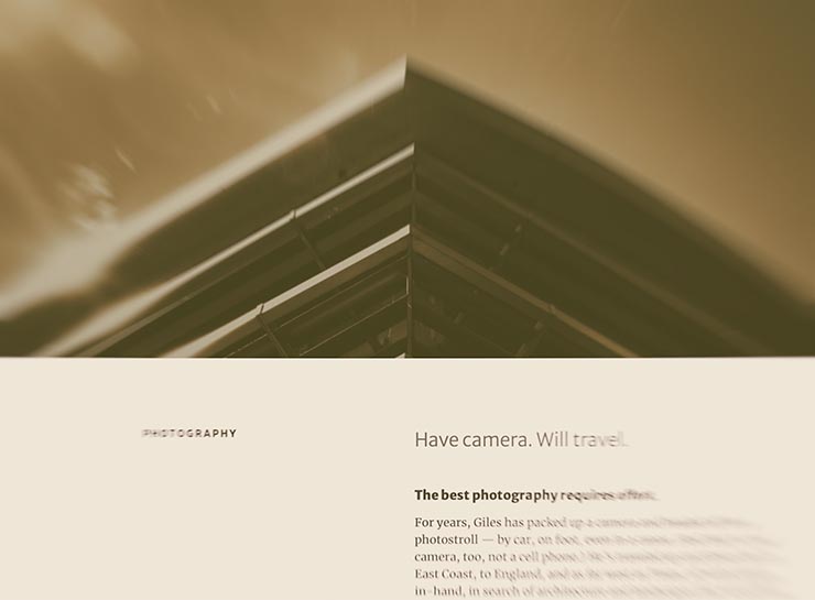
Photography #1: Minimalism
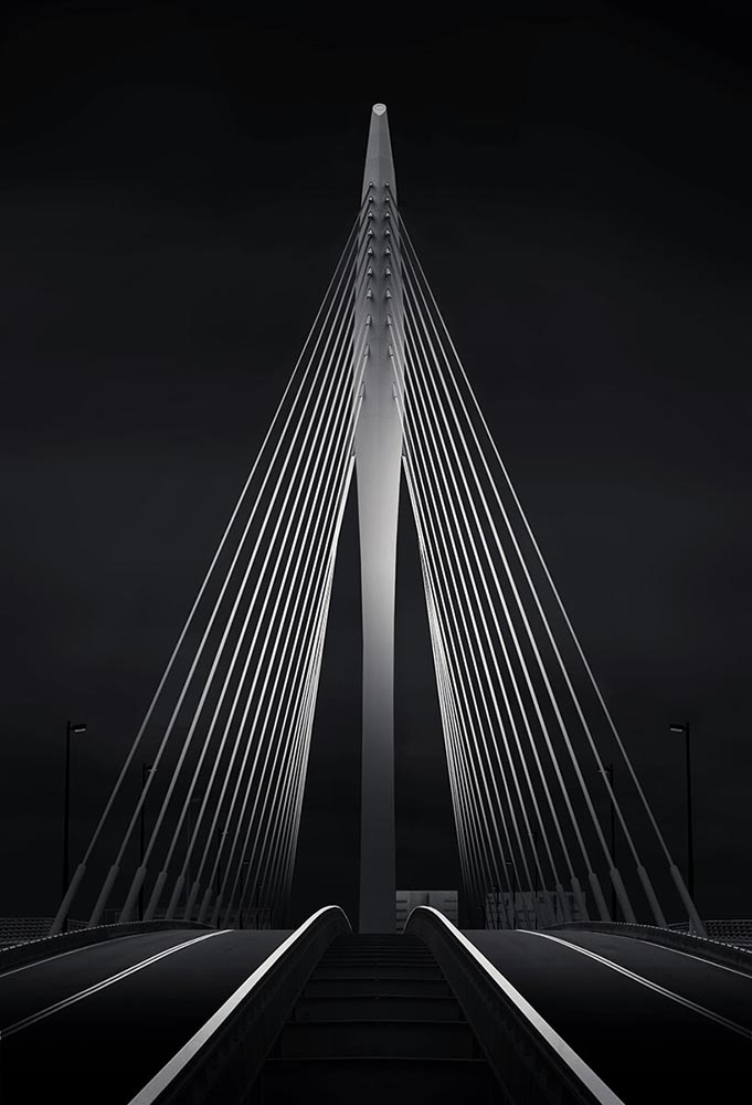
The winners of the Minimalist Photography of 2022 awards are in, some are fantastic. Here are a couple of favorites, from the architecture category:
“Prince Claus Bridge in the Netherlands,” by Arthur van Orden“Blue Window,” by Andrea Richey
The Minimalist Photography Award is the only foundation that deals extensively and professionally with minimalist photography as a branch of photography in which the photographic artistic vision takes the lead.
Milad Safabakhsh, President of Minimalist Photography Awards
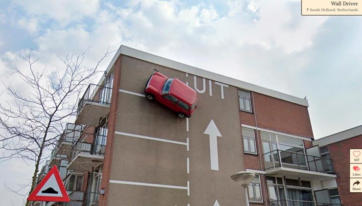
Direct quote, just because: “A man with three legs, a vintage car scaling a building, and an unsettling formation of people donning bird masks are a few of the scenarios highlighted in the terrifically bizarre Wonders of Street View.”
I didn’t know it was a thing to dress up and pose for the Google cameras. Perfect.
Street Sign Style Guide
Speaking of street views, did you know there’s a style guide for highway signs? Would you believe that I’m a fan?
Interestingly, there is an I-42/I-17 interchange in Phoenix, but this ain’t it: these signs are representational.
As with most things government, there’s confusion, too many regulations, and yet it’s based around good ideas. Beautiful Public Data has a guide to the guide.
Adobe Steps in it, Again
From DPReview: “If you’re an Adobe Creative Cloud subscriber, you might want to go and turn off a new setting immediately. It’s been discovered that Adobe has automatically opted users into a ‘Content analysis’ program that allows Adobe to analyze your media files […] for use in its machine learning training programs.”
It’s important to note that Adobe only uses the files saved in the “Creative Cloud,” something I don’t do as a matter of course, but even still, this is yet another example of Adobe using its monopoly position in the creative field to take advantage of its paying customers.
Adobe, unsurprisingly, didn’t return DPReview’s request for a comment/clarification.
Just like last year, this post took longer than expected due to the best possible circumstance: there were so many great book cover designs in 2022 that I had a hard time whittling down the list. Even as it is, we’re busting right through last year’s limit of 50. Good times!
If we take a step back and look at the trends this years’ favorites represent, it’s more and better illustration, custom and hand-painted type, and a sense of a single focus — one, dominant thing on a field of color. Also, the trend of fewer photographs continues — more evidence that photography has become so ubiquitous that something different is required to stand out. (Or, of course, a really great photograph.)
Please remember that these are my favorites — others might say “best,” but I’ve been in this business long enough to know that there’s always another great title you haven’t seen or read about, and I don’t want to disrespect any of the great book designers not on this list. I’ve tried to include design credit where I could (special thanks to the folks who answered emails with that information), and I wish to stress that any mistakes in the list below (incorrect attribution, for instance) are mine.
Note: If you’re on Foreword’s main page, please click on the post title, above, to view this list. You’ll get larger covers for your viewing pleasure.
My favorite book covers for 2022 (Three-way tie):
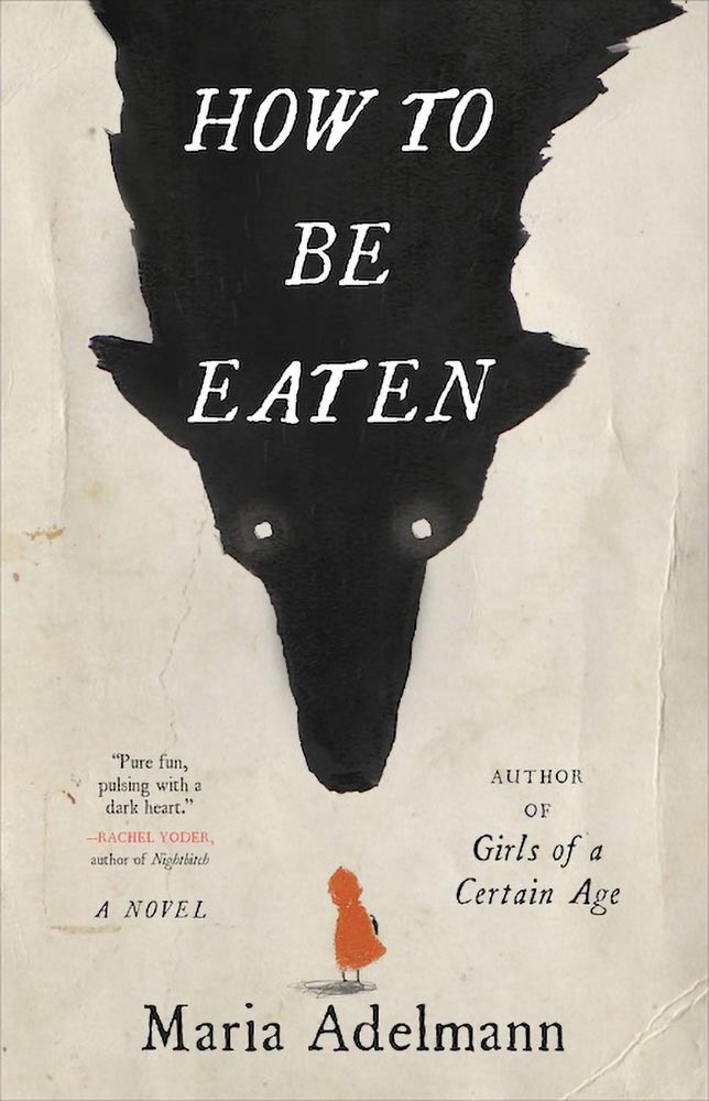
Design by Julianna Lee.
How to be Eaten combines an aged look, just a smidgen of pencil sketch, hand-drawn type, and those eyes to create something that just goes beyond. I’m certain the background wolf and creases are real, too, either photographed or scanned — bonus points for that all-too-rare practical effects — and all this in what amounts to two colors. Simply awesome.
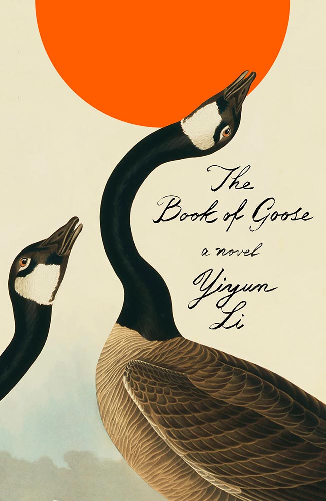
Design by Na Kim.
The Book of Goose defies use of the words “art form” — it’s the kind of cover that for many designers would be once-in-a-career good. However, Na’s work appears below, was here last year, and speaks to Na’s creativity being, well, a golden goose that just keeps on giving.
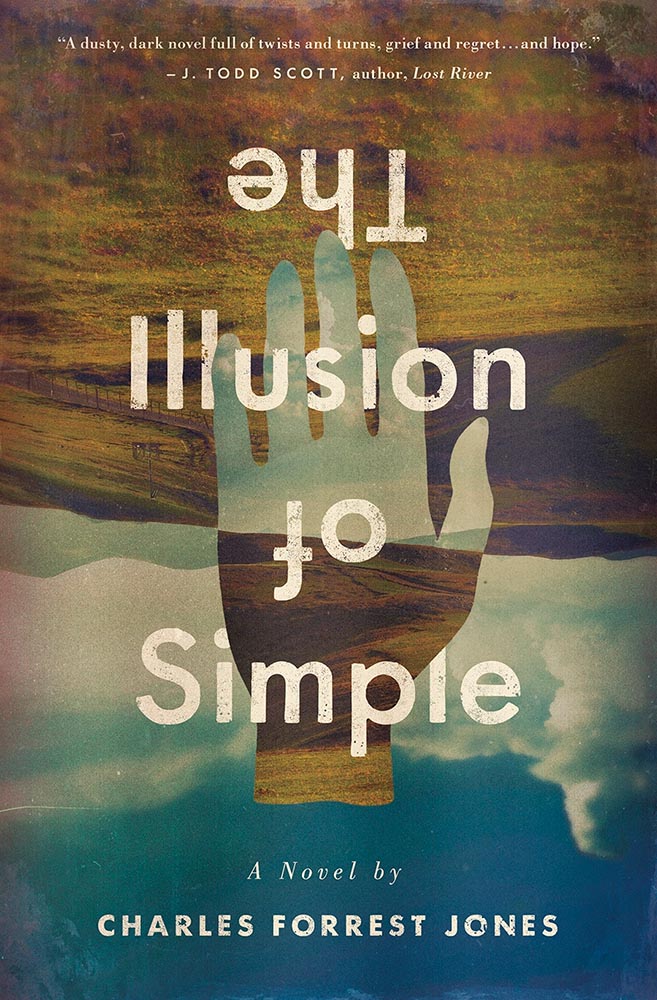
Design by Derek Thornton.
Simply put: there’s literally nothing about The Illusion of Simple that isn’t perfect. J’adore.
Other 2022 favorites, in alphabetical order:
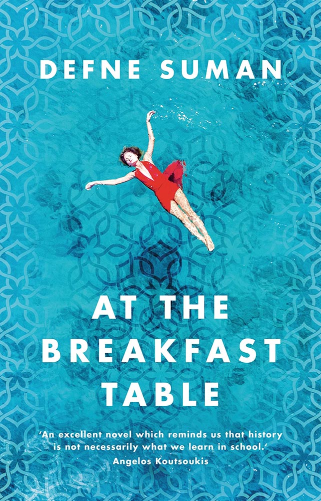
Design by Matt Bray.
This is striking not only for the beautifully-photographed woman in the pool, but the way the pool is extended out to make that woman even more striking. The pattern overlay is fantastic, too.
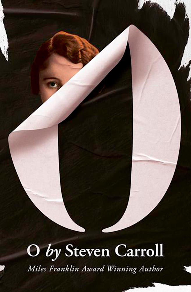
Design by Pete Garceau.
There’s nothing about this not to like: the frankly perfect illustration on a great background color, the head through the “O,” subtitle censorship bar, the sock, even the title. Enjoy-a-cigarette-after good.
SoHo Press didn’t return a request for cover design information.
Bunch of aged books with a little type, right? Yes, by so much more: striking colors, great hand-done supplementary text, perfect title treatment, style in spades.
Design by Jo Walker.
This is a UK cover — the American one is okay, but not on this list — that celebrates a minimalism that is rarely seen, let alone so well seen.
Design by Tyler Comrie.
What’s not to say about this cover? While faceless women are perhaps overused, this is a book I’d snatch off the shelf — and seemly catch something from — in an instant. Well. Done.
Design by Oliver Munday.
As simple illustrations go, this one in on track for the city of Superlative. Another Oliver Munday classic.
Illustration by Seb Agresti.
Along with “faceless woman” is “headless woman,” but the illustration here more than makes up for it. But it’s the expert, almost laugh-out-loud use of a void that makes it. Well done.
Design by Aleia Murawski and Sam Copeland.
Sure, the title and background colors are neat, the sky outside is cool, and “a novel” is a nice, subtle addition. However: I want to know how this photograph happened. (And a waffle hot dog.)
Design by Maddie Partner.
The first of a couple of titles with unexpected wrap-around type treatments, this one has great type choices, too. But the real treat for me is the plane knocked out the photograph. Fantastic.
Design by Suzanne Dean.
This title hides a secret: under the simple and wonderfully-die-cut jacket is a beautiful photo from René Groebli’s photoessay The Eye of Love.
Awesome. (Note that, once again, we celebrate the UK version of the book; the US hardcover has a design not on this list. Crumpets.)
Design by Mike Topping.
The moon as O. The birds. The graduation from fur to imagery. The yellow. Any would be good on their own, but are great together. Have to say: I’ve seen this in multiple shades of yellow. I prefer the darker — closer to the Barnes title, above — to the lighter, shown here.
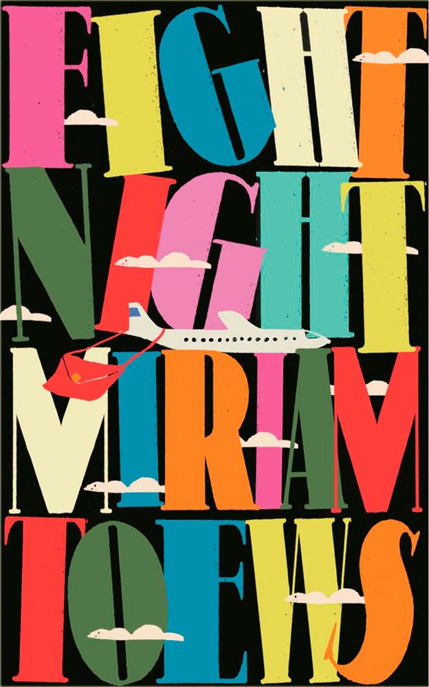
Design by Anna Morrison.
The typography, awesome little plane — the purse(r)! — the clouds, all of it: sky-high levels of good.
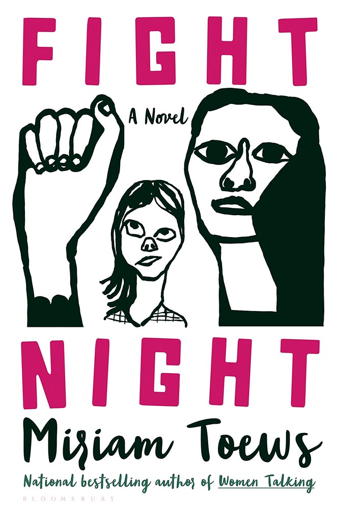
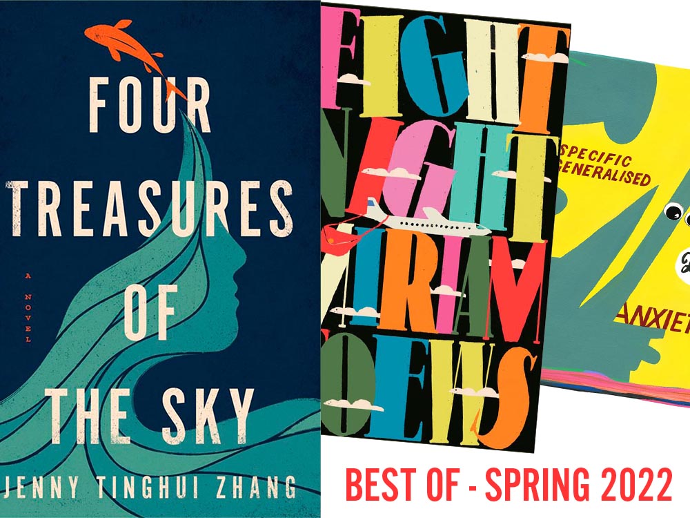
Interestingly, Fight Night‘s cover also had a 2021 version worthy of note:
Design by Patti Ratchford, illustration by Christina Zimpel.
I can’t begin to imagine what caused the redesign, or why it wound up being so radically — 180 degree! — different. The old design wound up on some “best covers” lists (here’s LitHub’s October 2021 post, for instance); both have wound up on mine.
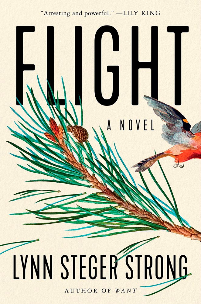
Design by Ploy Siripant.
The bird exiting the scene stage right makes this just right, with bonus points for the textured paper and slightly-rounded sans serif. I think the illustration is perfect — classically done, one could say — and also love that “author of Want” is in a different font.
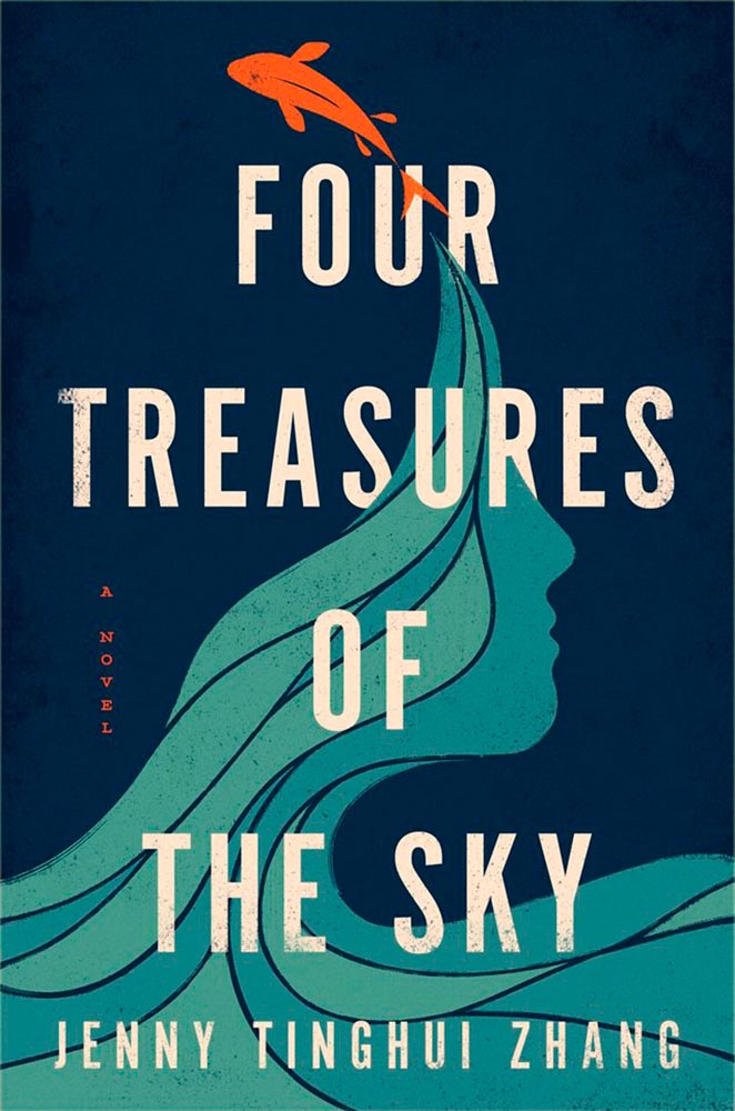
Design by Vi-An Nguyen.
Four Treasures to the Sky, mentioned in the May book cover design roundup, leaps into the best-of-the-best list. It features an aged look, but in a woodblock way that celebrates its limited palette. Add in the illustration’s interactions with the type and the vertical “a novel” — often an afterthought — and brilliance emerges.
W. W. Norton didn’t respond to a cover designer request. Apologies.
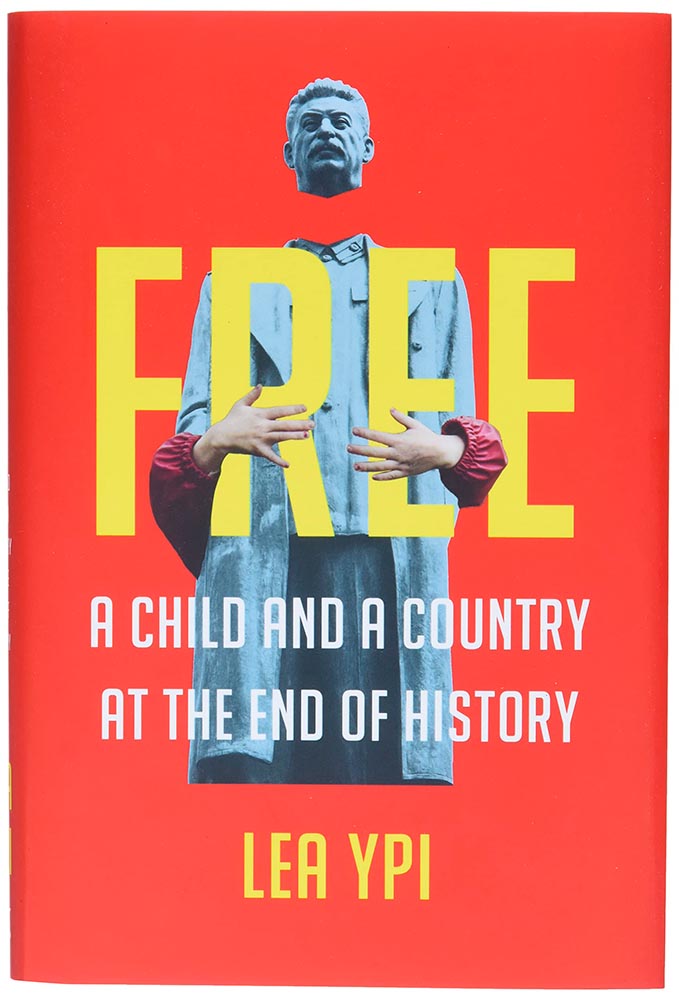
As photomontages go, this one is simple — yet simply powerful: red Albania meets (and hugs!) beheaded Stalin. Great choices.
Design by Alison Forner.
The quality of type and decorations on this “label” are beyond outstanding. This cover is candy for book design lovers and readers alike.
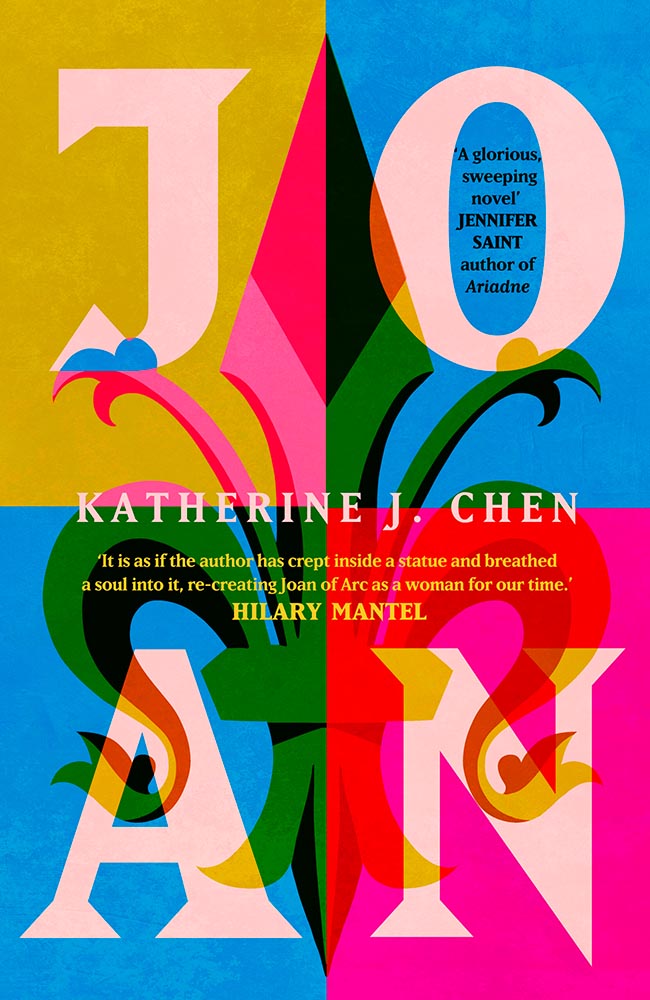
Design by Alex Merto.
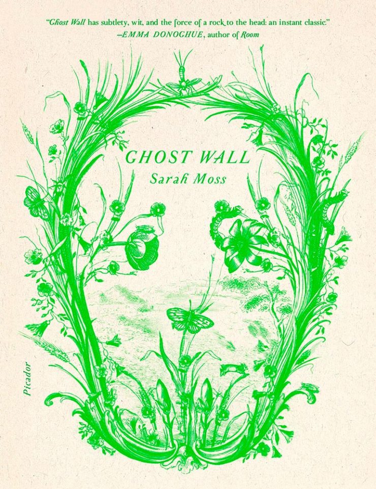
From It’s Nice That, we have a nice feature on Alex Merto — whose Ghost Wall cover is a great example of plant life adding so much more: “the force of a river to the head,” to paraphrase Emma Donoghue’s quote. Plus, one color! Win.
Design by Grace Han.
Nine parts awesome: type and illustration join to light a fire under the words “quality” and “imagination.” (Have I mentioned that I love a textured paper? Here’s a different one that’s also great.) This is one of several titles that’s not only a great book cover, but on a bunch of “best book” lists, too. Great books should have cover equal to their contents, and this one scores.
Design by Emily Mahon.
This isn’t here because of the attention Ukraine deserves these days, it’s here because of that illustration. Brilliant design needn’t be complicated, so ably proved here.
Design by Lucy Kim.
I mentioned at the top of the post that, these days, photographs have to bring something special to the table to stand out. And this cover does, from any table in any bookstore anywhere. (Lovely typography choices here, too.)
Design by Matthew Broughton.
One trend I didn’t mention at the top of the article is the montage-in-type, done here to absolute perfection.
Design by Andrea Ucini.
The woman in looking off the edge of the page at … something looking back. (Not only that, whatever it is casts a shadow.) The book is described as “subtle yet candid,” something that could equally be said about this brilliant cover.
Design by Holly Ovenden.
Another UK cover, this image doesn’t show the uncoated stock and debased type — but does show the jump-off-the-shelf color choices and awesome interaction of title with background. (The US cover, alas, resorted to stereotype. Perhaps we aren’t sophisticated enough?)
Yale Univ. Press didn’t respond to a request for the cover designer.
Choose a interesting texture, put some blocks of color on it, some type and … done. Hah! (Seriously, just look at the hands: they say it all.) Bonus to the hints of doily in heaven.
Design by Emma Ewbank.
The wrap-around title treatment makes another appearance here, with bonus second and third layers and a perfectly-done pull quote. With the aged ink fill and type accenting the striking illustration, this one is in that “wall-worthy” category.
Design by Matt Dorfman.
On our second Ukrainian title, both flower and umbrella work together here to force us to stop and look. (The stenciled type is a brilliant stroke, too.) Proof that genius often appears simple.
Design by Jenny Carrow.
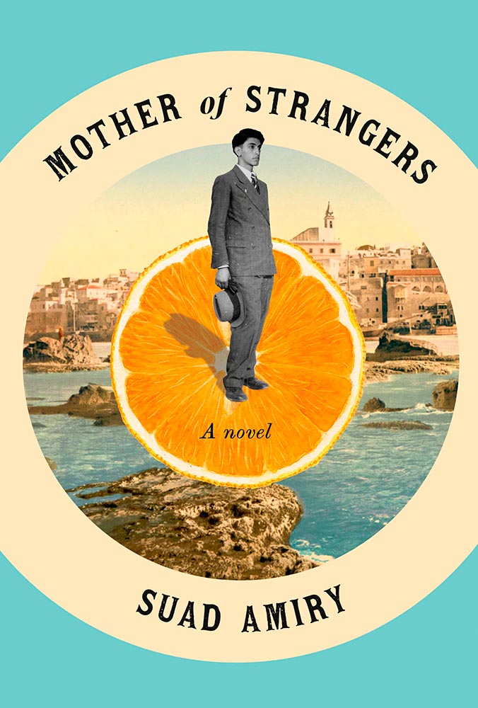
The montage, taken to the next level: Jaffa, orange exports, and an healthy serving of emotion. (Also: curved text is rarely so on-target.)
Design by John Gall.
So simple, yet it is precisely that reaching off the shelf, grabbing your attention. This book is described as “spare and monumental,” and no less can be said of the cover.
Design by June Park.
“Texture is key,” sure, but there’s texture and there’s this. The island’s brush strokes into what seem like a moon are whatever happens beyond perfection. I didn’t expect this cover for a novel about Pakistan, yet the emotion, the … evocation is perfect.
Design by Oliver Munday.
Apple? Tongue? Misfit teenager? Disturbed and distressed? Yes.
W. W. Norton didn’t respond to a request for cover design information.
Rarely are such seemingly “dry” subjects treated with such skill: the angled type set against an urgent red, the subtitle sticker-that’s-better, and the photo choices add up to something I’d grab off a shelf immediately.
Cover design: Christopher Sergio
LitHub says this one has a very high “hang on the wall” factor. I can’t think of a better description — great stuff.
Cover design: Na Kim
Na Kim just can’t help but design the best covers: a wonderful, antique background complimented by sheer brilliance. (Great typography, too.)
Cover design: Emily Mahon
It’s nigh-on impossible to look at this cover and not flip it around to read the text trisecting the leopard. Take something simple, add the elusive more, get this. Yeah.
Cover design: Jim Tierney
Another fantastic example of plants adding more than the sum of their parts. The mottled green background and watercolor-style falloff is perfectly complimentary. Great stuff.
Macmillan did not return my inquiry regarding a cover designer.
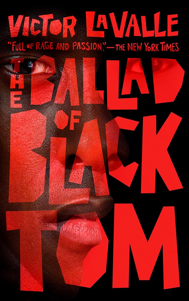
From the Banned Books Department, we have the 20th Anniversary edition of this difficult title rendered in a photo-based collage that’s nothing short of brilliant. Highest praise.
Very nearly the perfect black-and-white cover. Texture and shape combine with an incredible title treatment in a way that shrugs off the need for color. Fantastic.
Design by Allison Saltzman, art by Sonya Clark.
I’ve said before that moving to the South was a bit of a shock — the racism still all-too-evident jars all-too-often. This cover takes a simple, elegant idea and, without any of the stereotypes so often reached for, delights with style and simplicity, absolutely earning its spot in this list. (This is another of those titles that’s on many “best of” book lists, too. It’s a genuine pleasure to see worthy books get great covers.)
Design by Holly Macdonald.
“Wow” is the only word here — a stunner of a photograph used in, if I may borrow from the cover, a breathtaking way. Simple, elevated to exquisite.
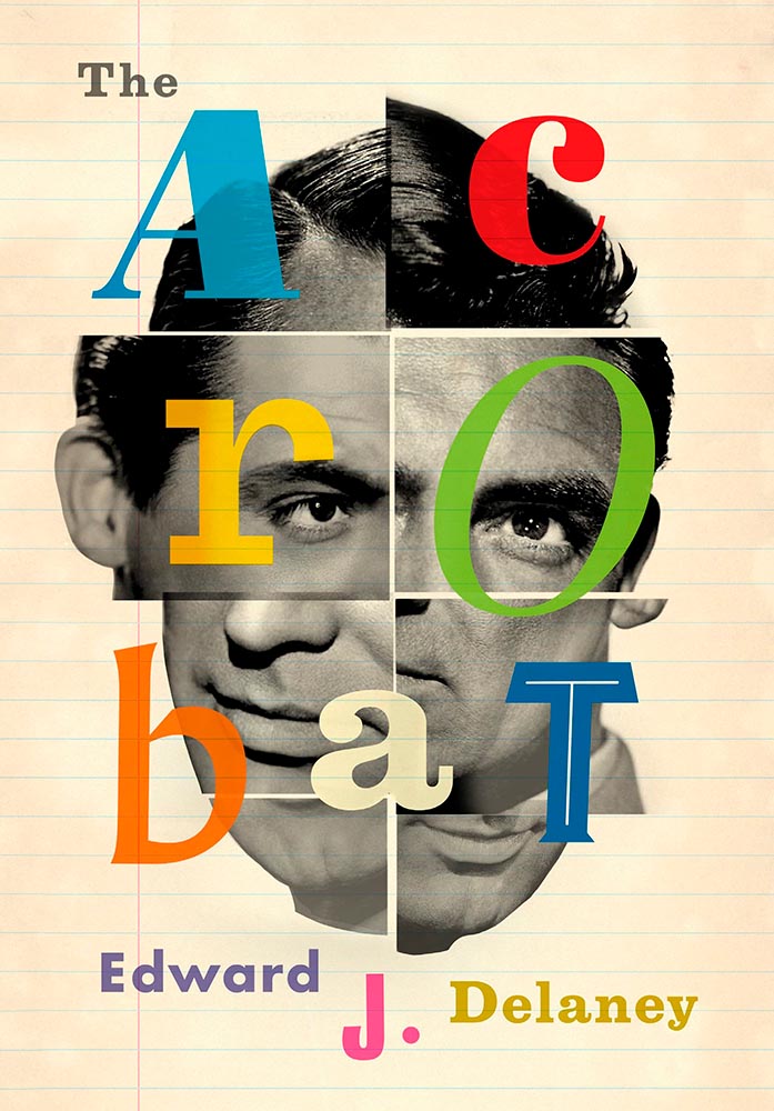
Design by Jamie Keenan.
Never mind that I never knew Cary Grant was once a stilt walker (or named Archie Leach), this is an exercise in using a famous face in an innovative way, with a cast of supporting characters that flow as naturally as lines on paper. A trip through the possible — fantastically well-done.
Design by Jamie Stafford-Hill.
Fantastic type and color treatments, yes, but it’s the way the photograph is handled that shines: where the eyes are, the color treatment implying front and side, all of it. A 2016 book reissued in hardcover with a cover guaranteed to attract new readers.
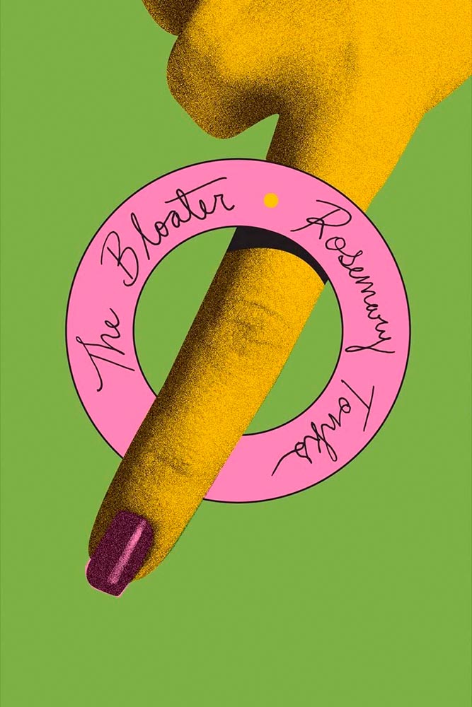
Design by Oliver Munday, or perhaps Erik Rieselbach (depending on who you ask).
This cover is the antithesis of a swelled, salted herring: it’s brisk, to the point (if I do say so), and throws a life ring out to inspire book designers everywhere.
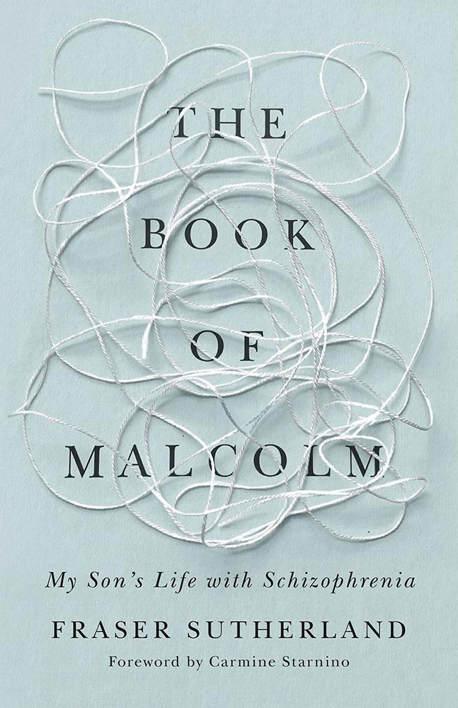
Book design: David Drummond
Brilliant: actual text, printed (on a great color paper, too), with actual string, photographed on said print. Not only is it exactly right for the subject matter, it’s simply and beautifully done.
Cover design: Jack Smyth
Never mind the great brushed color blocks or boat-rowing-the-ocean above the title. This is here mainly for the overlap between color and island: shortlisted for the prize for intersection-of-the-year.
Design by Luke Bird.
“I’ll just do a little cropping,” designers say. Then there’s … genius.
Design by Mary Austin Speaker, art by Stacia Brady.
Another piece of art that’s absolutely wall-worthy — actually by the author’s mother — complimented by a tasteful type treatment with a wonderfully-offset “poems.”
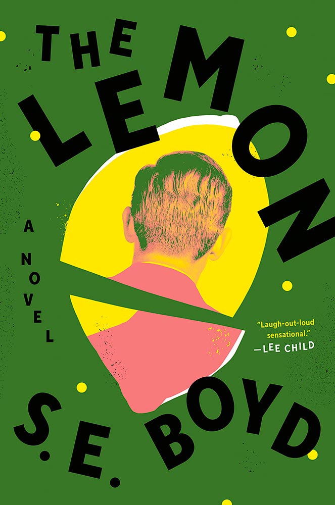
Design by Colin Webber.
“Great” can’t even begin to describe this cover — from the lemon shape, staggered type, green background, back-of-head portrait, to the slightly-aged treatment, we have ingredients that add up to that highest of achievements: a book I’d buy knowing nothing about, no hype [machine] needed.
Design by John Gall.
Classical painting with a singularity. Sure. So easily pulled off … if you’re John Gall.
Graywolf Press didn’t respond to a request regarding cover design.
The title treatment is the winner here, using two translucent shades of orange to the best possible effect — taking a nice painting/illustration to the top floor.
Design by Alex Merto.
Describing this cover as “haunting” would be a cheat — but completely accurate. (Love the line of type down the right side, too.)
Design by Jamie Keenan.
The rare type-only treatment … taken to an entirely new level. Fantastic.
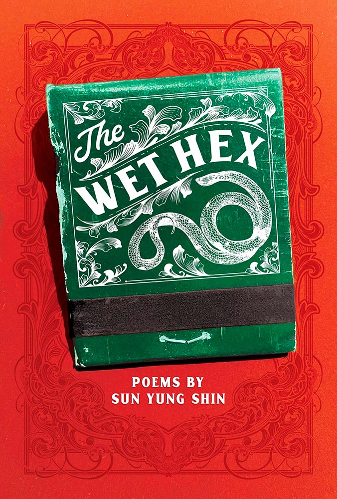
Design by Christina Vang.
A triumph of textures: one matchbook you never want to throw away.
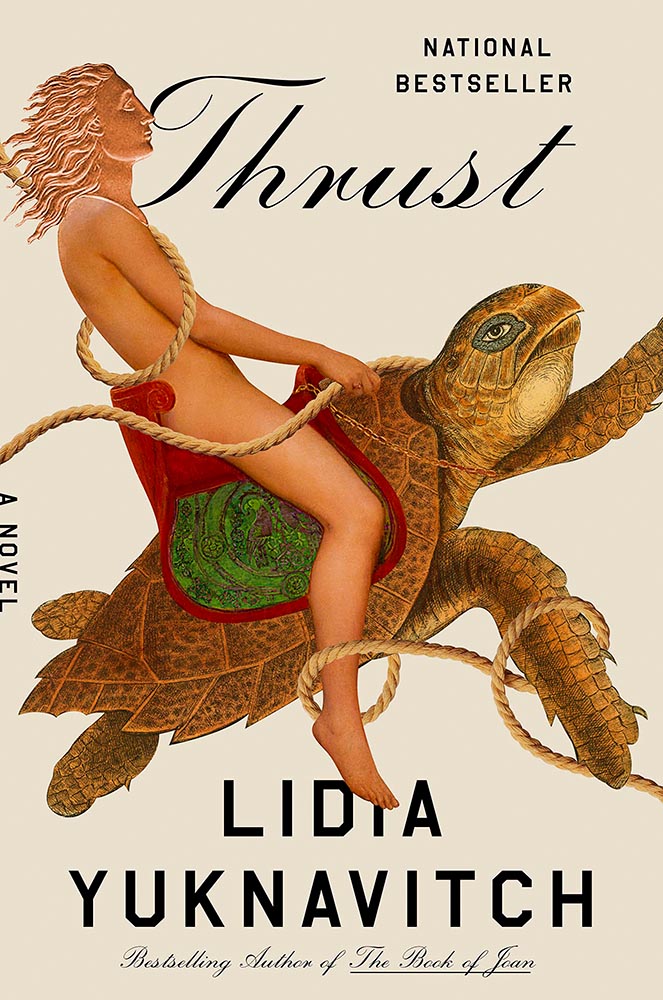
Design by Lauren Peters-Collier.
Breaks through more than water and time: it’s thrust into your memory. (See a note from the designer at LitHub’s cover reveal.)
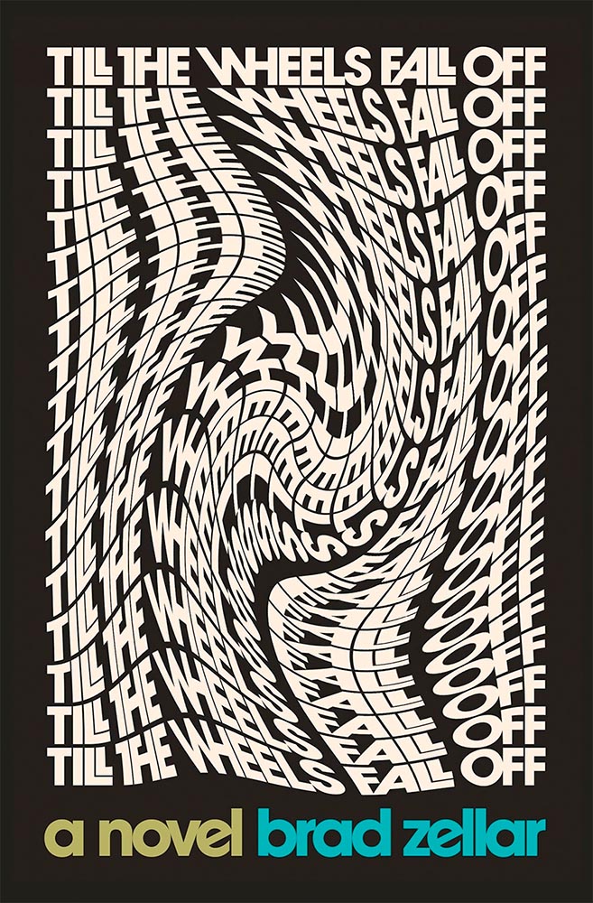
Design by Albon Fischer.
One of only two text-only treatments in this list, done in a ’70s style — yet taken to a clever and impressive level. (Love the stacked “lls.”)
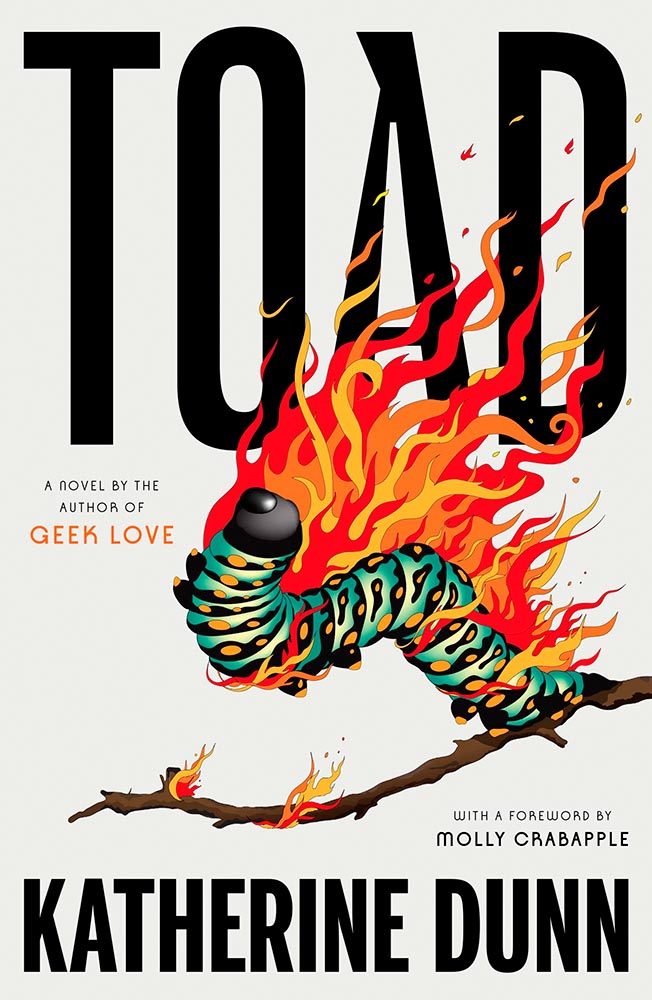
Design by June Park.
I adore how the type and frankly fantastic illustration work together here. Wonderful!
Cookbooks rarely make an appearance on “best book covers” lists — yet this one earns its spot with an antithesis-of-the-stereotype approach. Ordinary it is not, in the best possible way.
Design by Jack Smyth.
Another UK version — the US version is good, more than most even, but it’s this one that shines with its great photo choices, cut lines, and great type treatment.
Design by Katie Tooke.
This one’s a two-fer, with the UK version, above, showing the book-edge treatment done really well, while the US version…
Design by … ?
…takes it to another level. Is there such a thing as a cloud globe? Or is that one of those old-fashioned stock-ticker covers? Either way, the subtle pattern — in front in some places, receding in others — adds a wonderful touch. Great stuff. (Great, too, to see the US version take one: a rare treat.)
Cover design by Roman Muradov.
Bellevue Literary Press scores a win here, with something immediately recognizable as about music, yet so much more. Performance art, indeed.
Note: I originally attributed this title to Yale University Press instead of Bellevue Literary Press. I regret the error.
Design by Na Kim.
Na Kim apparently not only did the design but the illustration, as well. The rest of us can only aspire to that level of talent.
Cover design: Leanne Shapton
This illustration being in grayscale is, at first, a little off. But, of course, that’s exactly the point. I overuse “brilliant,” but it’s the best description. (Again, see a note from the designer at LitHub‘s cover reveal.)
Design by Elizabeth Yaffe.
Family epics, climate change, dystopian futures, and Moon — all somehow included in this rich illustration. Two-color greatness. (Bonus: Another great use of “a novel,” something often “meh.”)
Design by Brian Moore.
A standout historical photograph is only the beginning: it’s really the coloration that’s the story here, for both book and cover — so well done.
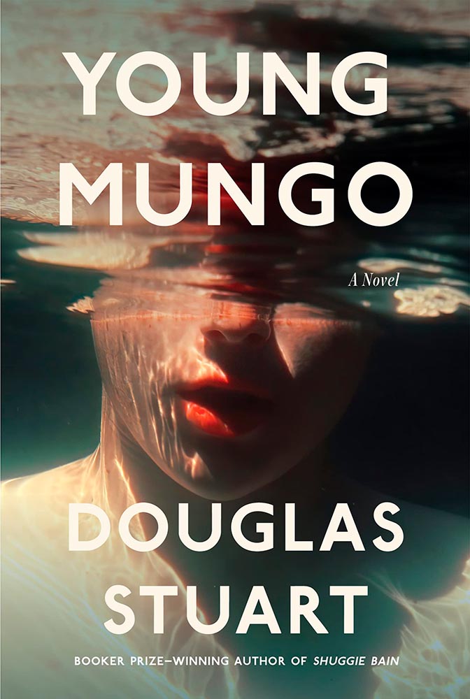
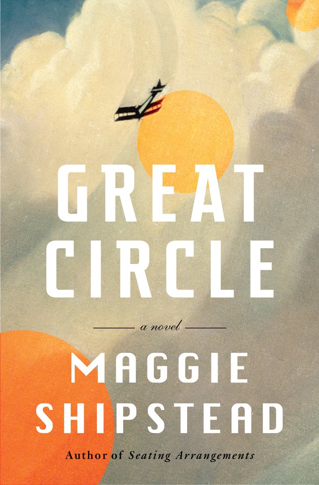
Design by Kelly Blair. Illustration by Toby Leigh.
Among the best book cover illustrations ever, perfectly inserted into the seatback in front of you. (Great Circle’s cover was in last year’s list, by the way.)
Design by Christopher Moisan.
There’s something about underwater photography, with its beautiful, soft light and fascinating reflections, that is evocative — and there’s nothing about this photograph that isn’t evocative. A triumph.
• • •
Whew. Seventy great book covers. 70!
Okay, let’s summarize: 2022’s crop of favorite covers not only surpass 2021’s, the quality of work here represent what I believe to be a new standard. To all the designers — and art directors that chose them — congratulations.
In this edition: Hummingbirds, the UK’s 2022 Landscape Photography of the Year 2022, a potential new logo treatment from Honda, and something just in time for Halloween.
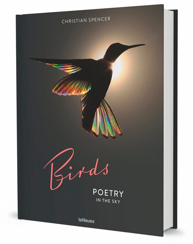
Who Knew: Hummingbird Edition
Wow.
Taken when the creatures are mid-flight and beating their wings at incredible speeds, Spencer’s striking photos capture sunlight as it filters through their feathers, emitting a full spectrum of color. The opalescent phenomenon is caused by diffraction and transforms their limbs into tiny, ephemeral rainbows.
This is Colossal
Let’s set aside for the moment the time and energy get these photographs and just celebrate that Australian photographer Christian Spencer worked to get these shots. Better still, there’s a book:
Like the typography in addition to the photograph, too. Thanks to This is Colossal for pointing us in this pretty wonderful direction.
New Honda Logo?
This hasn’t been reported anywhere, so I don’t know whether there’s a shift ahead for Honda (pardon the expression), but…:
This is a photograph — well, graphic — of the 2024 Prologue EV. Note that instead of the classic “H” seen on every Honda since I don’t know when, the name is spelled out.
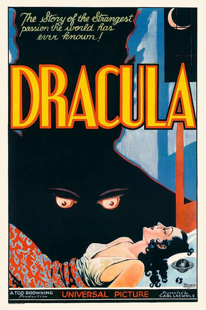
Speaking of slideshows on The Guardian, they had a great subject just in time for Halloween: “Cinema’s unquenchable thirst for vampires celebrated in posters.”
A classic.A future classic — scary-great.
Unquenchable thirst, indeed. Enjoy.
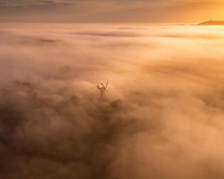
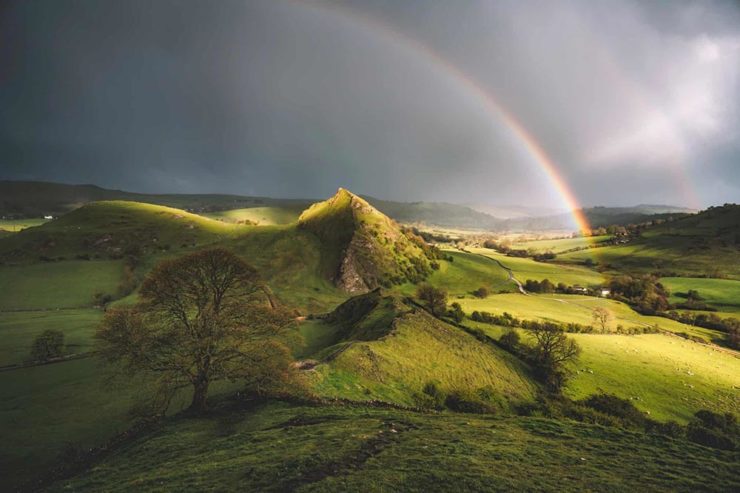
1
The aptly-named Dragon’s Back is in the Brecon Beacons National Park, Black Mountains, Wales. Take a walk.
This time, we’ve got some great book design (with a bonus), Hoefler educates on typography (with a bonus), and two updated car company logos. Let’s get right to it!
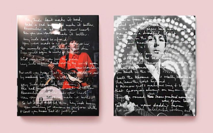
Print Magazine on the design of Lyrics
The still-very-relevant-in-2022 Print Magazine brings us a great feature on the design of Paul McCartney’s book, Lyrics:
Front and back covers of Paul McCartney’s Lyrics, by Triboro Design.
Turns out it was designed by an outfit called Triboro Design, from Brooklyn (appropriately). Print brings us an interesting interview with David Heasty, the principal:
I […] found him to be sharp, quick, articulate, and modest. Below, we discuss Paul’s involvement with the project, the book’s gorgeous bespoke typeface, and the importance of staying true to a legend’s vision.
Ellen Shapiro, Print Mag
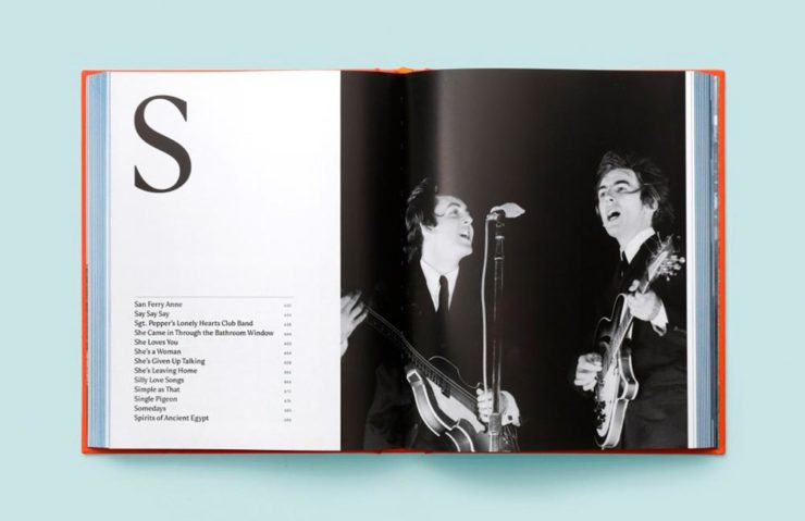
The “S” spread of Paul McCartney’s Lyrics, by Triboro Design.
Bonus: Looking at Triboro’s website, this lovely piece of typography stood out:
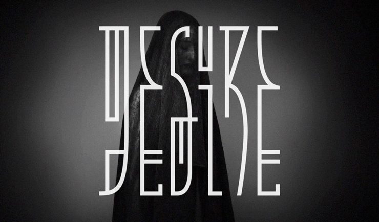
Triboro Design’s Zolo Jesus album typography creates desire.
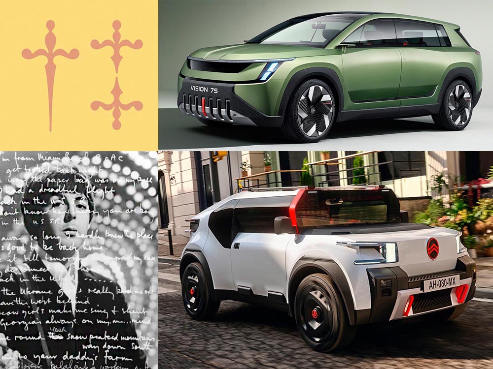
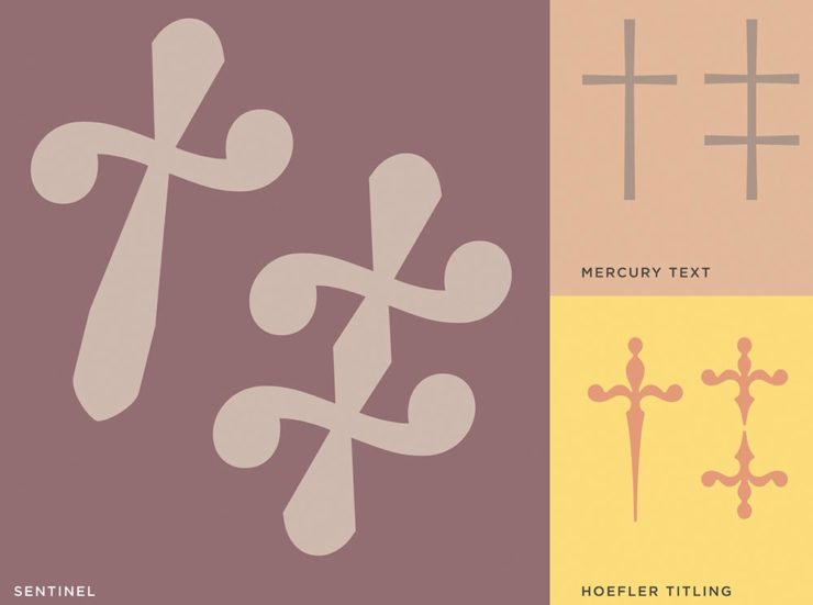
Hoefler Discusses Daggers
In “House of Flying Reference Marks,” Jonathan Hoefler talks about daggers, or, what you use when an asterisk isn’t enough:
Hoefler on daggers.
Beautiful examples, complete with a phrase you don’t hear everyday: “twisted quillon.” Read and enjoy. (If the opportunity presents, follow on with the ampersand article — which, uh, takes a stab at where the word came from. Nice.)
It seems like nearly all of the major car manufacturers have introduced a new logo in the past couple of years, but here are two more. One’s best described as “an update,” while the other … goes a little farther.
Skoda, for those that don’t know, is a Czech company and part of the massive VW Group. Frankly, it shows:
Skoda’s 2022 Kodiaq, a thoroughly VW Group product.
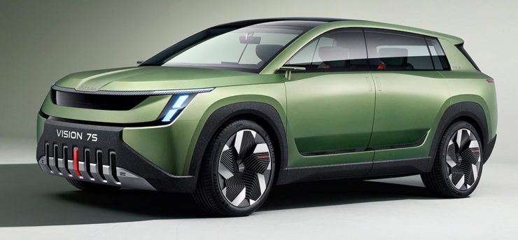
For 2023, they’re introducing a push to separate themselves from VW a little, resisting the downmarket image. As is (now) normal with updated car company identities, there’s a concept:
Skoda’s Vision 7s concept.
It’s … not inspiring. Maybe the actual updated logo will turn the corner:
Skoda’s 2022 logo.
Solid. (Pardon the pun.) But seriously, even an avid car nut like me didn’t know that represents a winged arrow — and I’m not sure the new version helps. At least they get points for consistency:
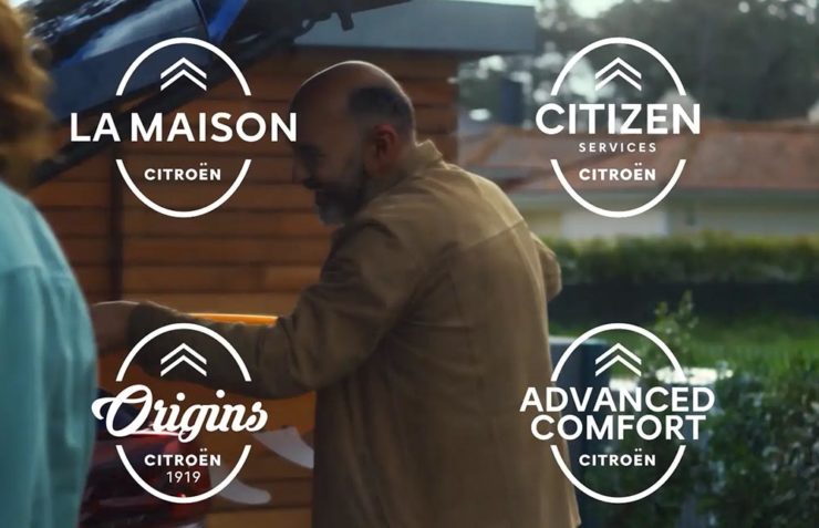
Then there’s Citroen. Even under the potentially-smothering corporate blanket that is Stellantis (there’s a name!), the pioneer of decades past still manages to actually thrive. First their new logo:
Citroen’s 2022 logo.
They’re not quite as consistent — the dual chevrons have varied a bit. This time, they’ve literally gone back to their roots, pulling the 1919/1921/1936 version out and dusting it off for modern use:
History of Citroen’s logos, 1919–2022.
Points to them for hinting at what’s to come, too:
Citroen’s 2022 logo, with just a slice of concept car showing.
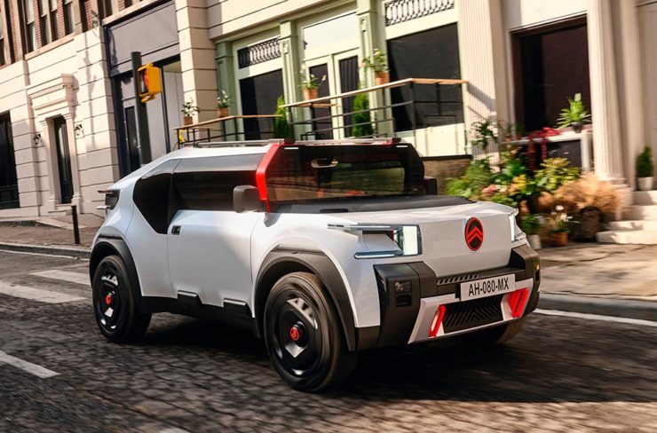
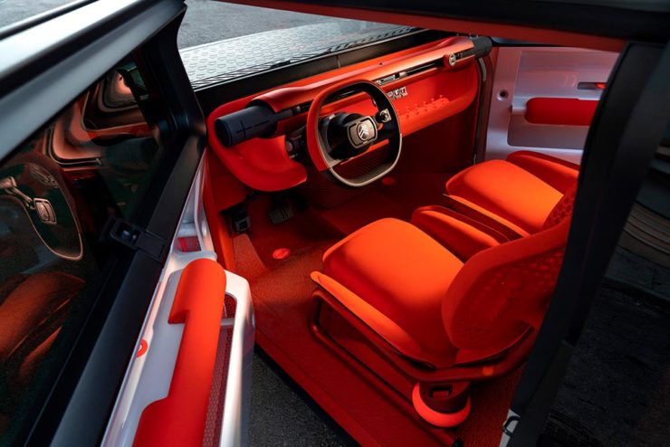
…Which turns out to be something with, ahem, Oli bits:
Citroen’s Oli: the antithesis of a Skoda.
“Nothing moves us like Citroen,” they say. The Oli moves me, to a point where I truly wish Citroen was once again available in the ’States. Cool and radically innovative, without losing sight of something VW has truly lost: fun. Well done.
Updated, 19 October, 2022:Brand New adds to Citroen’s new logo story, with a slightly-less-than-enthusiastic take on the logo and has frankly unkind things to say about the new, custom typeface (custom typefaces are now de rigueur — a policy as much related to rights ownership than creativity, alas).
I really like the cursive in this Vimeo screenshot:
YouTube? What YouTube? Citroen posts to Vimeo. Ahh, the French.
BN also includes a number of extra photographs of the simply awesome Oli, too. Here are a couple, for your enjoyment:
Plug-and-Citroen.
Note the removable Bluetooth speakers (the black tubes with “+” and “-“) and, especially, the seats:
Note: Click on the title above to see this post in one-column format, which includes larger graphics — helpful with some of these jackets especially. (This applies to any post here on Foreword, by the way.)
It’s time once again to celebrate the unsung heroes of the book world: the best items published by university presses.
The annual show, now in its 57th year, honors the university publishing community’s design and production professionals. The Association recognizes achievement in design, production, and manufacture of books, jackets, covers, and journals, and the Show serves as a spark to conversations and source of ideas about intelligent, creative, and resourceful publishing.
Association of University Presses 2022
This show, like the 50 Books, 50 Covers also announced around this time of the year, is cool in that it doesn’t just talk about a book’s exterior — there are covers and jackets, interior design, even awards for the quality of typography.
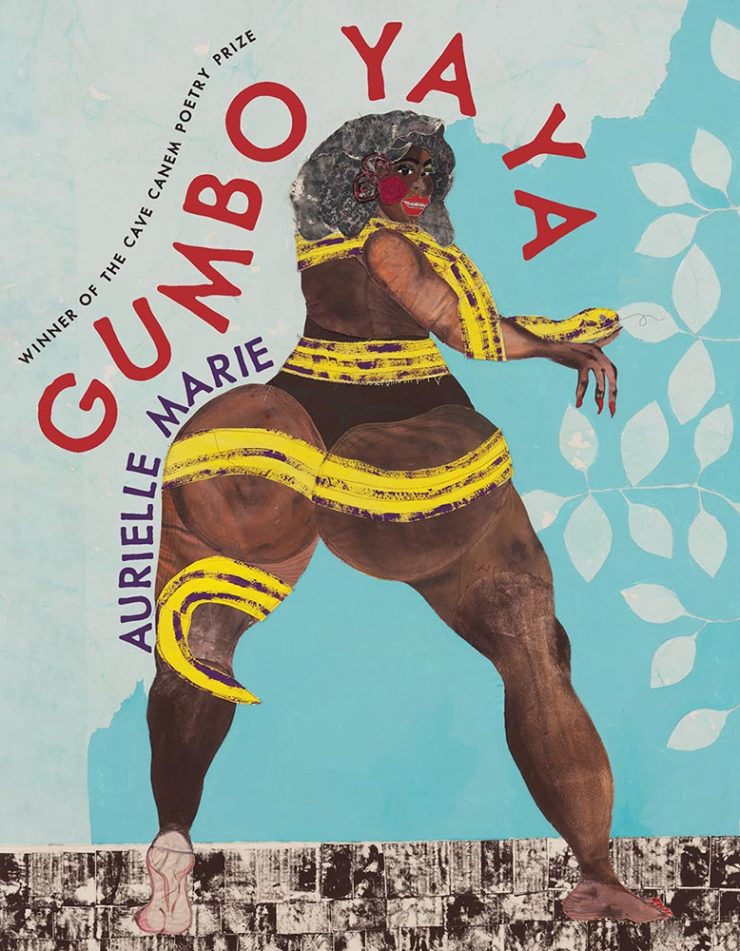
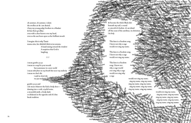
Let’s talk about titles with both covers and interiors first, starting with the great Gumbo Ya Ya from the Poetry category:
University of Pittsburg Press. Cover design by Alex Wolfe.University of Pittsburg Press. Interior design by Alex Wolfe.
The strength of this design, inside and out, towers head and shoulders and whatever else above — designer Alex Wolfe deserves this win and many kudos from me.
Georgetown University Press. Design by Jeff Miller.
Flag-as-fence. ’Nuff said.
McGill-Queen’s University Press. Design by David Drummond.McGill-Queen’s University Press. Design by David Drummond.McGill-Queen’s University Press. Design by David Drummond.
I don’t know that these are a series of titles as much as a style forthe titles — but, in either case, they work.
University of Pittsburgh Press. Design by Henry Sene Yee.
Not the only title here with textured paper, the simple typography with a fantastic — and fantastically-placed — bird wins for more than literature.
University of Minnesota Press. Design by Casalino Design.
The white border around this is difficult to see here, but adds to the overall in an interesting way; I also like the hand lettering over this amazing photograph.
University of Nebraska Press. Design by Nathan Putens
Additive color combined with the subtitle-of-the-year on this winner.
Princeton University Press. Design by Derek Thornton.
Great, great typography here. When combined with the radiating lines and provocative title, it makes for a title that I’d absolutely pick up.
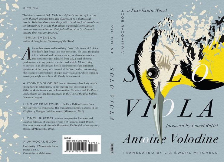
I’ve saved my favorite from the whole show for last:
University of Minnesota Press. Design by Michel Vrana.
Another appearance of textured paper is just the start here, with that illustration rocking so hard indeed — the eye! Fantastic in every way. (Bonus points for “A Post-Exotic Novel.”)
See all of the entries from this great Association of University Presses show here. (FYI, nothing from Spine yet, but kudos to the University of Chicago Press for blogging about their favorites.)
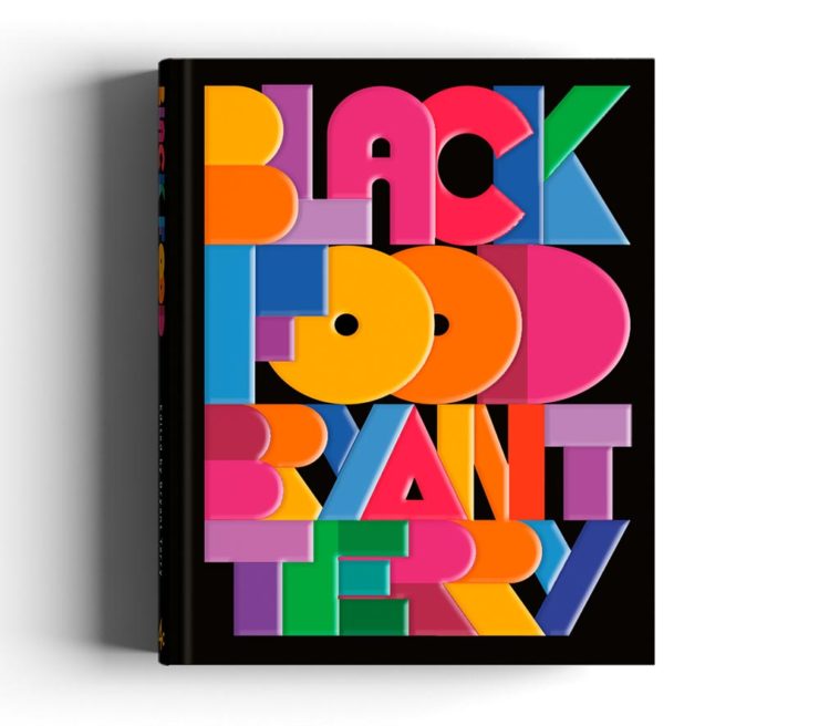
AIGA has announced their winners of the 2021 50 Books, 50 Covers competition:
With 605 book and cover design entries from 29 countries, this year’s competition recognizes and showcases excellence in book design from around the world. […] Eligible entries for the 2021 competition were open to books published and used in the marketplace in 2021.
AIGA Press Release
In this year’s competition, innovative book designs for topics ranging from designing and motherhood, African surf culture, stories of resistance, visual histories of Detroit, Black food traditions, and more all give our jury life, hope, and visible windows into new possible worlds. The covers and books we looked at had a diverse range of visual language and took aesthetic risks.
Silas Munro, AIGA [Competition] Chair
As usual, there are items here that I haven’t seen before, along with several that surfaced on others’ “best of 2021” book design lists (see that Foreword post for my faves). Also as usual, there are some excellent choices.
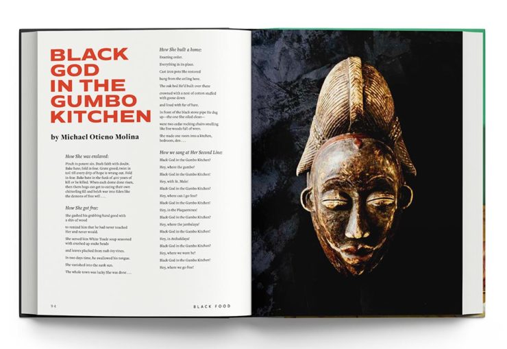
Further, there’s something in this competition that you don’t see in the usual “best of” posts: interiors. Half of the competition is covers, sure, but the other half considers the whole book design — and sometimes, as I can definitely attest, an underwhelming cover can lead to a treasure within.
But enough talking. My favorites, in no particular order:
Cover by George McCalman.Book design by George McCalman.
This is one from the 2021 “best of” finalists that I didn’t post about — but now that I’ve seen the interior…. So very worthy. (See more.)
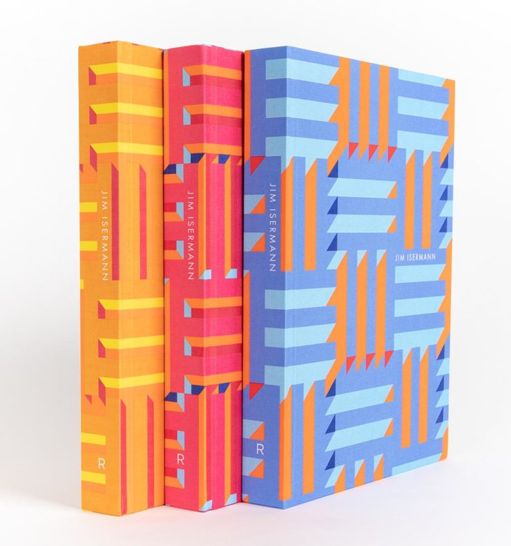
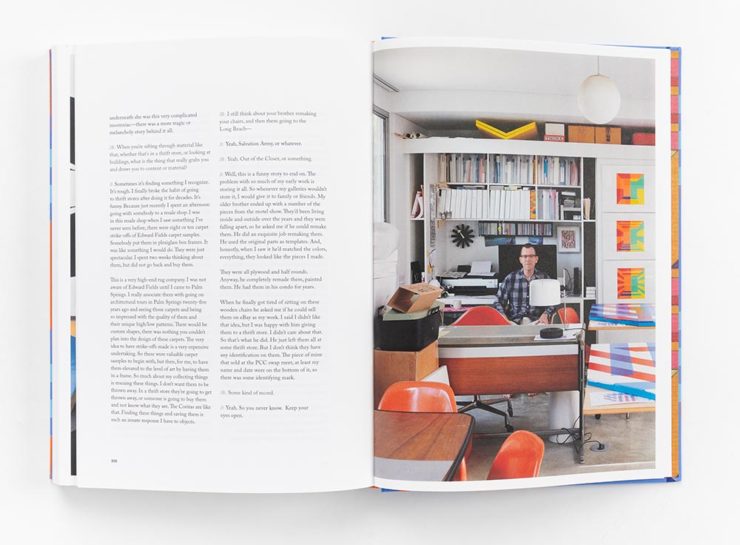
Cover design by David Chickey and Mat Patalano.Book design by David Chickey and Mat Patalano.
This series of three books not only have striking covers I’d not seen before but exceptionally competent interiors done on matte paper, a personal favorite. (Click through for more examples.) Excellent.
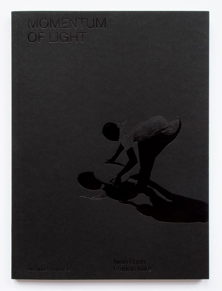
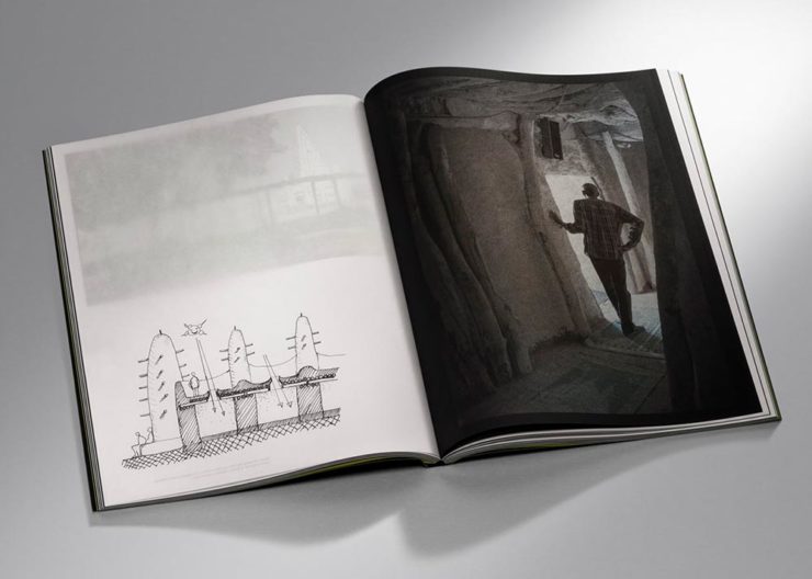
Design overseen by Haller Brun.Design overseen by Haller Brun.
In this fascinating book, architectural photographer Iwan Baan and (Pritzker-winning) architect Francis Kéré “set out to capture how the sun’s natural light cycle shapes vernacular architecture.” While I may be slightly biased in terms of architecture and photography, this one’s a winner. (Read the AIGA’s take.)
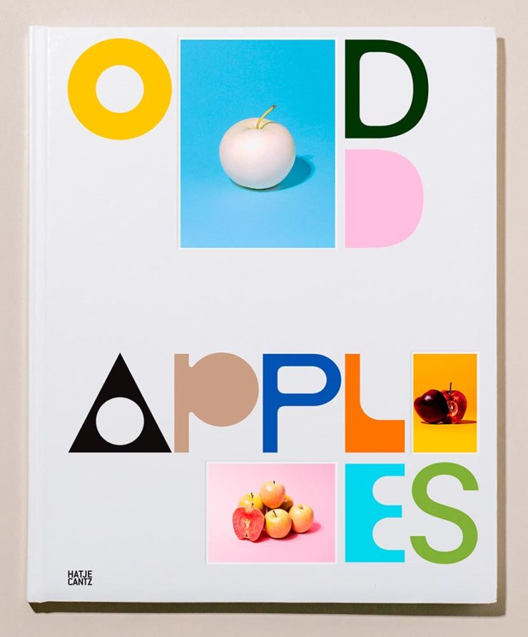
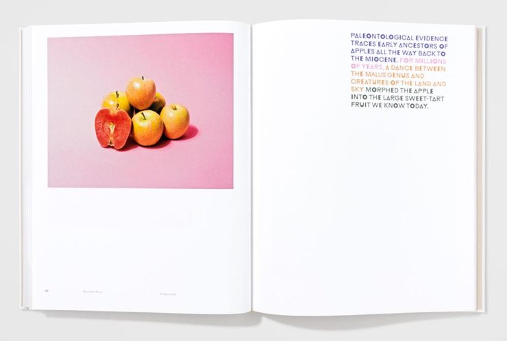
Cover by Andrea A. Trabucco-Campos.Book design by Andrea A. Trabucco-Campos.
“A little overly precious,” the AIGA says … while awarding it a prize. Completely fresh, I say, with interesting content presented in a way that does considerably more than interest. Well done. (See them apples.)
Cover by Gary Fogelson and Ryan Waller.Book design by Gary Fogelson and Ryan Waller.
“The type on the cover and in the body is perfect, in all ways and choices. The use of the gutter for captions is a great understanding of the art and a perfect way to save space. The page numbers too.”
Brian Johnson, AIGA Judge
This is one of those books that you have to say, “I wish I’d done that.” Great stuff. (See its individual entry.)
The Time Formula. Cover by Honza Zamojski.Book design by Honza Zamojski.
There always seems to be some projects that violate book design “rules” — this one doesn’t have a title on the cover, has page numbers in the gutters, and more. Yet this book, about a sculpture project, makes for interesting viewing indeed. (See more.)
Last, we have a couple that are only covers:
Cover by Janet Hansen.
This was considered for my favorites of 2021 (and made it onto others’ lists). I’m glad to have been given the chance to call it out. Excellent in its simplicity. (See the AIGA entry.)
Last, but certainly not least:
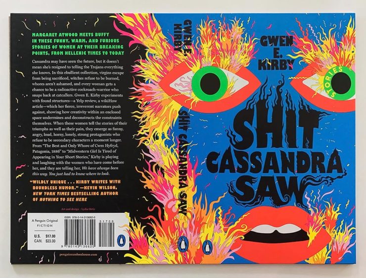
Cover by Lydia Ortiz.
Another advantage of this competition: seeing more than the front cover. And this cover, front, back, and spine, is so much more — especially in person: black plus four neon inks. Wow. (See the AIGA’s praise.)
Car site The Autopian scores with book design, Ford posts old marketing material gold mine, and more on the Eames Institute of Infinite Curiosity in this edition of Beautifully Briefed.
Autopian suggests book design
The Autopian, founded by a couple of former Jalopnik writers, is a new automotive gem: in these days of more-of-the-sameism sites trying to make money of others’ ideas, the Autopian has a retro style and interesting, original content.
Including this short post from their Cold Start column:
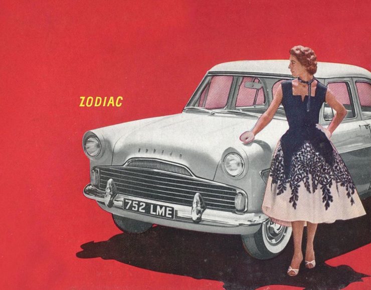
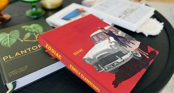
Sometimes you may encounter an old car ad and realize that the design of it could lend itself very well to something completely different. In this case, this 1958 Ford Zodiac ad, with its rich, saturated colors, striking dress on the model, and evocative name with understated typography just feel like something you’d see on modern book cover design.
Jason Torchinsky, Autopian Founder
The ad:
A 1958 Ford Zodiac (European)
His book design idea “realized”:
Jason’s book cover mock-up. Love the author name.
Nice.
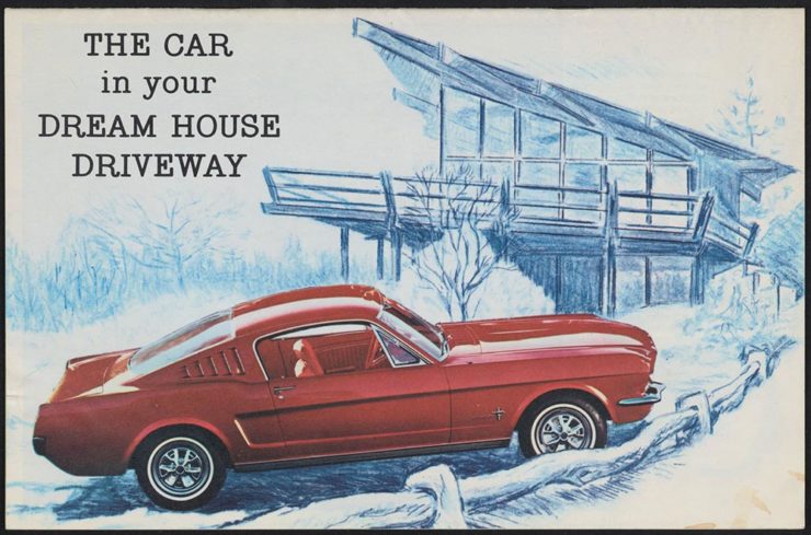
The Ford Heritage Vault
Ford has taken the unusual step of posting a good chunk of their old — 1903 to 2003, their first 100 years — marketing materials online: “promotional materials, photographs, and all kinds of other historical goodies,” according to CarScoops.
“Our archives were established 70 years ago, and for the first time, we’re opening the vault for the public to see. This is just a first step for all that will come in the future,” says Ted Ryan, Ford archive and heritage brand manager.
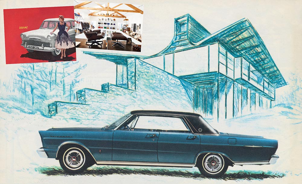
Here’s a personal favorite: the 1965 full line brochure, showing the cars set in architectural drawings — presumably, matching the car to the house:
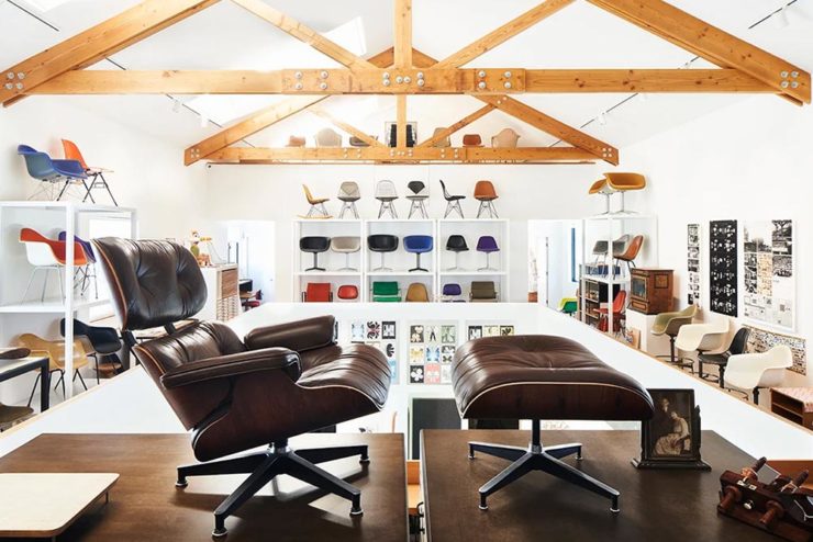
We discussed the Eames Institute of Infinite Curiosity back in April, but Metropolis magazine has published an extensive article covering a visit to the Institute.
Modernism has largely been diluted from a series of ideas rooted in social change to one of just style—Instagram moments, if you will. The Eameses insisted that they did not have a style or even an “ism.” […] Modernism was an idea, not a style. With the establishment of the Eames Institute, I hope Charles and Ray will be remembered most of all for their ideas and processes.
Kenneth Caldwell, Metropolis
An exhibit at the Eames Institute of Infinite Curiosity.
With our ongoing struggle to use materials more efficiently, many of the Eameses’ ideas and ideals need to be taken for the solutions that they are: style with incredible substance.
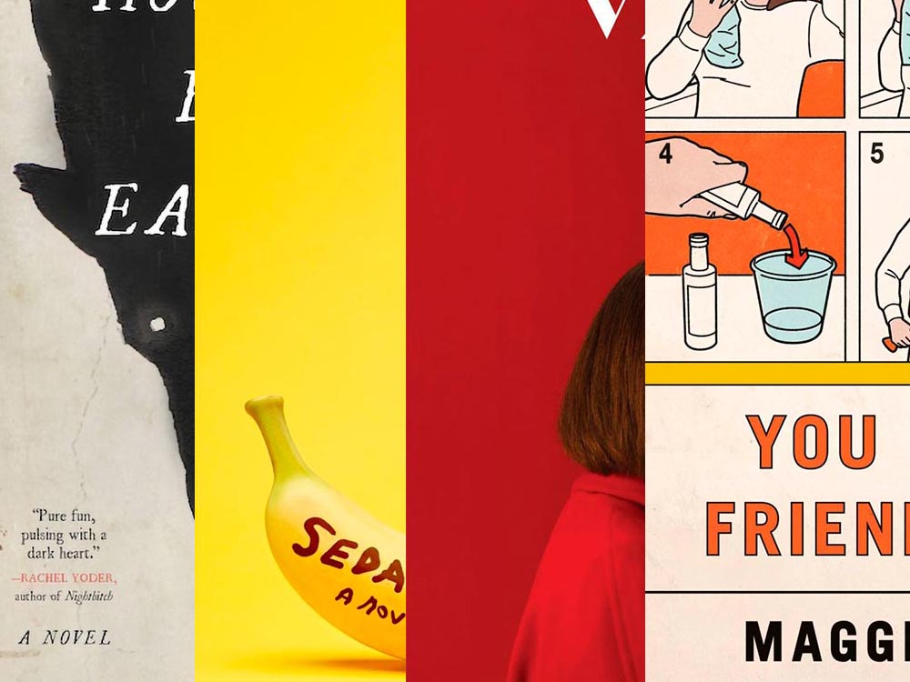
A book design treat for your Monday morning: four of my favorite new book covers from last month’s debuts.
How To Be Eaten. Design by Julianna Lee.
Aged, distressed paper is a great look when done well, and this one hits all the right notes. The size relationship between the characters, the glow around the eyes, the two color choices, the type, all of it — great stuff.
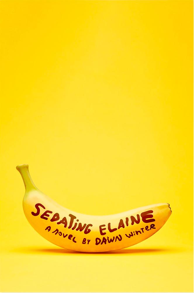
Sedating Elaine. Design by Janet Hansen.
A veritable how-to on less-is-more. Brilliant.
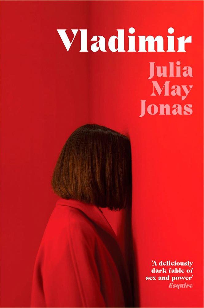
Vladimir. Design by Katie Tooke.
Another solid-color triumph. Great font choice here, too. Awesome.
I’ve saved the best for last:
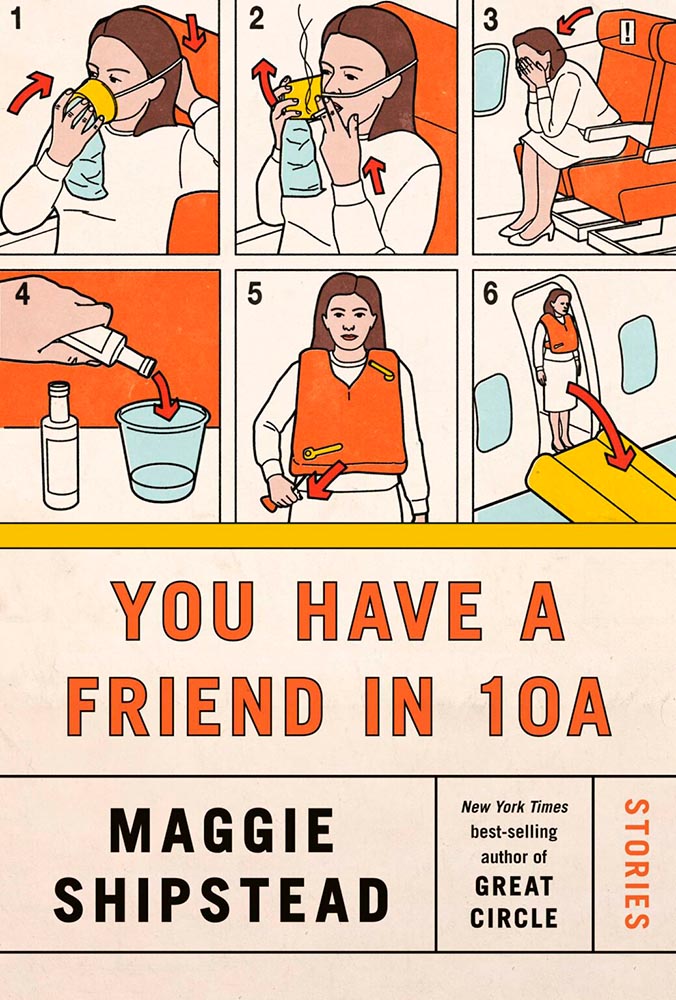
You Have a Friend in 10A. Design by Kelly Blair.
Great Circle has featured before, and this follow-up takes us inside the plane and into the safety brochure in the best possible way. Great, brilliant, and awesome wrapped into one.
Update, June 20th: WABE, Atlanta’s NPR station, has a summer reading list out, highlighting Georgia books and authors — and I’d like to include two of the covers here:
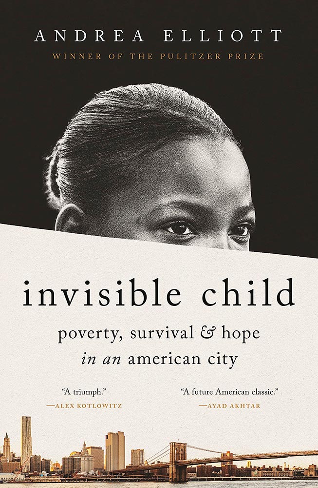
Invisible Child.
The grainy photograph, the wonderfully placed city skyline, and classic typography, combined with the diagonal cutline, elevate this title from mundane to eye-catching.
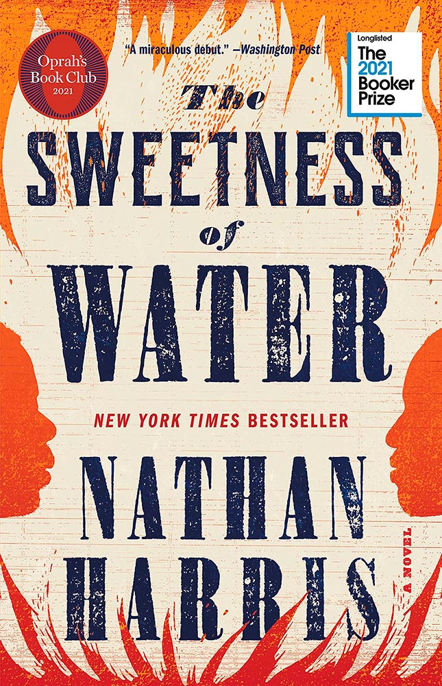
The Sweetness of Water.
Excellently distressed doesn’t begin to describe this, on many levels. Side note: it’s a terrible shame that the Oprah and Booker call-outs have been elevated to logo status in what can politely be described as a distraction (from a book designer’s point of view, at least).
For your May Day, please take a closer look at twelve great book covers — and a bonus thirteenth! — spotted during the first four months of 2022.
In alphabetical order:
Book design: David Drummond
Brilliant: actual text, printed (on a great color paper, too), with actual string, photographed on said print. Not only is it exactly right for the subject matter, it’s simply and beautifully done.
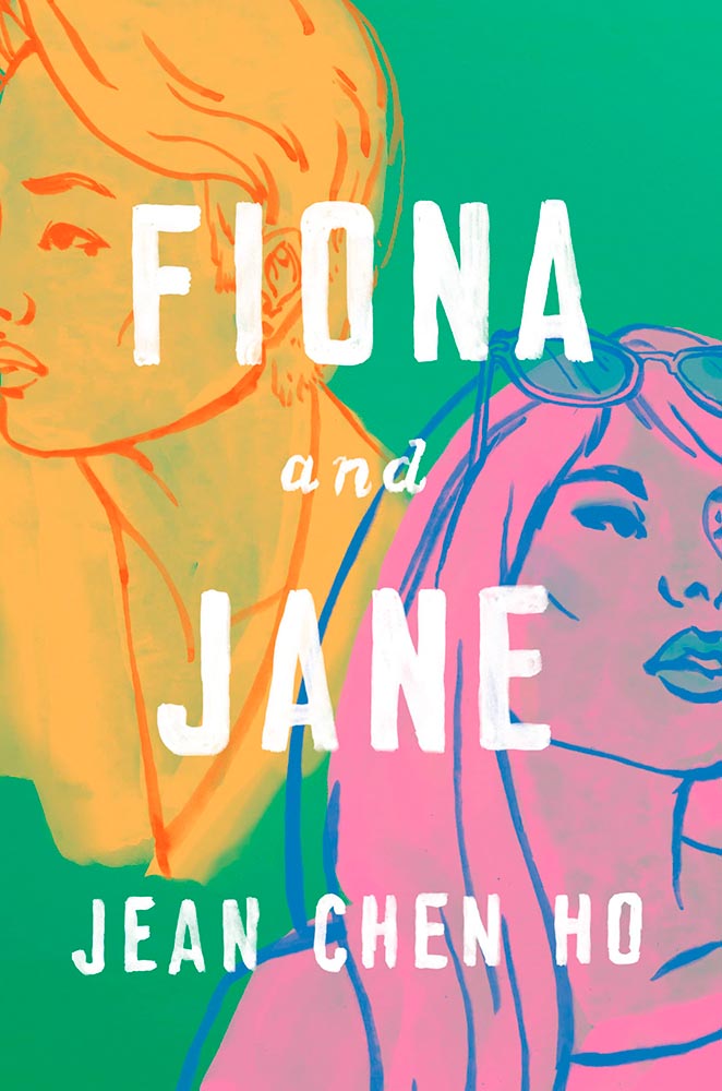
Cover design: Brianna Harden
Another great background color choice, this time highlighting the awesome colors chosen for Fiona and Jane’s illustrations. The hand-painted text is perfectly done.
Cover design: Vi-An Nguyen
Woodcut or just aged? Doesn’t matter, as “brilliant” falls short when describing this title.
Cover design: Alex Merto
From It’s Nice That, we have a nice feature on Alex Merto — whose Ghost Wall cover is a great example of plant life adding so much more: “the force of a river to the head,” to paraphrase Emma Donoghue’s quote.
Cover design: Anna Morrison
The typography, awesome little plane — the purse(r)! — the clouds, all of it: sky-high levels of good.
Interestingly, Fight Night‘s cover has gotten notice before:
Cover design: Patti Ratchford, illustration: Christina Zimpel
I can’t begin to imagine what caused the redesign, or why it wound up being so radically — 180 degree! — different. The old design wound up on some “best covers” lists (here’s LitHub’s October 2021 post, for instance); the new one has wound up on mine.
Cover design: Christopher Sergio
LitHub says this one has a very high “hang on the wall” factor. I can’t think of a better description — great stuff.
Cover design: Na Kim
Na Kim just can’t help but design the best covers: a wonderful, antique background complimented by brilliance. (Great typography, too.)
Cover design: Emily Mahon
It’s nigh-on impossibly to look at this cover and not flip it around to read the text trisecting the leopard. Take something simple, add the elusive more, get this. Yeah.
Cover design: Jim Tierney
Another fantastic example of plants adding more than the sum of their parts. The mottled green background and watercolor-style falloff is perfectly complimentary. Great stuff. (Except: This is one of those times when an editor or publicist somewhere says, “Hey, we need to add this quote at the top. Let’s do it without consulting the cover designer.”)
Cover designer … unknown. Credit where credit is due — when I can.
Never mind the great brushed color blocks or boat-rowing-the-ocean above the title. This is here for the overlap between color and island. Shortlisted for the prize for intersection-of-the-year.
Cover design: Leanne Shapton
This illustration being in grayscale is, at first, a little off. But, of course, that’s exactly the point. I overuse “brilliant,” but it’s the best description. (See a note from the designer at LitHub‘s cover reveal.)
So, the bonus. No, it’s not the extra Fight Night, above, it’s a fictitious cover. That’s right:
Cover design: Anna Hoyle
In another It’s Nice That post, we have Anna Hoyle: “Judge her fake books by their comical covers.” Okay!
More book design updates soon — ’cause, here in Georgia, USA, we’re done with spring. Summer starts . . . now.
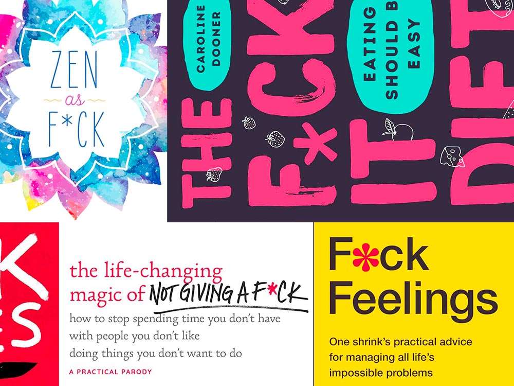
Kottke recently revisited a theme that’s been running for a few years now: titles with a swear — f*ck, in this case — in the title. According to Slate, the practice stems from the 2011 parenting title Go the F*ck to Sleep, and has accelerated over the years.
I’m more interested in the design of such a title. Bookstores, advertisers, and publicists demand that the swear never be completely spelled out, but that doesn’t restrict great design ideas. Here are a few of my favorites:
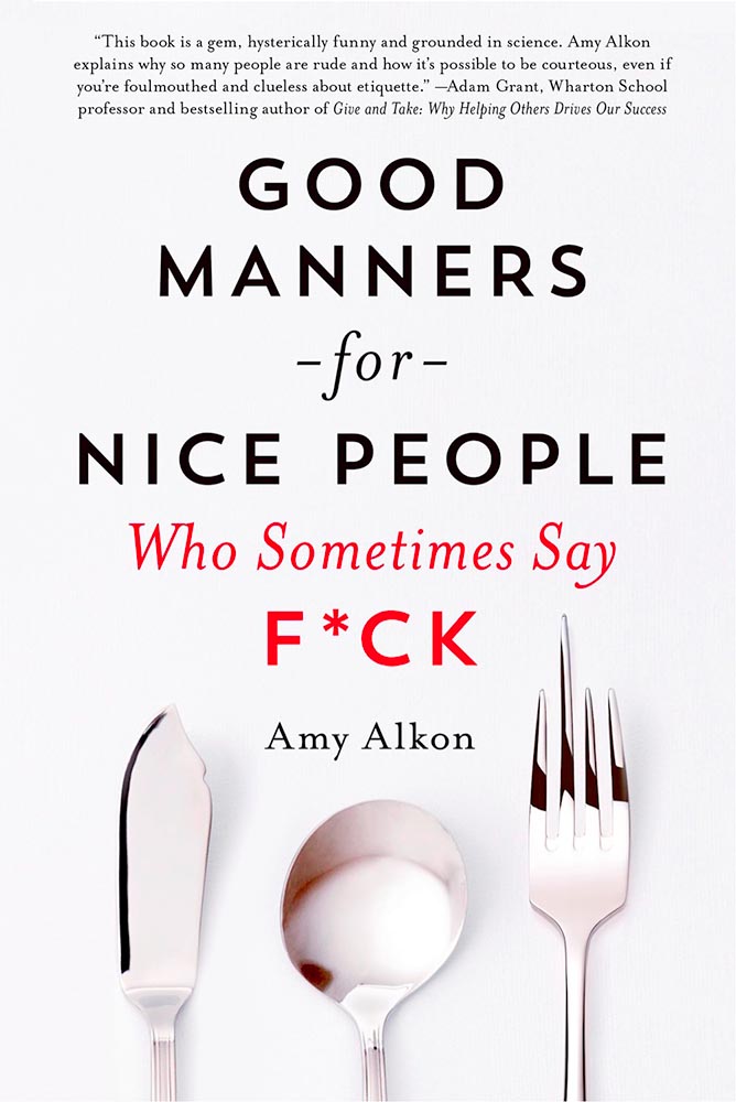
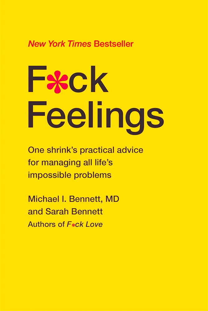
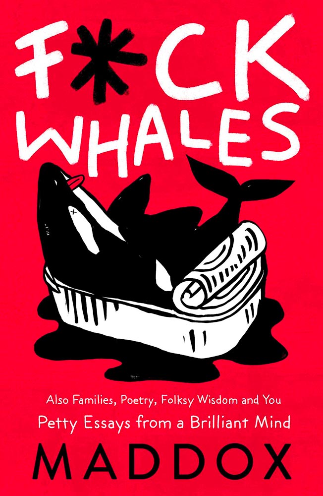
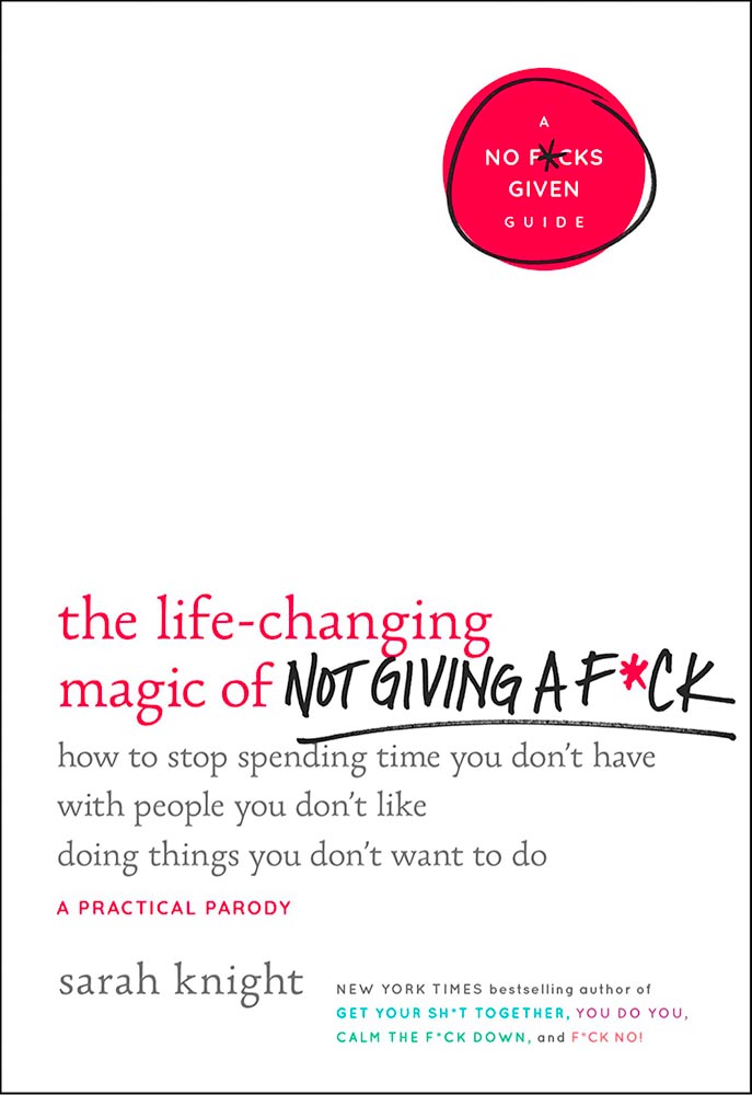
Love the fork. (So to speak.)The less-is-more approach.Whales as sardines.Interesting choice with the capitals, or lack thereof.
Note the over-arching theme: no, not that — the lack of photography. The vast majority of these titles are text based, supposedly because something competing with the swear would detract from the shock value. There’s a primary color thing going, too, probably for the same reason.
Three diverse items in this round-up, from illustration to typography to whether or not ad-blockers are actually environmentally-friendly — along with a response that reminds us to look at the bigger picture.
Malika Favre (Expanded Edition)
CreativeBoom:
French illustrator and graphic designer Malika Favre has been impressing audiences for years with her minimalist work for publications such as The New Yorker, Vogue, and Vanity Fair. Now over a decade’s worth of her work has been released in a new monograph from Counter-Print, which contains a suitably stripped-back aesthetic.
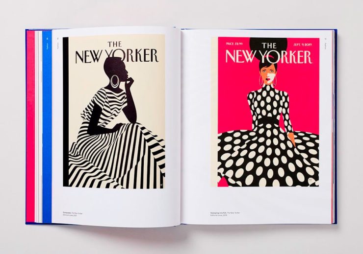
Her style is distinctive; I’ve liked her New Yorker covers especially:
Malika Favre (Expanded Edition) in English
The book includes the illustrator’s own cover, and she had a big hand in designing the layout, too. CreativeBoom’s article is excellent — check it out.
Throughout yet another “unprecedented year,” it’s safe to say that the macro trends influencing the type design community are nearly too long to list. Several socioeconomic, political, and cultural events continue to shape the way we approach creative work and how connect to each other online and offline.
Biodiversity’s relationship to type, varying type styles in a single logo, and thin serifs — the one I’m likely to use somewhere — are in this year.
Media, Trackers, Blockers, and the Environment: There’s a Problem
Did it ever occur that using an ad blocker in your browser is actually an environmentally-friendly move? No, I hadn’t put it together, either.1More from MIT on ecological impacts of cloud computing here.
70% junk. Surprise and shock (not really).
[U]p to 70% of the electricity consumption (and therefore carbon emissions) caused by visiting a French media site is triggered by advertisements and stats. Therefore, using an ad blocker even becomes an ecological gesture. But we also suggest actions web editors could take to reduce this impact.
An interesting study, certainly, with information that many of us already use and some suggestions for action in case we don’t. But…:
Another of Monotype’s 2022 Type Trends, appropriated for use here
Nick Heer:
I have qualms with this. The idea of a “carbon footprint” was invented by British Petroleum to direct focus away from environmental policies that would impact its business, instead blaming individuals for not recycling correctly or biking to work more. A “carbon footprint” is also a simplistic view of how anything contributes to global warming, and that it seems to be used here as a synonym for bandwidth and CPU consumption.
I’m not sure whether I’ve called out the excellent Pixel Envy2A sort-of Daring Fireball with Canadian roots, but this is an example of why I should.
That is where I think this well-intentioned study falters. Even so, it is absurd that up to 70% of a media website’s CPU and bandwidth consumption is dedicated to web bullshit. Remember: the whole point of web bullshit is that it is not just the ads, it is about an entire network of self justifying privacy hostile infrastructure constructed around them.
1
More from MIT on ecological impacts of cloud computing here.
As some of you know, for getting around town, I zip about in an electric BMW i3. The range isn’t great — 120 miles, give or take, meaning I’d have to recharge there if I went to Atlanta — but for Macon and pretty much all of Middle Georgia, it’s perfect. Grocery store? No problem. Park, for a walk? No warmup, no emissions. Enough range for an ice cream in Musella or lunch in Milledgeville? Easy.
In fact, it’s not an understatement to say that I rave about my i3. Simply put, I love it.
Electric Toolbox, Wooden Shed
When introduced in 2014, it was hugely ahead of its time. Built on a bespoke platform with a carbon-fiber body and an eye-catching style (that somehow just looks electric), it was a huge change of pace for the “Ultimate Driving Machine” folks. And it’s done well for them, too: a quarter-million since.
Leica has announced their photograph of the year for 2021:
Over the past ten years, Leica Camera AG has honoured twelve renowned photographers for their life’s work, by inducting them into the Leica Hall of Fame. A Leica Picture of the Year has now been designated for the first time, with the aim of sharing this success with all Leica enthusiasts.
Leica’s 2021 Photograph of the Year
One of the things that makes photography so glorious is how many different ways the person behind the camera could approach a subject. So, I ask myself: would I have taken that photograph? Almost certainly not. That said, would I hang it on my wall? Yes. For $2000? Maybe another lens instead!
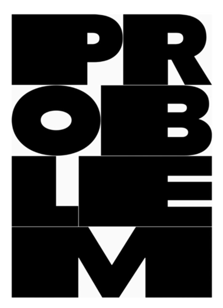
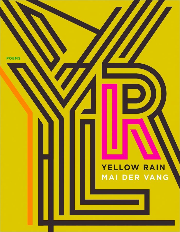
Lastly, the New Yorker’s Briefly Noted book reviews (from 6 December — I get them second-hand, and subsequently, am a little behind) reveals a collection of poetry — a reinvestigation of chemical weapons dropped on Vietnam — whose cover is sublime:
Housekeeping news: I went back to having an actual website in June, 2019; for a few years, I’d just used a photography hosting service, as photography was the vast majority of what I did. However, when book design again became an important-enough part of my work, I wanted to have a space to talk about it. I bought a WordPress template, added photographs, and posted it.
…But I never really liked it. From the beginning, I felt y’all deserved more: better typography, better photography, better everything. Like so many, however, one’s own stuff is always at the bottom of the to-do list. No longer.
I’d like to introduce the new version:
The new gileshoover.com, January, 2022
There were a few bumps getting here (naturally, I broke everything along the way; to say I don’t code is an understatement!), but with some tweaking notwithstanding, the new gileshoover.com is live. It’s got all-original photography, matched sans and serif font superfamily (Merriweather by Sorkin Type, a Google Font), much faster response time, open-source foundations, and so on.
Note that entries on Foreword are best seen individually, as you’ll see bigger photographs (or illustrations, graphics, etc.). Click on entry titles to get there.
This post is late, because I had trouble narrowing my long list down . . . and then, when even the short list was too long, said, “heck, 21 is too few for a year with such superlative design.” So, instead of 21 for ’21, y’all get 50. Grab a delicious beverage, settle in, and enjoy.
Please remember that these are my favorites — others might say “best,” but I’ve been in this business long enough to know that there’s always another great title you haven’t seen or read about, and I don’t want to disrespect any of the great book designers not on this list. I’ve tried to include design credit where I could (thank you to the folks who answered emails with that information), and I wish to stress that any mistakes (incorrect attribution, link not working, etc.) in the list below are mine.
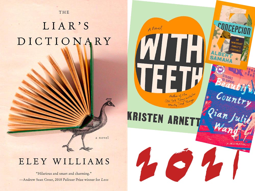
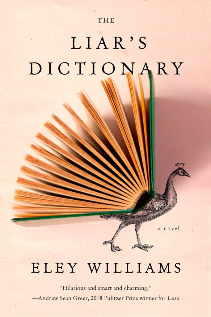
My cover of the year is one of those combinations of photography and printed word that works on multiple levels. Okay, sure, it’s called Liar’s Dictionary, so I may totally be pulling your leg here, but:
“We all peacock with our words,” one reviewer said: exactly right. I’m wondering about the direction of the shadow — some Monday morning quarterbacking, for certain — but otherwise, I’d be incredibly pleased to have this cover in my portfolio. It speaks to what I aspire to, which is the best photography and best graphics working in beautiful concert. Design by Emily Mahon. (Bonus: See a Spine write-up on Emily from 2017.)
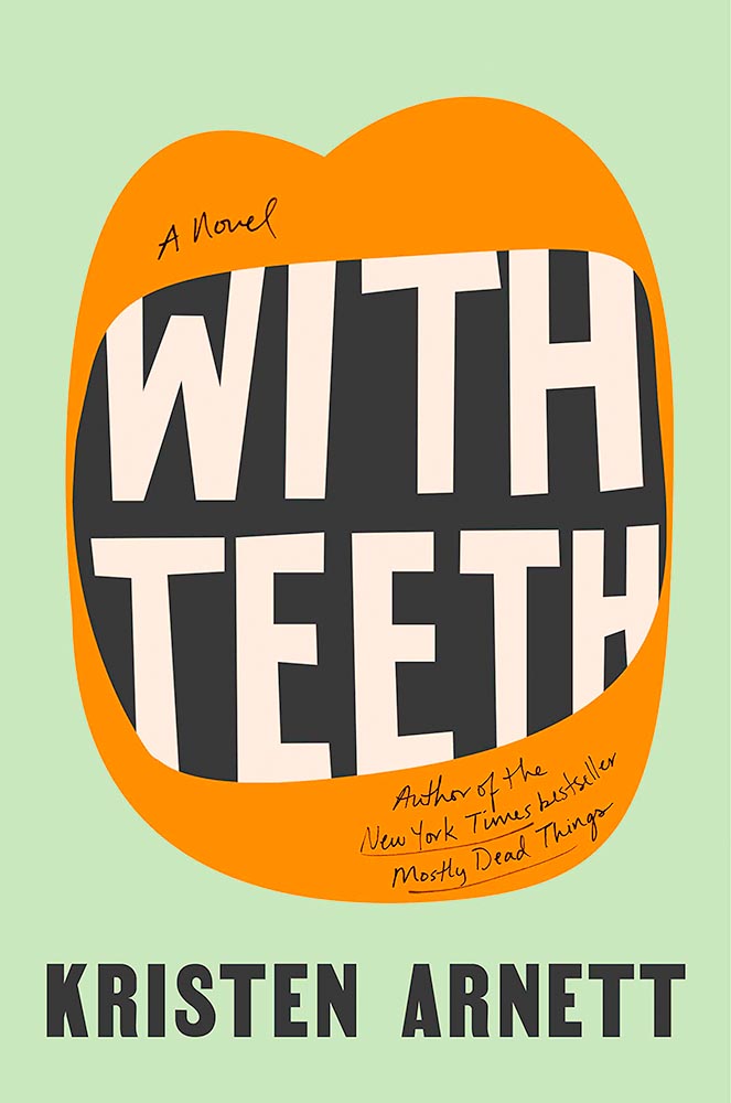
My runner-up for favorite cover of the year, this novel of a queer mother is immeasurably strengthened by this extraordinary cover. Great color, great type . . . just great. Design by Lauren Peters-Collaer.
The rest, in alphabetical order:
The ability of this cover to catch your eye on a crowded bookshelf is undeniable, but it’s the amount communicated with seeming simplicity that makes it a winner. Design by Kapo Ng.
The progression of graphics here win on several levels, but the icing on this “exquisite ransom note” (thanks, Lithub) is the shadow from the silhouette in the middle. The use of so few colors is a huge bonus. Design by David Pearson. (He doesn’t seem to have a website, but here’s a It’s Nice That article.)
The combination of background image — the eyebrows are perfect — with the elements making up the overlays is wonderful. The wraparound text adds to the whimsy. Brilliant results. Design by Joan Wong.
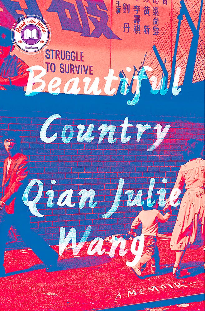
This is just great: “struggle to survive” so prominently displayed, the fence and wall, what looks like a cop in the upper left, the guy staring straight at camera in the lower left, the “hurry up” notion of the mother and child, the colors of the collage, everything. Wow. Design by Linda Huang.
This is another from the “simple is better” category. Great colors, yes, but little details, like the type and the subtle overlay of the graphs over some of that type take it over the finish line with style.
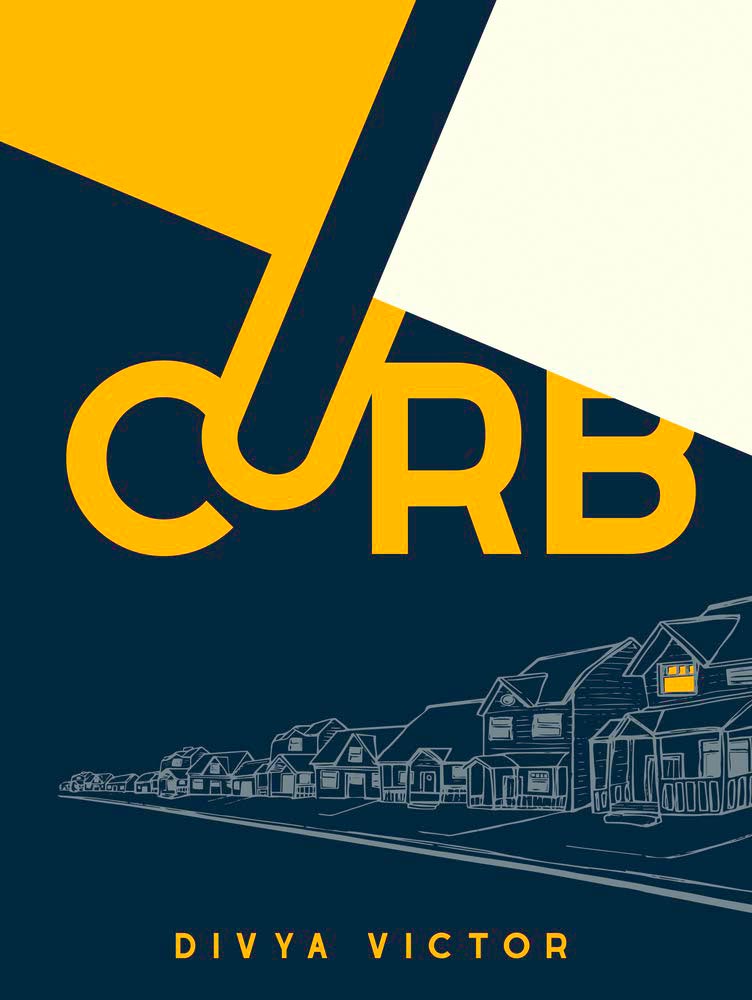
Collage and type, yellow and green, all done beautifully well. Bonus points for the hints — just hints — at faces. Design by Lauren Peters-Collaer.
Another with simple colors, but the strengths here are not only in the eye-catching type, but the repeating line drawings with their own curb . . . and that single lit window for the win.
Leopard! Wonderful pencil sketch! From the simple-at-first-glance category we have anything but.
At the risk of repeating myself, this one seems simple. Until you realize that the tomatoes age . . . and spoil. (The vine’s awesome, too.) Edgy design by Na Kim. (Bonus AIGA Eye on Design article on her.)
“Memorable” doesn’t begin to describe this one; the upside-down painting is only the beginning. Design by Daniel Benneworth-Gray.
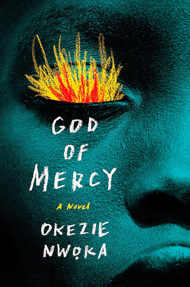
I’m going to go with chalk rather than brush to describe the type and especially flames, but either way, when combined with this extreme close-up, its perfectly-chosen duotone, and fantastic skin texture of this beautiful model, we get something close to amazing. Design by Sara Wood.
In contrast to some, this one is not simple at all: deeply detailed and strikingly colored, this cover says “all-American” in a way only an immigrant can. Design by Stephanie Ross.
The smile — and the shoes! — speak more loudly than the revolutionary themes so typical of Maoist-era settings. The perfect parody cover. Brilliant. Cover design by Matthew Broughton, based on art by Biao Zhong.
Color, type, objects, the arrow, “a novel,” circled, the people and places . . . all add up to so much more than just the sum of the parts. Awesome.
Nobel prize, blah, blah. It’s the cover, darn it! Design by Alex Merto.
The first of two skulls on this year’s list, this one made up of perhaps the least-hexed thing imaginable.
This one’s on this list for its subtle brilliance: the watercolor lines, the great typography choice, and integration of the photograph. Nicely done.
One the one hand, a simple photograph-and-title book cover. On the other, it’s beautifully cropped, the reader/viewer catches the “look,” and it’s complimented with great color choices. Long title served oh-so-well.
You don’t see almost-blank covers every day, and this one, especially, makes you want in. (Sorry.) Brilliant.
I. Want. To. Have. Taken. This. Photograph. (And then done this cover.)
This type of cover is actually very difficult to accomplish well, and here, it’s . . . well, accomplished.
Brilliant on so many levels. Design by David Litman.
Color and type compliment the awesome choice of suit and hat here. One of those covers that demands the reader/viewer pick it up off the shelf and explore. Design by Kelly Blair.
The painterly elements here lead the reader/viewer to the correct question: “what is this about?” and, guaranteed: it’s not what you think.
This made a bunch of best-of lists this year, and I gotta say: it’s one accomplished scribble. Brilliant. Design by Dave Drummond. (Bonus: Dave Drummond has a write-up from PRINT.)
The best riff on “upstairs, downstairs” seen in a long, long time.
Watercolor, in every sense of the word. (Cloudy drips, too.) O-so-beautiful. Design by Young Jin Lim.
Oh — wait a minute. Stick-on that isn’t, quite, combined with peeling and what seems like staring add up to a favorite. Design by Gray318.
From the simple-but-not dept., we have another brilliant entry, with great color choices, type placement, and the best — some might say, “Iconic” — “a biography” stamp ever. Love that the smallest photo is peeling, too. I’m actually envious of the talent displayed here! Design by Yang Kim.
I hope it comes out in the relatively small photograph, but this is actually paper cut. Great choices, great colors.
Like a dreamily lace curtain, the overlay on this painted shore brings what could be nice to the level of sublime. Having a cool title helps, too. Winner.
Wow. This cover violates so many supposed rules, yet succeeds on so many levels — absolutely brilliant. Design by Janet Hansen.
The simple-yet-not cup floweth over with this one; its scant 96 pages encompass dystopian political fiction that wins national awards and deserves something this strong. Design by Janet Hansen.
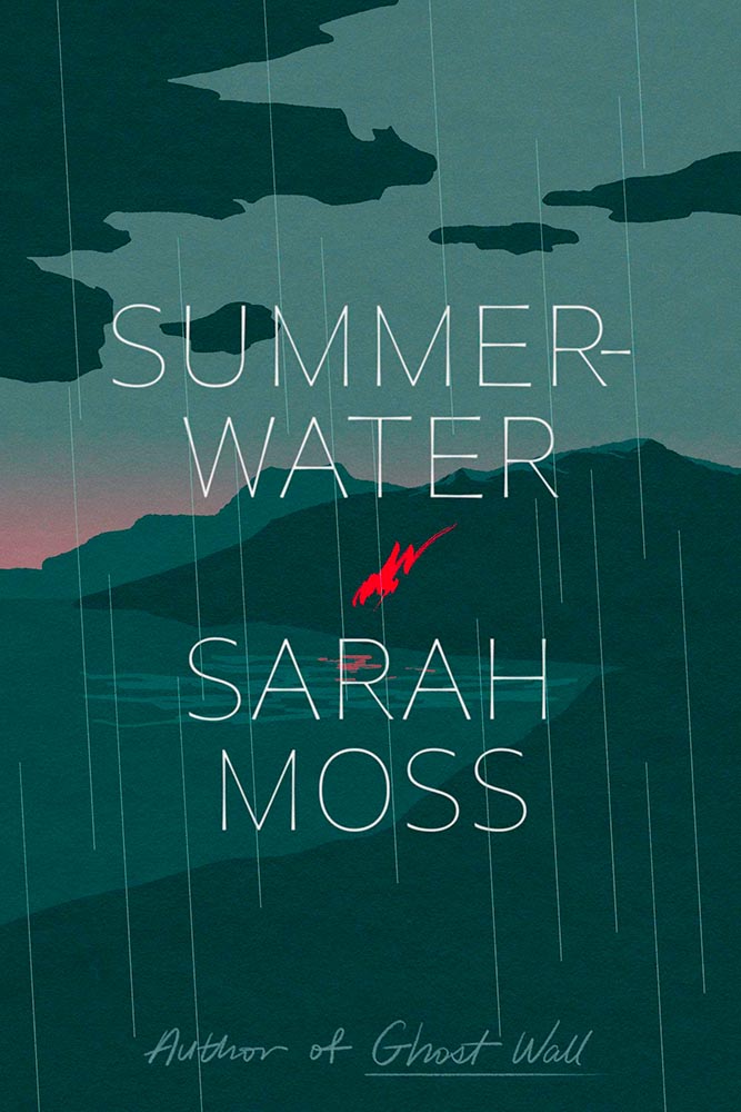
Illustration rules, in a foreboding style that suggests anything other than a Scottish summer. Lovely slim type is complimented perfectly by the script at the bottom. The title is actually Summerwater, by the way — I missed the hyphen at first — but ultimately I’m not sure it matters. Design by June Park.
The ingredients on this cover, together with splattered red, suggest more than food, racism, and a parent’s problems, yet this is a title I’d definitely pick and and spend time examining — all thanks to great design.
An absolutely perfect photograph highlights a stack of great choices.
The old-time portrait it taken to the next three levels. Fantastic. Bonus points for an unusual type choice (type name, according to site name). Great, great design by Na Kim. (See also the PRINT write-up on this title.)
The photograph cropping alone brings this title to the table, but when combined with the aged background, the white dots perhaps suggesting a past shot through with problems, and the desiccated flower suggest something so much more. Design by Mumtaz Mustafa.
Sure, impressing Ta-Nehisi Coates and Barak Obama means impressive fiction — but it deserves a cover with star power, and this design by — absolutely delivers. Great stuff.
The second skull on the list, this “house built by memory in-between your skin and bones” requires a second look, then a third. Deal me in. Design by Vince Haigh.
Great type complimenting great illustration choices, sure, but those feet . . . .
Surreal smart speaker — no kidding. How does one design a cover for that, exactly? This way. Design by Sara Wood.
“[C]ut a hole in the sky / to world inside,” this volume of Native American poetry suggests. The cover does just that.
“Another few cuts of paper,” he said with such casualness. Ha! Design by Tom Etherington.
“Beautifully rendered and bracingly honest,” one of the reviews says. The cover, as well. (Plus, lines.)
The color choices here, combined with the illustration, suggest something soothing, yet catch the eye in a way that demands attention. The mystery within does, too, from practically the first sentence. Here because I know I wouldn’t have done it so well.
Climbing that ladder’s going to take a minute. But then, that’s what it’s all about . . . .
On to 2022, everyone! Thanks for surviving 2020, 2021, and continuing to read — here, and behind your favorite book cover.
The Washington Post has an article from book designer Kimberly Glyder with her favorite book covers of 2021. Her bio:
Kimberly Glyder’s studio specializes in book design, illustration and lettering. Her work has been featured in the AIGA 50 Books/50 Covers show, the Type Director’s Club Annual Exhibition, Print magazine, American Illustration, the American University Presses Book Jacket and Journal Show, and the New York Book Show.