Beautifully Briefed, Holiday Edition (Late December, 2022): Nick Heer, Jason Kottke, Stealing Sheep, a Landscape Photograph, and Some Old Logos

“The Bleak Cycle”

I don’t usually think it’s fair to quote another blog post in its entirety, and I certainly won’t make a habit of it. With that out of the way, the always-interesting Pixel Envy, written by Nick Heer, hits us with a doozy — one that, due to its length and depth, requires the complete quote:

The Bleak Cycle

It’s a cycle. People create something, together, that reflects their energy and weird work; that thing becomes compelling as a result, and that makes it valuable, and at some point someone puts a price on it and someone else pays that price. It is at that moment that the thing begins to change. The new owner will almost always decide that what is most interesting about this thing is not the human essence that gave it value, but The Owner Himself, and will act accordingly. People will come back for the valuable stuff until the owner succeeds in crowding it out; when that crowding is done, the owned thing dies. Until then, what’s left is just what’s valuable—the humanity and brilliance and unpredictability and fun that all that cynical and idiotic and self-serving wealth is always and everywhere busy replacing with itself. There’s nothing to do but look for the good stuff until the looking becomes too challenging, or until it’s gone.

David RothDefector

Heer writes in response: “You may disagree with Roth’s headline thesis — ‘everything is Silicon Valley now’ — or his tie-in with the story du jour, Twitter, or his analysis of baseball’s problems. But the paragraph above? That is something to keep pinned in your brain. For most of us, it is a reminder to be wary of how things are changed in exploitative ways; for those in power, it should be seen as a cautionary pattern.”

Pinned.

Kottke is Back!

After a few months off, Jason Kottke is back in the blogger’s seat to enrich all of our lives. As someone who’s been reading for years — he started in 1998, and I’m certain his site was in the blogroll of the old Foreword, back in the Aughts.

Fine hypertext products indeed: Kottke.org, December, 2022.

We might be waiting a while for his so-called “comically long what I did on sabbatical post,” but his Sabbatical Media Diet post is a gold mine of to-read and to-watch items.

Welcome back, sir. May you blog for many seasons more.

Stop Stealing [Free] Sheep

No, not that — the type book:

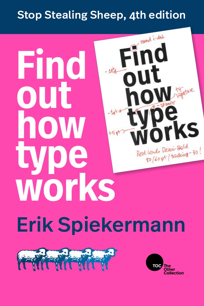
From Kottke, while we’re on the subject, one of his Quick Links from Dec 20th: “Google Fonts is offering a free download of the newly updated 4th edition of Erik Spiekermann’s Stop Stealing Sheep & Find Out How Type Works.” It’s a PDF, available now.

9th Annual Landscape Photography Awards

It’s fair criticism to say that I both decry photography contests and yet sometimes celebrate the results. But…:

“The Winding Journey” by Max Rive, Border Between Chile And Argentina, Patagonia

Wow. I couldn’t not highlight that photograph.

Many more at the source. (Via DPReview.)

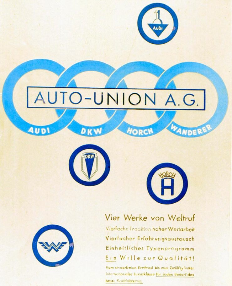
Oldest Logos Still in Use

Image Relay has an interesting item showing how long some familiar logos have been used — and, yeah, there’s a reason they’re familiar!

The black triangle is when the company was founded, and the bar indicates how long a logo with elements still used today has been around.

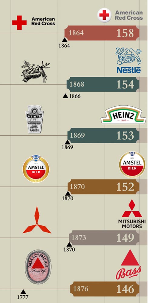
That’s but a sample of the complete listing; shown are nos. 3–8. Coca-Cola, the company I’d probably name if asked for the oldest logo, is no. 12. Click through for the rest.

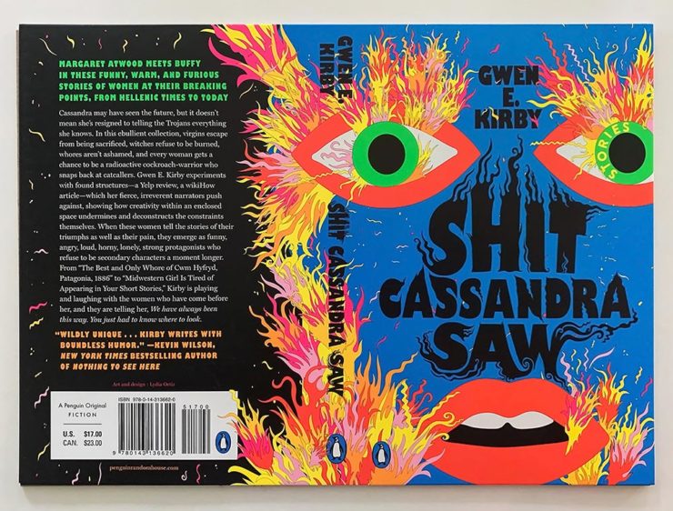
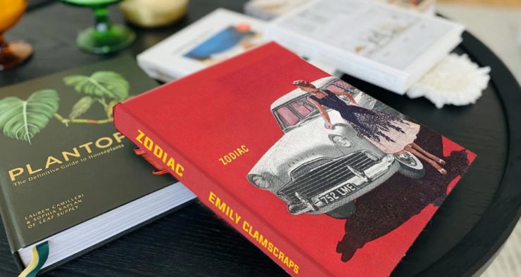
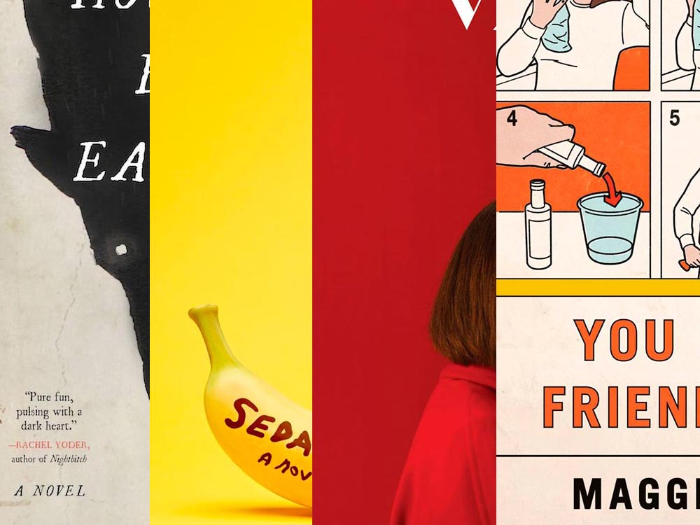
That’s it for this year

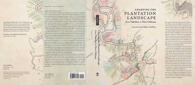
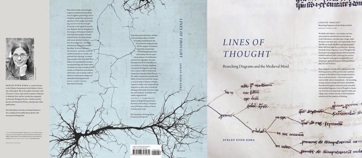
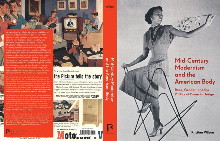
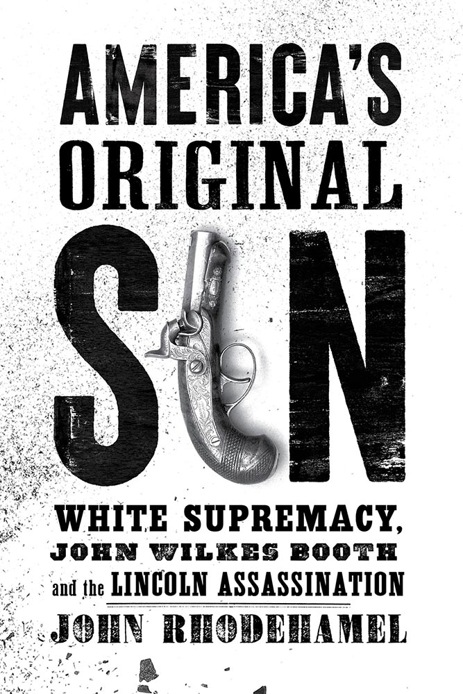
Foreword will be back in January with our annual first-of-the-year best-of: my favorite book covers of 2022. Happy holidays, everyone!

Top image: Tree Lights, December 2020, downtown Macon, Georgia.

Beautifully Briefed, Automotive Edition (December 2022): Audi, Lancia, Kia, and Mercedes-Benz

This time, it’s three automotive logos . . . and Mercedes’ accounting department, plus a holiday bonus. Joy to the Auto!

New Audi Logo Falls Flat

Audi’s “Four Rings” have been around for a long time — since Auto Union was formed, ninety years ago:

Now Audi follows the pack (see VW, Mini, Volvo, etc.) and converts their logo from three-dimensional to two; the rings now are either white and framed by a thin black border or dark grey with black borders.

Four-ring closeup. (It’s hiding sensors, too.)

Not an improvement, IMHO. One of the articles mentions the concept of “a consequence of digitalization,” and think that’s about as good a description as you’re gonna get.

The change will roll out starting with the updated Q8 e-tron — which, thankfully, still looks good:

Even better in Sportback form:

Dezeen has the best coverage of Audi’s new logo, but see also Motor1 and CarScoops for more pictures.

Lancia Debuts … a Mouse

Okay, it’s not really — it’s a conceptual sculpture, titled “Pu+Ra Zero,” that represents their rebirth:

They call it a “a three-dimensional manifesto,” and no, I don’t get it either. (The light signatures and, apparently, the circular sunroof will carry through to the new models, however.) The logo, their eighth in 116 years, is new as well:

I didn’t know Lancia well (only in passing? Eh. —Ed.) until the famous Top Gear segment naming them “the Greatest Car Manufacturer of All Time,” although I knew of the Delta Integrale — and think that the Fulvia is one of the prettiest sedans ever:

The 1972 Lancia Fulvia

Let’s hope their new models, and conversion to an all-electric manufacturer, lives up to their past achievements. Meanwhile, The Autopian has the best roundup of the new Lancia.

Kia, KN, and … Wait, What?

30 thousand folks a year are doing Google searches for “the KN car.” Why? Kia’s logo, of course:

Thankfully, the Autopian to the rescue:

I’m not a huge fan of the new Kia logo — and can absolutely see the “KN problem” — but I think it speaks more to modern society that this is a news item than anything related to graphic design. Willing to be wrong.

Mercedes: $1200/yr for Full Output

This subscription thing has gotten seriously out of hand: Mercedes-Benz USA, in an effort to further bilk their customers — ’cause, y’know, MBs don’t cost enough — has decided that the last 60-110 horsepower available on their 2023 electric vehicles are only available for a yearly fee.

The MB EQS gets even less attractive.

Gak.

Holiday Bonus: Free Online Automotive Design

Interested in car design? Happy Holidays.

Beautifully Briefed, Late October 2022 [Updated X2]: Translucent Hummingbirds, Honda, Landscape Photography, and … Vampires!

In this edition: Hummingbirds, the UK’s 2022 Landscape Photography of the Year 2022, a potential new logo treatment from Honda, and something just in time for Halloween.

Who Knew: Hummingbird Edition
Wow.

Taken when the creatures are mid-flight and beating their wings at incredible speeds, Spencer’s striking photos capture sunlight as it filters through their feathers, emitting a full spectrum of color. The opalescent phenomenon is caused by diffraction and transforms their limbs into tiny, ephemeral rainbows.

This is Colossal

Let’s set aside for the moment the time and energy get these photographs and just celebrate that Australian photographer Christian Spencer worked to get these shots. Better still, there’s a book:

Like the typography in addition to the photograph, too. Thanks to This is Colossal for pointing us in this pretty wonderful direction.

New Honda Logo?

This hasn’t been reported anywhere, so I don’t know whether there’s a shift ahead for Honda (pardon the expression), but…:

This is a photograph — well, graphic — of the 2024 Prologue EV. Note that instead of the classic “H” seen on every Honda since I don’t know when, the name is spelled out.

Maybe it’s because this is a rebadged GM?

Either way, you heard it here first. (Read more about the Prologue on Motor1.)

Update, 29 October 2022: Motor1 has another preview, this time of the upcoming 11th-gen Accord, the rear of which uses the usual “H.” So, electric-only? Models from 2024?

Update, 7 November 2022: Here’s a future Honda model for China with the name spelled out. (Here’s the Motor1 story, and a second, better article from Autopian.) So … maybe?

2022 Landscape Photography of the Year

These haven’t gotten much press here in the US, and they deserve better:

Windmill in the Mist, Itay Kaplan – winner, historic Britain
Loch Awe, Damian Waters – winner, lines in the landscape

My personal favorite is this stunning shot:

Ascension, Demiray Oral – winner, classic view

The Dragon’s Back.1The aptly-named Dragon’s Back is in the Brecon Beacons National Park, Black Mountains, Wales. Take a walk. Thanks to The Guardian for the slideshow. See the entire list of winners on the official contest website.

Vampires!

Speaking of slideshows on The Guardian, they had a great subject just in time for Halloween: “Cinema’s unquenchable thirst for vampires celebrated in posters.”

A classic.
A future classic — scary-great.

Unquenchable thirst, indeed. Enjoy.

  • 1
    The aptly-named Dragon’s Back is in the Brecon Beacons National Park, Black Mountains, Wales. Take a walk.

Beautifully Briefed, Early October 2022 [Updated]: Triboro’s Lyrics, Hoefler’s Daggers, and Skoda and Citroen Provide Contrast

This time, we’ve got some great book design (with a bonus), Hoefler educates on typography (with a bonus), and two updated car company logos. Let’s get right to it!

Print Magazine on the design of Lyrics

The still-very-relevant-in-2022 Print Magazine brings us a great feature on the design of Paul McCartney’s book, Lyrics:

Front and back covers of Paul McCartney’s Lyrics, by Triboro Design.

Turns out it was designed by an outfit called Triboro Design, from Brooklyn (appropriately). Print brings us an interesting interview with David Heasty, the principal:

I […] found him to be sharp, quick, articulate, and modest. Below, we discuss Paul’s involvement with the project, the book’s gorgeous bespoke typeface, and the importance of staying true to a legend’s vision.

Ellen Shapiro, Print Mag
The “S” spread of Paul McCartney’s Lyrics, by Triboro Design.

Interesting and informative. Catch this interview when you can.

Bonus: Looking at Triboro’s website, this lovely piece of typography stood out:

Triboro Design’s Zolo Jesus album typography creates desire.
Hoefler Discusses Daggers

In “House of Flying Reference Marks,” Jonathan Hoefler talks about daggers, or, what you use when an asterisk isn’t enough:

Hoefler on daggers.

Beautiful examples, complete with a phrase you don’t hear everyday: “twisted quillon.” Read and enjoy. (If the opportunity presents, follow on with the ampersand article — which, uh, takes a stab at where the word came from. Nice.)

Bonus: Creative Boom’s article, “18 highly respected type foundries that remain fiercely independent.” (I guess you could say I’m still surprised Hoefler is now, well, Monotype.)

Skoda and Citroen have new logos

It seems like nearly all of the major car manufacturers have introduced a new logo in the past couple of years, but here are two more. One’s best described as “an update,” while the other … goes a little farther.

Skoda, for those that don’t know, is a Czech company and part of the massive VW Group. Frankly, it shows:

Skoda’s 2022 Kodiaq, a thoroughly VW Group product.

For 2023, they’re introducing a push to separate themselves from VW a little, resisting the downmarket image. As is (now) normal with updated car company identities, there’s a concept:

Skoda’s Vision 7s concept.

It’s … not inspiring. Maybe the actual updated logo will turn the corner:

Skoda’s 2022 logo.

Solid. (Pardon the pun.) But seriously, even an avid car nut like me didn’t know that represents a winged arrow — and I’m not sure the new version helps. At least they get points for consistency:

Evolution of Skoda’s logo, 1895–2023.

Read more at Brand New’s “Czech this Out,” or Carscoops’ more optimistic take, “Thriving Skoda Brand Forging Its Own Path Within The VW Group.”

Then there’s Citroen. Even under the potentially-smothering corporate blanket that is Stellantis (there’s a name!), the pioneer of decades past still manages to actually thrive. First their new logo:

Citroen’s 2022 logo.

They’re not quite as consistent — the dual chevrons have varied a bit. This time, they’ve literally gone back to their roots, pulling the 1919/1921/1936 version out and dusting it off for modern use:

History of Citroen’s logos, 1919–2022.

Points to them for hinting at what’s to come, too:

Citroen’s 2022 logo, with just a slice of concept car showing.

…Which turns out to be something with, ahem, Oli bits:

Citroen’s Oli: the antithesis of a Skoda.

“Nothing moves us like Citroen,” they say. The Oli moves me, to a point where I truly wish Citroen was once again available in the ’States. Cool and radically innovative, without losing sight of something VW has truly lost: fun. Well done.

Read more on the logo: Motor1, “Citroen Unveils Updated Retro-Flavored Logo And New Slogan,” and Carscoops, “Citroen Unveils New Logo Inspired From Its Past, Teases New Concept.” Read more on the Oli at the excellent Autopian: “The Citroen Oli Concept Is An EV Made From Cardboard And Good Ideas.”

Updated, 19 October, 2022: Brand New adds to Citroen’s new logo story, with a slightly-less-than-enthusiastic take on the logo and has frankly unkind things to say about the new, custom typeface (custom typefaces are now de rigueur — a policy as much related to rights ownership than creativity, alas).

I really like the cursive in this Vimeo screenshot:

YouTube? What YouTube? Citroen posts to Vimeo. Ahh, the French.

BN also includes a number of extra photographs of the simply awesome Oli, too. Here are a couple, for your enjoyment:

Plug-and-Citroen.

Note the removable Bluetooth speakers (the black tubes with “+” and “-“) and, especially, the seats:

I love everything about this interior.

Check the rest, and BN’s take, here.

Apologies to both Skoda and Citroen for the lack of language-correct accents. WordPress needs a glyph function.

Beautifully Briefed, Mid-September 2022 [Updated]: Indigenous Type, Italic Type, Adobe Types “Stop,” and Two Awesome New Cameras

A wide selection of items for the beginning of fall, from positive fonts to jolly cameras — with Adobe and Pantone pouring some cold water on things. Let’s get to it!

Indigenous Letterforms

As Americans, Europeans, or, more generally, Westerners, we take for granted that fonts will reflect the various pieces of individual type — that is, letterforms — that we’ll need. But not everyone falls into that category.

North American Indigenous fonts — with updated Unicode. Major Kudos. (Courtesy of Dezeen.)

Dezeen points us to an especially interesting effort: “Typotheque typography project aims to protect Indigenous languages from “digital extinction.” In this case, folks who were in the Americas long before Westerners arrived used languages often not written down, or that use letterforms that simply aren’t supported in modern typographic systems.

“When [the Unicode Standard] doesn’t contain characters in a given language’s orthography, it is not possible for that community to accurately use their language on digital text platforms.”

Typotheque typeface designer Kevin King 

Fascinating. Read more at Dezeen.

Italic Letterforms

The always-great Hoefler & Co. spends a minute educating us about italics:

Hoefler examines italics: point-and-sketch
Hoefler’s Fifteen Italic Textures illustration

Italics can be the most colorful part of a type family, diverging dramatically from their roman cousins. Here’s a look at twelve kinds of italic typeface, with some notes on their cultural contexts, historical backgrounds, and practical applications.

Hoefler & Co.

Read the article, “Italics Examined,” at Hoefler & Co.’s Typography.com.

Adobe Types, “Stop.”

Adobe and Pantone are having a . . . thing. As a result, all Pantone spot libraries have been removed from Adobe products:

A classy move, completely in character for both companies, to reach into users’ machines and remove stuff they had paid for and may rely on because of some licensing spat.

Nick Heer, Pixel Envy

I didn’t get a notice in either InDesign or Photoshop, but a check in InDesign (the CC 2022, aka 17.4, version) shows only the CMYK libraries:

Adobe’s Pantone+ CMYK (Coated) color picker, from InDesign CC 2022

You can subscribe to the additional libraries from Pantone for $60/year. Book design is almost exclusively CMYK, so I won’t be . . . but grrrr.

On the subject of Canadians: thanks to Nick Heer’s north-of-the-border reporting for the notice.

Update, 28 September, 2022: Adobe got around to putting up a banner in my version of InDesign — blaming Pantone:

This notice showed up September 27th, 2022.

They’ve put up a “help” page. (I took a moment to fill in the feedback at the bottom of that page, too: “Removing features we’ve paid for is incredibly uncool, Adobe. Shame on you.”)

Two Awesome New Cameras, from $100 to $100,000

So Pagani, the multi-million-dollar sports car manufacturer, has decided to market large-format cameras. Okay!

One of Pagani’s new camera models
A closeup of the (beautifully-detailed) tripod plate for Pagani’s new cameras.

Incredible, breathtaking detail and quality, based on Gibellini models but taken to 11. But like their cars, mere mortals need not apply: their cameras start over $100,000.

Mortals can dream, sure, but here on Earth, I encourage an order from this Ukrainian company instead:

Jollylook’s Pinhole Instant Mini film camera
Jollylook’s Pinhole Instant Mini in situ

They’re based on instant film cartridges, are made of recycled materials, look incredibly cool, and a kit starts at an incredibly-reasonable $99. Throw in a few extra dollars to support Ukraine and . . . feel Jolly.

Thanks to This is Colossal for the link.

Beautifully Briefed, August 2022 [Updated]: Drobo, Rolling Stone, Aston Martin, and Bugatti

Three interesting logo redesigns this month, plus a moment where venti has nothing to do with coffee. Oh, and a airy bonus.

Drobo Declares Bankruptcy

Generally speaking, I’m not one to engage in schadenfreude, aka “enjoying the pain or suffering of another.” (Wiki. Anyone surprised that the Germans have a word for this … but I digress.)

A selection of expensive, unreliable junk.

Back in 2011, I lost two Drobos in short order — and with them, the majority of my back files. Project I’d worked on, photographs I’d taken, personal documents, years worth of stuff, just gone.

Drobo, the company, did nothing to help, offering neither solutions nor apologies. I wasn’t alone; forums across the ’net suggested that I should have chosen more carefully.

It turns out they should have, too. Good.

Gloat Read more at DPReview or PopPhoto.

Rolling Stone’s New Logo

To call Rolling Stone‘s place in America culture iconic might be selling it short, and their logo plays a large role in that. In 2018, they flattened it — leading that trend, possibly — and it lost something.

However, this month, it’s back:

Rolling Stone’s 2022 logo redesign.

“The assignment was a paradox. How could we make the logo look like it did in the past, without making it feel dated? My hope is that loyal readers will believe the old logo is back, but on closer inspection will be surprised to notice how much it has been modernized.”

Jesse Ragan, XYZ Type

The “old logo” he’s referring to is the one that ran from 1981–2018, but there were others, too:

Rolling Stone’s lettering shapes through the years. See more at both links.

A great study in logo evolution: read more at the Type Network, and lettering specifics from XYZ Type. Awesome. (Hat tip to, as usual, Brand New.)

Aston Martin’s New Logo

On the subject of subtlety, Aston Martin usually isn’t the first thing that comes to mind. Their recent logo redesign, however, falls into that category:

Wings of Glory (so to speak)

The evolution of their logo emphasizes those small steps:

AM’s logo through the years.

Not a great amount of information on this one, but the accompanying photographs of the logomark being made are fantastic. See more at The Drive, with more at Brand New.

Bugatti’s New Logo

Subtlety and Bugatti rarely — if ever — fit in the same sentence. Aston is stratospheric as far as I’m concerned, so Bugatti would qualify as the antithesis of subtlety. But, but, but: there’s something about one.

The new Mistral. (Sorry, it’s sold out.)

They have a new logo and marketing campaign to go with:

Specifics, courtesy of Interbrand.
The Mistral from the back, showing the new type treatment.

Read up at It’s Nice That. Car and Driver has more information on the Mistral.

Update, 20 Sept., 2022: Brand New weighs in on Bugatti’s updated logo.

Bonus: In the Skies

It’s been a busy August, including having to make a lightning trip through the usually-not-fun Atlanta airport. But there’s always a bright spot at the end of that tunnel: being the little boy again, awed by the simple act of flying.

Better still, the flight was on a 757, the sports car of big planes. Everybody around me had their window shades pulled and noses in their phones, but I was looking out the window:

Delta Ship 5654, Above Clouds and Sea

See you in September!

University Press Design Show 2022

Note: Click on the title above to see this post in one-column format, which includes larger graphics — helpful with some of these jackets especially. (This applies to any post here on Foreword, by the way.)

It’s time once again to celebrate the unsung heroes of the book world: the best items published by university presses.

The annual show, now in its 57th year, honors the university publishing community’s design and production professionals. The Association recognizes achievement in design, production, and manufacture of books, jackets, covers, and journals, and the Show serves as a spark to conversations and source of ideas about intelligent, creative, and resourceful publishing.

Association of University Presses 2022

This show, like the 50 Books, 50 Covers also announced around this time of the year, is cool in that it doesn’t just talk about a book’s exterior — there are covers and jackets, interior design, even awards for the quality of typography.

Let’s talk about titles with both covers and interiors first, starting with the great Gumbo Ya Ya from the Poetry category:

University of Pittsburg Press. Cover design by Alex Wolfe.
University of Pittsburg Press. Interior design by Alex Wolfe.

The strength of this design, inside and out, towers head and shoulders and whatever else above — designer Alex Wolfe deserves this win and many kudos from me.

Next, two from the Scholarly Typographic category:

University of Georgia Press. Design by Erin Kirk.

Fractals are a great choice on this title page. (Love the title, too.)

LSU Press. Design by Barbara Neely Bourgoyne.

This whole project is well done, with the jacket taking an old map and giving it just the right treatment.

Three from the Scholarly Illustrated category:

Chicago University Press. Design by Jill Shimabukuro.

Not dissimilar to the above when zoomed out, but so much more than a scribble when zoomed in. (Note that the blue wraps onto the front — nice choice.)

Getty Publications. Cover design by Catherine Lorenz and Jim and Drobka.
Getty Publications. Interior design by Catherine Lorenz and Jim and Drobka.

Great cover, and the contents pages are awesome! (I don’t get to say that very often.)

Princeton University Press. Cover design by Roy Brooks.
Princeton University Press. Interior design by Roy Brooks.

This is not an easy title to design for, and here both the cover and title pages are extremely well done.

Next, the Trade Typographic category:

Johns Hopkins University Press. Design by Amy Ruth Buchanan.

A one-color triumph.

Leuven University Press. Design by Stéphane de Schrevel.

Great, great photograph with interesting typography grabs your attention here.

One from the Trade Illustrated category:

Trinity University Press. Design by Janice Shay.

It’s difficult not to appreciate a book with “Love, Loss, and Laundry” in the subtitle — but the book design does it justice.

We finish up with several favorites from the Book Covers and Jackets category:

Georgetown University Press. Design by Jeff Miller.

Flag-as-fence. ’Nuff said.

McGill-Queen’s University Press. Design by David Drummond.

I don’t know that these are a series of titles as much as a style for the titles — but, in either case, they work.

University of Pittsburgh Press. Design by Henry Sene Yee.

Not the only title here with textured paper, the simple typography with a fantastic — and fantastically-placed — bird wins for more than literature.

University of Minnesota Press. Design by Casalino Design.

The white border around this is difficult to see here, but adds to the overall in an interesting way; I also like the hand lettering over this amazing photograph.

University of Nebraska Press. Design by Nathan Putens

Additive color combined with the subtitle-of-the-year on this winner.

Princeton University Press. Design by Derek Thornton.

Great, great typography here. When combined with the radiating lines and provocative title, it makes for a title that I’d absolutely pick up.

I’ve saved my favorite from the whole show for last:

University of Minnesota Press. Design by Michel Vrana.

Another appearance of textured paper is just the start here, with that illustration rocking so hard indeed — the eye! Fantastic in every way. (Bonus points for “A Post-Exotic Novel.”)

See all of the entries from this great Association of University Presses show here. (FYI, nothing from Spine yet, but kudos to the University of Chicago Press for blogging about their favorites.)

50 Books, 50 Covers: 2021 Edition

AIGA has announced their winners of the 2021 50 Books, 50 Covers competition:

With 605 book and cover design entries from 29 countries, this year’s competition recognizes and showcases excellence in book design from around the world. […] Eligible entries for the 2021 competition were open to books published and used in the marketplace in 2021.

AIGA Press Release

In this year’s competition, innovative book designs for topics ranging from designing and motherhood, African surf culture, stories of resistance, visual histories of Detroit, Black food traditions, and more all give our jury life, hope, and visible windows into new possible worlds. The covers and books we looked at had a diverse range of visual language and took aesthetic risks.

Silas Munro, AIGA [Competition] Chair

As usual, there are items here that I haven’t seen before, along with several that surfaced on others’ “best of 2021” book design lists (see that Foreword post for my faves). Also as usual, there are some excellent choices.

Further, there’s something in this competition that you don’t see in the usual “best of” posts: interiors. Half of the competition is covers, sure, but the other half considers the whole book design — and sometimes, as I can definitely attest, an underwhelming cover can lead to a treasure within.

But enough talking. My favorites, in no particular order:

Cover by George McCalman.
Book design by George McCalman.

This is one from the 2021 “best of” finalists that I didn’t post about — but now that I’ve seen the interior…. So very worthy. (See more.)

Cover design by David Chickey and Mat Patalano.
Book design by David Chickey and Mat Patalano.

This series of three books not only have striking covers I’d not seen before but exceptionally competent interiors done on matte paper, a personal favorite. (Click through for more examples.) Excellent.

Design overseen by Haller Brun.

In this fascinating book, architectural photographer Iwan Baan and (Pritzker-winning) architect Francis Kéré “set out to capture how the sun’s natural light cycle shapes vernacular architecture.” While I may be slightly biased in terms of architecture and photography, this one’s a winner. (Read the AIGA’s take.)

Cover by Andrea A. Trabucco-Campos.
Book design by Andrea A. Trabucco-Campos.

“A little overly precious,” the AIGA says … while awarding it a prize. Completely fresh, I say, with interesting content presented in a way that does considerably more than interest. Well done. (See them apples.)

Cover by Gary Fogelson and Ryan Waller.
Book design by Gary Fogelson and Ryan Waller.

“The type on the cover and in the body is perfect, in all ways and choices. The use of the gutter for captions is a great understanding of the art and a perfect way to save space. The page numbers too.”

Brian Johnson, AIGA Judge

This is one of those books that you have to say, “I wish I’d done that.” Great stuff. (See its individual entry.)

The Time Formula. Cover by Honza Zamojski.
Book design by Honza Zamojski.

There always seems to be some projects that violate book design “rules” — this one doesn’t have a title on the cover, has page numbers in the gutters, and more. Yet this book, about a sculpture project, makes for interesting viewing indeed. (See more.)

Last, we have a couple that are only covers:

Cover by Janet Hansen.

This was considered for my favorites of 2021 (and made it onto others’ lists). I’m glad to have been given the chance to call it out. Excellent in its simplicity. (See the AIGA entry.)

Last, but certainly not least:

Cover by Lydia Ortiz.

Another advantage of this competition: seeing more than the front cover. And this cover, front, back, and spine, is so much more — especially in person: black plus four neon inks. Wow. (See the AIGA’s praise.)

Many, many more to choose from at AIGA: set aside a little time, wander through all of the projects chosen, and truly enjoy. (Via Locus.)

FYI: See last year’s 50 Books, 50 Covers, too.

Beautifully Briefed, Early July 2022: The Autopian, The Ford Heritage Vault, and an Eames Follow-Up

Car site The Autopian scores with book design, Ford posts old marketing material gold mine, and more on the Eames Institute of Infinite Curiosity in this edition of Beautifully Briefed.

Autopian suggests book design

The Autopian, founded by a couple of former Jalopnik writers, is a new automotive gem: in these days of more-of-the-sameism sites trying to make money of others’ ideas, the Autopian has a retro style and interesting, original content.

Including this short post from their Cold Start column:

Sometimes you may encounter an old car ad and realize that the design of it could lend itself very well to something completely different. In this case, this 1958 Ford Zodiac ad, with its rich, saturated colors, striking dress on the model, and evocative name with understated typography just feel like something you’d see on modern book cover design.

Jason Torchinsky, Autopian Founder

The ad:

A 1958 Ford Zodiac (European)

His book design idea “realized”:

Jason’s book cover mock-up. Love the author name.

Nice.

The Ford Heritage Vault

Ford has taken the unusual step of posting a good chunk of their old — 1903 to 2003, their first 100 years — marketing materials online: “promotional materials, photographs, and all kinds of other historical goodies,” according to CarScoops.

“Our archives were established 70 years ago, and for the first time, we’re opening the vault for the public to see. This is just a first step for all that will come in the future,” says Ted Ryan, Ford archive and heritage brand manager.

Here’s a personal favorite: the 1965 full line brochure, showing the cars set in architectural drawings — presumably, matching the car to the house:

The 1965 Ford Family of Cars brochure

Fancy a drive down memory lane?

More from the Eames Institute

We discussed the Eames Institute of Infinite Curiosity back in April, but Metropolis magazine has published an extensive article covering a visit to the Institute.

Modernism has largely been diluted from a series of ideas rooted in social change to one of just style—Instagram moments, if you will. The Eameses insisted that they did not have a style or even an “ism.” […] Modernism was an idea, not a style. With the establishment of the Eames Institute, I hope Charles and Ray will be remembered most of all for their ideas and processes.

Kenneth Caldwell, Metropolis
An exhibit at the Eames Institute of Infinite Curiosity.

With our ongoing struggle to use materials more efficiently, many of the Eameses’ ideas and ideals need to be taken for the solutions that they are: style with incredible substance.

Read the whole article at Metropolis. (Via ArchDaily.)

Beautifully Briefed, Late June 2022: AIA’s Best Architectural Photography, 2022 Logo Trends, and … Buick!

Three items for the end of June, 2022: AIA Los Angeles announces photography awards, the 2022 edition of the Logo Lounge logo trends report is out, and Buick makes its new logo official. Let’s get into the details.

AIALA Photography Awards

The Los Angeles chapter of the American Institute of Architects (AIA|LA) has announced this year’s winners of the annual Architectural Photography Awards, and there’s some pretty great stuff:

Ryan Gobuty: Santa Fe (Santa Fe, NM)
Taiyo Watanabe: C-Glass House (Dillon Beach, CA)
Tim Griffith: Mission Bay (San Francisco, CA)

See more at AIA|LA. (Via Archinect.)

2022 Logo Trends Report

The always-excellent Brand New points us at Logo Lounge’s 2022 Logo Trends report, it’s 20th annual look at what logos and branding, as a group, are looking like this year.

Logo Lounge 2022 Logo Trends Report

[W]hile there are still corporate-looking marks being crafted there is a stronger effort to find ways to identify products that are artisanal and handcrafted.

Bill Gardner, Logo Lounge

Corporations trying to be more human. (News at 11.) But then, my use of that particular phrase perhaps betrays my lack of being in touch with the modern corporate world; I think publishing is a different animal, and prefer being part of that world despite the regular influence of corporate entities there, too.

Nonetheless, following logo trends is, from a purely graphic design perspective, worthwhile — and this report summarizes beautifully. Read on.

Buick’s New Logo, Officially

We’ve touched upon it before, but Buick has, with the release of the Electra Wildcat concept, officially updated its logo:

Official: Buick’s new logo

Electra is Buick’s name for electric cars, simultaneously stating the obvious while giving a big nod to past models — and the Wildcat concept is, dare I say it, borderline cool:

Scandinavian, American, Futuristic, Retro … Buick!

Both Buick and Cadillac have hinted at more Art Deco in their upcoming products, perhaps best illustrated on this concept’s interior:

It’s a head rest, folks.

Nice. (Not even remotely possible on a production model, but still.) Read more on Buick’s new logo and transition to an electric car brand at Car and Driver or The Drive.

See you in July!

Update, 12 August 2022: Brand New weighs in: A New Point of View… ick

Beautifully Briefed [Updated]: Book Six-Fer, June ’22

A book design treat for your Monday morning: four of my favorite new book covers from last month’s debuts.

How To Be Eaten. Design by Julianna Lee.

Aged, distressed paper is a great look when done well, and this one hits all the right notes. The size relationship between the characters, the glow around the eyes, the two color choices, the type, all of it — great stuff.

Sedating Elaine. Design by Janet Hansen.

A veritable how-to on less-is-more. Brilliant.

Vladimir. Design by Katie Tooke.

Another solid-color triumph. Great font choice here, too. Awesome.

I’ve saved the best for last:

You Have a Friend in 10A. Design by Kelly Blair.

Great Circle has featured before, and this follow-up takes us inside the plane and into the safety brochure in the best possible way. Great, brilliant, and awesome wrapped into one.

Via LitHub and Spine, as usual. Have a good week!

Update, June 20th: WABE, Atlanta’s NPR station, has a summer reading list out, highlighting Georgia books and authors — and I’d like to include two of the covers here:

Invisible Child.

The grainy photograph, the wonderfully placed city skyline, and classic typography, combined with the diagonal cutline, elevate this title from mundane to eye-catching.

The Sweetness of Water.

Excellently distressed doesn’t begin to describe this, on many levels. Side note: it’s a terrible shame that the Oprah and Booker call-outs have been elevated to logo status in what can politely be described as a distraction (from a book designer’s point of view, at least).

Beautifully Briefed, May 2022: Two on Type, Two on Photography, and Kottke

This month’s favorites cover a delightful new extension of the typeface DaVinci, Google’s updated mega-font, Noto, photographs of a desert aircraft boneyard from above, and mega-photographs of the Milky Way.

Before we get there, however, I wanted to wish Jason Kottke — whose 24 years of web sleuthing has been a source for items here on Foreword dating back to its original iteration in the ’90s — good luck on his sabbatical:

“I need some space to think and live and have generative conversations and do things, and then I’ll make something, but I can’t tell you what it is just yet.”1Alexandra Bell, NYT That’s the sort of energy I need to tap into for a few months.

Hear, hear.

The Beautiful DaVinci Italic

It’s Nice That points us to a new, extended version of the font DaVinci, done for Sydney’s Biennale:

“When you do this sort of type exercise — based on printed letters — it gives a very organic shape and form, in opposition to the very metallic sharp shape from type materials.” Furthering this organic look by pushing the fluidity curse at its maximum, Virgile ended with a design “which is very historical, yet with a contemporary twist.” 

Just look at those glyphs!

Makes you want to find an excuse to use it. But that’s not all: Flores is an incredibly diverse artist whose work both challenges and inspires. See more.

Google’s Noto

Called “A Typeface for the World,” Google’s Noto defines “megaproject.”

Noto is a collection of high-quality fonts with multiple weights and widths in sans, serif, mono, and other styles. The Noto fonts are perfect for harmonious, aesthetic, and typographically correct global communication, in more than 1,000 languages and over 150 writing systems. 

Google’s Noto font collection.

According to Google,

“Noto” means “I write, I mark, I note” in Latin. The name is also short for “no tofu”, as the project aims to eliminate ‘tofu’: blank rectangles shown when no font is available for your text.

While the font itself has been around for a few years — 2013 seems like yesterday in so many ways! — it’s updated regularly, cover 150 out of the 154 scripts defined in Unicode, and deserves attention from every web designer and type nut. Read more at Google or Wikipedia. (Via Kottke.)

Aircraft Boneyard, From an Aircraft

This is Colossal introduces us to Davis-Monthan Air Force Base in Tucson, Arizona, whose desert conditions are ideal for storing — and scrapping — aircraft:

What happens when the military’s aircraft are end-of-lifed

The photographs are by Bernhard Lang — whom Colossal has highlighted before — and who has an incredible talent for finding patterns from above. See many more at his website.

Milky Way Photography

We don’t get many opportunities here in Middle Georgia, but in other, less populous (read: less light-polluted) places in the world, the Milky Way shines forth from the heavens:

Mountain, redefined.

The Guardian points us to the 2022 Milky Way Photographer of the Year, and many just wow:

Take cover . . . in awe!

Check ’em all out, be inspired to take one of your own, or simply be reminded just how big this system we’re a part of is. Enjoy.

Spring Book Design Coverage

For your May Day, please take a closer look at twelve great book covers — and a bonus thirteenth! — spotted during the first four months of 2022.

In alphabetical order:

Book design: David Drummond

Brilliant: actual text, printed (on a great color paper, too), with actual string, photographed on said print. Not only is it exactly right for the subject matter, it’s simply and beautifully done.

Cover design: Brianna Harden

Another great background color choice, this time highlighting the awesome colors chosen for Fiona and Jane’s illustrations. The hand-painted text is perfectly done.

Cover design: Vi-An Nguyen

Woodcut or just aged? Doesn’t matter, as “brilliant” falls short when describing this title.

Cover design: Alex Merto

From It’s Nice That, we have a nice feature on Alex Merto — whose Ghost Wall cover is a great example of plant life adding so much more: “the force of a river to the head,” to paraphrase Emma Donoghue’s quote.

Cover design: Anna Morrison

The typography, awesome little plane — the purse(r)! — the clouds, all of it: sky-high levels of good.

Interestingly, Fight Night‘s cover has gotten notice before:

Cover design: Patti Ratchford, illustration: Christina Zimpel

I can’t begin to imagine what caused the redesign, or why it wound up being so radically — 180 degree! — different. The old design wound up on some “best covers” lists (here’s LitHub’s October 2021 post, for instance); the new one has wound up on mine.

Cover design: Christopher Sergio

LitHub says this one has a very high “hang on the wall” factor. I can’t think of a better description — great stuff.

Cover design: Na Kim

Na Kim just can’t help but design the best covers: a wonderful, antique background complimented by brilliance. (Great typography, too.)

Cover design: Emily Mahon

It’s nigh-on impossibly to look at this cover and not flip it around to read the text trisecting the leopard. Take something simple, add the elusive more, get this. Yeah.

Cover design: Jim Tierney

Another fantastic example of plants adding more than the sum of their parts. The mottled green background and watercolor-style falloff is perfectly complimentary. Great stuff. (Except: This is one of those times when an editor or publicist somewhere says, “Hey, we need to add this quote at the top. Let’s do it without consulting the cover designer.”)

Cover designer … unknown. Credit where credit is due — when I can.

From the Banned Books Department, we have the 20th Anniversary edition of this difficult title rendered in a photo-based collage that’s nothing short of brilliant. Highest praise. Kudos, too, to Open Culture: The New York Public Library Provides Free Online Access to Banned Books: Catcher in the RyeStamped & More.

Cover design: Jack Smyth

Never mind the great brushed color blocks or boat-rowing-the-ocean above the title. This is here for the overlap between color and island. Shortlisted for the prize for intersection-of-the-year.

Cover design: Leanne Shapton

This illustration being in grayscale is, at first, a little off. But, of course, that’s exactly the point. I overuse “brilliant,” but it’s the best description. (See a note from the designer at LitHub‘s cover reveal.)

So, the bonus. No, it’s not the extra Fight Night, above, it’s a fictitious cover. That’s right:

Cover design: Anna Hoyle

In another It’s Nice That post, we have Anna Hoyle: “Judge her fake books by their comical covers.” Okay!

More book design updates soon — ’cause, here in Georgia, USA, we’re done with spring. Summer starts . . . now.

Additional sources: Spine, “Book Covers We Love” for January, February, March, and April, and LitHub, “Best Book Covers of the Month.”

Beautifully Briefed, Early April 2022: Eames Institute, Loony Backgrounds, and … Condor!

Three completely unrelated items for you this time, ranging from the serious and interesting through the loony and interesting to something of a whole different stripe.

The Eames Institute of Infinite Curiosity

Update 2, 25 Apr: Brand New discusses this logo, with the usual catchy title: The Fast and the Curious: Counterspace Drift

Eames Institute’s “curious” logo variations, discussed at Brand New

Update, 8 Apr: It’s Nice That has more: The Eames Institute launches with a curious, “Eamesian” identity, and a logo that observes

Original post: Practically everyone has heard of an Eames Chair:

A particularly awesome example of an Eames Chair (and ottoman).

What you might not realize is that the legacy Charles and Ray Eames left behind enriches our lives to this day. It’s a shame, then, that while their house is a mid-century masterpiece (and museum), much of their lives have remained behind closed doors.

For almost three decades, a barn-like building in Petaluma, California, contained remnants of one of the most iconic design legacies of the twentieth century. […] We created the Eames Institute because we want you to examine the archive of what you know—the collection of your experiences, understanding, memories, and questions—and connect to the provocations that call to you. We want you to tap into that same fount of relentless curiosity, and its power to shift your perception and open you to innovations and discoveries.

Now, however, there’s the Eames Institute of Infinite Curiosity. Awesome name aside, it introduces us to the more personal side of one of design’s strongest partnerships.

Items from the Charles and Ray Eames Institute.
Drawings from the Charles and Ray Eames Institute.

The website requires some interesting scrolling to get where you need, but the results are more than worth the time — and is one that earns (Eames?) its suggestion of satisfying infinite curiosity. Explore and enjoy. (Hat tip: ArchDaily, The Newly Launched Eames Institute Brings Insight into the Eameses’ Design Methodology.)

Loony Toons Backgrounds

Design You Trust: “Looney Tunes Without Looney Tunes: Existential, Surreal, And Creepy Backgrounds.” The post sends readers to an Instagram account, which I’m not going to link to, but the images themselves are fascinating:

Crossed wires, anyone?
Imagine who might run up to — or even get pushed off of — this cliff.
A nice, innocent factory. Nothing could possibly go wrong.

Next time I treat myself to a Loony break, I’m going to make sure to spend some time looking beyond the action and appreciate the backgrounds. Nice.

Condor Airlines Rebrands

Most of you have probably never heard of Condor Airlines; they’re mainly a European thing, a “leisure” airline associated with Thomas Cook, formerly owned and run by Lufthansa. (Here’s some history.)

It doesn’t particularly matter. What does is the bravado exhibited by management. Before, a typical airline logo — dare I say, typically Germanic:

Condor’s OLD livery.

Then someone said yelled, “HEY. WE DO VACATIONS. LIKE BEACH TOWELS. LET’S DO STRIPES.” The result:

Condor’s NEW livery. Wow.

Armin Vit:

The new livery has zero fucks to give and just plasters every plane with thick vertical stripes that go against pretty much every single assumed tenet of what makes a good livery. It doesn’t look speedy, it doesn’t look nimble, it requires a lot of paint, and by all other standards it is just plain ugly and I love it.

Read more or see images at Condor, see the Brand New post, or even hear from the armchair pilots at Airliners.net. Now: anyone got a beach?

Beautifully Briefed, Late March 2022: Type Museum, Toshiko Mori, and … Buick?

Catching up with a few unrelated stories that I’ve been meaning to post — including one pretty significant failure on my part, one potentially significant failure, and because not everything should be about fail, an extremely interesting and thoughtful interview.

Tiny Type Museum Sold Out

I was cleaning up open Safari tabs on my phone the other day — the detritus that results from checking things on the fly when out and about, often or never closed — and noticed that I’d sort-of bookmarked something for action and … missed it. Crap!

The Tiny Type Museum & Time Capsule, with specimens and those beautiful drawer pulls.

The Tiny Type Museum & Time Capsule is a celebration by journalist and printing historian Glenn Fleishman of type and printing, and an effort at preserving history for future generations to re-discover. Each custom, handmade wood museum case holds several dozen genuine artifacts from the past and present, including a paper mold for casting newspaper ads in metal, individual pieces of wood and metal type, a phototype “font,” and a Linotype “slug” (set with a custom message), along with original commissioned art, a letterpress-printed book, and a few replicas of items found in printing shops.

The Tiny Type Museum. (Bottom drawer.)

The museum includes a letterpress-printed book written for the project, Six Centuries of Type & Printing, in which Fleishman traces the development of type and printing starting before Gutenberg printed his Bible around 1450 up through the present day. This book acts as “docent” for the museum, providing insight into the stages in technological and artistic development that took place, and explaining the importance and nature of the artifacts. It also slides out neatly as part of a sled from the top of the museum case, and provides the visible name.

The letterpress book is still available: get your copy, or subscribe to the podcast. But even if you don’t, take a moment to appreciate the work that went into this — well done, indeed.

Buick’s New Logo

This one … I dunno. The race to do car logos flat black-and-white has seemed like a race to the lowest common denominator. (See previous coverage of BMW, Volvo, Cadillac, and more.) Below, Buick’s old (left) and new (right) logos, courtesy of Motor1:

The trademark filing for Buick’s new logo.

Thankfully, there’s been a leak — Instagram, natch, so no link here — demonstrating that it’ll still be in color:

From Instagram (alas): The new Buick logo in living color.

Still, not sure. Will have to see the official announcement and package that goes with it; Motor Trend suggests that it might be part of an EV-only future. Stay tuned for Brand New’s take, I guess….

Toshiko Mori

The former chair of Harvard’s graduate architecture program has given a great and wide-ranging interview to New Reader:

I think innovation doesn’t come in one huge leap. It’s a series of small steps. Accumulations of small discoveries, followed by incremental implementation. And then it all adds up. Innovation is not a single idea—it’s incredibly incremental and additive. Even these small discoveries can change the way we think about things very quickly. So I think every step of the way—problematizing “what are the issues?” and “what are the solutions?” filtering issues of sustainability, supply chain, accessibility, will eliminate many solutions which are not possible. And then you end up with small nuggets of potential. In a way it’s very systematic, innovation, and so is experimentation. It’s the elimination of what’s not possible and focusing on goals.

Toshiko Mori. Image courtesy of New Reader.

You know, history is not about the past, really. History is about the story of an individual interpreting history. Historians cannot be unbiased narrators. Every history is a story, and then yes, there are facts—which are important, but the way you connect facts and then make diverse narratives is super interesting. 

As you can see, Fox News provides false narratives, and a lot of times they skew the facts, and that’s a problem. It can be used dangerously, but it can also be used productively. I think that’s what makes history rich. It’s not about the past, it’s about projecting into the future. So when I teach students, I ask them to make their own story based upon their research. But it’s a story—so that’s kind of their own reality. And based upon that reality, they can develop diverse narratives and then communicate the story to others. It’s not as if you have different opinions, but you have different stories to share. It’s not about controversial opinions, but about the way we each look at life very, very differently—and that enriches everybody.

The whole thing is definitely worth a read: Archinect News called it a “nuanced interview,” and if anything, that’s an undersell. Please go, reflect, and appreciate.

Side note: New Reader‘s notes throughout the interview deserve special mention (see the red Greek letters and separate, well, sidenotes). Nice.