Design, art, photography, and book design often involve a certain lifestyle, and those items generally get categorized as such here on Foreword. (That said, it might just be life in general, too.)
This time: System Six, from Glider’s programmer; MacOS 8 — including Glider — in your browser; and a pictorial history of Apple monitors. Nostalgia for your enjoyment!
System Six
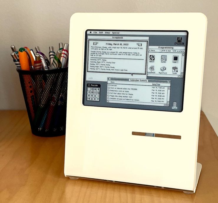
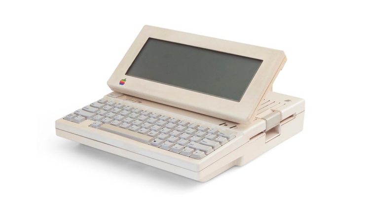
John Calhoun, who wrote one of my all-time favorite games for the classic Mac, Glider, has taken a Raspberry Pi, an e-ink screen, and a great deal of ingenuity to make this:
It’s only got the shape of a classic Mac — and yet….
Calendar events, the current moon phase, and more, in a form that can’t help but bring a smile. Better still, he’s written about the process so others can make one, too. (Ahem, Gerald.) Best desk accessory evah, to coin a phrase.
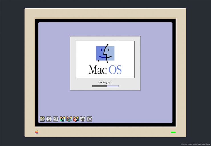
Infinite Mac
Fastest MacOS 8 startup times in history.
A project to have an easily browsable collection of classic Macintosh software from the comfort of a (modern) web browser. […S]ee what using a Mac in the mid-1990’s was like.
Well, naturally, I’ve been . . . here:
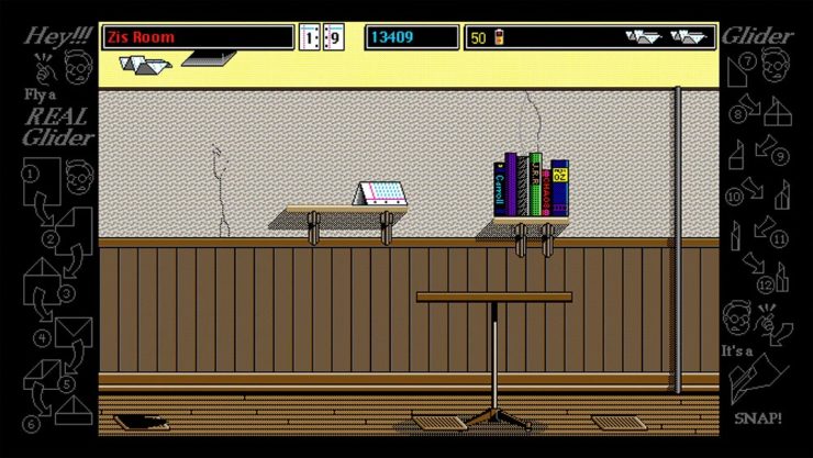
Glider works — and wastes time — just as well as on the original.
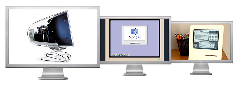
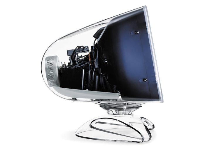
It takes a footnote — hmph — to get to what Steven and I both agree is a favorite, the last iteration of the CRT-based Apple Studio Display (you knew that name was familiar, right?):
The last great CRT monitor, IMHO.
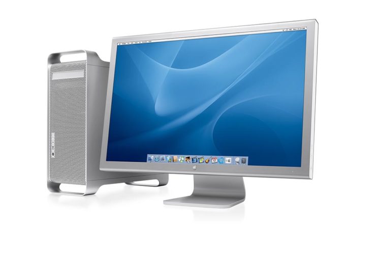
And then there’s the 30-inch Cinema Display, shown here with the G5 tower:
Awesome.
I had several of these monitors, including one of the 30-inchers, and have loved every one of them. And while I, like a lot of creatives, use a 27-inch iMac these days, thanks to Apple’s discontinuation of said iMac, the next iteration of my office setup will include a standalone Apple monitor. I’m glad Steven took the time to remind us what’s been — thanks.
Three completely unrelated items for you this time, ranging from the serious and interesting through the loony and interesting to something of a whole different stripe.
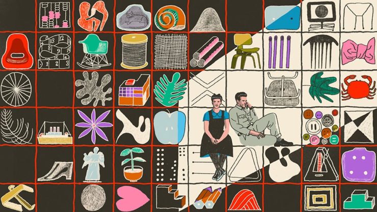
The Eames Institute of Infinite Curiosity
Update 2, 25 Apr:Brand New discusses this logo, with the usual catchy title: The Fast and the Curious: Counterspace Drift
Eames Institute’s “curious” logo variations, discussed at Brand New
Update, 8 Apr: It’s Nice That has more: The Eames Institute launches with a curious, “Eamesian” identity, and a logo that observes
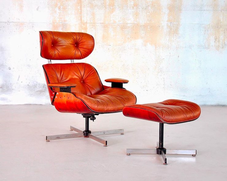
Original post: Practically everyone has heard of an Eames Chair:
A particularly awesome example of an Eames Chair (and ottoman).
What you might not realize is that the legacy Charles and Ray Eames left behind enriches our lives to this day. It’s a shame, then, that while their house is a mid-century masterpiece (and museum), much of their lives have remained behind closed doors.
For almost three decades, a barn-like building in Petaluma, California, contained remnants of one of the most iconic design legacies of the twentieth century. […] We created the Eames Institute because we want you to examine the archive of what you know—the collection of your experiences, understanding, memories, and questions—and connect to the provocations that call to you. We want you to tap into that same fount of relentless curiosity, and its power to shift your perception and open you to innovations and discoveries.
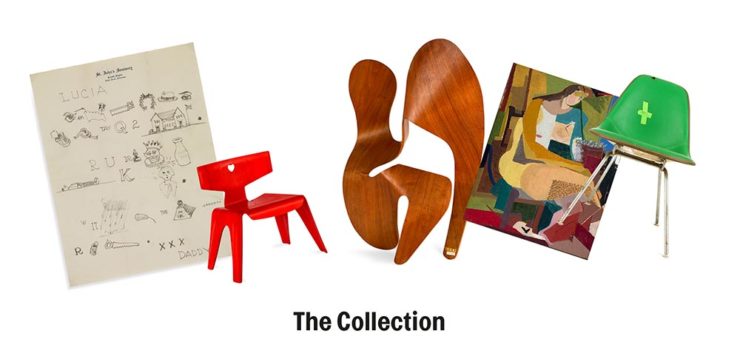
Now, however, there’s the Eames Institute of Infinite Curiosity. Awesome name aside, it introduces us to the more personal side of one of design’s strongest partnerships.
Items from the Charles and Ray Eames Institute. Drawings from the Charles and Ray Eames Institute.
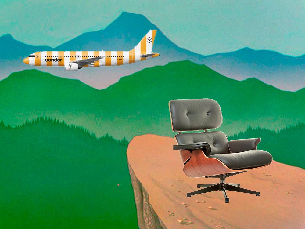
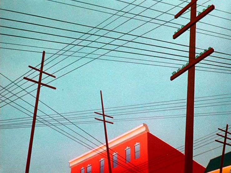
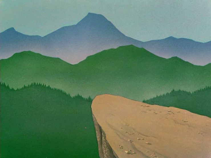
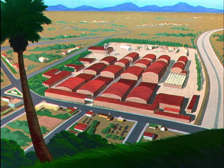
Crossed wires, anyone?Imagine who might run up to — or even get pushed off of — this cliff.A nice, innocent factory. Nothing could possibly go wrong.
Next time I treat myself to a Loony break, I’m going to make sure to spend some time looking beyond the action and appreciate the backgrounds. Nice.
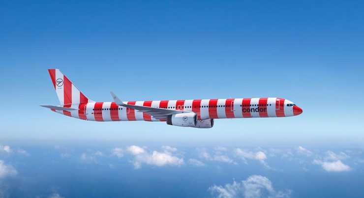
Condor Airlines Rebrands
Most of you have probably never heard of Condor Airlines; they’re mainly a European thing, a “leisure” airline associated with Thomas Cook, formerly owned and run by Lufthansa. (Here’s some history.)
It doesn’t particularly matter. What does is the bravado exhibited by management. Before, a typical airline logo — dare I say, typically Germanic:
Condor’s OLD livery.
Then someone said yelled, “HEY. WE DO VACATIONS. LIKE BEACH TOWELS. LET’S DO STRIPES.” The result:
Condor’s NEW livery. Wow.
Armin Vit:
The new livery has zero fucks to give and just plasters every plane with thick vertical stripes that go against pretty much every single assumed tenet of what makes a good livery. It doesn’t look speedy, it doesn’t look nimble, it requires a lot of paint, and by all other standards it is just plain ugly and I love it.
A few days ago, Jason Kottke posted an item that raised an important enough question — well, twenty of them — that I wanted to repeat it here. The questions stem from a 1981 quiz1Developed by Leonard Charles, Jim Dodge, Lynn Milliman, and Victoria Stockley, originally published in Coevolution Quarterly 32, from winter 1981, asking how well you know your local natural environment. They are:
Trace the water you drink from precipitation to tap.
How many days til the moon is full? (Slack of 2 days allowed.)
What soil series are you standing on?
What was the total rainfall in your area last year (July-June)? (Slack: 1 inch for every 20 inches.)
When was the last time a fire burned in your area?
What were the primary subsistence techniques of the culture that lived in your area before you?
Name 5 edible plants in your region and their season(s) of availability.
From what direction do winter storms generally come in your region?
Where does your garbage go?
How long is the growing season where you live?
On what day of the year are the shadows the shortest where you live?
When do the deer rut in your region, and when are the young born?
Name five grasses in your area. Are any of them native?
Name five resident and five migratory birds in your area.
What is the land use history of where you live?
What primary ecological event/process influenced the land form where you live? (Bonus special: what’s the evidence?)
What species have become extinct in your area?
What are the major plant associations in your region?
From where you’re reading this, point north.
What spring wildflower is consistently among the first to bloom where you live?
I did poorly. (In the words of the authors, “It’s hard to be in two places at once when you’re not anywhere at all.”) In fact, I did so poorly that I decided to not only follow up on the questions but put my camera where my mouth is.
In answer to the first question, Macon and a good chunk of Middle Georgia get their drinking water from the Ocmulgee River:
Ocmulgee (River) Origin
In fact, this past weekend’s trip to Monticello and Barnesville were merely extensions of the trip to Jackson Lake and Dam, so I could see where the Ocmulgee starts. Next up is to trace the Yellow, Alcovy and South Rivers, which feed Jackson Lake. (See the rest of the photographs from the Jackson area.)
Jackson Dam #1
But I’d ask everyone reading this to ask yourselves the same questions. As Kottke points out, most of the people living here years ago would have known more of the answers than those of us who live in the built environment do. He passes on an idea from Rob Walker:
Pick one of the questions you don’t know the answer to – and make it a point to learn what that answer is. After you’ve mastered that, move on to a new question.
Go!
1
Developed by Leonard Charles, Jim Dodge, Lynn Milliman, and Victoria Stockley, originally published in Coevolution Quarterly 32, from winter 1981
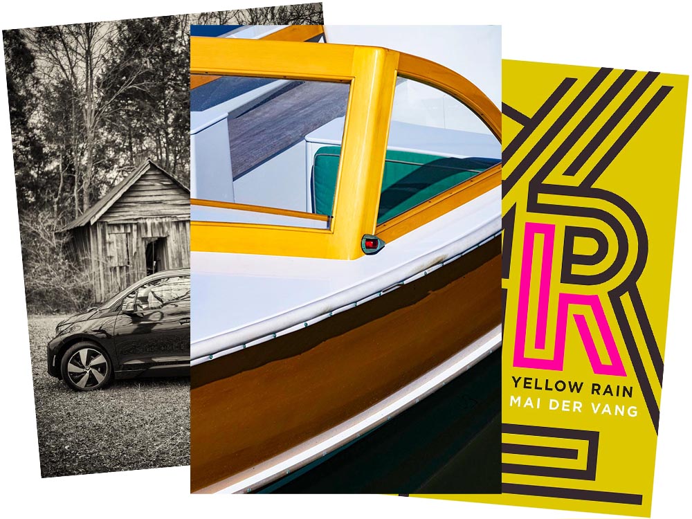
As some of you know, for getting around town, I zip about in an electric BMW i3. The range isn’t great — 120 miles, give or take, meaning I’d have to recharge there if I went to Atlanta — but for Macon and pretty much all of Middle Georgia, it’s perfect. Grocery store? No problem. Park, for a walk? No warmup, no emissions. Enough range for an ice cream in Musella or lunch in Milledgeville? Easy.
In fact, it’s not an understatement to say that I rave about my i3. Simply put, I love it.
Electric Toolbox, Wooden Shed
When introduced in 2014, it was hugely ahead of its time. Built on a bespoke platform with a carbon-fiber body and an eye-catching style (that somehow just looks electric), it was a huge change of pace for the “Ultimate Driving Machine” folks. And it’s done well for them, too: a quarter-million since.
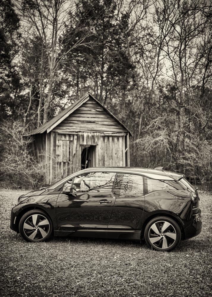
Leica has announced their photograph of the year for 2021:
Over the past ten years, Leica Camera AG has honoured twelve renowned photographers for their life’s work, by inducting them into the Leica Hall of Fame. A Leica Picture of the Year has now been designated for the first time, with the aim of sharing this success with all Leica enthusiasts.
Leica’s 2021 Photograph of the Year
One of the things that makes photography so glorious is how many different ways the person behind the camera could approach a subject. So, I ask myself: would I have taken that photograph? Almost certainly not. That said, would I hang it on my wall? Yes. For $2000? Maybe another lens instead!
Lastly, the New Yorker’s Briefly Noted book reviews (from 6 December — I get them second-hand, and subsequently, am a little behind) reveals a collection of poetry — a reinvestigation of chemical weapons dropped on Vietnam — whose cover is sublime:
It’s the yearly wrap-up and the holiday season! Recap and Rejoice!
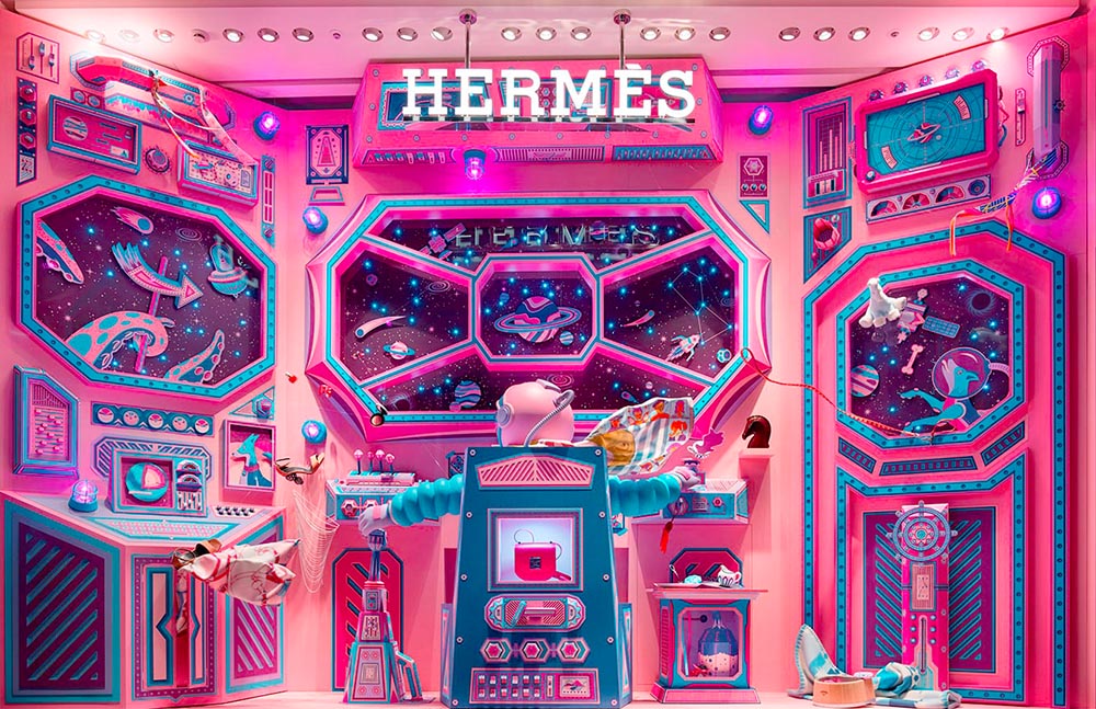
Hermès Does Windows
“Journey of a Lifetime” is this year’s window display for Hermès — yes, Hermès should have an accent, but I can’t seem to summon it today fixed! — so let’s go with a picture instead:
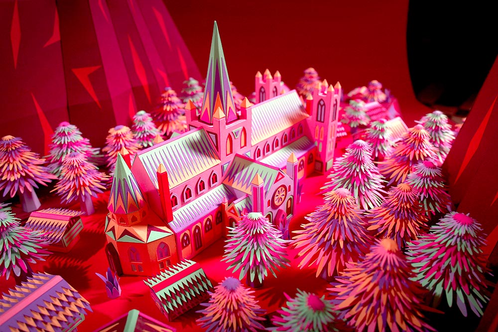
All in paper. No, let me repeat that: it’s all paper. (Well, perhaps some glue.) From artists Zim and Zou. Here’s another, one of their earlier works:
As seen in the last line above, the 2014 logo is a simplification of the 2000 logo, sans the “old-person” wreath, and I thought quite successful:
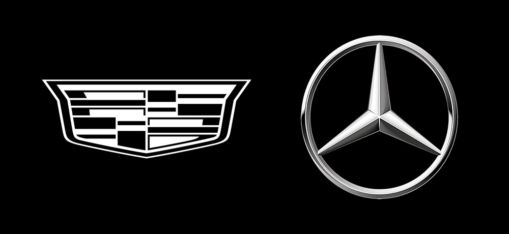
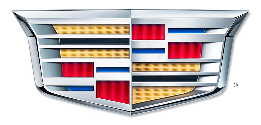
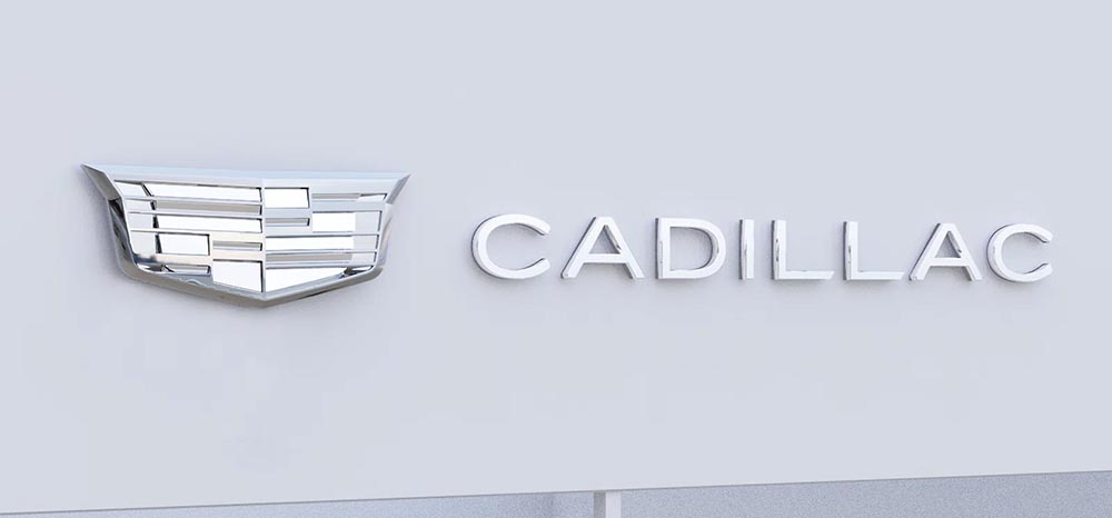
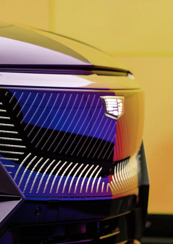
Fast-foreword (ahem) to 2021, and the monochromatic, flat-logo thing is in full swing. The latest “old-person” target is the Cadillac script, replaced with another trendy item, a custom “Cadillac Gothic” font.
Not only that, but there’s the new trend among luxury automobiles — mere cars aren’t good enough — of illuminated logos;
In fact, for all his acclaim in the field of book design, Mendelsund himself isn’t particularly fond of book covers, generally seeing them as an impediment that inevitably colors a reader’s perception of a book. “As much as I love book covers — I love making them, it’s fun — I don’t love the fact that there’s somebody between me and the text.”
These days, actually, the renowned book designer who never wanted to be a book designer tends to simply rip the covers off his books altogether. “If it’s a paperback, I’ll rip the cover off,” he says. “The books that are most important to me in my life don’t have covers on them.”
I didn’t know Peter Mendelsund’s name off the top of my head [Memory not what it used to be? —Ed.], but we’re sure familiar with his work, such as The Girl with the Dragon Tattoo and the Atlantic’s recent redesign. And what an interesting relationship with book design he has. Read more
One thing I never read, if possible: ebooks. That said, in these strange times, they are what folks need — and, because these are strange times, it’s causing problems. Ars Technica has the story.
Lots and lots covered here, including things this huge fan of the movie never knew — including specifics on the fonts, type, and more. When you have a few minutes, grab a beverage and enjoy!
“At the Columbia Journalism Review, we capitalize Black, and not white, when referring to groups in racial, ethnic, or cultural terms. For many people, Blackreflects a shared sense of identity and community. White carries a different set of meanings; capitalizing the word in this context risks following the lead of white supremacists.”
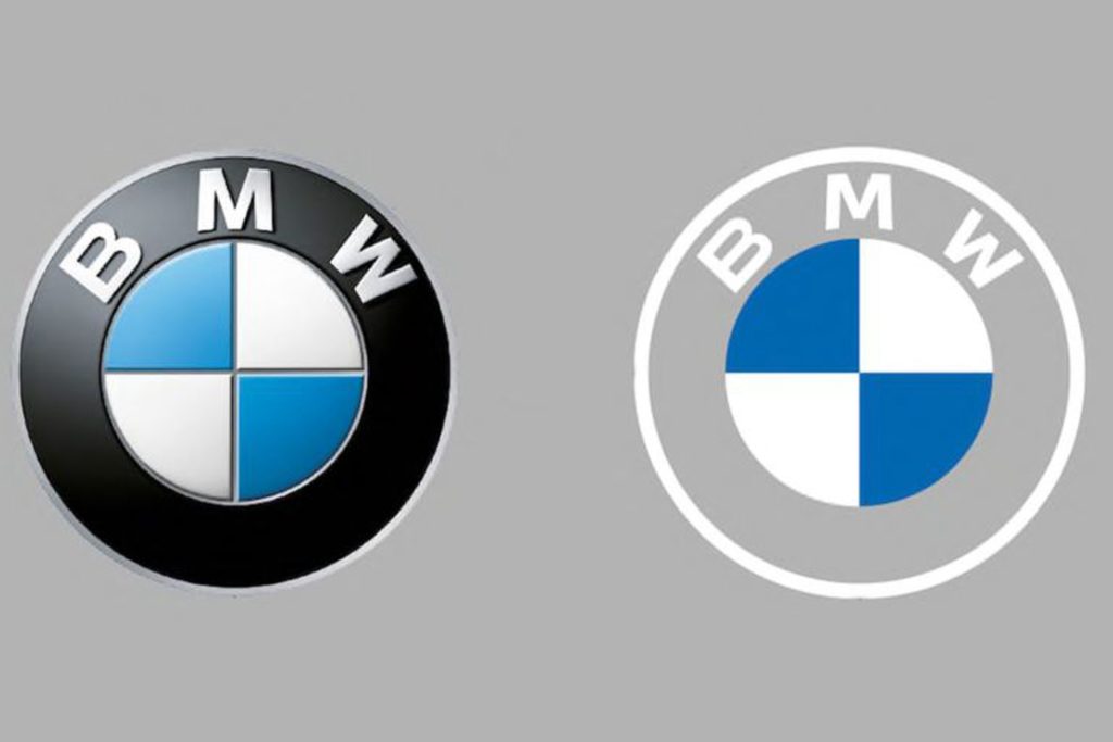
Original post, March 5th, 2020: After 23 years, BMW has updated its logo … but there’s a problem.
Let’s back up a little, as even the previous logo wasn’t perfect. Debuted in 1997, it followed the then-trendy “3D” look, complete with highlights. It was, however, clearly BMW — black background, blue-and-white roundel, chrome outline, lettering. This new one, however, loses the iconic black (for transparent) and chrome outline (for white):
BMW’s logo: 1997 (left) and 2020 (right)
It’s less representative and less clear in my opinion, but hey, I’m only a BMW owner, not any part of their marketing team.
Another problem: it debuted on the Concept i4. controversial all by itself.
Why not revert to the earlier, 1963 version? (Or update it with new type — but keep the black?) Transparency is fine in some cases, but I’m not sure that this isn’t a case of style over substance in the actual use cases (web site logo, app logo, etc. — more than just on the cars, I mean).
Update, 7/27/20: Dezeen has a roundup of the six other companies that have made their logos “flat,” proving the “3D” look mentioned above is truly out of fashion:
Audi, Citroen, VW, Nissan, Mini, and Toyota, oh boy!
Ford Almost Let a Graphic Design Legend Update Its Blue Oval Logo in 1966: Paul Rand, who designed iconic logos for IBM, Cummins, ABC and numerous other companies, designed a sleek logo for Ford that went unused.
“Opel Details All-New, Slimmer And More Modern ‘Blitz’ Logo,” at CarScoops.
Update, 12/30/20: Kia’s was previewed on a show car earlier in the year, but they’ve gone and made it official:
There were some changes along the way, if you compare what’s on the show car and what you see above — and not all for the better, as it almost gets smeared. Still, looking forward to seeing where one of the most dynamic car companies today goes with this.
Update, 1/8/21: GM. One word: GAK.
So bad I actually feel sorry for them. More here and here.
Update, 1/13/21: Brand New is actually much nicer to GM’s logo update than I expected. Diplomacy? You decide. (Brand New is a subscription now, BTW — the best $20/year available, IMHO.)
Update, 3/2/21: Peugeot has joined the fray. Not great, especially at smaller sizes, but at least not the GM train wreck — and, in many ways, better than the last couple of outline lions (this one seems to be based on the 1960 version):
Read about the lion’s history here, Peugeot’s press release “reaffirming its personality and character” here, or one of the regular site’s notes, including a potential move upmarket here or here.
Update, 3/4/21: Audi, while not redoing their iconic “4 rings” logo, has redone the branding around that logo:
Update, 3/6/21: Speaking of Brand New, they have a good deal more information regarding Peugeot. Good stuff!
Update, 3/10/21:Dezeen has more on Peugeot, as well. And CarScoops has the first pictures of the new 308 — the new logo premieres on this model update — and discusses that, on the grille, some of the car’s sensors appear behind the logo. Interesting. (I still preferred the lion on the grille, myself. Not that we get Peugeots in the United States, anyway….) Check it out.
Update, 3/10/21: CarScoops has some more on Nizzan — uh, Freudian slip there: Nissan and their new logo.
Okay, who’s gonna be next…?
Update, 3/13/21: Uh… Renault!
Not as big a change as Peugeot, and more successful, too: single color, retains history well, still instantly recognizable, works at small sizes. Nice. Details from Motor1 or CarScoops.
Update, 3/20/21: Brand New discusses the new Renault logo:
There is nothing wrong at all with it and I do like the approach to its construction but, ultimately, it’s like it’s missing some emotion or passion or, pardon my French, a Je ne sais quoi to make it special.
I agree that the 1972 version is superior. Let’s see how this one evolves.
Back in the ’90s and Aughts, my ex-wife and I ran a popular book design blog called Foreword. For a variety of reasons, from divorce to moving to Georgia and then deciding to do photography full-time, I got away from it. I even let the company name, ospreydesign, get away from me.
I’ve been seriously regretting losing Foreword for a while now — and its return one of the driving reasons for the new web site. Part of that has to do with a return to book design, and wanting to comment on the same, but also because I don’t do social media and have wanted a space to talk about — and get feedback on — items to do with book design, photography, and so much more. There’s no place better than your own web site. Thus, Foreword is back, this time as part of my personal site: gileshoover.com.
Memory Lane
Here’s what ospreydesign looked like way back when:
ospreydesign as of February, 2001
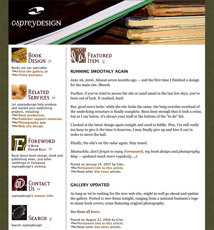
The site evolved, but only to a point — those were the days of having to pay attention to screen width. Remember: 15-17-inch screens were the new hotness; 13-inch was more normal. (Hence the small layout.) There was something comforting about it, though, and this look preserved for years. Here’s another screenshot:
ospreydesign’s home page, as of January, 2007
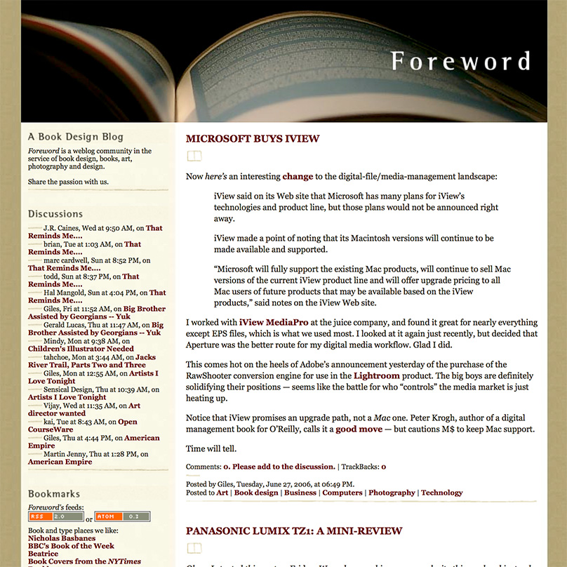
Foreword, a relatively new item called a weblog, or blog, was both a vehicle of discussion and publicity. And it worked — this little blog grew and gained followers, basically riding the early “wave” of blogs.
Here it is from 2005:
Foreword in March, 2005
The “look” changed shortly after, while the popularity continued to grow. Here’s another, from fourteen months later:
Foreword‘s new, wider-columned look, from June, ’06
At this point, Foreword was at its utmost; thousands of readers, #1 in a Google search for “book design,” pretty much everything — and I, quite frankly, decided to throw it all away.
The Photography Era
Changing my priority to photography full-time was both awesome and a completely mixed bag. I absolutely loved the instant results of digital photography, and enjoyed the possibilities of editing them; filters, textures, black and white, and more. The creativity was more immediate, as well, in that I was my own “editor,” for lack of a better term, not answering to as many people as designing books can be.
Making money was more difficult than with book design, but somehow more exciting; in many ways, it’s a performance art — I had to get it right at the time (there are no redos — events move on!), then make it better in the edit. But, I quickly found that weddings and events were not my strong suit. Like many making a profession out of a passion, I too often clashed with the “vision” thing; what I wanted to do — architecture, landscapes, “things” more than people — wasn’t what you made money on.
Maine Schooners, 2009
Worse, I was ahead of an extremely powerful wave: photography as something ubiquitous. With the rise of everything from a flood of new folks doing photography full-time to practically everyone “being” a photographer with just their cell phone, there was absolutely no way I could make the success out of it that I could have had I just stayed with book design first and photography second. Sure, I still did book design — I was early in the photography book genre — but photography as a career proved unsustainable.
Lesson learned.
New Memories
So, book design is again what I describe my profession as, with photography back to being a passion instead of a full-time job, and Foreword has returned. I’m better for it, frankly; so, hopefully, will my readers, as we can again share my love book design — along with why I’ve returned to it full-time.
Having a blog again also gives me a chance to talk about design, book production, photography and how they’ve changed in the intervening years, and recommit myself to regular posting; something I’ve missed and hope others have, too.