This time, several items related to books and bookstores; two more — possibly the last two — from the automotive logo category; and PRINT Magazine’s 2023 roundup of great design.
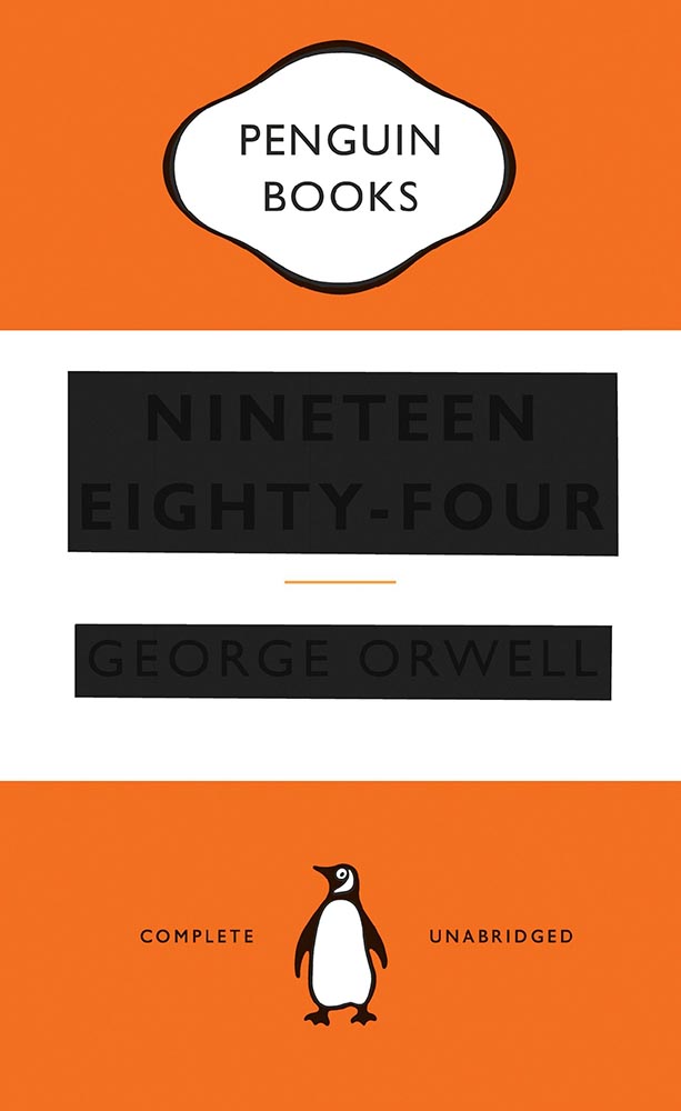
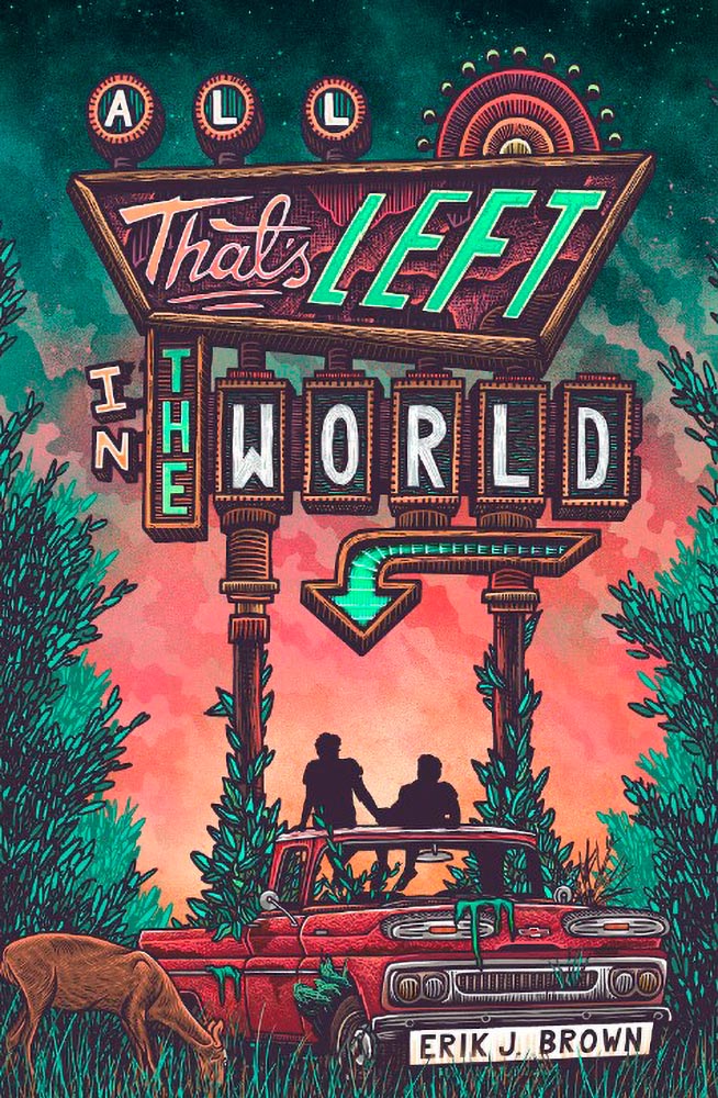
Book Four-For
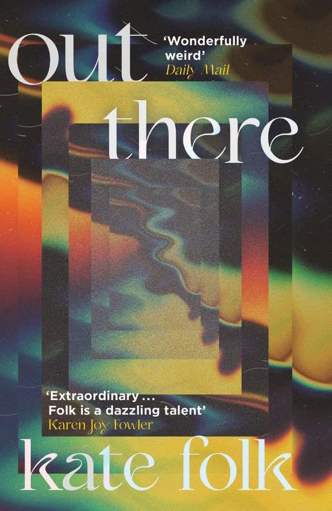
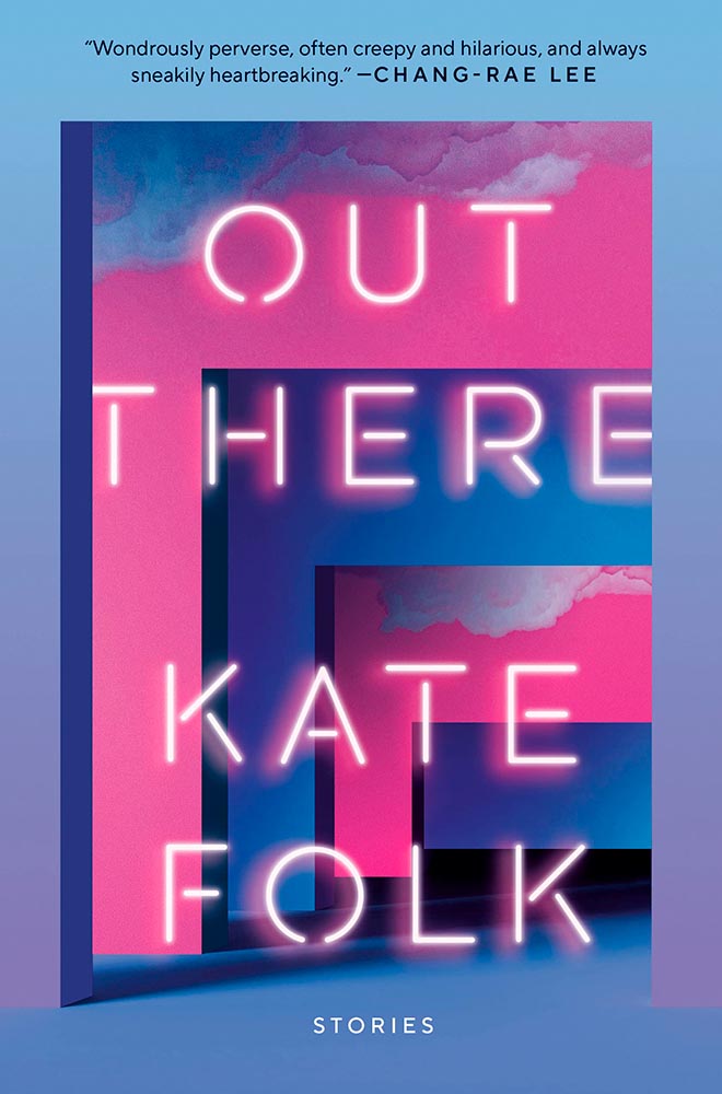
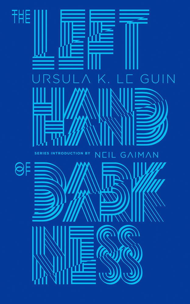
AI book covers? Here, now.
Creative Bloq, which I wasn’t familiar with, has a post up that’s only here because it’s the first I’ve seen of what is sure to be a trend: AI imagery on a book cover.

“Causing controversy,” they say, in that…:
[F]or a while now, with concerns over copyright and ethics plaguing text-to-image generators. Perhaps the most existential worry of all is the idea that AI could put human artists out of work – and while many still find the idea fanciful, we’re already seeing examples of AI-generated art being used commercially.
— Daniel Piper, Creative Bloq
The article itself has a hint of click-bait about it, what with Twitter users spotting a NY Times bestseller but complaining about the UK version of the cover design . . . but the larger question of AI coming for the book designers everywhere is valid.
Then again, AI imagery has the potential to reshape much of the creative landscape. Let’s hope — hope! — that it’s deployed ethically.
B&N’s Market Repositioning
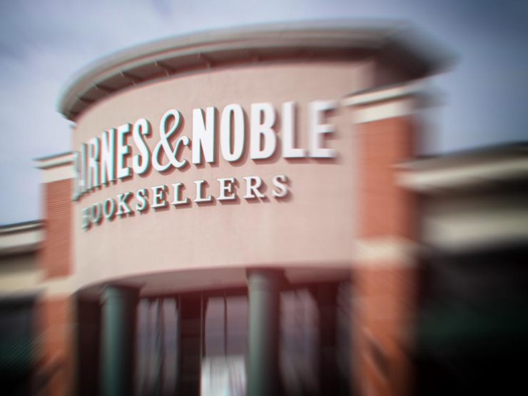
BookRiot asks whether Barnes & Noble’s new presentation as “a local bookstore” — something that’s part of the community in a way that Amazon can never be —is genuine, let alone successful. (We have a B&N here in Macon, which I visit infrequently, and which doesn’t feel “local.”)
Background: The BookRiot article (and the image) above ultimately stem, I believe, from a NY Times option piece from 2018.
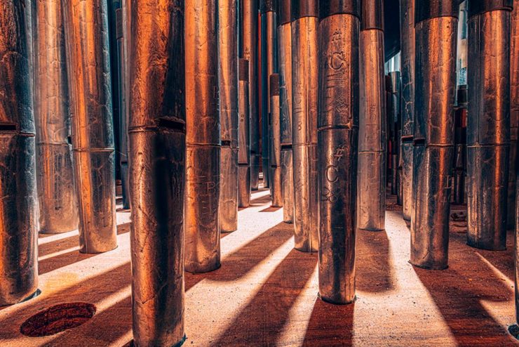
Temples of Books
As regular readers know, I’m a huge fan of combining books and photography. Naturally, great photographs of great libraries strike just the right chord:
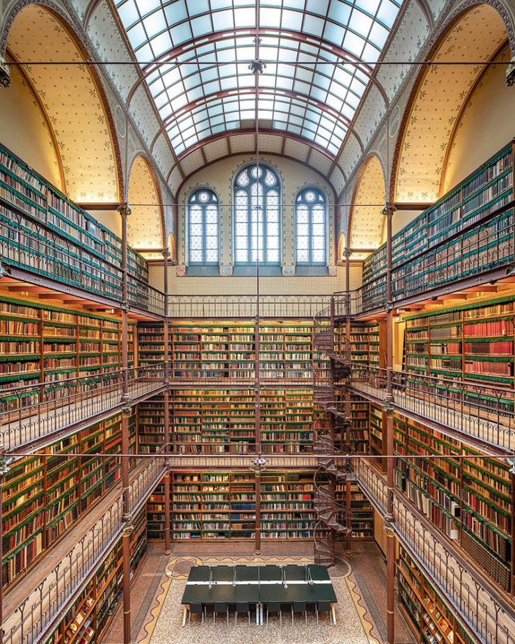
As This is Colossal puts it, “Written by Marianne Julia Strauss, Temples of Books: Magnificent Libraries Around the World celebrates the stunning architecture and quietude associated with wandering the stacks.”
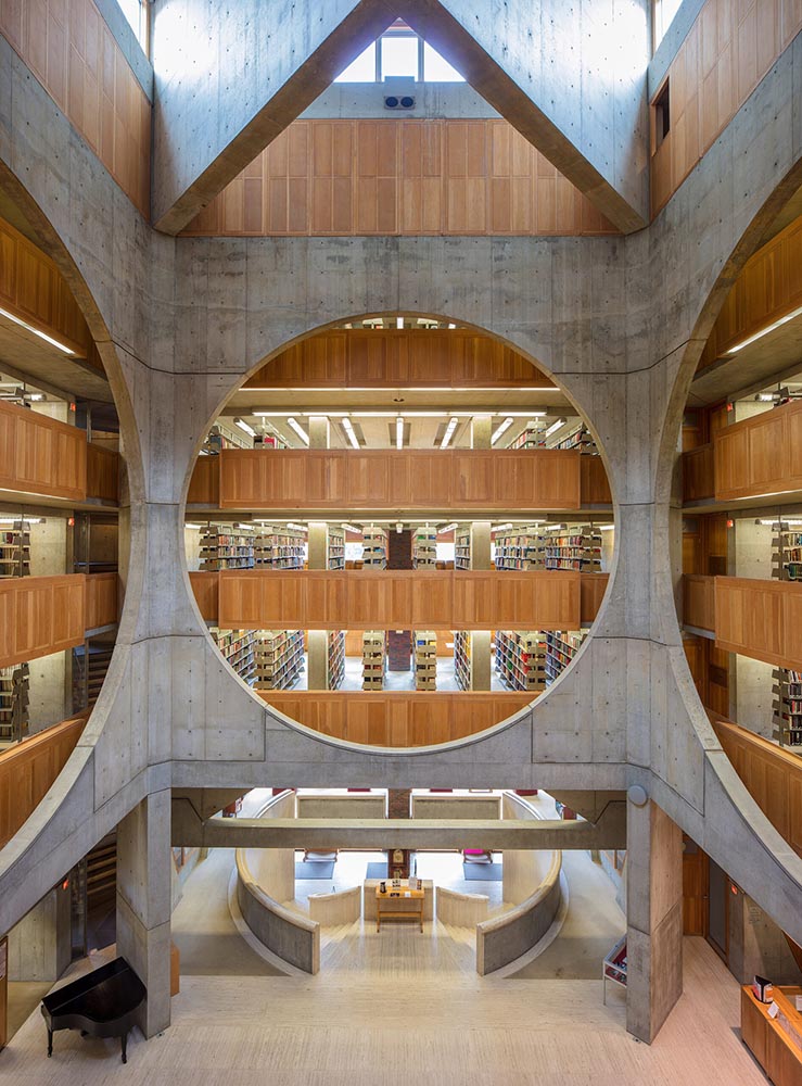
Positioning these spaces as intellectual havens, Temples of Books highlights their wide array of offerings, including botanic gardens, archival repositories, and of course, room to read. “As an institution that can curate knowledge, scrutinize the status quo, and encourage education, the library is more important today than ever,” a statement says. “This responsibility is only growing as the freedom to publish on all manner of channels increases.”
— Grace Ebert, This is Colossal
Instant wishlist item!
Take Action for Libraries

Simple brilliance: a handy step-by-step guide on what to do if you don’t like a book at your local library.
Carmaker Logo Updates: Porsche and JLR
Jaguar Land Rover > JLR
Formerly Jaguar Land Rover, but generally known in the industry as JLR, the British company1Technically, it’s an Indian company, as JLR is a subsidiary of the TATA conglomerate. decided to have a FedEx moment and rebranded. Alas, Paul Rand was unavailable, so there’s no brilliance in the execution. (We’ll absolutely leave whether walking away from Land Rover as a brand is a smart move for another, longer discussion.) Motor1 has the details.
Porsche > Almost all other mainstream car brands
There’s a new Porsche logo!
That’s right: it’s a very subtle change. But it’s a significant one, perhaps because it’s only the fifth in the company’s 75-year history:
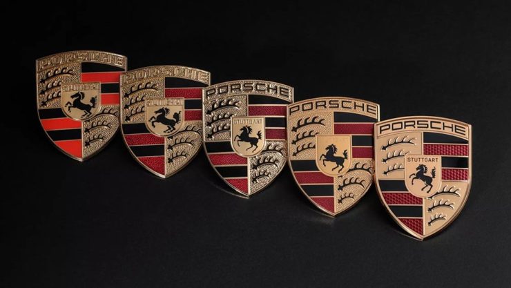
The biggest changes are the backgrounds and the prancing horse in the middle, which is completely redrawn. (And, yes, has more than a passing — heh — resemblance to Ferrari’s.)
Wallpaper* has the best coverage I’ve seen.
Bonus: Motor1 has a roundup of every recent (2015+) automotive change in branding. Of course, I’ve covered most of ’em here, too.
Update: Nissan, already on the updated list above, might be up to something.
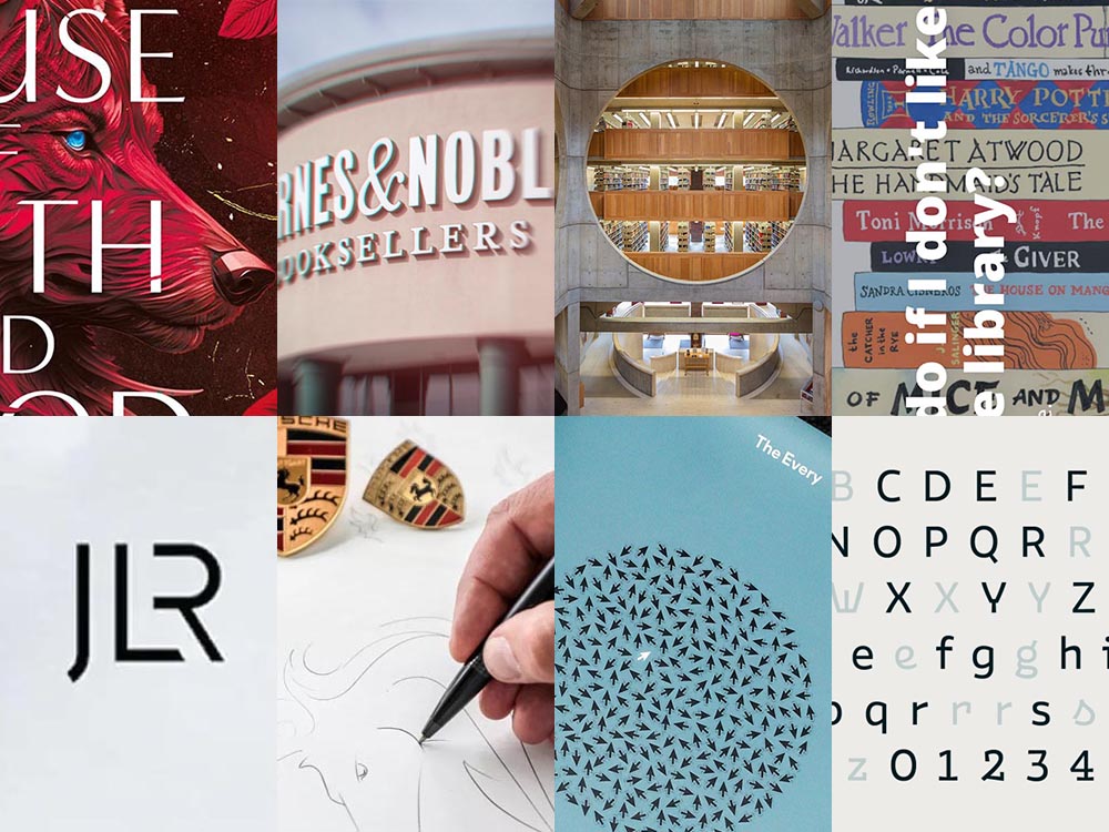
PRINT‘s Best of 2023
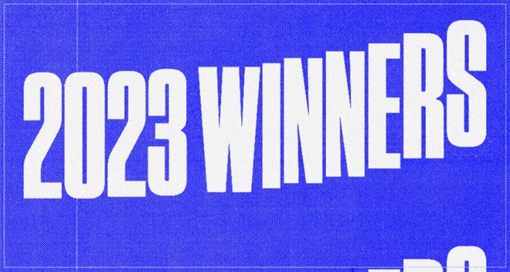
PRINT reminds us that not everything is digital these days — so much of the work still goes on paper or packaging — in their 2023 roundup of great stuff:
The 2023 PRINT Awards celebrated outstanding design in every shape and form, from the delicate texture and exquisite form of print to digital design that married technical skill with precise craftsmanship.
— PRINT Magazine
The best in show is a brilliant environmental design, the annual reports category is oddly satisfying (I didn’t know that Land O’ Lakes is a cooperative that owns Purina, for instance), the editorial category contains brilliance, and many, many more worthy of a design lover’s attention.
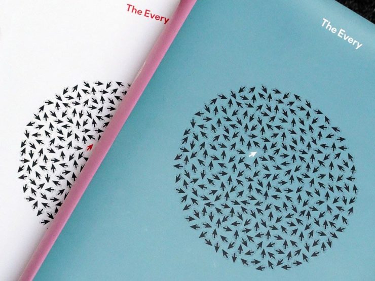
Sadly, their book design category is a bust. I like “The Every,” but pretty much any of my Best of 2022 picks run circles around it (and the other two choices):
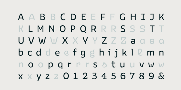
But there are gems. I really like Bakemono, for instance, a winner in the fonts category and the best monospaced font I’ve seen:
It’s a long article (they call it a 74-minute read!), but when you have a moment, grab a drink and an iPad and enjoy — hopefully as much as I did.
And that’s it! Settle into summer, and stay tuned for more soon.
- 1Technically, it’s an Indian company, as JLR is a subsidiary of the TATA conglomerate.