Note: Click on the title above to see this post in one-column format, which includes larger graphics — helpful with some of these jackets especially. (This applies to any post here on Foreword, by the way.)
It’s time once again to celebrate the unsung heroes of the book world: the best items published by university presses.
The annual show, now in its 57th year, honors the university publishing community’s design and production professionals. The Association recognizes achievement in design, production, and manufacture of books, jackets, covers, and journals, and the Show serves as a spark to conversations and source of ideas about intelligent, creative, and resourceful publishing.
Association of University Presses 2022
This show, like the 50 Books, 50 Covers also announced around this time of the year, is cool in that it doesn’t just talk about a book’s exterior — there are covers and jackets, interior design, even awards for the quality of typography.
Let’s talk about titles with both covers and interiors first, starting with the great Gumbo Ya Ya from the Poetry category:
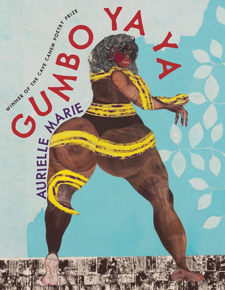
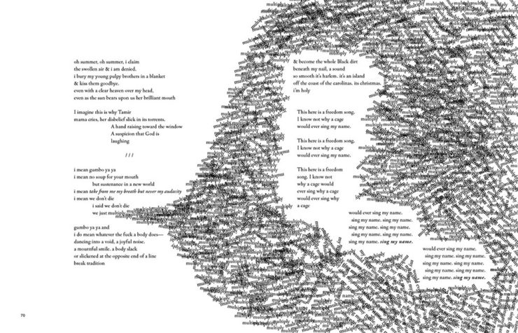
The strength of this design, inside and out, towers head and shoulders and whatever else above — designer Alex Wolfe deserves this win and many kudos from me.
Next, two from the Scholarly Typographic category:
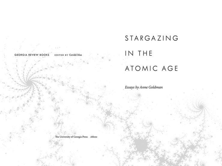
Fractals are a great choice on this title page. (Love the title, too.)
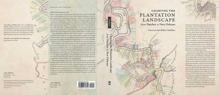
This whole project is well done, with the jacket taking an old map and giving it just the right treatment.
Three from the Scholarly Illustrated category:
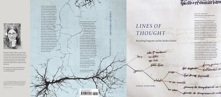
Not dissimilar to the above when zoomed out, but so much more than a scribble when zoomed in. (Note that the blue wraps onto the front — nice choice.)
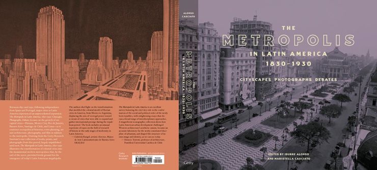
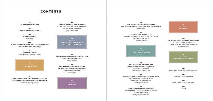
Great cover, and the contents pages are awesome! (I don’t get to say that very often.)
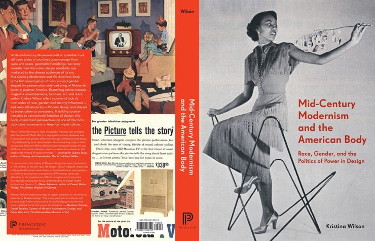
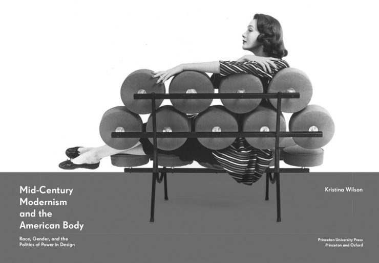
This is not an easy title to design for, and here both the cover and title pages are extremely well done.
Next, the Trade Typographic category:
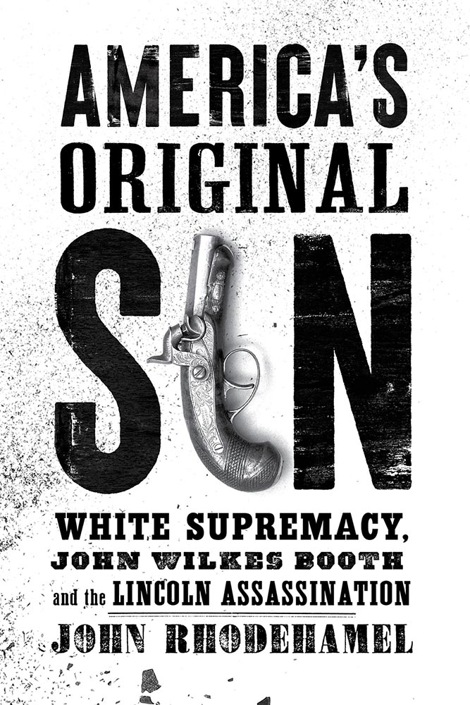
A one-color triumph.
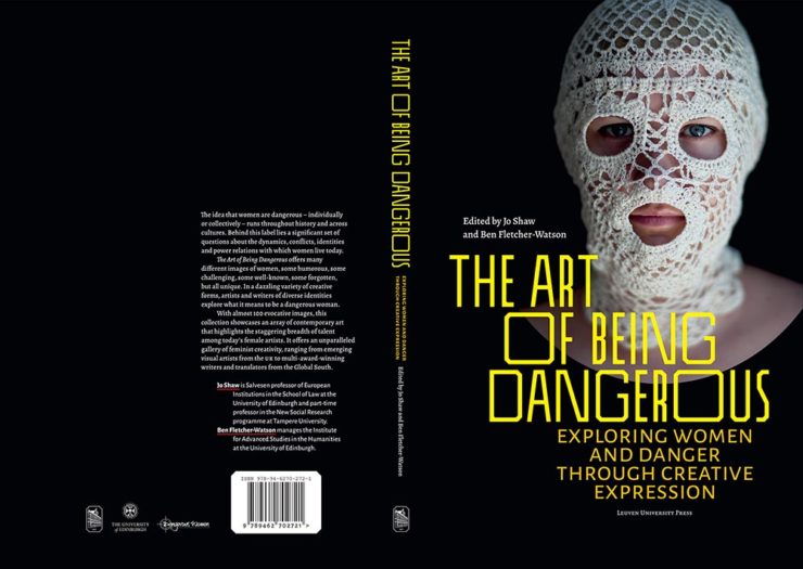
Great, great photograph with interesting typography grabs your attention here.
One from the Trade Illustrated category:
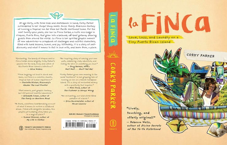
It’s difficult not to appreciate a book with “Love, Loss, and Laundry” in the subtitle — but the book design does it justice.
We finish up with several favorites from the Book Covers and Jackets category:

Flag-as-fence. ’Nuff said.
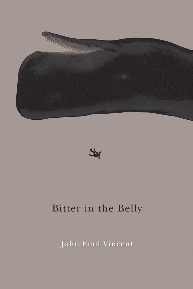
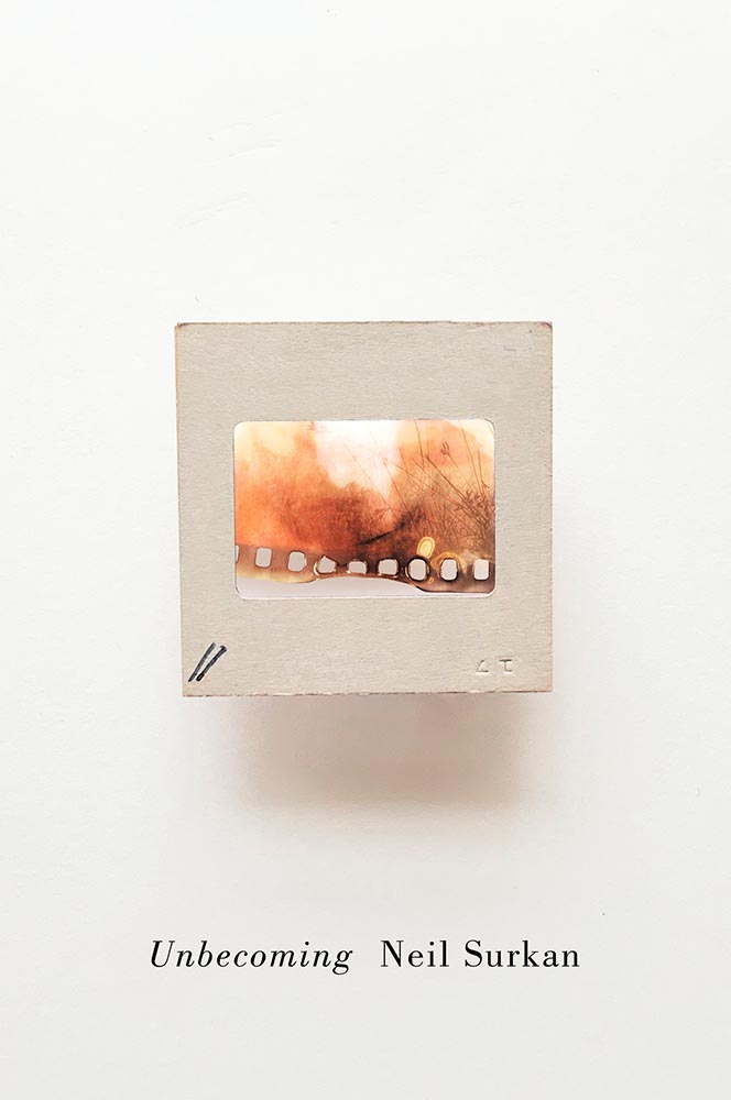
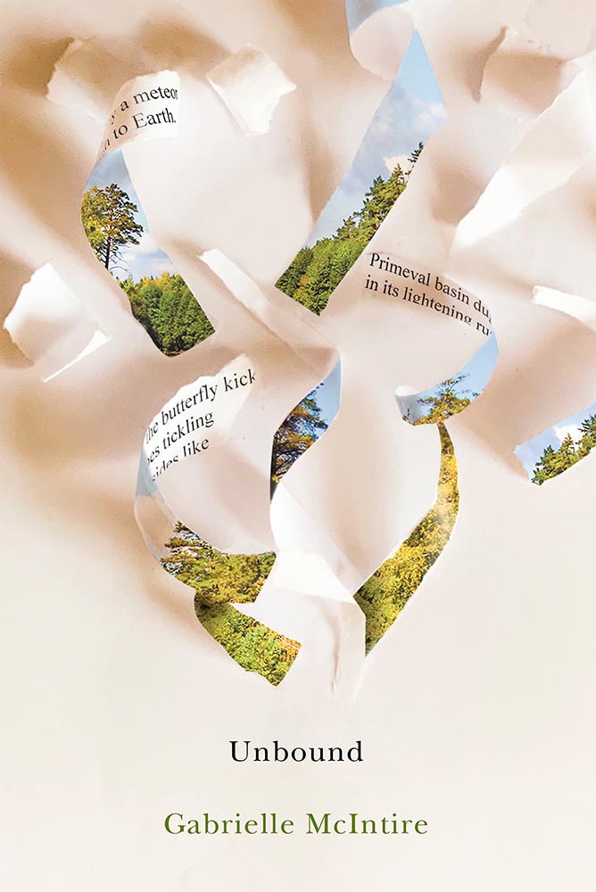
I don’t know that these are a series of titles as much as a style for the titles — but, in either case, they work.
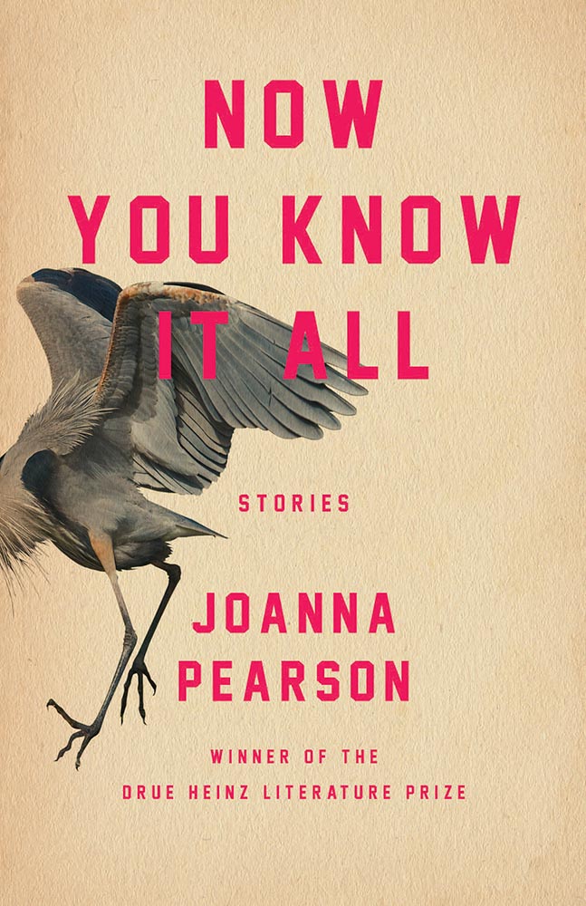
Not the only title here with textured paper, the simple typography with a fantastic — and fantastically-placed — bird wins for more than literature.

The white border around this is difficult to see here, but adds to the overall in an interesting way; I also like the hand lettering over this amazing photograph.
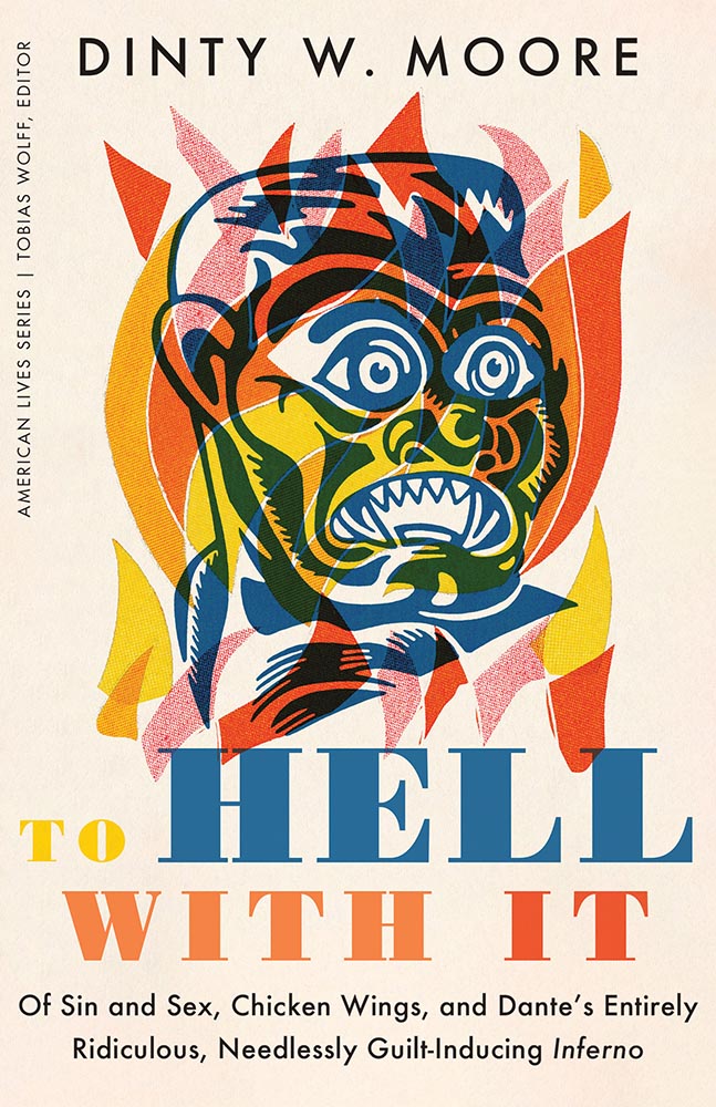
Additive color combined with the subtitle-of-the-year on this winner.

Great, great typography here. When combined with the radiating lines and provocative title, it makes for a title that I’d absolutely pick up.
I’ve saved my favorite from the whole show for last:
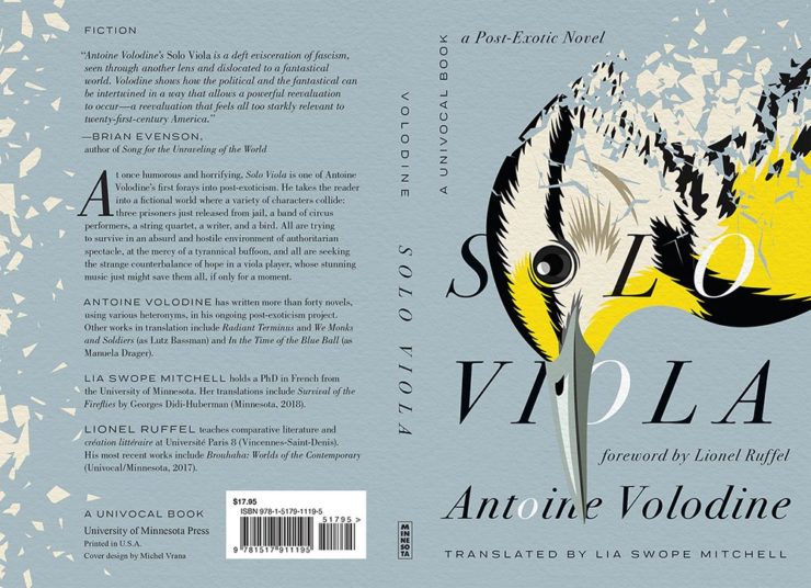
Another appearance of textured paper is just the start here, with that illustration rocking so hard indeed — the eye! Fantastic in every way. (Bonus points for “A Post-Exotic Novel.”)
See all of the entries from this great Association of University Presses show here. (FYI, nothing from Spine yet, but kudos to the University of Chicago Press for blogging about their favorites.)

