Beautifully Briefed 24.8: Picture This

A trio of miscellany, a trio of space photography, more than a trio of great black and white photography, and a single, very serious photography question for you this time — let’s get right into it.

Summer of Fun Miscellany
Intermezzo, Explained
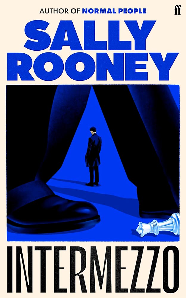
The UK cover for Intermezzo. Book design by Kishan Rajani. (The US cover doesn’t compare.)

GQ UK has an interview with Kishan Rajani, a senior designer at Faber, and Pete Adlington, the publisher’s art director, “about how the Intermezzo design came together, the role of social media in modern book design, and how to make books ‘as pickupable as possible.'”

The endpapers for Intermezzo (UK). I really like that they’ve sweated the little details.

We can discuss “pickupable” as a word another time — your time is better spent, for now, reading the interview.

WeTransfer Sold

“Some of Bending Spoons’ most successful products are tools that serve creativity, therefore we are confident that this milestone will complement both businesses, supercharge our growth, and help us create even more value for creative industries at large,” says WeTransfer CEO Alexander Vassilev of the acquisition.

I like and appreciate WeTransfer — unlike the corporatespeak above (but hey, we’re inventing words today … right?) — and hope that despite being corporatized, nothing substantive will change.

PetaPixel: “The companies did not say whether or not all staff or leadership at WeTransfer would be maintained after the conclusion of the acquisition. That may come into question since Bending Spoons does have a track record of buying completed products, training its internal staff on their upkeep, and then releasing the original development team.”

Crap.

Update, 9 September, 2024: “Bending Spoons acquired file-sharing platform WeTransfer in July and has now laid off 75% of WeTransfer’s staff,” PetaPixel reports. “The Italian app company Bending Spoons has confirmed the layoffs to TechCrunch, which comprise at least 260 people based on WeTransfer’s employee headcount of around 350 people.”

Adobe, Again
The Adobe “World Headquarters” buildings in San Jose, California. Image via PetaPixel.

Adobe (previously) recently sat down with PetaPixel to discuss the shambles where things stand — clearly, an attempt at damage control. PP published it … and got some feedback:

Adobe couldn’t explain why it let its once excellent relationship with photographers and media lapse, only that it is sorry that happened. I do believe [their explanation], at least when I hear it from the people responsible for making the software. There is a big divide between the folks who code Photoshop and the C-level executives who are so out of touch with the end users. The thing is, it doesn’t matter what those people down in the trenches of development say or even how good Adobe’s software happens to be, some photographers just don’t like the feeling of giving money to the company because of the people at the helm.

Jaron Schneider, PetaPixel

The thing is: it’s less photography, really, than design. If you’re a photographer, how you get to the point of printing or publishing the photographs offers options in software — whether iPhoto, Affinity, Photoshop, or the Pixel 9 Magic Editor — Instagram doesn’t care, Zenfolio takes multiple file formats, and so on.

But in design — that is, desktop publishing or especially book design — Adobe has a monopoly over the software used by the industry, full stop. I used to love working with their software. Today, not so much. (And for the record, it’s more than their fees, it’s the quality of the software.) It’s extremely frustrating and, at the moment, there is no alternative even on the horizon.

Crap. (Again.)

Extraordinary Astrophotography

So, how many can place Kyrgyzstan on a map? It’s a former Soviet Republic in Central Asia, and, clearly, a great place to do some astrophotography.

Star Trails Above Tash Rabat by Soumyadeep Mukherjee.

PetaPixel highlights the work of Soumyadeep Mukherjee, who traveled there specifically for the purpose — and succeeded wildly. It’s awesome to see a country I’m not familiar with served so well. (My favorite, of course, is the short depth-of-field portrait — if you can call it that — of Yuri Gargarin, seen in the header image above.)

Alternatively, This is Colossal points us at “Bisected by the Milky Way, a Stellar Image Captures the Perseid Meteor Shower Raining Down on Stonehenge“:
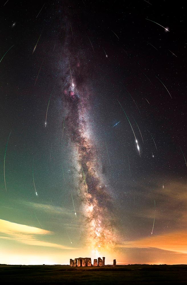
Perseid Meteors over Stonehenge by Josh Dury.

“Josh Dury, aka ‘Starman,’ is an award-winning landscape astrophotographer, presenter, speaker and writer from The Mendip Hills ‘Super National Nature Reserve’ in Somerset, United Kingdom,” his web site trumpets.

The thing is … despite looking like he’s about 25, he’s earned it. Great stuff.

Meanwhile, back at PetaPixel, “Photographer Aaron Watson, who goes by Skies Alive Photography, has seen many incredible things in the night sky. His latest sighting is a rare double ‘moonbow,’ a rainbow created by bright moonlight in precise conditions.”
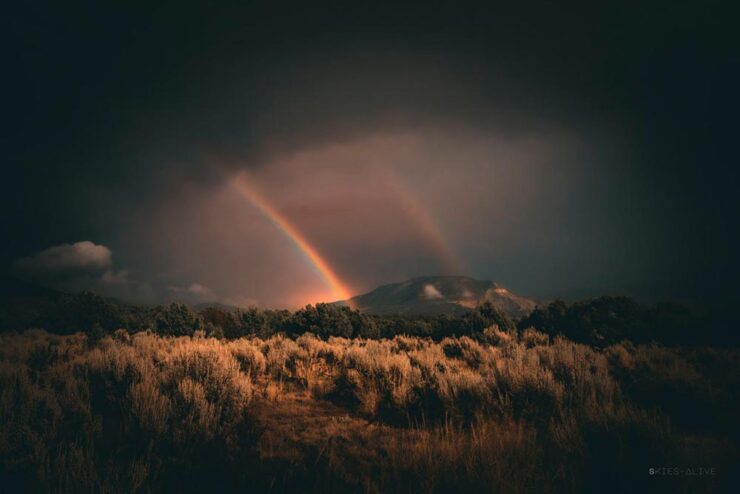
Double Moonbow by Aaron Watson.

All three of these folks need special thanks for their patience. I have trouble standing still long enough to set up a tripod, let alone do long exposures under rarely-encountered combinations of time, weather, equipment and location — plus lots of good luck — in the middle of the night. Well done, all.

“Majesty of Monochrome”

The winners of the third annual Black and White Photo Awards have been unveiled, showcasing the best in monochrome photography across multiple categories.

Monochrome Majesty: Marie-Elisabeth-Lüders-Haus, by Robert Fulop. Bronze Mention from the Black and White Photo Awards 2024.

Naturally, I gravitate towards architecture — and the winners (of the nearly 5000 entrants) demonstrate serious talent.

Bench, by Colin Page. Finalist from the Black and White Photo Awards 2024.
The Double Helix, by Md Tanveer Rohan. Finalist from the Black and White Photo Awards 2024.
Windows by Manfred Gruber. Finalist from the Black and White Photo Awards 2024.

See the winners — and especially, take in the finalists, many of which I’d personally judge to be winners in their own right — at the contest’s web site.

Special Bonus #1: It’s time once again for the annual iPhone Awards, “a powerful testament to the art of storytelling through photography.” I especially liked this one:

Bicycle Forest by James Kittendorf. 3rd place in the Cityscape category, 2024 IPPAwards.

It’s a great photograph, certainly, but it was taken by a now-quite-elderly iPhone X — proof, once again, that it’s the camera you have with you. See all the 2024 winning photographs, in multiple categories and taken worldwide, here. (Via PetaPixel.)

So … What’s Next for Photography?

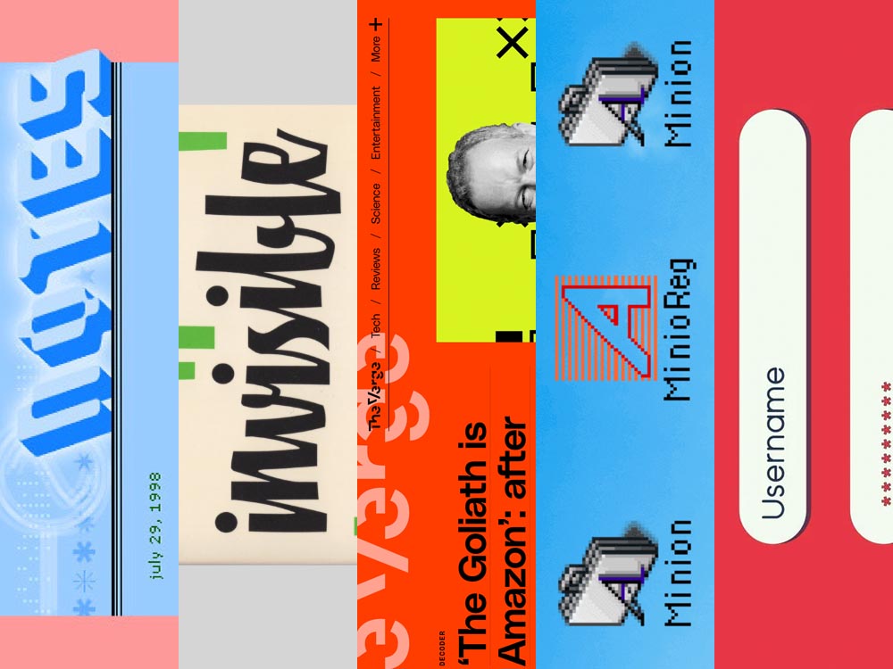
The Verge: “Anyone who buys a Pixel 9 — the latest model of Google’s flagship phone, available starting this week — will have access to the easiest, breeziest user interface for top-tier lies, built right into their mobile device.”
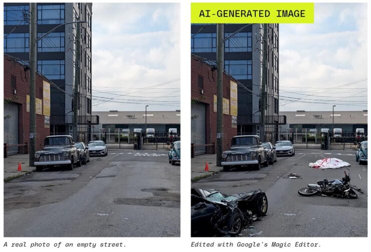
A montage from The Verge, thankfully clearly labeled.

Life-changing moments have long been captured using photography, from Moonrise to George Floyd. But, generally, fakes were the exception, not the rule. We’re, unfortunately, arming the folks who cry foul.

Another montage from The Verge. Note the woods filled in behind the helicopter less convincingly than the accident, above — but how many are going to notice?

It does this article disrespect to summarize. Just go read: “No one’s ready for this.”

Special Bonus #2: Nick Heer, at Pixel Envy, articulates what needs to be said: “anyone can now radically and realistically alter an entire scene within minutes of taking a photo. [O]ur expectations need to change.”

Beautifully Briefed 24.6: Summer of Win (Mostly)

In this installment of Beautifully Briefed, let’s take a look at some great posters, great print items, and great photography. Plus, an update from Adobe’s continued campaign to lose friends and attract government attention. Fun stuff!

GET LECTURED (ON ARCHITECTURE)

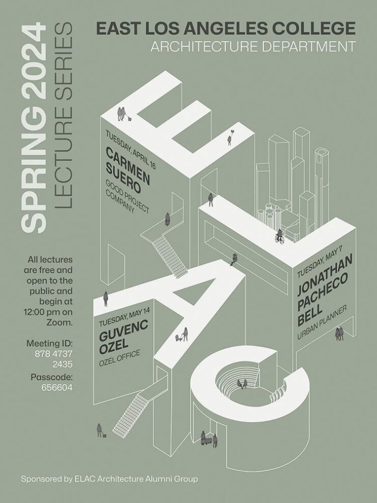
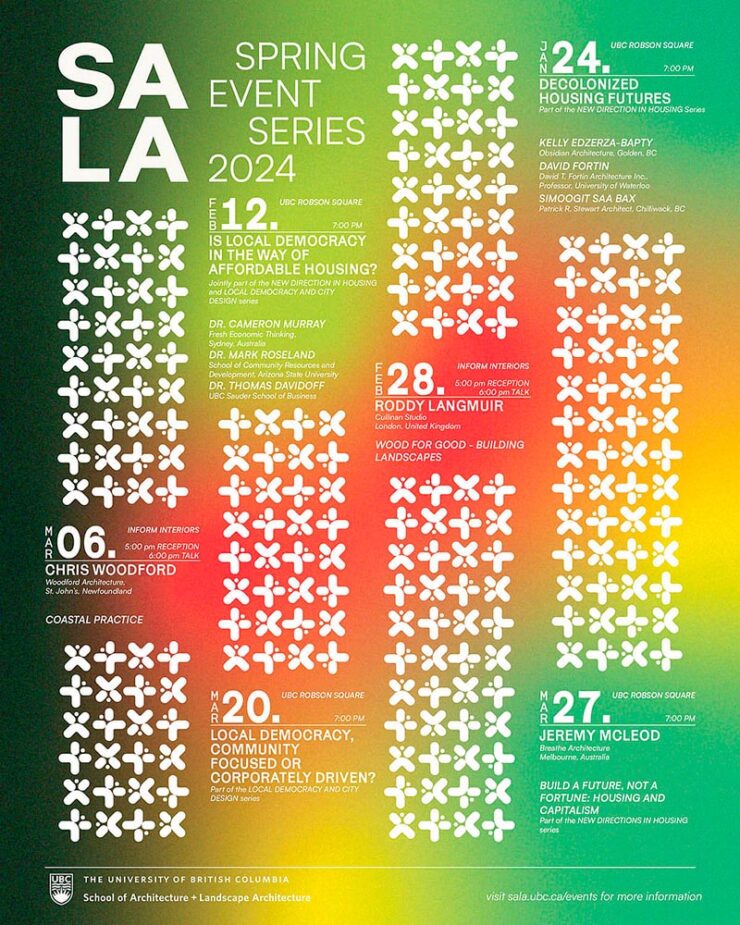
Back in September, I mentioned Archinect’s Get Lectured poster series. They’re back with the Spring 2024 winners, including these two faves:

ELAC lecture poster design by Tashfiah Ahmed.
Lecture poster from the University of British Columbia; designer not listed.

Great examples of design in a often difficult category. See the rest.

Architecture Photographs by Hélène Binet

While we’re discussing architecture, let’s talk about a Dezeen post that caught my eye: photographer Hélène Binet has a new book out, adding to her long career capturing the old-school way — using film.

“A Sentimental Topography by Dimitris Pikionis, landscaping of the Acropolis, Athens, Greece.”

This series captures shadows and light with exceptional talent, including the above, where she’s praised for “captur[ing] in a single image the tactile and textured presence of tectonic form, both in built and natural environments.”

“Staircases in Sperlonga, Latina, Italy.”

I love the softer shades of gray than shown in the previous image, and both this and the image below demonstrate a deep understanding of architectural expression.

“Kolumba Museum, Cologne, Germany, by Peter Zumthor.”

Read the post from Dezeen, see more examples of outstanding work on her website, or buy the book with 170 photographs, essays, and more.

2024 Audubon Photography Winners

This is Colossal posted about this a day before my Audubon magazine showed up with these prominently featured, and they’re all winners.

Wild Turkey, Female Bird Prize Winner, by Travis Potter.

Bird photography is a difficult skill requiring patience, perseverance, and specialized gear; those who excel at it deserve recognition. Plus, there’s this:

Audubon’s climate science report Survival by Degrees reveals that two-thirds of North American birds are threatened by extinction from climate change, including species featured in this year’s Audubon Photography Awards like the Blackburnian Warbler, California Quail, and Sedge Wren.

Forster’s Tern, Professional Honorable Mention, by Kevin Lohman.

Check out the Colossal post, or see the full story at the Audubon website.

Special Bonus #1: Kottke points us towards the Siena 2024 Drone Photography Awards. “Look! Up in the sky! It’s … another contest!” Good stuff nonetheless:

“Jiashao Bridge” by Sheng Jiang, China.
PRINT 2024 Awards

The annual PRINT awards are out, featuring — natch — great items in print, including items like the Smithsonian’s annual report and a Naked Trails brochure. Here are a couple of items from the book design category:

Jacket design by Robin Bilardello.

Author sketch and lettering by the author. Also, let’s get the . . . :

Cover design by Milan Bozic, with illustration and typography by Lauren Tamaki.

Fantastic.

Special Bonus #2: Hoefler & Co. brings us Typographic Doubletakes: “While good typefaces have prodigious families of carefully related styles, some of the best typography builds unexpected relationships between unrelated fonts.”

Left: Chronicle Hairline + Landmark. Right: Vitesse + Gotham.

Their blog refreshes as you scroll in more ways than one — enjoy.

Left: Mercury Text + Ideal Sans SSm. Right: Whitney + Operator and Operator Mono.

Special Bonus #3: Kottke points us to a LitHub post arguing for adding full credit pages to books acknowledging everyone who worked on them. “How lovely it is to be seen and appreciated.”

Adobe “Too Easy to Hate,” Say Users, Employees

Adobe continues to score big with the public — in the best Boeing style, a formerly-great company has put profits before users and employees. While successful from the shareholders’ point of view (record profits, again), some are . . . upset. PetaPixel:

Just over a month ago, an Adobe exec called AI the “new digital camera.” Simultaneously, an Adobe marketing campaign chucked photographers under the bus, and not for the first time, which caught the attention of the American Society of Media Photographers (ASMP). At the very top of Adobe, there is a concerning and frustrating lack of understanding about art and the people who make it.

Even “exasperated employees implored leadership to not let it be the “evil” company customers think it is;” while that might be a stretch — “ignorant greed” is a better description — either is not a winning look.

The latest was a terms-of-service update that many saw as a rights grab, allowing the company to use users’ work to train its AI services. While those have been amended, the seemingly clear language — “We’ve never trained generative AI on customer content, taken ownership of a customer’s work, or allowed access to customer content beyond legal requirements” — comes from a company that has lost the trust of users, making those words just that — words. Time will tell if they are truth.

But there’s more: Adobe’s just been sued by the FTC (via PetaPixel, Pixel Envy) for hidden fees and difficult cancellations:

“For years, Adobe has harmed consumers by enrolling them in its default, most lucrative subscription plan without clearly disclosing important plan terms,” the lawsuit alleges. “Adobe fails to adequately disclose to consumers that by signing up for the ‘Annual, Paid Monthly’ subscription plan, they are agreeing to a yearlong commitment and a hefty early termination fee that can amount to hundreds of dollars. Adobe clearly discloses the early termination fee only when subscribers attempt to cancel, turning the stealth early termination fee into a powerful retention too that [redacted] by trapping consumers in subscriptions they no longer want.”

I’m actually glad for this, as I wasn’t aware that my $60+ monthly fee is a payment on an annual plan. (Ug.) Not too big an issue — I actually feel like there’s decent value in the plan and will continue to subscribe for the foreseeable future.

But I’d also be lying if I said I’m completely satisfied with our business arrangement: alternatives are few and far between. While Adobe does not have a monopoly legally or technically, in the publishing industry at least, they are, for all intents and purposes, the only game in town. It would be nice if they would at least demonstrate a modicum of respect for their users.

Update, 25 July 2024: “Adobe Exec Says Early Termination Fees Are ‘Like Heroin’ for the Company,” according to PetaPixel. Hmph.

Beautifully Briefed 23.10: Shifting, Branding, and Creating

A variety of interests addressed this time: a bit on Shift Happens, a great question on branding, and Leica’s new M camera — and its content credentials. (Plus, bonuses.) Happy October!

Booking a Keyboard

We talked about this title back in January, but it’s worth the reminder:

A 3D rendering of Shift Happens.

Marcin Wichary has long been interested in keyboards. In his words,

Keyboards fascinated me for years. But it occurred to me that a good, comprehensive, and human story of keyboards — starting with typewriters and ending with modern computers and phones — has never been written. How did we get from then to now? What were the steps along the way? And how on earth does QWERTY still look the same now as it did 150 years ago? I wanted a book like this for years. So I wrote it.

Marcin Wichary, Shift Happens

This title fascinates me, partially because it’s an interesting subject — one we’ve all interacted with, often without thinking about — and partially because it’s a great, well-covered exercise in book design.

A very cool photograph of an IBM Electric. Photo by Marcin Wichary.

Further, Marcin has done a fantastic job in getting the word out. He’s designed a killer web site, written some great updates, and gotten some good press — including a recent interview with Ars Technica, in which he says:

I am a web guy, and I used to think that the web (just like typewriters, once) took away a lot of hard-won typesetting nuance and tradition. But it turns out that the web also makes it much easier to do certain things. To have a word be surrounded by a rounded rectangle—a visual representation of a key—is a few lines of CSS or a few clicks in Figma. But for the book, I had to cut my own font and then write Python scripts to do typesetting inside the font-making software, which I’m pretty sure you are not supposed to do[.]

Marcin Wichary, Shift Happens

Really looking forward this title. Copies are, as of this writing, still available.

Let’s Talk Branding.

It’s Nice That asks a great question: “Are rebrands starting to look the same? The challenges facing commercial design,” in which author Elizabeth Goodspeed discusses whether “shortened turnarounds and economic tensions” are taking a toll on originality.

Westinghouse branding guidelines from the ’60s.

The answer might seem to be, “Well, duh,” but it’s nonetheless a thoughtful and insightful article that asks the correct question: “how does one define originality in an age saturated with visual stimuli?”

[T]he digital applications more often associated with modern rebrands, while comparatively easy to update, may counter-intuitively promote less care and attention towards their making. [A]nother possible issue contributing to rebrand redundancy: lack of rollout support beyond rebrand launch. Even a unique identity may lose its spark when its primary consumer touchpoint is what a social media manager produces on Canva after skimming the brand guidelines once. Further still, many clients no longer approach design studios to harness their expertise but, instead, with preconceived notions of the result they expect; design studios may want to create original work, but sometimes clients are willing to pay more for a rebrand that mirrors their own preconceived ideas of what the work should look like.

— Elizabeth Goodspeed, It’s Nice That
The logo’s the same, but the applications vastly different.

The whole article is great (and richly illustrated) — give it a few minutes of your time.

Special Bonuses #1 & 2: Let’s look at a couple of places where branding has been in the news recently (pun intended). Also from It’s Nice That, an article on The Irish Independent rebrand. Here, as is often the case recently, it’s the custom illustrations that carry the day:

Andy Goodman is the illustrator responsible for the lively work found throughout, which toe the line between measured and playful,” It’s Nice That writes. Agreed 100%.

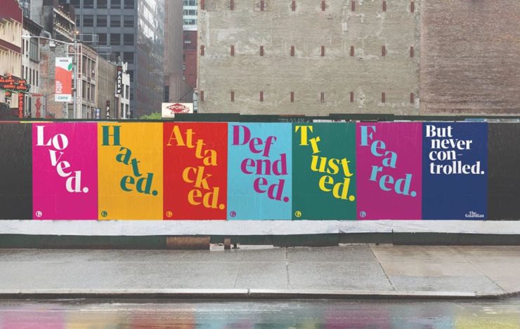
Less successful is England’s The Guardian, whose ongoing campaign to raise money — they don’t have a paywall, relying instead on reader contributions — perhaps could have used more work:

These ads don’t really have me on the fence: The Guardian deserves better.

Meh. (And this from a huge fan of The Guardian.) Creative Boom is more positive.

Special Bonus #3: From the wildly successful, original branding department comes, of course, the brilliantly-named Eames Institute of Infinite Curiosity. They’ve been covered here twice before, but are back in the news with a new branding Manual. See why that’s capitalized at Dezeen.

The Eames Institute branding oozes positivity, class, and — you guessed it — infinite curiosity. Nice.
Leica, Adobe, and Content Authenticity

One would assume that Leica users are the epitome of content authenticity — there’s nothing like the world’s best lenses (IMHO), attached to some incredible cameras, to provide photographers with all that’s needed to make the best possible images.

Leica’s new M11-P, however, packs a world first: hardware encryption that supports a system called the “Content Authenticity Initiative (CAI).” In CAI corporate-speak, it’s “the future of photojournalism […] usher[ing] in a powerful new way for photojournalists and creatives to combat misinformation and bring authenticity to their work and consumers, while pioneering widespread adoption of Content Credentials.”

Leica’s new M11-P. A bargain at $9,195. (Lenses extra, of course.)

B&H puts it another way:

The Content Authenticity Initiative (CAI) is a collaborative effort initiated by Adobe in partnership with various other organizations, including The New York Times and Leica, among others. Announced in late 2019, its primary goal is to develop a standard for digital content attribution. The rise in manipulated digital content, deep fakes, and misinformation has underlined the need for a more transparent system of content attribution, which the CAI seeks to address.

The interesting thing here is Adobe’s initiative. What’s their goal?

Adobe has been suffering a few hits recently. They’ve just raised prices — on the heels of record profits — and “monopoly” is not in any way a stretch. Photoshop? Entered the lexicon. InDesign? No credible alternatives. Illustrator? Professional standard across multiple industries. In other words, we’re stuck with ’em, and they know it.

This line of thinking is expanded at CreativeBoom: “Is Adobe Becoming the Frenemy of Creatives? But that’s not all.

Ignore’s Adobe’s unfailingly cute examples: AI + texture = exactly what some “creative director” needed. Seriously uncute.

They’re pushing hard into AI, too, and surprisingly up-front about it changing creative work in ways potentially less creative:

Firefly 2 was unveiled yesterday at the 2023 Adobe Max conference with the artificial intelligence (AI)-powered tool incorporated into Lightroom’s new lens blur feature that simulates depth of field along with a host of other tools. However, it was the new “Generative Match” tool that will allow users to upload a reference image to guide the AI image generator to a specific style that prompted Adobe to comment that the new tools could mean less work for photographers. 

Adobe is appealing to companies who want a “consistent look across assets.” It is offering brands the chance to generate hundreds, if not thousands, of similar images for different uses such as websites, social media, and print advertisements.

— Matt Growcoot, PetaPixel

Or how about this example: An agency or freelancer working on a vector image in Illustrator, and need to add something that they either don’t have the time or talent to do myself. Previously, they could find either a stock item — made by a human (who is paid, by the way) — or hire it out (again, to a human, and again, one who is paid for their work). Now? Just tell the computer what you need.

Get more from Ars Technica’s Unlimited Barbarians Dept.

All of which ties nicely back to the previous section on whether branding is beginning to homogenize. Is AI going to accelerate that process? You betcha.

Value human creativity, folks. Artists, teachers, writers, thinkers: all the people pushing at the edges of the envelope will now have to push even harder, in an era when envelope-pushing is increasingly demonized.

Special Bonus #4: Ars Technica argues that the U.S. Copyright Office’s blanket ban on the copyright-ability of AI-generated images isn’t going to age well, using photography as an argument.

Special Bonus #5 (Updated 31 Oct): Via Nick Heer’s excellent Pixel Envy, we have a great explainer from Tim Bray regarding The Coalition for Content Provenance and Authenticity (C2PA), the actual implementation of CAI. Better than my brief description by a country mile.

Special Bonus #6: To round out this post, from the department of envelope-pushing: PRINT Magazine put together the book covers of the 11 most-banned books in America. Dangerous, indeed!

Beautifully Briefed 23.3: Kottke’s 25, The Book Cover Review, B&N Back to its Roots, The End of Type 1 Fonts, and I Don’t Want to Log In

This time, the twenty-fifth anniversary of one of my favorite websites, a new book cover review site, an interview with B&N’s CEO, the end of Type 1 fonts, and a world-class rant.

Kottke Turns 25
“Fine Hypertext Products,” indeed.

Jason Kottke has been publishing a blog continuously for twenty-five years — more than half his life — and along the way, earned many an eye. (It’s been a full-time job since 2005.) Some of his thoughts from the anniversary post:

My love for the web has ebbed and flowed, but mainly it’s persisted — so much so that as of today, I’ve been writing kottke.org for 25 years. A little context for just how long that is: kottke.org is older than Google. 25 years is more than half of my life, spanning four decades (the 90s, 00s, 10s, and 20s) and around 40,000 posts — almost cartoonishly long for a medium optimized for impermanence.

I had a personal realization recently: kottke.org isn’t so much a thing I’m making but a process I’m going through. A journey. A journey towards knowledge, discovery, empathy, connection, and a better way of seeing the world. Along the way, I’ve found myself and all of you. I feel so so so lucky to have had this opportunity.

— Jason Kottke, Kottke.org

Cited here often, always brimming with interesting items, and a regular source of learning, Jason deserves massive congratulations. Happy 25! Here’s to many more.

Bonus: Kottke was a guest on Daring Fireball’s The Talk Show. Check the links — Textism! — and enjoy a trip down blogging’s memory lane.

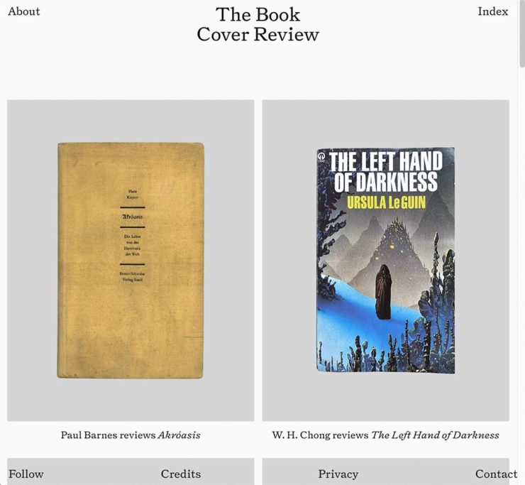
The Book Cover Review
NYT? No, English, actually.

FastCompany points us to a new and interesting cover review site: mostly classic titles, covered in ~500 words “from a range of voices around the world.” Good stuff, with a NYT Book Review look and feel, updated regularly. Give it a try.

The Verge interviews B&N’s CEO
Decode B&N with James Daunt

I’m not a regular listener of The Verge’s Decoder — it’s usually business-centric, going so far as to describe itself as secretly about org charts — but this one’s interesting: an interview between Nilay Patel and Barnes and Noble CEO James Daunt. They cover changes at B&N (with emphasis on why) and, of course, the elephant in any room:

[Amazon is] really terrible at putting a book in front of you that you never thought you’d want to read, that you have no reason to read and no tether to at all. Whereas a bookstore is precisely the place that does that. You pick up the book that you never thought you would want to read, might read, or could even think about reading, by an author you’ve never even heard of until that moment. When a bookseller says, “Look at that,” “Read that when you next come in,” or “I love that,” or whatever it is, all those small, little recommendations are personal and able to attach themselves to books that otherwise have nothing going for them at all.

James Daunt, CEO, B&N

Props to The Verge for providing a full transcript, especially helpful for folks who would rather read the interview than listen to it. Whether you want to read or listen, though, book lovers in the US should take in this interview.

Adobe Discontinues Type 1 Support
Flying Suitcases.

Back in the old days, Type 1 fonts were the backbone of desktop publishing. They were multi-part, often incomplete or corrupted, and always getting in the way of perfect print output — and yet beautiful and opening never-before-appreciated horizons of possibility for your projects.

Now, in these days of OpenType, Google Fonts, and digital output, Adobe has taken the decision to discontinue support for the legacy Type 1 format. TypeNetwork has the full story, along with some options, and there are other converters if you need ’em.

Bonus: TypeNetwork also has all of the Adobe Originals, from back when Adobe was your go-to instead of the corporate behemoth. Classy classics: see the list.

The end of an era. (Via BrandNew.)

The Perfect Rant: Solved
There’s a park calling your name.

One more from The Verge: “I don’t want to log in to your website.” The surge of login and email requests before being allowed to read “free” content is addressed brilliantly:

So what we’re looking at here is creating a worse user experience in order to pursue a variety of scummy money-making schemes. And that sucks because there are no real public spaces on the internet. Here in reality, I can fuck off to a park and hug a tree and sit on a bench and do stuff without ads, without anyone trying to track me, and without having to pay a dime. There was a time within my memory when people tried to make websites feel like semipublic places — you could hang out on someone’s cool blog and enjoy yourself. 

Elizabeth Lopatto, The Verge

Read the whole thing, nod in agreement, and go enjoy that park.

Beautifully Briefed 23.1: Winter Potpourri

From book design and minimalist photography to … well, book design and what absolutely isn’t minimalist photography, plus some street signs and another warning about Adobe. Let’s dig in.

Book Design #1: People Really Do Judge a Book by its Cover

From University College Cork — that’s Ireland, folks — we have something that, on the surface, seems obvious: a book cover “is the most likely factor to convince a person to read a book if they are unfamiliar with the work or its author.” Maria Butler, a PhD candidate in the School of English and Digital Humanities at UCC, reminds us why.

Design by Kimberly Glyder.

You’re reading Foreword, so you likely agree — and shown above is one of those worth-a-thousand-words images: the first of the 2023 titles I’ve set aside for my favorites of the year, and absolutely something good enough to make me pluck it off the shelf without knowing anything about either the title or author.

Bonus: See 70 (!) more of my Favorite Book Covers of 2022.

Book Design #2: Shift Happens

A fantastic website has clicked our way: Shift Happens, for a book about keyboards.

A screenshot from the Shift Happens website. Great stuff.

This project not only scores with great web design — check the interactive version of the book, pictured above — but what also seems like great book design. It’s a Kickstarter project (or will be, next month), so the usual cautions apply, but I might just go ahead and take the leap.

Couple of interesting book design items, by the way: the TOC is at the back, the endpapers are awesome, and the macro photography is tops. The book design reminds me of The Playmakers, still my favorite book design project ever.

Bonus: Tim Walsh, author of The Playmakers, is still going strong. Nice.

Photography #1: Minimalism

The winners of the Minimalist Photography of 2022 awards are in, some are fantastic. Here are a couple of favorites, from the architecture category:

“Prince Claus Bridge in the Netherlands,” by Arthur van Orden
“Blue Window,” by Andrea Richey

The Minimalist Photography Award is the only foundation that deals extensively and professionally with minimalist photography as a branch of photography in which the photographic artistic vision takes the lead.

Milad Safabakhsh, President of Minimalist Photography Awards
Photography #2: Wonders of Street View

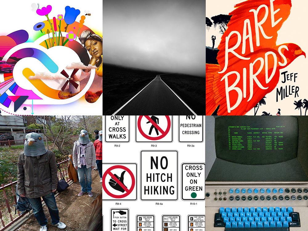
This is Colossal brings us another gem from Neal.Fun: the Wonders of Street View.

“Wall Driver,” indeed.

Direct quote, just because: “A man with three legs, a vintage car scaling a building, and an unsettling formation of people donning bird masks are a few of the scenarios highlighted in the terrifically bizarre Wonders of Street View.”

I didn’t know it was a thing to dress up and pose for the Google cameras. Perfect.

Street Sign Style Guide

Speaking of street views, did you know there’s a style guide for highway signs? Would you believe that I’m a fan?

Interestingly, there is an I-42/I-17 interchange in Phoenix, but this ain’t it: these signs are representational.

As with most things government, there’s confusion, too many regulations, and yet it’s based around good ideas. Beautiful Public Data has a guide to the guide.

Adobe Steps in it, Again

From DPReview: “If you’re an Adobe Creative Cloud subscriber, you might want to go and turn off a new setting immediately. It’s been discovered that Adobe has automatically opted users into a ‘Content analysis’ program that allows Adobe to analyze your media files […] for use in its machine learning training programs.”

It’s important to note that Adobe only uses the files saved in the “Creative Cloud,” something I don’t do as a matter of course, but even still, this is yet another example of Adobe using its monopoly position in the creative field to take advantage of its paying customers.

Adobe, unsurprisingly, didn’t return DPReview’s request for a comment/clarification.

Beautifully Briefed, Mid-September 2022 [Updated]: Indigenous Type, Italic Type, Adobe Types “Stop,” and Two Awesome New Cameras

A wide selection of items for the beginning of fall, from positive fonts to jolly cameras — with Adobe and Pantone pouring some cold water on things. Let’s get to it!

Indigenous Letterforms

As Americans, Europeans, or, more generally, Westerners, we take for granted that fonts will reflect the various pieces of individual type — that is, letterforms — that we’ll need. But not everyone falls into that category.

North American Indigenous fonts — with updated Unicode. Major Kudos. (Courtesy of Dezeen.)

Dezeen points us to an especially interesting effort: “Typotheque typography project aims to protect Indigenous languages from “digital extinction.” In this case, folks who were in the Americas long before Westerners arrived used languages often not written down, or that use letterforms that simply aren’t supported in modern typographic systems.

“When [the Unicode Standard] doesn’t contain characters in a given language’s orthography, it is not possible for that community to accurately use their language on digital text platforms.”

Typotheque typeface designer Kevin King 

Fascinating. Read more at Dezeen.

Italic Letterforms

The always-great Hoefler & Co. spends a minute educating us about italics:

Hoefler examines italics: point-and-sketch
Hoefler’s Fifteen Italic Textures illustration

Italics can be the most colorful part of a type family, diverging dramatically from their roman cousins. Here’s a look at twelve kinds of italic typeface, with some notes on their cultural contexts, historical backgrounds, and practical applications.

Hoefler & Co.

Read the article, “Italics Examined,” at Hoefler & Co.’s Typography.com.

Adobe Types, “Stop.”

Adobe and Pantone are having a . . . thing. As a result, all Pantone spot libraries have been removed from Adobe products:

A classy move, completely in character for both companies, to reach into users’ machines and remove stuff they had paid for and may rely on because of some licensing spat.

Nick Heer, Pixel Envy

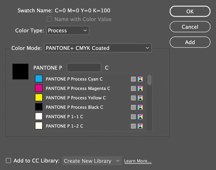
I didn’t get a notice in either InDesign or Photoshop, but a check in InDesign (the CC 2022, aka 17.4, version) shows only the CMYK libraries:

Adobe’s Pantone+ CMYK (Coated) color picker, from InDesign CC 2022

You can subscribe to the additional libraries from Pantone for $60/year. Book design is almost exclusively CMYK, so I won’t be . . . but grrrr.

On the subject of Canadians: thanks to Nick Heer’s north-of-the-border reporting for the notice.

Update, 28 September, 2022: Adobe got around to putting up a banner in my version of InDesign — blaming Pantone:

This notice showed up September 27th, 2022.

They’ve put up a “help” page. (I took a moment to fill in the feedback at the bottom of that page, too: “Removing features we’ve paid for is incredibly uncool, Adobe. Shame on you.”)

Two Awesome New Cameras, from $100 to $100,000

So Pagani, the multi-million-dollar sports car manufacturer, has decided to market large-format cameras. Okay!

One of Pagani’s new camera models
A closeup of the (beautifully-detailed) tripod plate for Pagani’s new cameras.

Incredible, breathtaking detail and quality, based on Gibellini models but taken to 11. But like their cars, mere mortals need not apply: their cameras start over $100,000.

Mortals can dream, sure, but here on Earth, I encourage an order from this Ukrainian company instead:

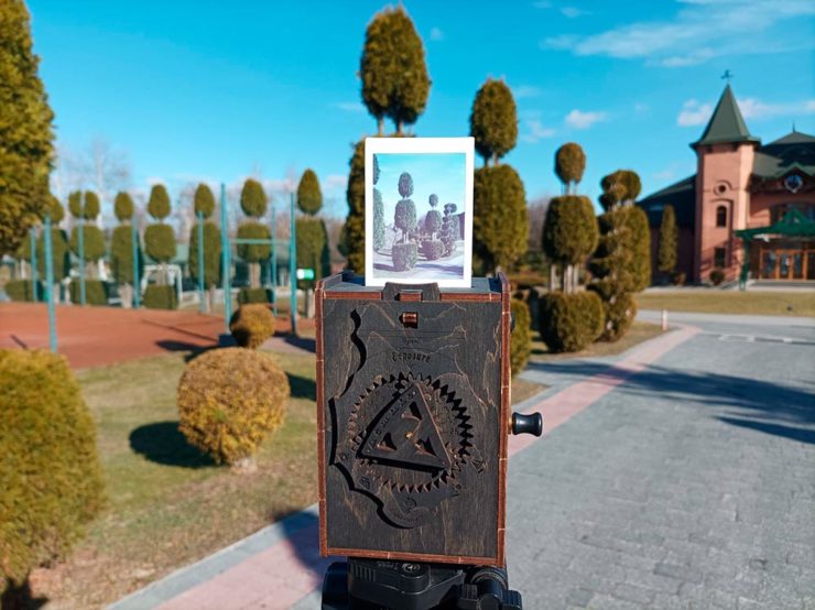
Jollylook’s Pinhole Instant Mini film camera
Jollylook’s Pinhole Instant Mini in situ

They’re based on instant film cartridges, are made of recycled materials, look incredibly cool, and a kit starts at an incredibly-reasonable $99. Throw in a few extra dollars to support Ukraine and . . . feel Jolly.

Thanks to This is Colossal for the link.

Neenah Swatch Pro

From Dieline:

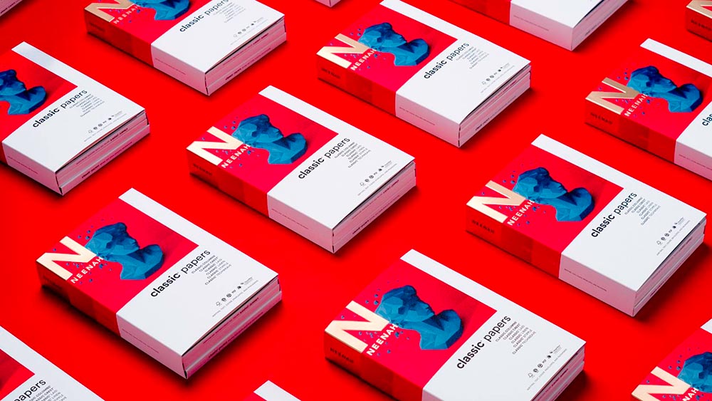
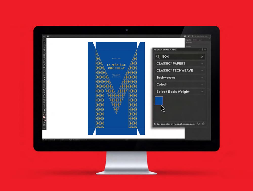
Specialty paper manufacturer Neenah has announced a refresh to its Classic paper swatchbooks that makes bringing designs from digital workspaces to the physical world, including a significant revamping of the numbering system, optimized for the Neenah Swatch Pro extension for Adobe Illustrator, Photoshop, and InDesign.

I’m a sucker for good paper — many of you know I started in print work, and to this day, prefer it over digital destinations. Neenah manufactures Classic Textures (think: linen, laid, etc.) that have been with us forever and are still very much appreciated when it comes time to put ink of paper. Literally. An extension that makes it easy to see what that looks like — something as simple as a number, like Pantone — is fantastic.

Get more information from Neenah, or check the Adobe Extension Exchange (note: that page still lists a 2019 update).

How Adobe InDesign Took Over

Way back in the day — that is, before the mid-nineties — publishing on the Mac consisted of Quark XPress. Okay, sure, there was Aldus Publisher and some bit players, but it was basically Quark or nothing. I used Quark in book design back then, and … basically hated it.

I was one of the early adopters of InDesign, dragging co-workers and companies along with me, as part of my time working at Tropicana. Not the juice cartons themselves — those were done in Illustrator — but the ancillary stuff, like marketing materials, sell sheets, and so on.

AppleInsider ran a piece a while ago (I’d missed it, initially), “How Adobe InDesign took over publishing with Steve Jobs’ help.” Good history for those of you who don’t know about those days or want a trip down memory lane, best summarized, in fact, by a commenter on the article: “This covers an interesting arc. Adobe went from an ambitious upstart trying to unseat an established, albeit arrogant, standard, to becoming the arrogant standard.”

Read on.

R.I.P., Aperture

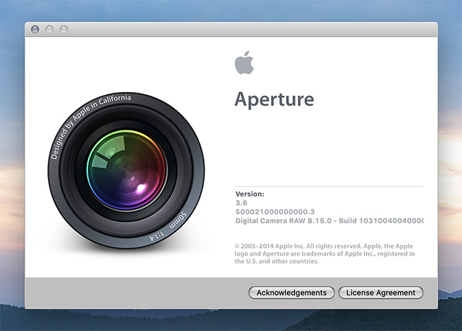
Apple’s Aperture photography software debuted in 2005, as a sort of hi-end iPhoto; it combined sorting and editing into one application, using libraries to keep large collections. It was almost immediately followed by Adobe’s Lightroom, which performed basically the exact same functions — and came with better integration with Adobe’s own Photoshop, as well.

Aperture was developed through several versions, but a change in Apple’s strategy led to a end to development in 2015; however, it’s still been useable in every new version of the MacOS since. Until now — with the debut of MacOS Catalina in September of this year, Aperture will cease to work.

That’s led me — and likely many others — to migrate our Aperture libraries into Lightroom. Now let’s be clear: I’ve been using Lightroom for several years now (I pay the $53 per month Adobe subscription, which offers all applications Adobe currently makes, including Photoshop, InDesign, and Illustrator in addition to Lightroom) and have gotten quite used to the workflow. So when the announcement was made that Aperture was going to stop working, I went into Aperture and . . . was lost. Migrating was necessary.

In the long run, though, it’s been a good thing. Since Lightroom doesn’t import all of the changes and corrections that Aperture makes into Lightroom, I’ve had cause to revisit some of the libraries with a fresh eye.

The first of these is the England library from 2011. Check it out soon.

If you had Aperture, here’s the info from Apple on what to do with your libraries, and the info from Adobe about how to import Aperture libraries into Lightroom (Classic version only).