Let’s continue a couple of discussions before closing out 2024, and send you into 2025 with some photographic and typographic goodness.
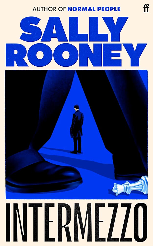
More AI Book Design
This was mentioned in another context in July, but is heading our way more aggressively as time goes by, with Microsoft and TikTok, among others, getting into the publishing arena.
While Microsoft’s new imprint, 8080 Books, plans “to test and experiment with the latest tech to accelerate and democratize book publishing.” They’re not entirely up-front about what that is — and might not know themselves yet, given the rapidly evolving tech and marketplace. That said, with the corporate giant’s name attached, we can be assured of some level of quality.
Yes, I just wrote a sentence suggesting that Microsoft is a guardian of quality. (“Books matter. In a deluge of data. In a bloat of blogs, a sea of social, and a maelstrom of email. Books will always matter,” they write.)
With others, the for-profit nature — TikTok’s engagement-before-all-else approach speaks volumes (or writes volumes, as the case might be) — assures that quality might come behind, say, slop. Publisher’s Weekly reports that 320 publishing startups have emerged just in the last two years, most in the AI space, adding to the 1,300 noted as of 2022. (PW also notes, “It is widely believed that each of the Big Five publishers has internal AI projects discreetly hidden from view.”)
And then there’s this: introducing Spams Spines, your AI book design and book completion service: “[f]rom manuscript to book in your readers’ hands – a single platform to help any author proofread, cover design, format, print, and distribute over global channels — zero tech know-how required.” Prices start at $1500 and promise a finished product in less than 30 days.
Their goal is to release 8,000 books per year. AI is heavily involved:
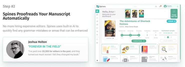
Because, yes, you want a machine to suggest that Sir Arthur Ignatius Conan Doyle needed assistance regarding a turn of phrase. (Never mind his expensive editor.)
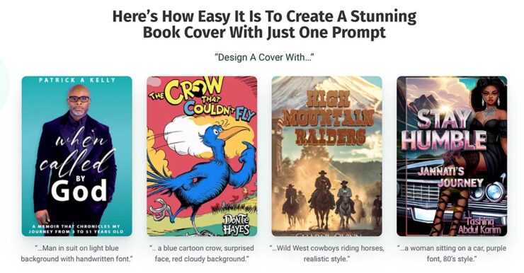
But it’s the book design that got my attention: these are apparently the good ones, the cited examples to which someone says, “Yes! Take my money!”
The sad thing is that people will say that. Have already said that. And there’s much, much on the publishing industry’s horizon. Our horizon.
Read more at The Conversation, “The tech world is ‘disrupting’ book publishing. But do we want its effortless art?” Shout out to the AV Club and the aforementioned PW article.
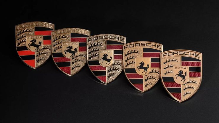
The Cat Leaps
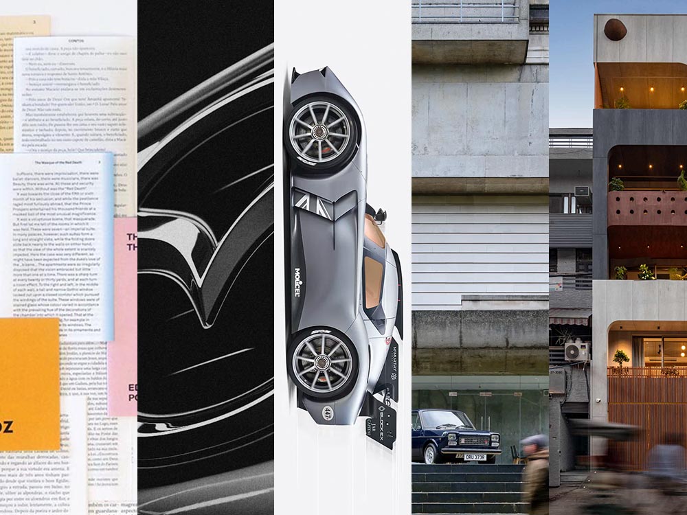
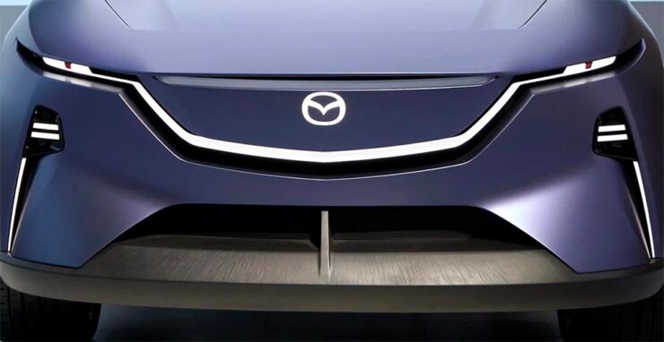
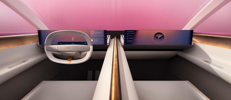
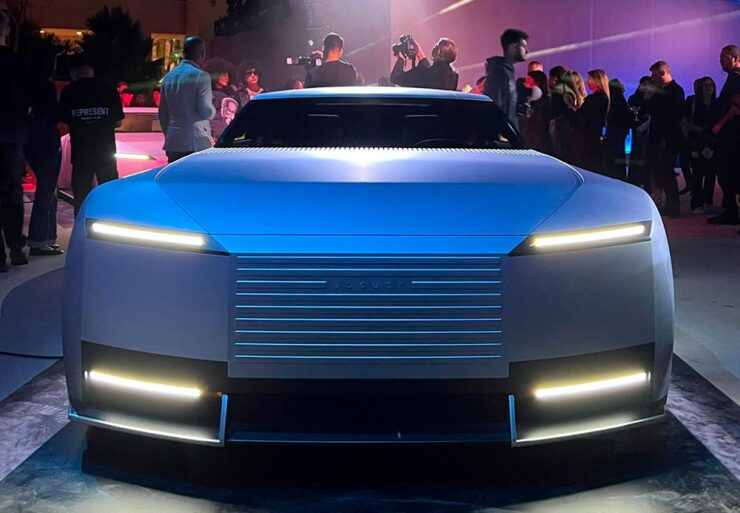
Last month, we left off Jaguar’s continuing road trip with a teaser. Let’s get right to it. The car’s called the Type 00:
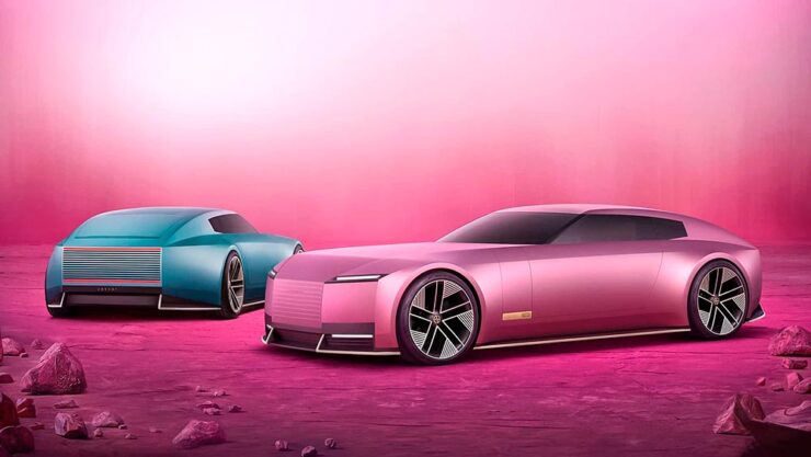
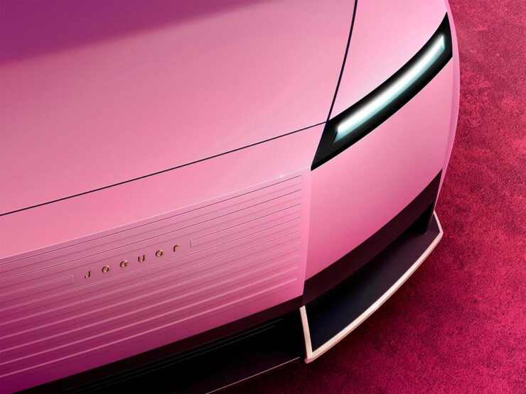
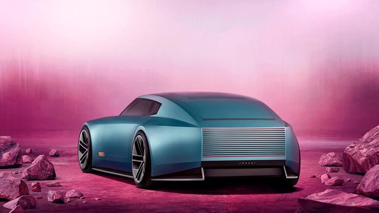
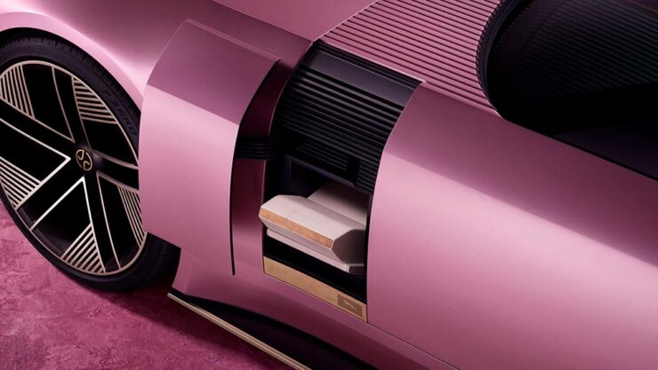
Some details:
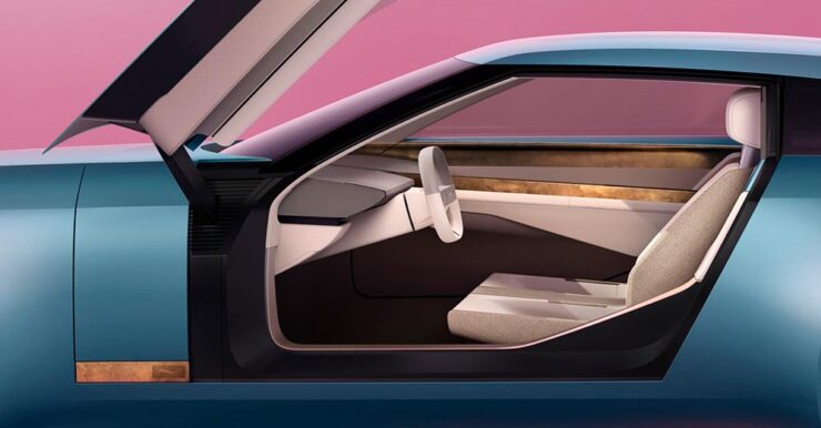
The interior:
The internet, predictably, has lost its collective … um, mind. However, amongst the melee, there are a few items worth mentioning.
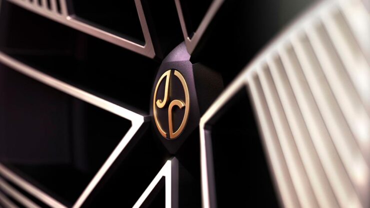
Creative Boom: “If the new logo seemed divisive in isolation, seeing it brought to life with Type 00’s design has brought much clarity. The flush surfaces, panoramic roof, and glassless tailgate – all adorned with the new Jaguar device mark and reimagined leaper – create a cohesive vision of modern luxury. Rawdon Glover, managing director of Jaguar, emphasised the importance of this shift: ‘We have forged a fearlessly creative new character for Jaguar that is true to the DNA of the brand but future-facing, relevant and one that really stands out.'”
The quote there is something to pay attention to. Read those words again, and think about the actual choice of language; it’s this, exactly, that has struck some. Armin at Brand New, for instance: “[W]hat I dislike the most about the new Jaguar brand: its tone of voice is INSUFFERABLE. Everything from the platitudes in the campaign to the script of McGovern’s presentation to the press releases is obnoxiously over-confident and self-congratulatory.” (Brand New, while excellent, is subscription-only — alas without a sample article. Here’s a link anyway.)
Meanwhile, Dezeen provides us some real-world images from the Miami launch:
But it’s The Autotopian that stands out. They have not one but two excellent articles by Adrian Clarke, an ex-JLR1That’s Jaguar Land Rover, before it was, um, initialized by owner Tata. designer, who has several important points to contribute:
A couple of weeks ago, the cancelled X351 Jaguar XJ leaked onto the internet. During my time at Land Rover, I saw this car back in 2018 and can confirm this is indeed, or rather was the EV XJ. Back when Mr. Tata was still alive every six months or so there would be a big board level presentation for him on upcoming products. […] I was privy to all the future production Jaguars and concepts. There was a J-Pace SUV to sit above the F-Pace (no problem in revealing this as it’s common knowledge) and everything else was as you’d expect. These cars were then cancelled as part of the revamp and one absolutely incredibly beautiful and exceptional proposal aside, nothing of value was lost.
It’s the first time I’d seen the cancelled-just-before-release XJ EV, and despite the incomplete body panels and obviously-on-the-sly phone shot, it’s incredibly disappointing. They made the right call.
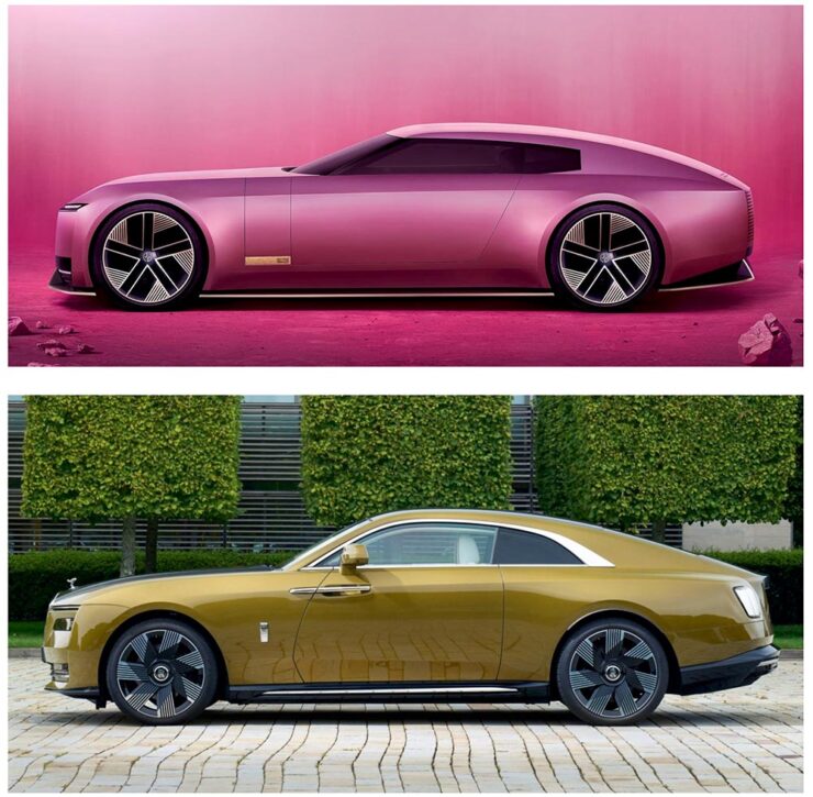
Compare it next to a Rolls Royce Spectre, a car the production Type 00 will be a competitor for, and see how successfully it hides its bulk in profile. [I]n the side view, particularly in the bottom half, I’m seeing some Range Rover. The crisp shoulder line, the kick-up of the tail behind the rear wheel, and the feature line along the bottom of the bodyside all scream Range Rover. This is exacerbated by the verticality of the front and rear of the car – the new full-size Range Rover and Sport have sharply docked tails. I heard that the initial sketch of this car was done by Massimo Frascella before he departed for Audi. Frascella was McGovern’s right-hand man at Land Rover for decades before Ian Callum retired and McGovern used the opportunity to bring both the Jaguar and Land Rover studios together. So maybe that’s where this Range Rover influence comes from.
We must remember this is only a concept. The actual production car will be a four-door GT. This is only a preview of the visual style of future Jaguar models. It’s certainly striking, but you’d struggle to call it beautiful. It’s also monolithic and slabby.
Let’s hope this brutal revamp is […] successful, because there are a lot of jobs depending on it.
— Adrian Clarke, ex-JLR designer
There’s much more from those two articles, too much to quote here, so please go read them — the initial report is more on the design, while the second delves into the why: “Why Jaguar Had To Blow Up Its Brand In Order To Save It.“
Meanwhile, I’ll actually be rooting for JLR to pull this one off. I’m not in the target audience — at all — but Jaguar needed to do something radical and, by God, they did just that. The concept is interesting. Some of the details are fantastic. Here’s hoping, indeed.
Update, 15 Jan 2025: Turns out the Jaguar’s designers were a little worried about the outcome — or the outsourcing, in this case — and its effect on the brand. The Drive has the details.
Special Bonus #1: Motor1 has a feature on Ian Callum’s current whereabouts. There are too many hypercars these days, but the Skye looks cool:
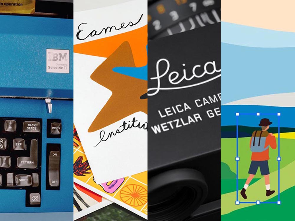
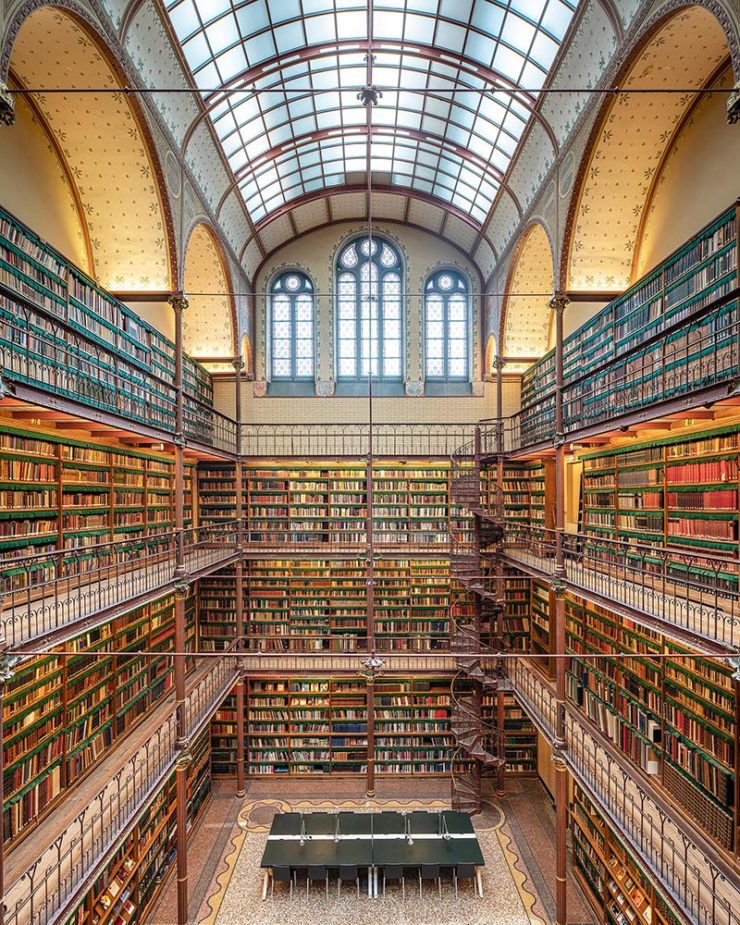
Some Extraordinary Items of “Normalcy”
To close out 2024, let’s take a break, pour a beverage, and enjoy some of what you read Foreword for: great photography, typography, and design.
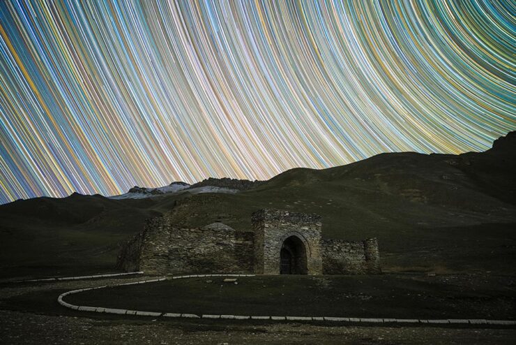
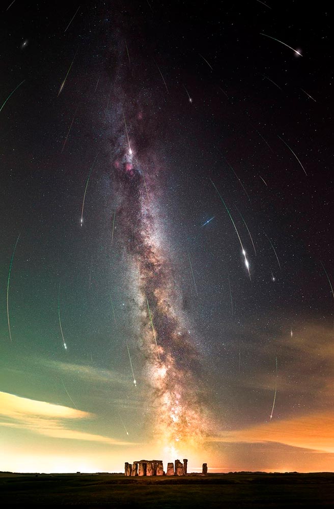
Northern Lights
I didn’t know — or didn’t remember — that amongst the glut of photography contests is one dedicated to the phenomenon known as the Northern Lights.
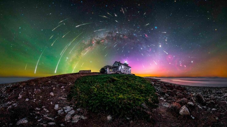
PetaPixel reminds us that Capture the Atlas’ Northern Lights Photographer of the Year competition features some exceptional opportunities to make spectacular captures this year due to the solar maximum — the peak of its eleven-year cycle.
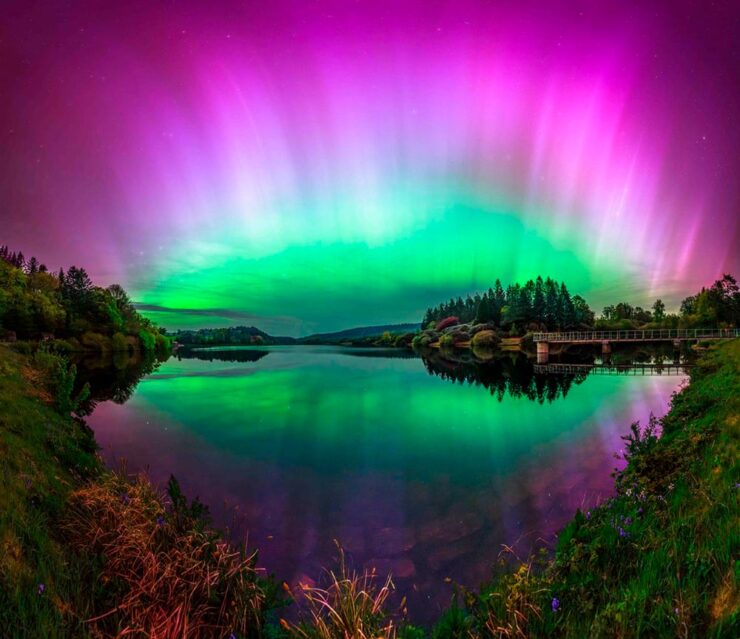
The 2024 competition awards feature 25 winners, each with a narrative and each a striking example of the larger system we’re part of. Check it out. (Also via This is Colossal.)
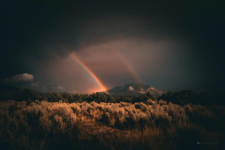
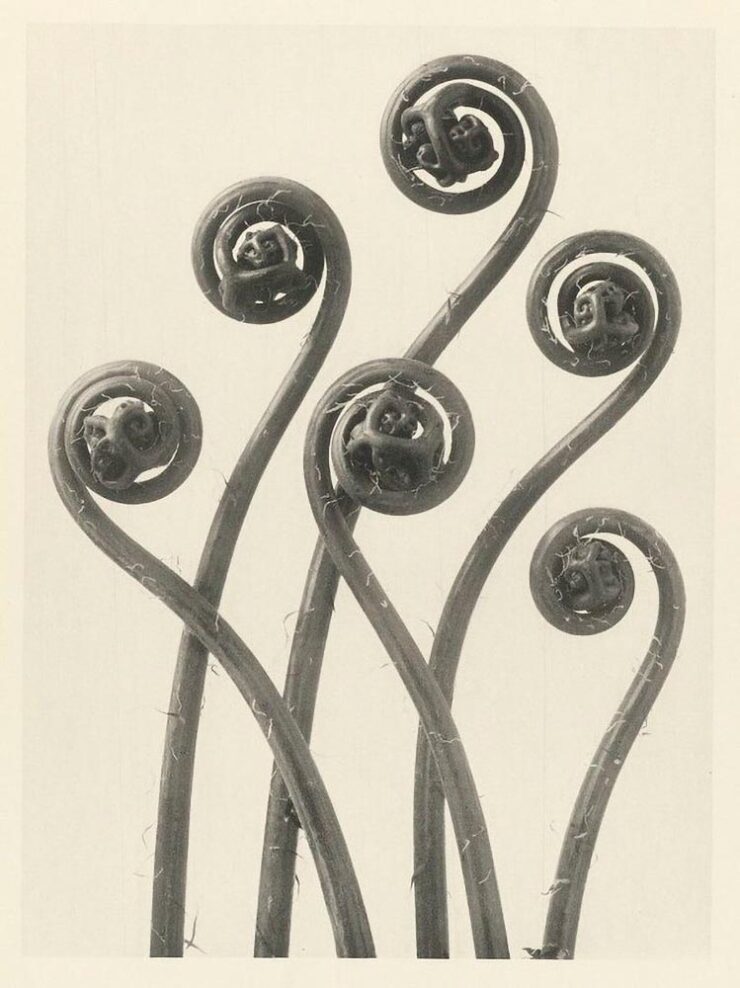
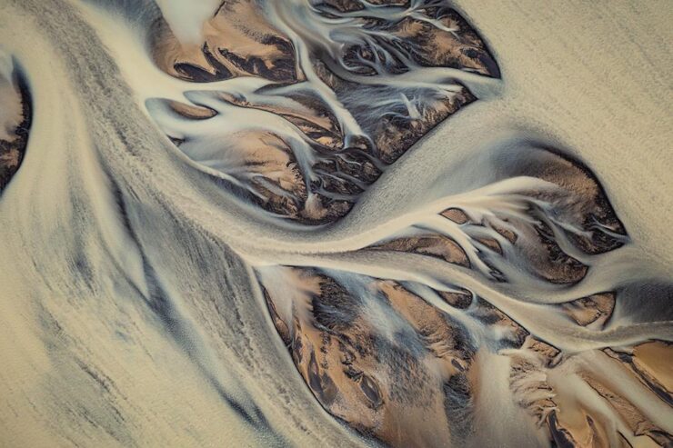
Nature
PetaPixel is among several that point us to the Nature Photographer of the Year contest, with images both poignant and funny. Since it’s New Year, let’s go with the latter:
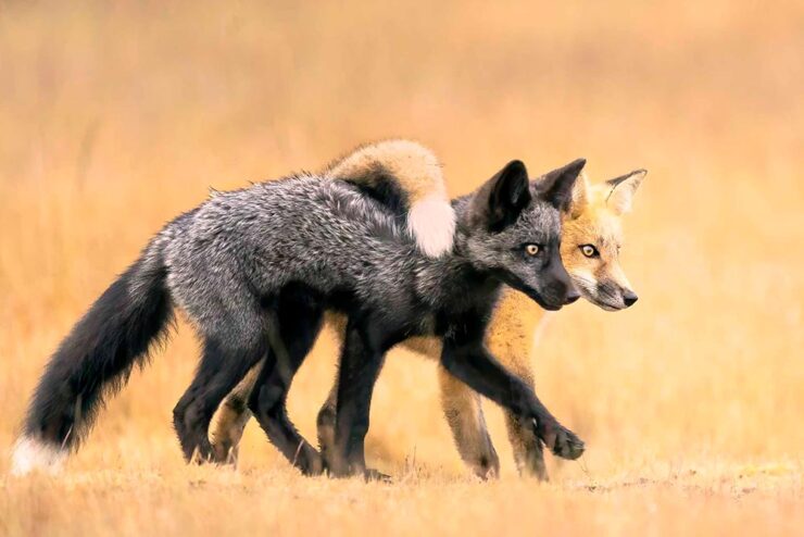
Of course, there’s just “spectacular,” too:
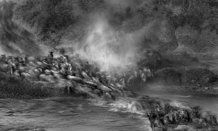
The contest’s winners page features many more, separated into categories; be sure to click on the individual photographs to get larger sizes and the story with each. Fantastic stuff.
Frozen Prairie Landscapes
Saskatchewan gets cold in the winter, but there’s a beauty to those temperatures, photographer Angela Boehm tells PetaPixel.
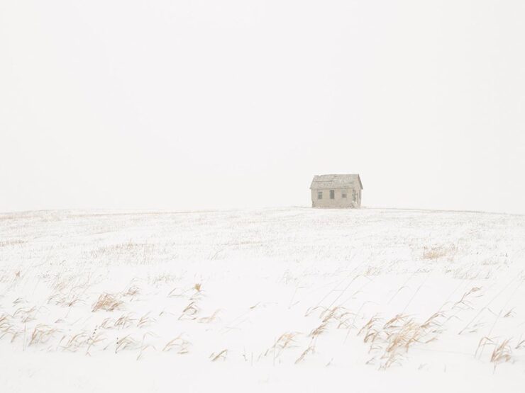
“The frozen prairie landscapes, while a subject in their own right, serve as a powerful metaphor for the deeper themes the book explores: loss, memory, and resilience,” she says. […] “The loss is embodied in the emptiness and biting cold. The memory, or its gradual fading, is represented by the snow obscuring the horizon, softening and blurring the scenes. And the resilience is in the solitary tree — a steadfast survivor of countless storms in this unforgiving landscape.”
— Angela Boehm, Minus Thirty
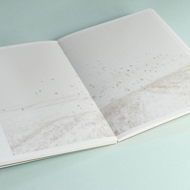
Read more of PetaPixel‘s story of realization to publication or just check out the title.
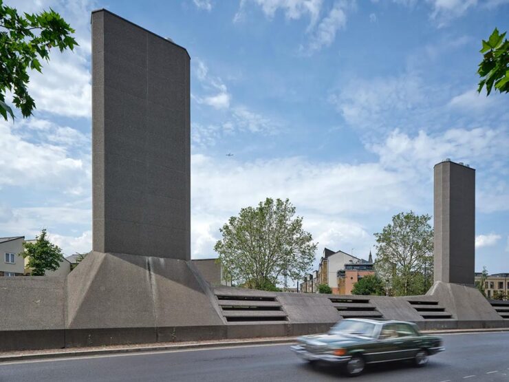
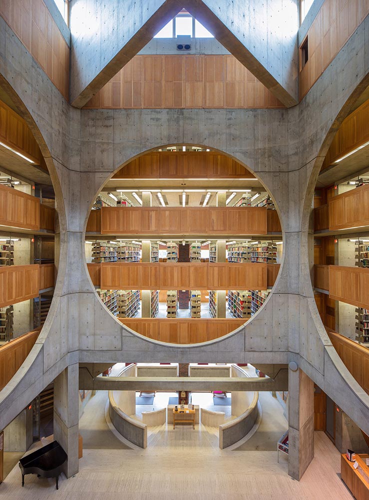
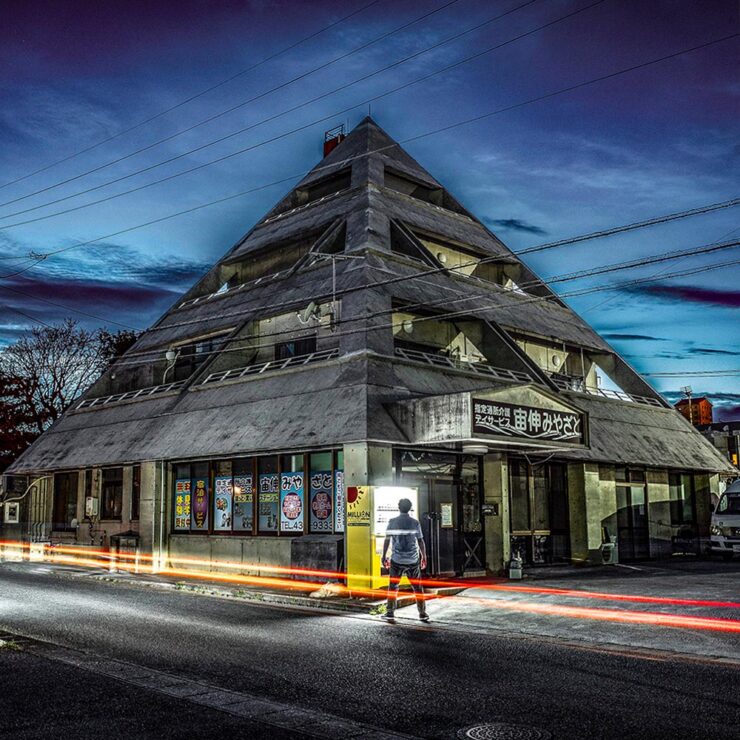
Special Bonus #2: Another book on an interesting subject — Japan’s brutalist architecture, which somehow manages to bring an inherent quality to the cement:
Ukraine’s “Fight for Visual Identity”
This PRINT piece is excellent: “A cultural gap persists in how history is organized and interpreted. I left the library without my requested images but with a lingering realization that how we organize history, even within the hallowed walls of an institution like the New York Public Library, can reflect the biases and oversights of a collective cultural perspective,” writes El. Stern.
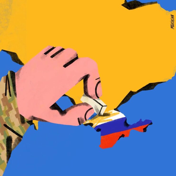
“Today, Ukrainian graphic design is rooted in national identification, in search of future needs, and in understanding the cultural influence of a painful past on a, once again, painful present.”
Ukraine’s search for a future — and present, and past — in design. Great read.
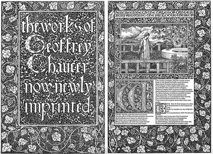
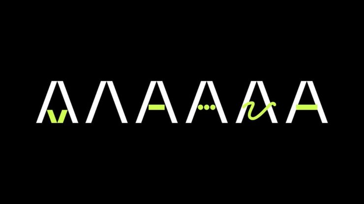
“A must-have manual for hot metal enthusiasts and linotype lovers”
Type Archived, a new book whose fundraising campaign I didn’t see in time: a “stunning visual tour of traditional typefounding and offers a definitive account of London’s legendary Type Archive,” writes Wallpaper*.
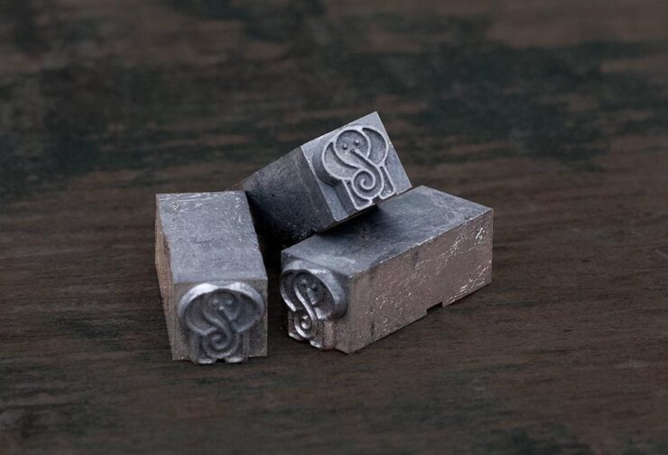
The book “traces the origins of typography through the physical tools, objects and machinery that made the printed word possible. Full of rich photography, [it’s] a visual journey through the punches, matrices, presses, type and paper which tell the story of the UK’s preeminent typefounding industry.”
Hopefully available at bookstores soon.
“The Arresting Typography of the Sanborn Fire Insurance Maps”
Jason Kottke writes, “Several years ago, Brandon Silverman become obsessed with the lettering and typography on the fire insurance maps published by the Sanborn Map Company in the late 19th and early 20th centuries.”
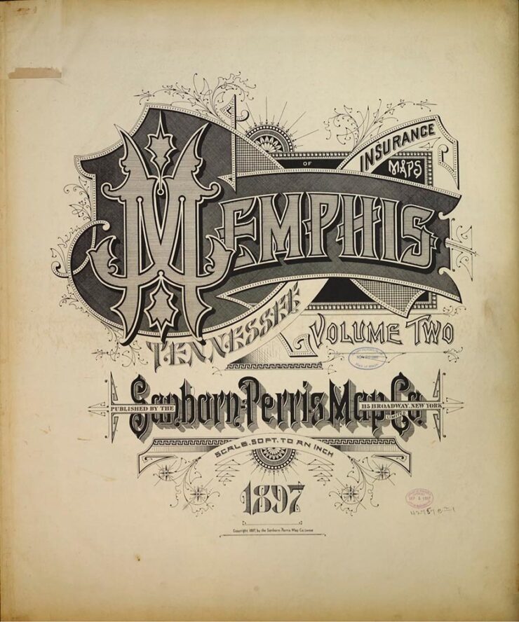
Silverman’s launched an archive of the maps, an absolutely fantastic way to pass a few minutes hours.
Special Bonus #3: Nick Heer, at the always-excellent Pixel Envy, has an essay on the essentials: “[E]fficiency and clarity are necessary elements, but are not the goal. There needs to be space for how things feel.” Delicious Wabi-Sabi is worth a few moments.
Wishing you and yours a very happy New Year!
- 1That’s Jaguar Land Rover, before it was, um, initialized by owner Tata.