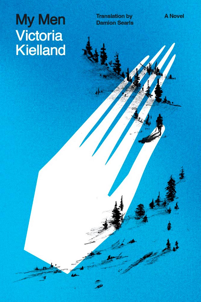
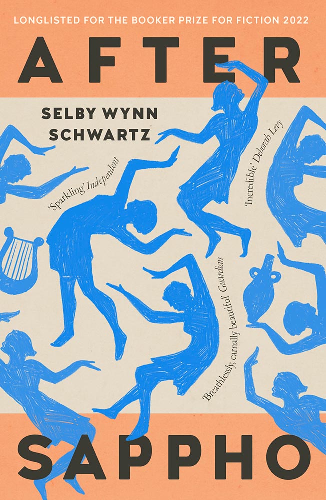
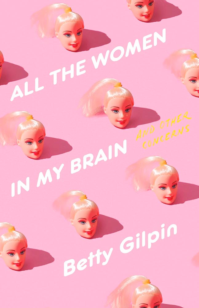
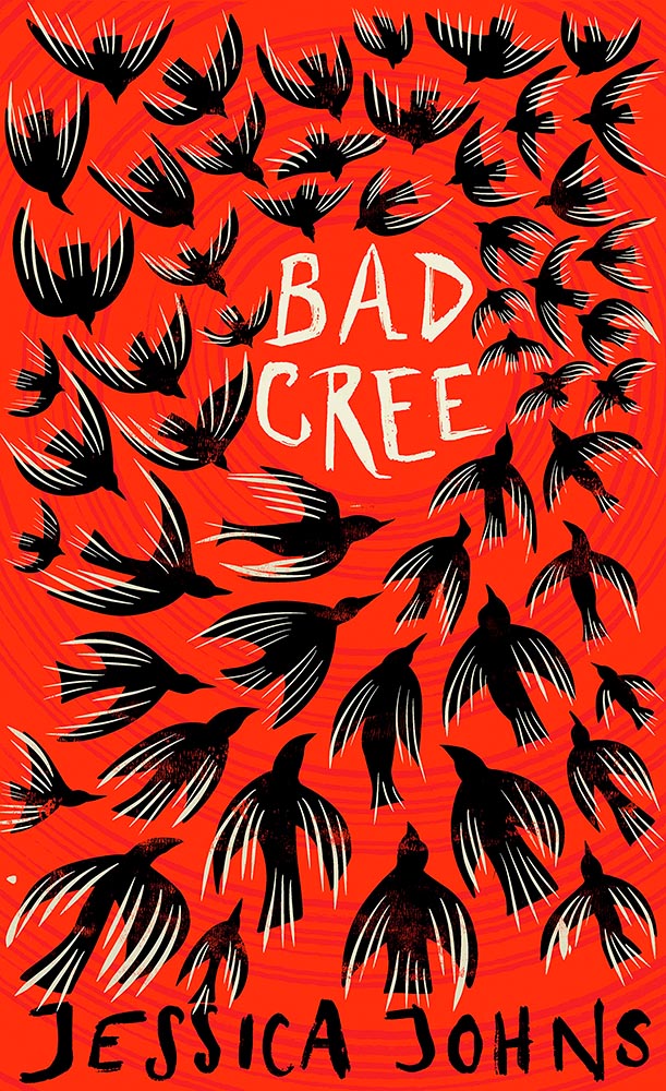
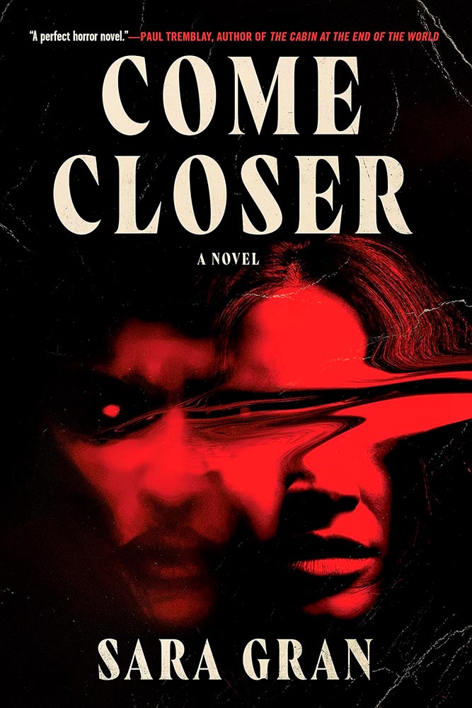
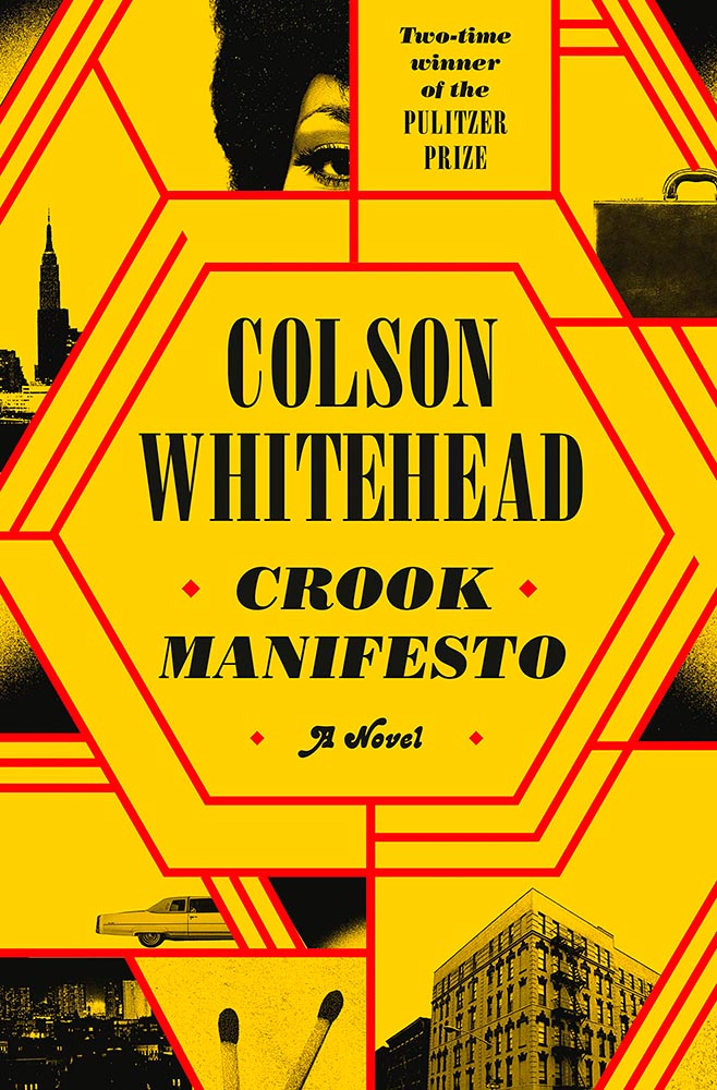
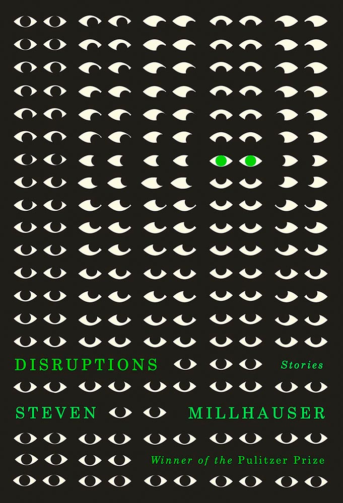
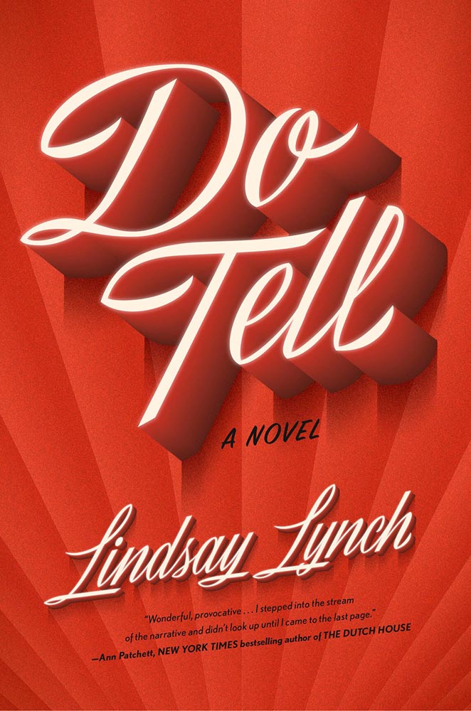
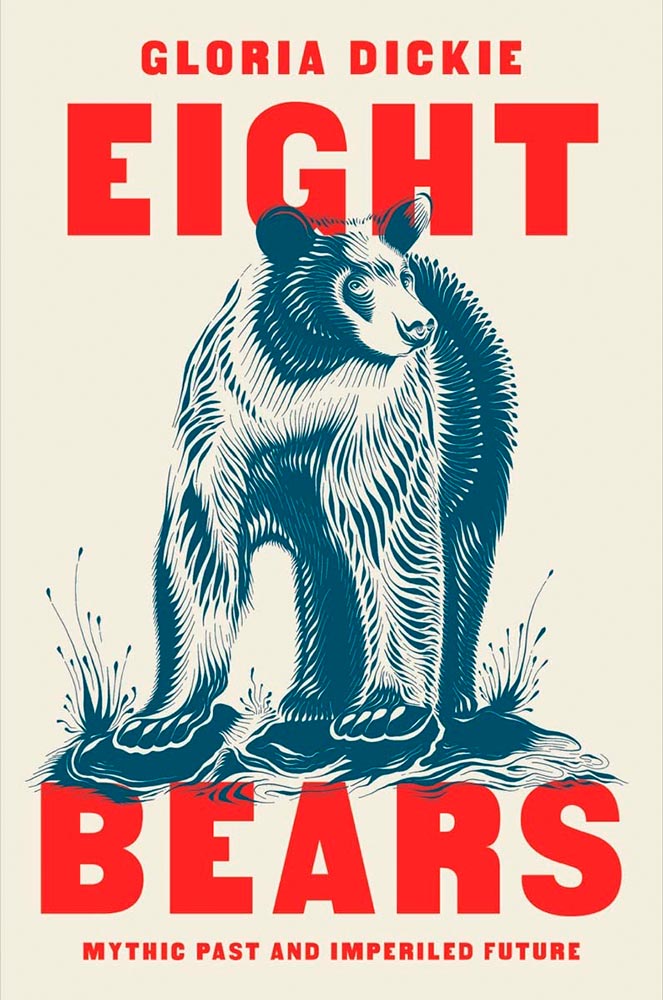
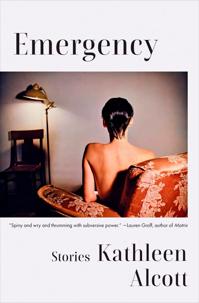
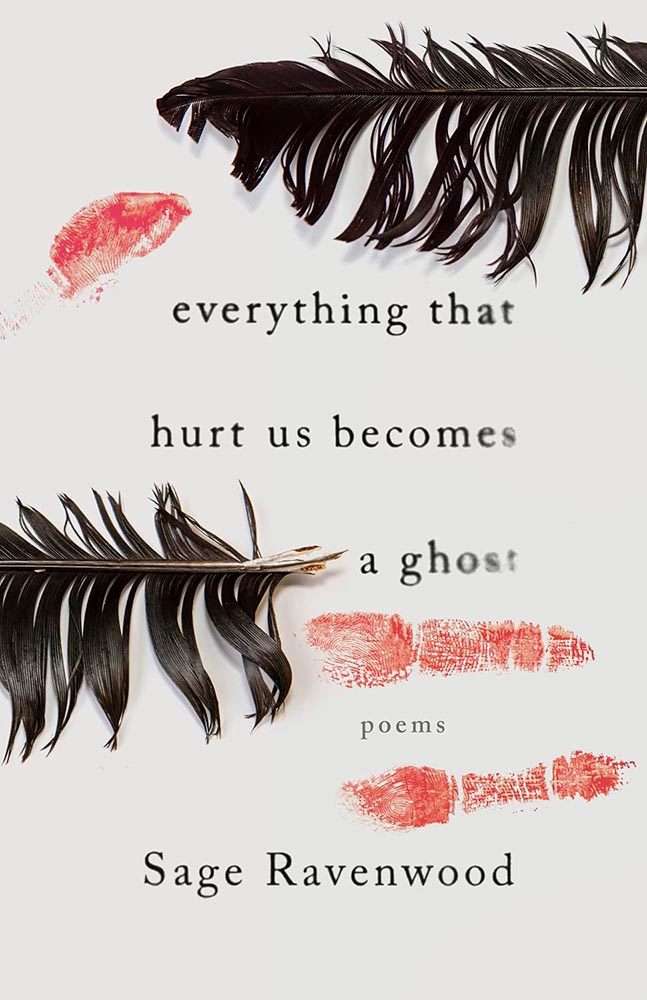
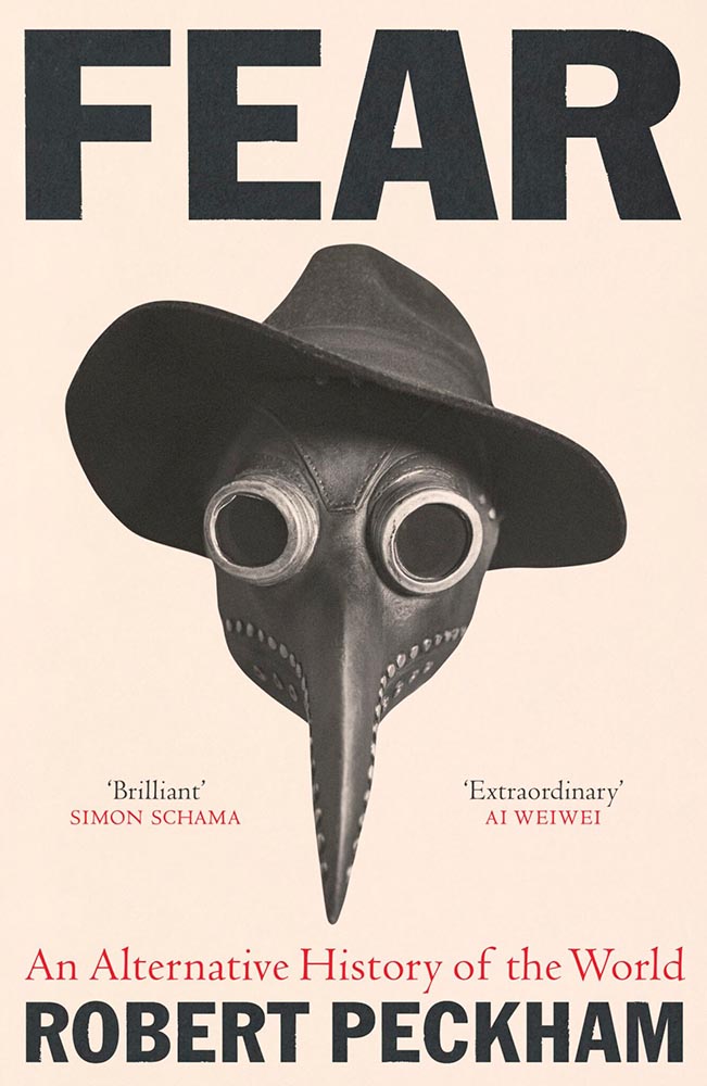
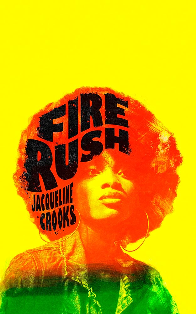
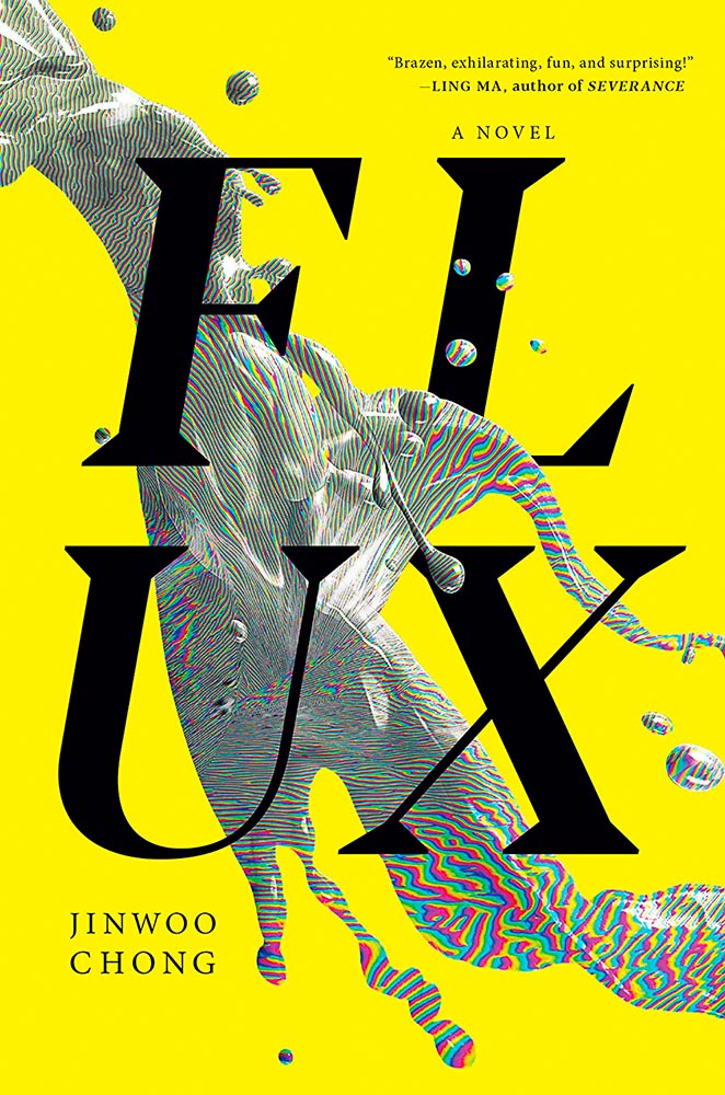
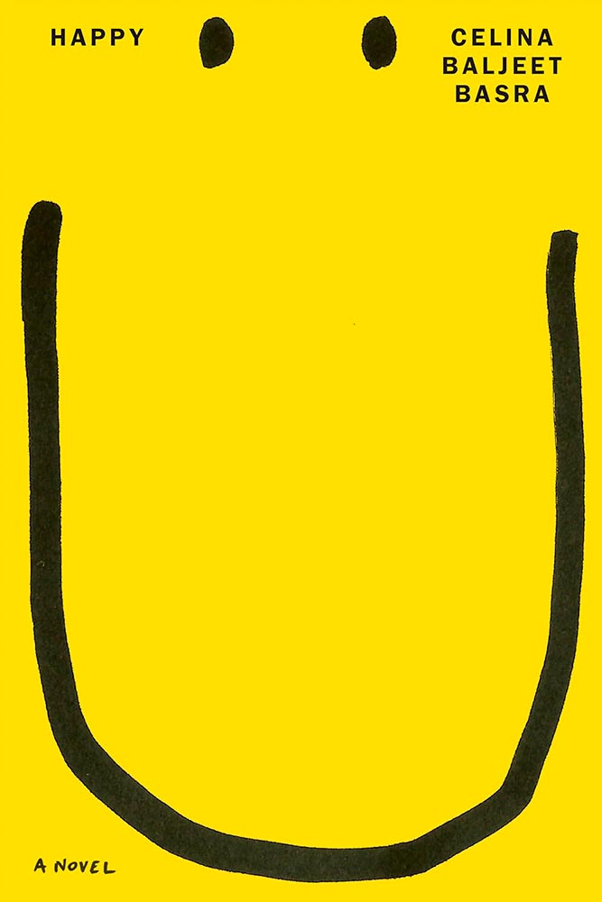
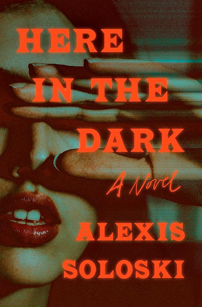
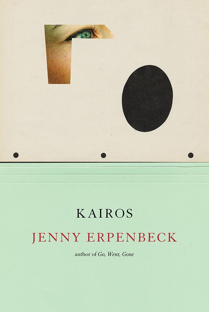
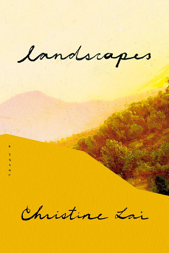
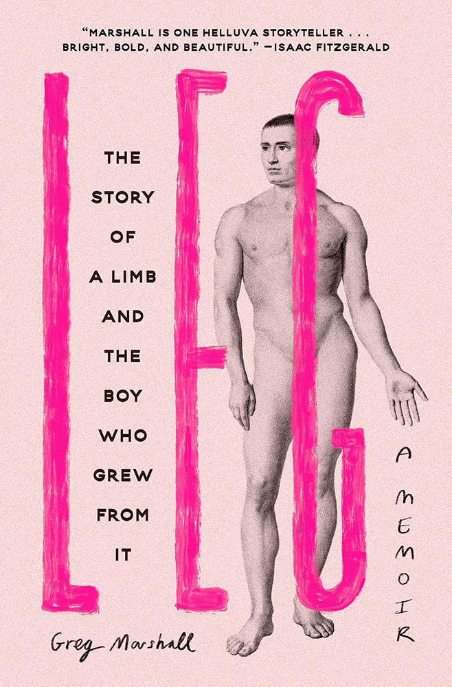
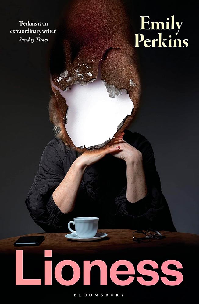
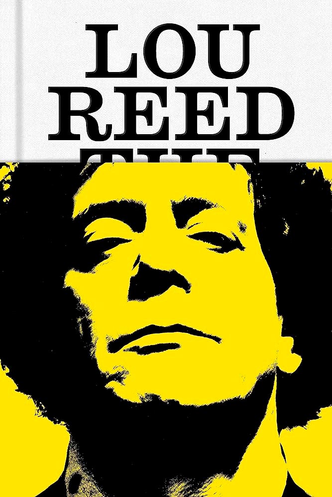
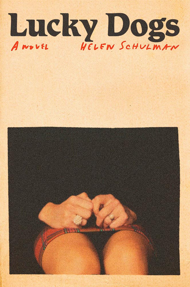
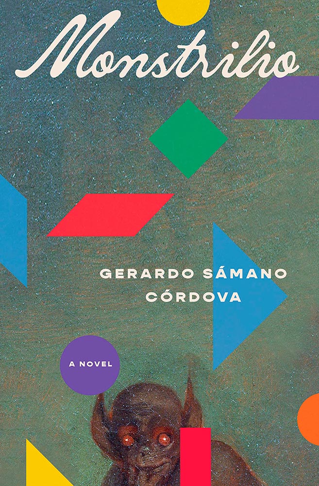
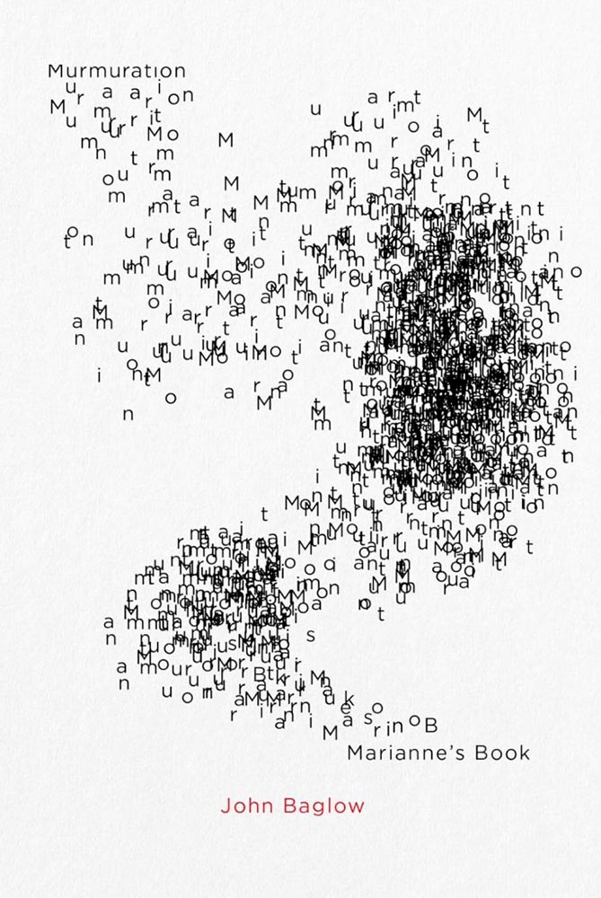
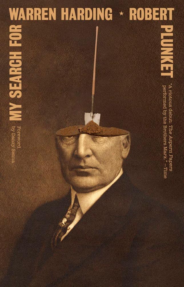
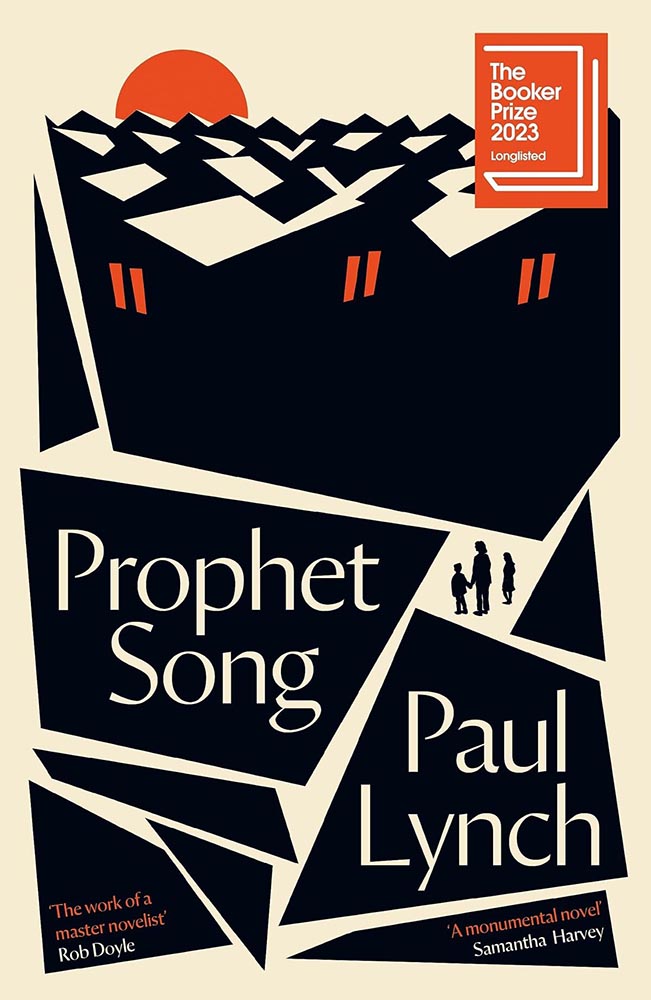
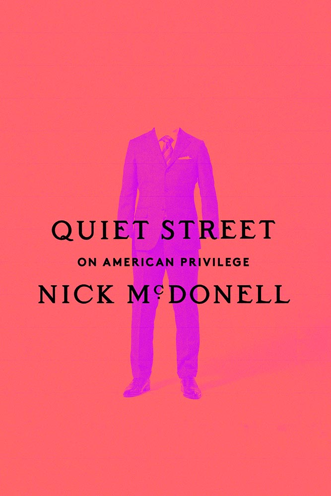
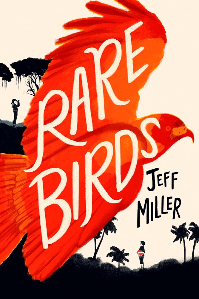
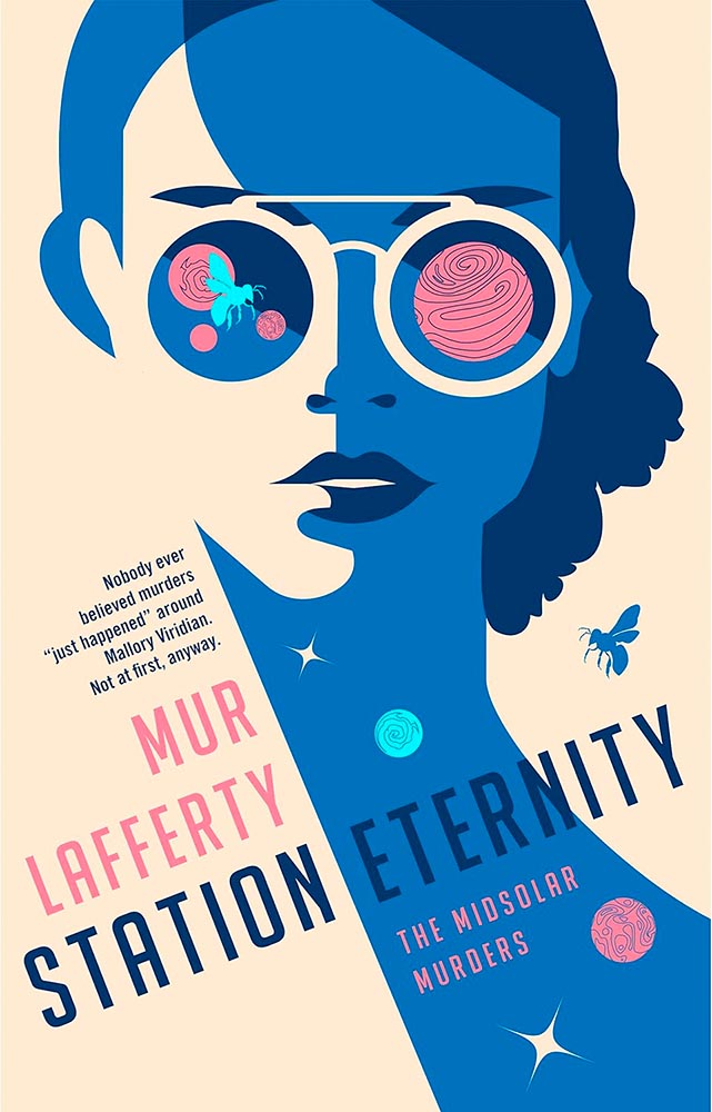
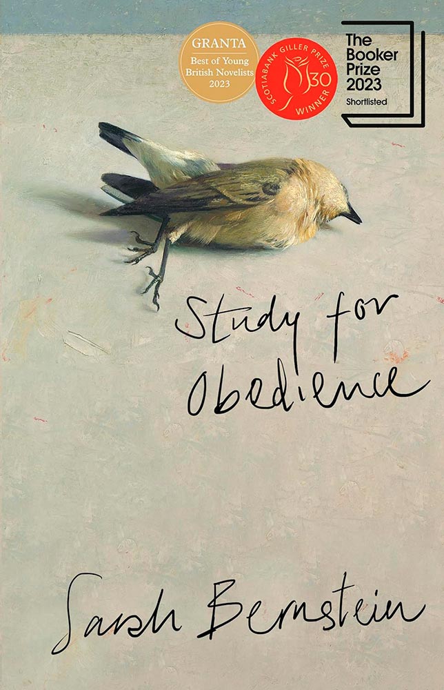
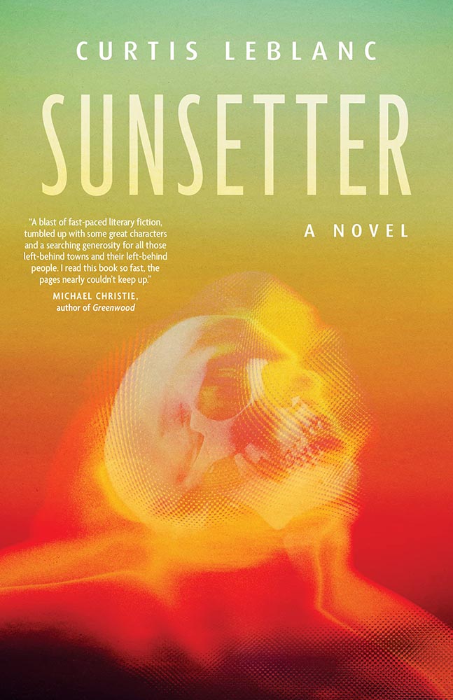
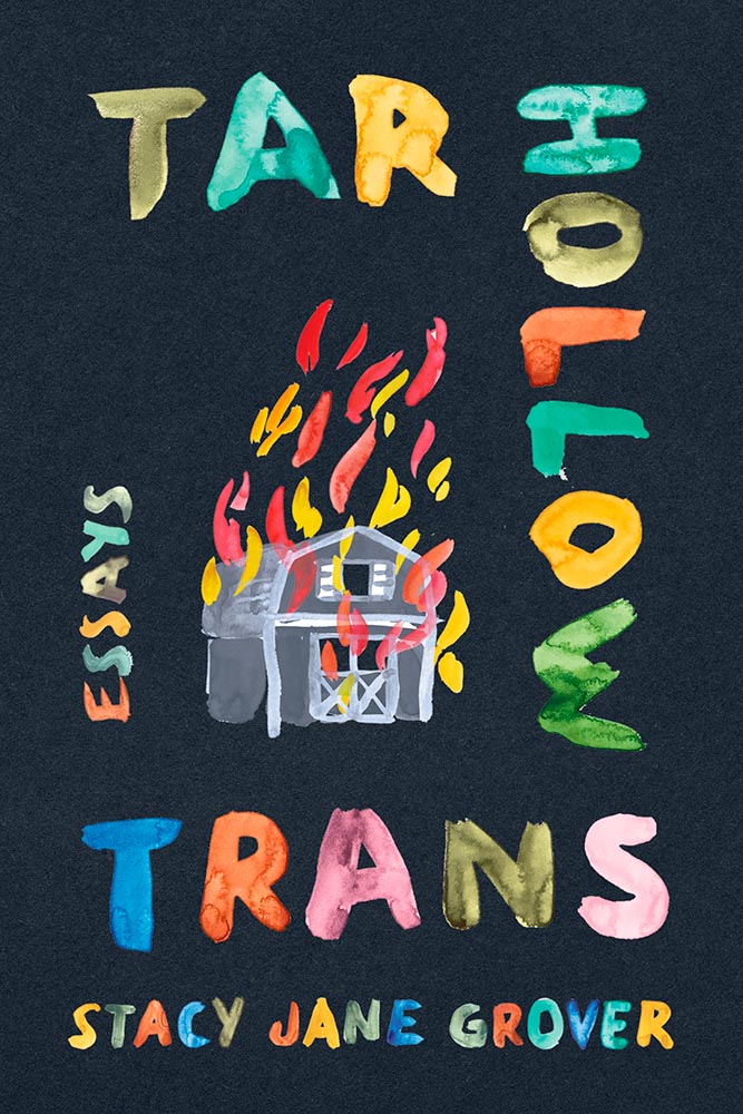
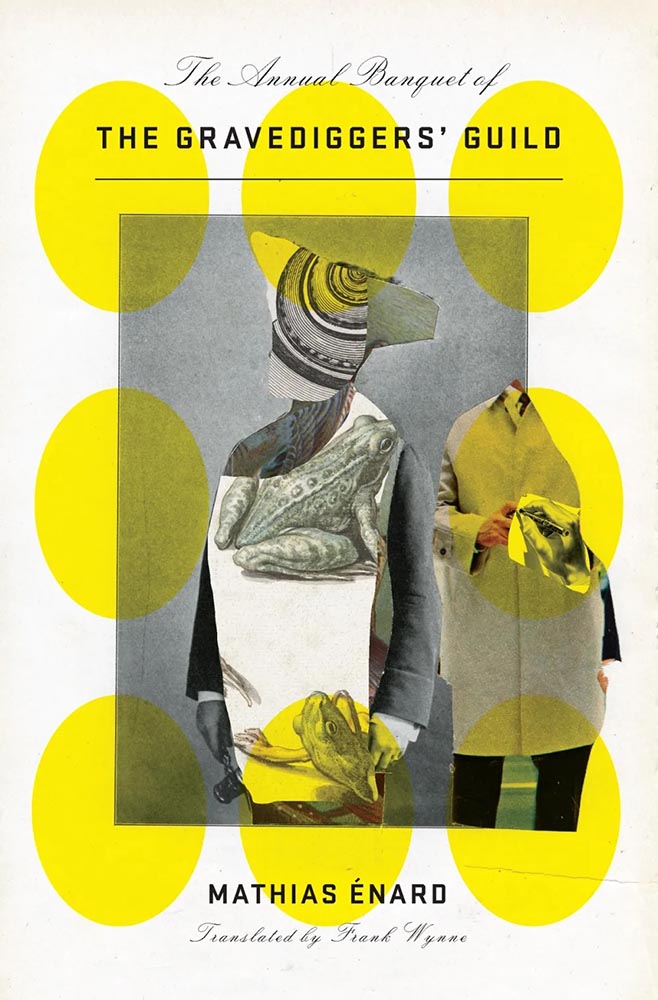
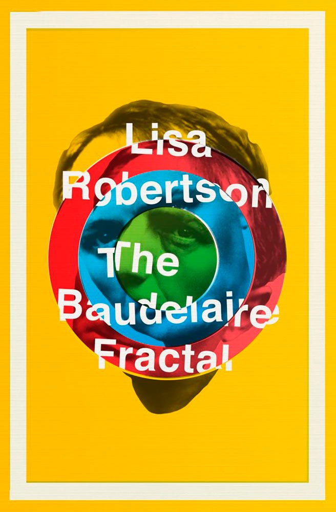
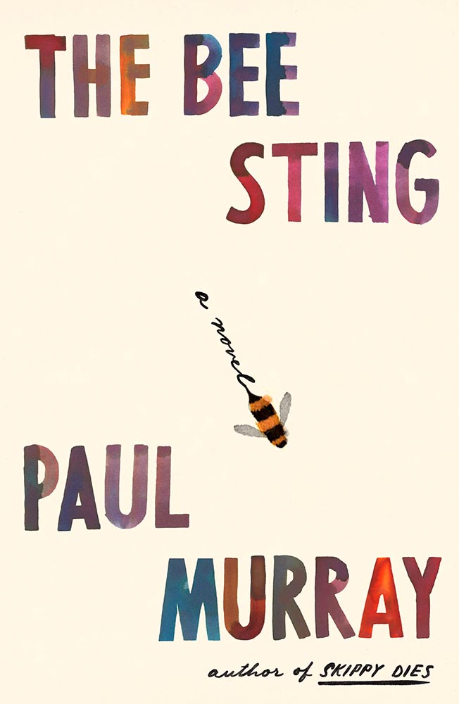
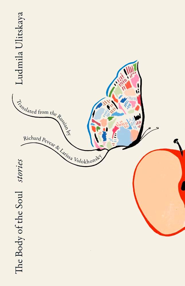
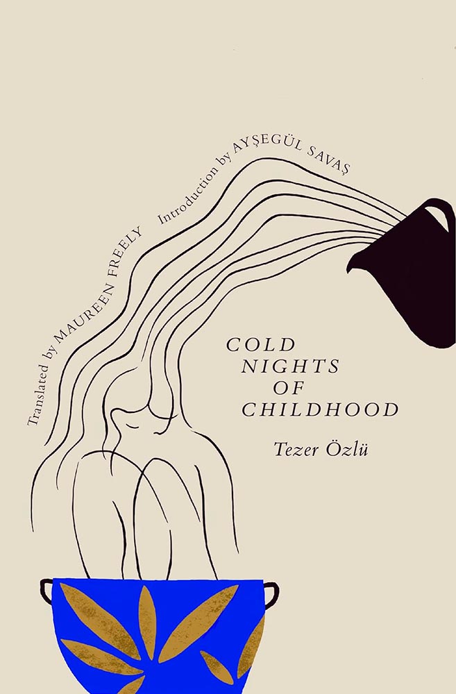
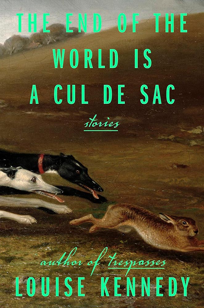
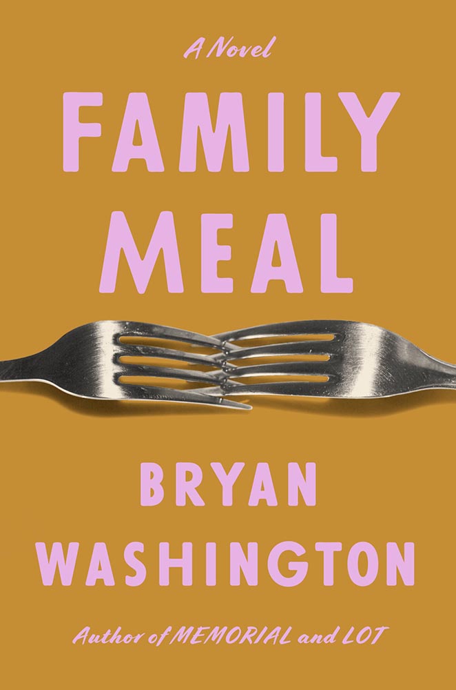
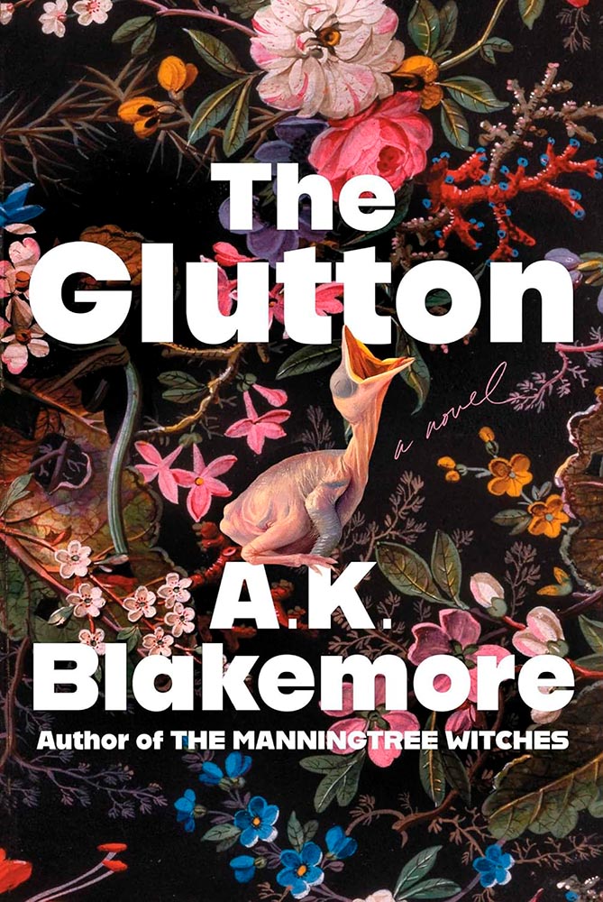
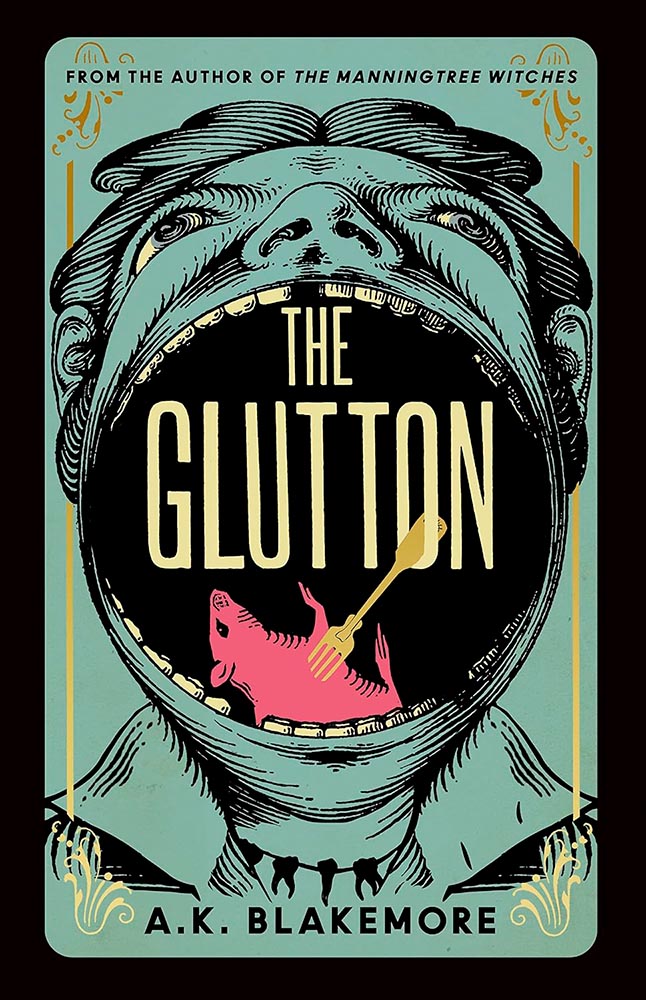
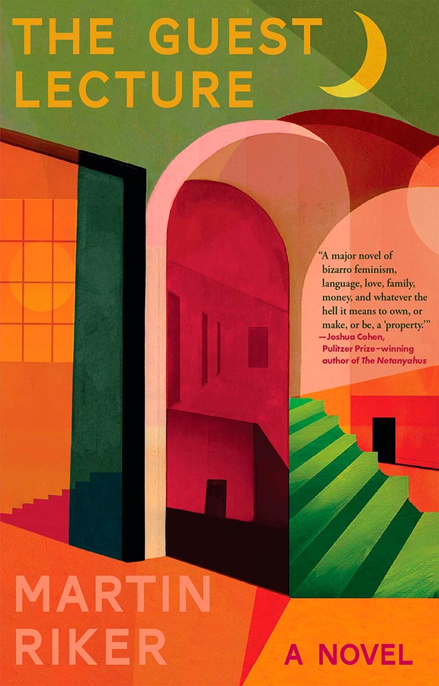
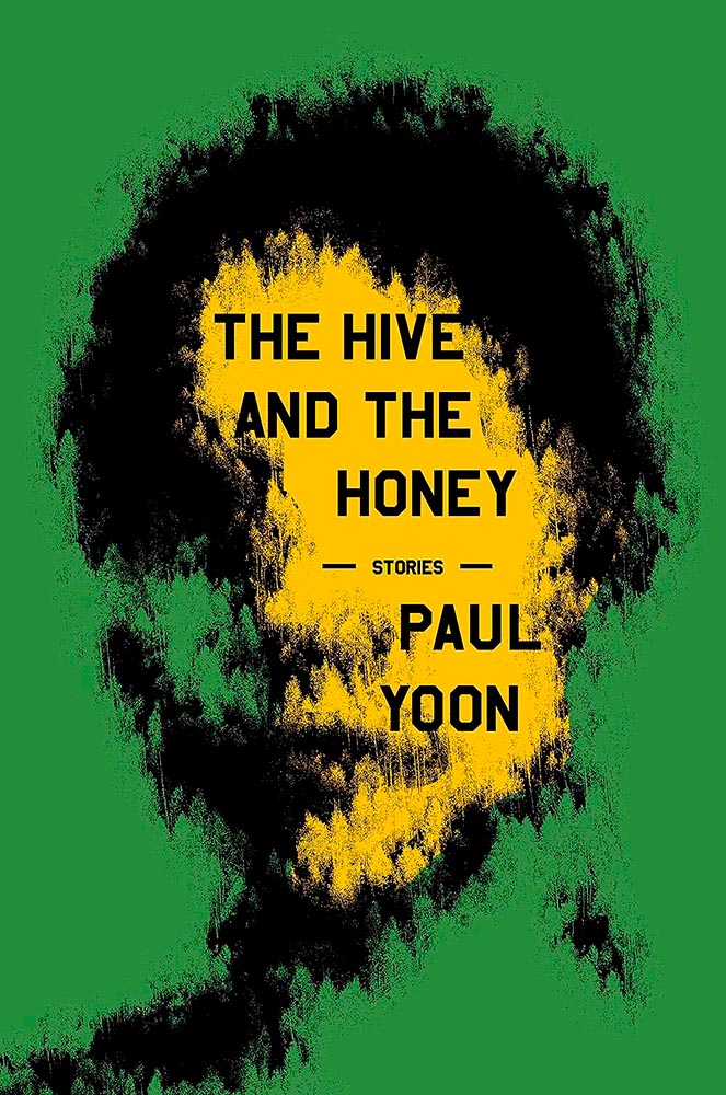
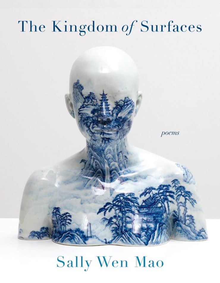
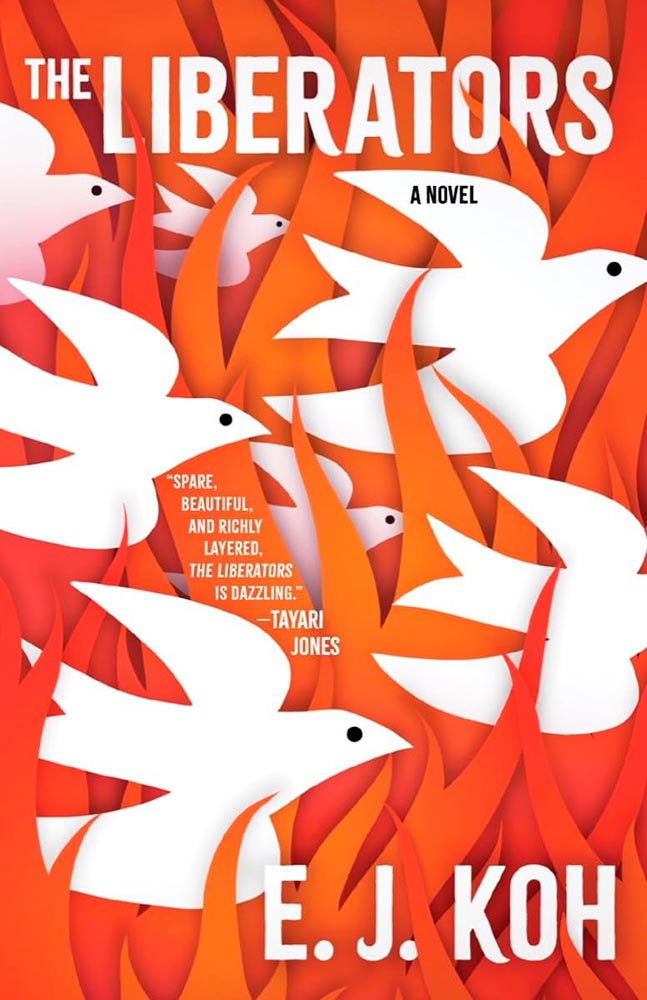
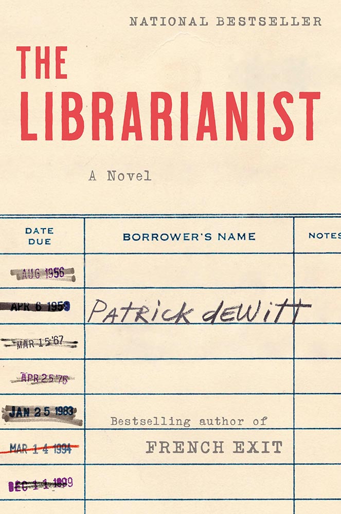
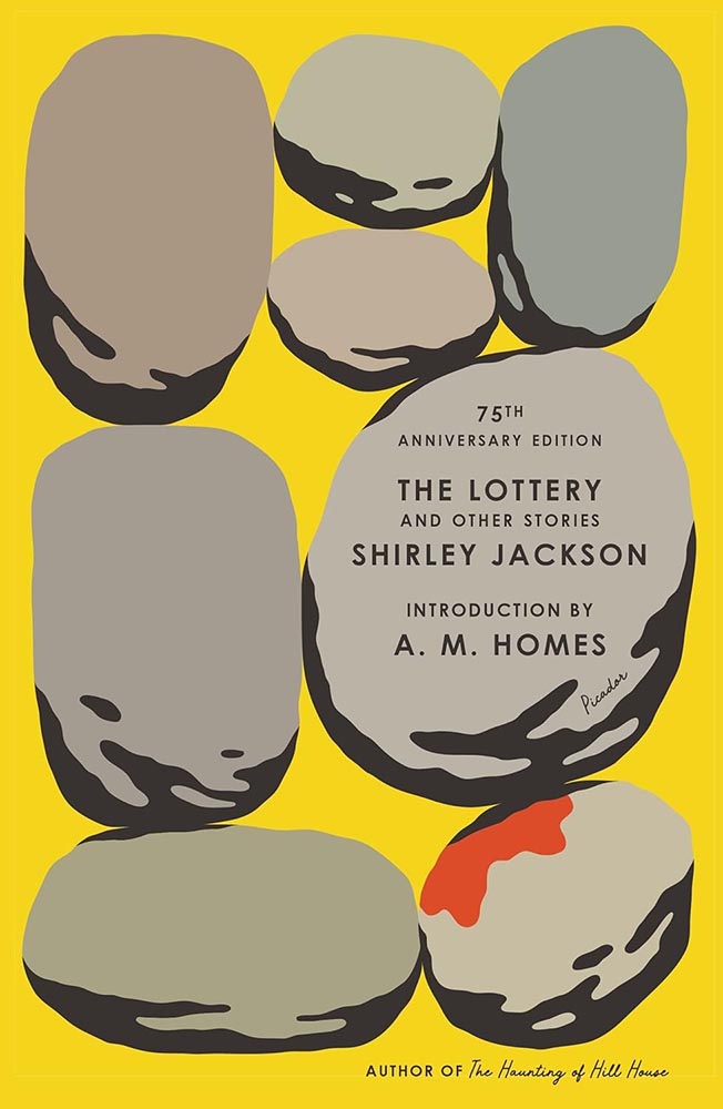
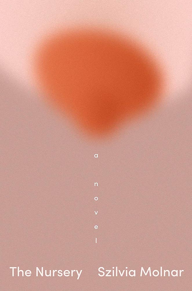
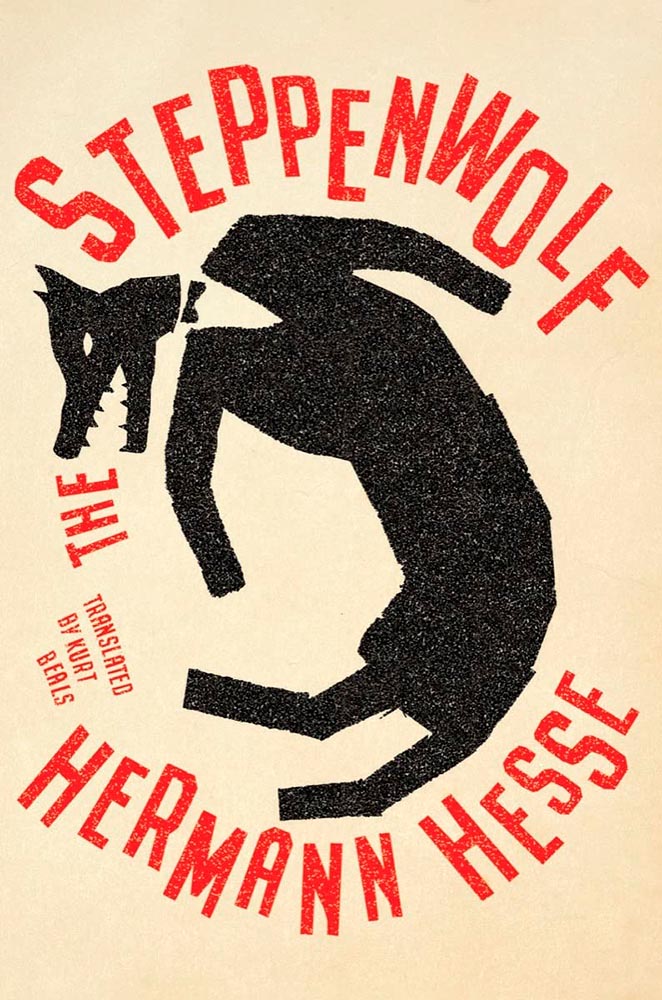
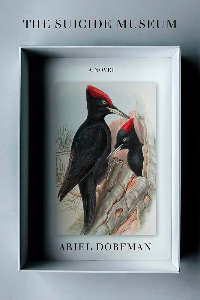
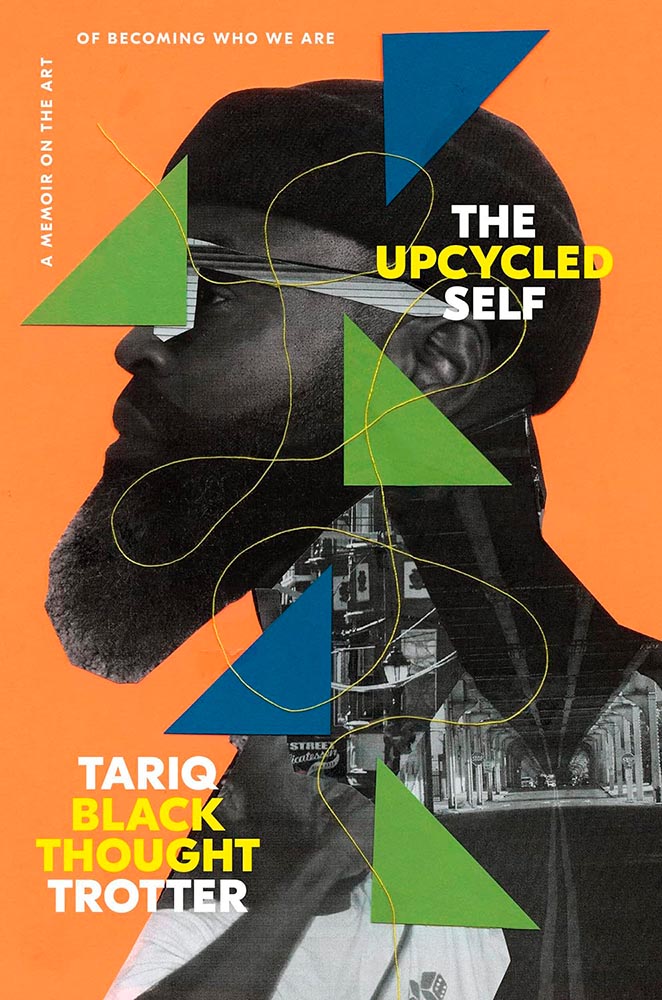
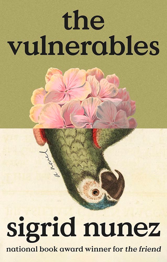
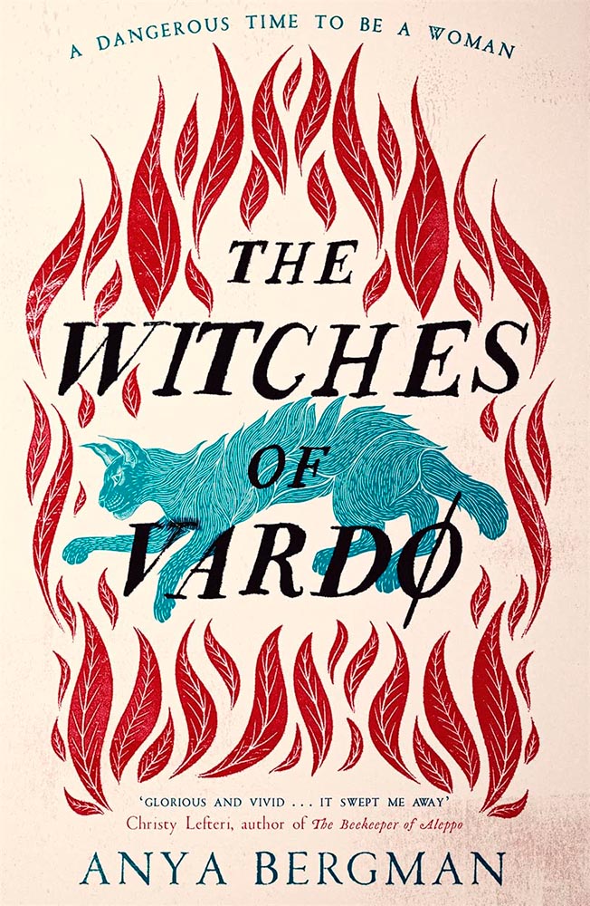
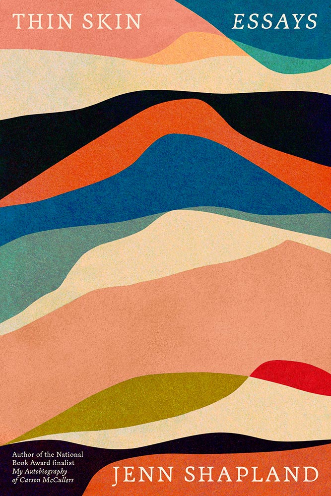
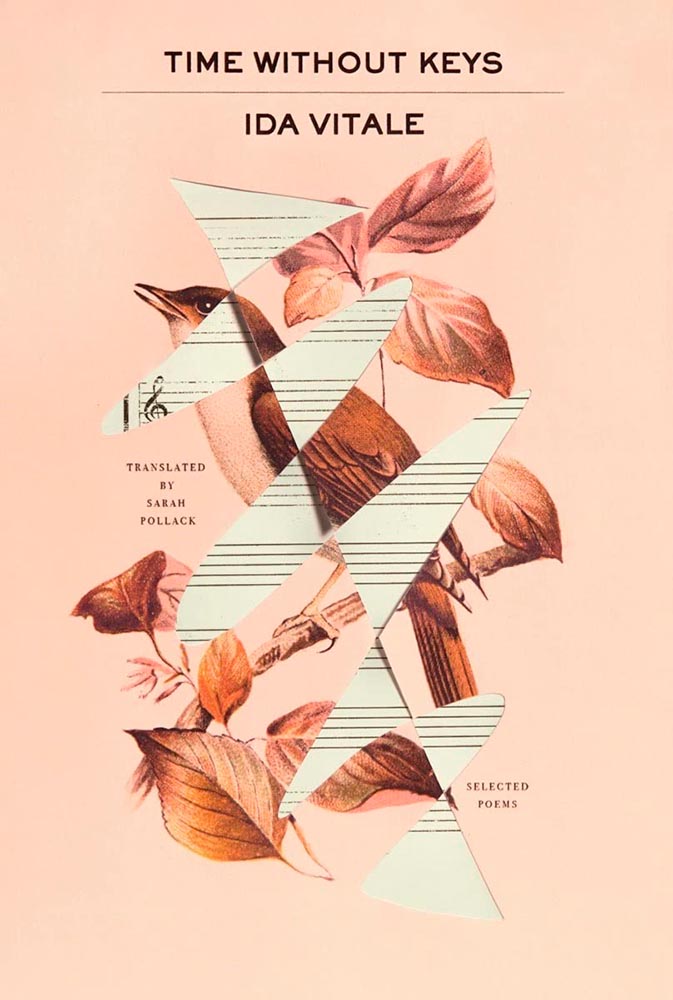
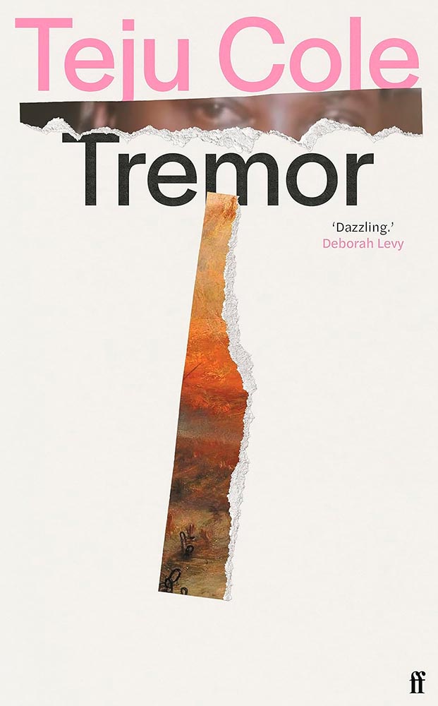
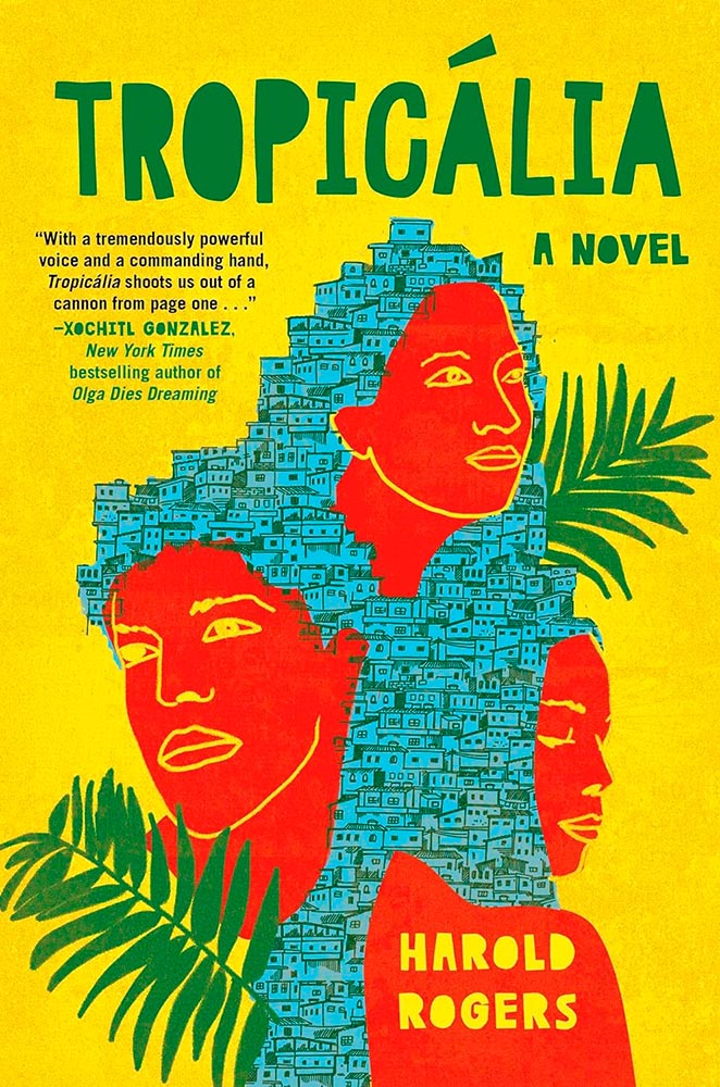
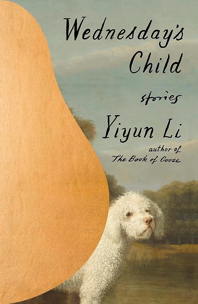
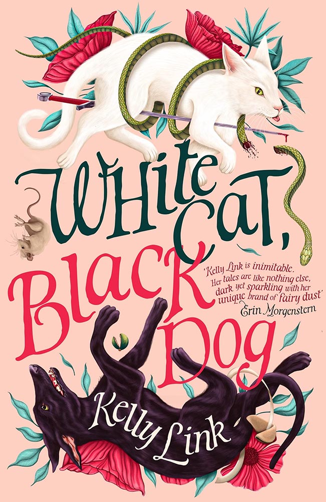
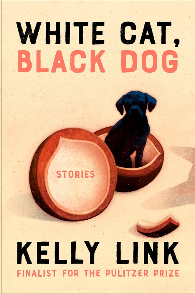
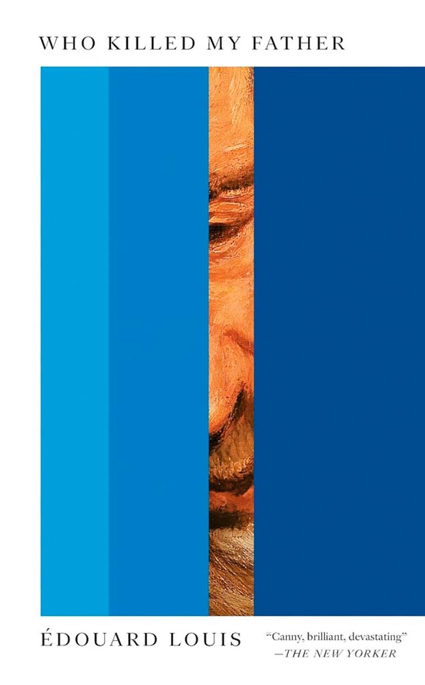
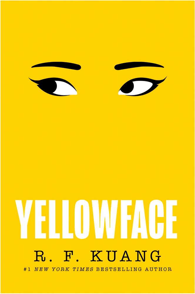
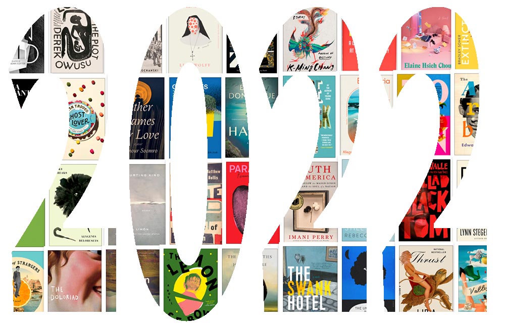
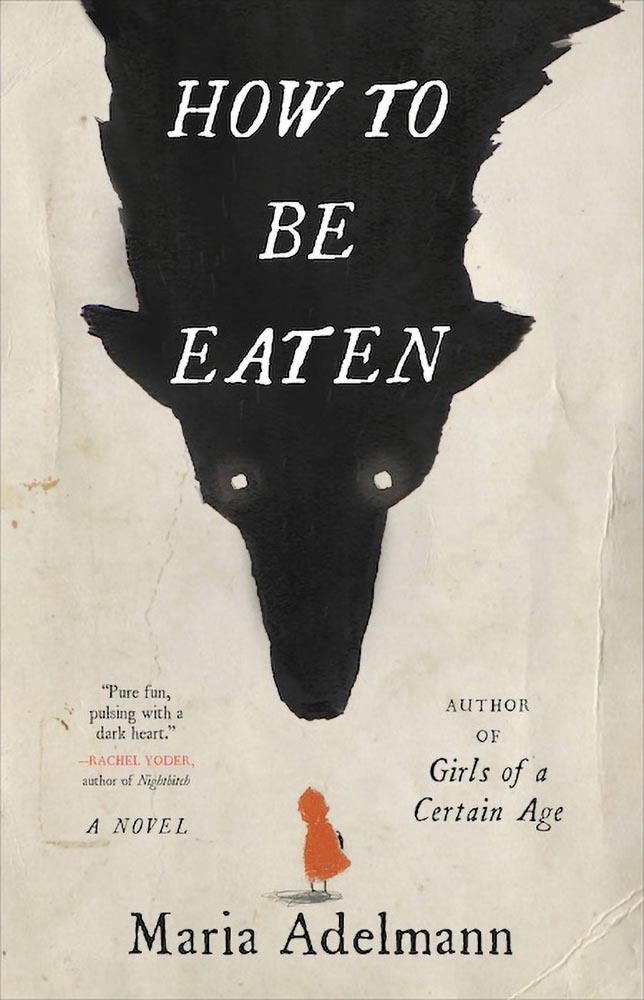
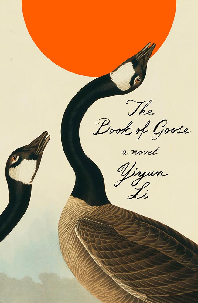
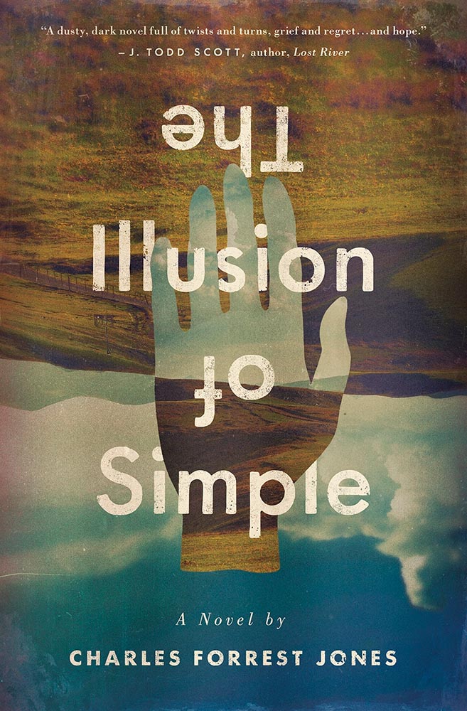
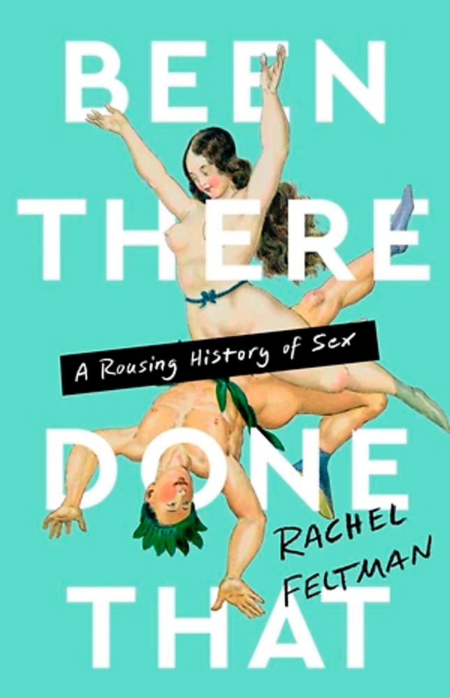
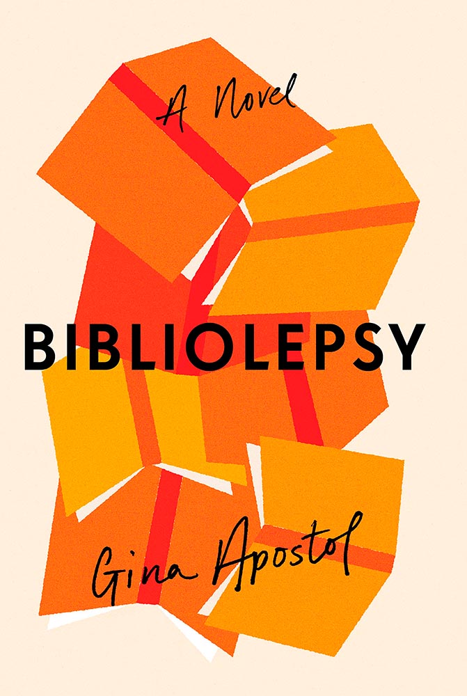
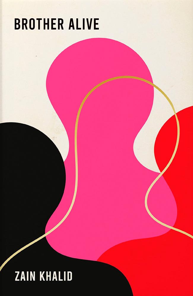
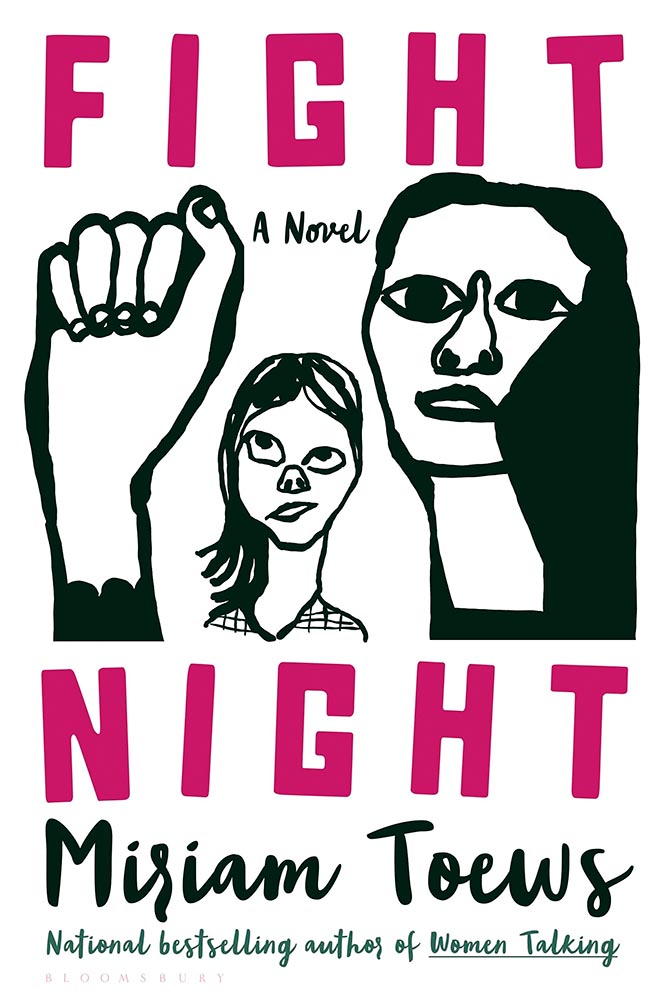
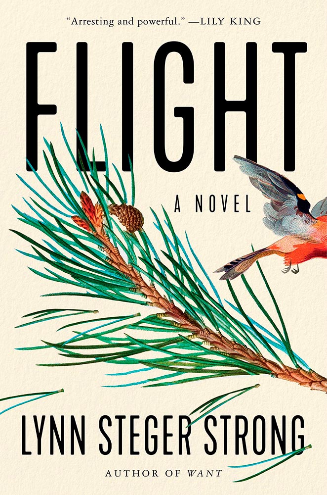
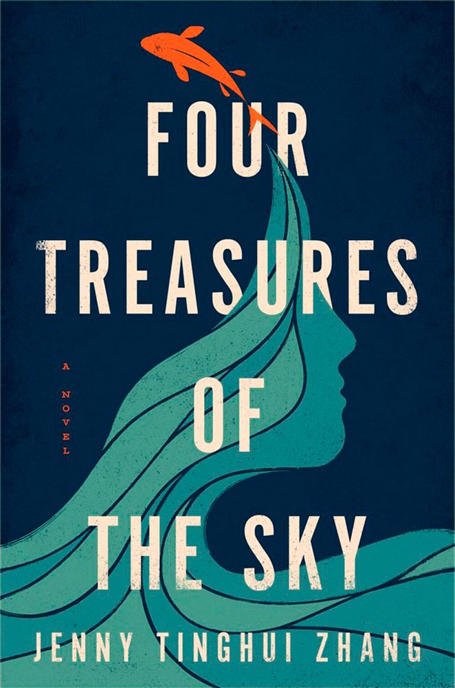
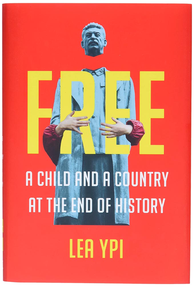
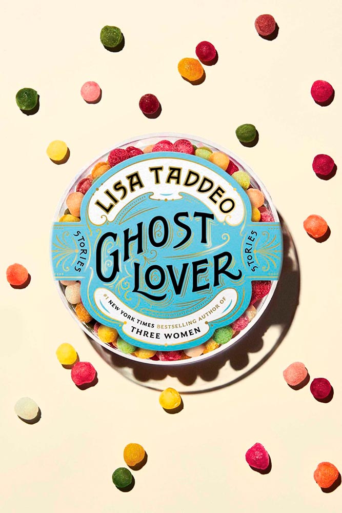
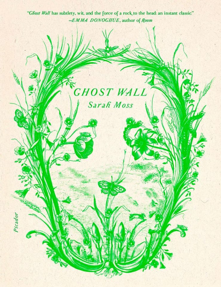
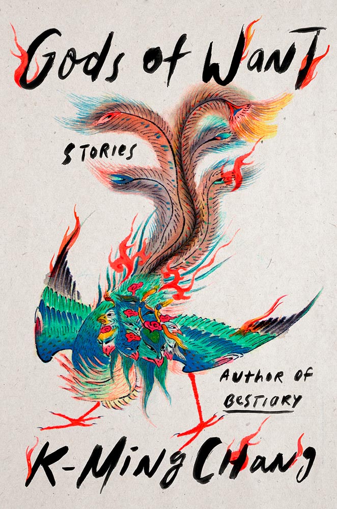
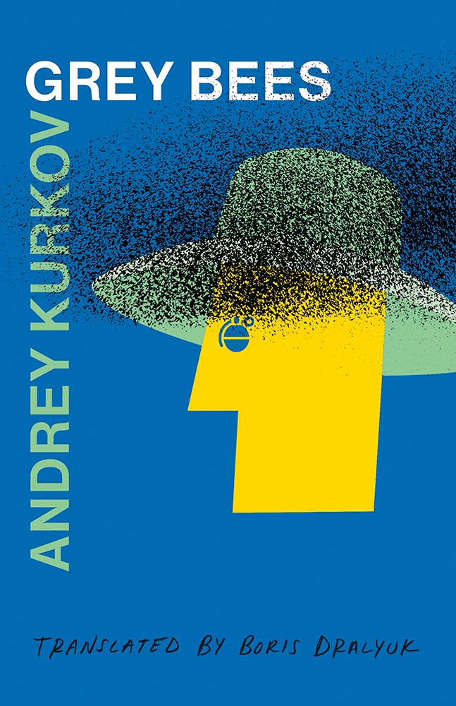
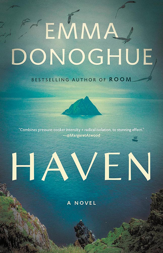
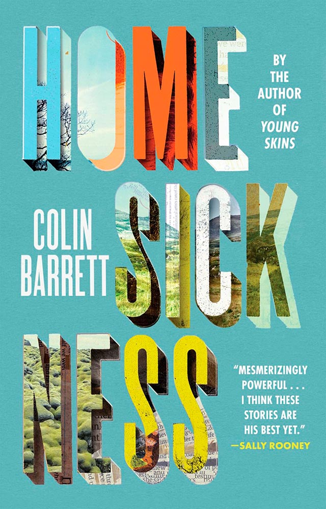
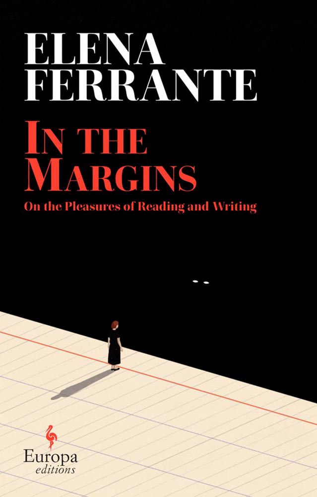
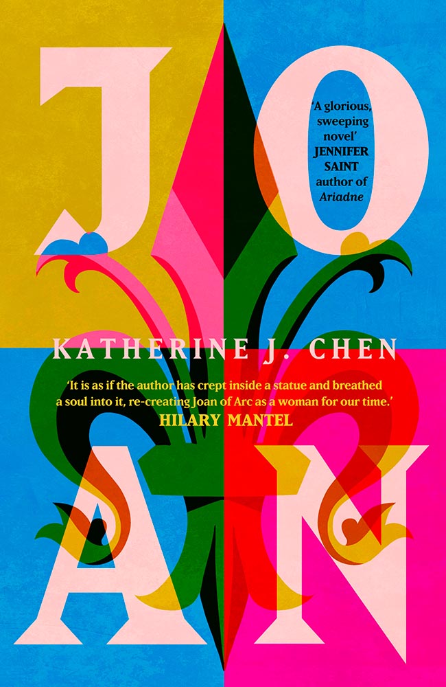
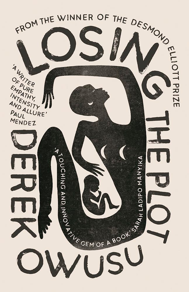
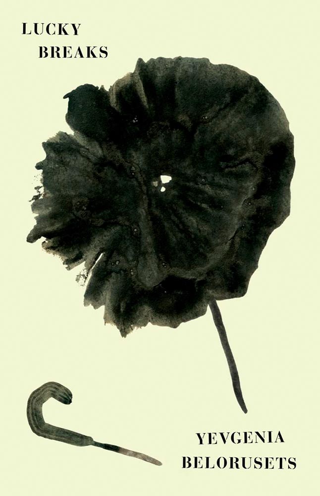
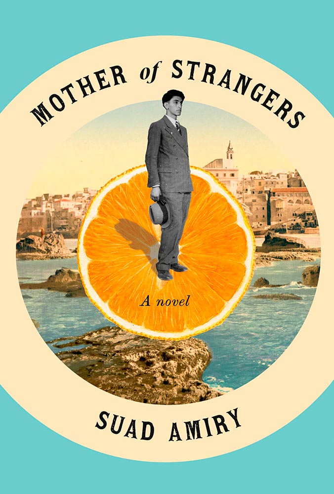
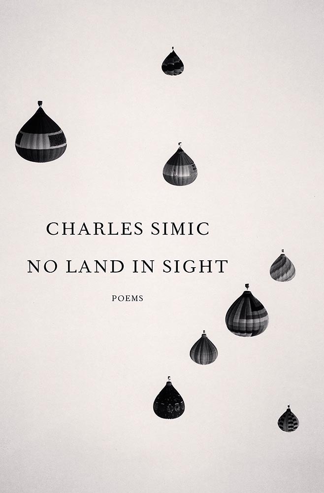
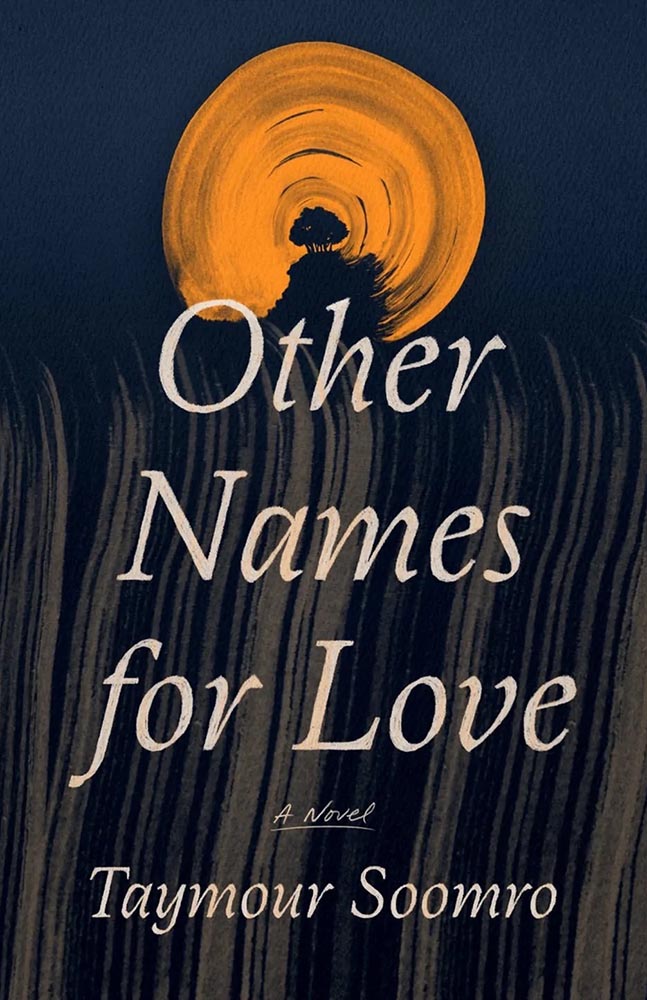
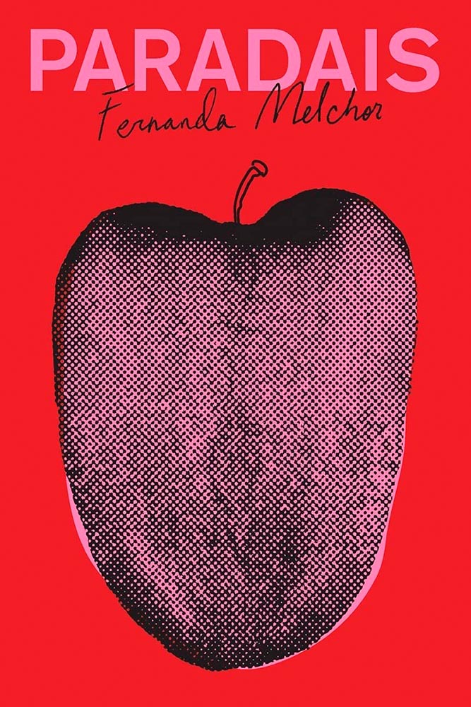
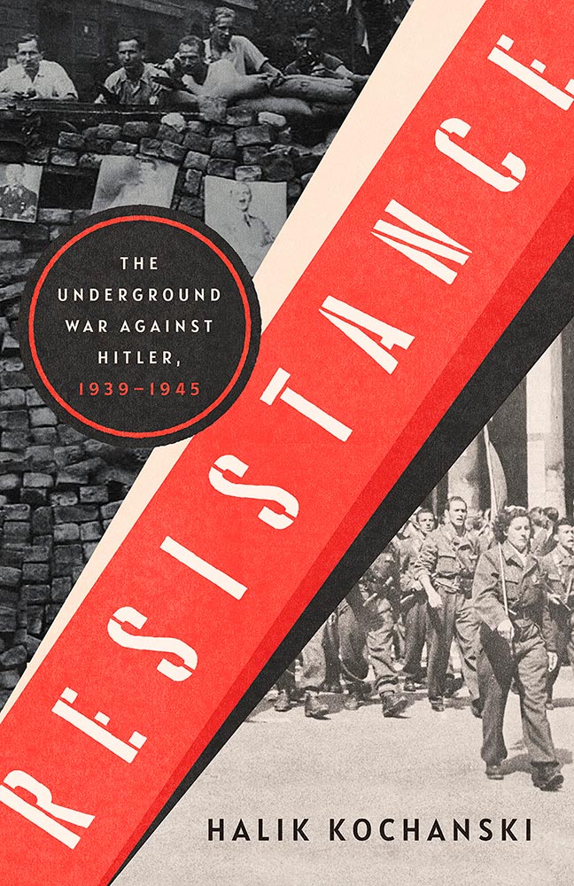
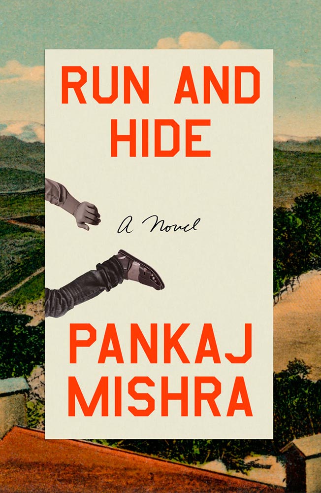
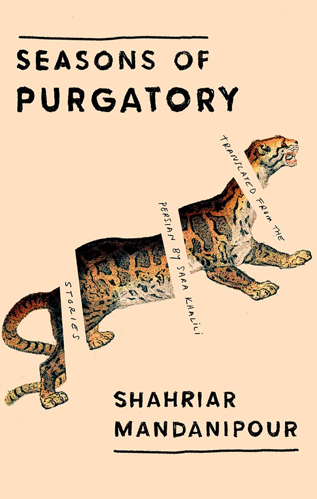
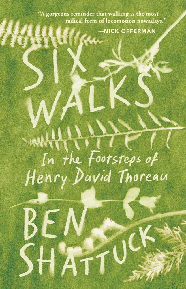
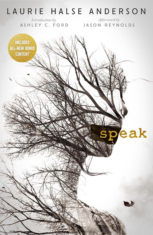
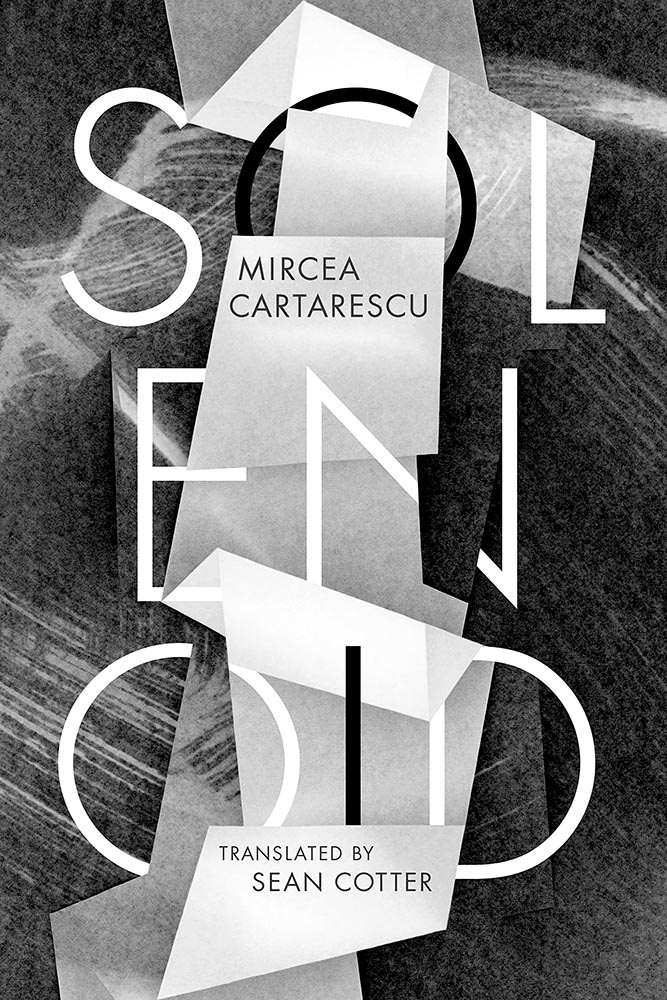
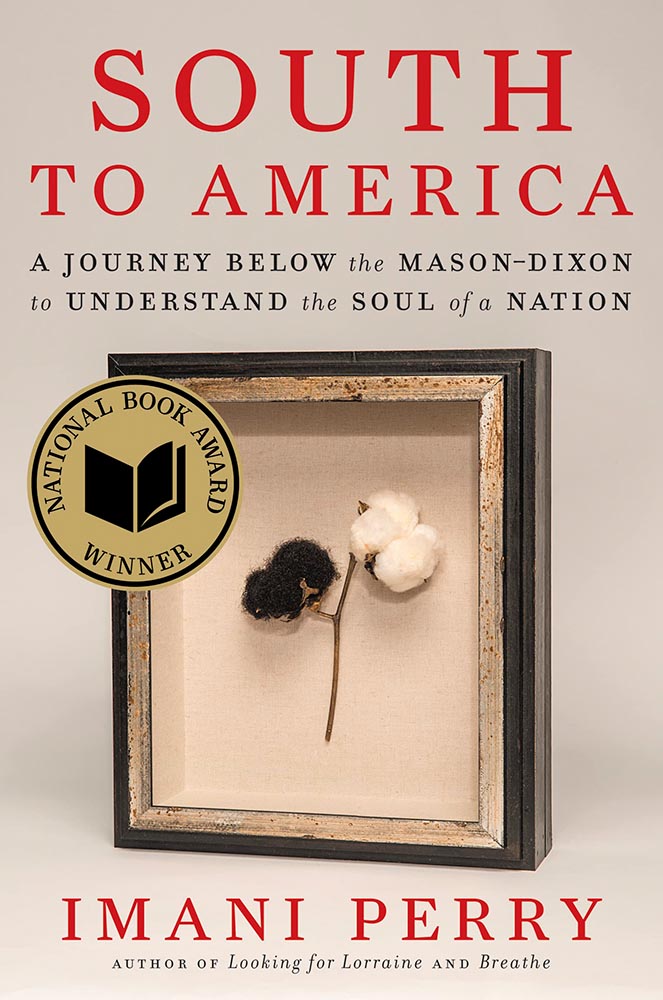
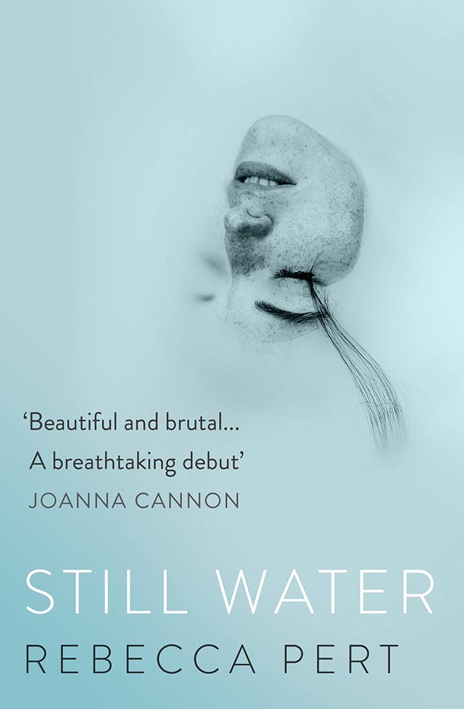
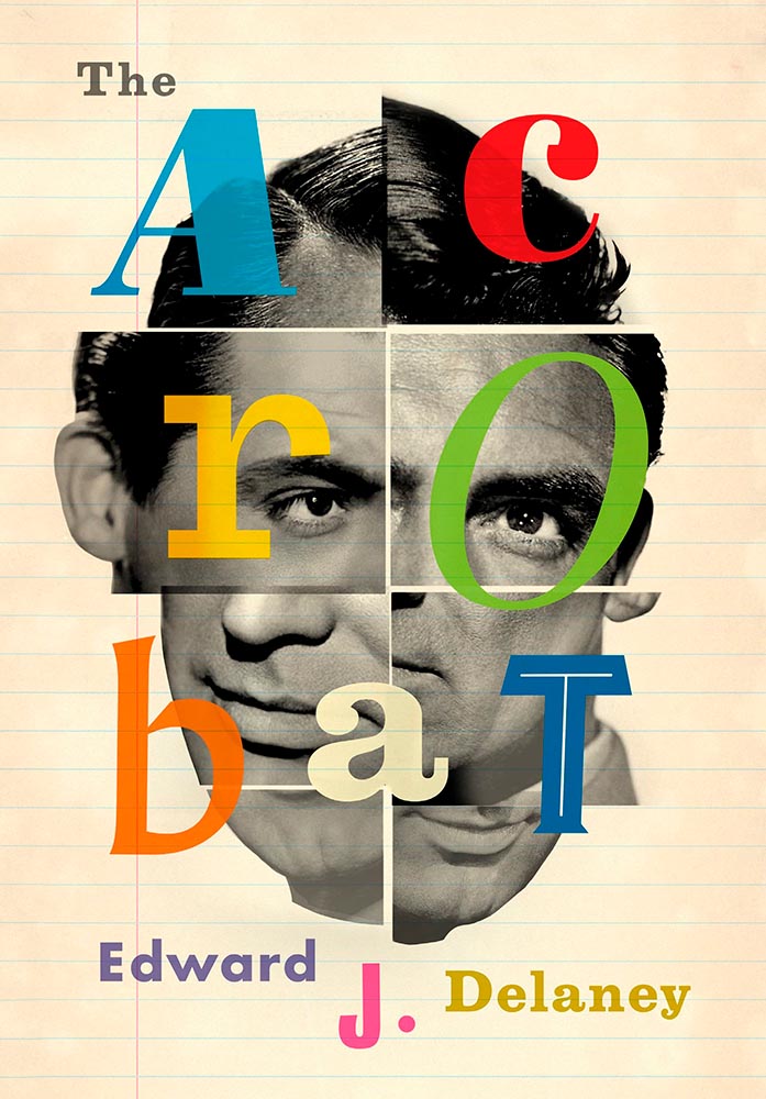
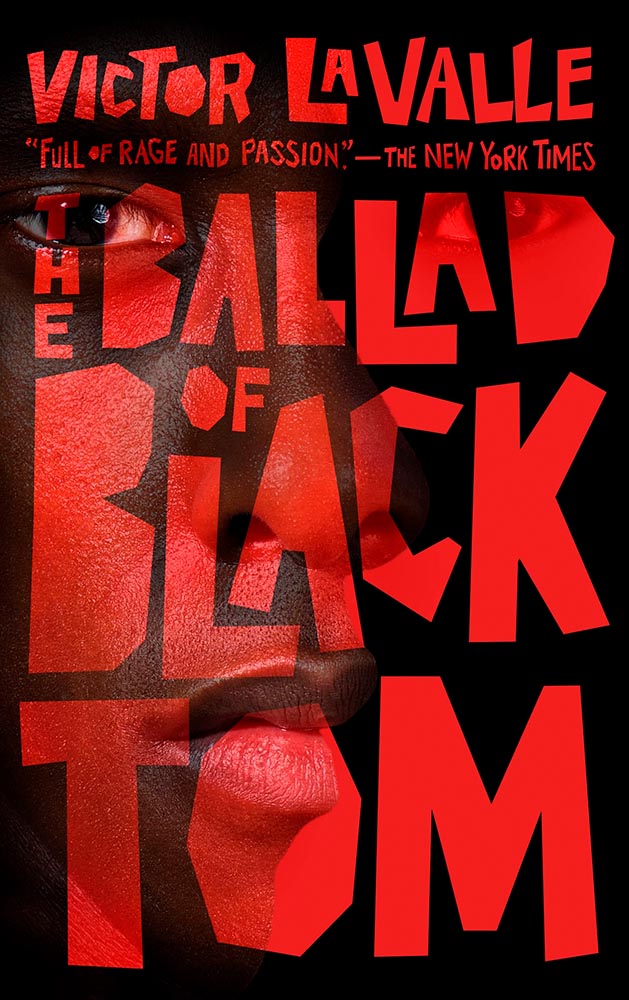
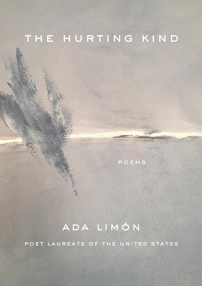
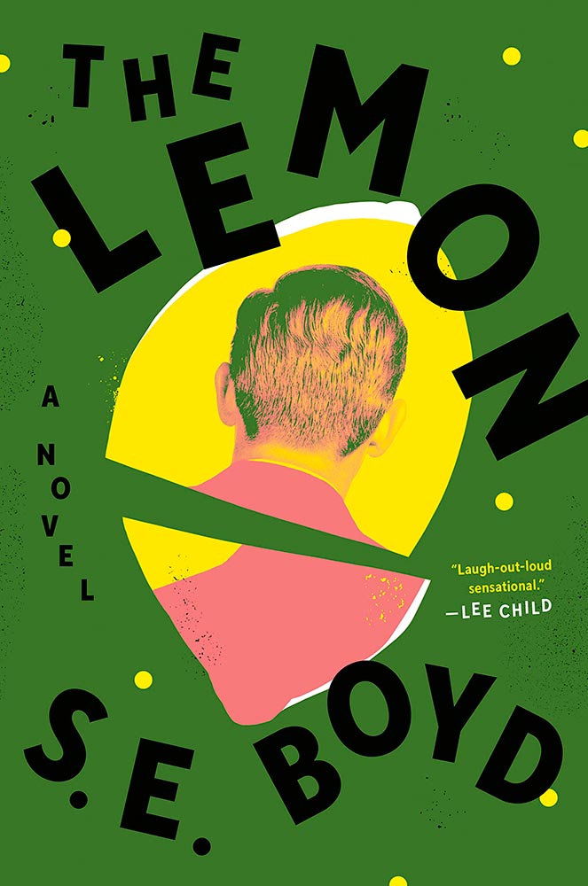
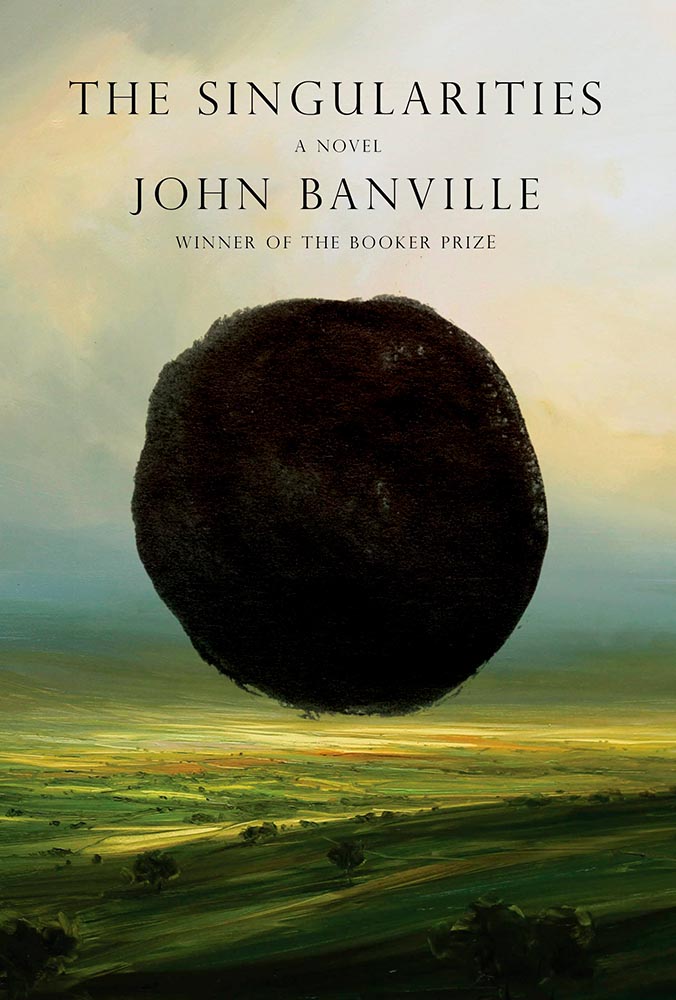
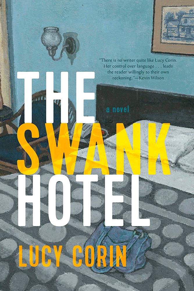
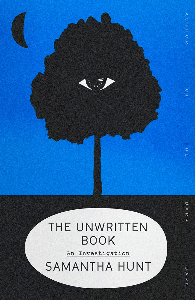
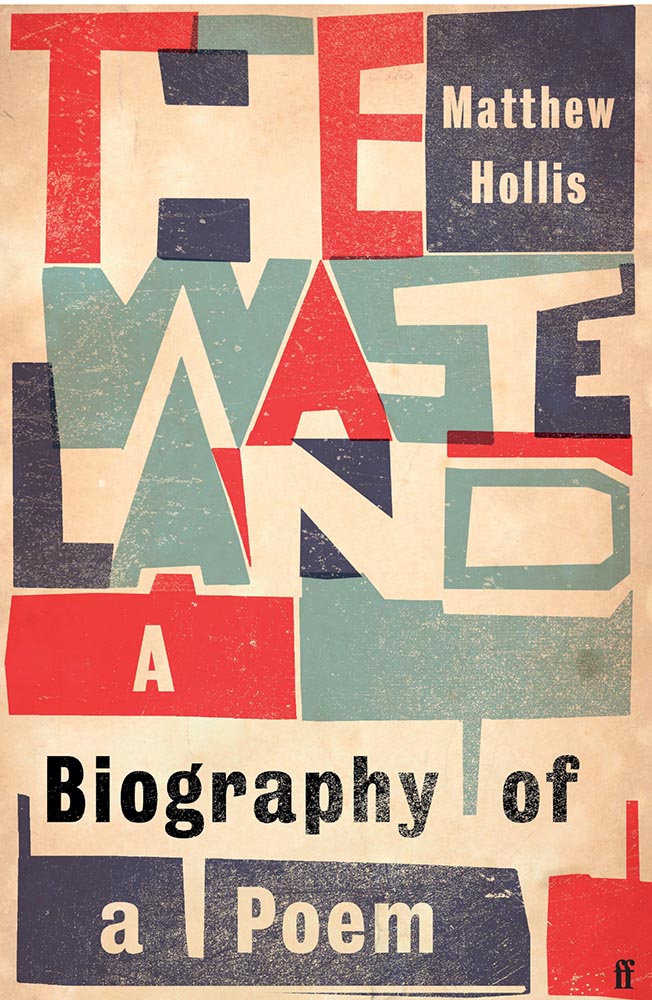
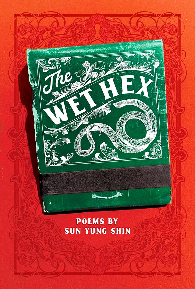
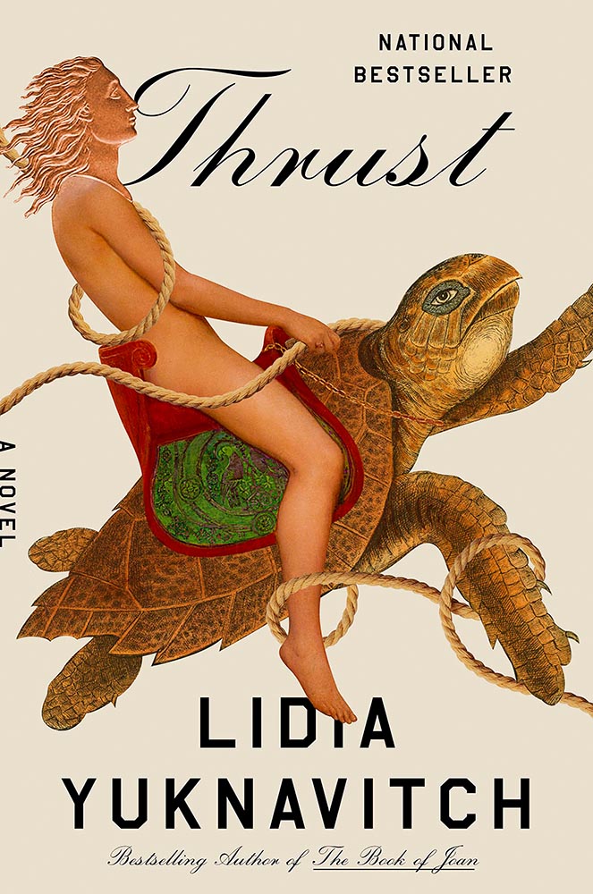
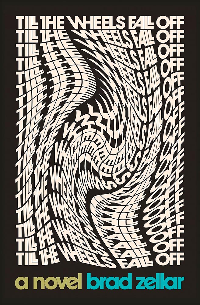
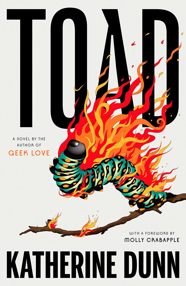
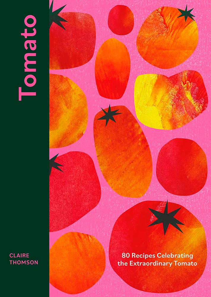
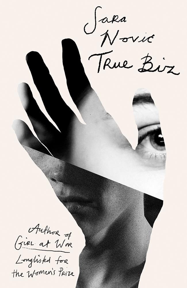
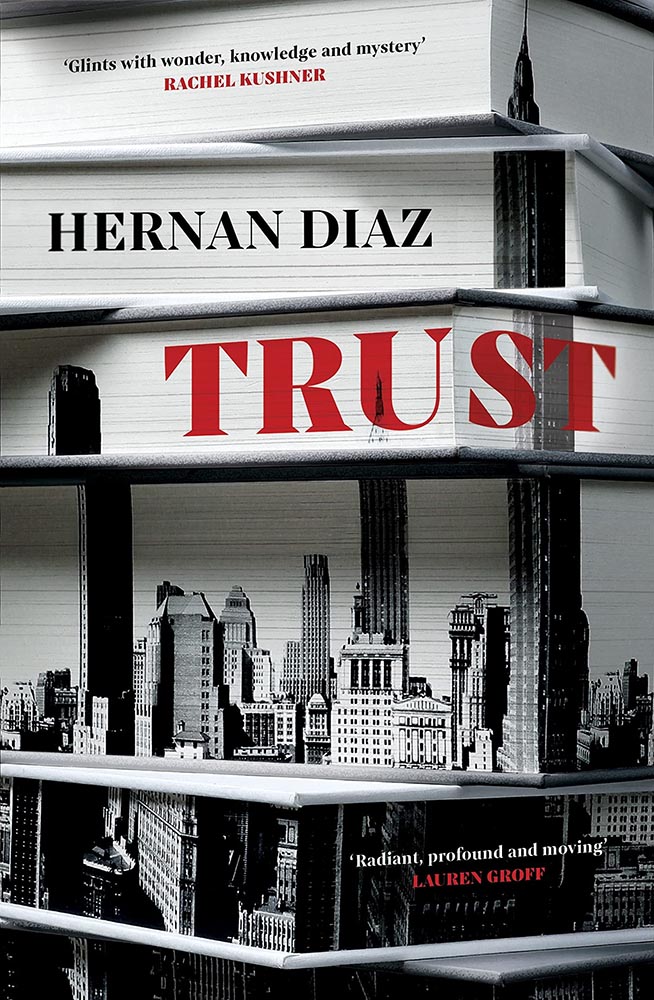
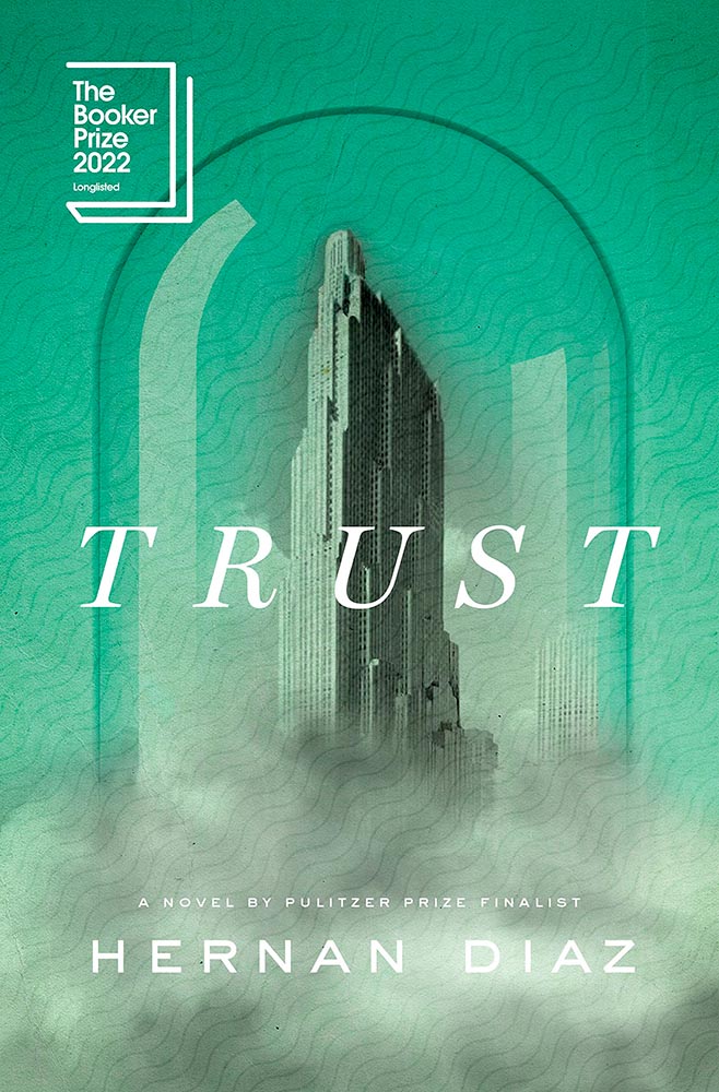
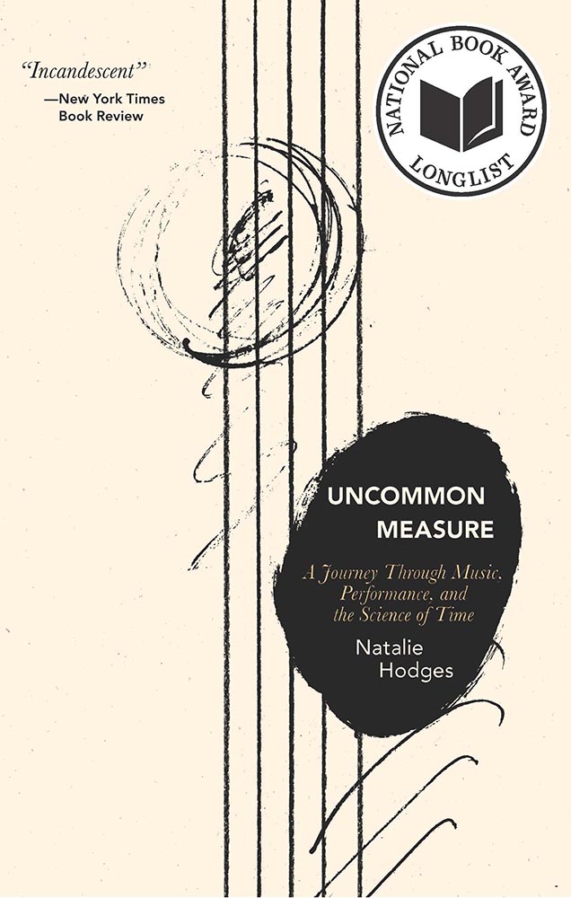
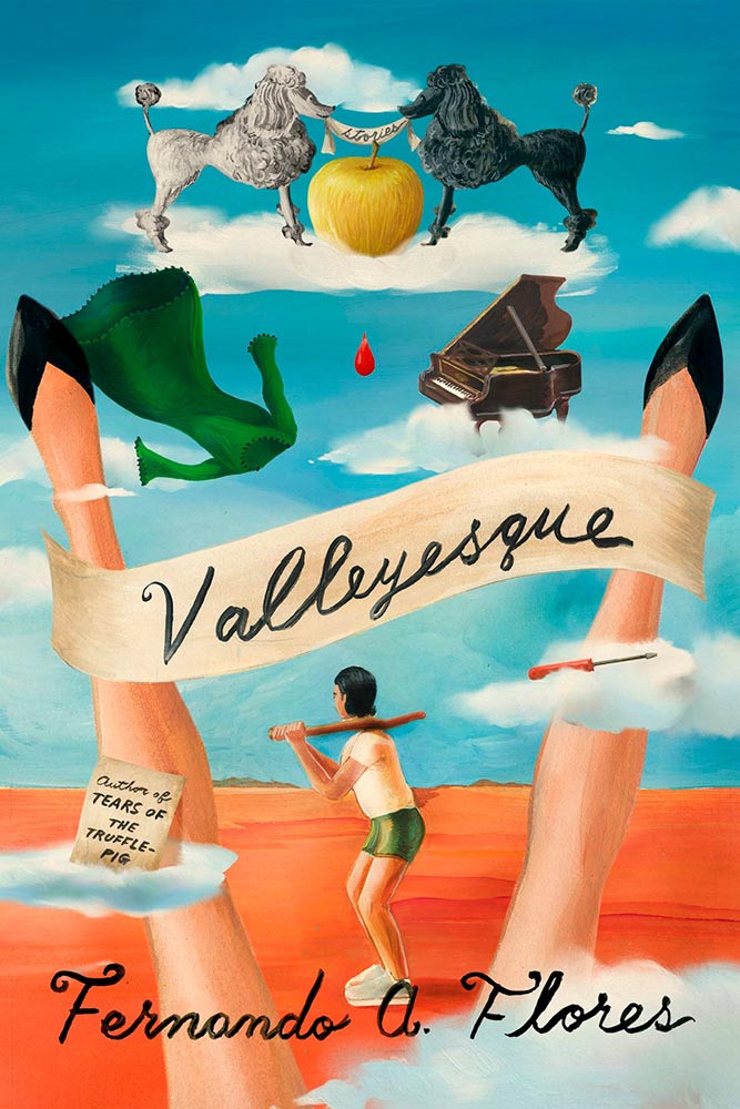
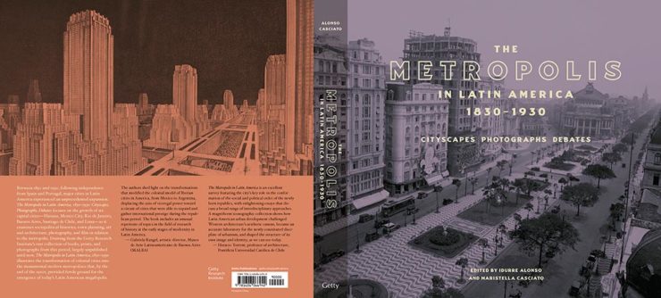
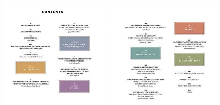
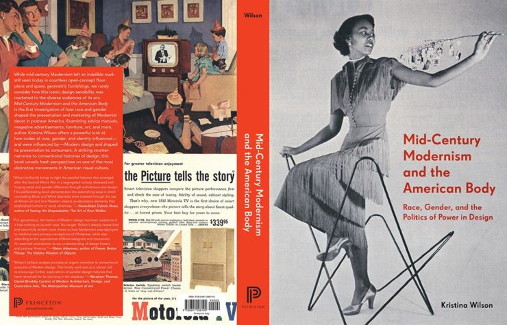
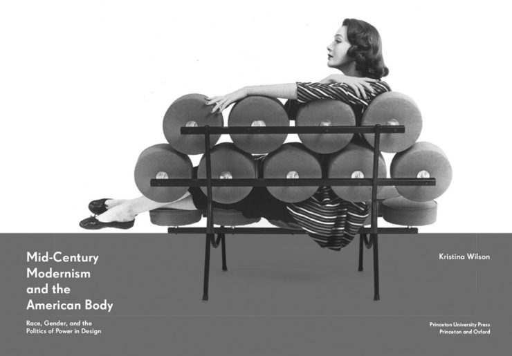
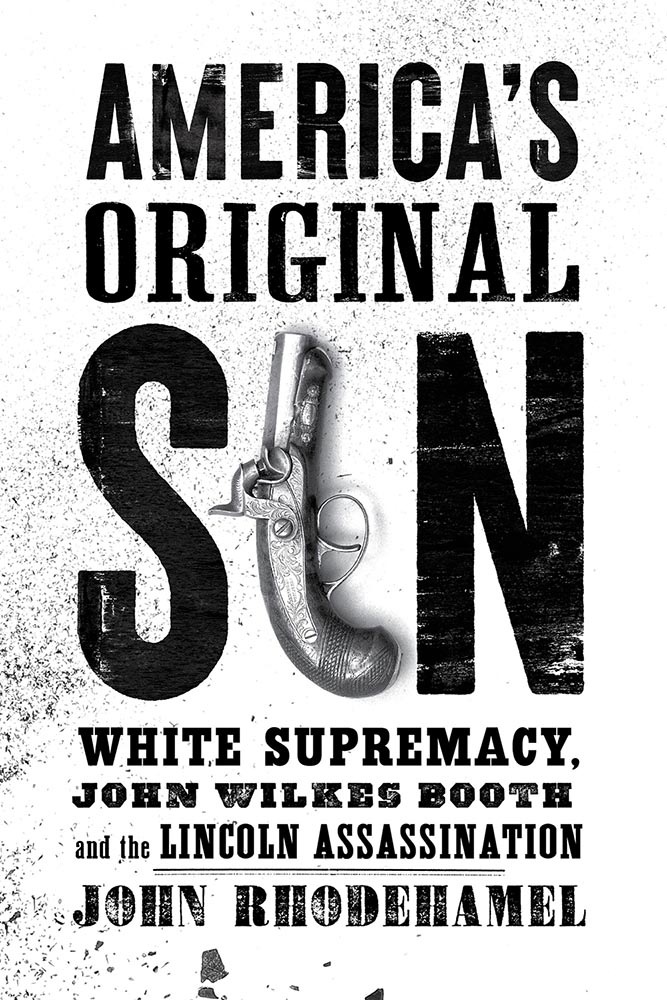
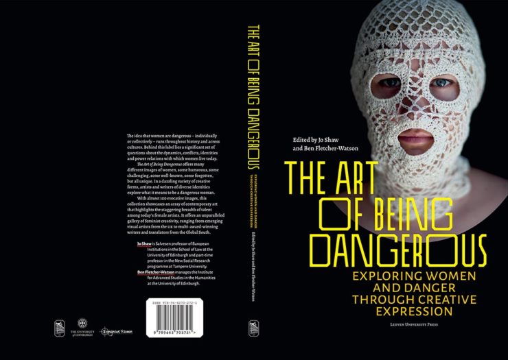
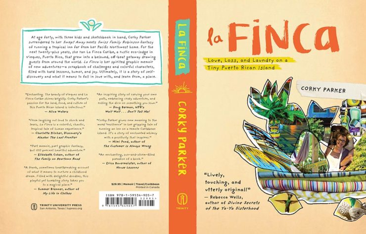
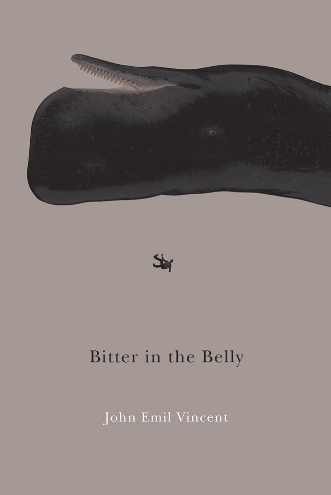
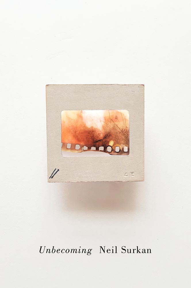
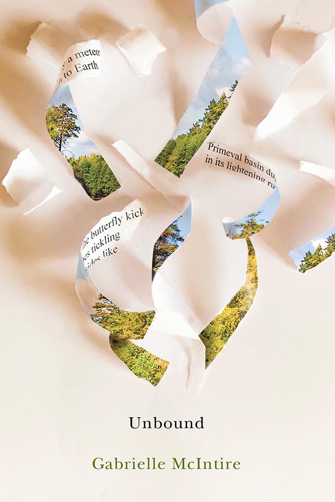
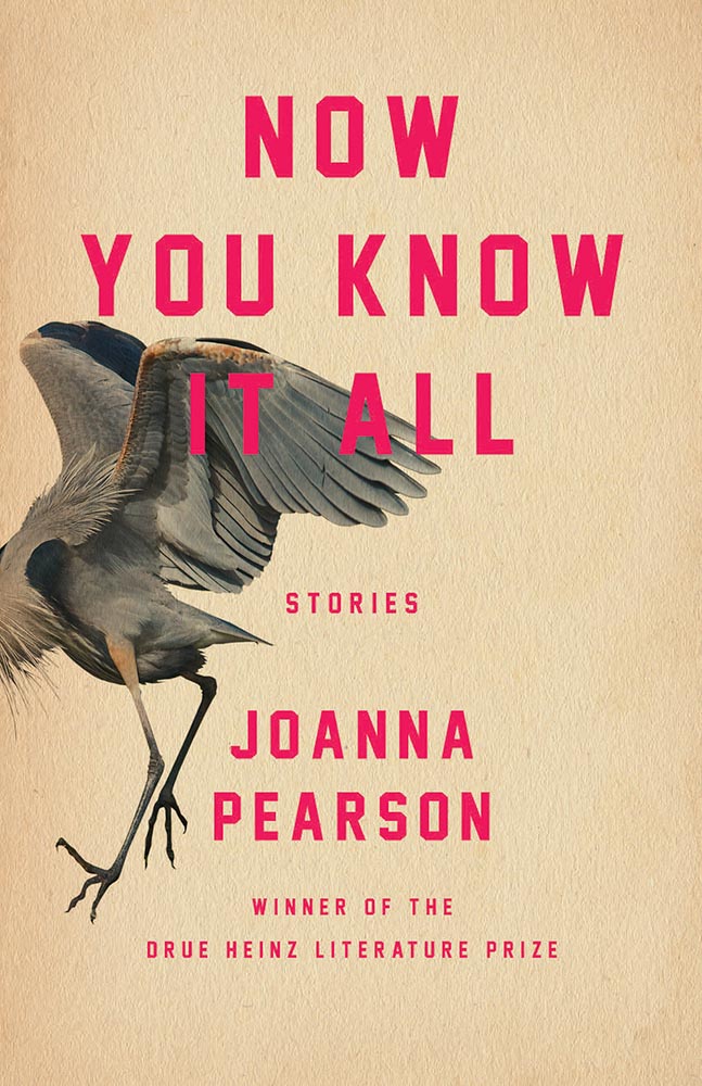
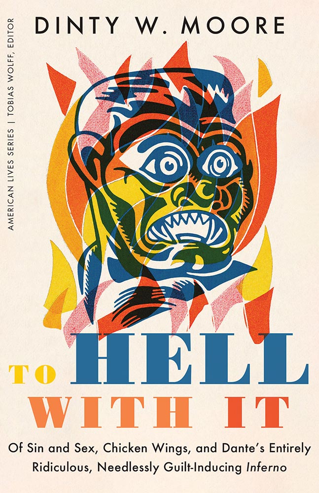
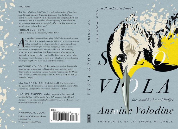
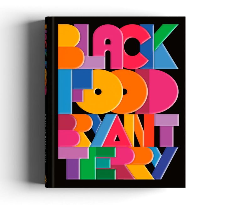
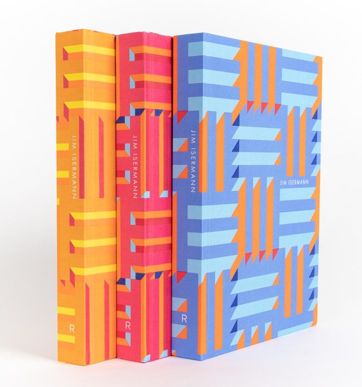
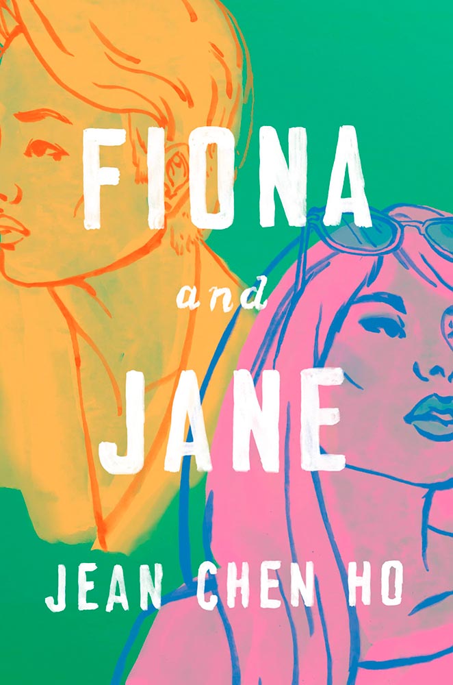
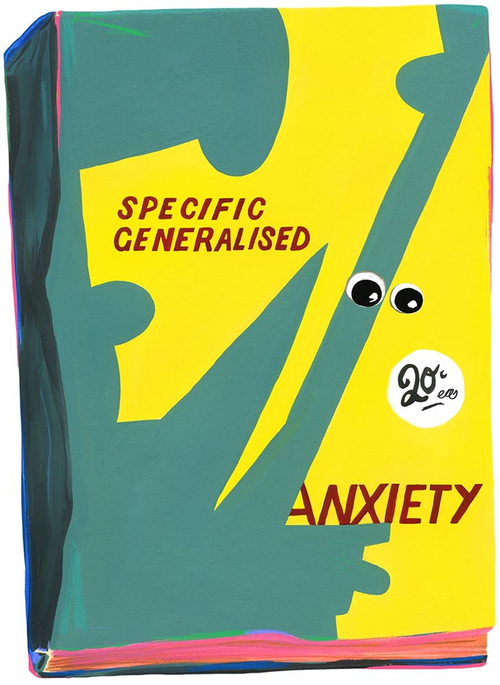
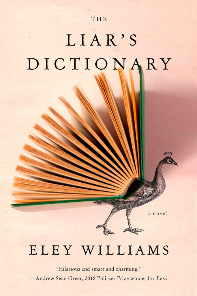
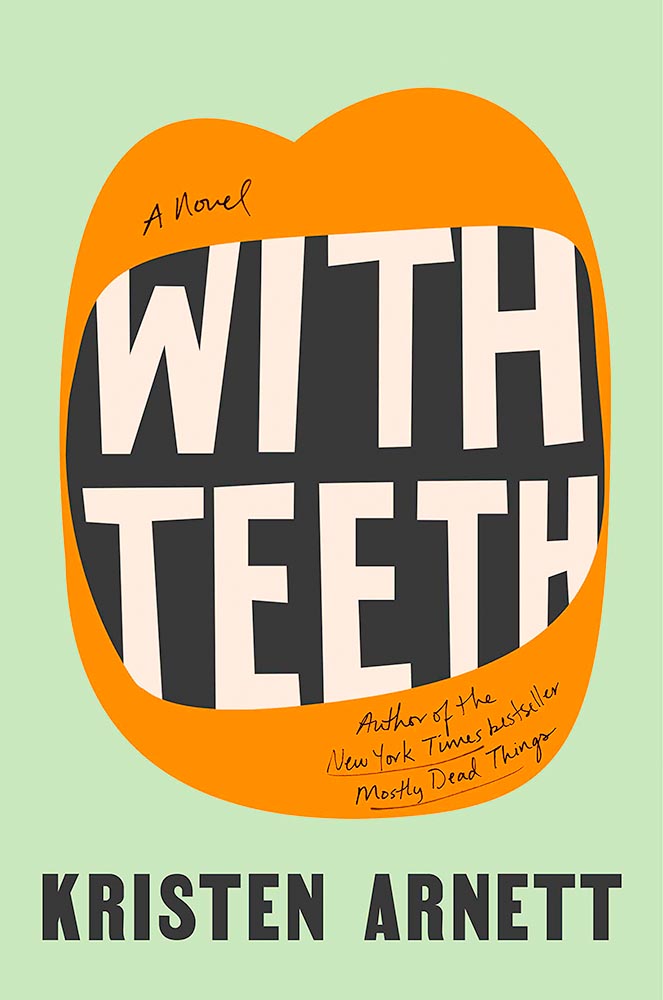
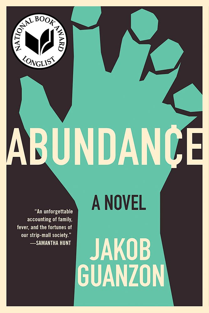
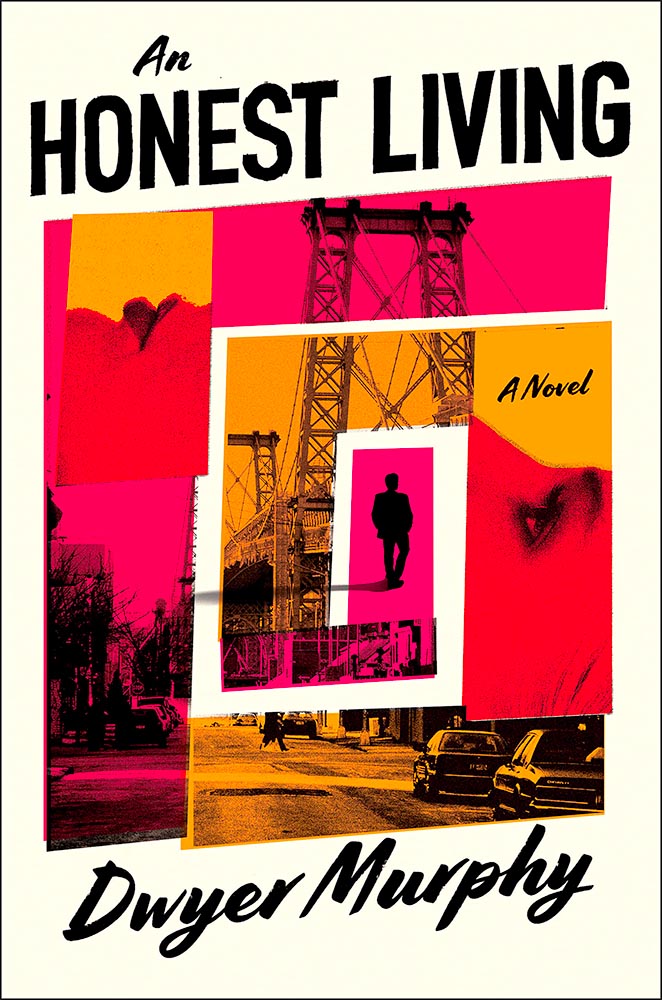
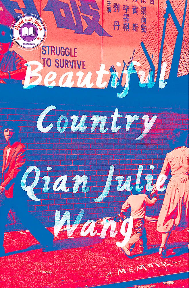
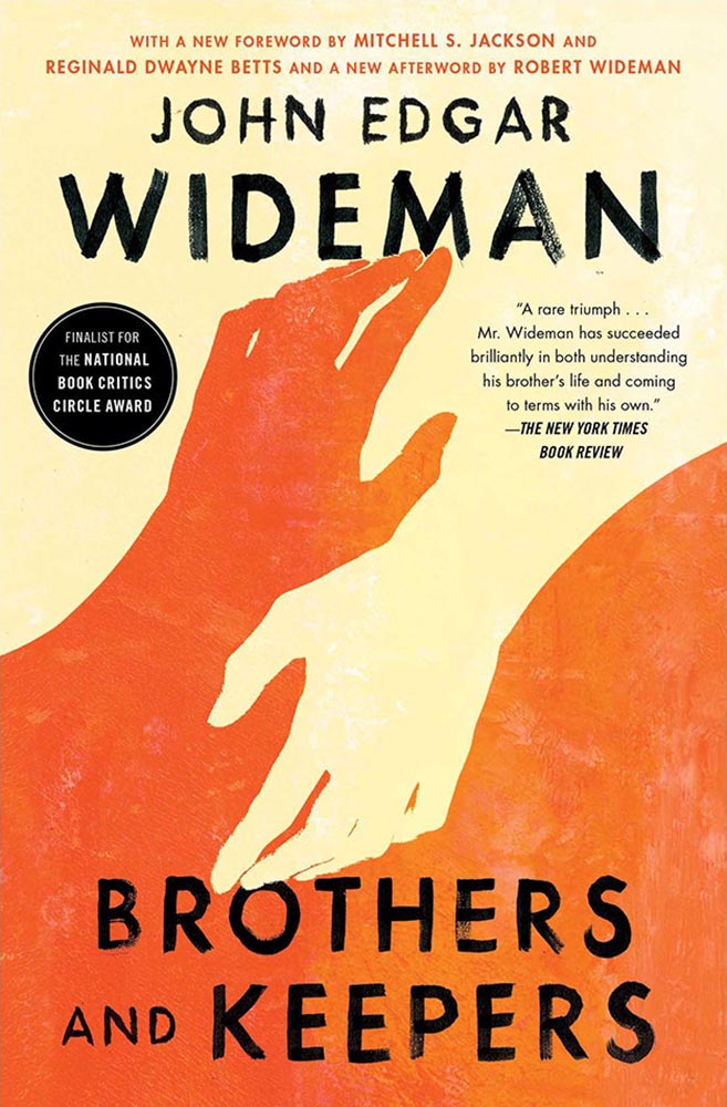
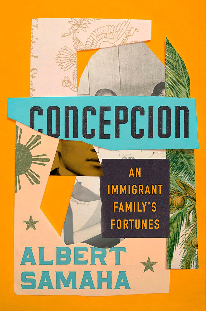
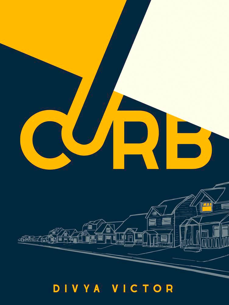
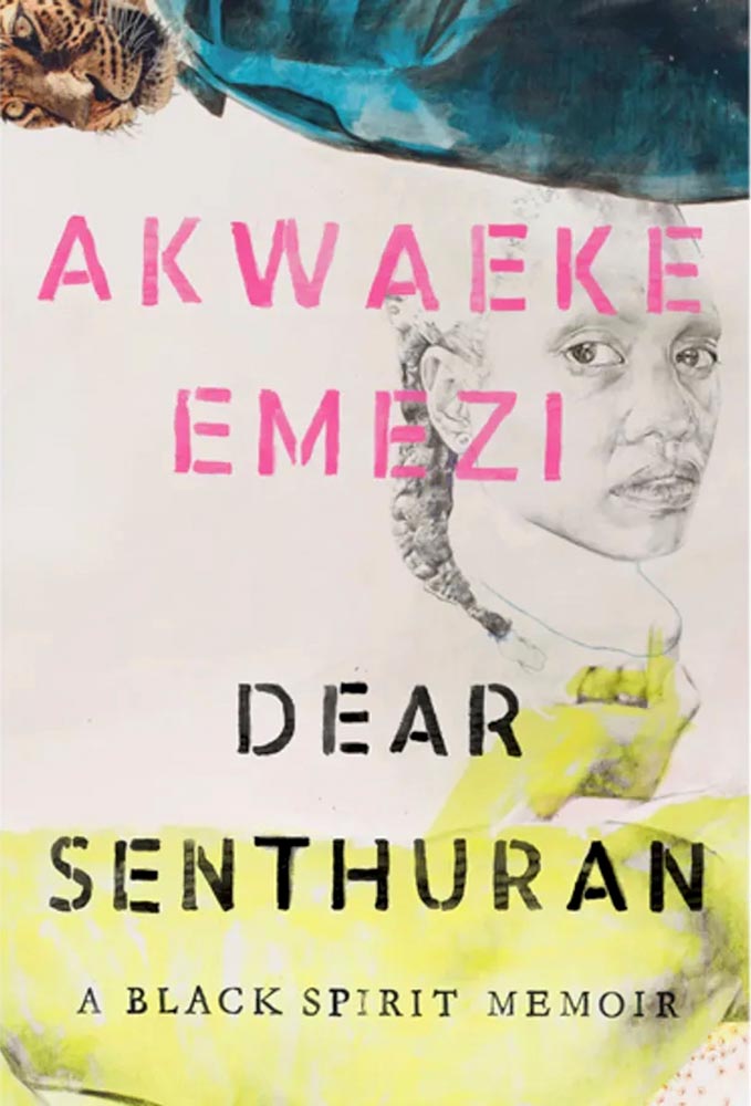
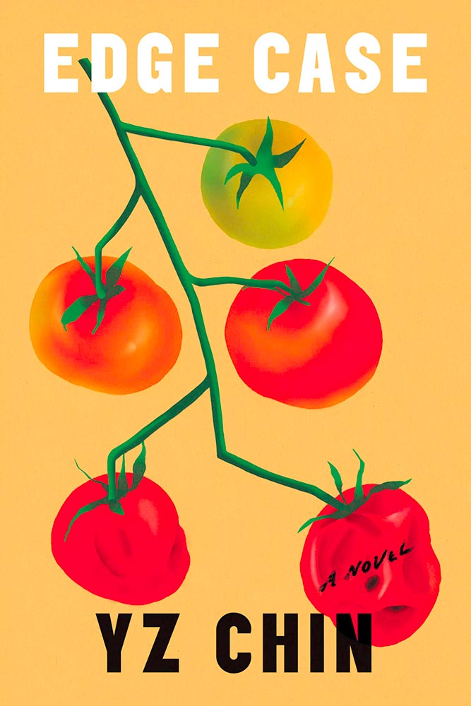
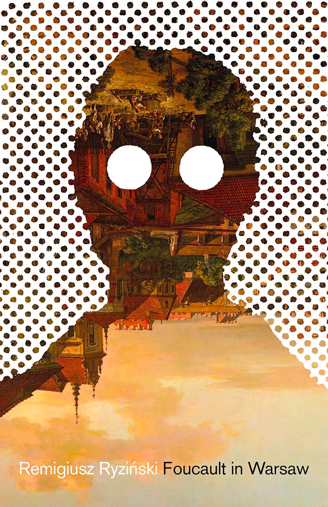
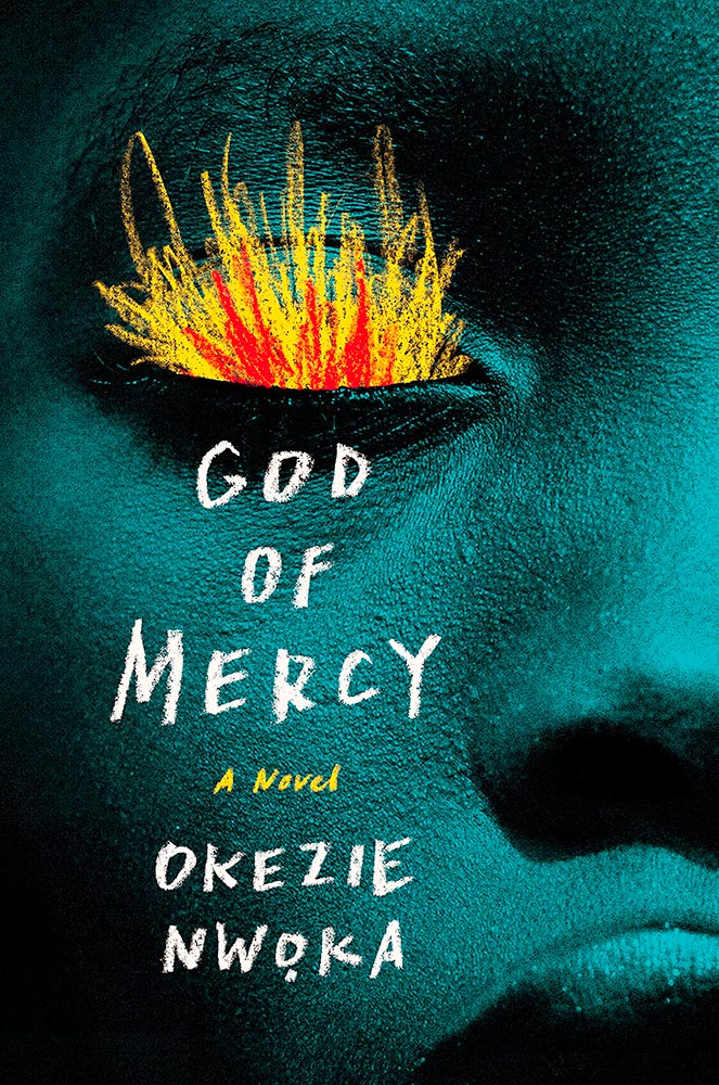
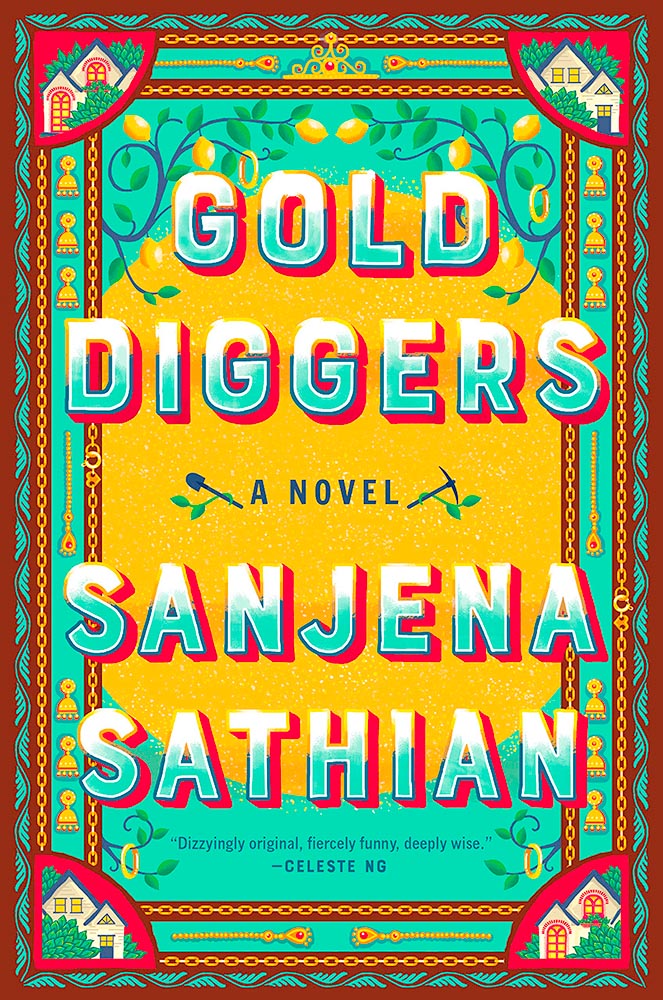
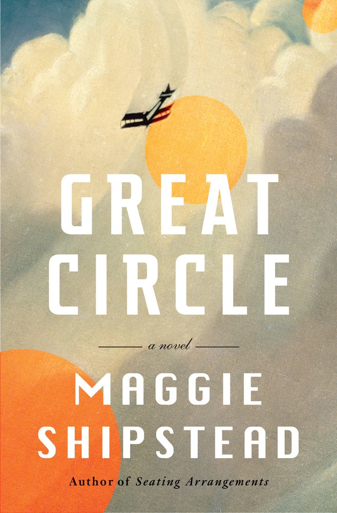
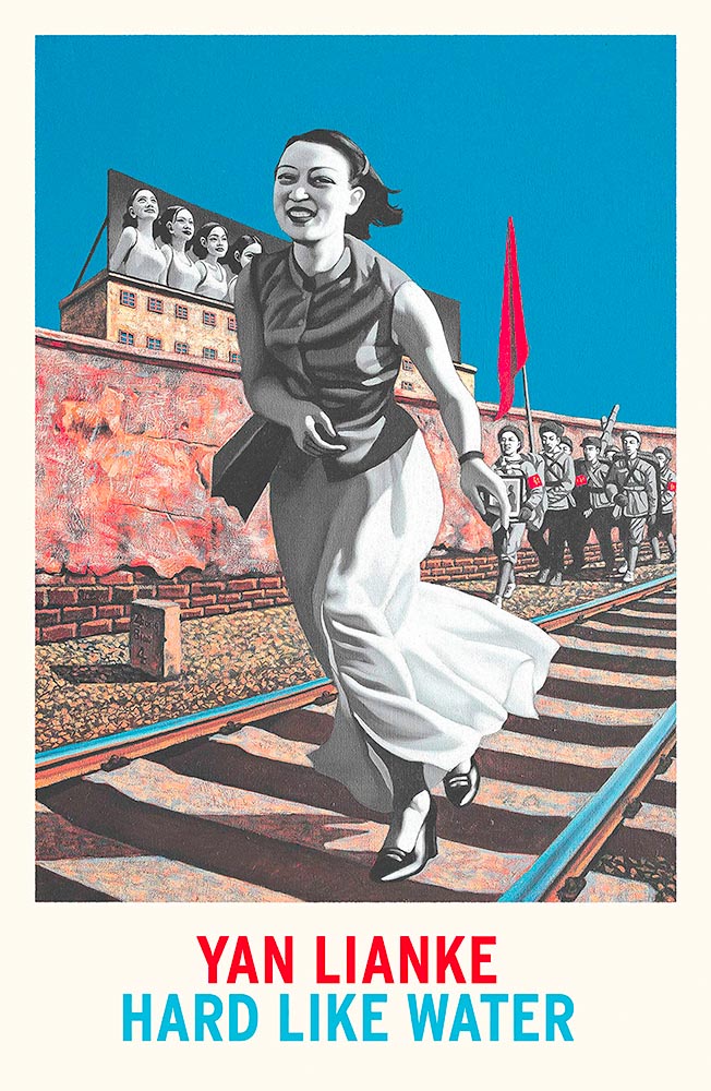
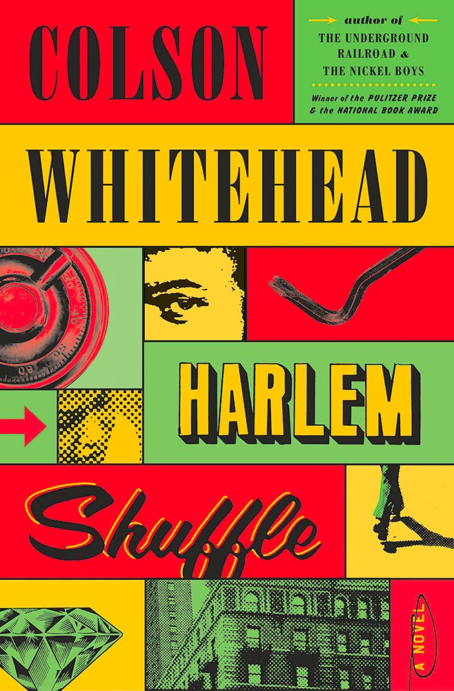
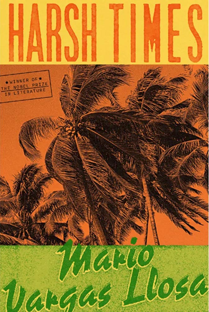
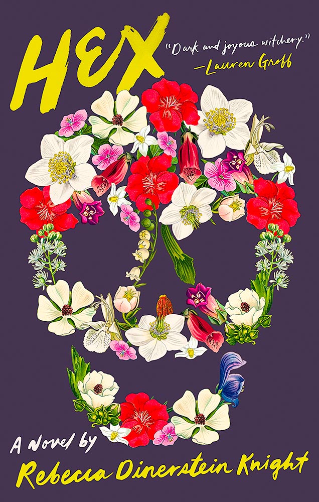
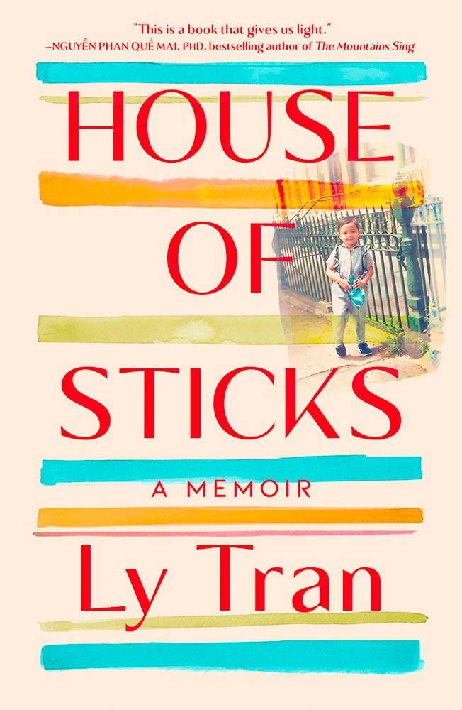
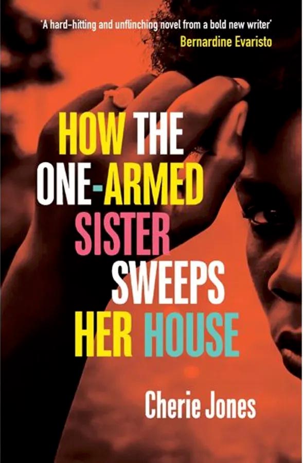
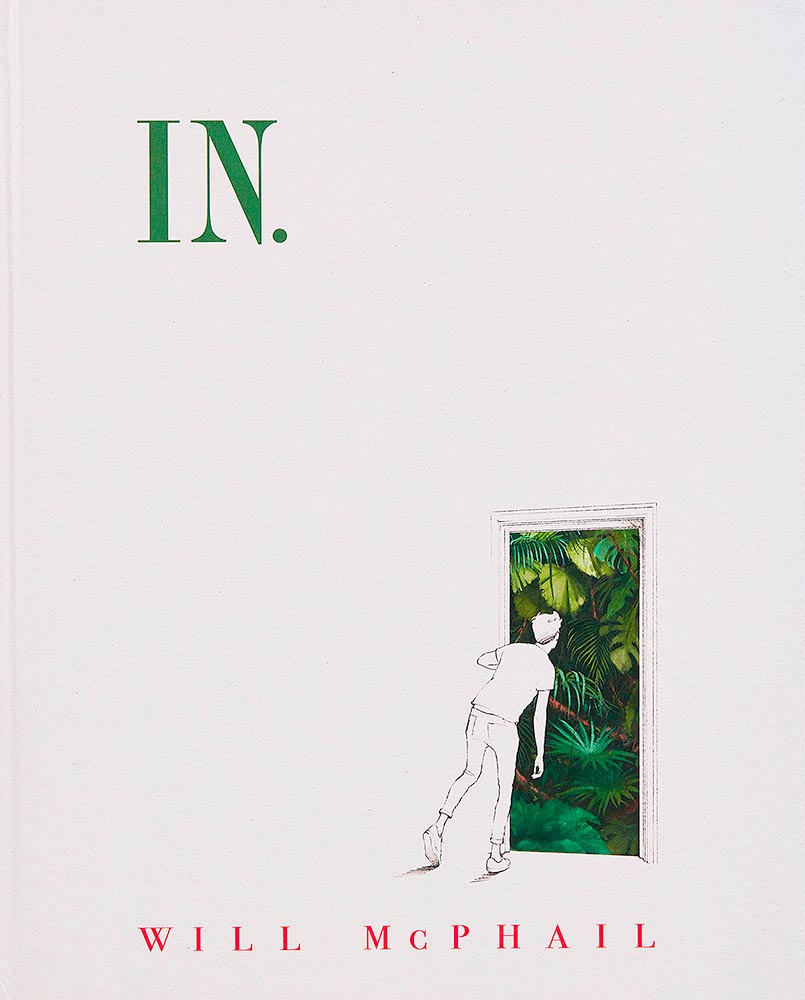
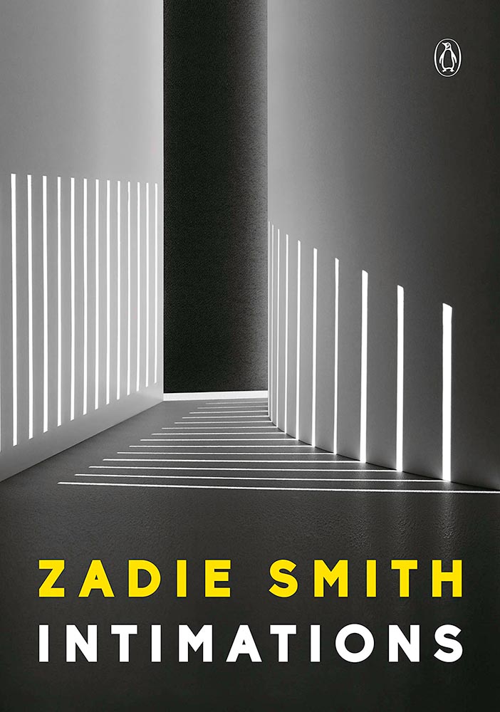
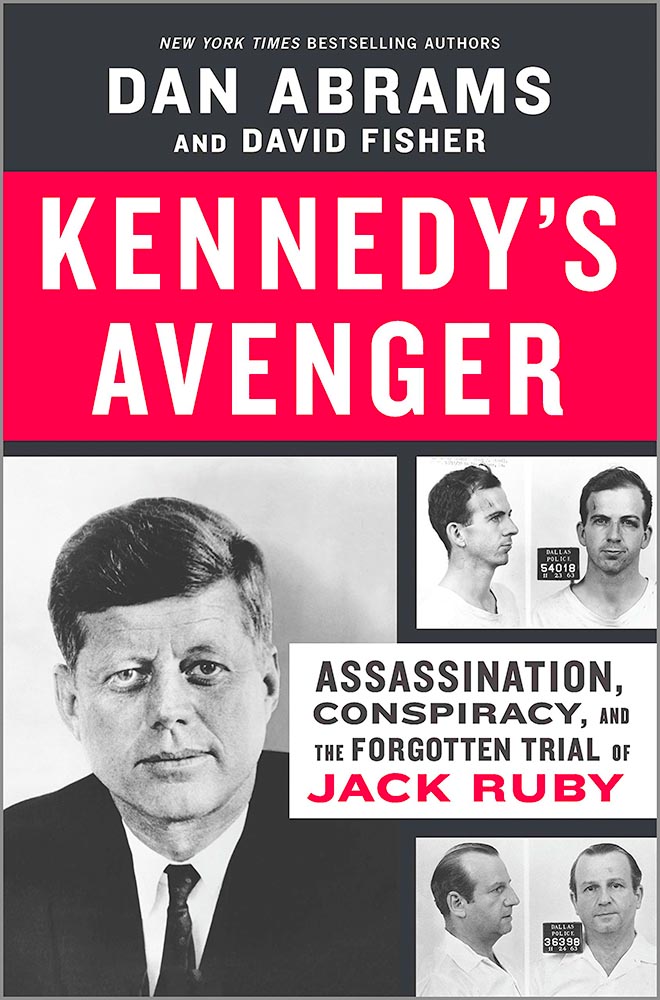
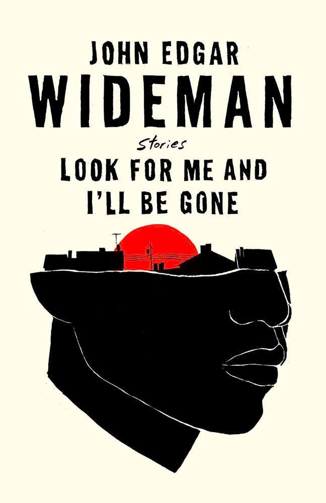
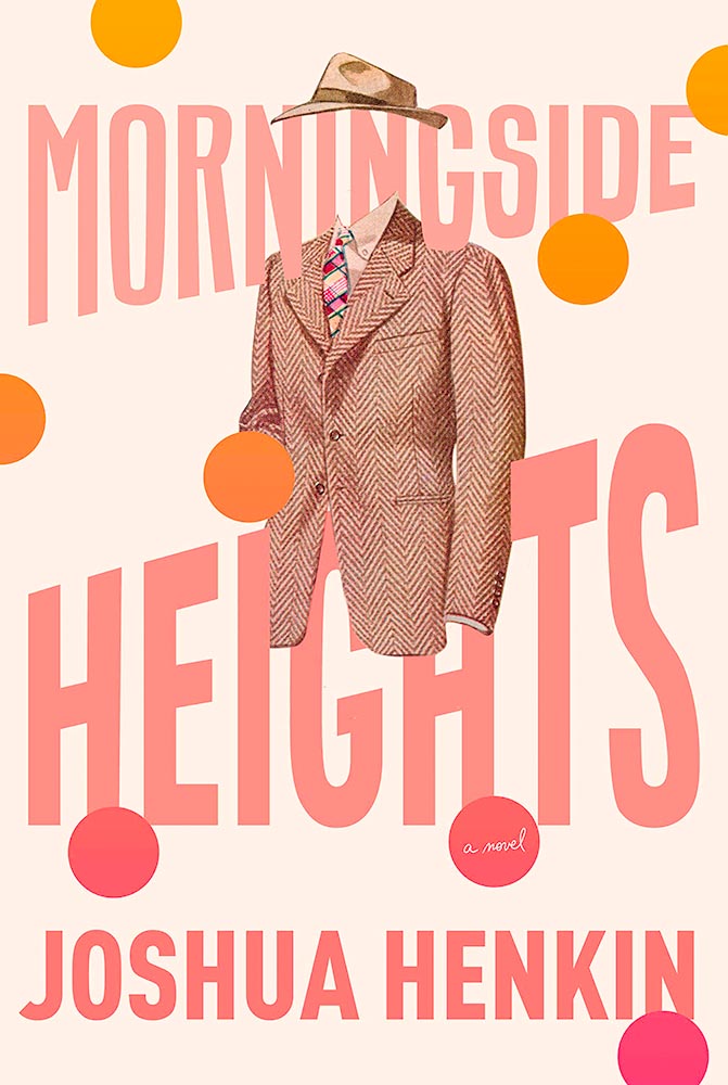
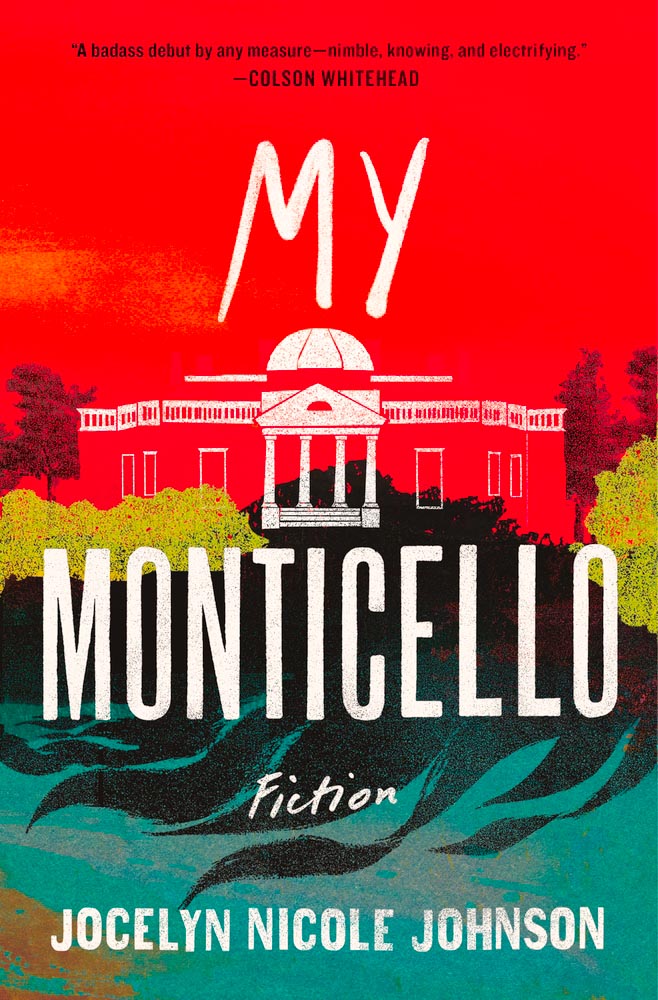
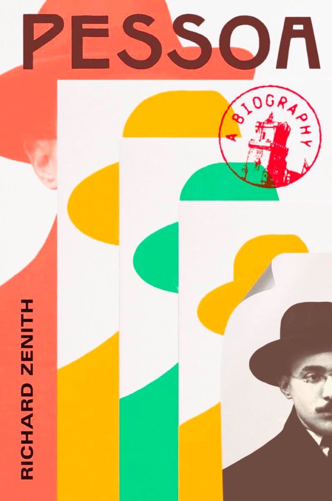
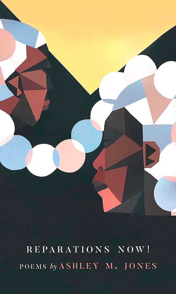
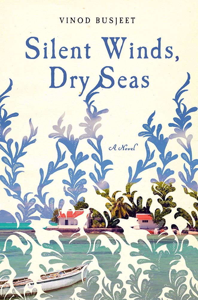
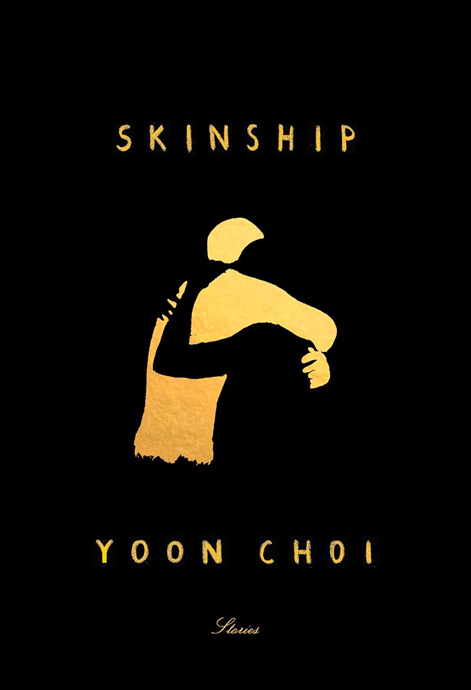
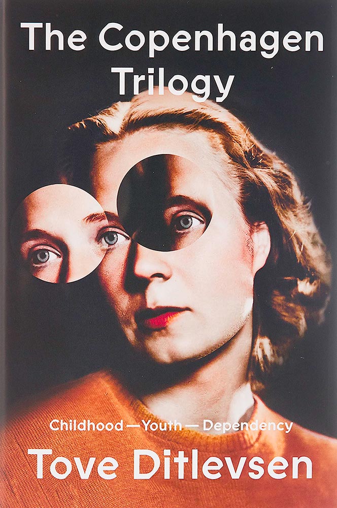
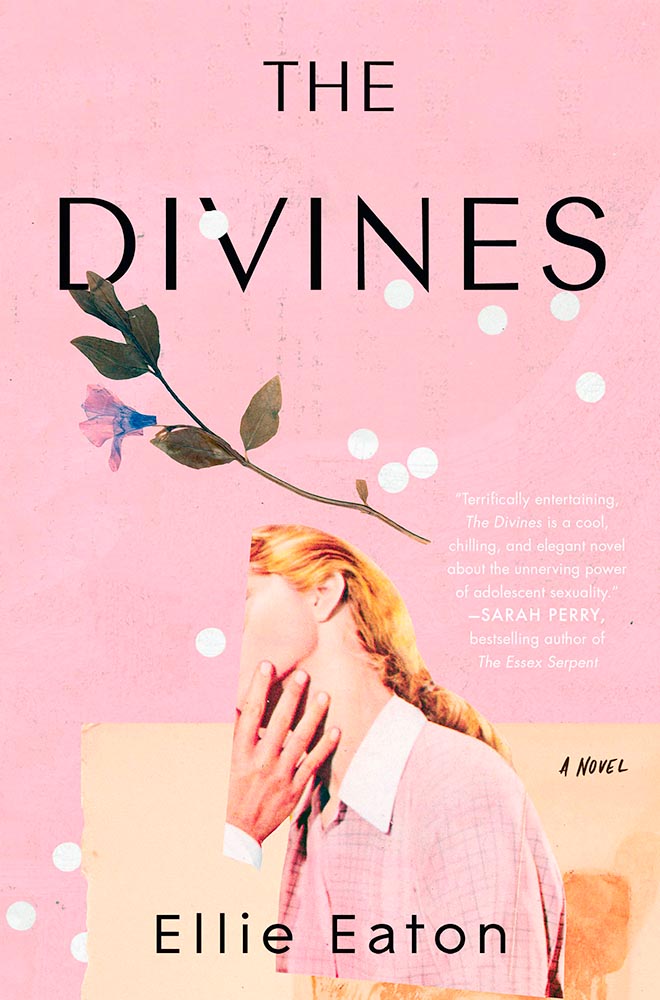
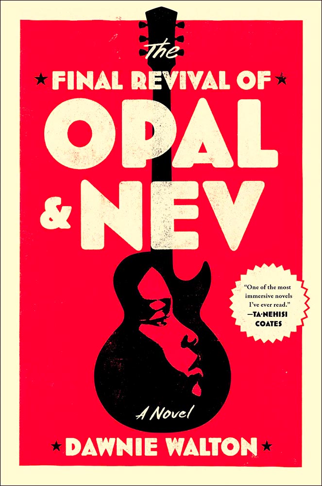
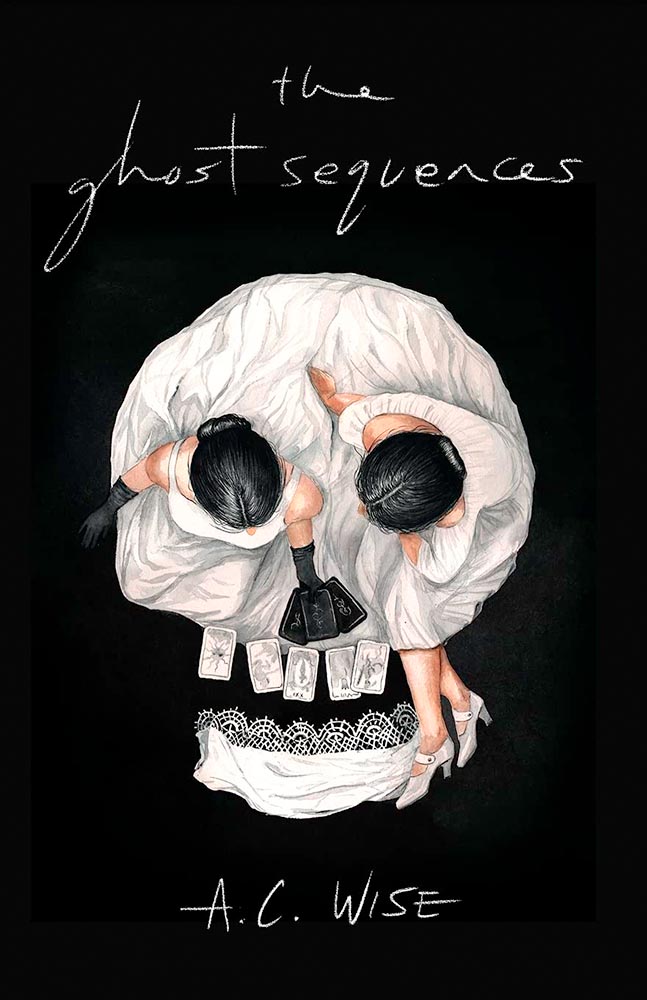
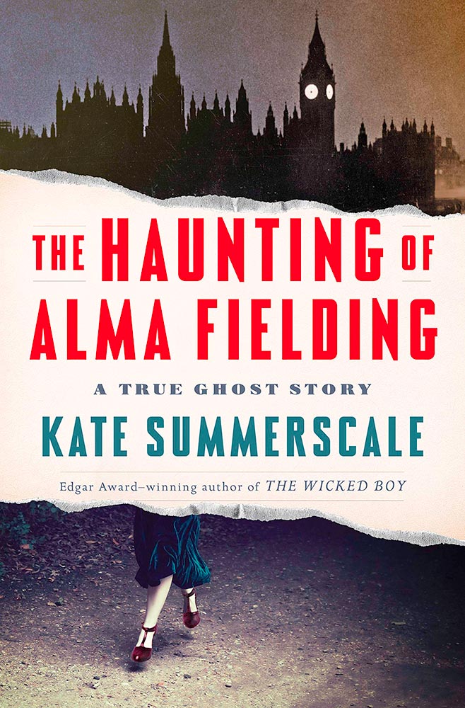
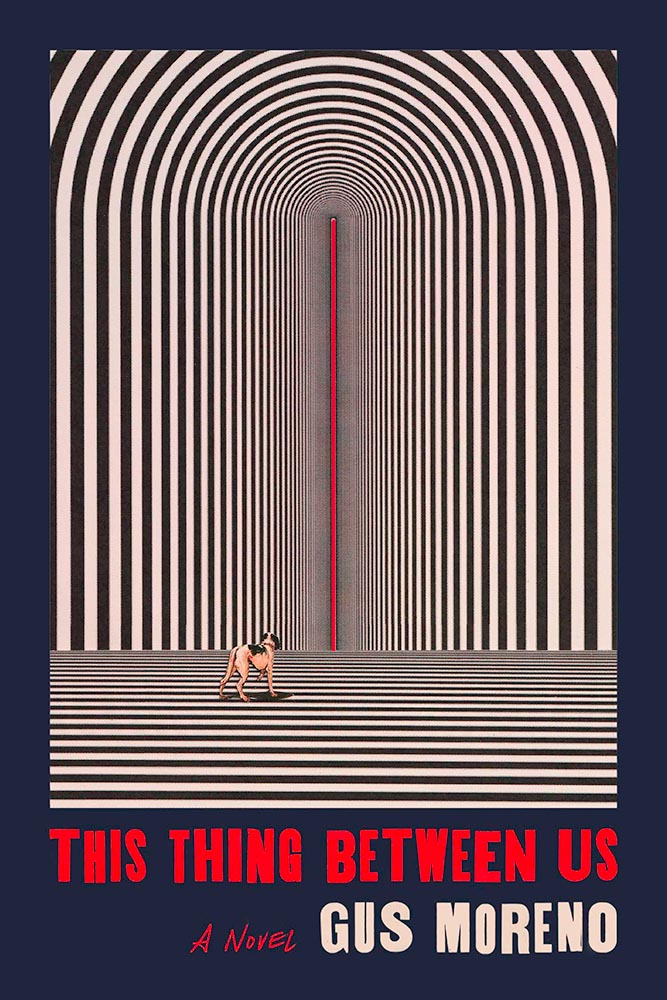
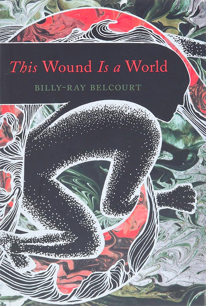
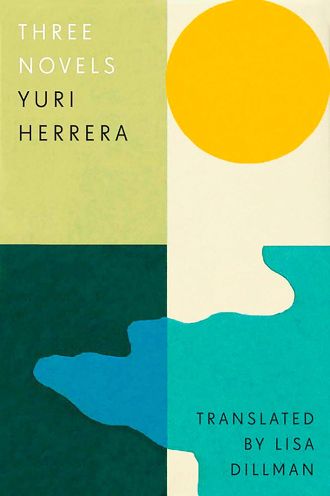
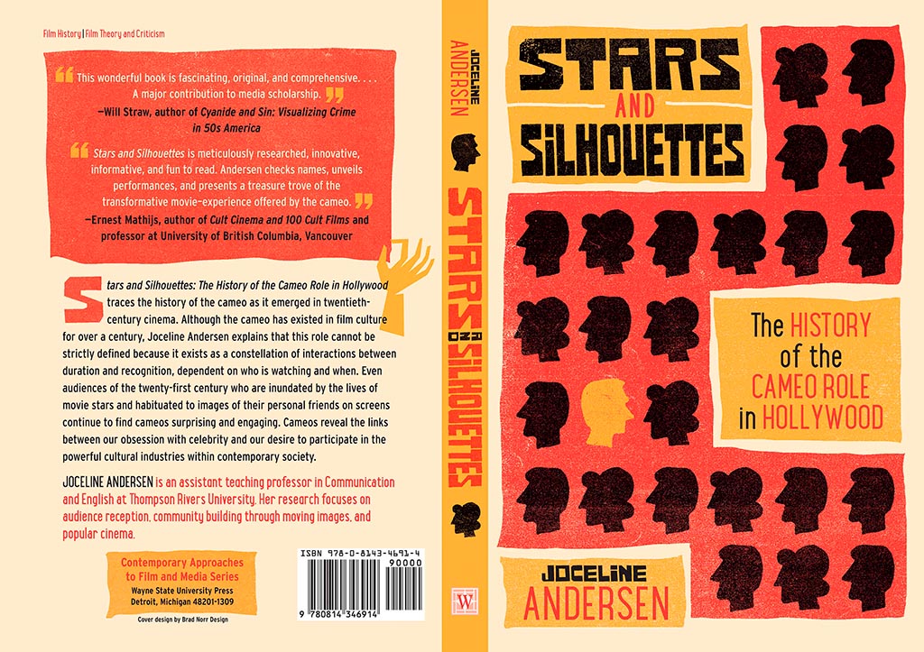
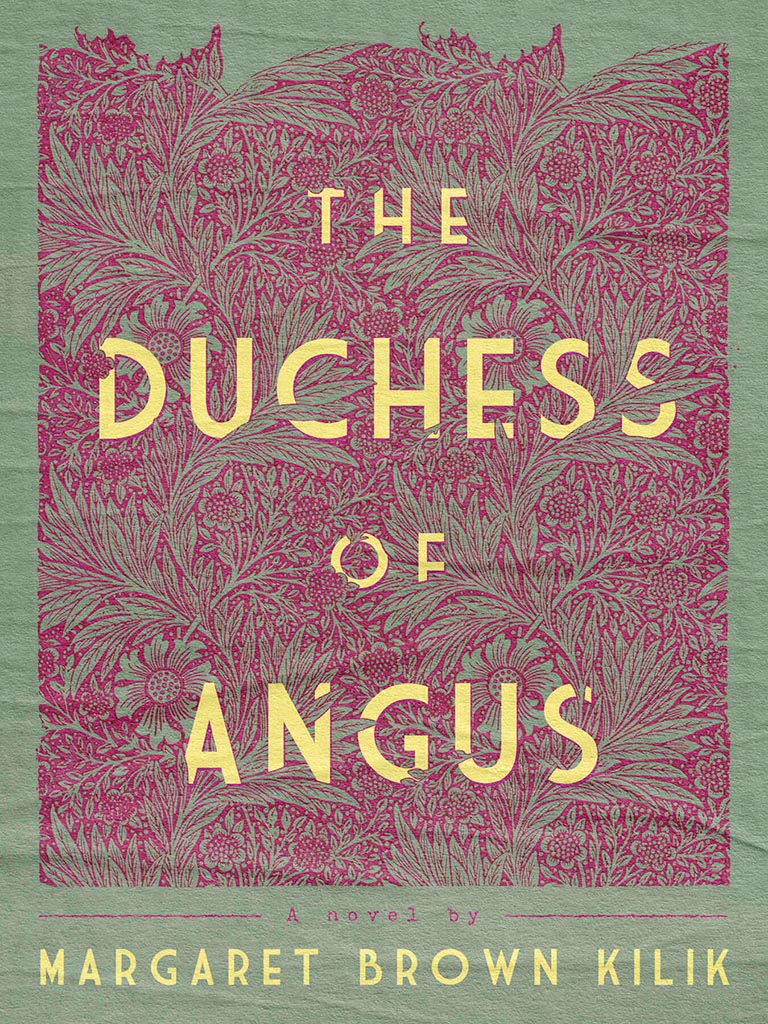
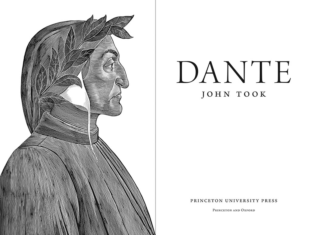
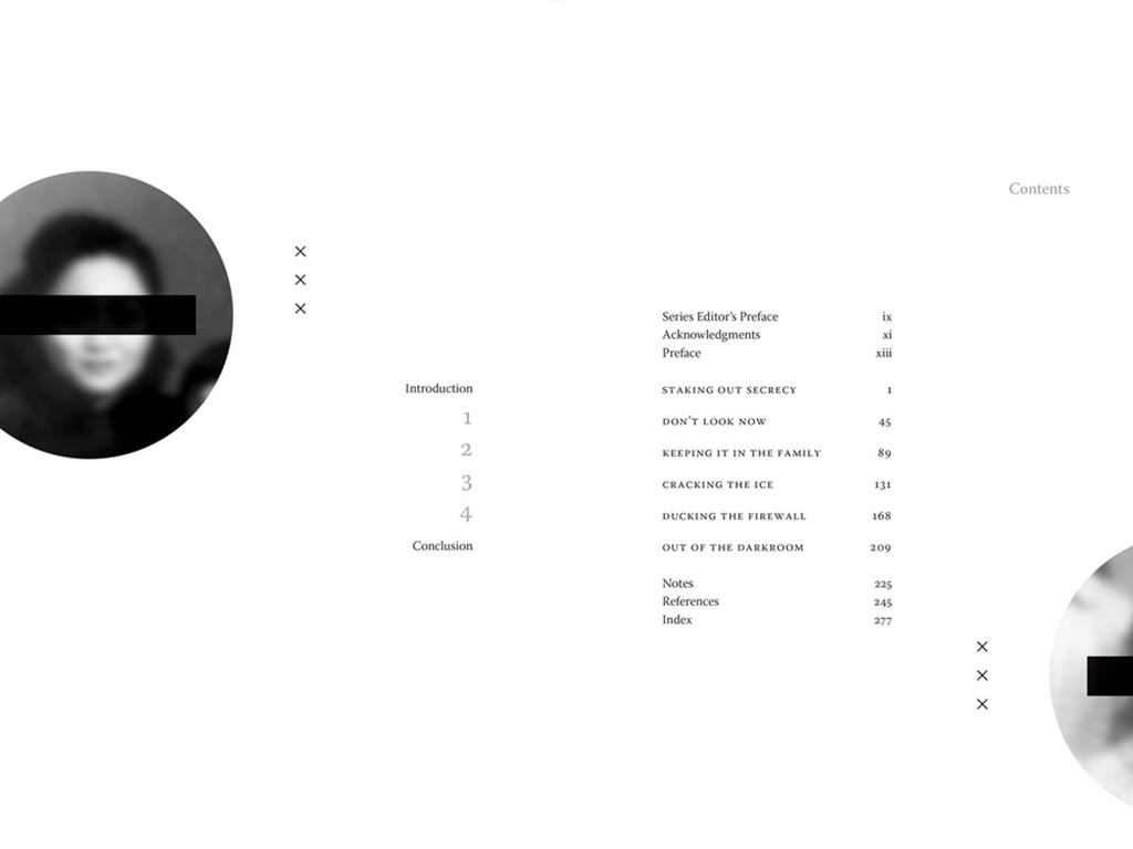
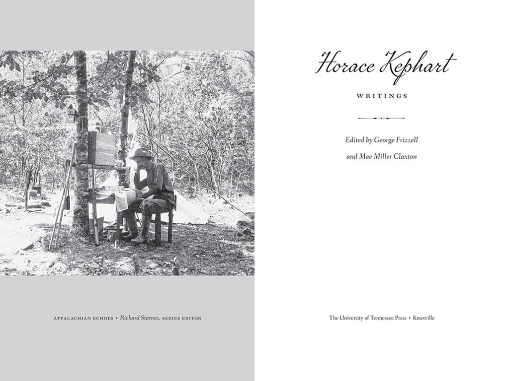
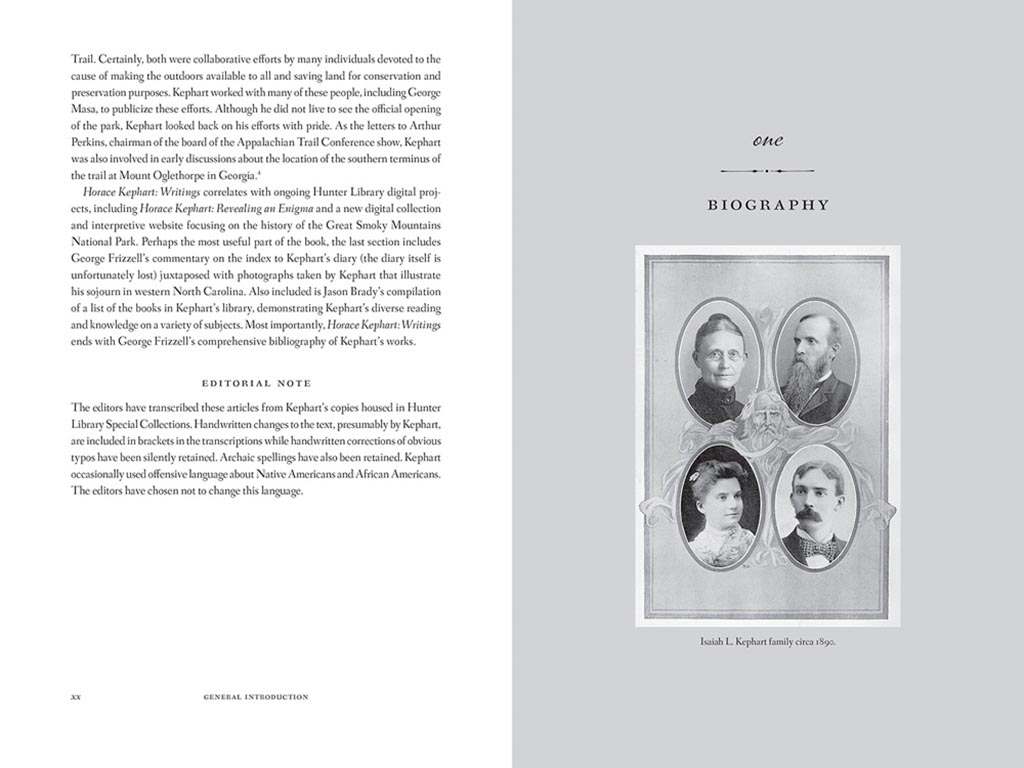
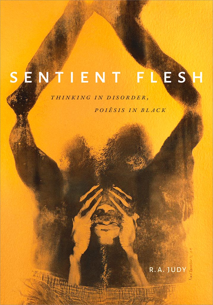
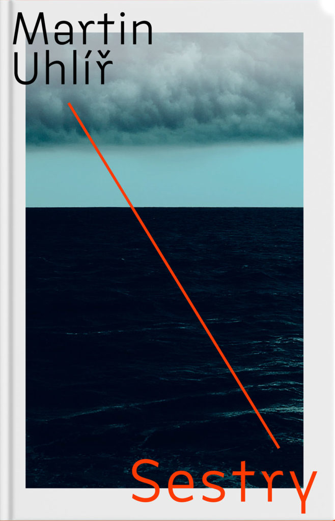
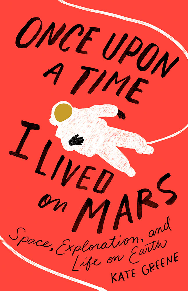
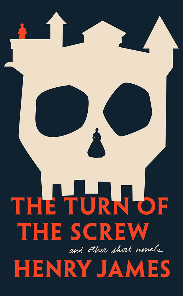
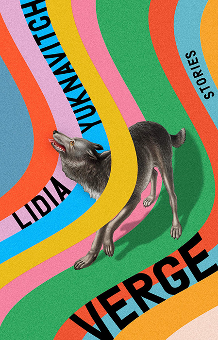
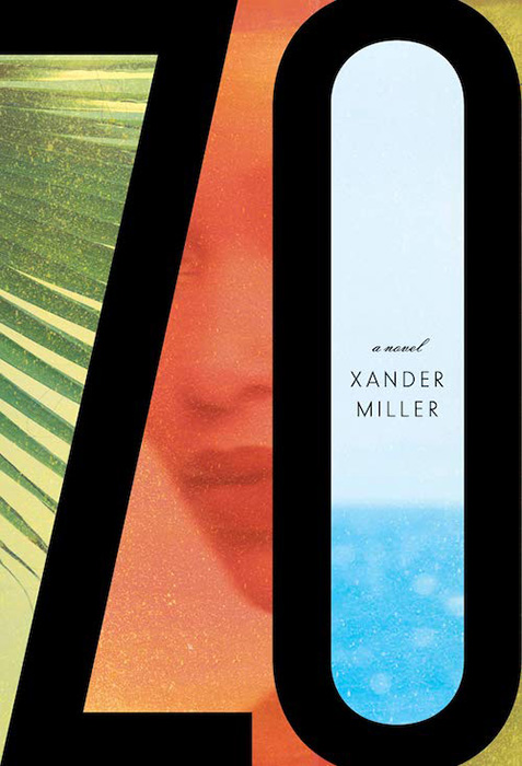
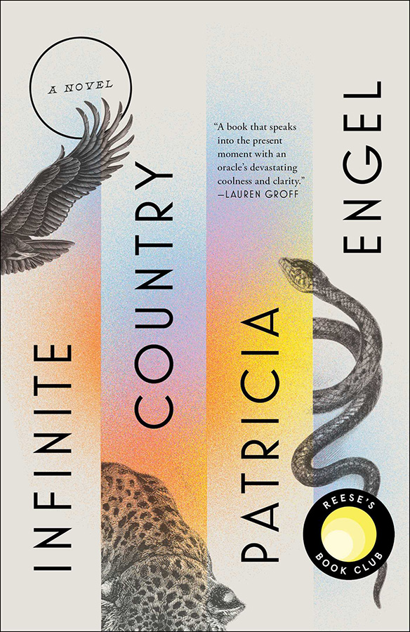
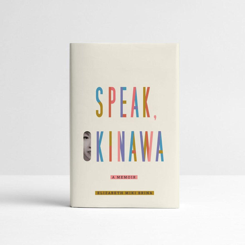
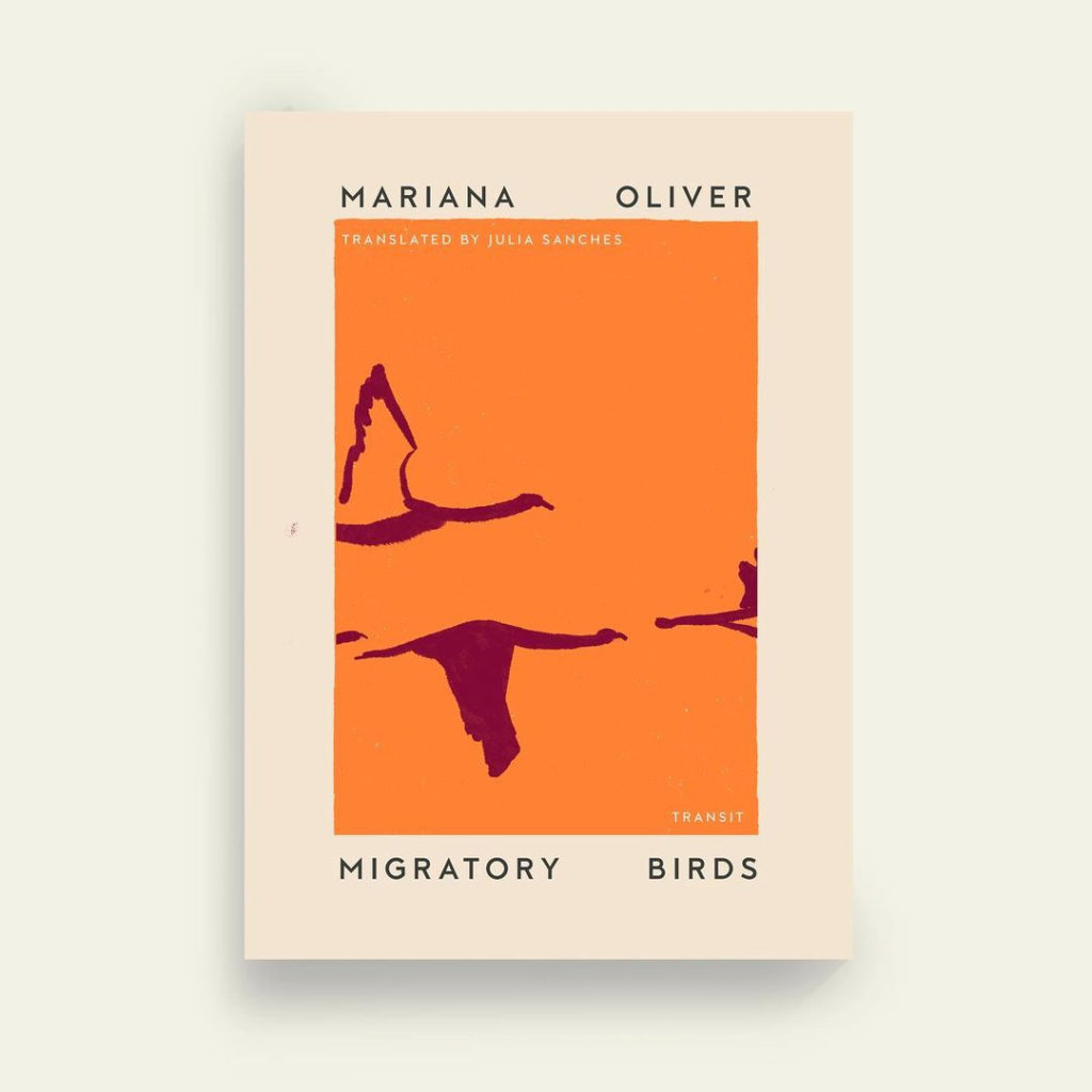
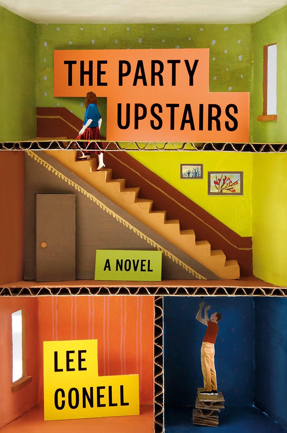
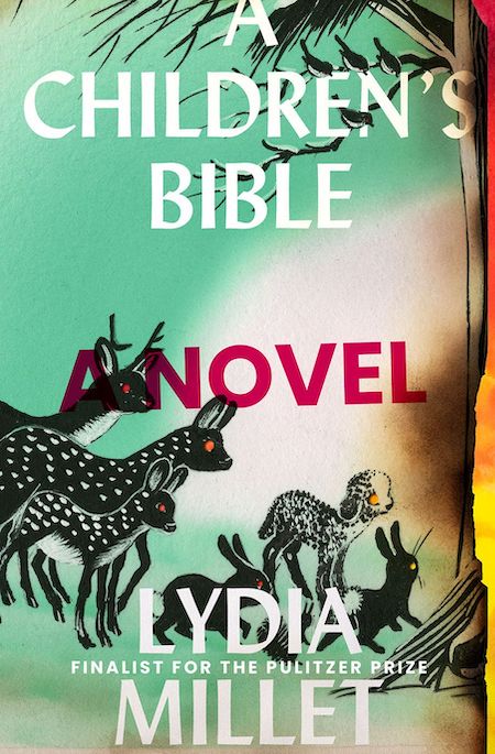
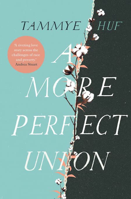
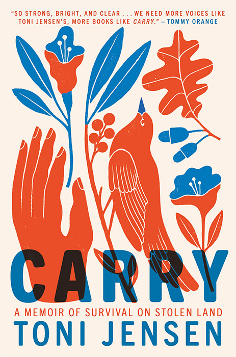
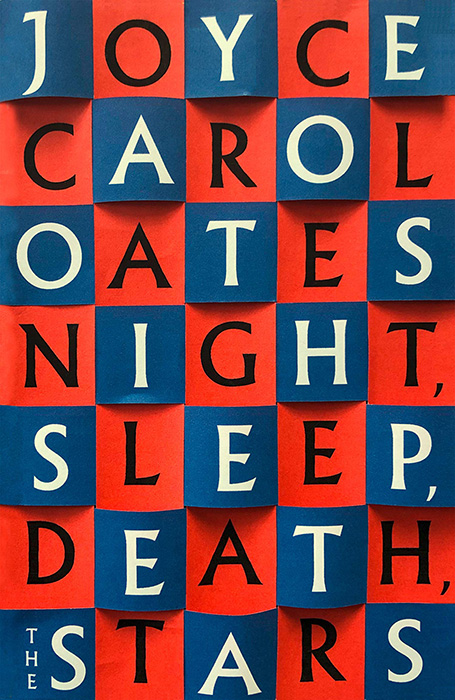
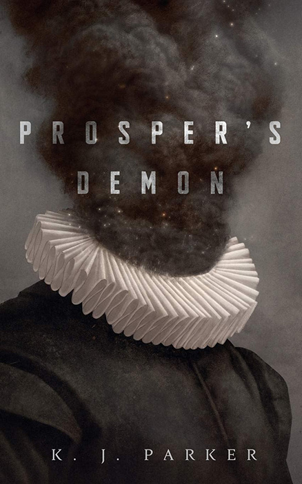
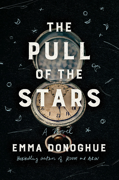
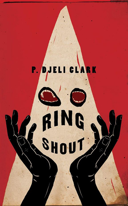
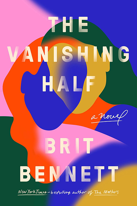
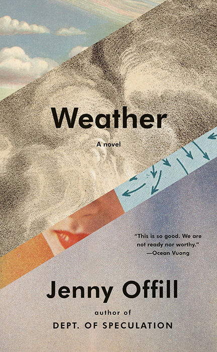
2024 was interesting in the way of the apocryphal Chinese curse: “May you live in interesting times.” Taking the time out to peruse the best of the new releases — for both book cover design and books in general — is tremendously enjoyable. Needed, even, now more than ever.
When it came time to do the years’ tally, summary, and post, the number of candidates in the favorites folder was well over three hundred: a third more than last year, more than double 2022’s.
It’s been argued that the increasing number of published titles is a reflection of publishers’ woes, including fighting back against publishing slop. (See my Beautifully Briefed series for more.) However, the increasing number of published titles means more work for the book designers among us — some of whom show, or continue to show, exceptional skill.
Consequently, this year’s list of favorite book design items has grown: up to one hundred and sixteen. Wow.
Fix a beverage and get comfy.
Please remember that the usual disclaimer applies: these are my favorites — others might say “best,” but I’ve been in this business long enough to know that there’s always another title you haven’t seen or read about. I don’t want to disrespect any of the talented book designers not on this list. I’ve tried to include design credit where I could — special thanks to the folks who answered emails with that information — and wish to stress that any mistakes in the list below are mine.
Note: If you’re on Foreword’s main page, please click on the post title, above, to view this list. You’ll get larger covers for your viewing pleasure.
• • •
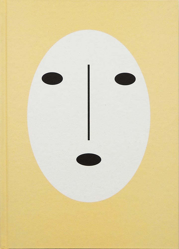
My Four Faves for ’24
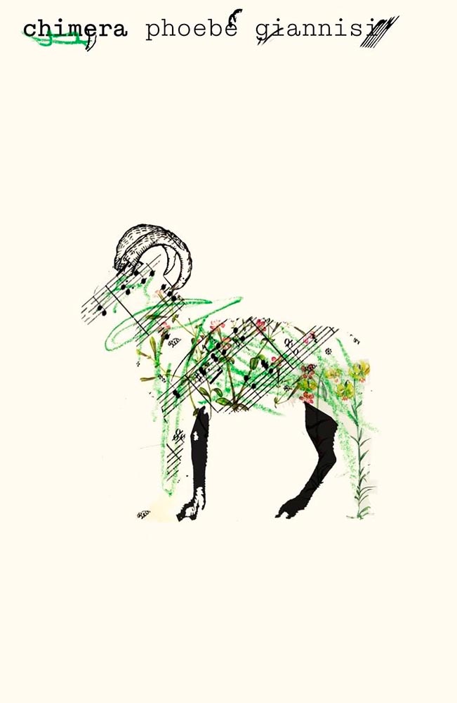
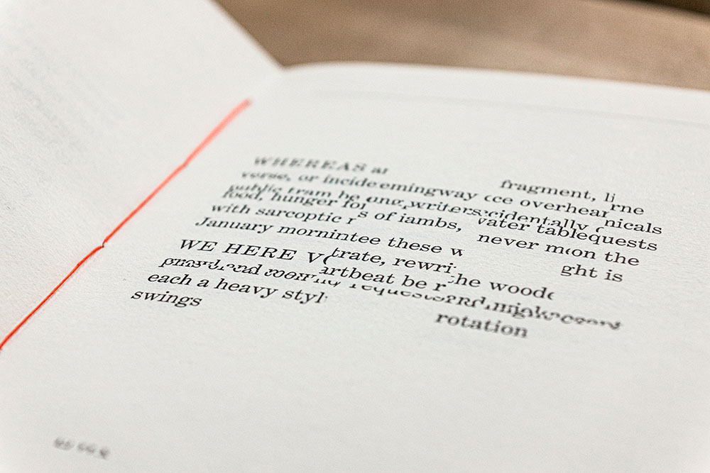
It’s no surprise that we’re leading with an example of minimalism-as-superlative. This UK title is described thusly: “The centre of Chimera engages with a three-year field research project on the goat-herding practices of the Vlachs, a nomadic people of Northern Greece and the Southern Balkans, who speak their own language. In these poems, day-to-day activities such as shearing and shepherding mix with snippets of conversations, oral tradition and song―locating a larger story in this ancient marriage between humans and animals.”
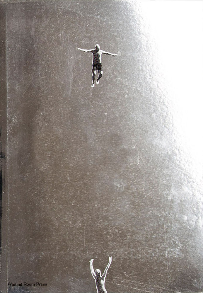
Aside from being visually arresting, I can’t think of a better visual summary — yet still in keeping with the style of Cicada, the previous title. Awesome.
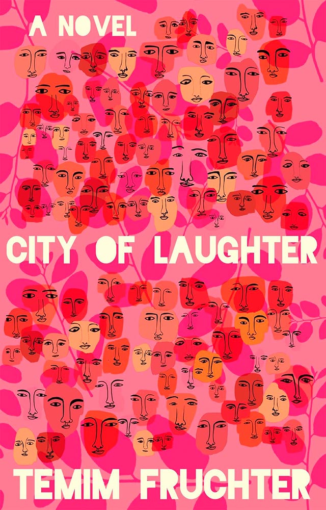
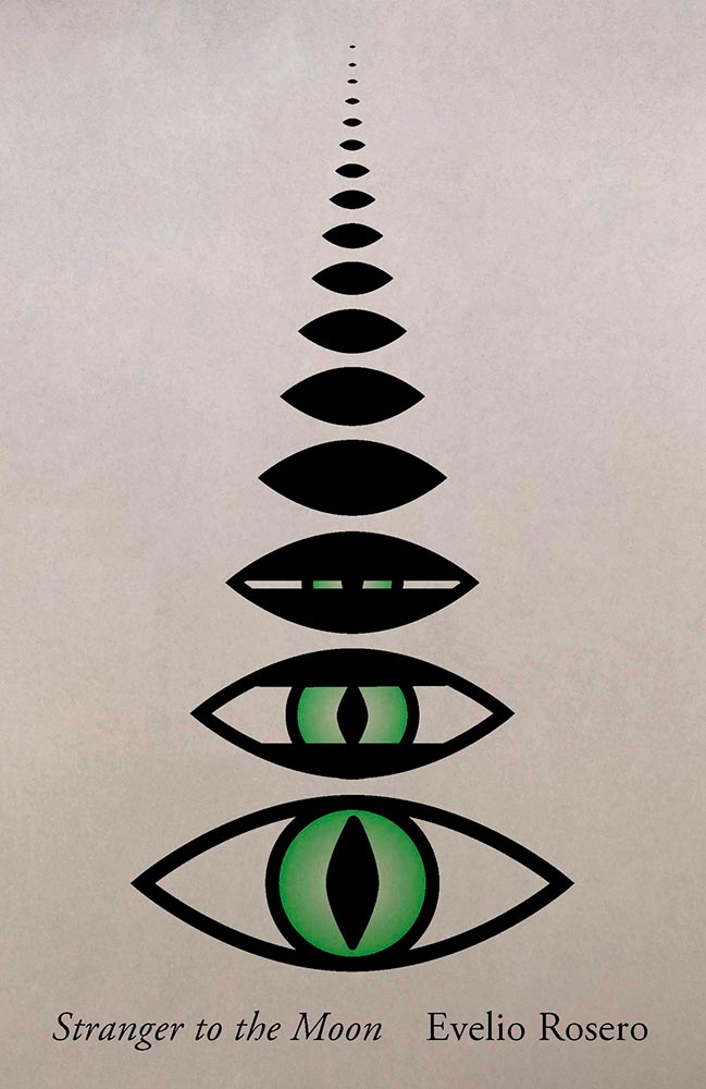
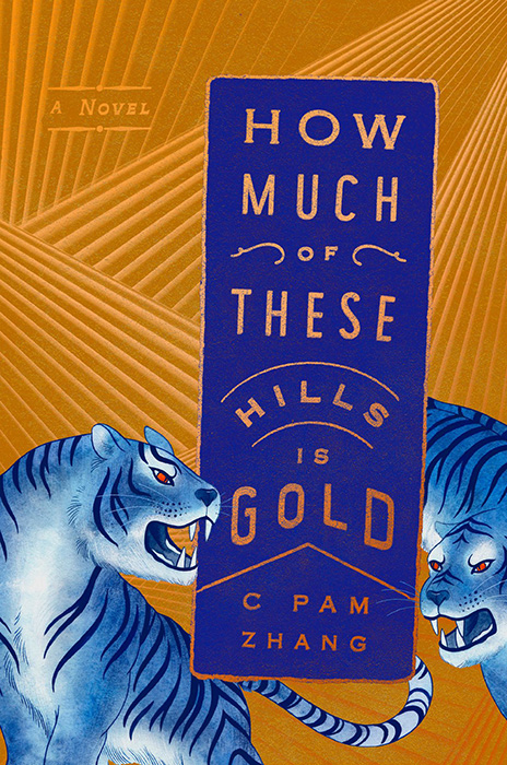
“[F]our generations of Eastern European Jewish women bound by blood, half-hidden secrets, and the fantastical visitation of a shapeshifting stranger over the course of 100 years,” all on a book cover, in a style that’s fresh and colorful with great lettering.
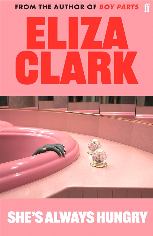
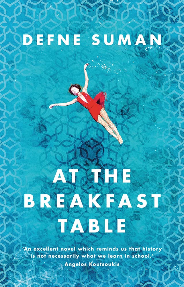
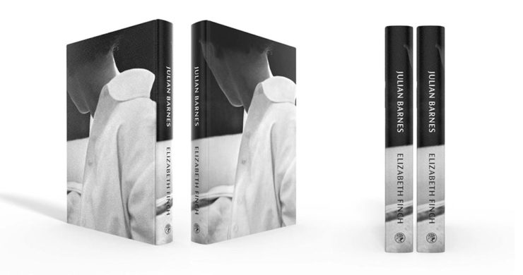
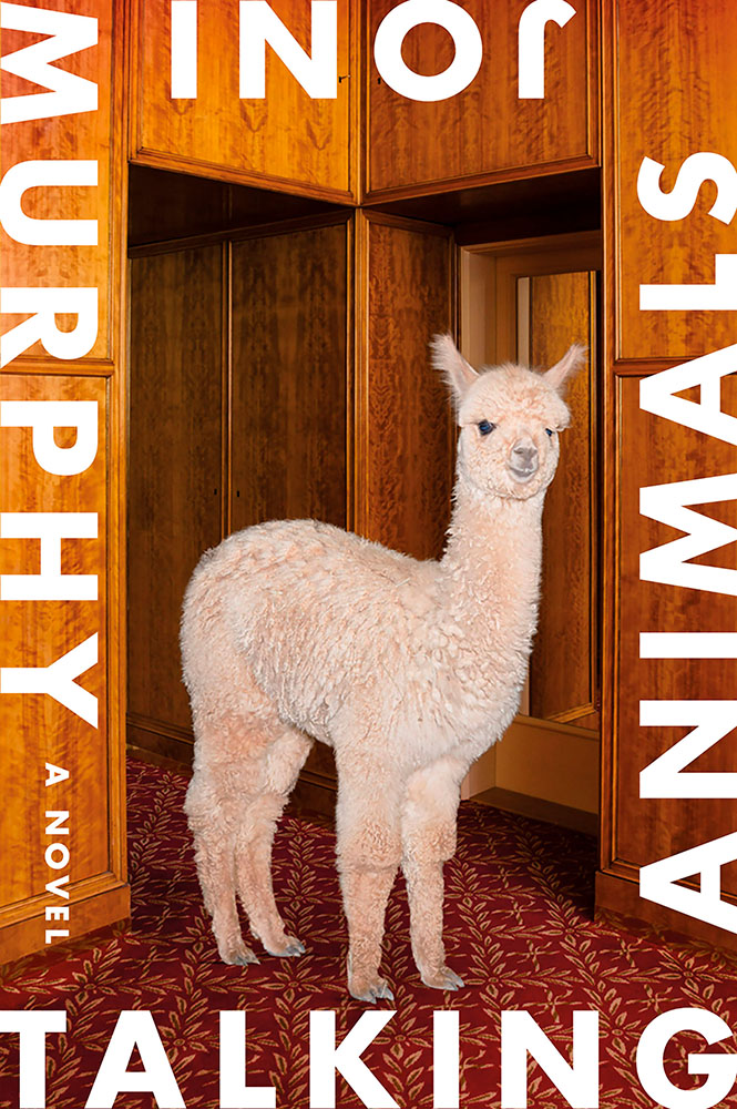
Occasionally, a photograph just makes a cover — and this one vaults it to the top. (Sometimes, great book design is as “simple” as selecting great elements.) Part of a series called “the Honeymoon,” it’s absolutely the style of photographer Juno Calypso.
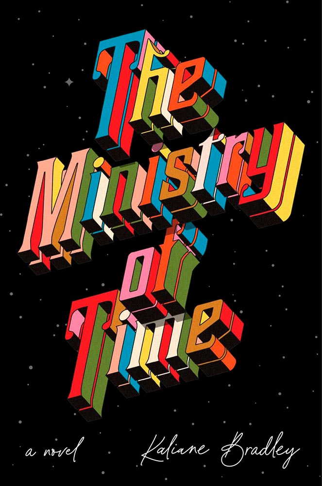
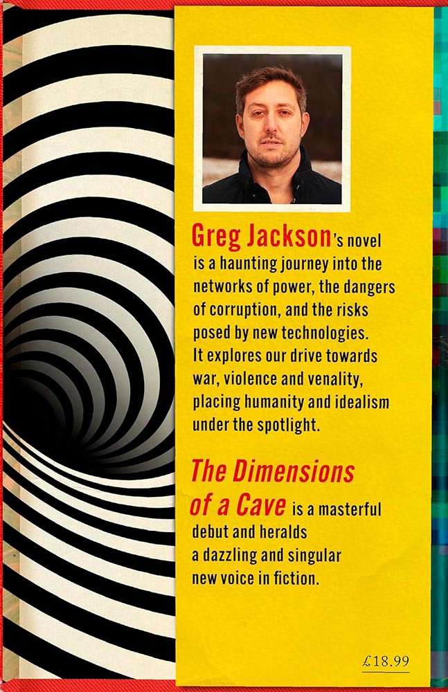
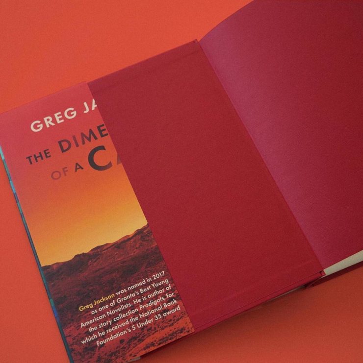
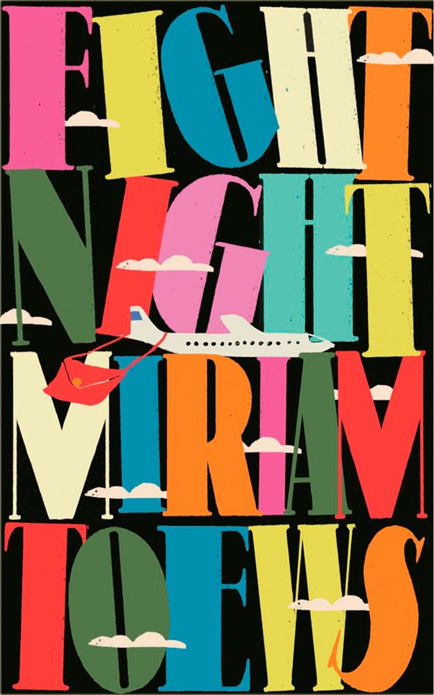
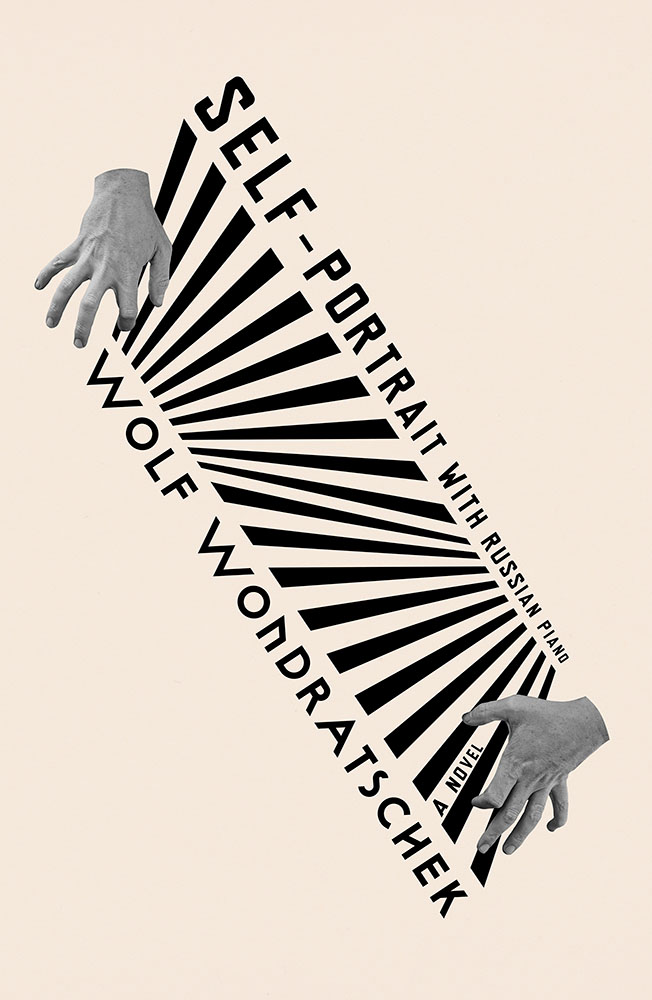
Never mind the “time travel romance, spy thriller, workplace comedy, and ingenious exploration of the nature of power and the potential for love to change it all” — it’s the oh-so-dimensional title that transcends. (All that other stuff is just a bonus.)
Other 2024 Favorites, in Alphabetical Order

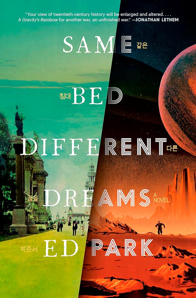
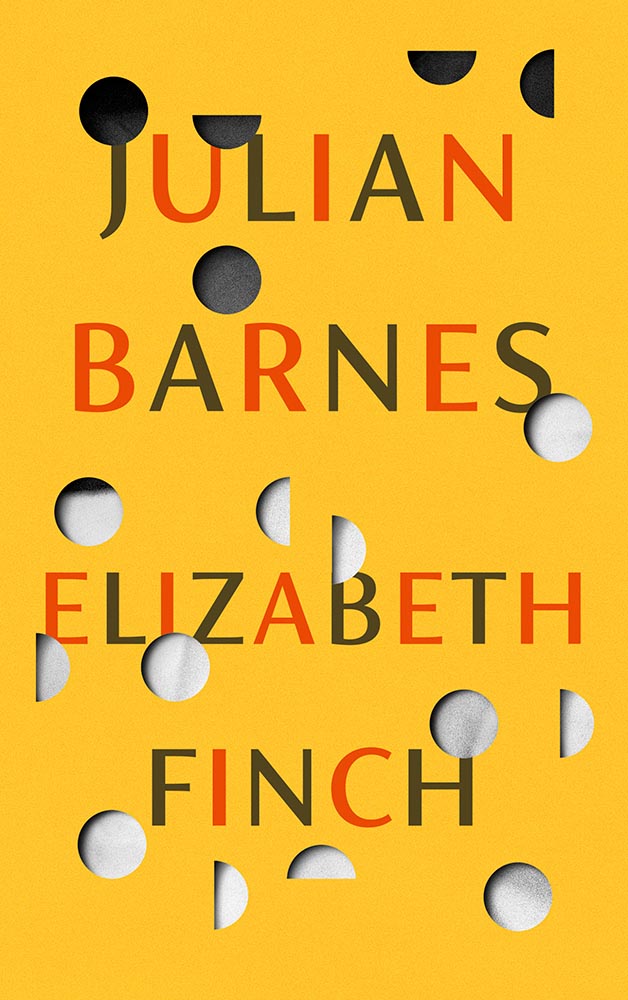
“I am unfinished business,” indeed.
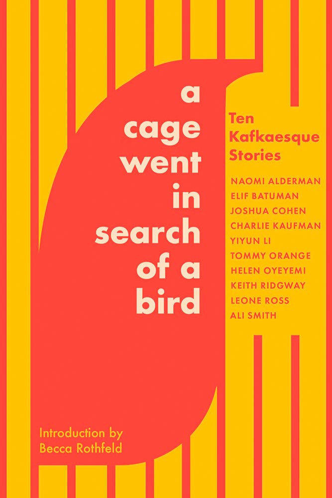
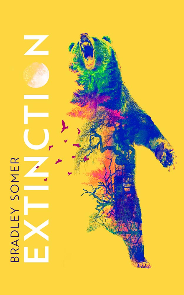
A-as-eye, shape-as-bird, lines-as-cage: Kafkaesque-as-subtlety. Yet….
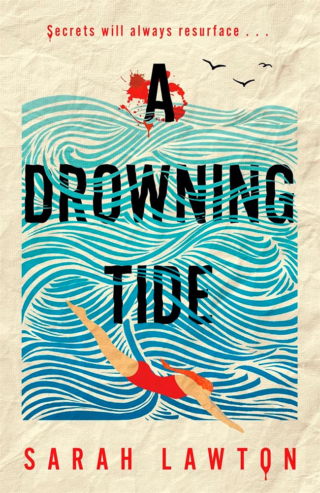
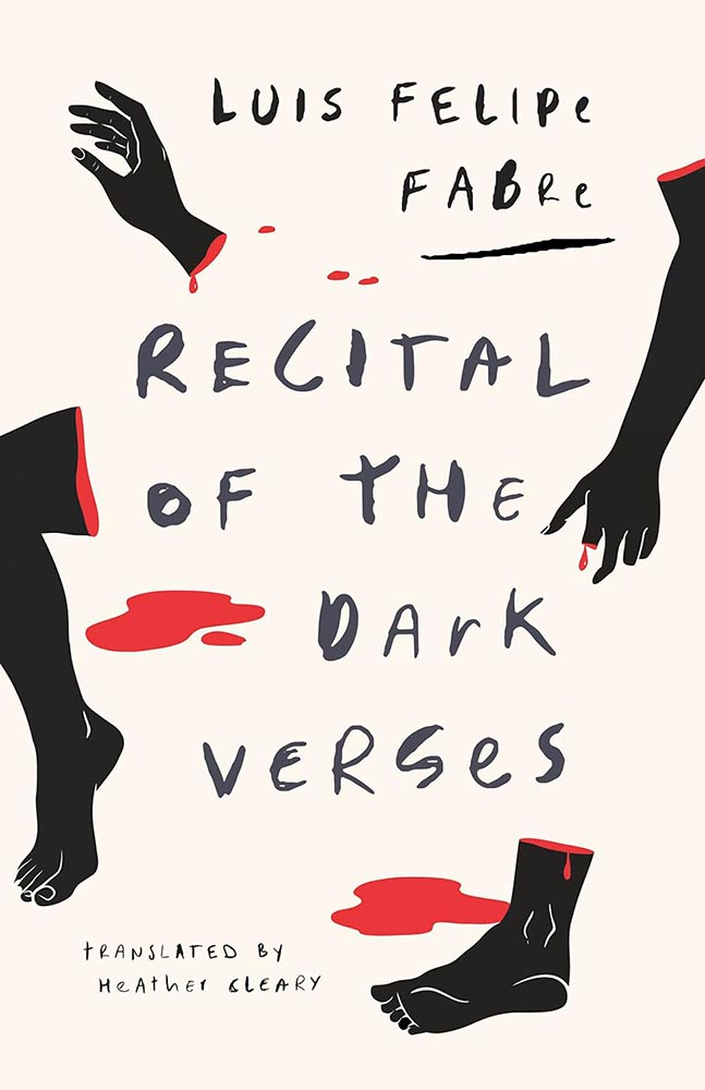
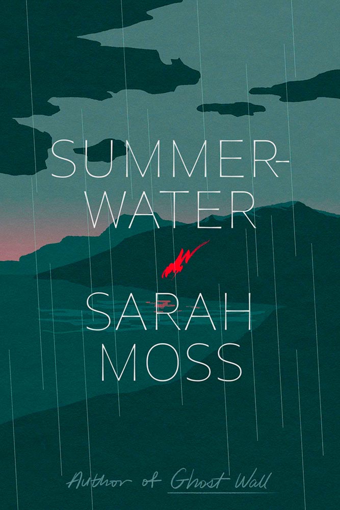
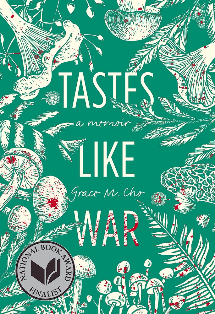
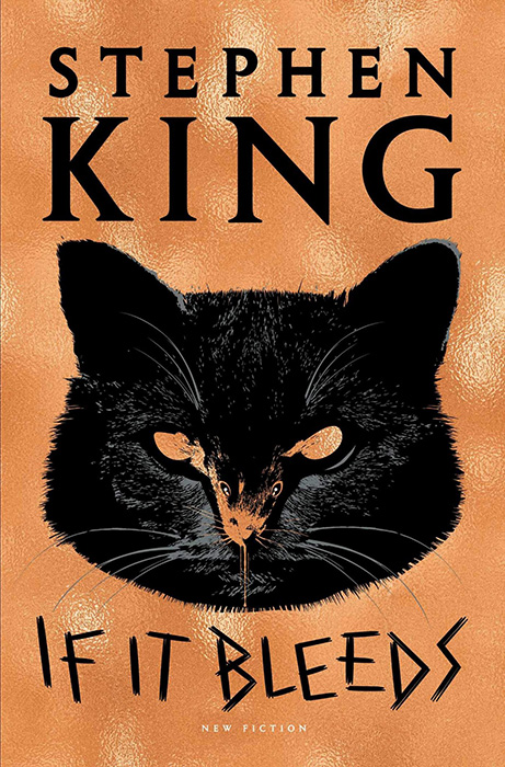
The paper is perfect, the title interleaved with the water superlative, and the blood, which can absolutely be done into the realm of cliché, drips rather than gushes.

The first of five appearances for Jack Smyth — tops this year — this cover speaks to solitude (and cats!) with fantastic expression.
Special Bonus: A 2019 write-up on Smyth at It’s Nice That.
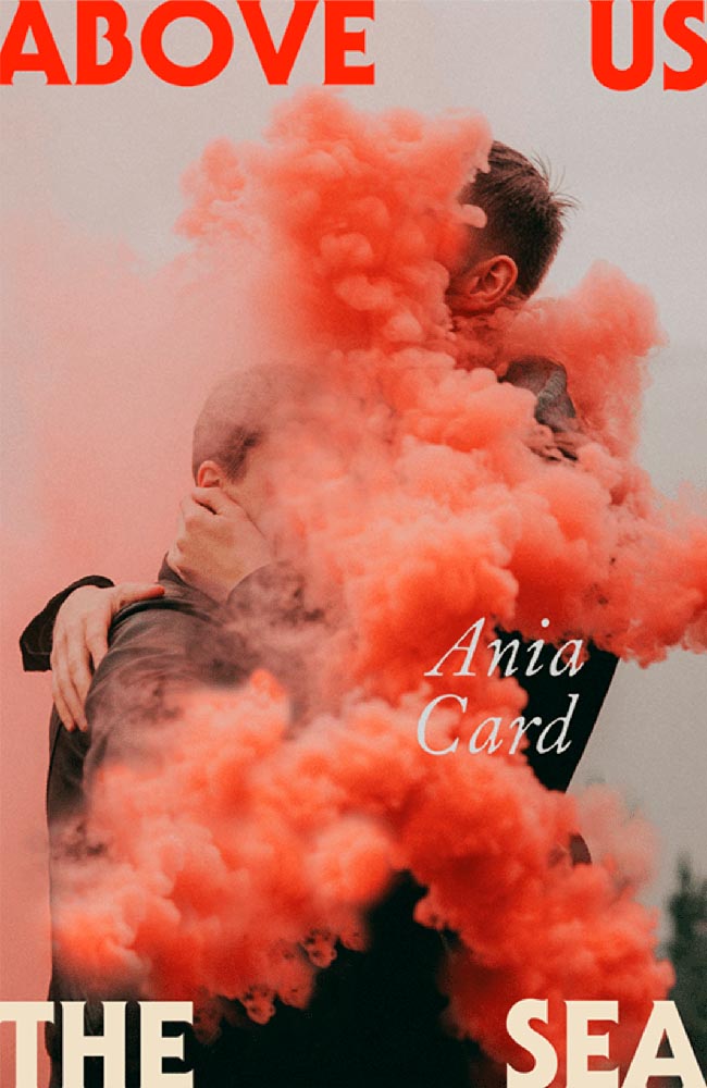
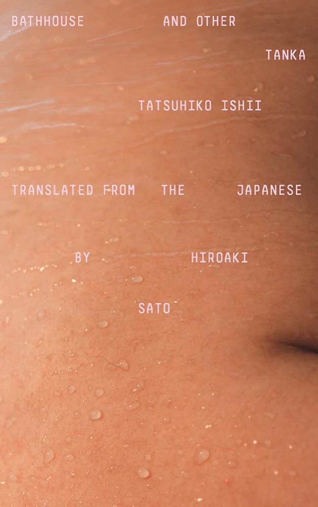
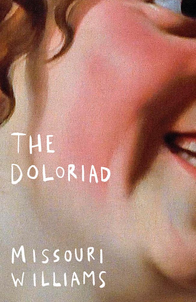
This photographic subject is so strong, yet clearly speaks to the cloudy tenderness within. (Also, title placement.)
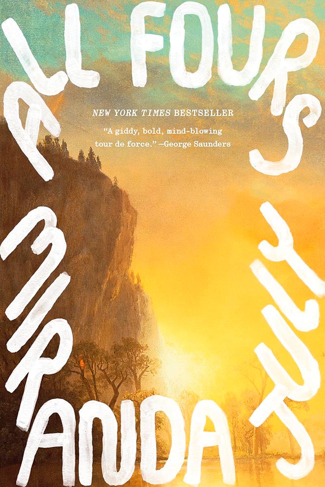
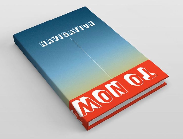
Another examples of typography-on-the-edge — but, really, the hero on this cover.
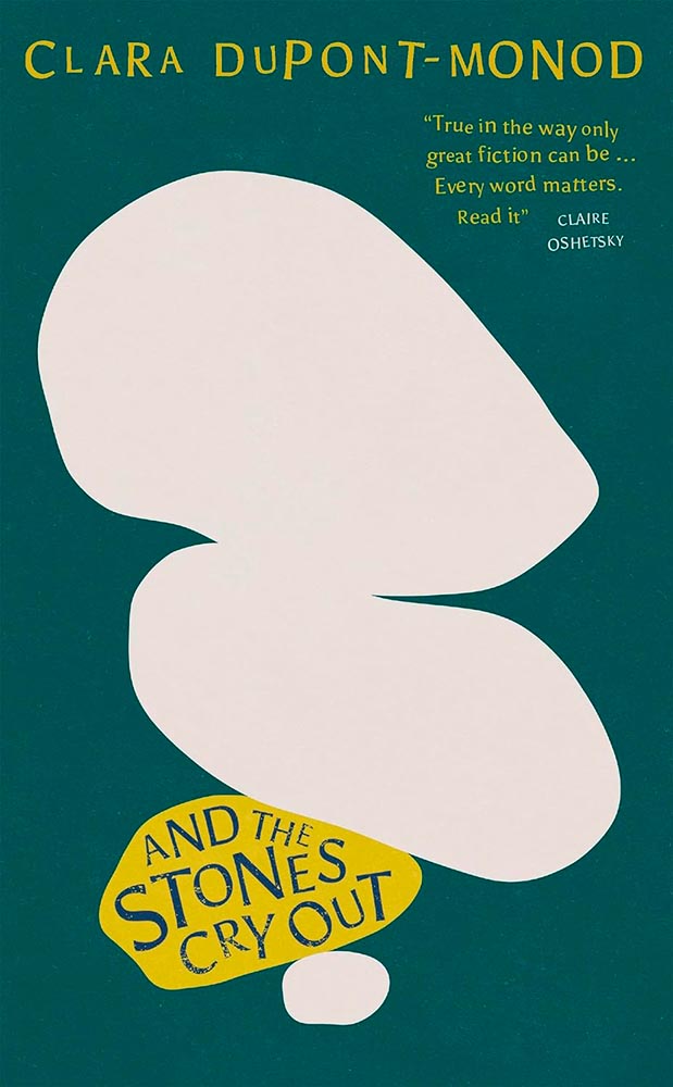
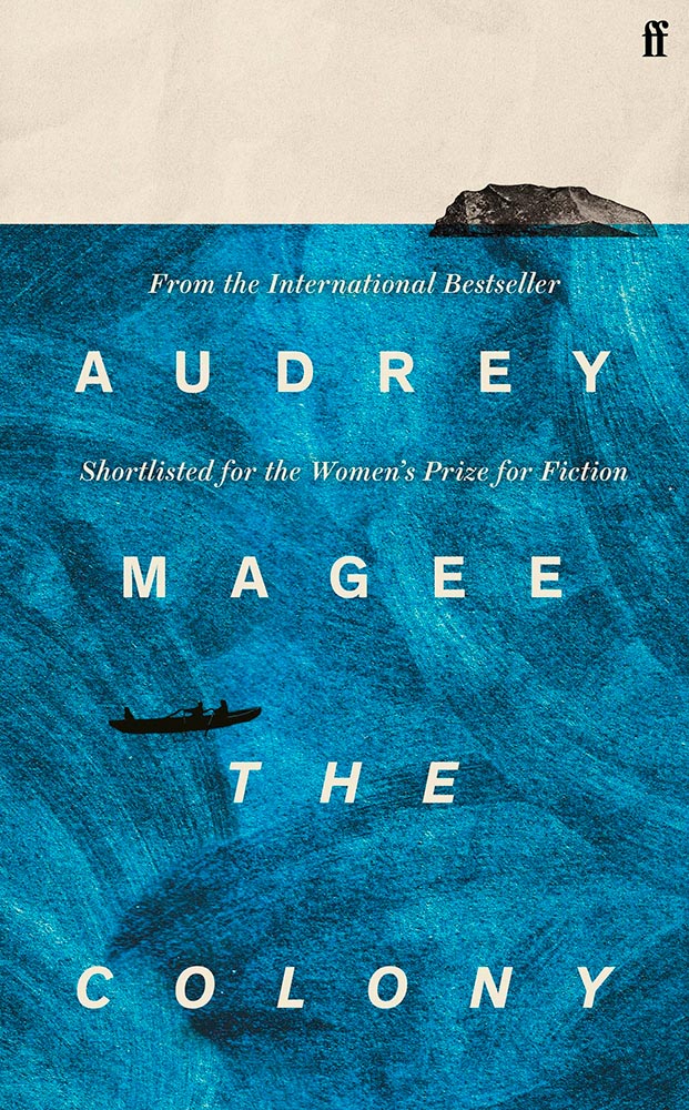
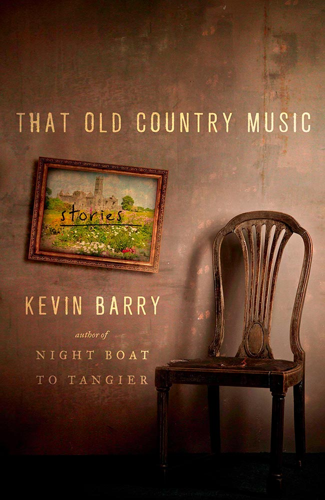
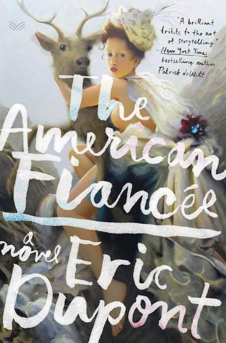
Fantastic title placement (with the perfect hint of wear), complimented by the unusual treatment of the author’s name and pull quote, this cover only hints at the story within yet holds it up.
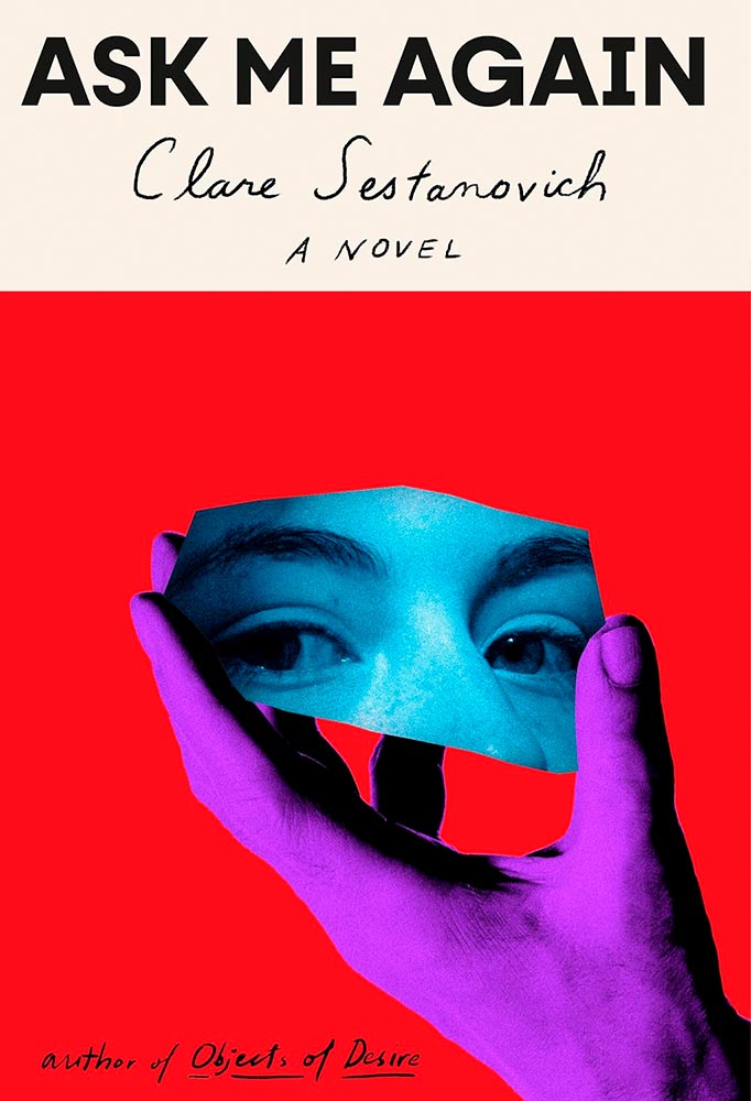
I’ll admit: it’s not immediately clear how this title and cover work together. Yet they do, and it’s not just because of the (male) hand and (female) face — or striking colors — it’s more the representation of reflection, something required in maturity.
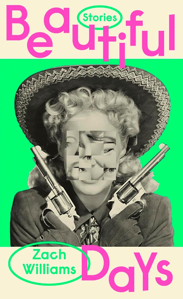
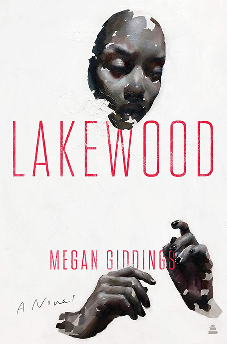
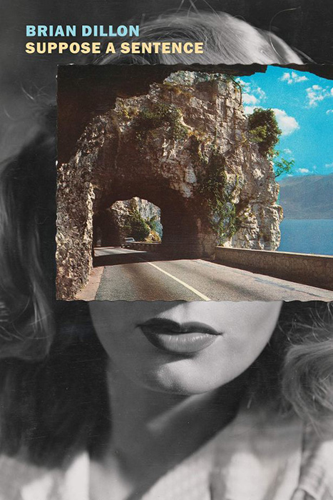
The rearrange-the-pieces treatment for faces has become a thing, but few do it so well. Special bonus for the selection of photograph for this UK version of the title — and great color choices.
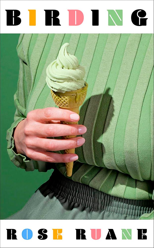
Another example of the photograph making the cover — but with simply awesome typography, too. (Huge fan of the overall color scheme, too.)
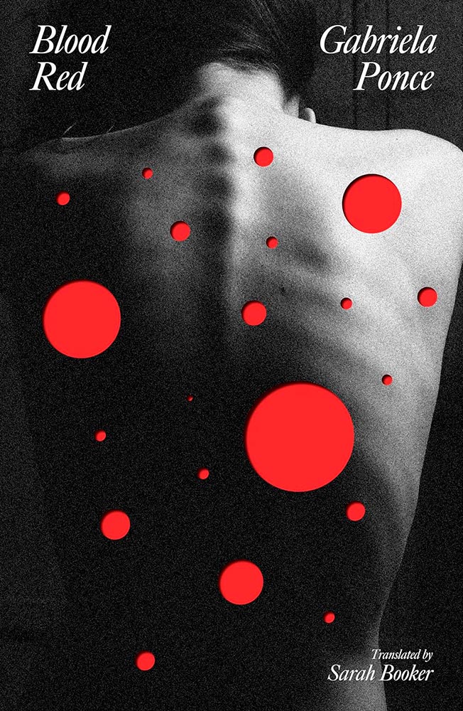
This UK title shoots to kill, perfect for a story of shooting one’s self in the back. (The Irony Dept. reports that the publisher is Dead Ink, by the way.)
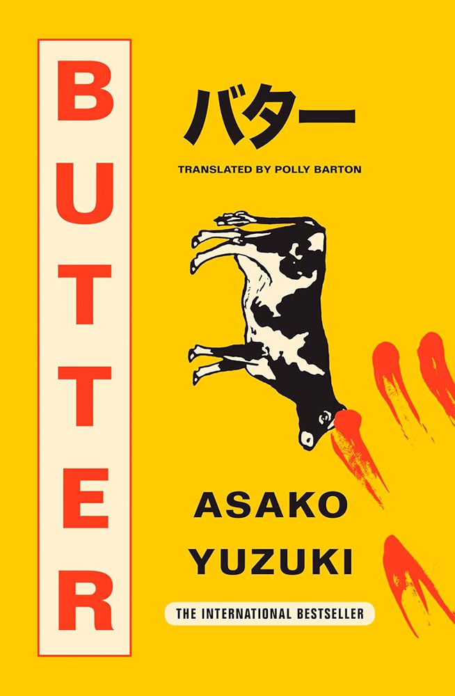
Sticks it to ’em in the most compelling way. (Also: “There are two things that I simply cannot tolerate: feminists and margarine.”)
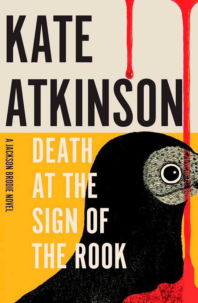
Another UK title, this one counters the too-much-blood thing with fabulous typography and an over-the-top — well, off-the-side, really — crop. (I especially love that the top of the rook’s head just peeks above the yellow.)
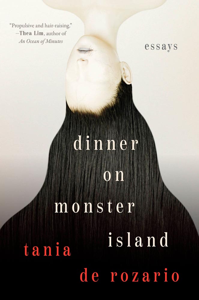
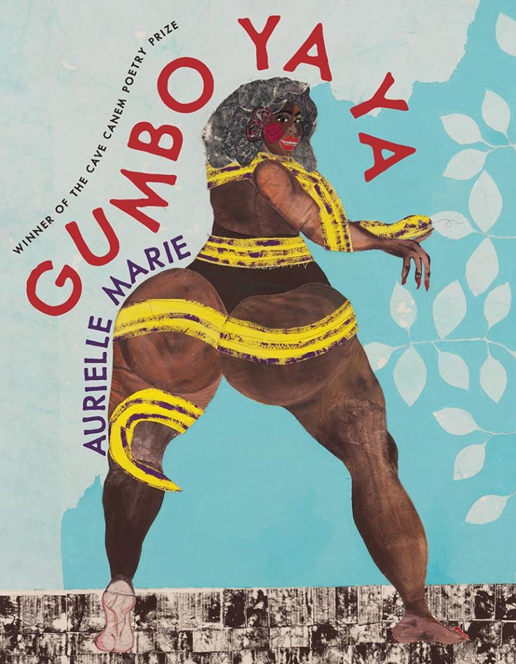
“Hair-raising,” indeed. (Check out the veins.) The opposite of queer, brown, and fat — and yet, somehow, just right.

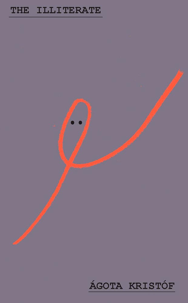
Few others can express so much with just a line. It sounds like a joke, something that treats the subject with something less than it deserves, but quite literally the lines on this gray background make all the difference.
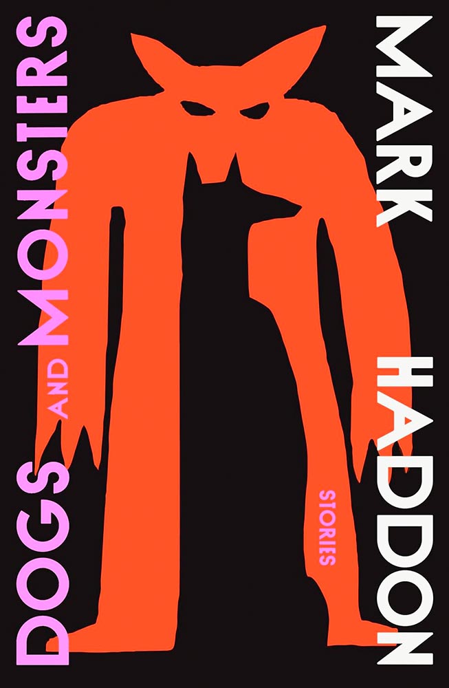
Greeks myths, contemporary dystopian narratives — never mind that, it’s the illustration on this cover that gets the “terrifyingly talented” label.
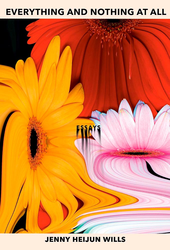
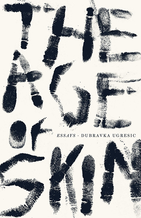
Subversive, surreal, yet “refuses to pander or be pinned down and possessed.” (Also, “Essays.”)
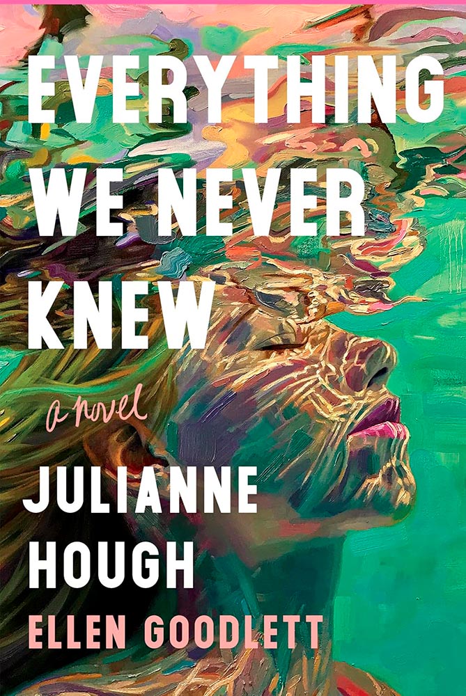
Real estate agent Lexi senses a drowning, leading to … well, a novel — but it’s the artwork, by painter Isabel Emrich, that carries this cover to the next level.

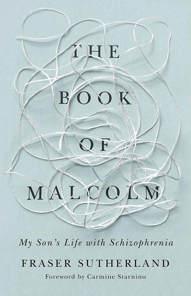
Minimalism exemplified. While some could argue cliché, I’d argue that it’s the perfect choice: for the weary, for the curious, for this cover.
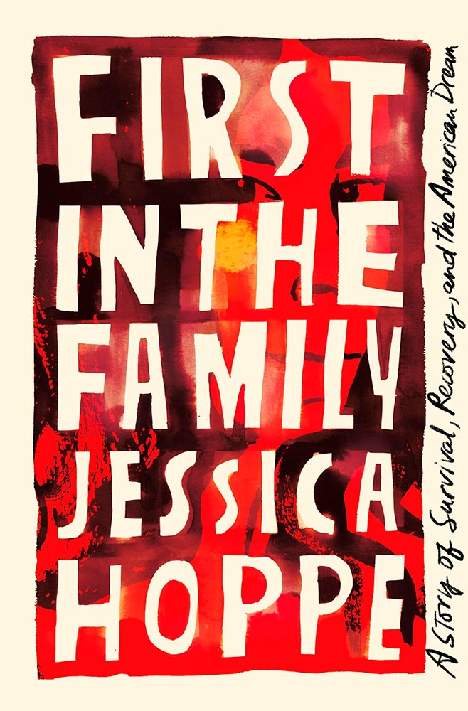
The eyes just grab you — “crackle like a bonfire,” to quote one of the reviews. (They were speaking of the text, not the cover, but better words….)
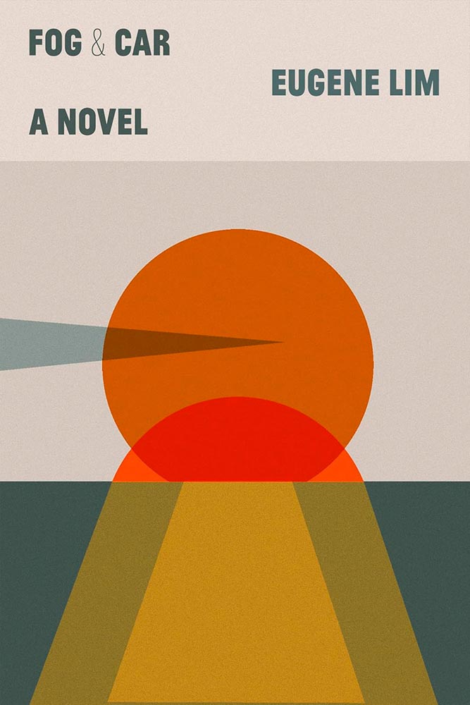
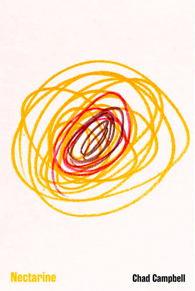
Simple and geometric, yet story-telling in the finest.
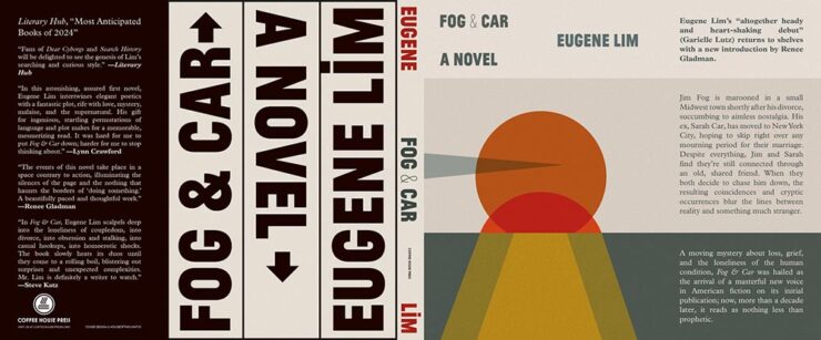
Also, the whole jacket wins. (The bar code space is below “a novel,” by the way.)
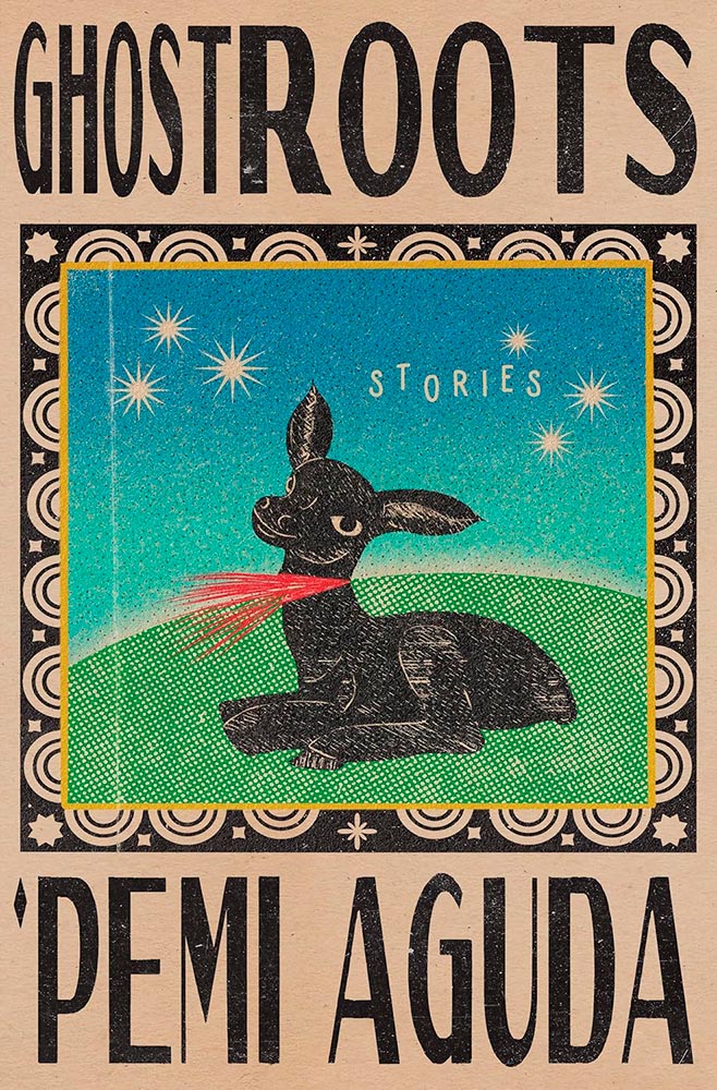
Containing short stories set in Lagos, Nigeria, this cover speaks to African roots yet does so in a way that causes both admiration and upset in equal measure. “Brilliant” is overused, but….

“Glorious Exploits,” indeed.
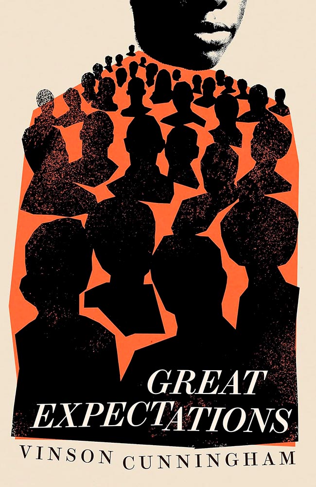
It’s, oddly, the UK version of this cover that does it for me: the US version relies on art, while Smyth’s version relies on talent. (Perhaps a metaphor for the bestseller within…?)
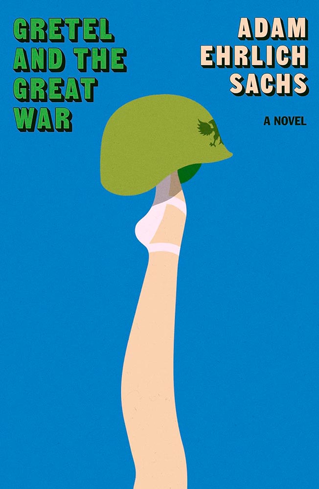
Shades of M*A*S*H, certainly, yet brilliant on its own: lunatics is war.
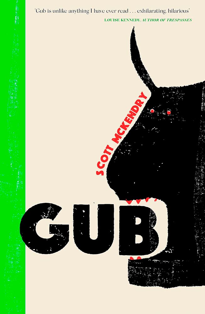
“Playful demotic,” writ large.

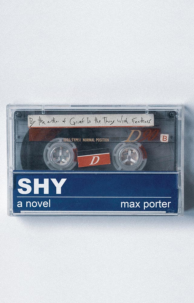
“A novel” is King. (Sorry.) Most haunting in exactly the right way.
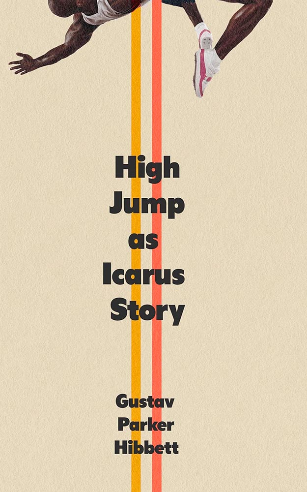
The paper, the lines, all perfect — but it’s the crop that, well, sends it over the top.
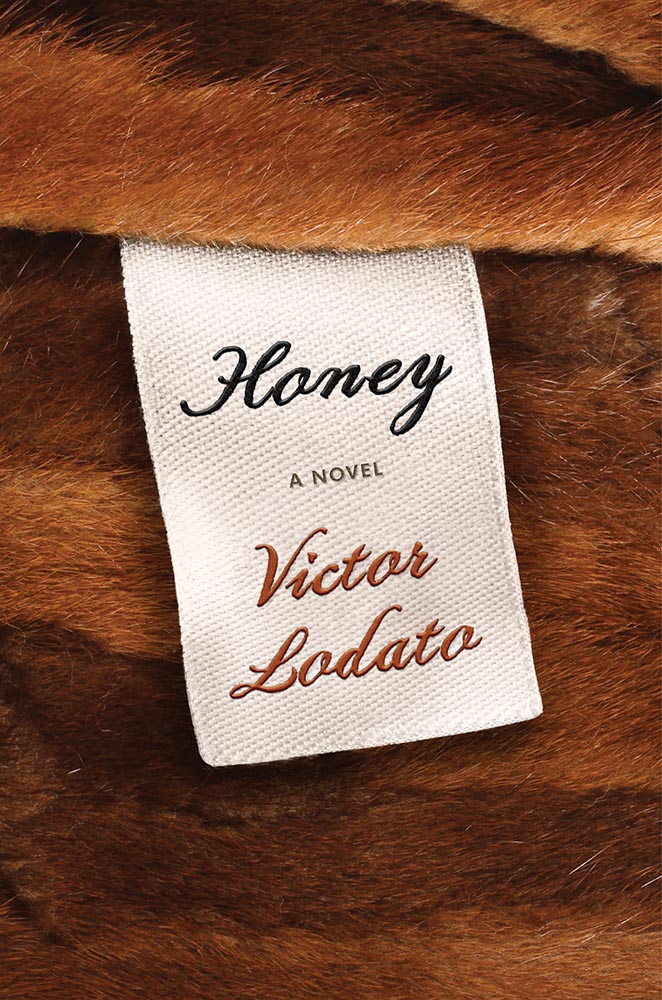
Labeled “perfect.”
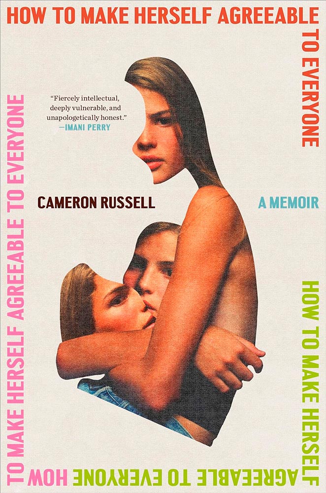
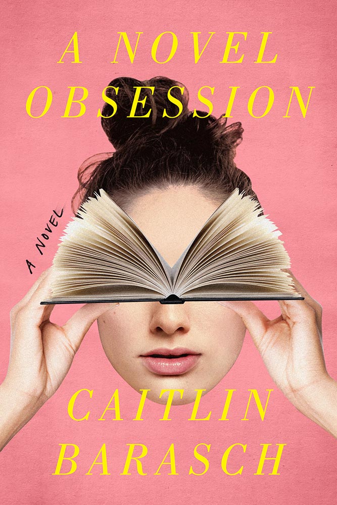
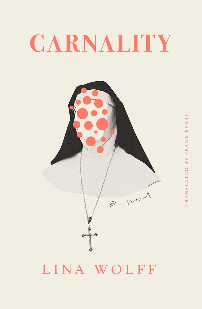
This girl represents the appropriate reaction to an image-based culture, a cut-apart look in the mirror that shouldn’t necessarily be limited to the fashion industry. (That the collage is vaguely heart-shaped probably ins’t a coincidence.) Bonus points for the title repeating around the edge.
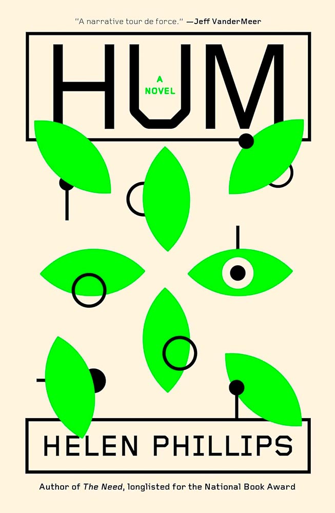
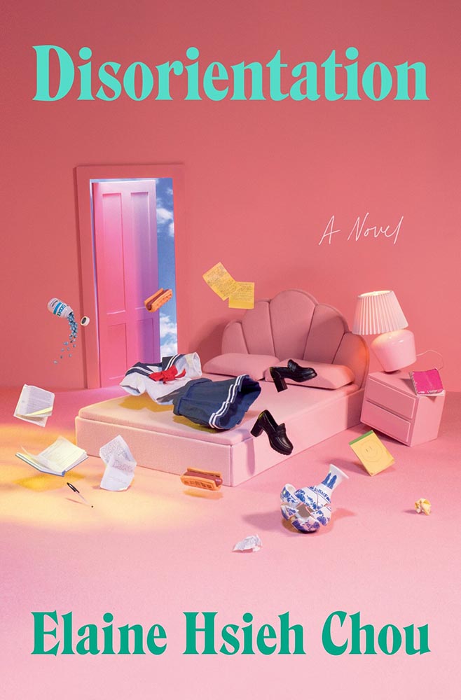
“In a near-future world addled by climate change and inhabited by intelligent robots called ‘hums,’ May loses her job to artificial intelligence,” the description reads. Yes.
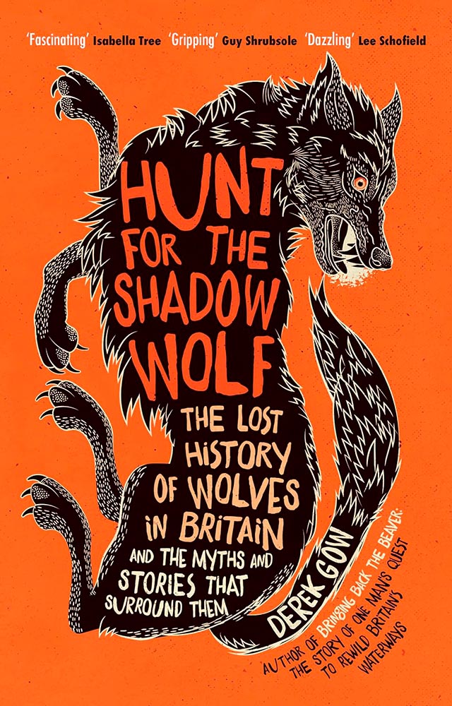
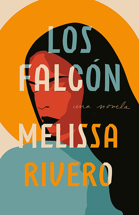
The illustration and type work so very well together. (Also, color.)
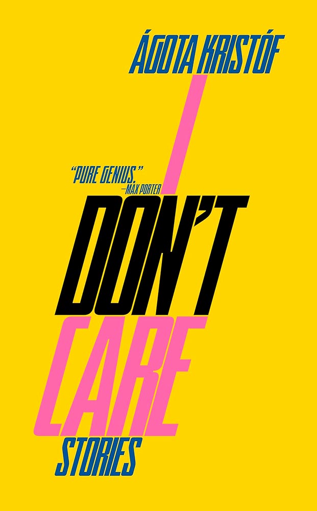
Movie poster! (Also, color.)
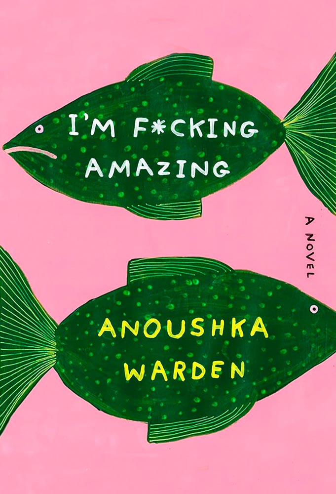
With a title like that, it’s tempting to let it carry the day. Uh … no.
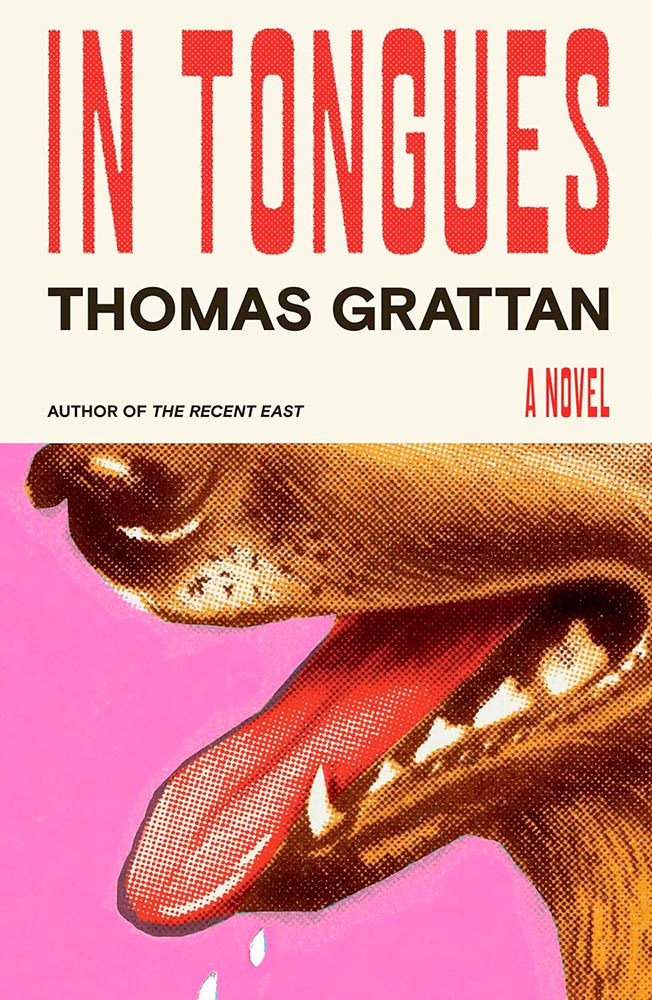
The pink isn’t in halftone. (Also, the drops of drool.)
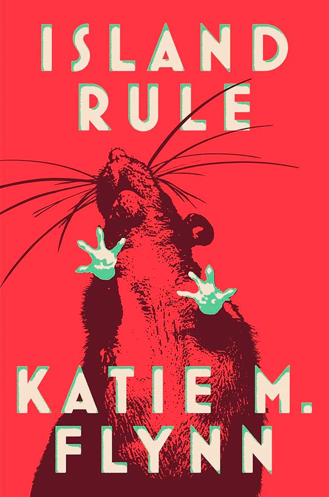
A red, red rat is awesome. But it’s the way the green works — in the feet, yes, but especially the type — defines “win.”
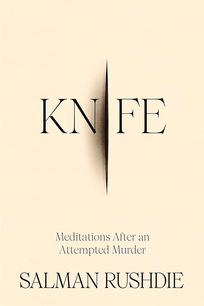
Not an easy title, handled with absolute skill.
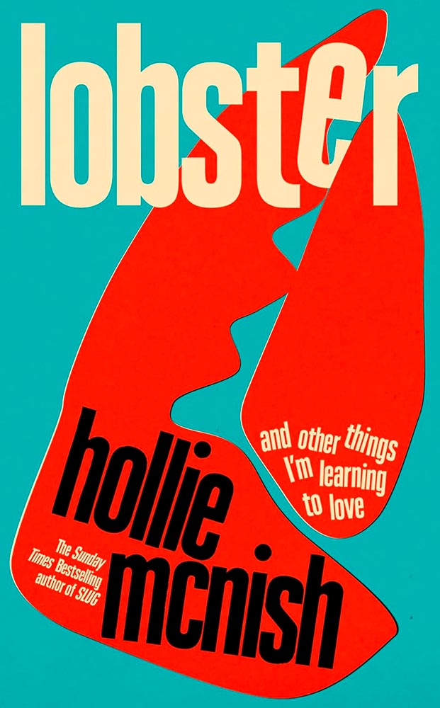
“This book is written out of both love and hate for the world.” Nuthin’ but love for the cover from me.
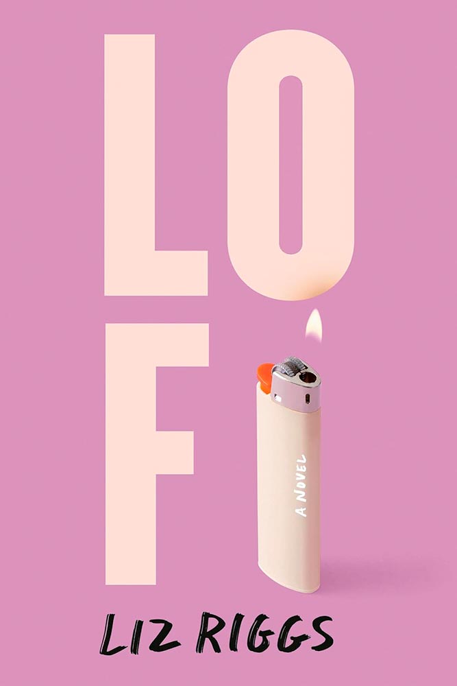
Sometimes, the literal approach works. (Pardon the expression.) But it’s the added burn mark that makes it.
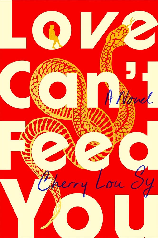
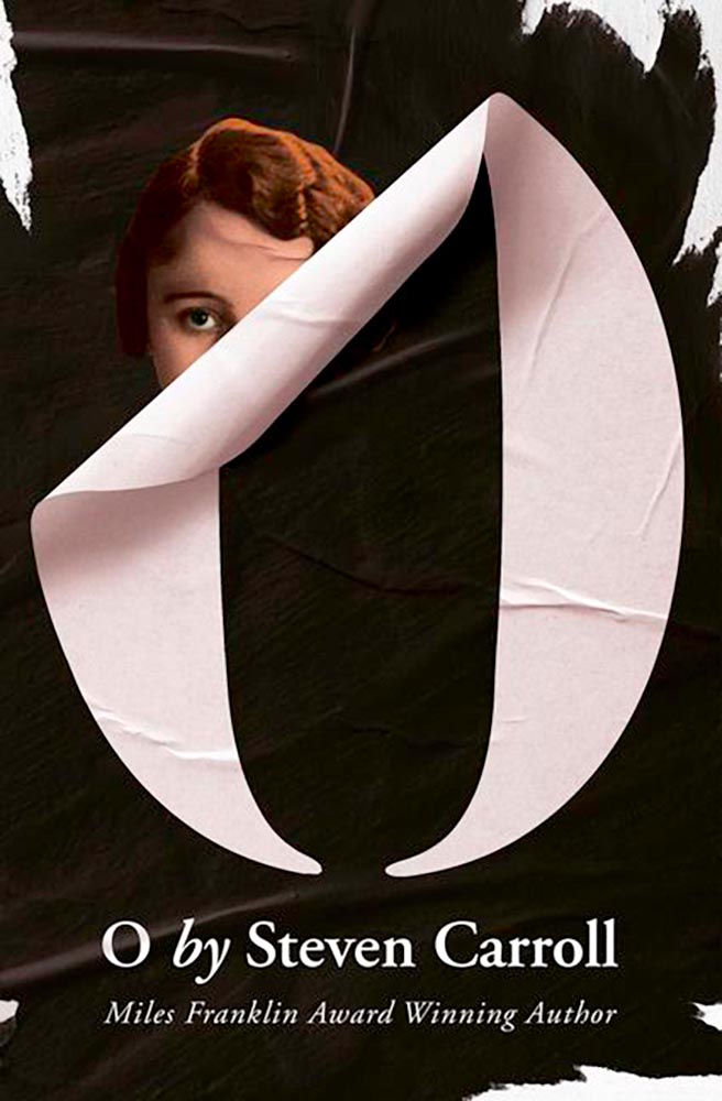
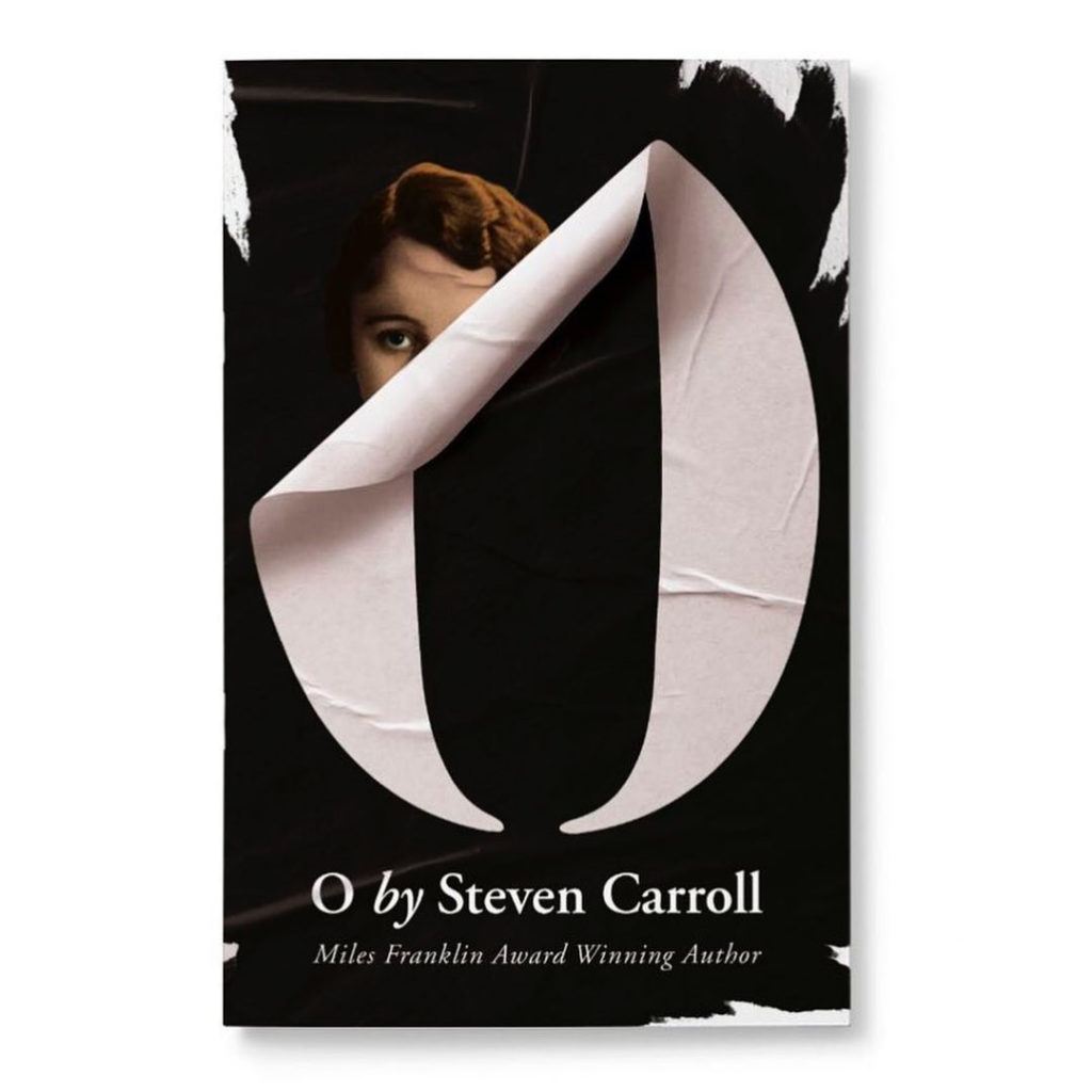
The red and gold, the title treatment, the complimentary blue ink, and the woman in the “o” are all fantastic. The snake, though, from scales to bite, is superlative.
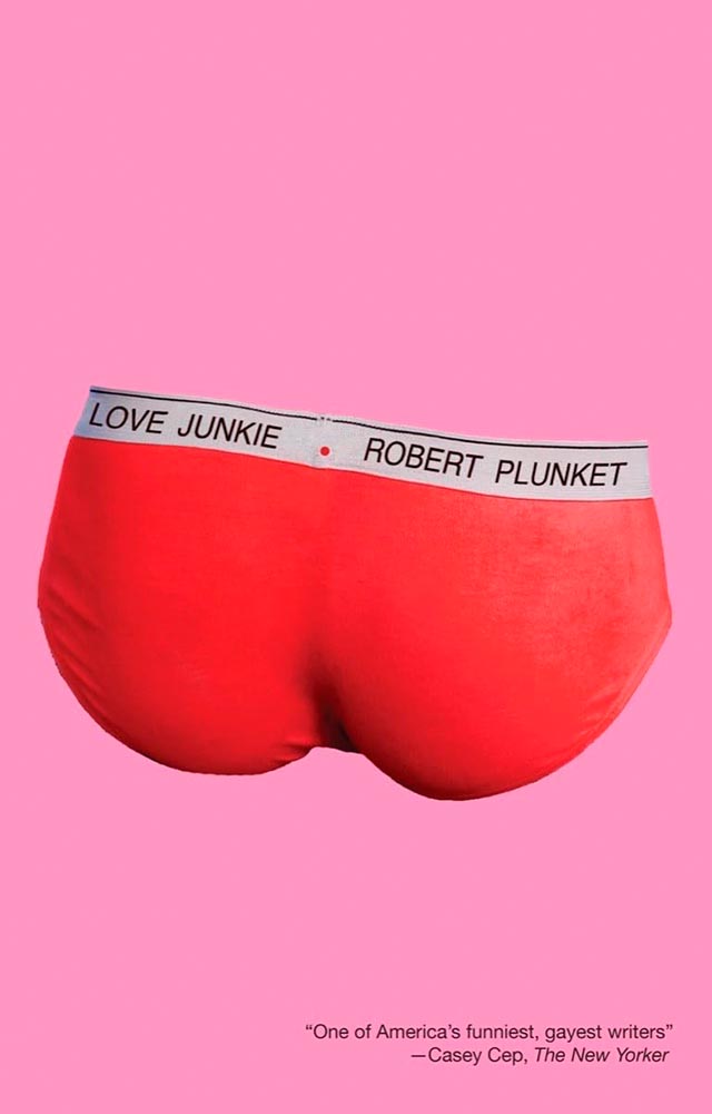
Oooollllliiiiivvvvvveerr! (Two years in a row, even.)
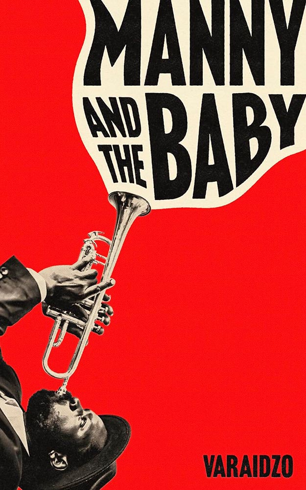
“British and Black, with Jazz and Character” is a tough brief, handled here in a way that makes the title incredibly appealing.
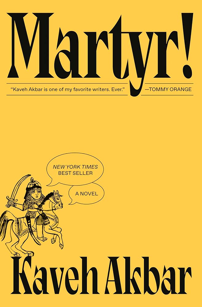
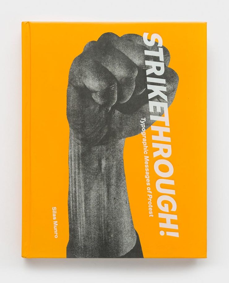
Unusual color choice, eye-catching type, the explanation point! But, of course, it’s the illustration — and the accompanying speech bubbles — that take it to the next level. Bonus points for both the hooves balanced on the “K” and the treatment for the pull quote.

That yellow, the blackletter title and unusually-spaced author play perfect — and curiosity-peaking — supporting roles to that painting. Purity, indeed.
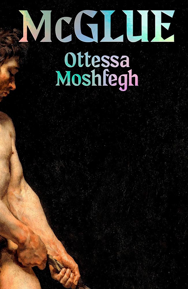
What’s he pulling on, now? (Also, the title/author treatment.)
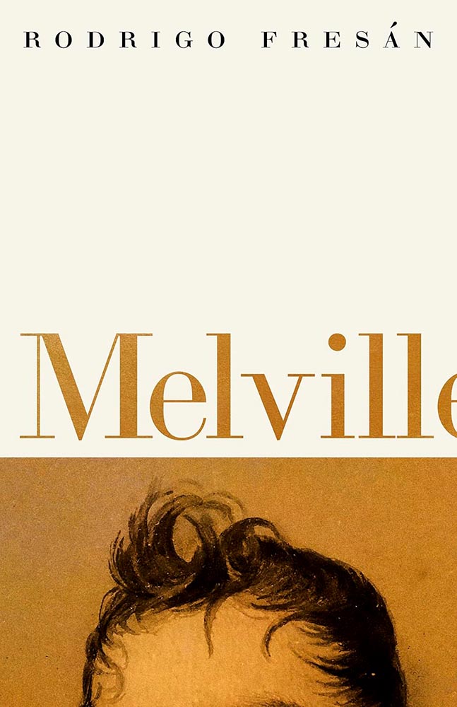
Cropped to perfection.
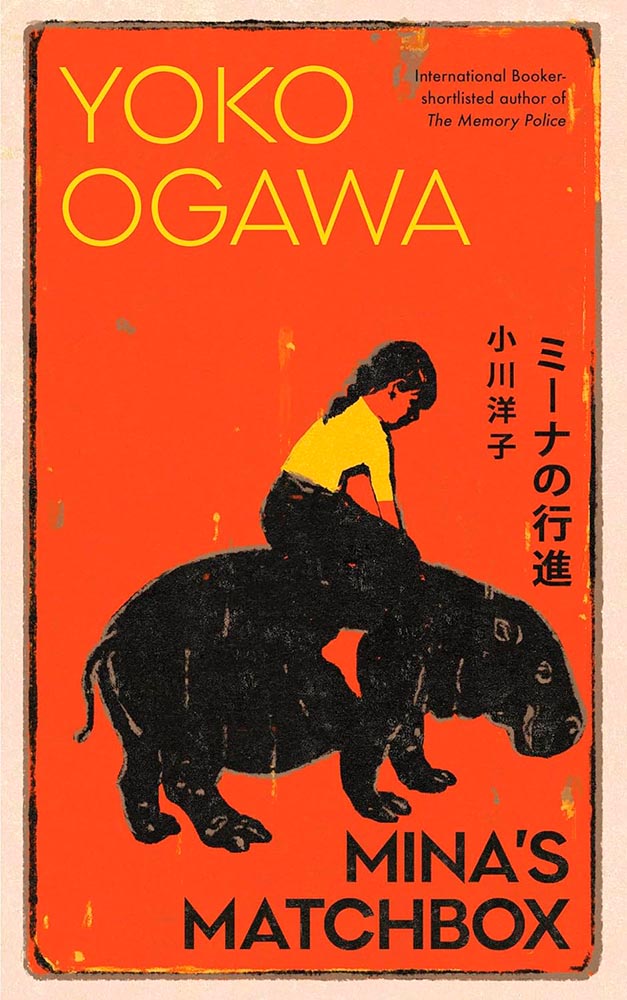
The first of three UK versions in a row: this title lights it up.
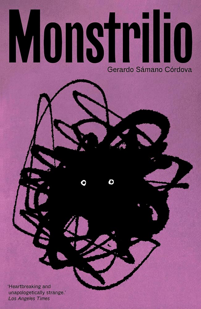
The US version of this title was in last year’s list, but this UK version is equally strong — in an entirely different way.
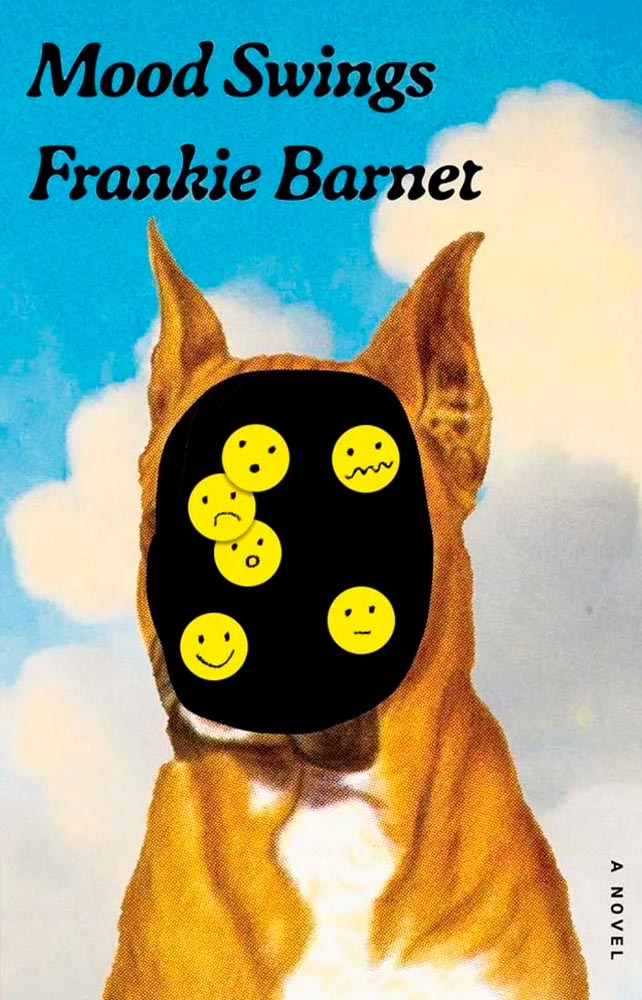
Another UK version, another winner. Love the typography. Bonus points for the homemade emoji.
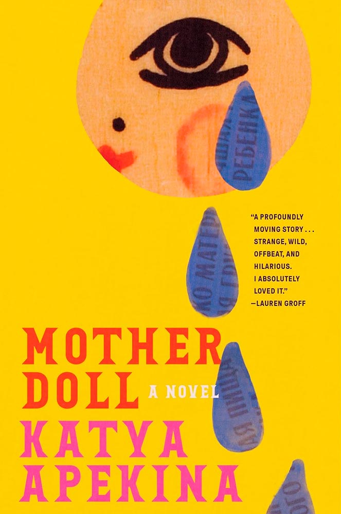
All kinds of goodness nested into this one, from the title treatment to the slight fading in the tears (which continue on the back cover).
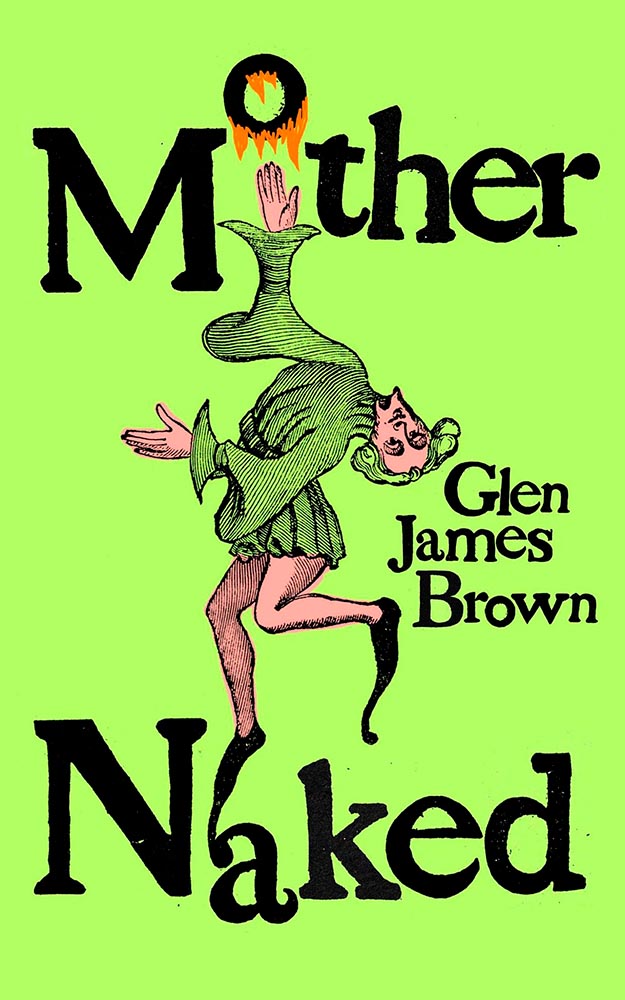
From the green to the typography to — especially — the illustration, this cover weaves a tale from 1434 straight into our brains.
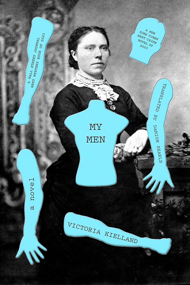
The disembodied bits. ’Nuff said.
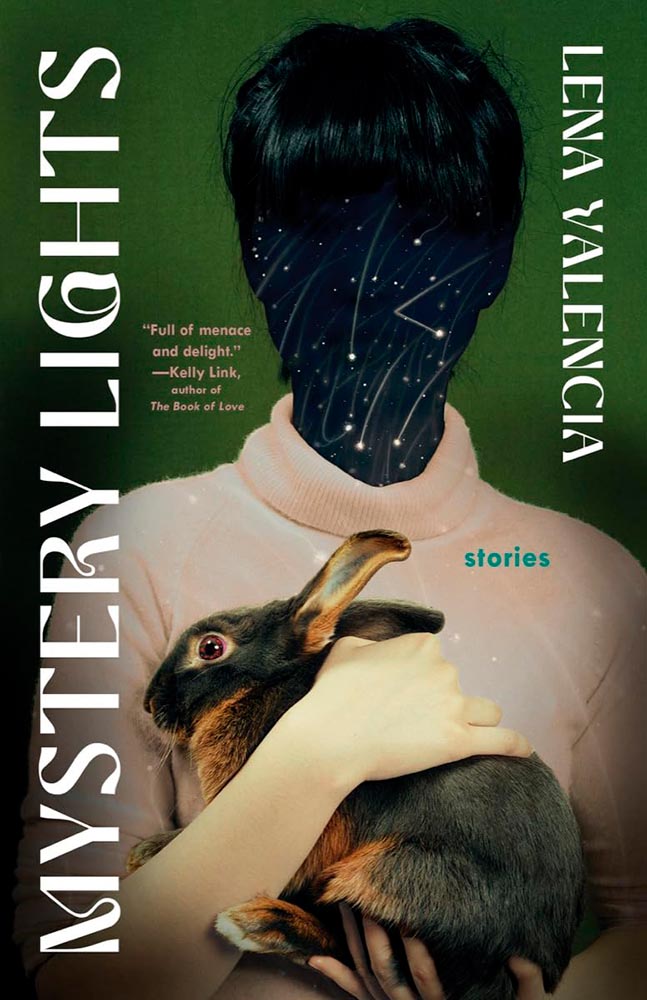
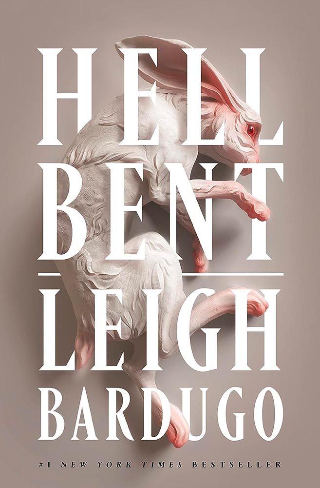
I feel for the rabbit.
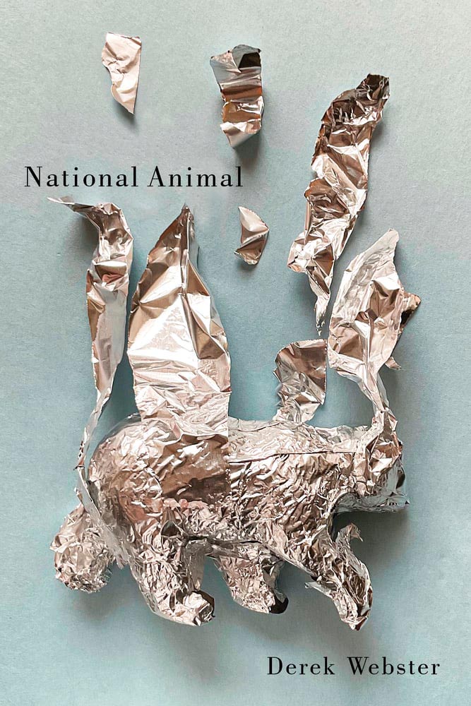
Speaking of empathy for the animal: this slim volume of poetry is perhaps an all-too-real sign of the times. (The cover, too.)
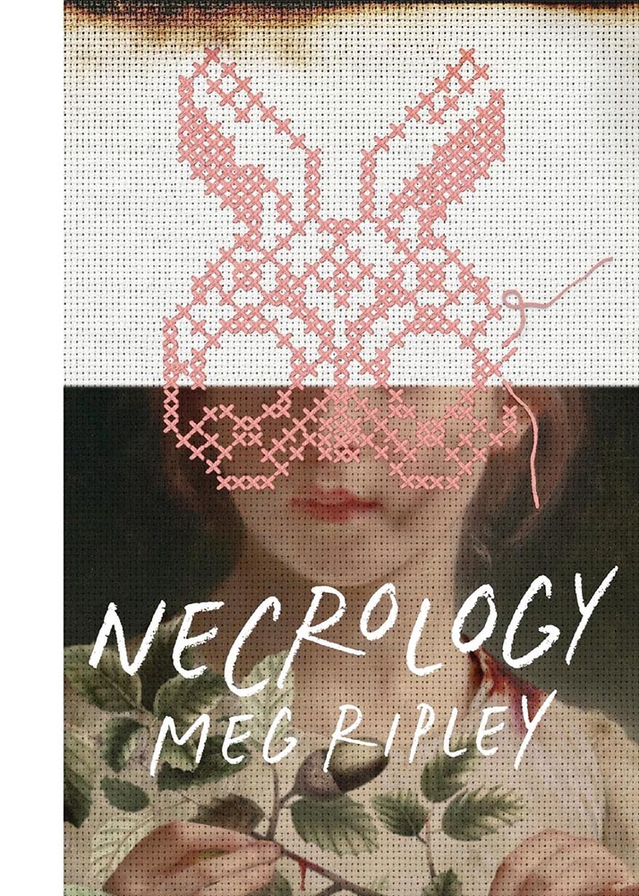
Pink Rabbit, slightly dirty: there’s a quality to this that grabs on and won’t let go. (Thankfully, it’s the first in a series….)
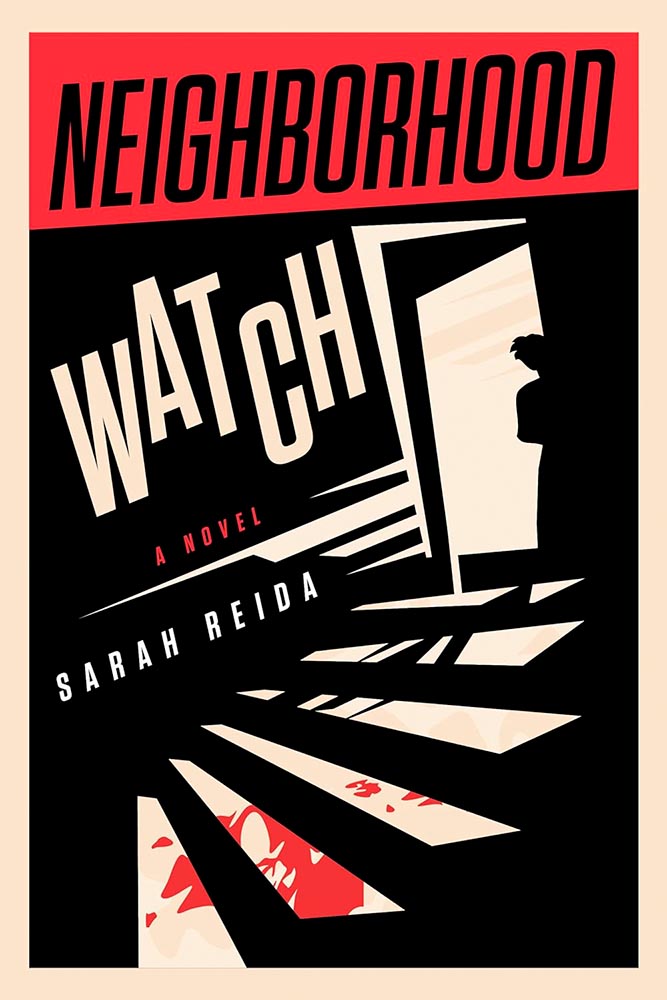
The opposite of the above, yet still bloody good at capturing attention.
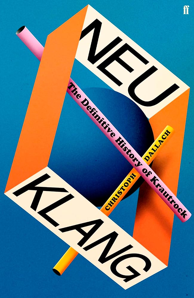
1968 called, with the perfect cover original of the moment.
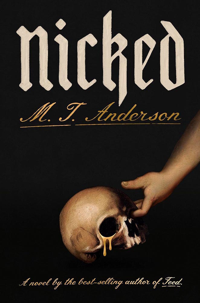
“Do a cover on sacrilegious theft,” someone said. Saint Nick brought us a gift.
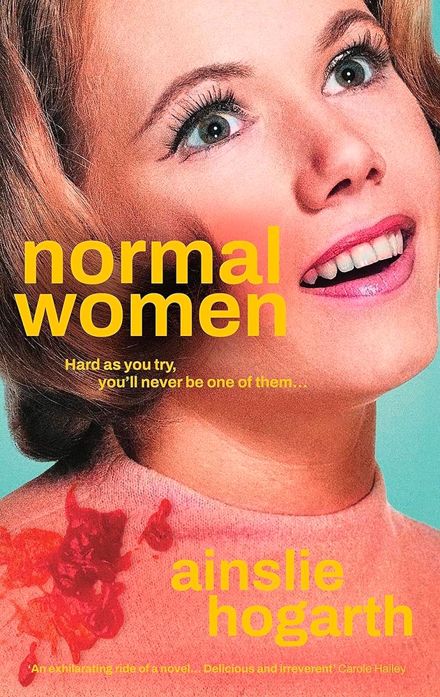
Hard as one might try, topping this might never be possible.
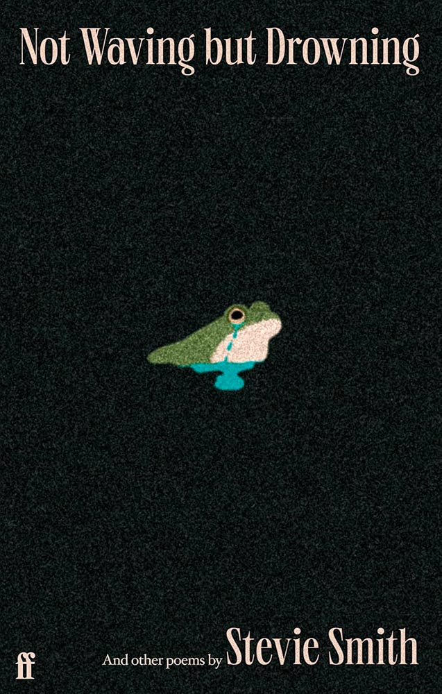
This UK title’s cover does so much more than it has any right to. Brilliant. (Bonus points for the grain.)
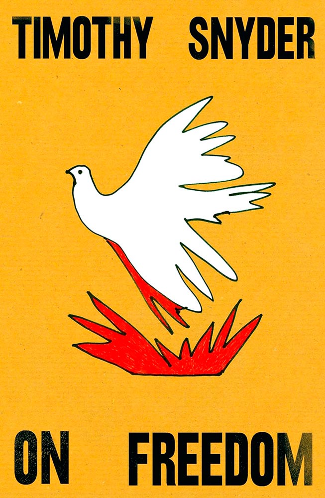
Another gem from the less-is-more department. (Also, the paper texture and slight aging on the lettering.)
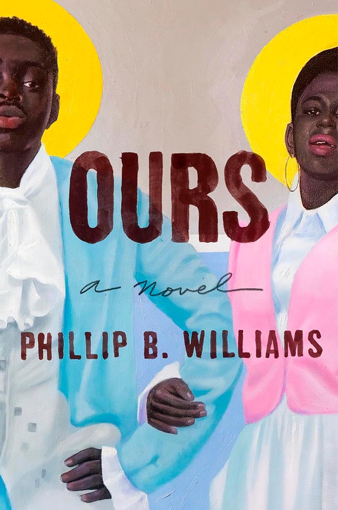
There’s something about this that just works. Take a moment to read this LitHub intro instead of listening to me.
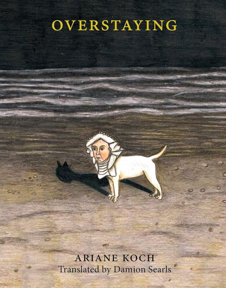
Overstays … in your brain. Very nearly put this at the top of the pile.
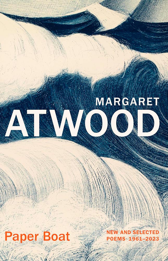
The energy in this cover is fantastic. But it’s what’s under the cover:
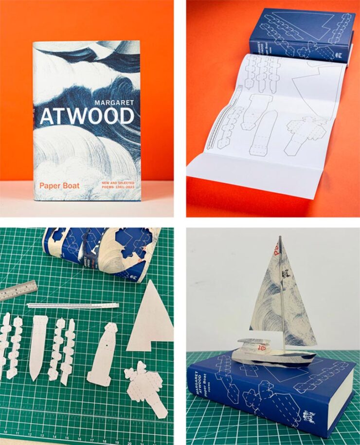
The printed cover, too. Awesome.
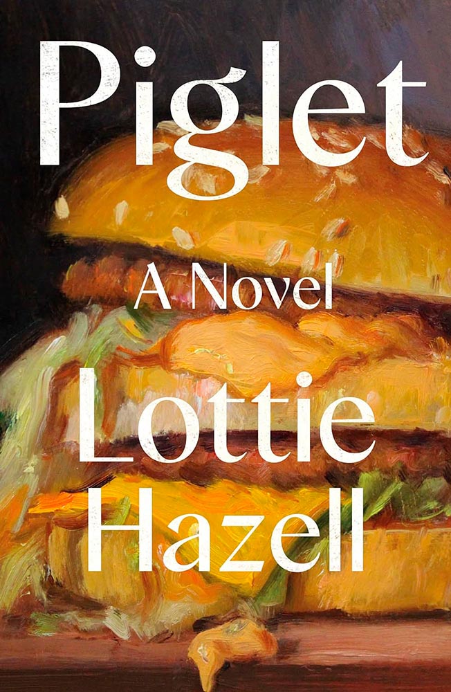
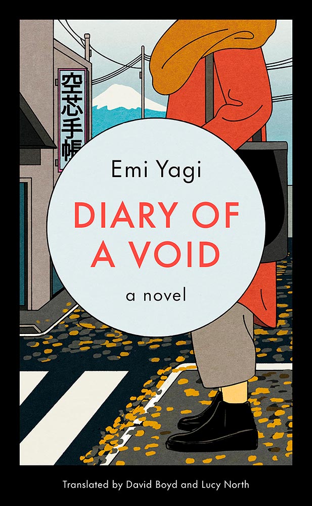
Leaving aside the notion that Americans can recognize a Big Mac on sight, even when idealized/stylized — beautifully — like this, it’s the perfect compliment to this title.

Farcical dystopia, embodied.

Unsee the face! (Bonus points for superlative typography.) Battled with Chimera and Rough Trade for one of the top spots.
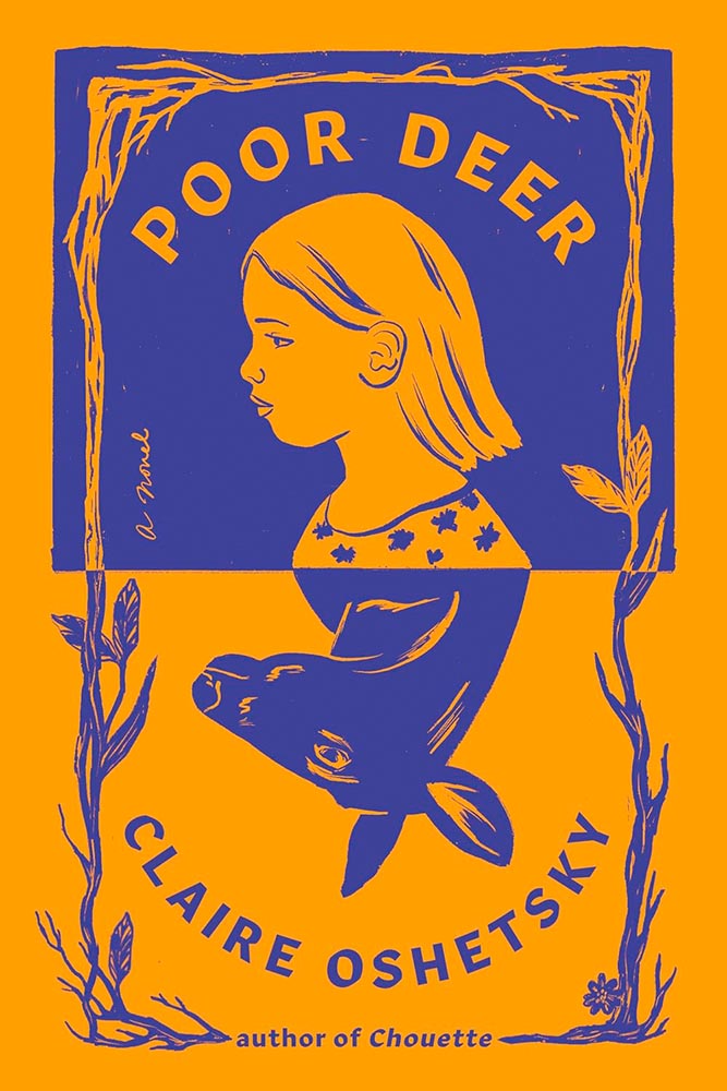
Reflections, indeed. (Also, color.)
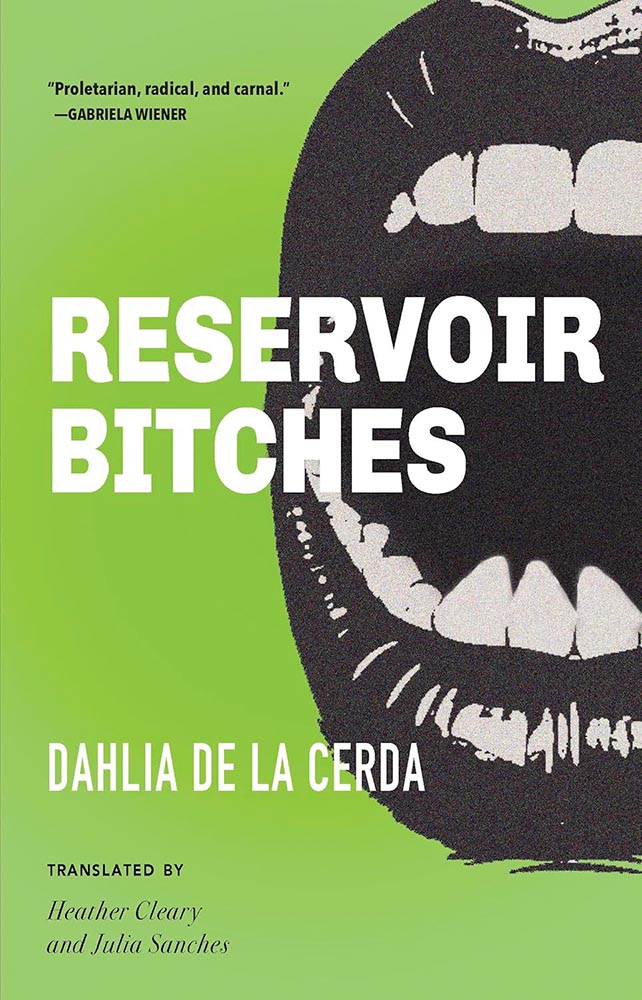
“Prod the bitch that is Life and become her.” These thirteen linked stories demand a cover that leaps off the shelf and grabs you.
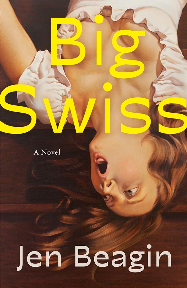
Every year, there’s at least one title that so incredibly well illustrates how that notion works here in the US versus in the UK, and this year, it’s this one. I really like the above — the color’s awesome, and those teeth! — and believe it’s exactly right for the US market.

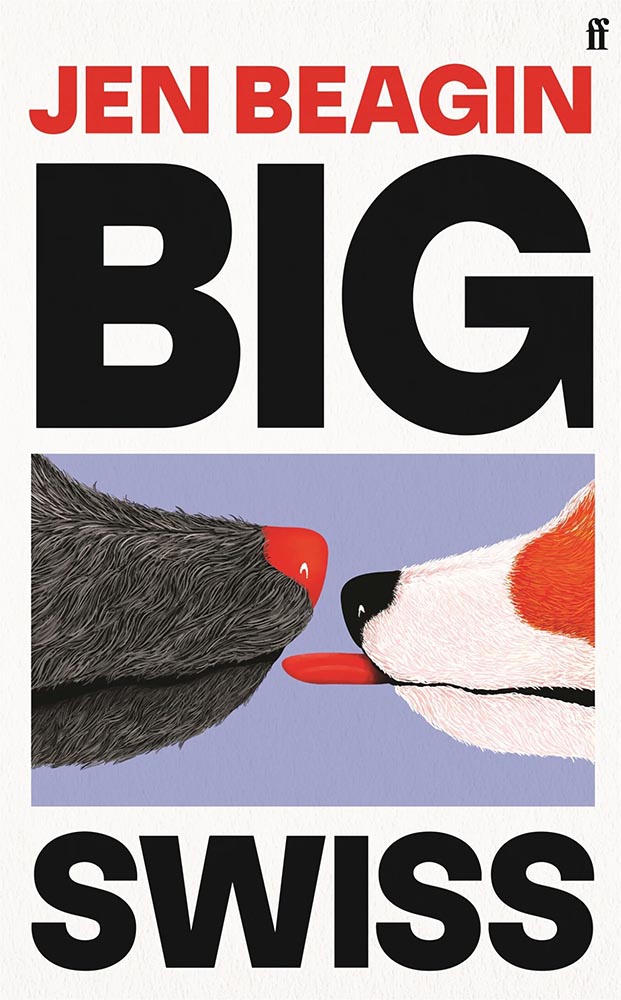
But for the UK market … that photograph. (Bonus points for the title treatment.)
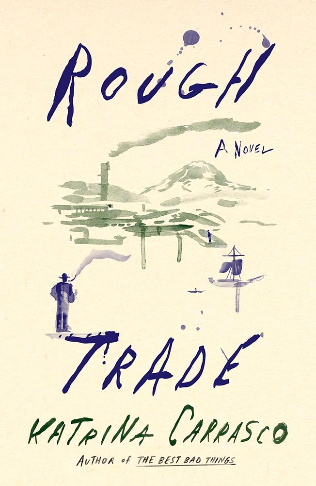
Watercolor perfection. Competed with Chimera and Point Line Plane for the one of the top spots. (I felt only one illustration-against-plain-background cover should be at the top. Might have been wrong.)
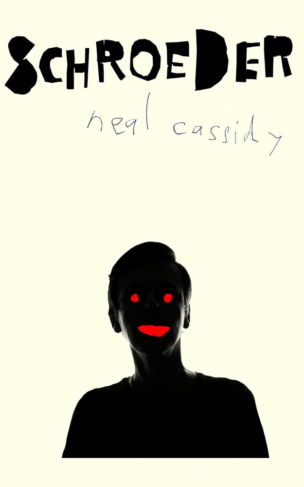
The title treatment, the ink author’s name, and the photograph alone would be compelling. But … wow.
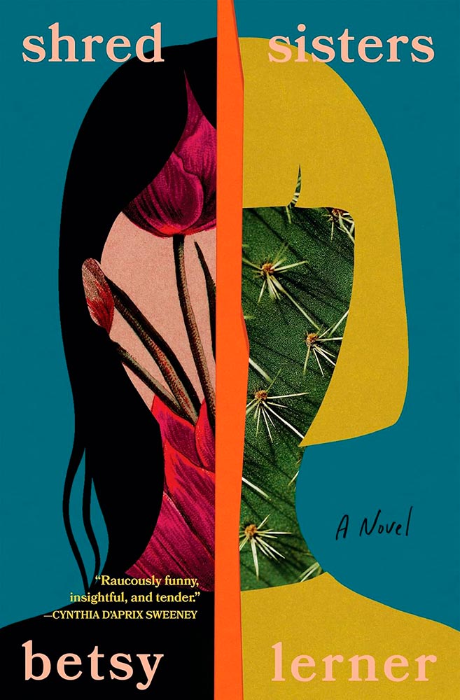
From the illustration-makes-it dept. (Bonus points for the not-quite-halves.)
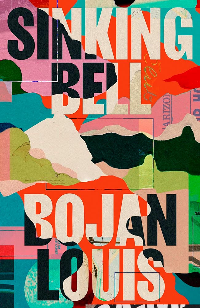
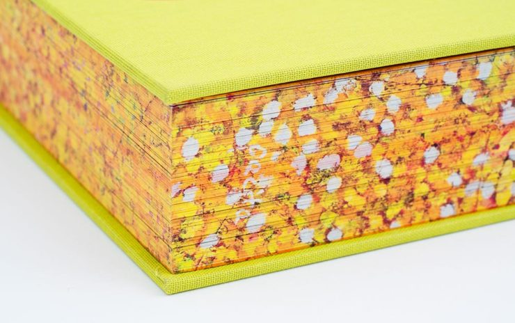
Paper and color, oh my.
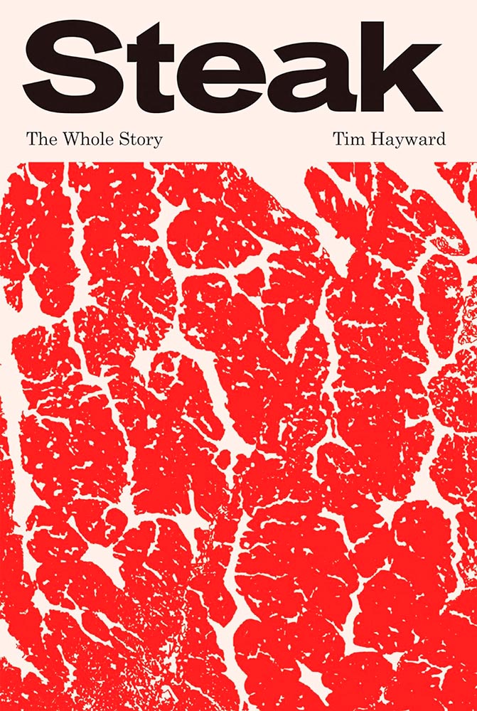
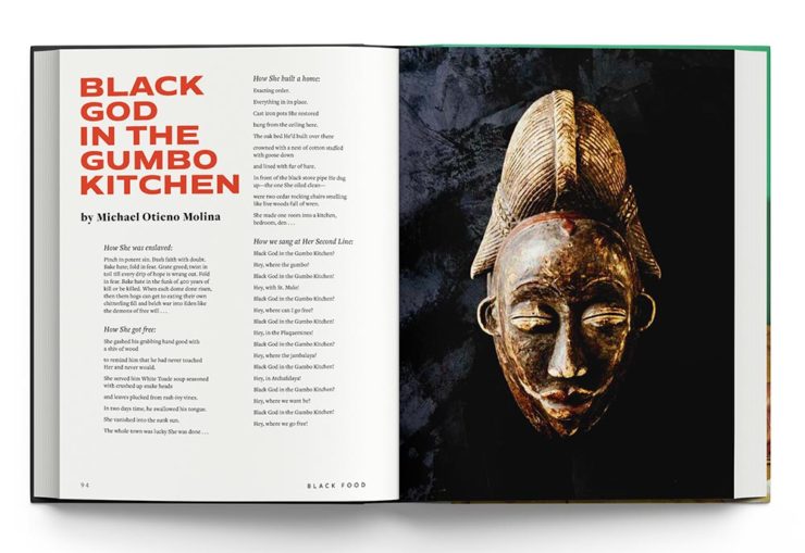
Yeah, it’s a cookbook. Who knew? Also:
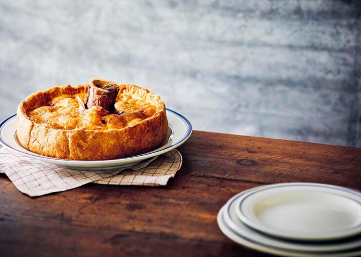
Bonus points for the fantastic photography within.
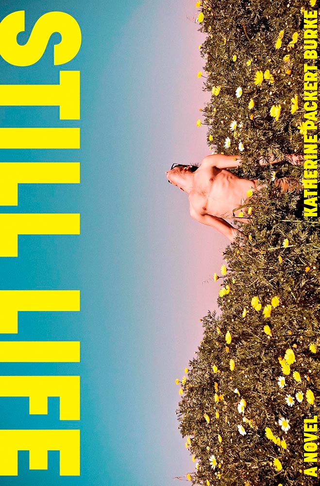
This would work perfectly well on the vertical. But it’s so much more this way.

Definitely amongst the 1%.
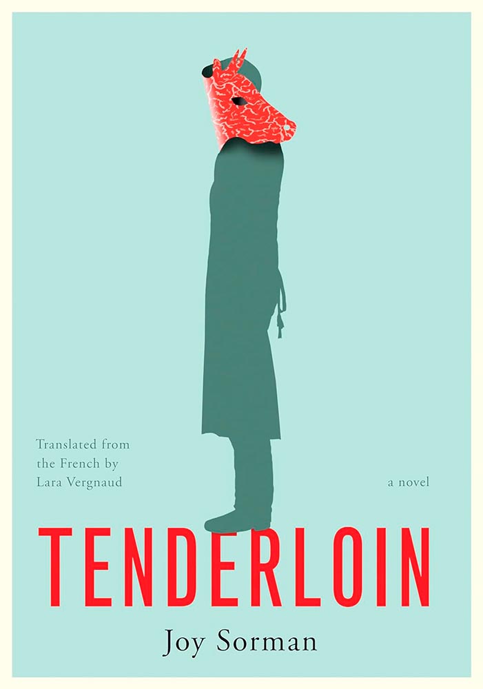
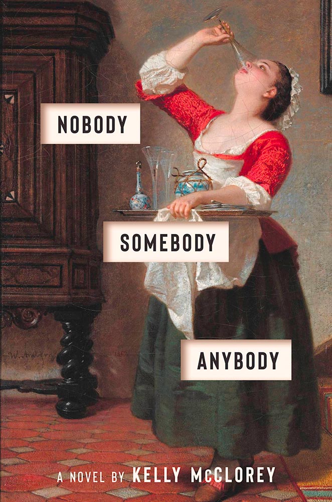
Someone chose not to butcher. Except…. (Extra points for the apron strings.)
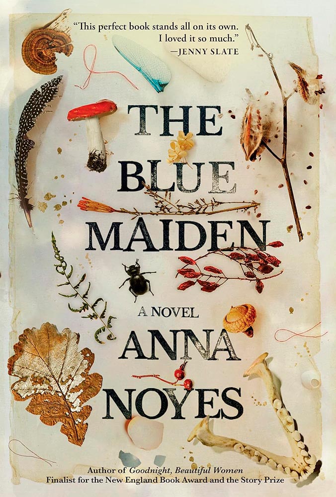
I’m a huge fan of a photorealistic collage, but this, interleaved with the title, defines superlative.
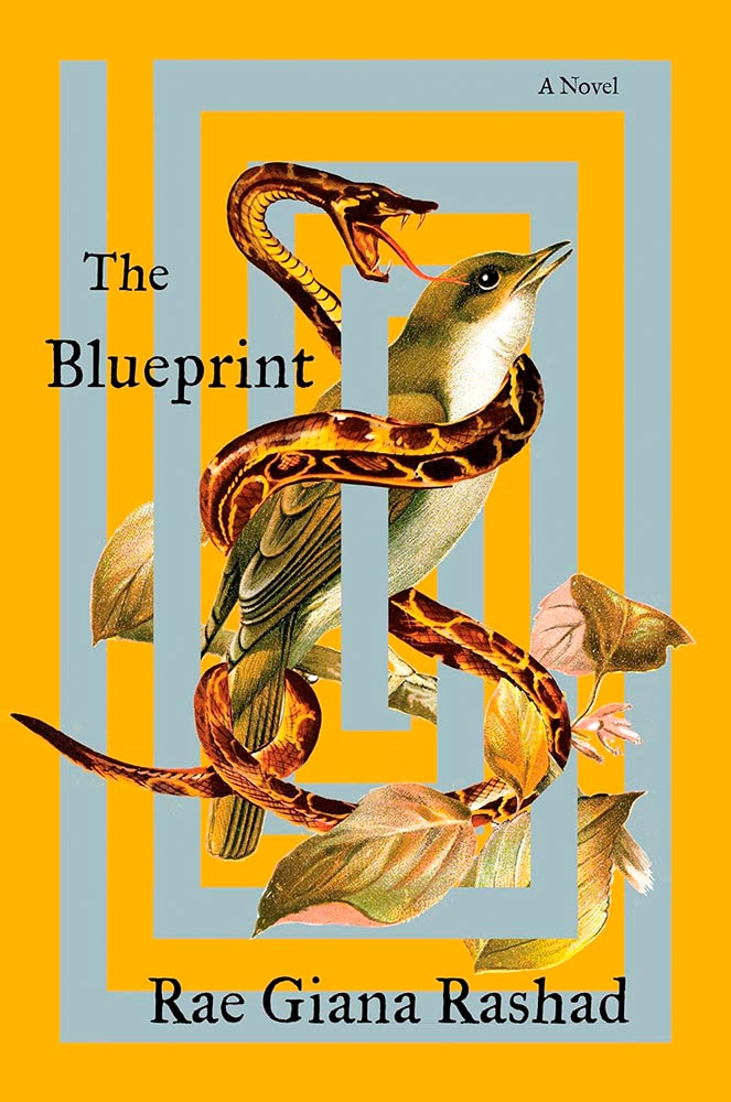
In a world of algorithms, proof that creativity and talent are so very human. (Also, color.)
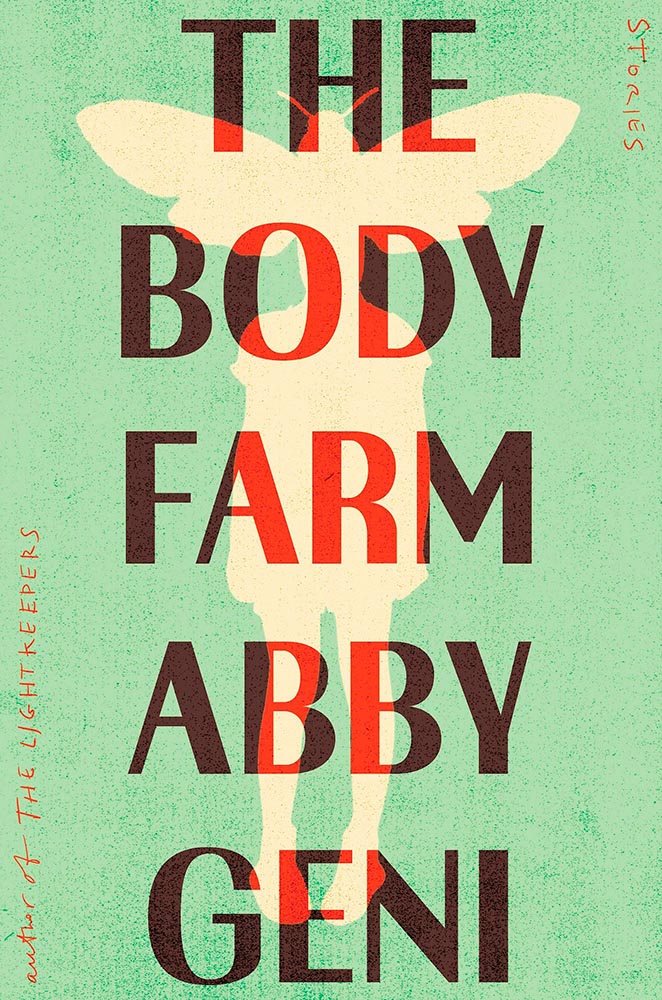
That awesome green, the color-burned title treatment, the hand lettering, the texture — all add up to top-flight attention-getting. (Bonus points for the entomology illustration/hint.)
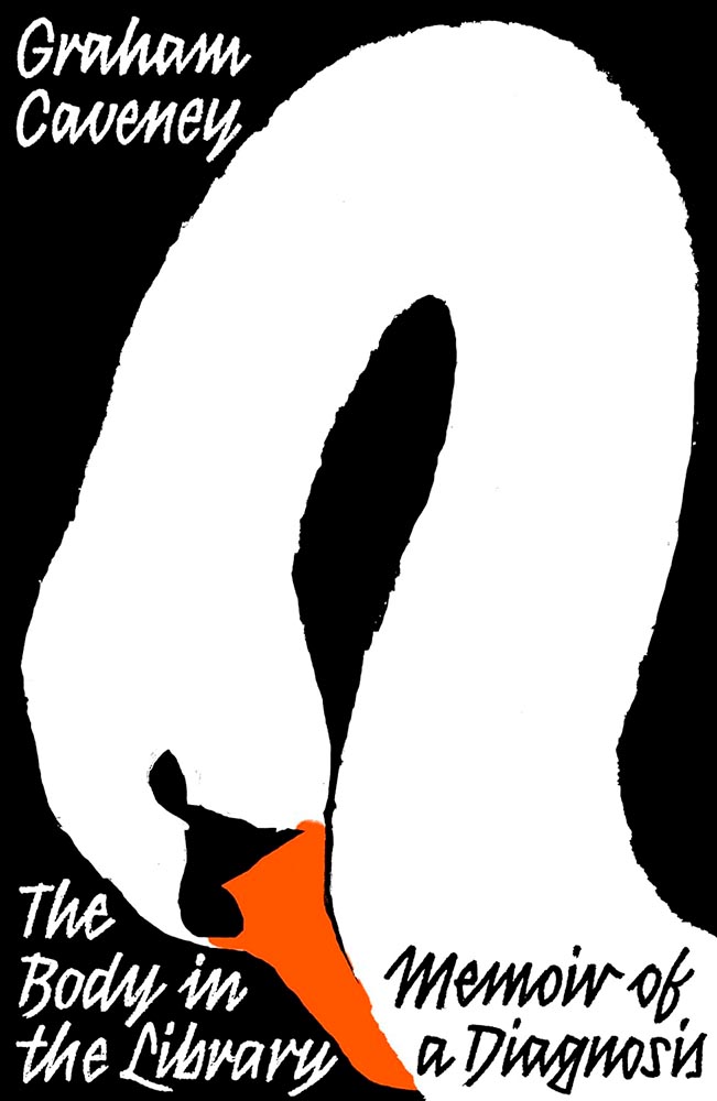
The swan’s pose of contemplation, indeed. (Also, color — perfect.)
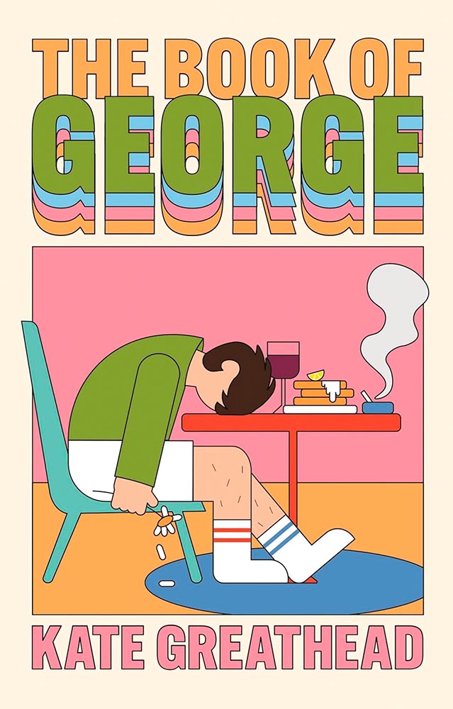
We all know a George.
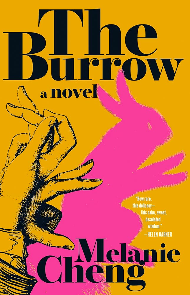
So much more than just a pet rabbit. (Also, color.)
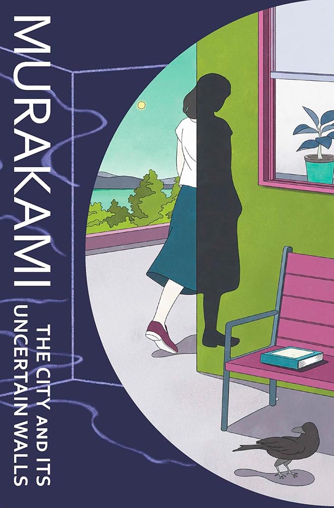
This cover had me at “uncertain walls.” (See also: End of the World and Hard-Boiled Wonderland.)
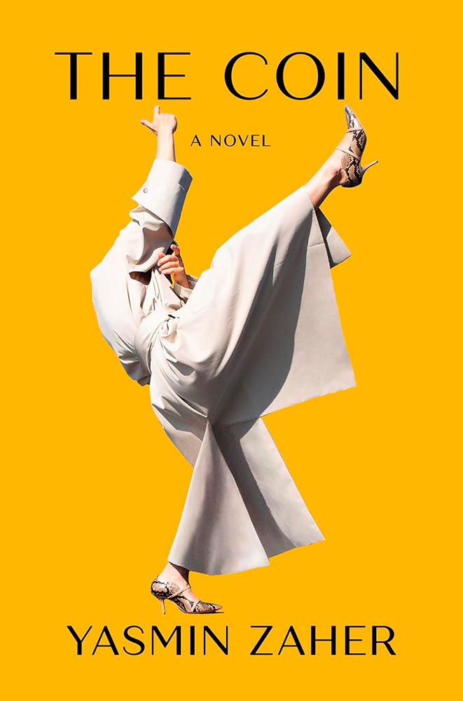
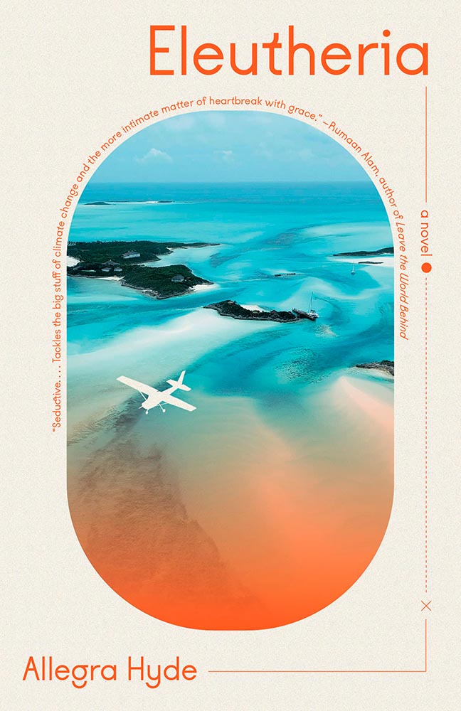
Never mind that this shade of yellow seems to be having a moment, let’s talk about that photograph: the goal of any cover is to peak your curiosity. And we have … win.
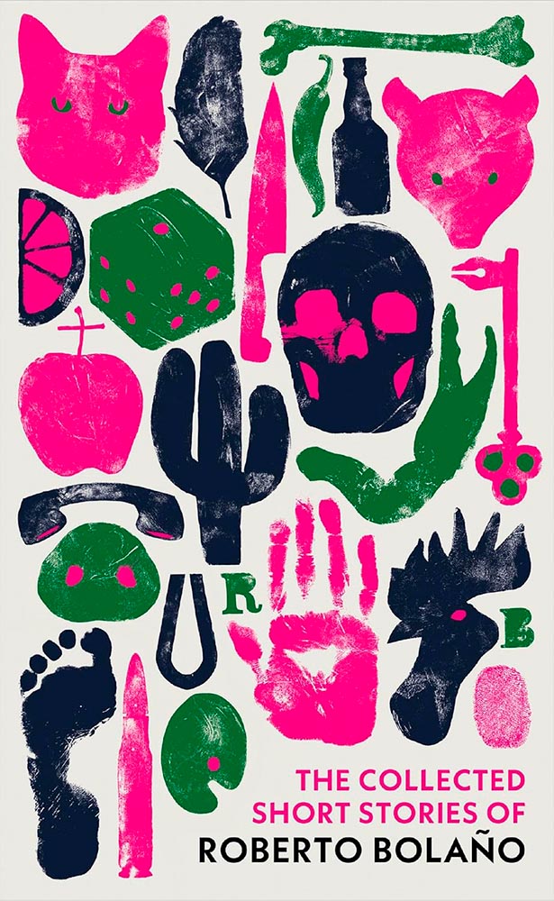
A collection, indeed. (Also, color.)
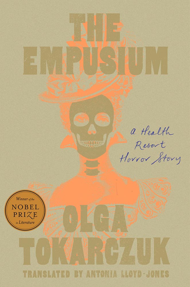
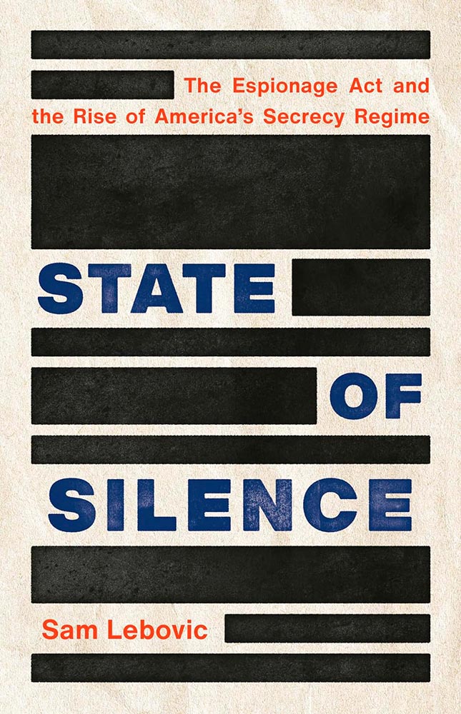
Ink gets blotted out. (Also, paper.)
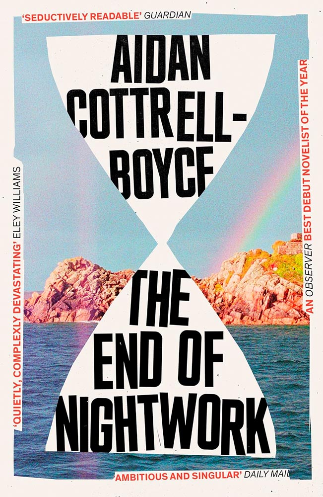
Never mind the brilliance in the middle — the four pull quotes are, quite literally, the end of the rainbow.

Cultural and emotional shifts through technology, as expressed in (cover) art.
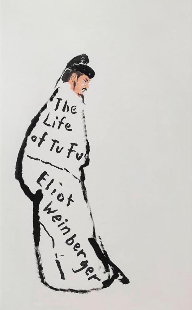
At the risk of repeating myself, no one does more with less than Oliver Munday: this level of white space deserves an award.
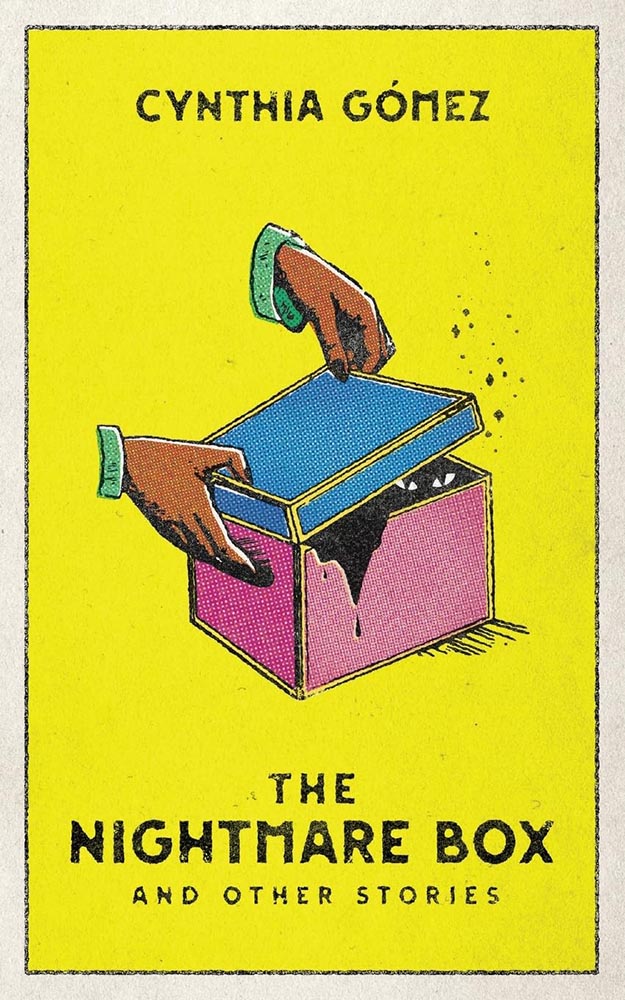
The eyes are eclipsed only by the rising magic dust. (Also, screening.)
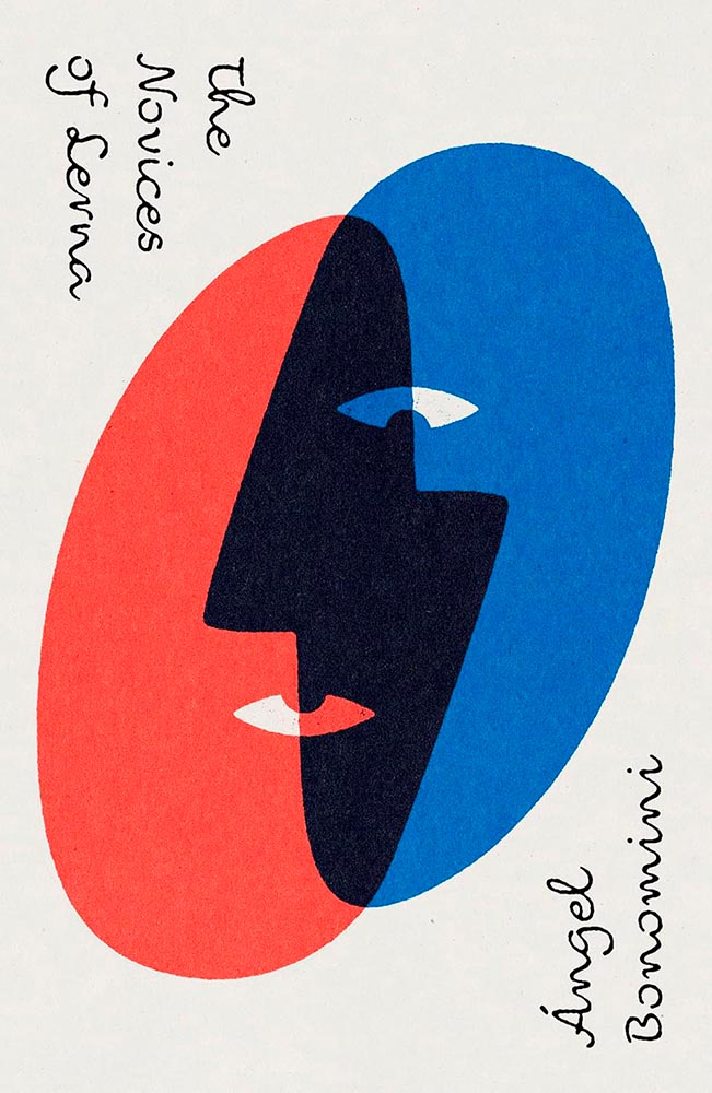
Another where the US and UK express things differently; the UK’s, above, is brilliantly simple and simple in its brilliance.
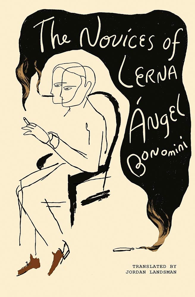
While the US version is more while still “less” in the big scheme of things. A two-fer.
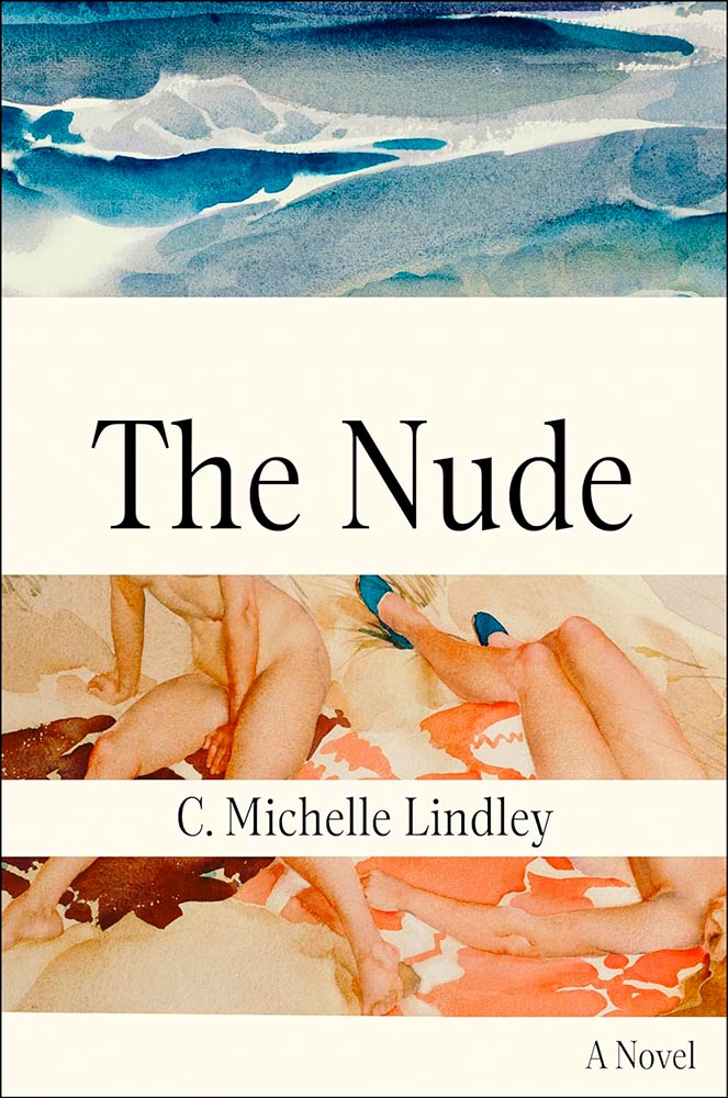
Text blocks do. (Also, awesome art.)
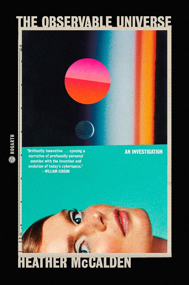
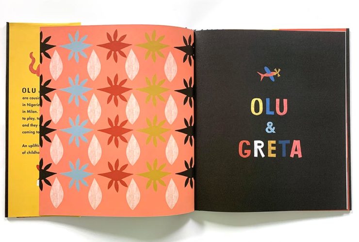
Get lost in it. (Also, the article peeking out on the left.)
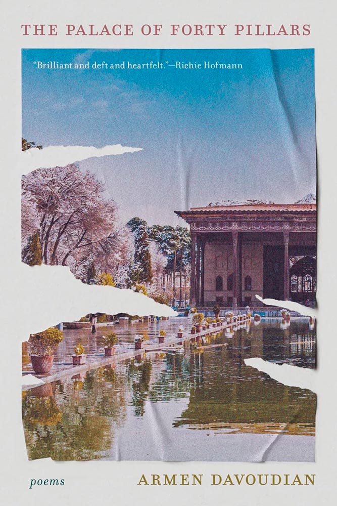
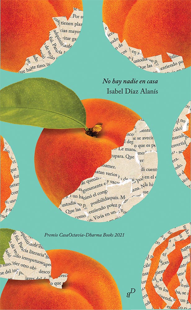
Reflections, torn asunder yet so lovingly smoothed out and preserved for posterity.
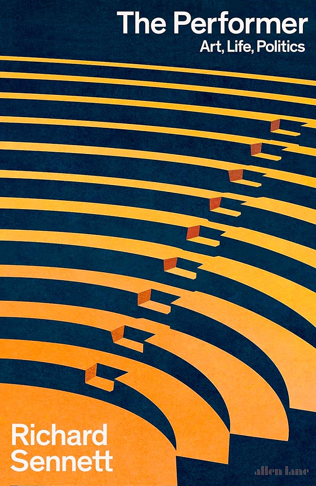
Two-color, geometric brilliance, given center stage.
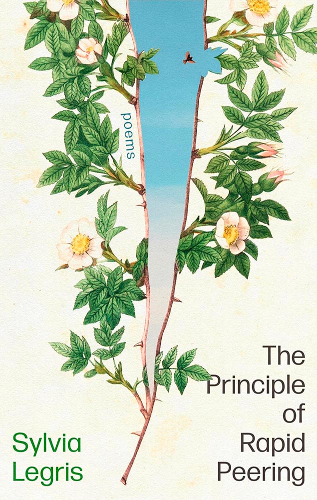
“Self-seeding wind / is a wind of ever-replenishing breath,” the title poem reads, but it’s the cover that drops the ultimate clipping. (Also, placement of “poems,” appropriately.)
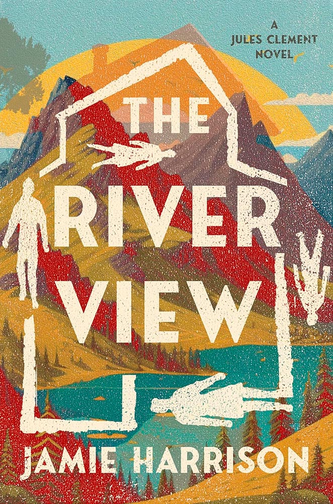
“Heavily textured” has never read so well.
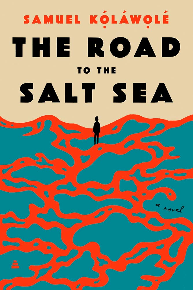
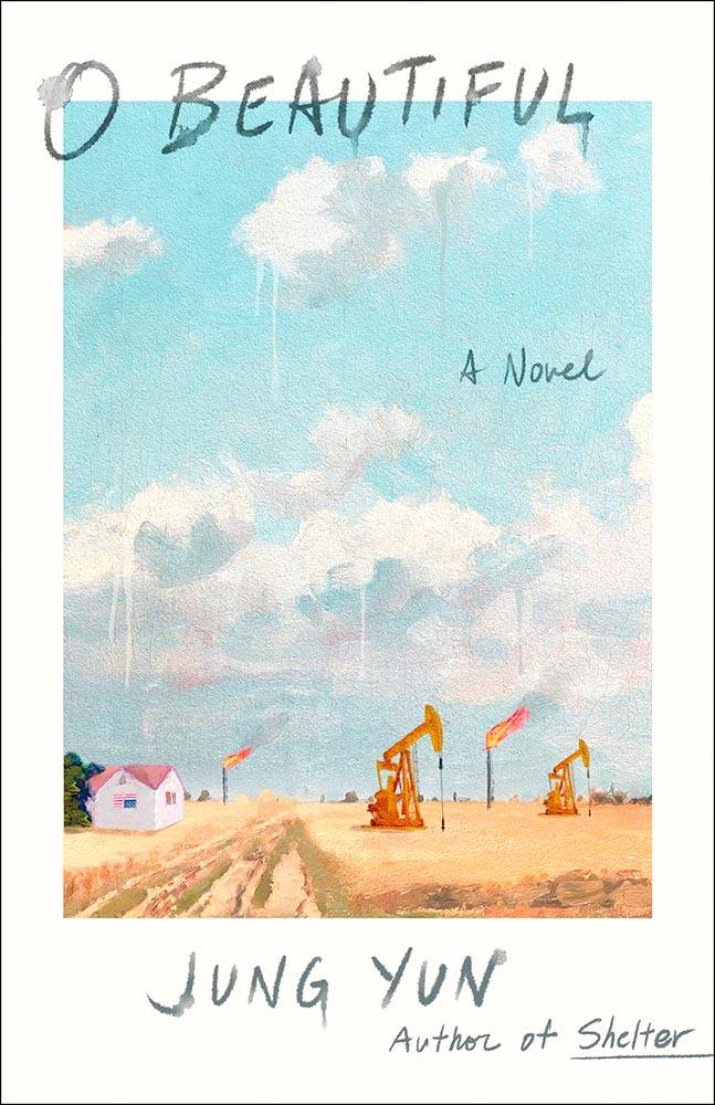
I’m not sure what the illustration on this cover stands for — desert, sea, paths taken or not, or something I don’t or even can’t understand — and perhaps that’s why this design works on so many levels: an enigma that requires further exploration.
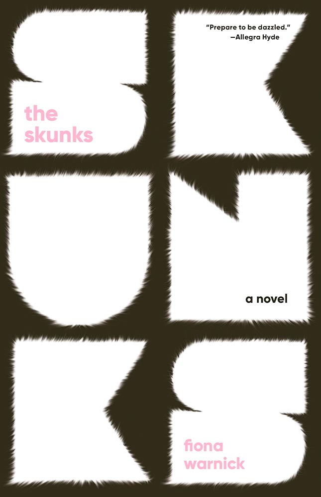
Cuddly in just the right way.
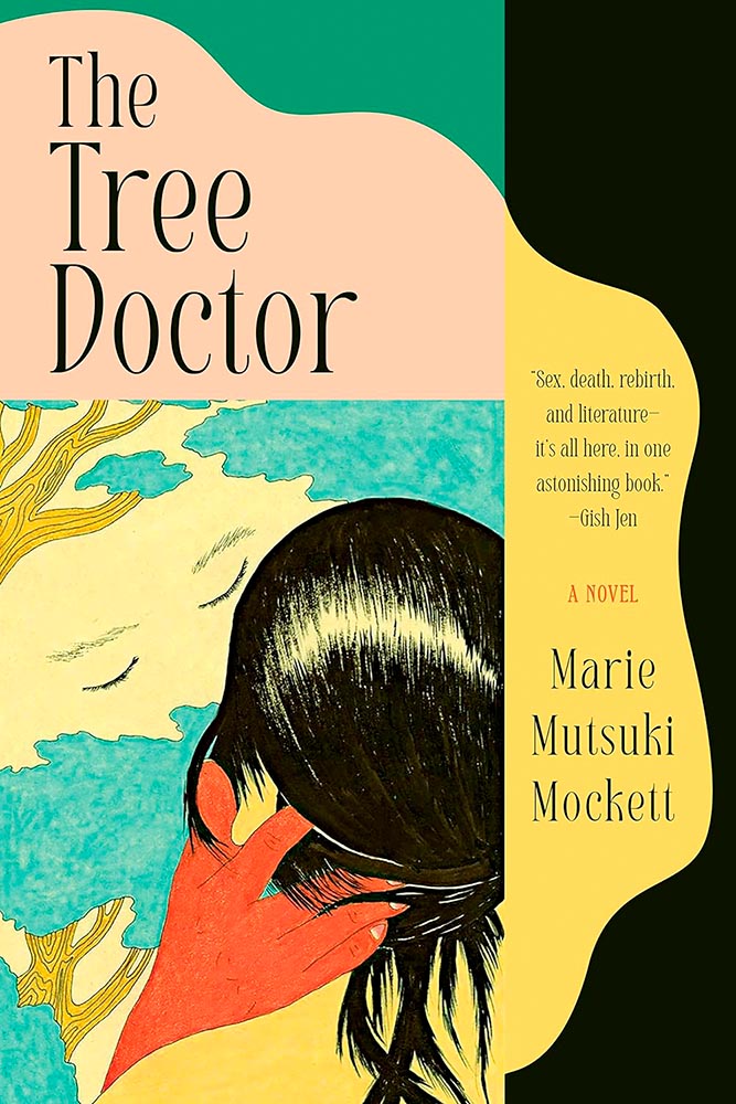
“An affair with an arborist could result in a cutting,” I chose not to say. Wait. (Also, the accompanying cover.)
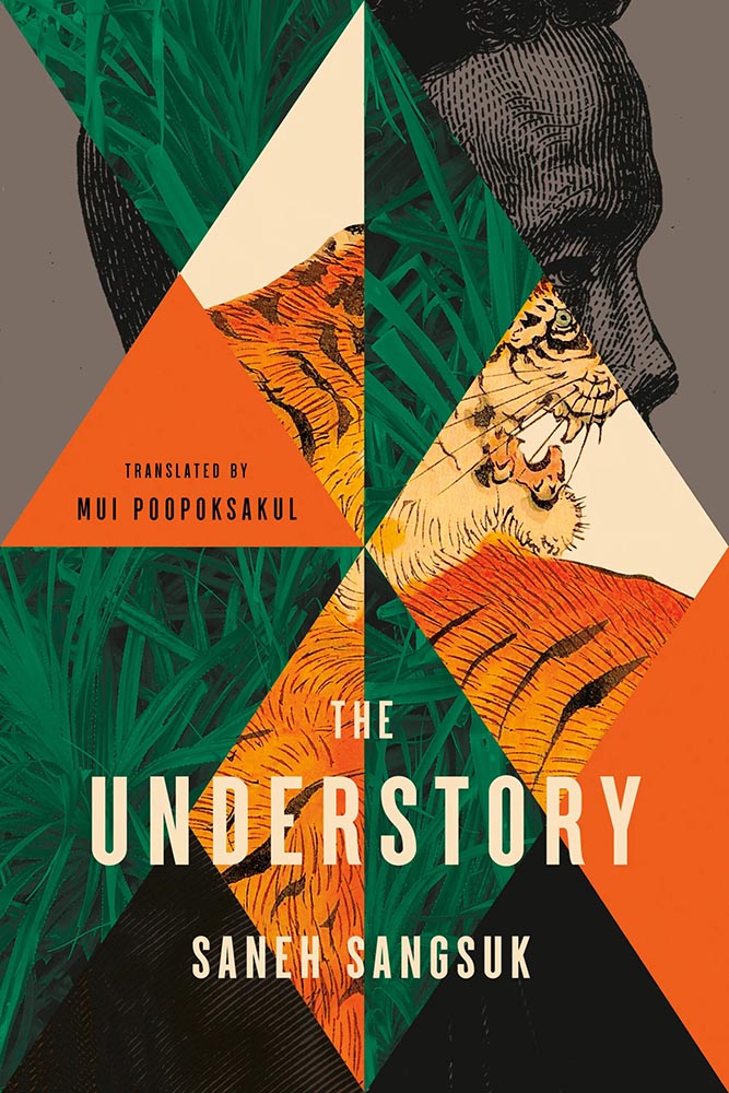
Geometry, color, content: this cover’s been promoted to the actual story.
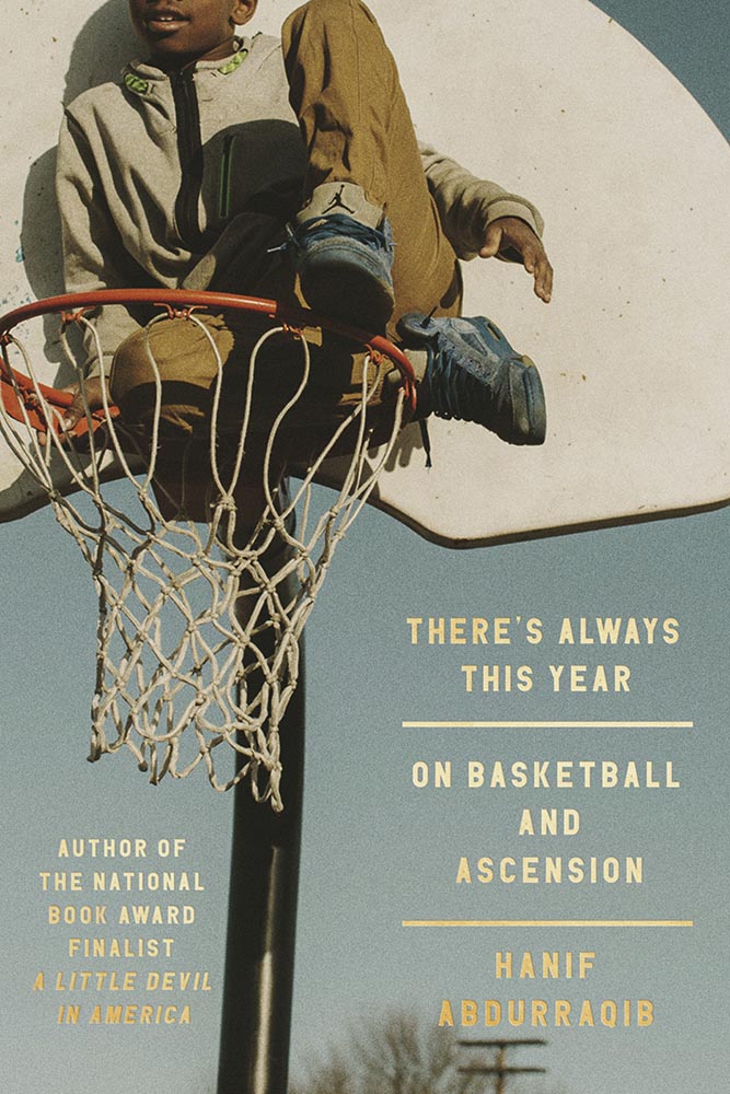
Photograph, texture, photograph, title treatment, photograph. (Also, the subtle shadowing in the author’s name and previous title.) Another very nearly at the top.
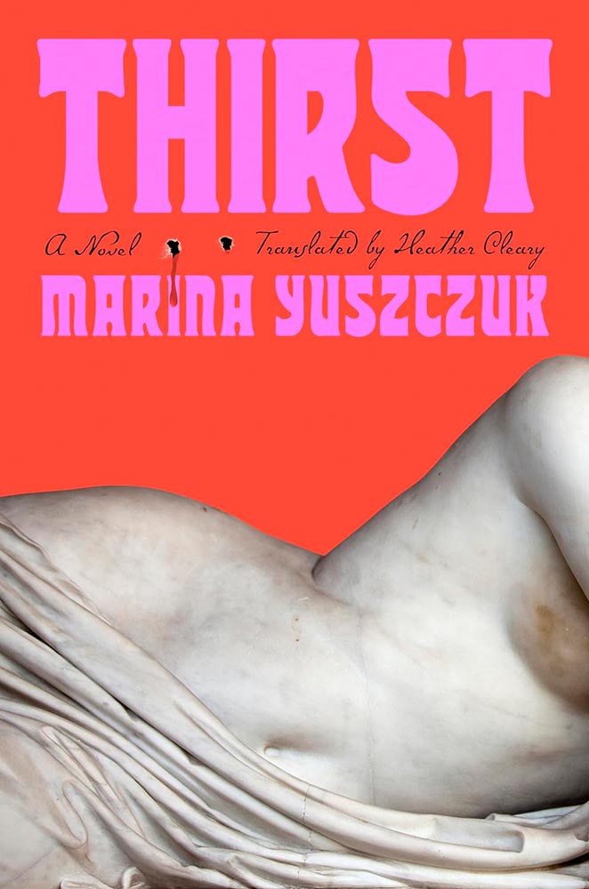
From color to art choice, this is a masterpiece. But those bite marks … aaaah!
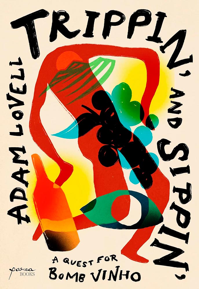
Tripping on a quest for a Bomb: yes.

Tripping on a quest for Utopia: yes.
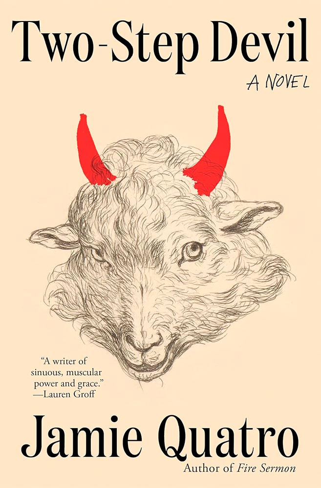
The eyes, the fur … and the horns. Transcendent.
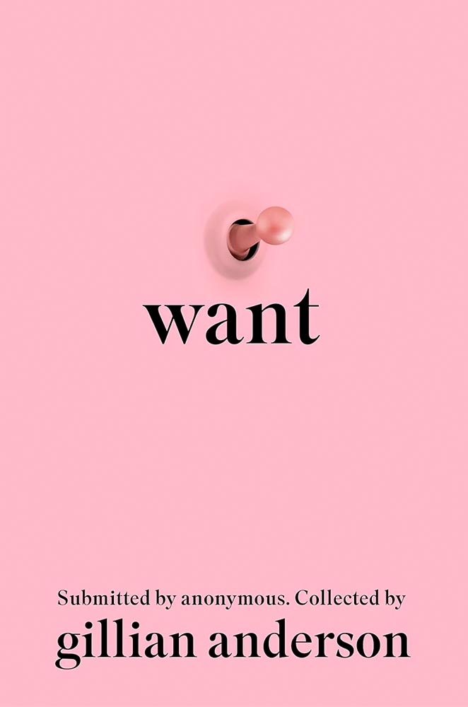
Something not to talk about … yet, so remarkably expressive.
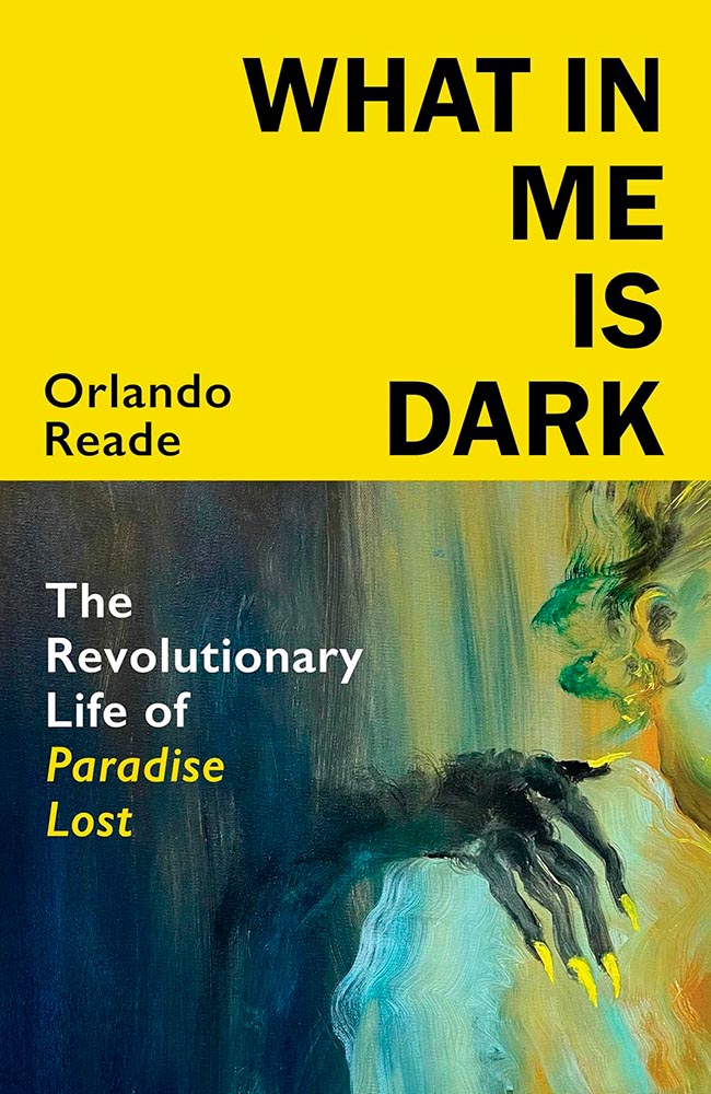
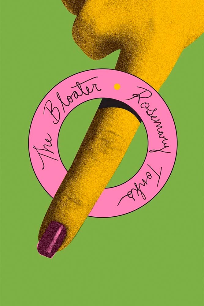
Never mind anything else: it’s the fingernails.
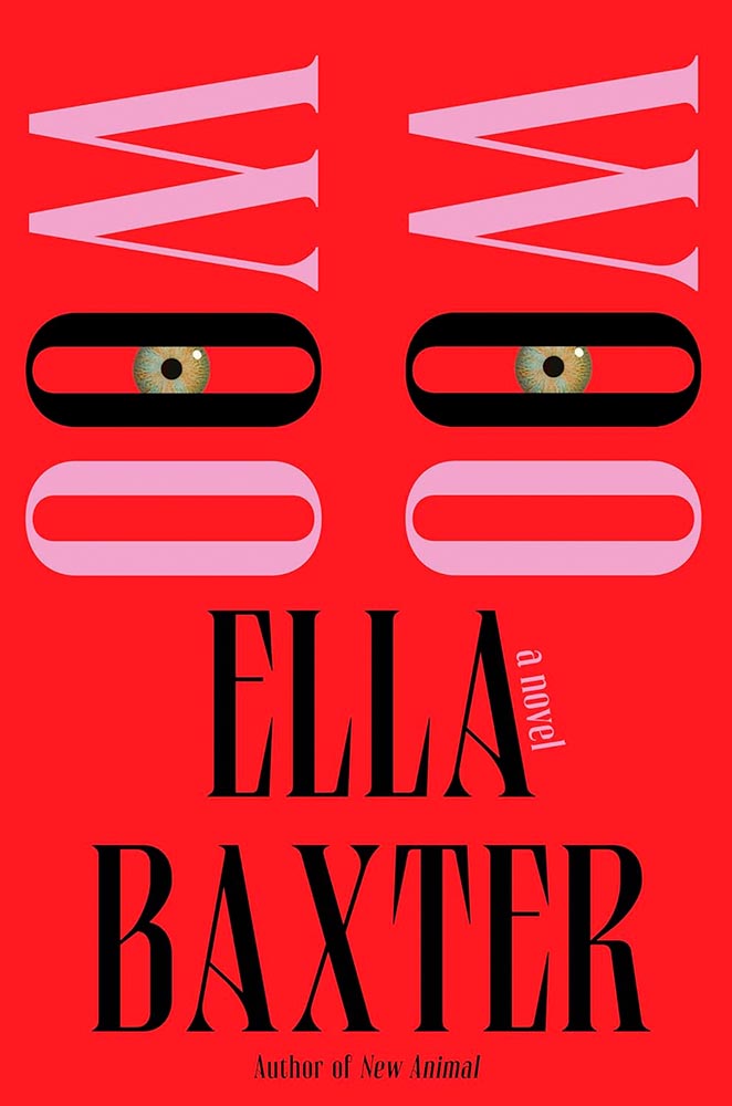
Just when you think these eyes have seen it all…. (Also, the typography.)
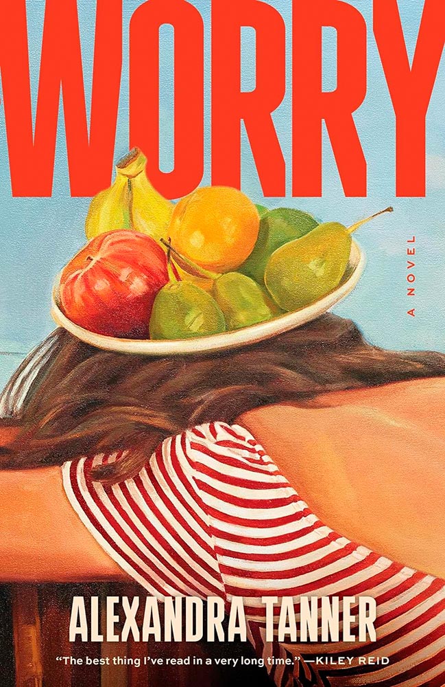
“Dryly witty” describes more than just the text within. (Also, the title treatment … and “Mormon mommy bloggers.”)
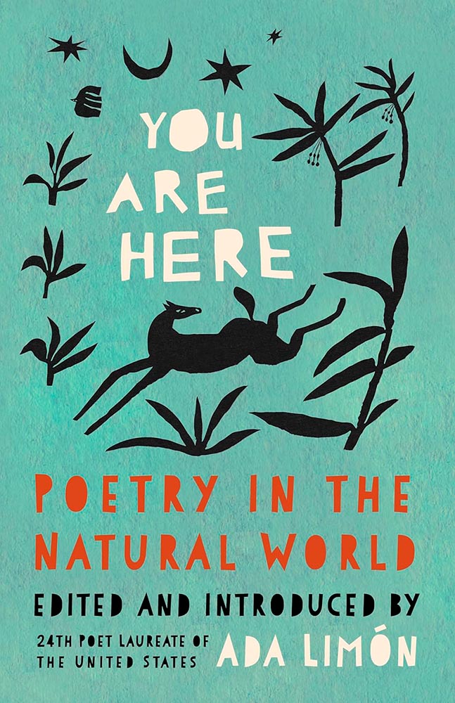
Surround yourself, feel, and bring great typography.
• • •
A moment of self-criticism, if I may: comparing this year’s list to the 2023 favorites, I can’t help but notice there’s a bit too much of the same. For myself, for my clients, and for my readers, I need to work on being too much inside a comfort zone. (Apparently hypocritically, in the 2023 summary, I commented on “sameism” being a thing.)
Meanwhile, again like last year, I’d like to highlight Dan Wagstaff’s comments over at The Casual Optimist:
A recent article on Spine argued that there is a battle between minimalism and maximalism going on. I think that could be true. Different approaches work for different audiences. But I also think it’s messier than that. I get the sense that publishers are less sure of what they want and what sells (certain genres notwithstanding).
It has been a rough year for a lot of publishers, so there is undoubtedly a lot of uncertainty, and no small amount of anxiety. I could go on about why that it is (and the publishing’s self-inflicted wounds) but, in short, what I think we’re also seeing with book covers is more meddling and less direction.
— Dan Wagstaff, The Casual Optimist
I’d read that Spine article, too, and generally agree with their argument that, “This is not just because designers have different ideas about the best way to cut through the noise, but because they are ultimately trying to appeal to two different types of readers. […] It is the designer’s job to know how to grab the attention of the specific readership that the author is trying to reach.”1I have point out: one of their minimalist examples, One Day, Everyone Will Have Always Been Against This, is a 2025 title already in the favorites folder. Stay tuned.
The buyers that minimalist and the maximalist covers appeal to don’t always overlap. But they do appear next to one another on shelves, actual or virtual. For one just perusing, it’s possible for the volume, whether minimalist or maximalist, to dissolve into noise. Dan’s right to caution.
Thankfully, the designers on this list have battled the committees bent on mediocrity and overcome with great talent, great design, and great perseverance.
My best wishes to them — indeed, all of us — in 2025. It has all the hallmarks of another interesting year.
How this list was compiled
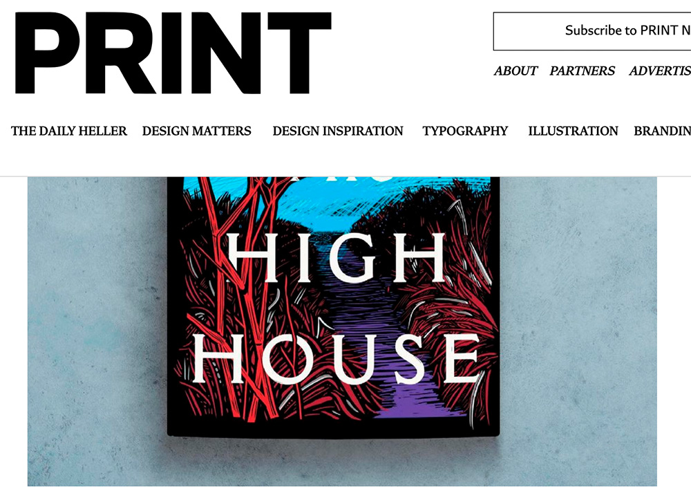
My selections stem from books I’ve seen in person; the “best of” lists from NPR, The Guardian, and the BBC (among others); and the best book cover lists from Spine, The Casual Optimist, BoingBoing, Creative Review, PRINT, and LitHub. (Shout out to LitHub’s 50 Biggest Literary Stories of 2024, too.) Please check all of those, and enjoy — a great many more outstanding examples of book cover creativity await.
- 1I have point out: one of their minimalist examples, One Day, Everyone Will Have Always Been Against This, is a 2025 title already in the favorites folder. Stay tuned.

