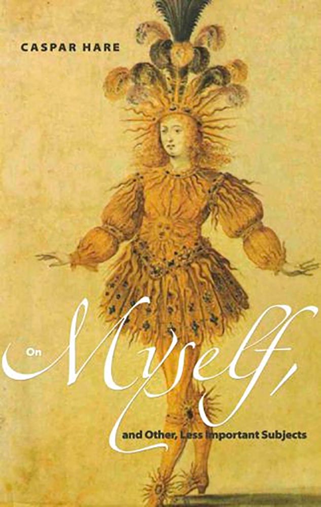
This post is late, because I had trouble narrowing my long list down . . . and then, when even the short list was too long, said, “heck, 21 is too few for a year with such superlative design.” So, instead of 21 for ’21, y’all get 50. Grab a delicious beverage, settle in, and enjoy.
My selections stem from books I’ve seen; the “best of” lists from NPR, The New Yorker, Kottke, and the BBC; and the best book cover lists from Spine, the Casual Optimist, Kottke, AIGA Eye on Design, Creative Review, LitHub, and PRINT magazine. When you’re done here, see how my list compares with theirs — a great many more outstanding covers await.
Please remember that these are my favorites — others might say “best,” but I’ve been in this business long enough to know that there’s always another great title you haven’t seen or read about, and I don’t want to disrespect any of the great book designers not on this list. I’ve tried to include design credit where I could (thank you to the folks who answered emails with that information), and I wish to stress that any mistakes (incorrect attribution, link not working, etc.) in the list below are mine.
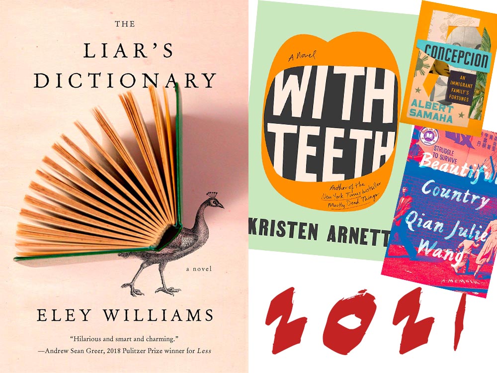
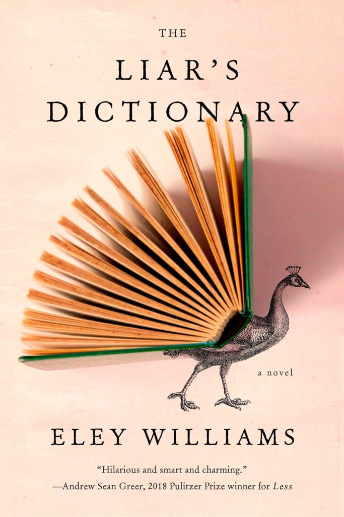
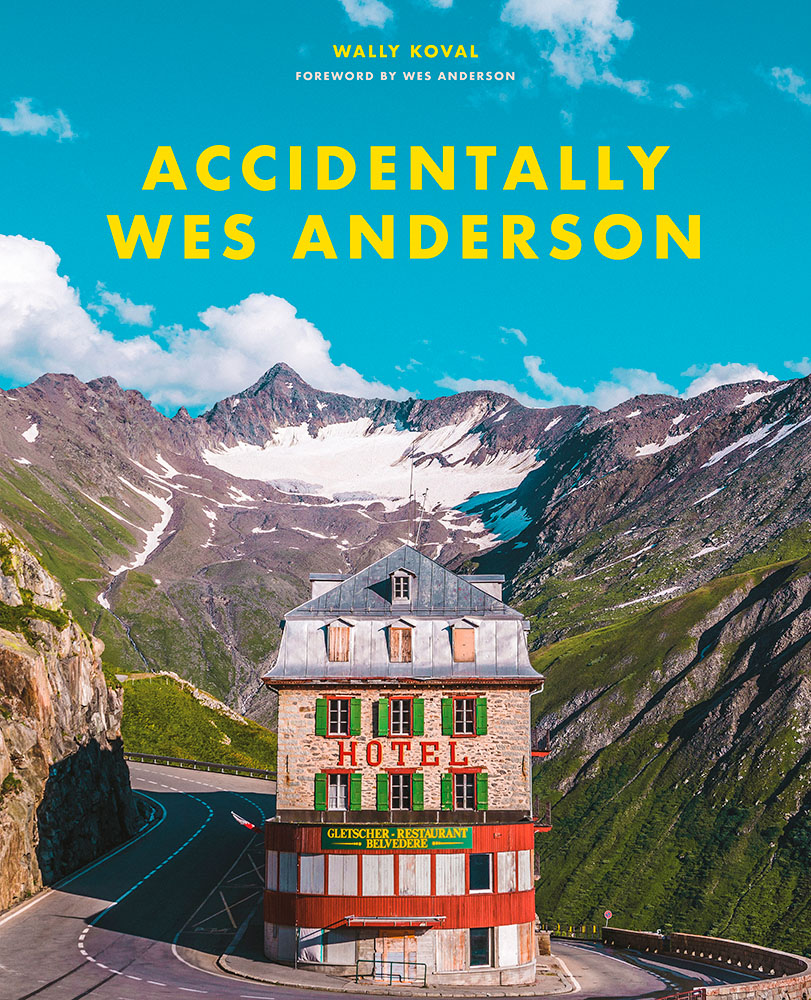
My cover of the year is one of those combinations of photography and printed word that works on multiple levels. Okay, sure, it’s called Liar’s Dictionary, so I may totally be pulling your leg here, but:
“We all peacock with our words,” one reviewer said: exactly right. I’m wondering about the direction of the shadow — some Monday morning quarterbacking, for certain — but otherwise, I’d be incredibly pleased to have this cover in my portfolio. It speaks to what I aspire to, which is the best photography and best graphics working in beautiful concert. Design by Emily Mahon. (Bonus: See a Spine write-up on Emily from 2017.)
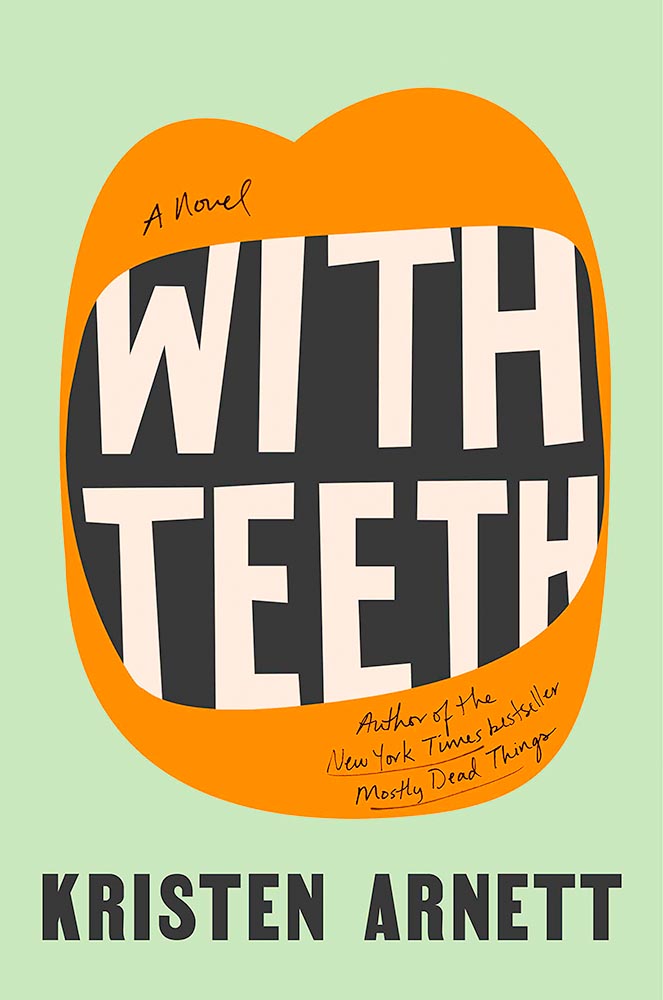
My runner-up for favorite cover of the year, this novel of a queer mother is immeasurably strengthened by this extraordinary cover. Great color, great type . . . just great. Design by Lauren Peters-Collaer.
The rest, in alphabetical order:
The ability of this cover to catch your eye on a crowded bookshelf is undeniable, but it’s the amount communicated with seeming simplicity that makes it a winner. Design by Kapo Ng.
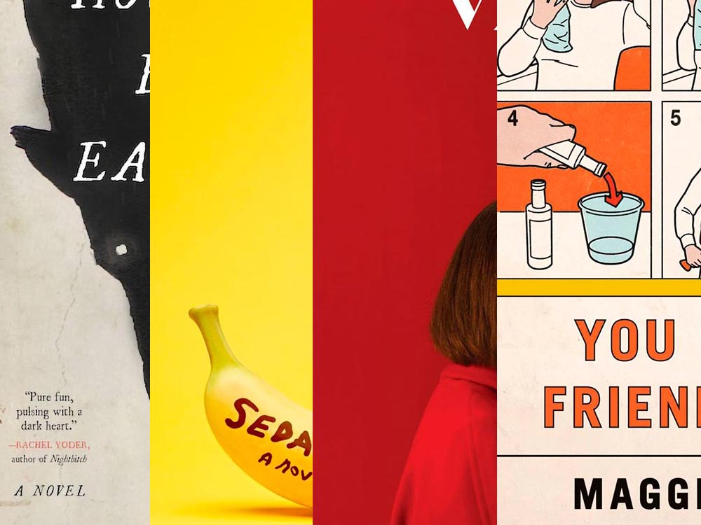
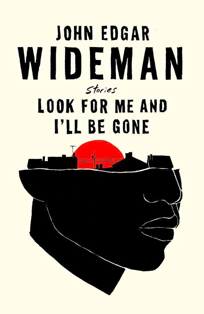
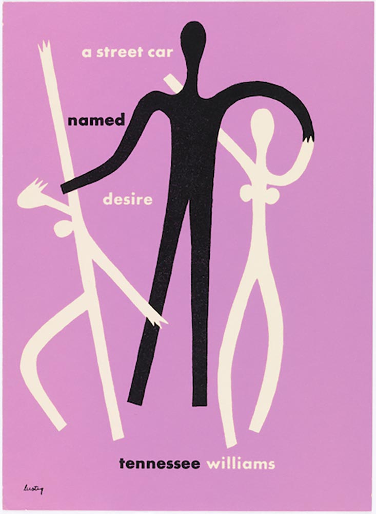
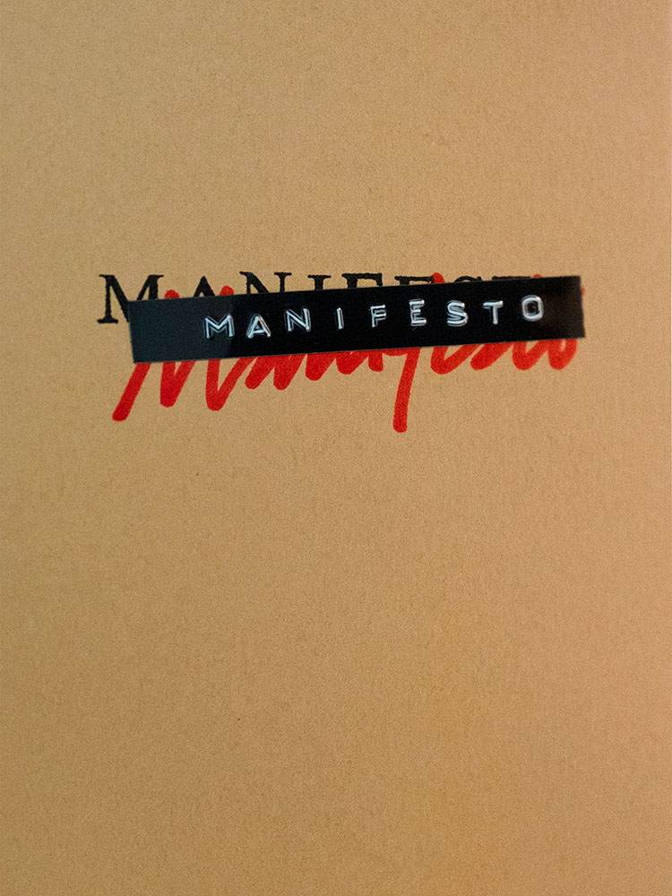
The progression of graphics here win on several levels, but the icing on this “exquisite ransom note” (thanks, Lithub) is the shadow from the silhouette in the middle. The use of so few colors is a huge bonus. Design by David Pearson. (He doesn’t seem to have a website, but here’s a It’s Nice That article.)
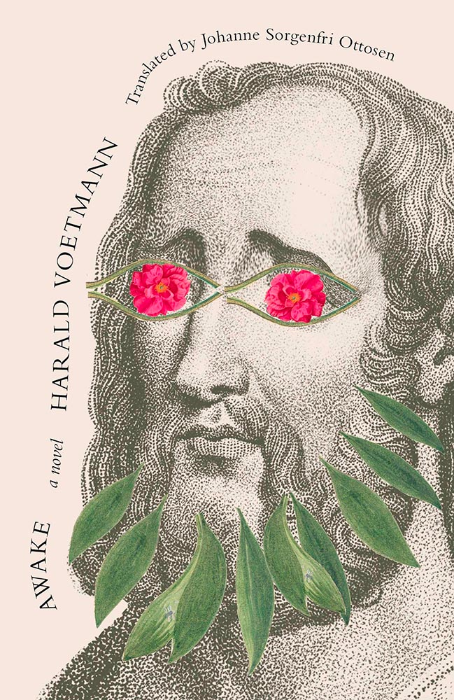
The combination of background image — the eyebrows are perfect — with the elements making up the overlays is wonderful. The wraparound text adds to the whimsy. Brilliant results. Design by Joan Wong.
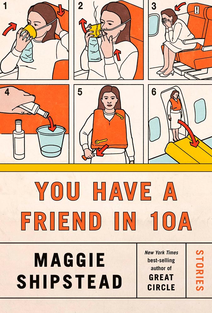
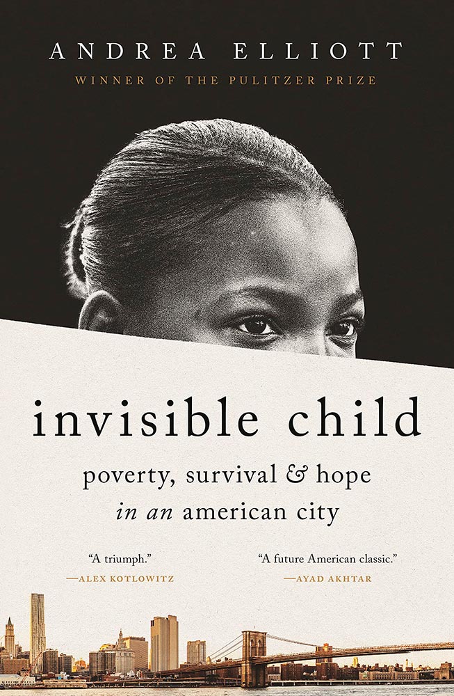
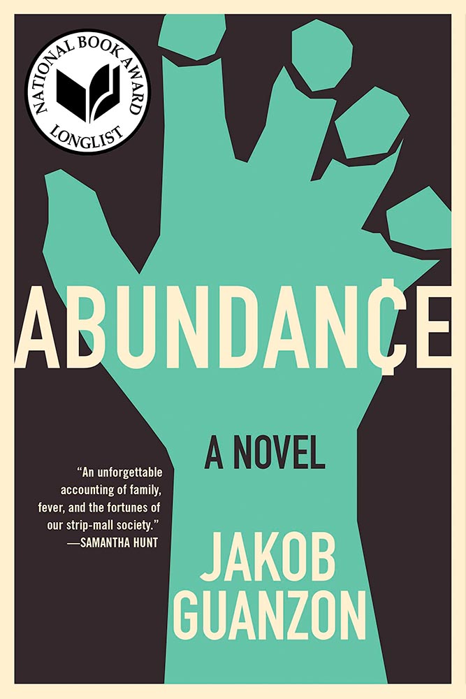
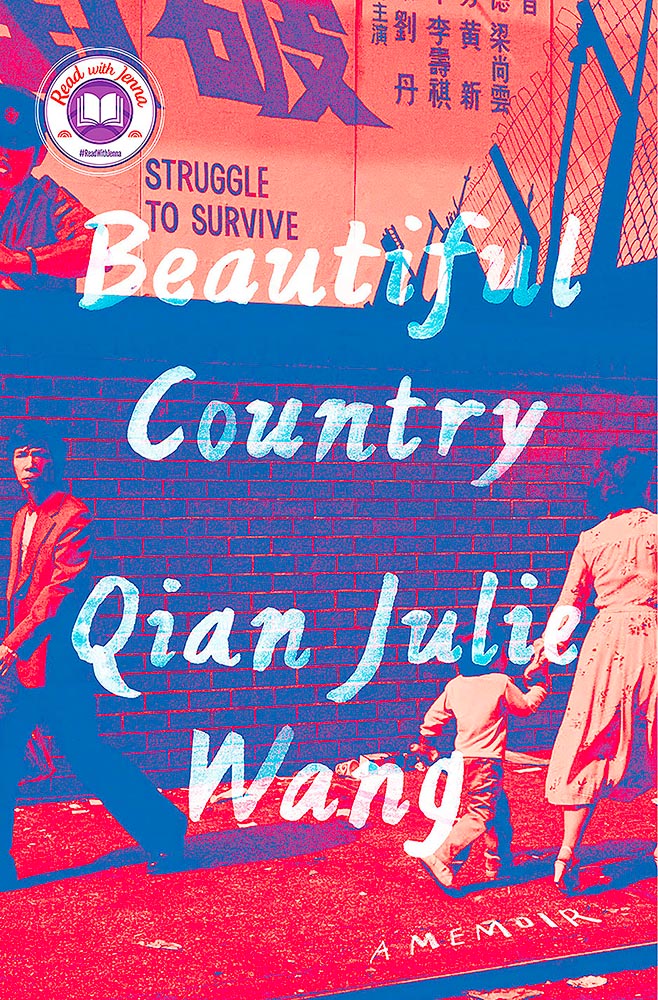
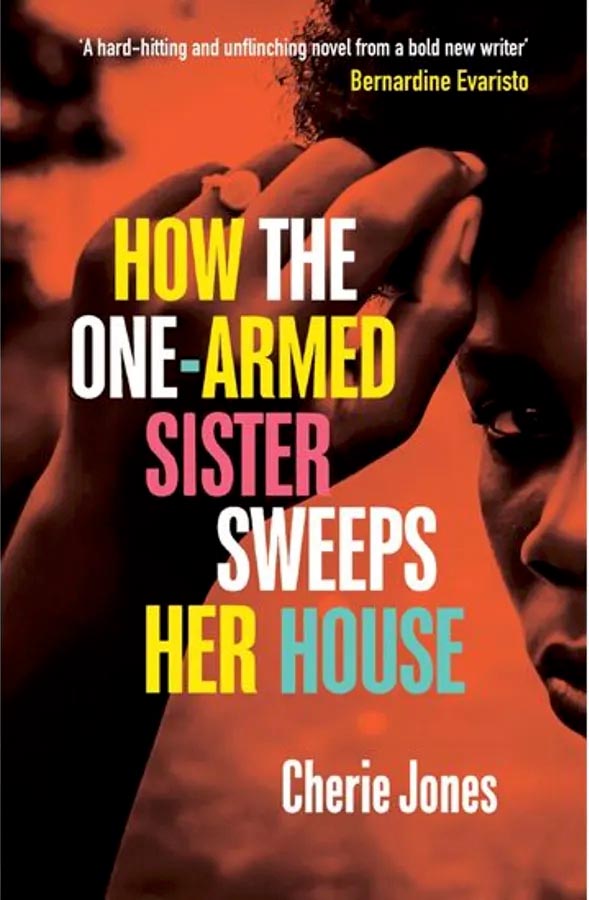
This is just great: “struggle to survive” so prominently displayed, the fence and wall, what looks like a cop in the upper left, the guy staring straight at camera in the lower left, the “hurry up” notion of the mother and child, the colors of the collage, everything. Wow. Design by Linda Huang.
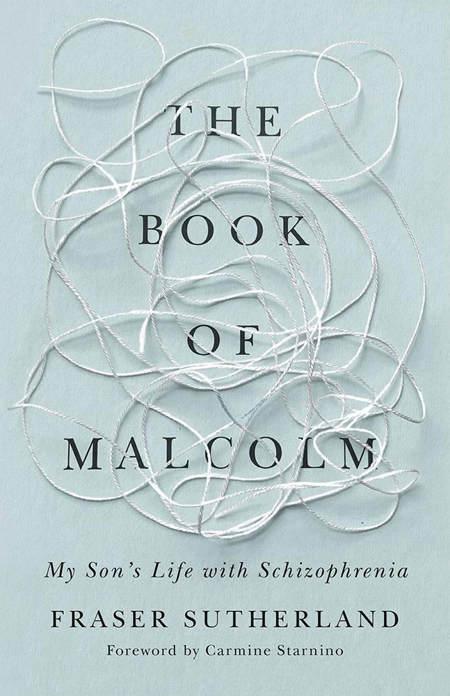
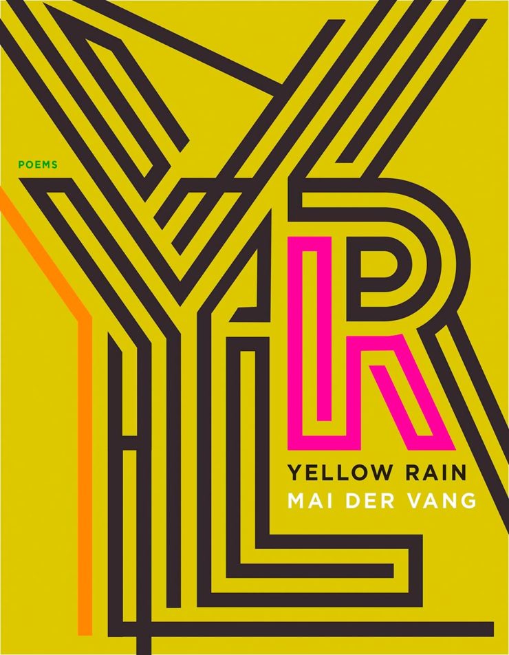
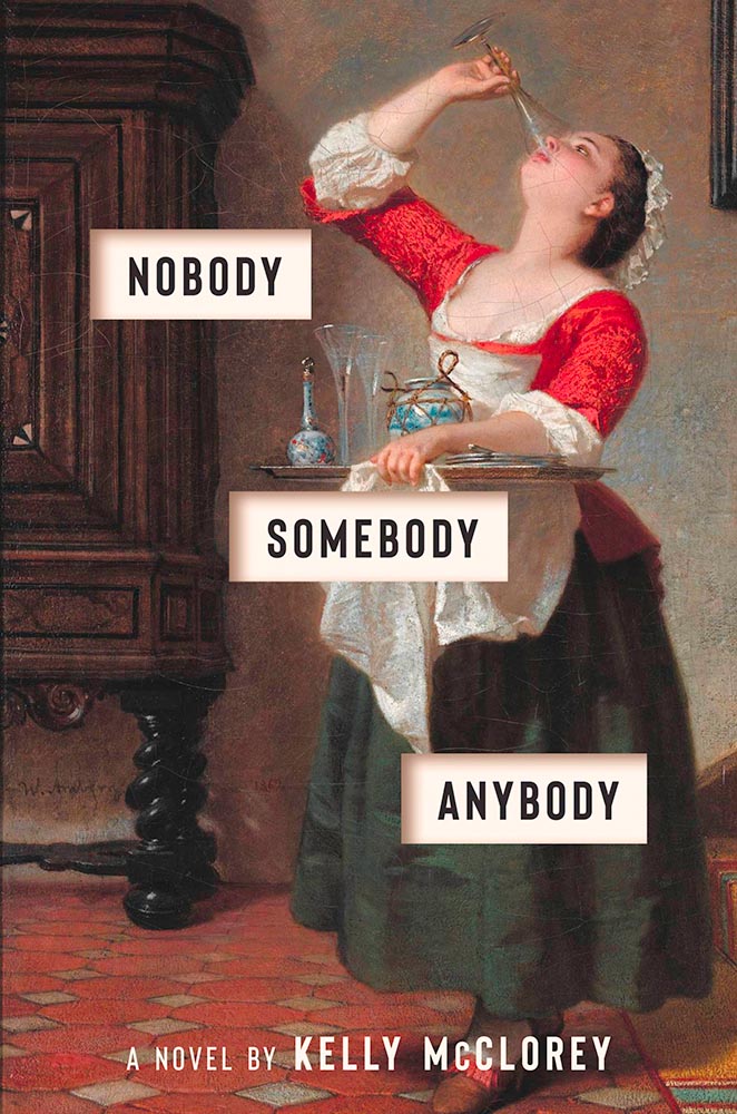
This is another from the “simple is better” category. Great colors, yes, but little details, like the type and the subtle overlay of the graphs over some of that type take it over the finish line with style.
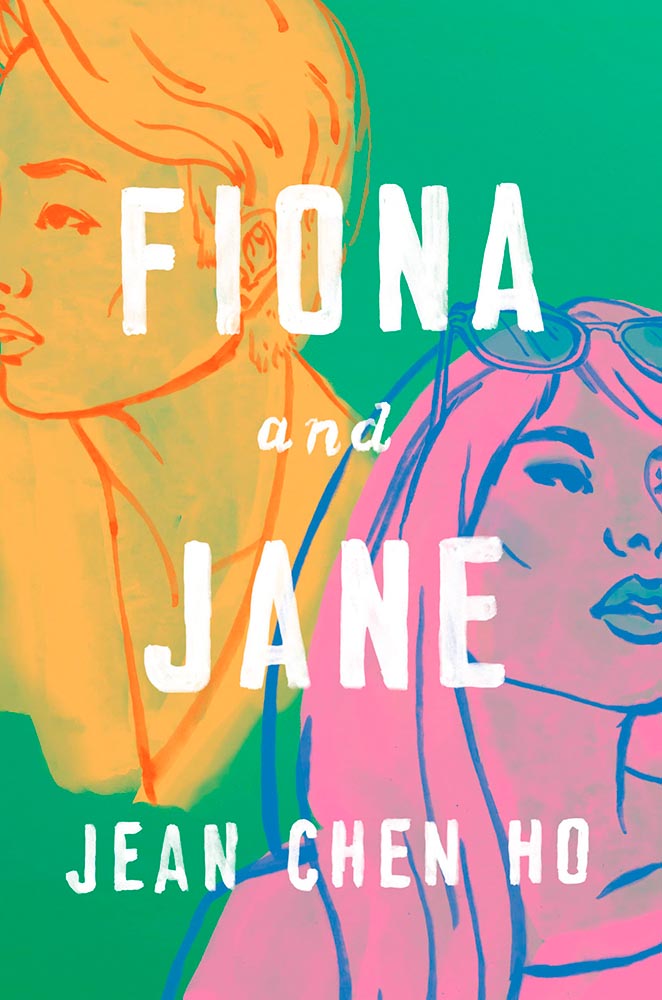
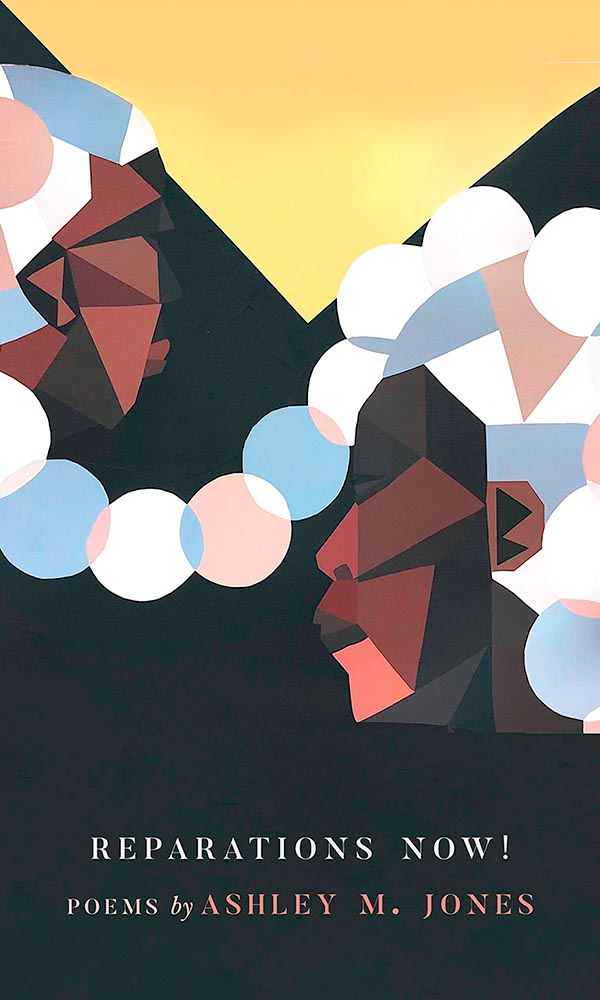
Collage and type, yellow and green, all done beautifully well. Bonus points for the hints — just hints — at faces. Design by Lauren Peters-Collaer.
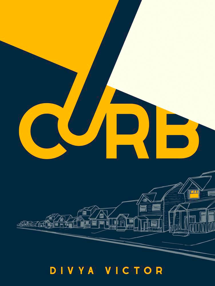
Another with simple colors, but the strengths here are not only in the eye-catching type, but the repeating line drawings with their own curb . . . and that single lit window for the win.
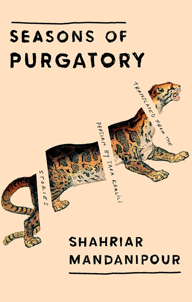
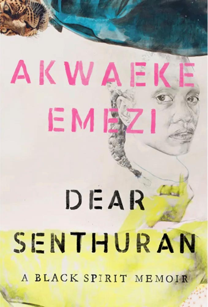
Leopard! Wonderful pencil sketch! From the simple-at-first-glance category we have anything but.
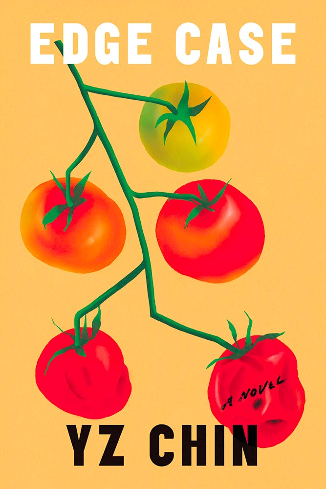
At the risk of repeating myself, this one seems simple. Until you realize that the tomatoes age . . . and spoil. (The vine’s awesome, too.) Edgy design by Na Kim. (Bonus AIGA Eye on Design article on her.)
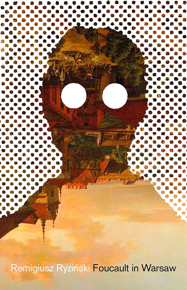
“Memorable” doesn’t begin to describe this one; the upside-down painting is only the beginning. Design by Daniel Benneworth-Gray.
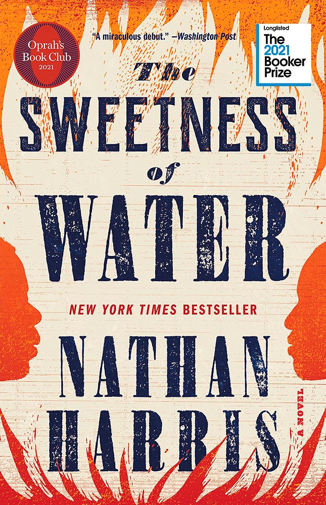
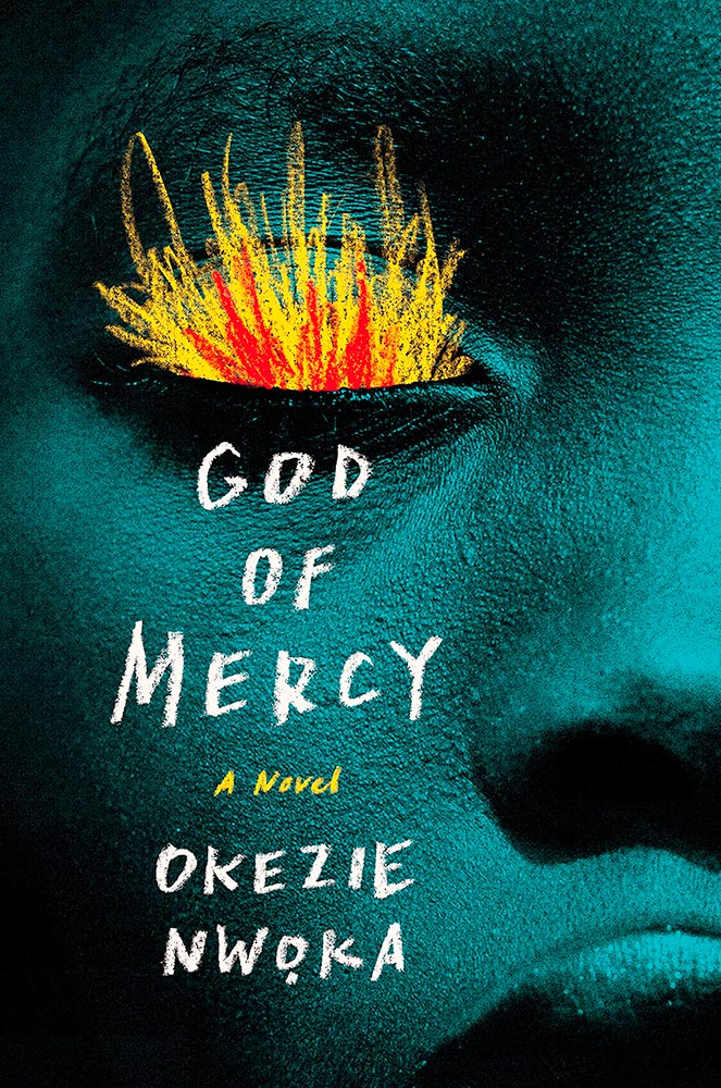
I’m going to go with chalk rather than brush to describe the type and especially flames, but either way, when combined with this extreme close-up, its perfectly-chosen duotone, and fantastic skin texture of this beautiful model, we get something close to amazing. Design by Sara Wood.
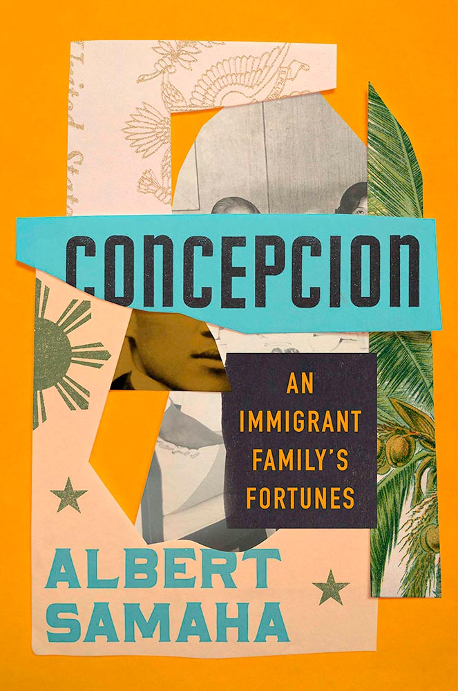
In contrast to some, this one is not simple at all: deeply detailed and strikingly colored, this cover says “all-American” in a way only an immigrant can. Design by Stephanie Ross.
Mentioned earlier this year, this title circles back because the artwork demands it. Cool white-type title, too. Design by Kelly Blair.
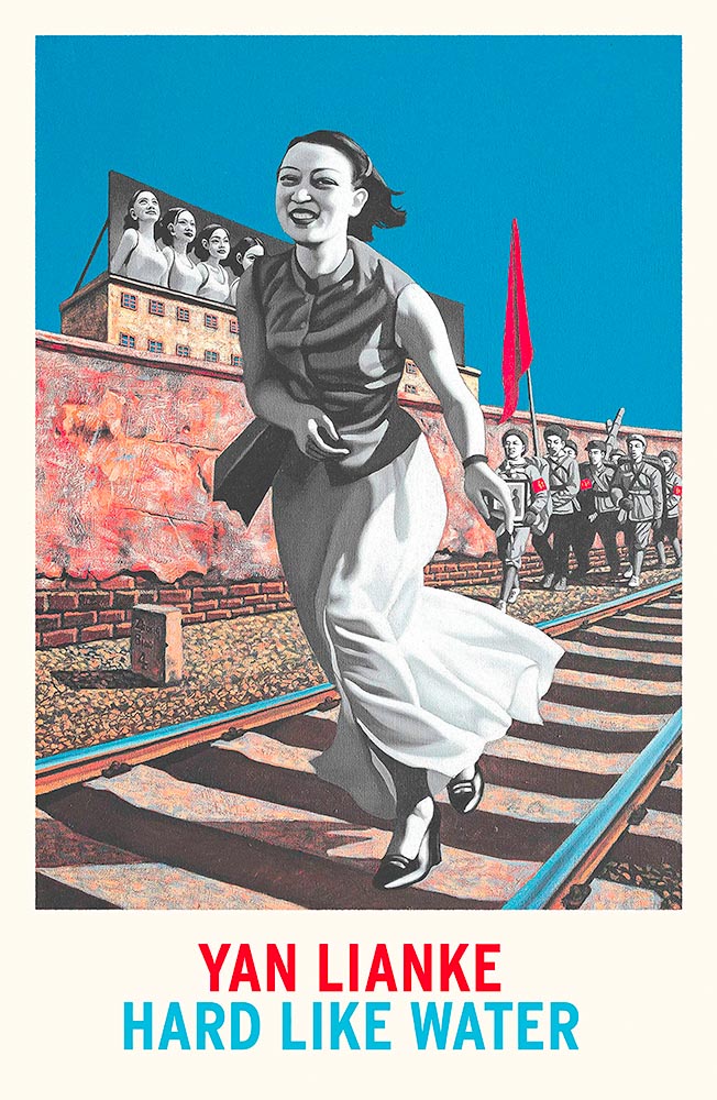
The smile — and the shoes! — speak more loudly than the revolutionary themes so typical of Maoist-era settings. The perfect parody cover. Brilliant. Cover design by Matthew Broughton, based on art by Biao Zhong.
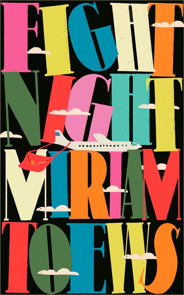
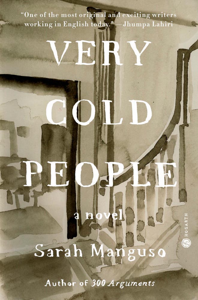
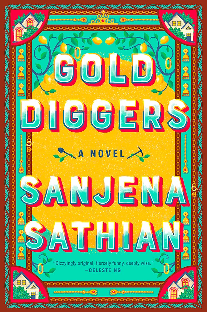
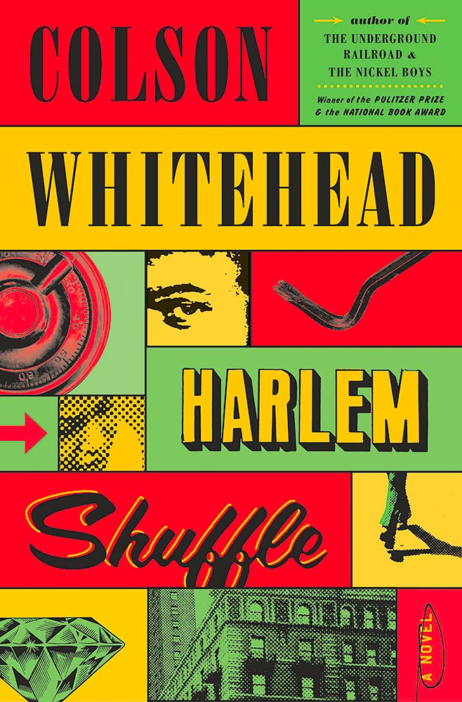
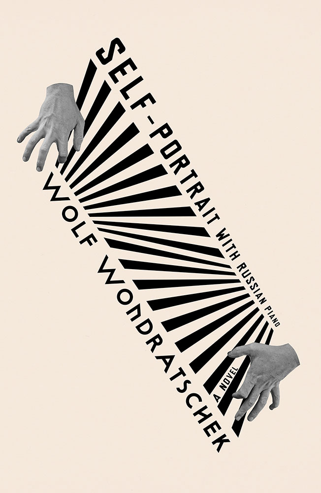
Color, type, objects, the arrow, “a novel,” circled, the people and places . . . all add up to so much more than just the sum of the parts. Awesome.
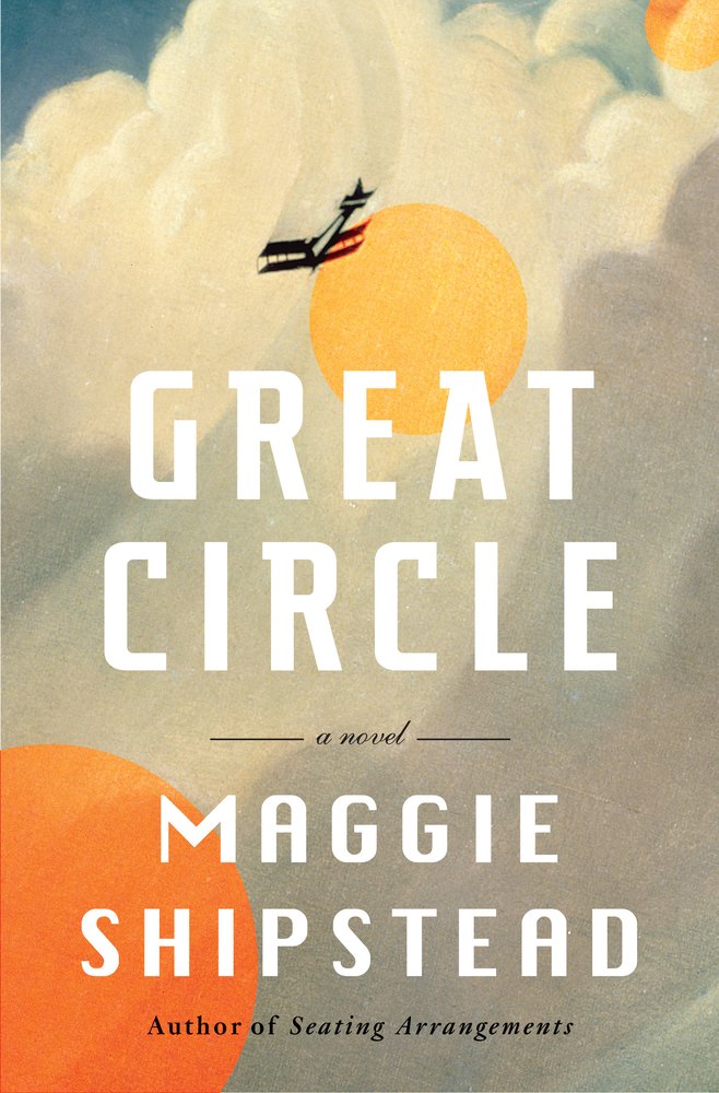
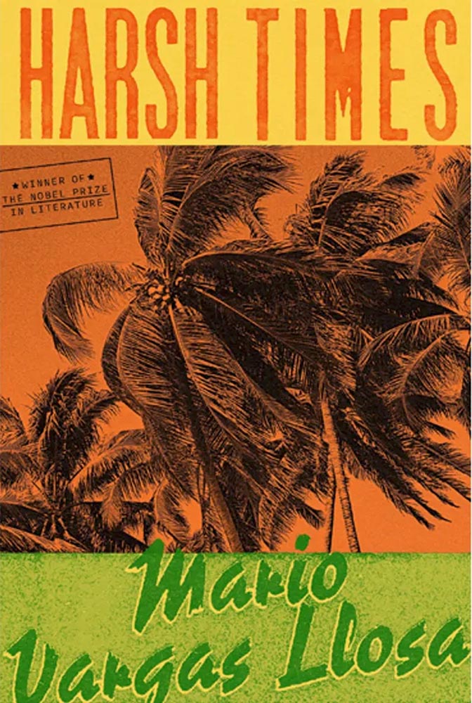
Nobel prize, blah, blah. It’s the cover, darn it! Design by Alex Merto.
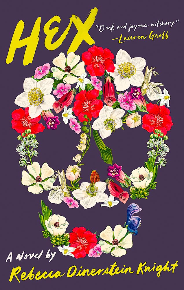
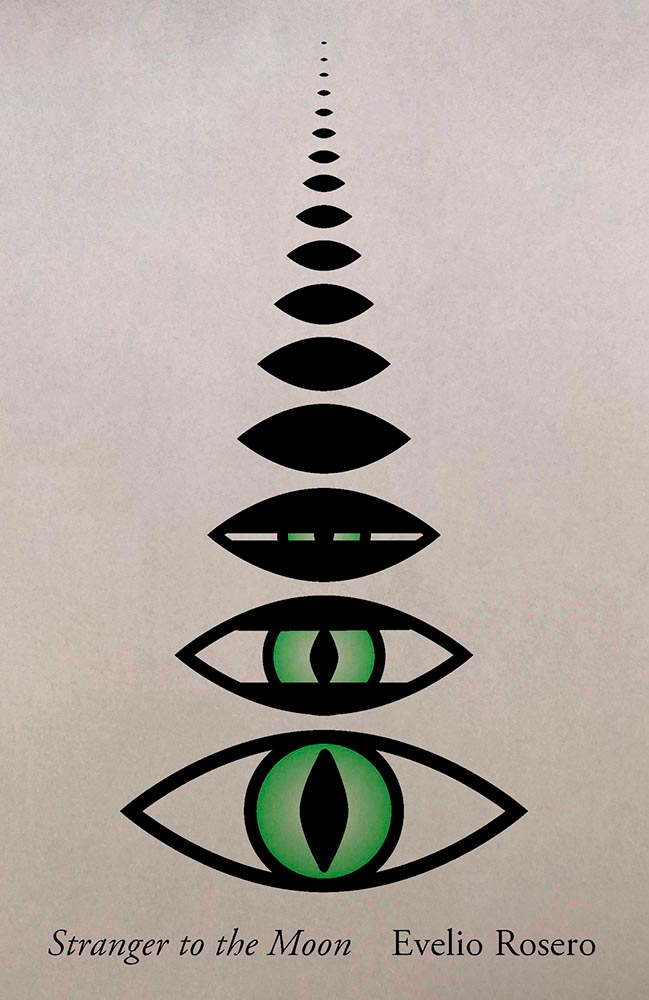
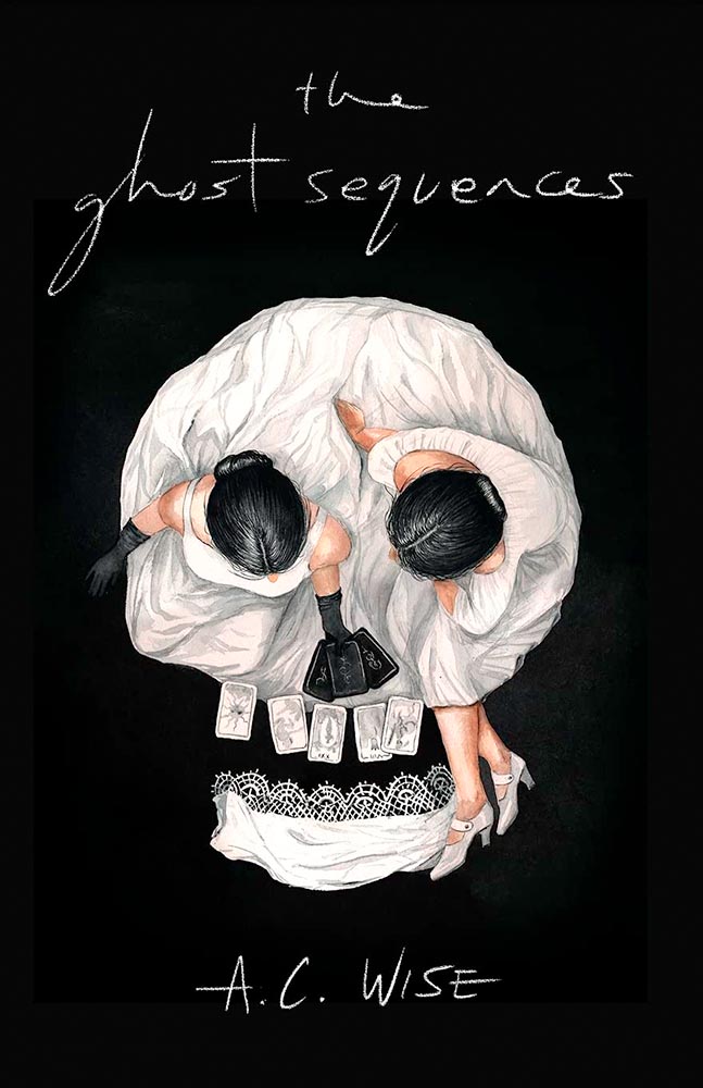
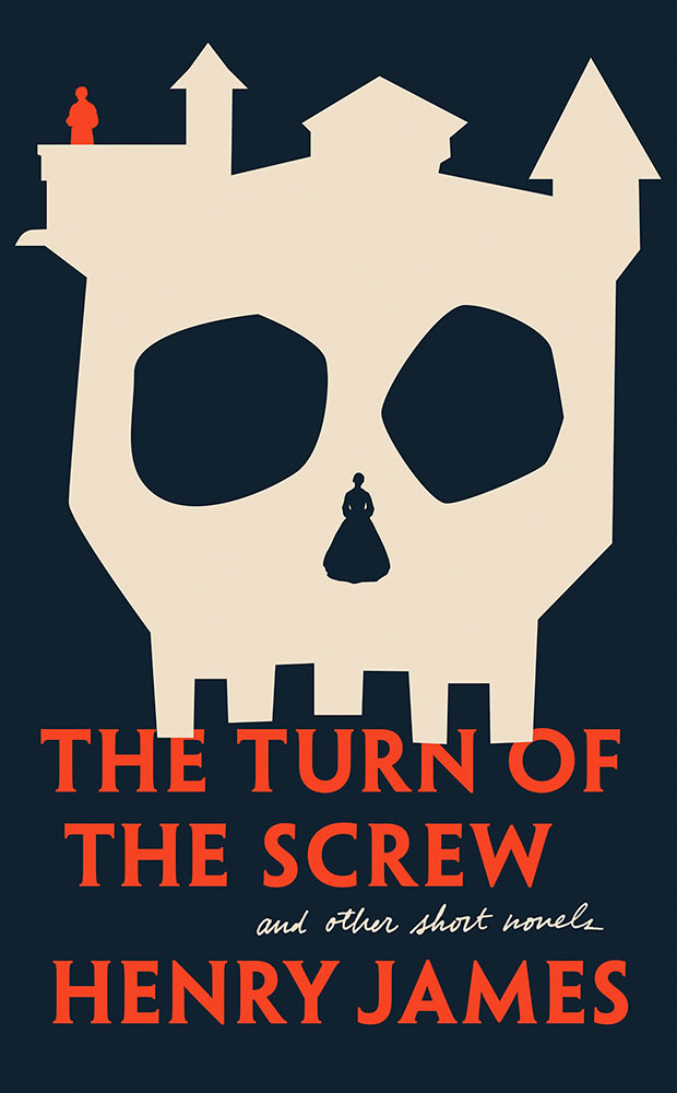
The first of two skulls on this year’s list, this one made up of perhaps the least-hexed thing imaginable.
This one’s on this list for its subtle brilliance: the watercolor lines, the great typography choice, and integration of the photograph. Nicely done.
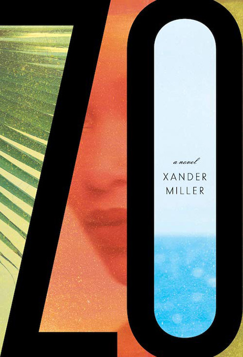
One the one hand, a simple photograph-and-title book cover. On the other, it’s beautifully cropped, the reader/viewer catches the “look,” and it’s complimented with great color choices. Long title served oh-so-well.
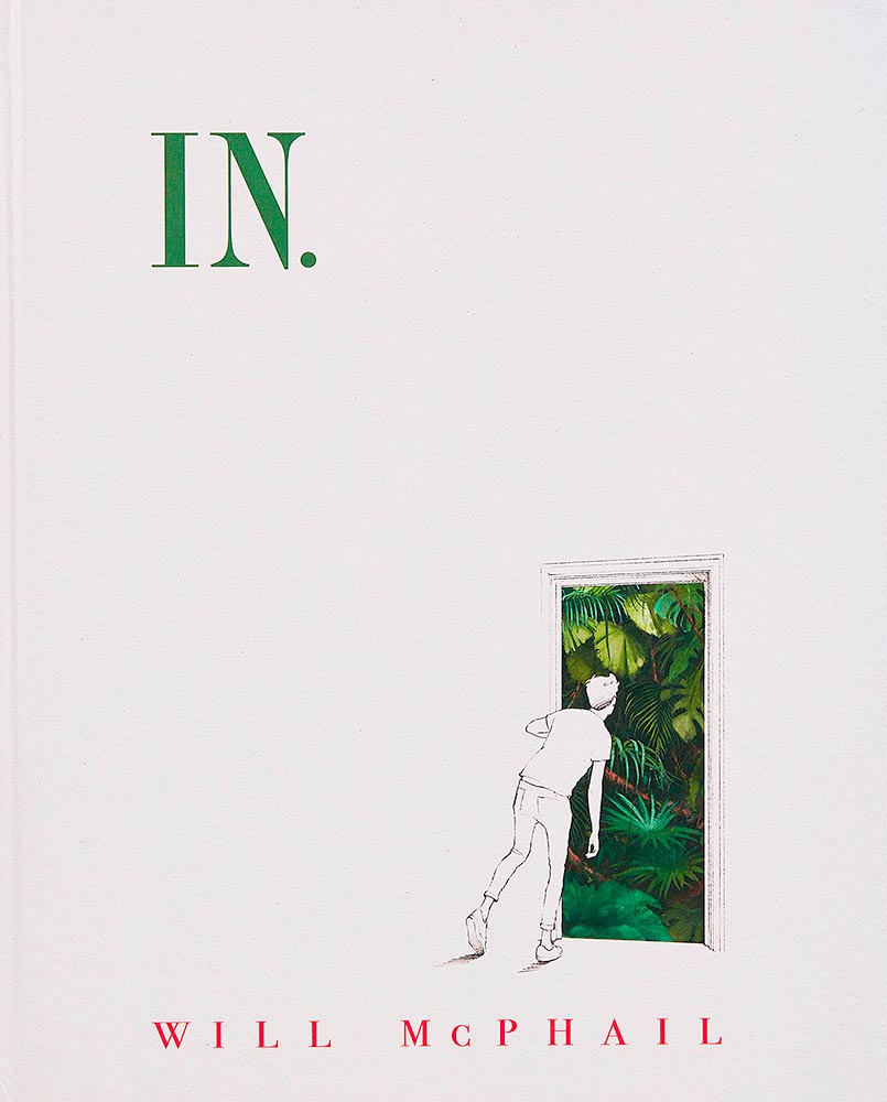
You don’t see almost-blank covers every day, and this one, especially, makes you want in. (Sorry.) Brilliant.
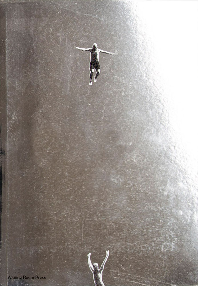
I. Want. To. Have. Taken. This. Photograph. (And then done this cover.)
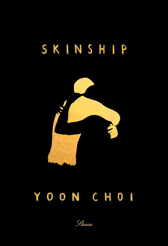
This type of cover is actually very difficult to accomplish well, and here, it’s . . . well, accomplished.
Brilliant on so many levels. Design by David Litman.
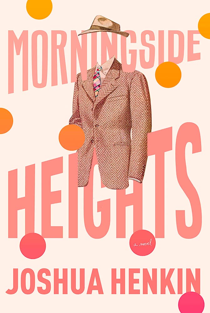
Color and type compliment the awesome choice of suit and hat here. One of those covers that demands the reader/viewer pick it up off the shelf and explore. Design by Kelly Blair.
The painterly elements here lead the reader/viewer to the correct question: “what is this about?” and, guaranteed: it’s not what you think.
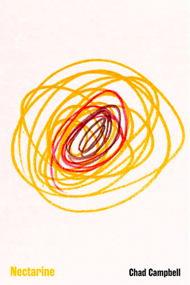
This made a bunch of best-of lists this year, and I gotta say: it’s one accomplished scribble. Brilliant. Design by Dave Drummond. (Bonus: Dave Drummond has a write-up from PRINT.)
The best riff on “upstairs, downstairs” seen in a long, long time.
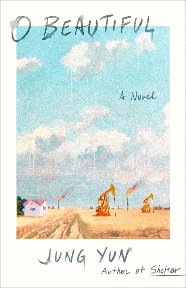
Watercolor, in every sense of the word. (Cloudy drips, too.) O-so-beautiful. Design by Young Jin Lim.
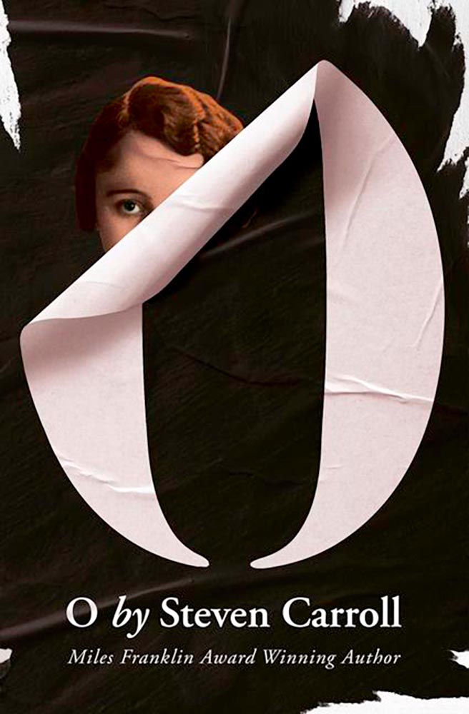
Oh — wait a minute. Stick-on that isn’t, quite, combined with peeling and what seems like staring add up to a favorite. Design by Gray318.
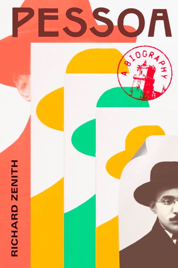
From the simple-but-not dept., we have another brilliant entry, with great color choices, type placement, and the best — some might say, “Iconic” — “a biography” stamp ever. Love that the smallest photo is peeling, too. I’m actually envious of the talent displayed here! Design by Yang Kim.
I hope it comes out in the relatively small photograph, but this is actually paper cut. Great choices, great colors.
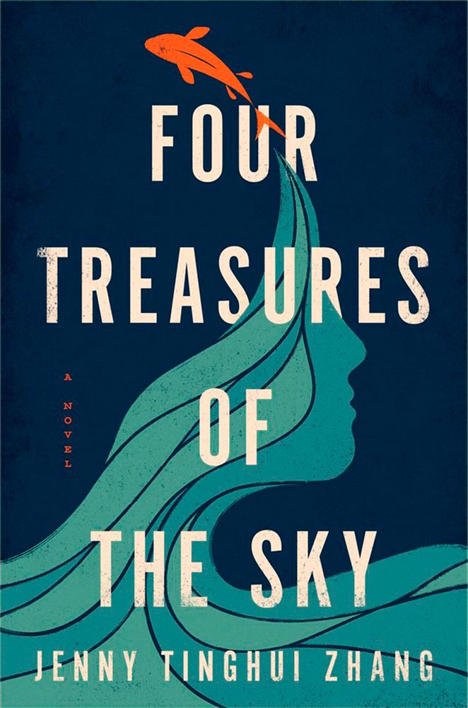
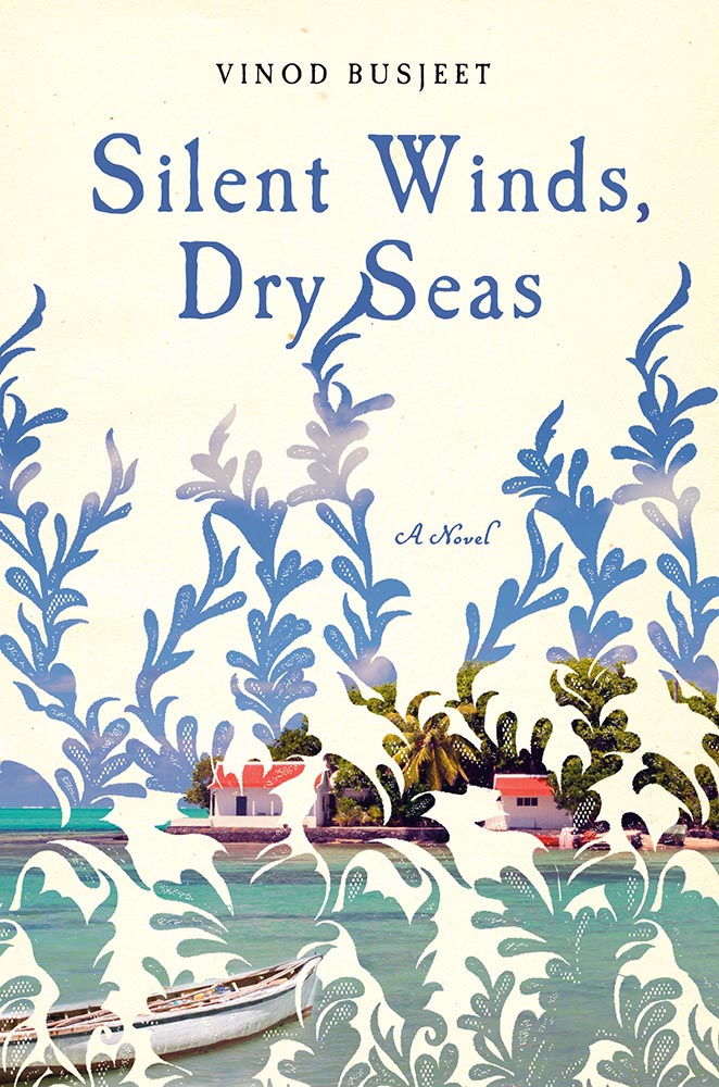
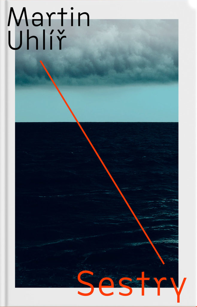
Like a dreamily lace curtain, the overlay on this painted shore brings what could be nice to the level of sublime. Having a cool title helps, too. Winner.
Wow. This cover violates so many supposed rules, yet succeeds on so many levels — absolutely brilliant. Design by Janet Hansen.
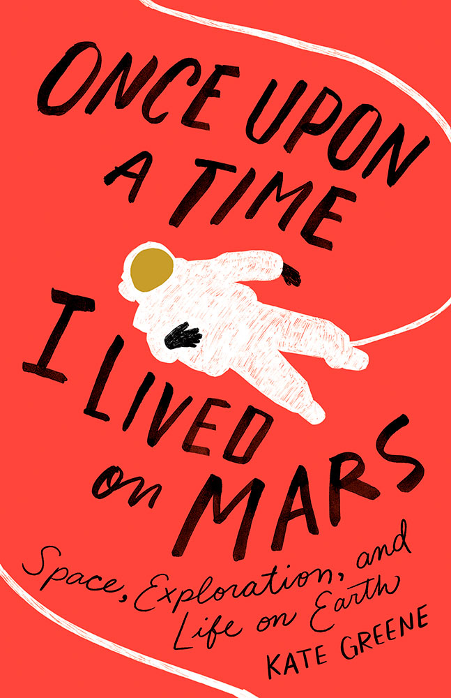
The simple-yet-not cup floweth over with this one; its scant 96 pages encompass dystopian political fiction that wins national awards and deserves something this strong. Design by Janet Hansen.
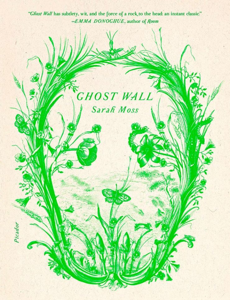
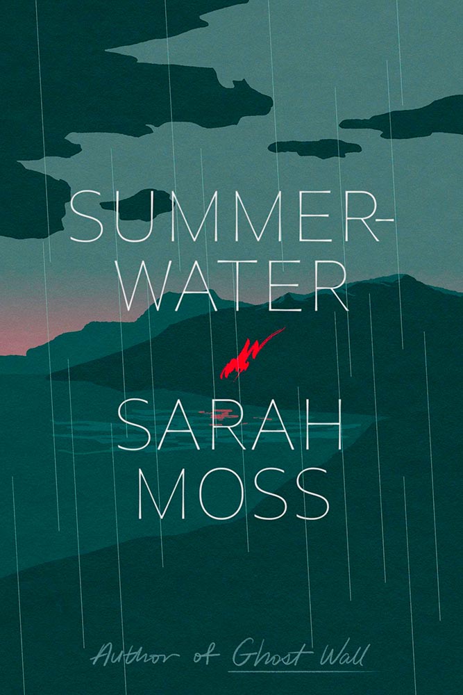
Illustration rules, in a foreboding style that suggests anything other than a Scottish summer. Lovely slim type is complimented perfectly by the script at the bottom. The title is actually Summerwater, by the way — I missed the hyphen at first — but ultimately I’m not sure it matters. Design by June Park.
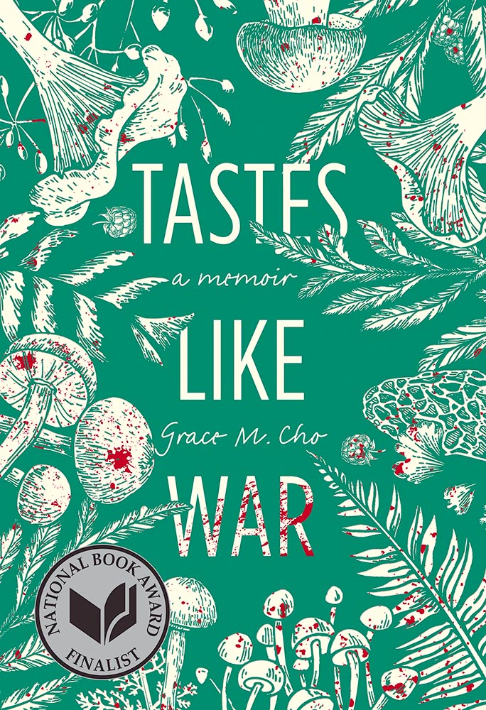
The ingredients on this cover, together with splattered red, suggest more than food, racism, and a parent’s problems, yet this is a title I’d definitely pick and and spend time examining — all thanks to great design.
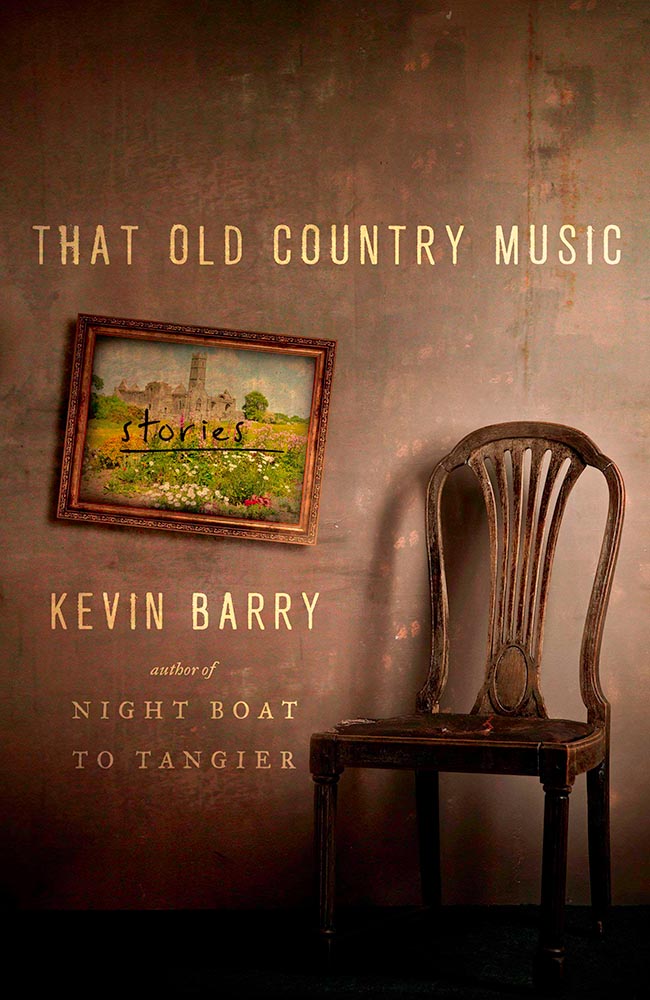
An absolutely perfect photograph highlights a stack of great choices.
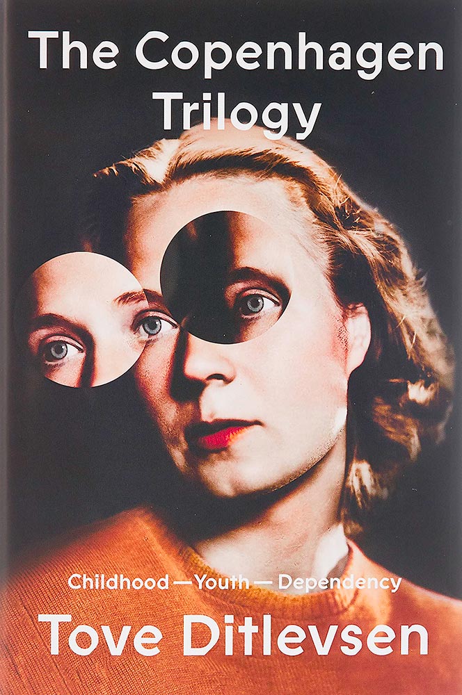
The old-time portrait it taken to the next three levels. Fantastic. Bonus points for an unusual type choice (type name, according to site name). Great, great design by Na Kim. (See also the PRINT write-up on this title.)
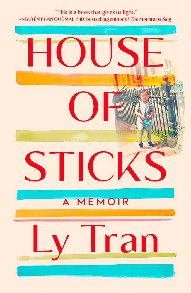
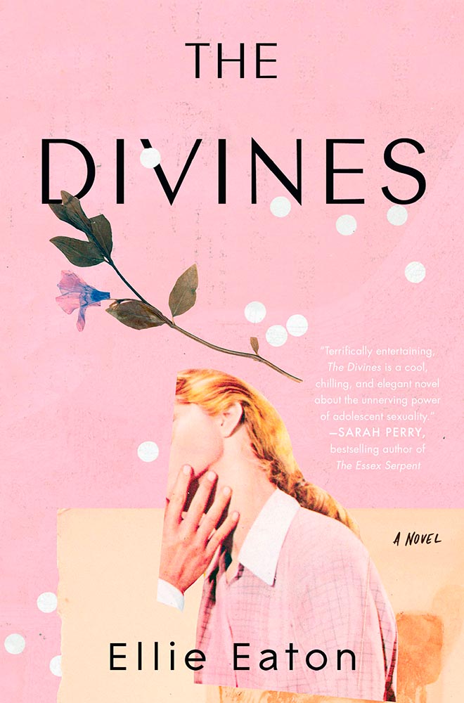
The photograph cropping alone brings this title to the table, but when combined with the aged background, the white dots perhaps suggesting a past shot through with problems, and the desiccated flower suggest something so much more. Design by Mumtaz Mustafa.
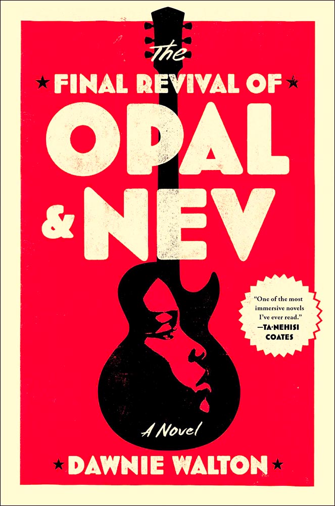
Sure, impressing Ta-Nehisi Coates and Barak Obama means impressive fiction — but it deserves a cover with star power, and this design by — absolutely delivers. Great stuff.
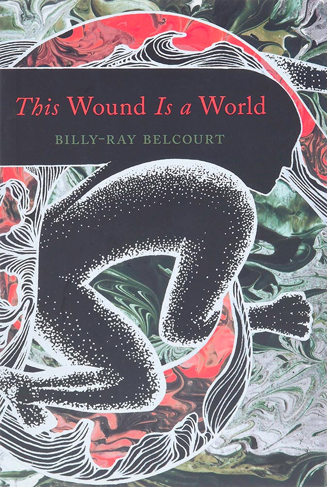
The second skull on the list, this “house built by memory in-between your skin and bones” requires a second look, then a third. Deal me in. Design by Vince Haigh.
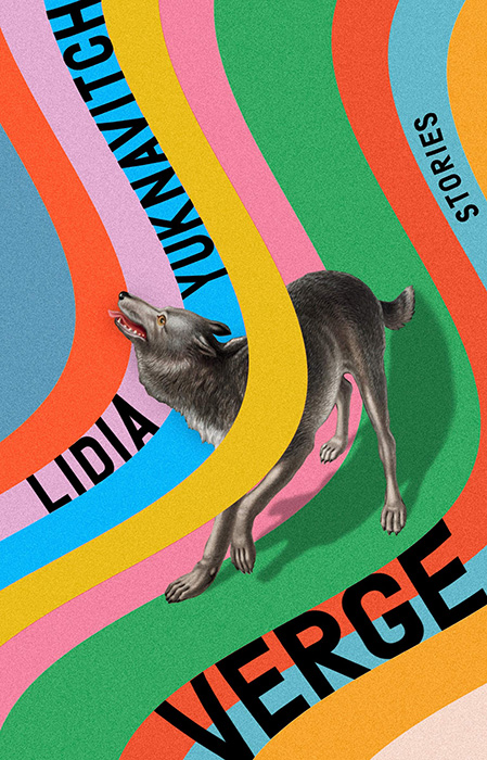
Great type complimenting great illustration choices, sure, but those feet . . . .
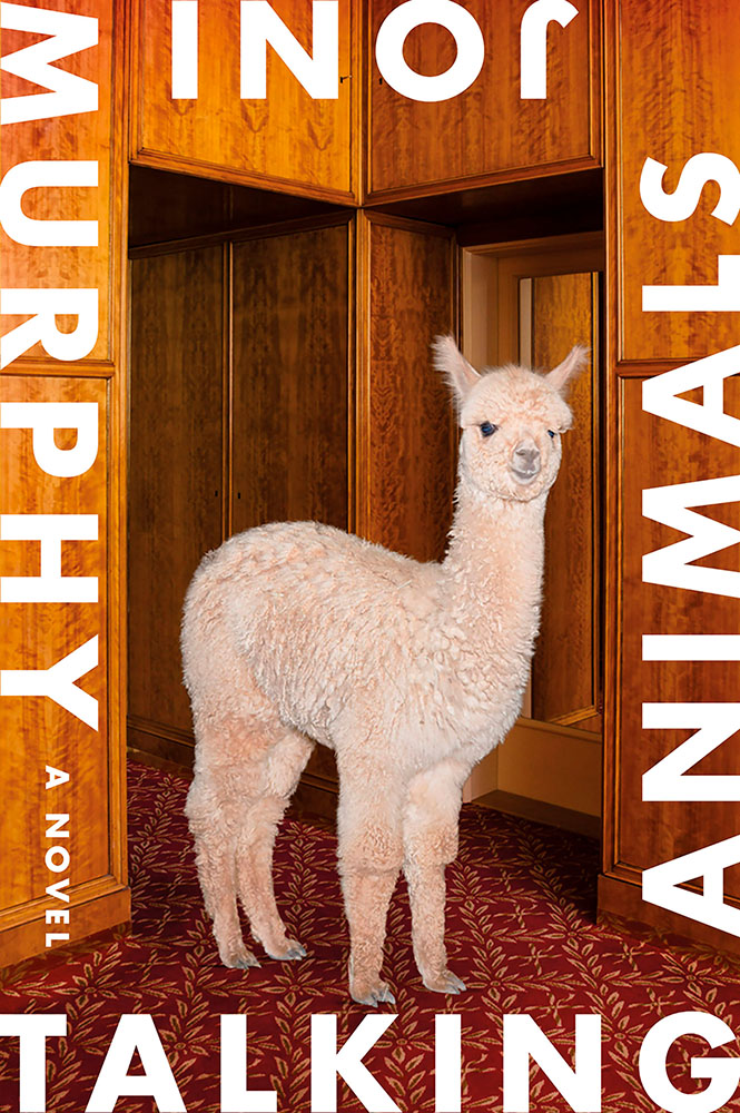
Surreal smart speaker — no kidding. How does one design a cover for that, exactly? This way. Design by Sara Wood.
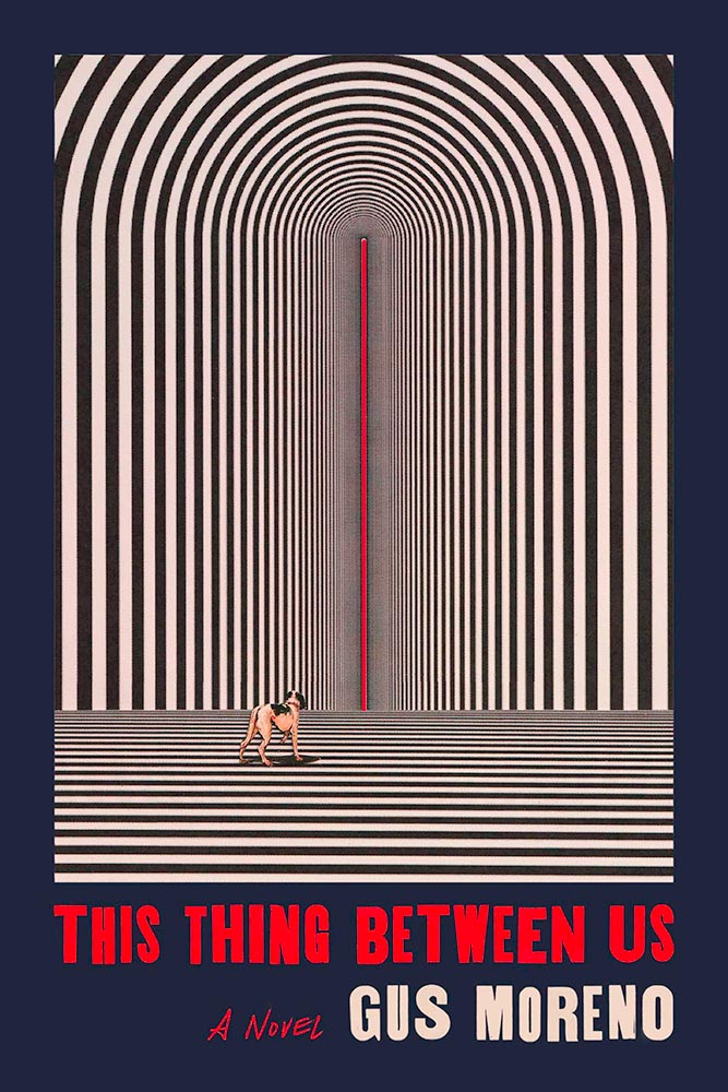
“[C]ut a hole in the sky / to world inside,” this volume of Native American poetry suggests. The cover does just that.
“Another few cuts of paper,” he said with such casualness. Ha! Design by Tom Etherington.
“Beautifully rendered and bracingly honest,” one of the reviews says. The cover, as well. (Plus, lines.)
The color choices here, combined with the illustration, suggest something soothing, yet catch the eye in a way that demands attention. The mystery within does, too, from practically the first sentence. Here because I know I wouldn’t have done it so well.
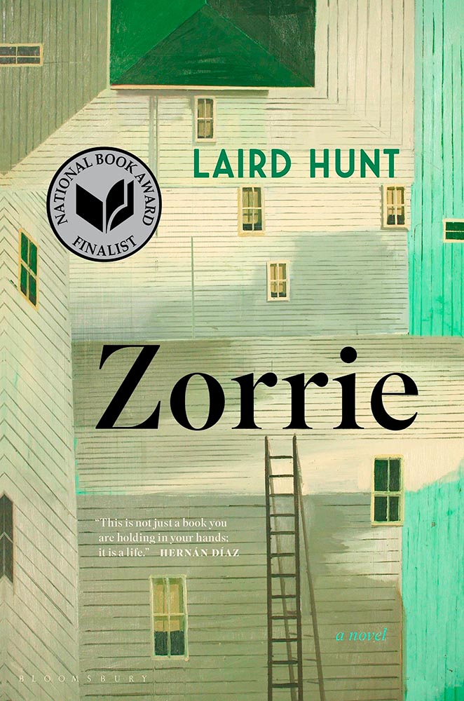
Climbing that ladder’s going to take a minute. But then, that’s what it’s all about . . . .
On to 2022, everyone! Thanks for surviving 2020, 2021, and continuing to read — here, and behind your favorite book cover.