
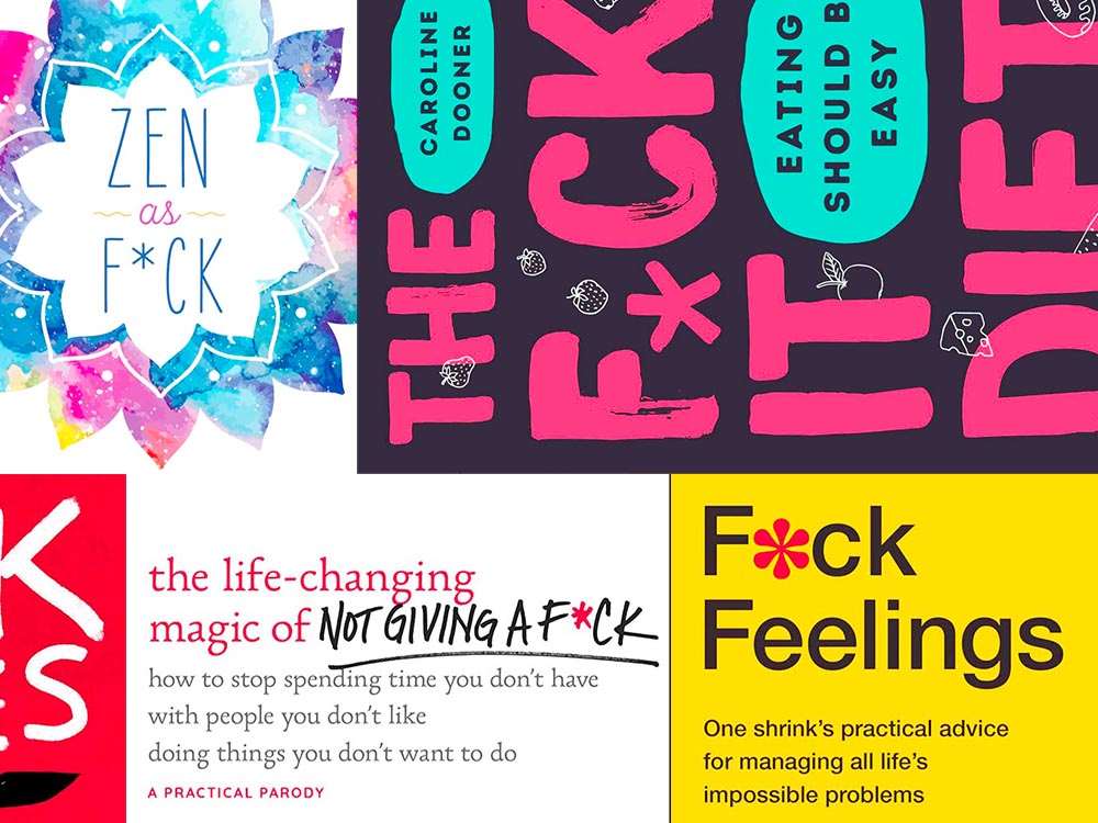
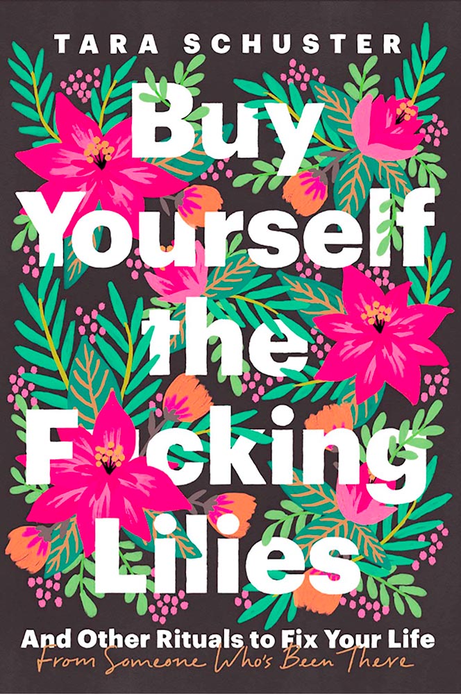
Kottke recently revisited a theme that’s been running for a few years now: titles with a swear — f*ck, in this case — in the title. According to Slate, the practice stems from the 2011 parenting title Go the F*ck to Sleep, and has accelerated over the years.
I’m more interested in the design of such a title. Bookstores, advertisers, and publicists demand that the swear never be completely spelled out, but that doesn’t restrict great design ideas. Here are a few of my favorites:
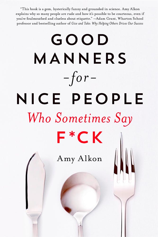
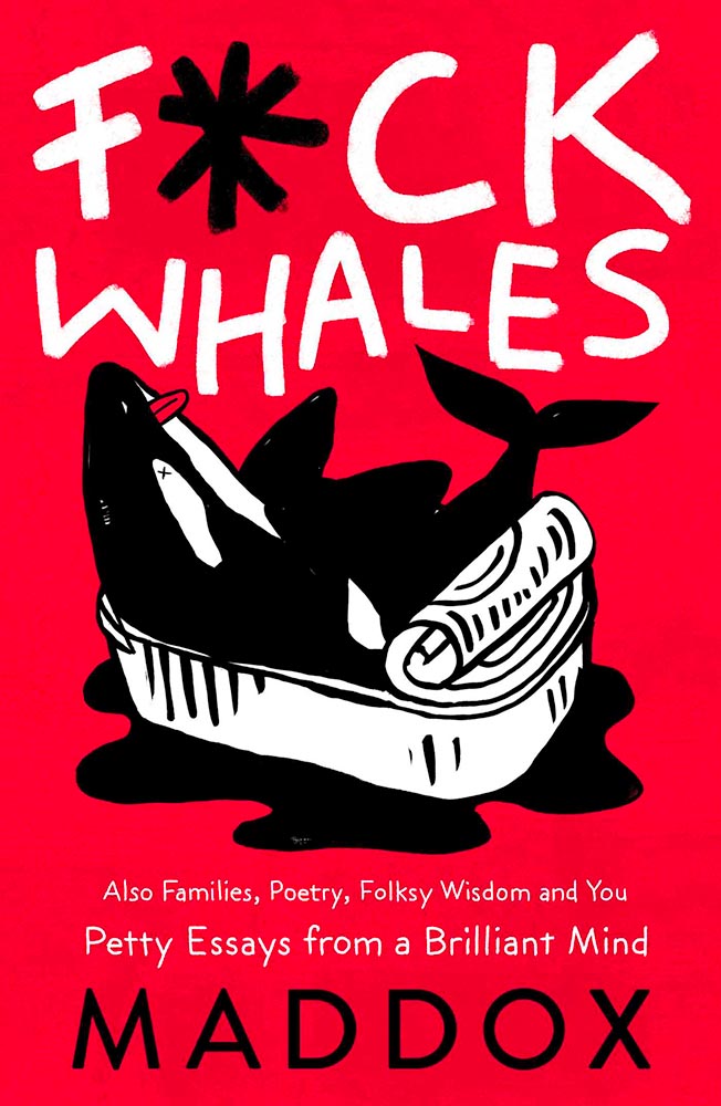
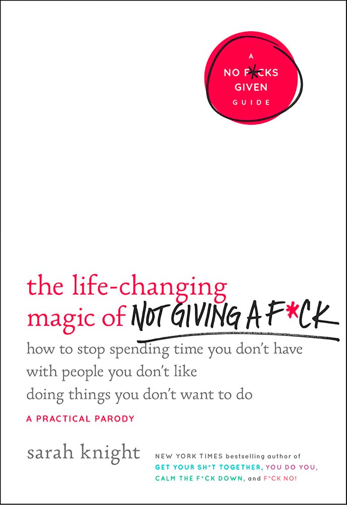
Note the over-arching theme: no, not that — the lack of photography. The vast majority of these titles are text based, supposedly because something competing with the swear would detract from the shock value. There’s a primary color thing going, too, probably for the same reason.
Most of the time:
Something different for your day!