Beautifully Briefed, Mid-September 2022 [Updated]: Indigenous Type, Italic Type, Adobe Types “Stop,” and Two Awesome New Cameras

A wide selection of items for the beginning of fall, from positive fonts to jolly cameras — with Adobe and Pantone pouring some cold water on things. Let’s get to it!

Indigenous Letterforms

As Americans, Europeans, or, more generally, Westerners, we take for granted that fonts will reflect the various pieces of individual type — that is, letterforms — that we’ll need. But not everyone falls into that category.
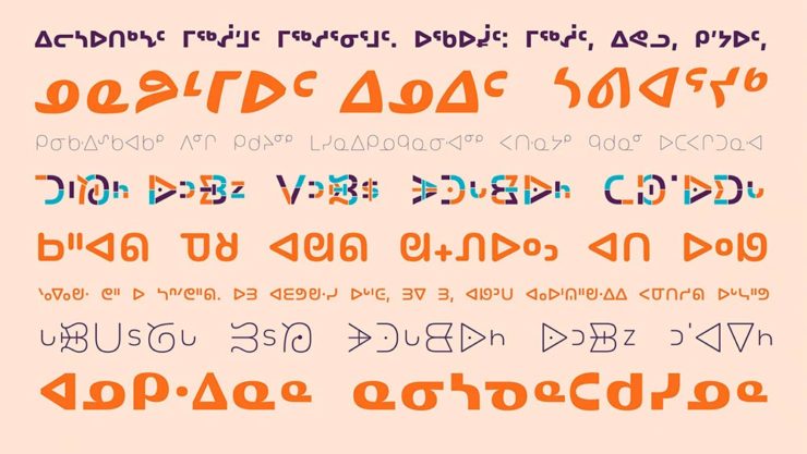
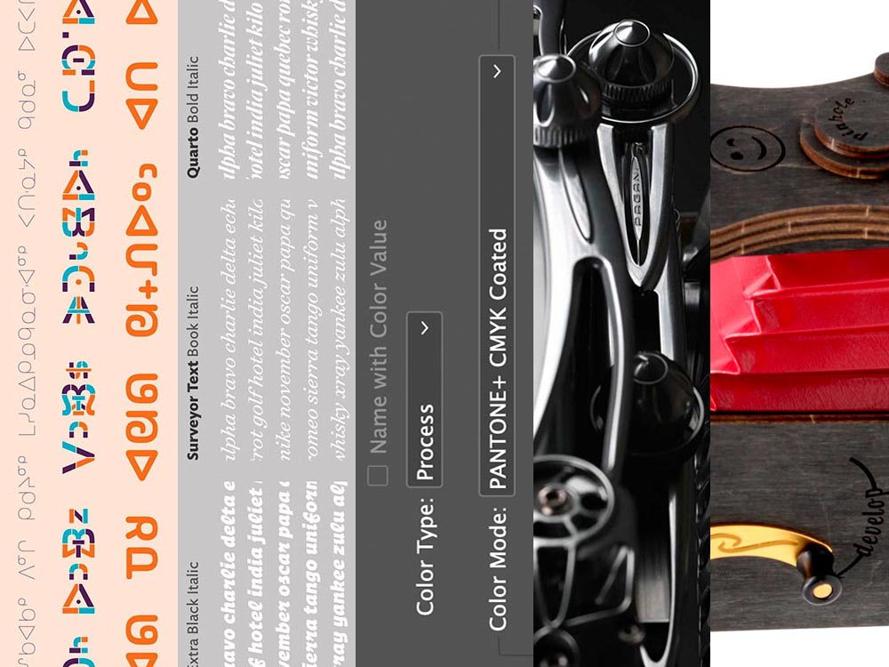
North American Indigenous fonts — with updated Unicode. Major Kudos. (Courtesy of Dezeen.)

Dezeen points us to an especially interesting effort: “Typotheque typography project aims to protect Indigenous languages from “digital extinction.” In this case, folks who were in the Americas long before Westerners arrived used languages often not written down, or that use letterforms that simply aren’t supported in modern typographic systems.

“When [the Unicode Standard] doesn’t contain characters in a given language’s orthography, it is not possible for that community to accurately use their language on digital text platforms.”

Typotheque typeface designer Kevin King 

Fascinating. Read more at Dezeen.

Italic Letterforms

The always-great Hoefler & Co. spends a minute educating us about italics:

Hoefler examines italics: point-and-sketch
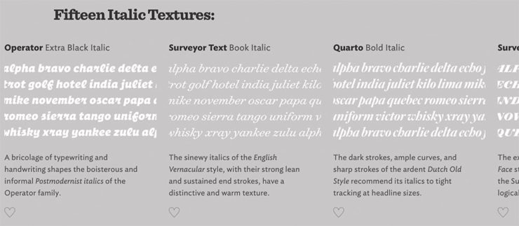
Hoefler’s Fifteen Italic Textures illustration

Italics can be the most colorful part of a type family, diverging dramatically from their roman cousins. Here’s a look at twelve kinds of italic typeface, with some notes on their cultural contexts, historical backgrounds, and practical applications.

Hoefler & Co.

Read the article, “Italics Examined,” at Hoefler & Co.’s Typography.com.

Adobe Types, “Stop.”

Adobe and Pantone are having a . . . thing. As a result, all Pantone spot libraries have been removed from Adobe products:

A classy move, completely in character for both companies, to reach into users’ machines and remove stuff they had paid for and may rely on because of some licensing spat.

Nick Heer, Pixel Envy

I didn’t get a notice in either InDesign or Photoshop, but a check in InDesign (the CC 2022, aka 17.4, version) shows only the CMYK libraries:
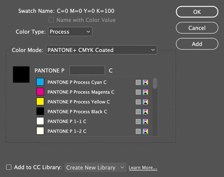
Adobe’s Pantone+ CMYK (Coated) color picker, from InDesign CC 2022

You can subscribe to the additional libraries from Pantone for $60/year. Book design is almost exclusively CMYK, so I won’t be . . . but grrrr.

On the subject of Canadians: thanks to Nick Heer’s north-of-the-border reporting for the notice.

Update, 28 September, 2022: Adobe got around to putting up a banner in my version of InDesign — blaming Pantone:

This notice showed up September 27th, 2022.

They’ve put up a “help” page. (I took a moment to fill in the feedback at the bottom of that page, too: “Removing features we’ve paid for is incredibly uncool, Adobe. Shame on you.”)

Two Awesome New Cameras, from $100 to $100,000

So Pagani, the multi-million-dollar sports car manufacturer, has decided to market large-format cameras. Okay!
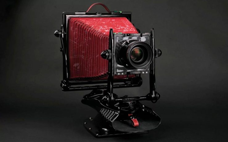
One of Pagani’s new camera models
A closeup of the (beautifully-detailed) tripod plate for Pagani’s new cameras.

Incredible, breathtaking detail and quality, based on Gibellini models but taken to 11. But like their cars, mere mortals need not apply: their cameras start over $100,000.

Mortals can dream, sure, but here on Earth, I encourage an order from this Ukrainian company instead:
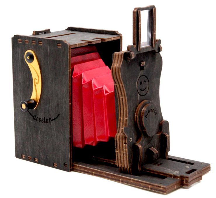
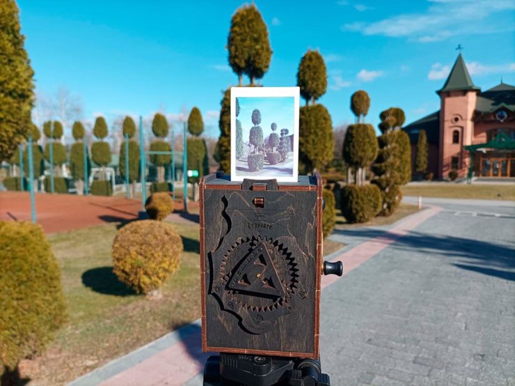
Jollylook’s Pinhole Instant Mini film camera
Jollylook’s Pinhole Instant Mini in situ

They’re based on instant film cartridges, are made of recycled materials, look incredibly cool, and a kit starts at an incredibly-reasonable $99. Throw in a few extra dollars to support Ukraine and . . . feel Jolly.

Thanks to This is Colossal for the link.

Beautifully Briefed, May 2022: Two on Type, Two on Photography, and Kottke

This month’s favorites cover a delightful new extension of the typeface DaVinci, Google’s updated mega-font, Noto, photographs of a desert aircraft boneyard from above, and mega-photographs of the Milky Way.

Before we get there, however, I wanted to wish Jason Kottke — whose 24 years of web sleuthing has been a source for items here on Foreword dating back to its original iteration in the ’90s — good luck on his sabbatical:

“I need some space to think and live and have generative conversations and do things, and then I’ll make something, but I can’t tell you what it is just yet.”1Alexandra Bell, NYT That’s the sort of energy I need to tap into for a few months.

Hear, hear.

The Beautiful DaVinci Italic

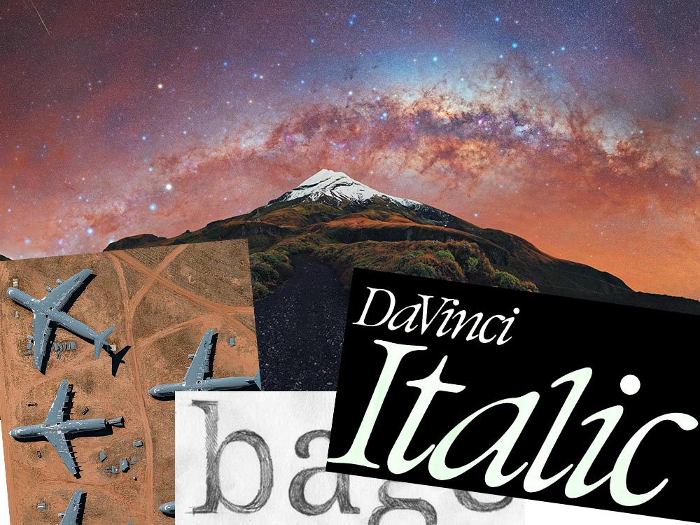
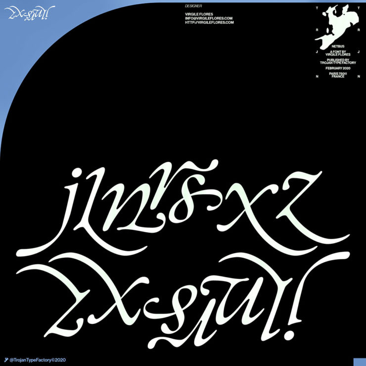
It’s Nice That points us to a new, extended version of the font DaVinci, done for Sydney’s Biennale:

“When you do this sort of type exercise — based on printed letters — it gives a very organic shape and form, in opposition to the very metallic sharp shape from type materials.” Furthering this organic look by pushing the fluidity curse at its maximum, Virgile ended with a design “which is very historical, yet with a contemporary twist.” 

Just look at those glyphs!

Makes you want to find an excuse to use it. But that’s not all: Flores is an incredibly diverse artist whose work both challenges and inspires. See more.

Google’s Noto

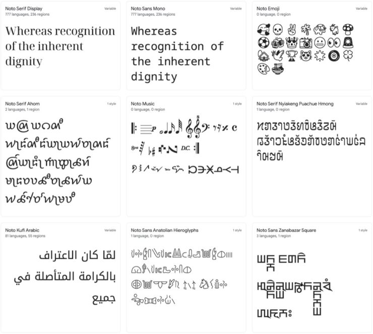
Called “A Typeface for the World,” Google’s Noto defines “megaproject.”

Noto is a collection of high-quality fonts with multiple weights and widths in sans, serif, mono, and other styles. The Noto fonts are perfect for harmonious, aesthetic, and typographically correct global communication, in more than 1,000 languages and over 150 writing systems. 

Google’s Noto font collection.

According to Google,

“Noto” means “I write, I mark, I note” in Latin. The name is also short for “no tofu”, as the project aims to eliminate ‘tofu’: blank rectangles shown when no font is available for your text.

While the font itself has been around for a few years — 2013 seems like yesterday in so many ways! — it’s updated regularly, cover 150 out of the 154 scripts defined in Unicode, and deserves attention from every web designer and type nut. Read more at Google or Wikipedia. (Via Kottke.)

Aircraft Boneyard, From an Aircraft

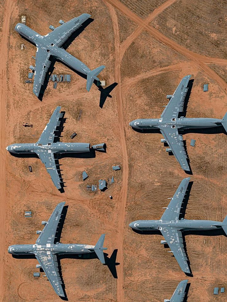
This is Colossal introduces us to Davis-Monthan Air Force Base in Tucson, Arizona, whose desert conditions are ideal for storing — and scrapping — aircraft:

What happens when the military’s aircraft are end-of-lifed

The photographs are by Bernhard Lang — whom Colossal has highlighted before — and who has an incredible talent for finding patterns from above. See many more at his website.

Milky Way Photography

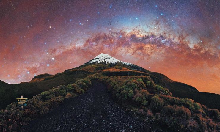
We don’t get many opportunities here in Middle Georgia, but in other, less populous (read: less light-polluted) places in the world, the Milky Way shines forth from the heavens:

Mountain, redefined.

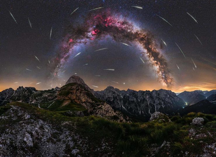
The Guardian points us to the 2022 Milky Way Photographer of the Year, and many just wow:

Take cover . . . in awe!

Check ’em all out, be inspired to take one of your own, or simply be reminded just how big this system we’re a part of is. Enjoy.

Architecture in Music

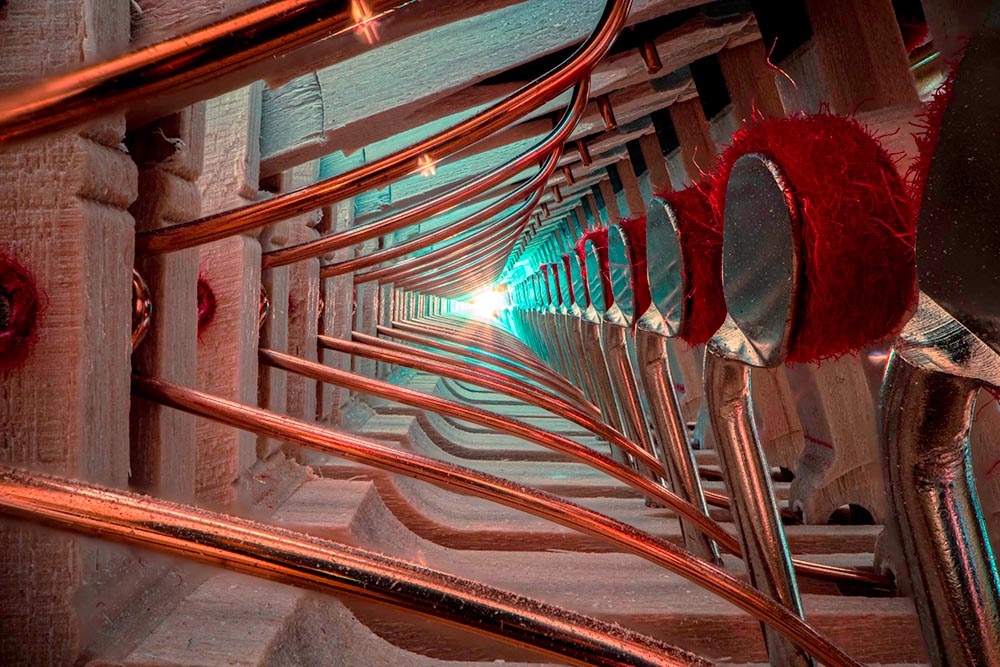
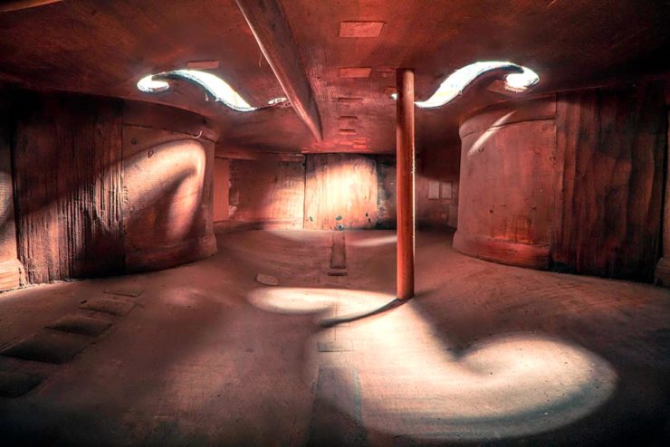
New Zealand-based photographer Charles Brooks, who happens to have spent years as a professional cellist, brings us some astonishing inside-the-instrument shots, including this one:

1780 Lockey Hill Cello. © Charles Brooks

The Colossal post, where I ran across this, is definitely worth a read. But let me just add one thing: He’s using an L-mount (yes!) Laowa probe lens, an insightful choice driven by curiosity. Well done, sir.

His levitation shots are killer, too. And there’s behind-the-scenes (literally) stuff on his blog. Oh, and his logo is fantastic.

Score! (Sorry — had to say it.) Go visit.

Beautifully Briefed, December 2021: Holiday Edition

Beautifully Briefed, December 2021

It’s the yearly wrap-up and the holiday season! Recap and Rejoice!

Hermès Does Windows

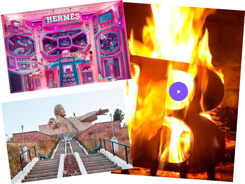
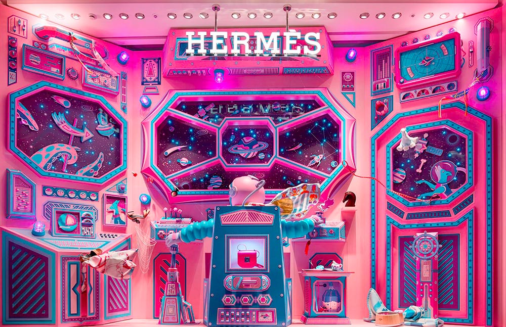
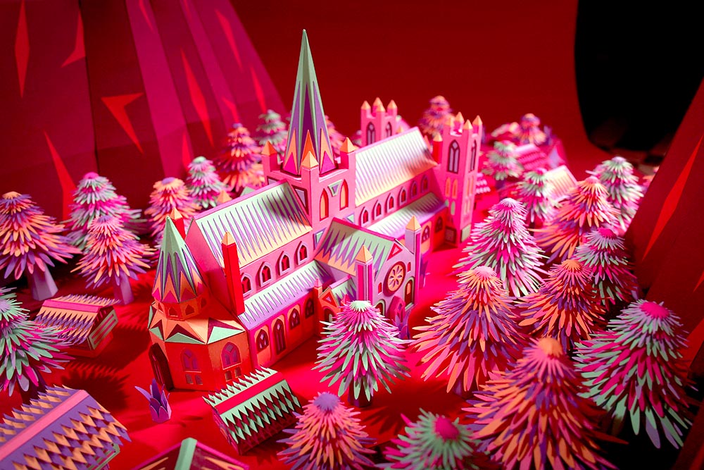
“Journey of a Lifetime” is this year’s window display for Hermès — yes, Hermès should have an accent, but I can’t seem to summon it today fixed! — so let’s go with a picture instead:

Hermes window display

All in paper. No, let me repeat that: it’s all paper. (Well, perhaps some glue.) From artists Zim and Zou. Here’s another, one of their earlier works:

Zim and Zou, previously

Read more at This is Colossal about the window and the church. Nice.

Yule Ogg

While we’re on the subject of the holidays, check this out:

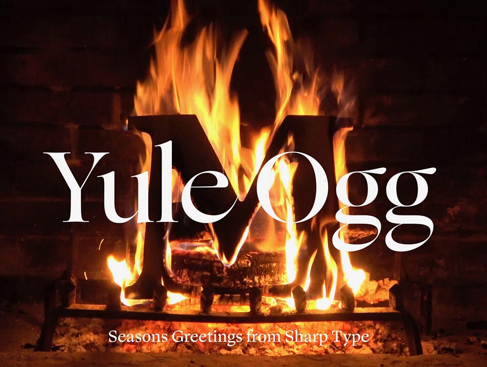
Yule Ogg

That’s right, it’s one of those four-hour Yule log videos — but with a twist. Those are wooden type pieces going up the flame. Check it out, along with the backstory, at It’s Nice That.

Top Architectural Photography Projects

Closing out, we start the year’s “best of” round-ups, this one Dezeen’s top 10 architectural photography projects of 2021:

Soviet (Asia) Photography

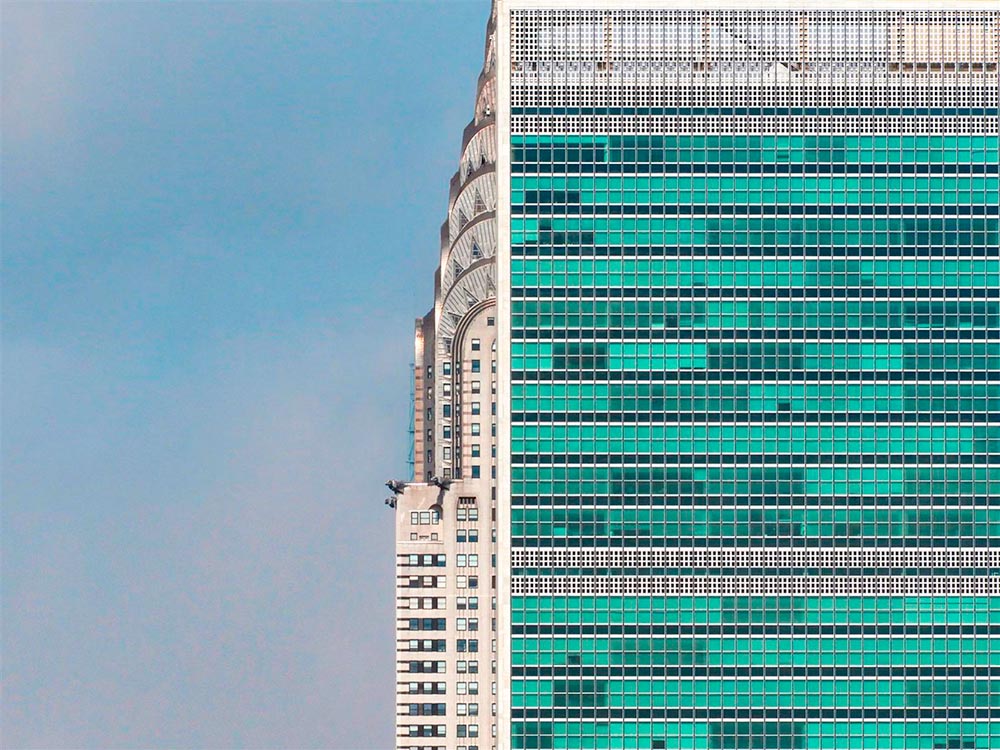
Above, Soviet architecture, central Asia, by Roberto Conte and Stefano Perego. Below, Structure Photography by Nikola Olic:

"Poetic" Architecture Photography

The latter is called “poetic,” a description I’d completely agree with. The Mother Road, USA, by Hayley Eichenbaum (previously mentioned) is there, too. Enjoy.

That’s it until after the holiday. Around the first, stay tuned for my favorite book designs of 2021 and more. Take care!

Beautifully Briefed: Icons and Typography, Mid-June, 2021

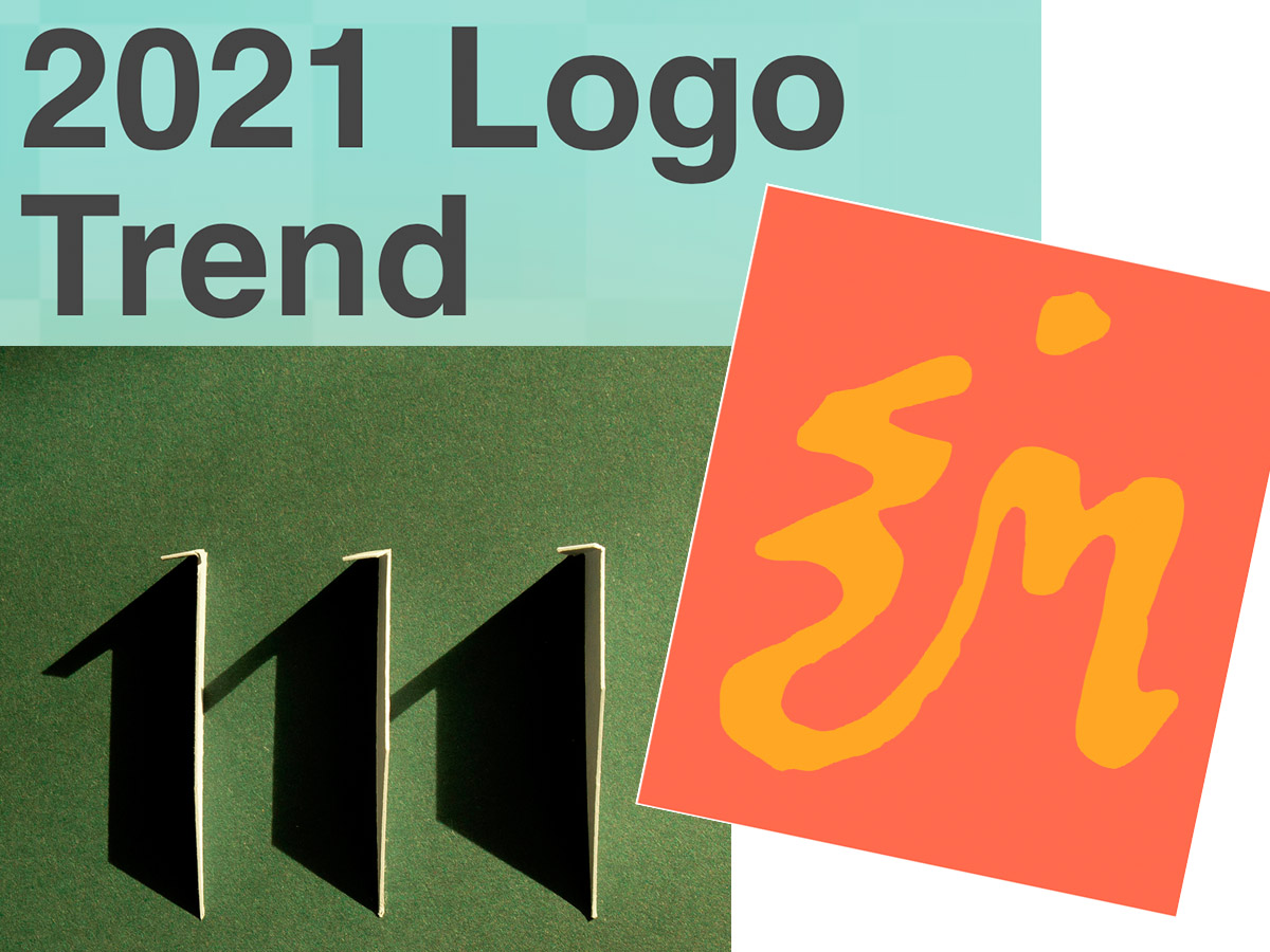
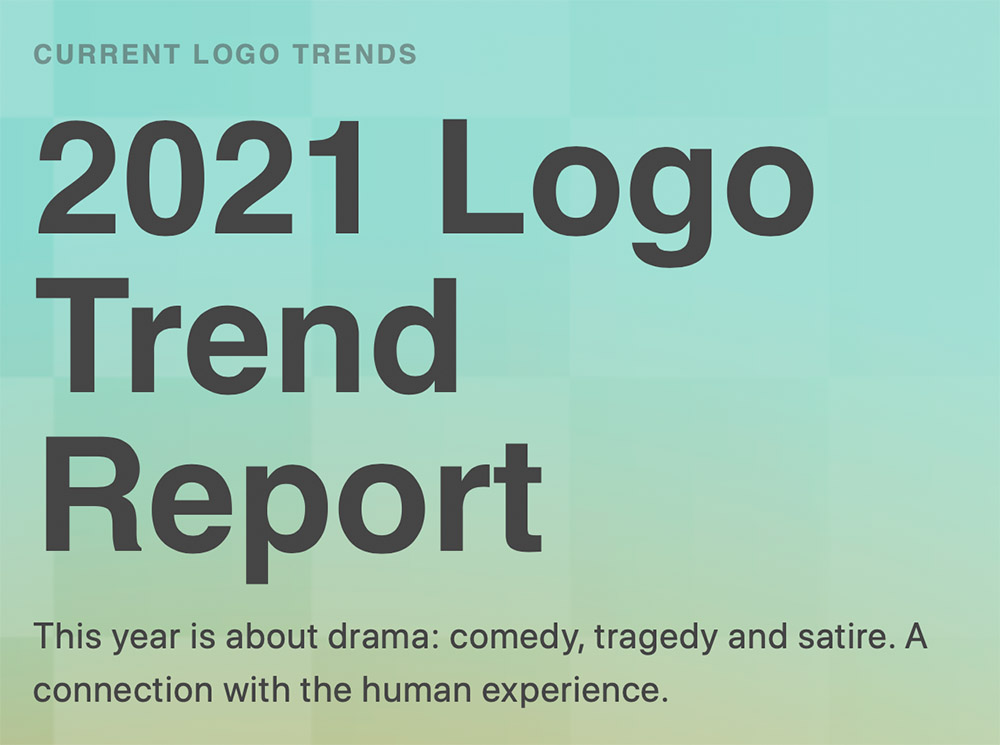
Three items for you here, starting off with the 2021 Logo Trend Report, from the Logo Lounge. From the Asterisk to Electric Tape, Quads, Chains, and more:

2021 Logo Trend Report

Bill Gardner discusses all fifteen different trends, with logos to back ’em up (naturally).

Next, “A Cabinet of Curiosities” from Hoefler & Co.

Printers once used the colorful term ‘nut fractions’ to denote vertically stacked numerators and denominators that fit into an en-space. (Compare the em-width ‘mutton fraction.’)

This is beautiful:

Dutch Curio, H&Co

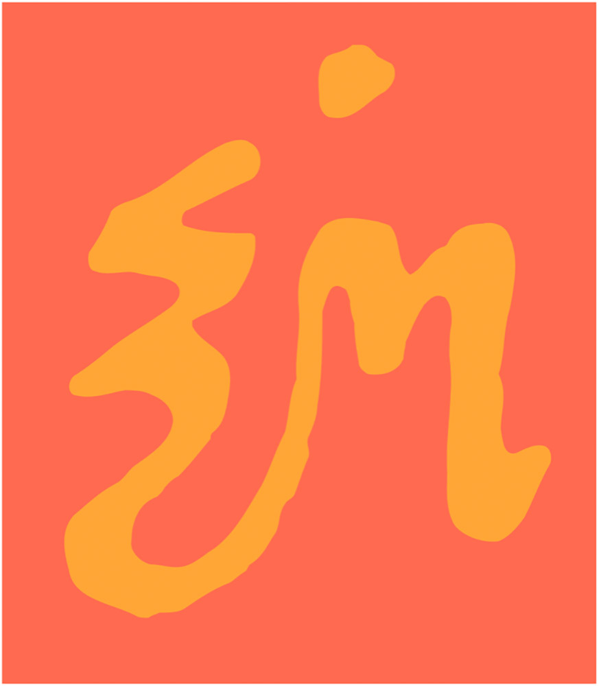
A Dutch curio, representing the letters z-i-j.

Read all of the rest.

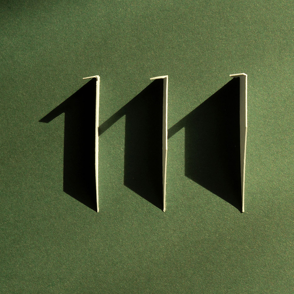
Lastly, these are amazing . . . and simple, the better form of “simply amazing.” Yeah:

111 Shadow

See the rest at This is Colossal.

Happy June!

In Stitches (of CMYK)

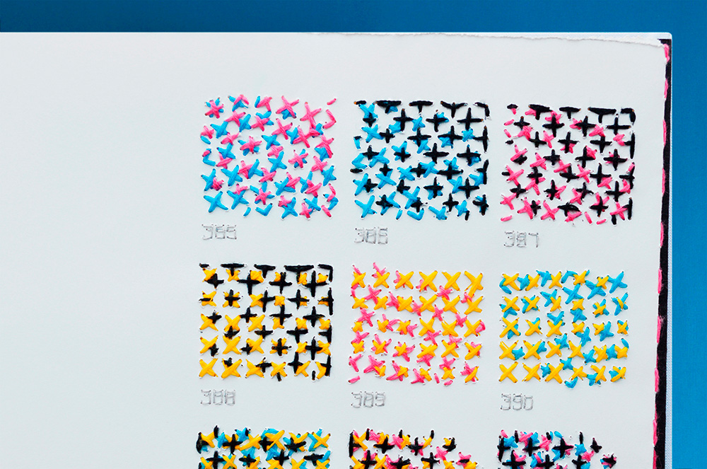
In “XXXX Swatchbook,” Evelin Kasikov explores all of the variables of CMYK printing without a single drop of ink. She catalogs primary, secondary, and tertiary colors, two-dozen combinations showing how rotation affects the final pigment, and a full spectrum of rich gradients. In total, the printing-focused book is comprised of four base tones, 16 elements, and 400 swatches of color entirely hand-embroidered in 219,647 stitches.

Six years. Six years.

More @ Colossal.