Beautifully Briefed, Early July 2022: The Autopian, The Ford Heritage Vault, and an Eames Follow-Up

Car site The Autopian scores with book design, Ford posts old marketing material gold mine, and more on the Eames Institute of Infinite Curiosity in this edition of Beautifully Briefed.

Autopian suggests book design

The Autopian, founded by a couple of former Jalopnik writers, is a new automotive gem: in these days of more-of-the-sameism sites trying to make money of others’ ideas, the Autopian has a retro style and interesting, original content.

Including this short post from their Cold Start column:

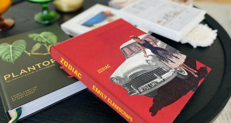
Sometimes you may encounter an old car ad and realize that the design of it could lend itself very well to something completely different. In this case, this 1958 Ford Zodiac ad, with its rich, saturated colors, striking dress on the model, and evocative name with understated typography just feel like something you’d see on modern book cover design.

Jason Torchinsky, Autopian Founder

The ad:
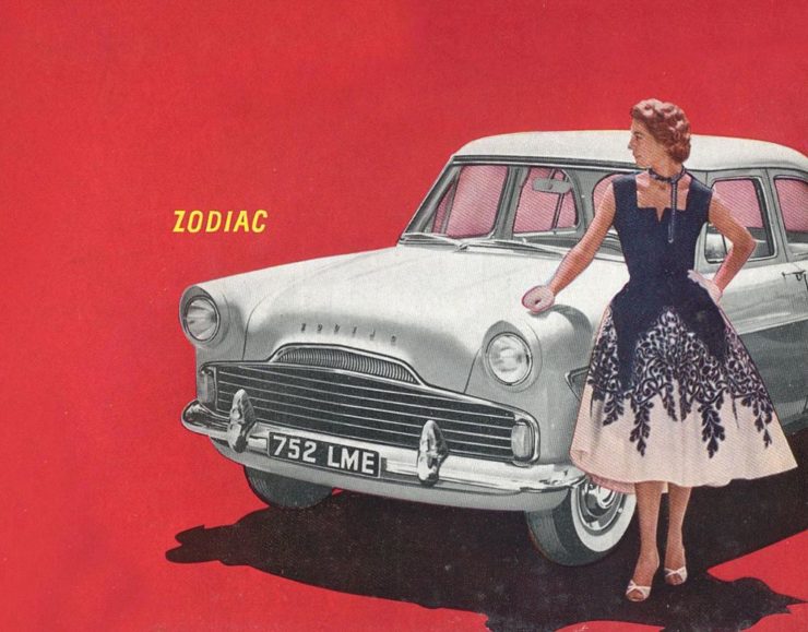
A 1958 Ford Zodiac (European)

His book design idea “realized”:

Jason’s book cover mock-up. Love the author name.

Nice.

The Ford Heritage Vault

Ford has taken the unusual step of posting a good chunk of their old — 1903 to 2003, their first 100 years — marketing materials online: “promotional materials, photographs, and all kinds of other historical goodies,” according to CarScoops.

“Our archives were established 70 years ago, and for the first time, we’re opening the vault for the public to see. This is just a first step for all that will come in the future,” says Ted Ryan, Ford archive and heritage brand manager.

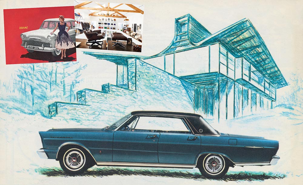
Here’s a personal favorite: the 1965 full line brochure, showing the cars set in architectural drawings — presumably, matching the car to the house:
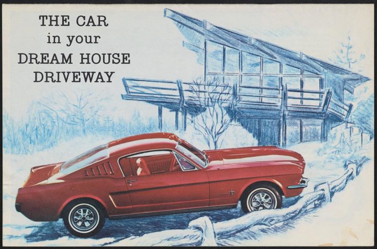
The 1965 Ford Family of Cars brochure

Fancy a drive down memory lane?

More from the Eames Institute

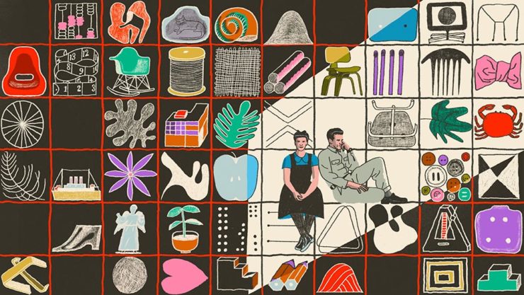
We discussed the Eames Institute of Infinite Curiosity back in April, but Metropolis magazine has published an extensive article covering a visit to the Institute.

Modernism has largely been diluted from a series of ideas rooted in social change to one of just style—Instagram moments, if you will. The Eameses insisted that they did not have a style or even an “ism.” […] Modernism was an idea, not a style. With the establishment of the Eames Institute, I hope Charles and Ray will be remembered most of all for their ideas and processes.

Kenneth Caldwell, Metropolis
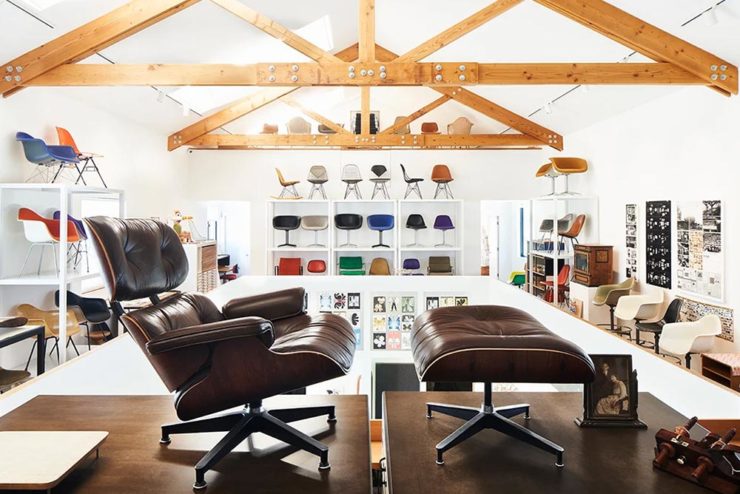
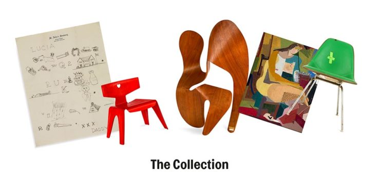
An exhibit at the Eames Institute of Infinite Curiosity.

With our ongoing struggle to use materials more efficiently, many of the Eameses’ ideas and ideals need to be taken for the solutions that they are: style with incredible substance.

Read the whole article at Metropolis. (Via ArchDaily.)

Beautifully Briefed, Early April 2022: Eames Institute, Loony Backgrounds, and … Condor!

Three completely unrelated items for you this time, ranging from the serious and interesting through the loony and interesting to something of a whole different stripe.

The Eames Institute of Infinite Curiosity

Update 2, 25 Apr: Brand New discusses this logo, with the usual catchy title: The Fast and the Curious: Counterspace Drift

Eames Institute’s “curious” logo variations, discussed at Brand New

Update, 8 Apr: It’s Nice That has more: The Eames Institute launches with a curious, “Eamesian” identity, and a logo that observes

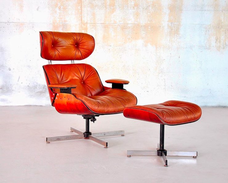
Original post: Practically everyone has heard of an Eames Chair:

A particularly awesome example of an Eames Chair (and ottoman).

What you might not realize is that the legacy Charles and Ray Eames left behind enriches our lives to this day. It’s a shame, then, that while their house is a mid-century masterpiece (and museum), much of their lives have remained behind closed doors.

For almost three decades, a barn-like building in Petaluma, California, contained remnants of one of the most iconic design legacies of the twentieth century. […] We created the Eames Institute because we want you to examine the archive of what you know—the collection of your experiences, understanding, memories, and questions—and connect to the provocations that call to you. We want you to tap into that same fount of relentless curiosity, and its power to shift your perception and open you to innovations and discoveries.

Now, however, there’s the Eames Institute of Infinite Curiosity. Awesome name aside, it introduces us to the more personal side of one of design’s strongest partnerships.

Items from the Charles and Ray Eames Institute.
Drawings from the Charles and Ray Eames Institute.

The website requires some interesting scrolling to get where you need, but the results are more than worth the time — and is one that earns (Eames?) its suggestion of satisfying infinite curiosity. Explore and enjoy. (Hat tip: ArchDaily, The Newly Launched Eames Institute Brings Insight into the Eameses’ Design Methodology.)

Loony Toons Backgrounds

Design You Trust: “Looney Tunes Without Looney Tunes: Existential, Surreal, And Creepy Backgrounds.” The post sends readers to an Instagram account, which I’m not going to link to, but the images themselves are fascinating:

Crossed wires, anyone?
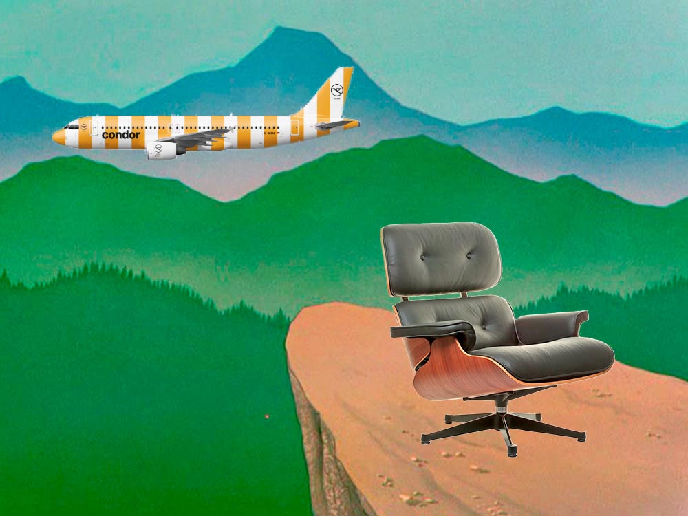
Imagine who might run up to — or even get pushed off of — this cliff.
A nice, innocent factory. Nothing could possibly go wrong.

Next time I treat myself to a Loony break, I’m going to make sure to spend some time looking beyond the action and appreciate the backgrounds. Nice.

Condor Airlines Rebrands

Most of you have probably never heard of Condor Airlines; they’re mainly a European thing, a “leisure” airline associated with Thomas Cook, formerly owned and run by Lufthansa. (Here’s some history.)

It doesn’t particularly matter. What does is the bravado exhibited by management. Before, a typical airline logo — dare I say, typically Germanic:

Condor’s OLD livery.

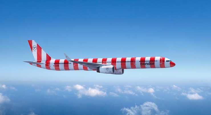
Then someone said yelled, “HEY. WE DO VACATIONS. LIKE BEACH TOWELS. LET’S DO STRIPES.” The result:

Condor’s NEW livery. Wow.

Armin Vit:

The new livery has zero fucks to give and just plasters every plane with thick vertical stripes that go against pretty much every single assumed tenet of what makes a good livery. It doesn’t look speedy, it doesn’t look nimble, it requires a lot of paint, and by all other standards it is just plain ugly and I love it.

Read more or see images at Condor, see the Brand New post, or even hear from the armchair pilots at Airliners.net. Now: anyone got a beach?