Beautifully Briefed 24.10: Content with Worthwhile Content

“Content,” that is, the feeling of satisfaction — contentedness — is a word I’d much rather use than “content,” that which is required of folks who produce material for their website/YouTube channel/social media feed/whatever. It’s a shame the world favors the latter over the former.

Or does it? We’ll get to that — right in the midst of the other content that caught my eye in October, 2024.

Adobe Content Credentials, Continued

Adobe’s positive messaging continues, saying “[it is] dedicated to responsibly developing tools that empower creators to express themselves and tell their stories while helping address their concerns.” It even carried out a study to get some feedback from creatives on generative AI and one of the standout insights was rising concerns over unauthorised sharing of their work or misattribution with 91% of creators seeking a reliable method to attach attribution to their work.

Bring on Adobe Content Authenticity. It’s a “powerful new web application that helps creators protect and get recognition for their work.”
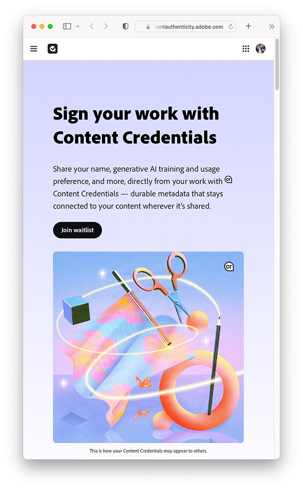
A screenshot of Adobe Content Authenticity website.

In today’s rapidly evolving digital landscape, creators are understandably concerned about safeguarding and gaining attribution for their work and having more control over how it’s used. That’s why we’re excited to introduce Adobe Content Authenticity, a new, free web app that allows creators to easily attach Content Credentials to their digital work — helping you protect your work, show attribution and better connect with your audiences online.

—Andy Parson, Senior Director, Content Authenticity Initiative, Adobe

For now, it’s limited to a beta Chrome extension, with a wider beta opening to the general public in spring 2025. (I don’t use Chrome, but have signed up to the waitlist, and will update Foreword readers when I hear back.) Content Credentials are already available in Photoshop and Lightroom — provided you’re using the latest versions, which may require the latest OS.

Three on Book Design
PBS on del Rey

I’d known the publishing house since . . . well, as long as I can remember. What I’d not known is the story behind the publishing house:

Set aside thirteen minutes when you can — absolutely worth it.

Multi-Panel Book Covers

I agree with Jason Kottke: “Bento Books” is the term. A great example:
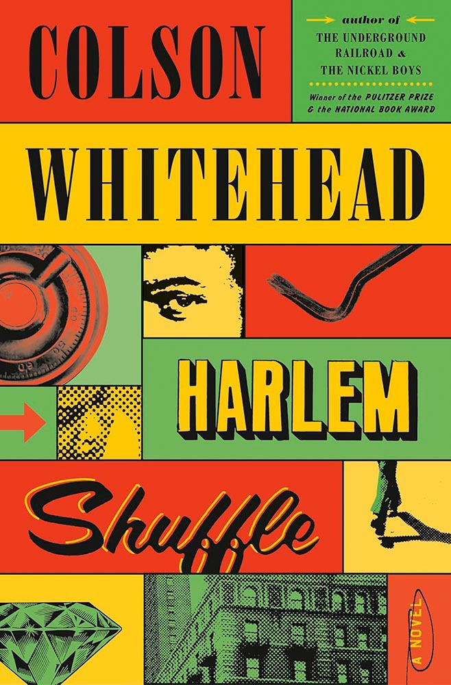
Book design by Oliver Munday.

Here’s the impetus discussing this latest book design trend, with many more examples.

It’s Nice That: Book Design in Brazil
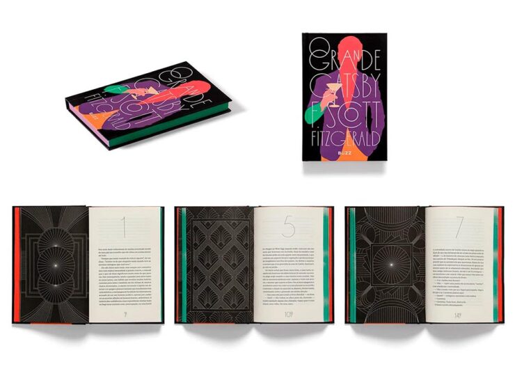
Book design by Bloco Gráfico.

Any foreigner entering a bookshop in São Paulo is likely to be impressed by the quality of the books on display. For a country with relatively few readers, few high quality printers and binders, and a very limited assortment of paper, the Brazilian publishing market shows remarkable graphic ingenuity[.]

— Elaine Ramos, It’s Nice That

Never mind the country, the great book design caught my attention: from The Great Gatsby, above, to the J.M. Coetzee series, Orwell’s 1984, even Melville — amongst others. A great read.

Special Bonus #1: Life outside the internet . . . and physical books, please:

“The whole internet social complex … and the way people use their computers to conduct life is doomed sooner than later,” said Justin Murphy, the founder of the media and education company Other Life. “The smartest people, the people who are the most cutting-edge, will increasingly live their lives outside of computers.”

Whether or not that’s true — or even a potential — isn’t as relevant as an actual trend: physical book sales are up:

Print, too, is on the rise, from books to magazines to newspapers. Print book sales had a pop with the pandemic in 2020, and have continued to maintain sales of more than 750 million units sold each year. Meanwhile, even though they’re cheaper, sales for ebooks are down slightly, which may be owed to the fact that younger readers, much like older generations, overwhelmingly prefer printed formats.

— Zoë Bernard, Vox

Flip phones, vinyl LPs, and . . . books: Read the whole article.

See also: The Guardian: Bookstores are Suddenly Cool.

50 Fonts for 2025

CreativeBoom is out with their annual post on future type, “50 fonts that will be popular with creatives [next year].” Some of my favorites (links in captions):
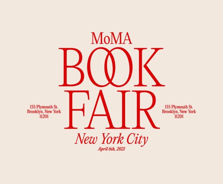
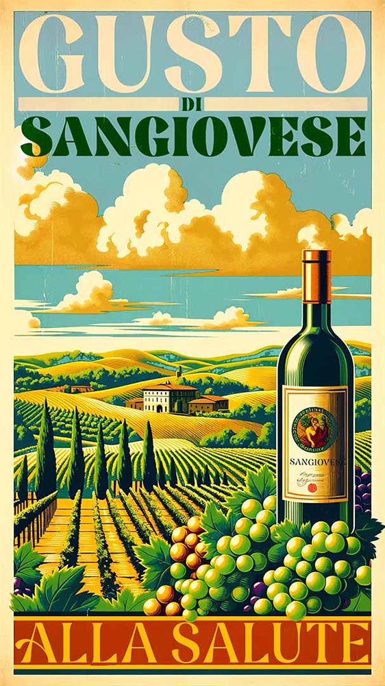
Editorial New, by Pangram Pangram.
Nave, by Jamie Clark Type. (Bonus points for the great illustration.)
Right Grotesk, especially the Casual flavor, by Pangram Pangram.
Canvas Inline, designed by Ryan Martinson from Yellow Design Studio. Available through Adobe Fonts.
Ssonder, from Type of Feeling. (Easily the most on-trend of my highlighted items.)

An honorable mention goes to Gamuth Sans, from Production Type. See CreativeBoom’s 2025 popular fonts list here. (Note: some are available through Google Fonts, and thus free-to-use. Nice.)

See also: Two more from CreativeBoom on the 2025 type scene: font trends and independent foundries.

Photography that causes content
Forest Fireflies

From This is Colossal, we have Kazuaki Koseki, who describes himebotaru — fireflies — as “artists who paint light on the forest.”
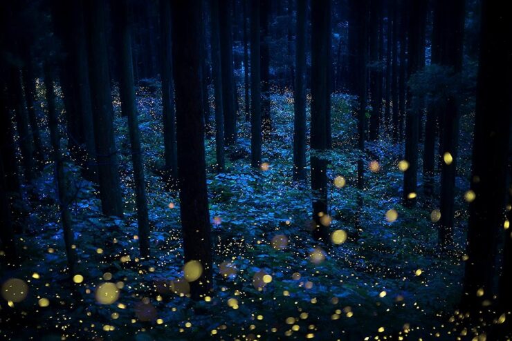
From the series “Summer Faeries” by Kazuaki Koseki.

Artistry, all right. See more.

Epson International Pano Awards

The 2024 Pano Awards have been announced, with a wealth of great wide-angle shots for your viewing pleasure. Two of my favorites:

“Storm Dump,” by Tom Putt. Taken near Wyndham, Western Australia.
“Uprooted,” by Nickolas Warner. Taken in Moab, Utah.

Epson’s rules are a little looser than some, but don’t diminish the sheer creativity displayed by the entrants. See coverage from PetaPixel or This is Colossal, or go to the source for the full list.

Siena Creative Photo Awards 2024

Just one favorite to highlight here, but what a favorite it is:

“Storm on the Elbe,” by Anna Wacker. 1st Prize, Architecture.

See some amazing sleeping bears — and much more — at the PetaPixel post or the full list at the Siena contest website.

Architecture MasterPrize

Few contests are more up my alley than this one, which inspires me to get back out there sooner rather than later:

Kaktus Tower, Copenhagen, by Shoayb Khattab. See more from this series.
“Fragments,” taken at the Nhow Hotel, Amsterdam, by Max van Son. See larger.

Awesome. Meanwhile, the below caught my attention not due to the striking photograph, but the striking content — which, indeed, caused contentedness. Such a huge change to anyone who might recognize this former hulk, now beautifully refurbished and in a new park setting:

“Michigan Central Station,” Detroit, by Jason Keen. See the full series here.

See the post from PetaPixel or the full list of 2024 winners at the Architecture Masterprize 2024 website.

Special Bonus #2: To close us out on this Halloween, the moon:

Photograph by Darya Kawa Mirza. See more.

Beautifully Briefed 23.11: Considerations

A selection of diverse items for this entry in the series: a new publication from The Guardian, open source fonts for your 2023 goodness (along with more for ’24), and the Natural Landscape Photography Award winners. Also: DAK. Let’s get into it.

The Long Read

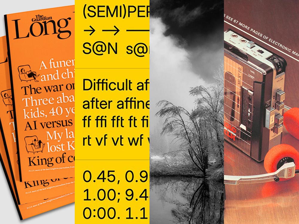
Regular readers will know that I’m a big fan of The Guardian, including its unusual-for-journalism payment model (that, frankly, some outlets in the US would be wise to copy). Now, they’re on newsstands with a “bookazine” called The Long Read.

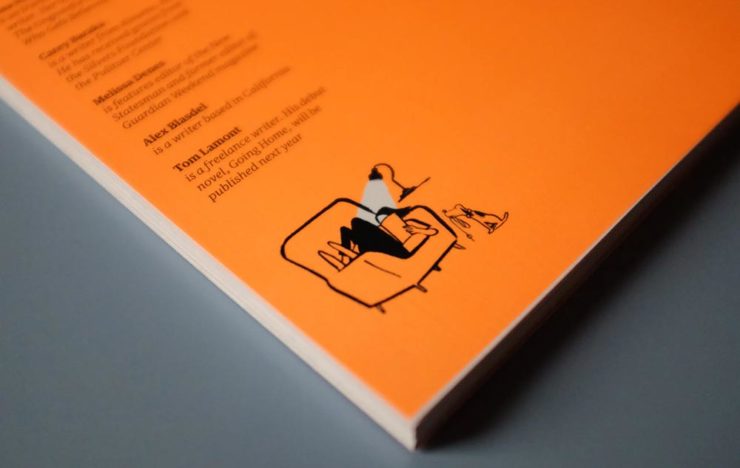
The back cover. (See the front cover at the left in the header image.)

“We know that for many people, myself included, when it comes to long, immersive pieces, reading in print […] is still the most satisfying reading experience, and one that should be cherished in a climate so saturated by disturbance,” quotes It’s Nice That. With most of these more evergreen stories taking months or even years to build, hardy print felt the best way for them to live. [A] ‘bookazine’, it balances all the things we love about magazines (“the drama, the pace, the energy”) with the considered typesetting of a book. A lot of attention was given to packaging its large volume of text – clocking in at 55,000 words – to make the reading experience as relaxing as possible, from body type size to column widths.

Liz Gorny, It’s Nice That
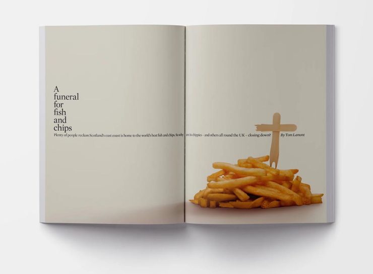
An article title page — indeed, the best of a newspaper magazine in book form.

Read more at It’s Nice That, and give The Long Read a look at The Guardian bookstore or a newsstand near you.

Three Open Source Fonts for 2023, and 50 for ’24

As a self-confessed font junkie, I’m always interested when a new one comes across the bow — but there are so many these days, they’ve unfortunately become almost commodities. (That’s a huge shame, but also a discussion for another time.) So it’s interesting when I see ones that are not only good but also available for everyone, free and open source.

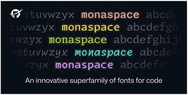
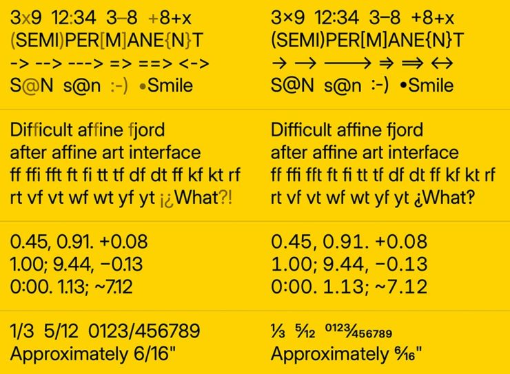
Monaspace is the first of three I want to highlight, “a monospaced type superfamily with some modern tricks up its sleeve.” Designed for code — hence the monospace — it’s a successful answer to the question, “Letters on a grid is how we see our code. Why not make those letters better?”

Get the full story or download from GitHub.

B612 is designed for — get this — the screens on Airbus commercial planes. “[T]he challenge was to improve the display of information on the cockpit screens, in particular in terms of legibility and comfort of reading, and to optimize the overall homogeneity of the cockpit.” Read the back story here.

B612 is available from Google or GitHub.

Inter is described as, “The 21st century standard,” “a workhorse of a typeface carefully crafted & designed for a wide range of applications, from detailed user interfaces to marketing & signage.” One of the world’s most-used font families, it’s perfect when readability is at the fore.

Inter is detailed and downloadable here.

But there’s more!

Brinca by In-House International. (Image via CreativeBoom.)

CreativeBoom has their annual compilation of 50 new fonts for the coming year up, “a comprehensive list of the best fonts that demand your attention in 2024. We’ve compiled this comprehensive list by asking the creative industry for their favourites, analysing work from the last 12 months, and taking on board the design trends emerging right now.”

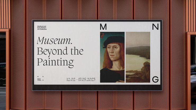
National Museum in Gdańsk by Tofu Studio. Featuring Migra by Pangram Pangram. (Image via CreativeBoom.)

Great stuff. Creative. Boom!

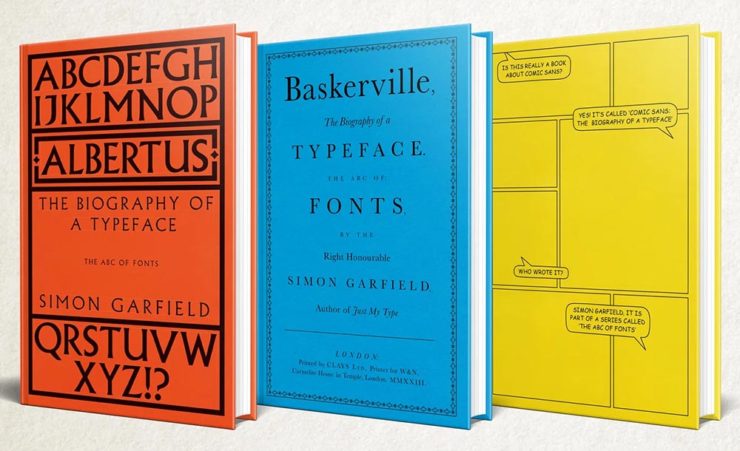
Special Bonus: Simon Garfield publishes biographies on Albertus, Baskerville and Comic Sans. Seriously:

The Natural Landscape Photography Awards

For once: a contest that demands more — like the original RAW files. (Literally the raw image from the camera, before processing, for those who don’t know — think film negatives, rather than the resulting prints.) Okay, sure, it’s not perfect; there are entry fees and it doesn’t have a long track record, but the rules are solid with respect to image integrity.

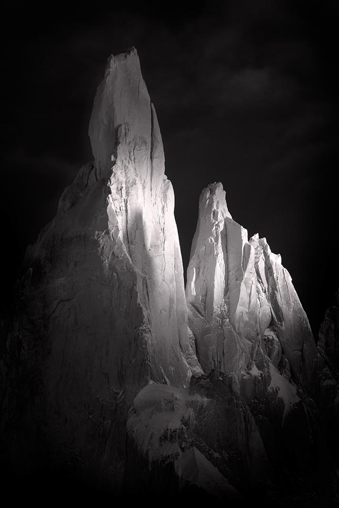
Of course, the quality of the subject chosen to photograph is, if you’ll pardon the expression, subjective. The overriding theme here seems to be the perfection of dramatic subtlety — not an easy thing to get right.

Photo: Adam Gibbs
Photo: Adam Gibbs

The two photographs above are both by Adam Gibbs and reflect the judges’ desire to reward photographers who display a diverse portfolio of subjects.

Photo: Alberto Rodriguez Garcia
“Once Upon a Time.” Photo: Matt Redfern

A winner from the “abstracts and details” category for the first and a great title for the second image that does indeed tell so many stories. Rounding it out, another beautiful black-and-white:

Photo: Franka Gabler

See the contest website for the complete selection of 2023 winners. (Via PetaPixel.)

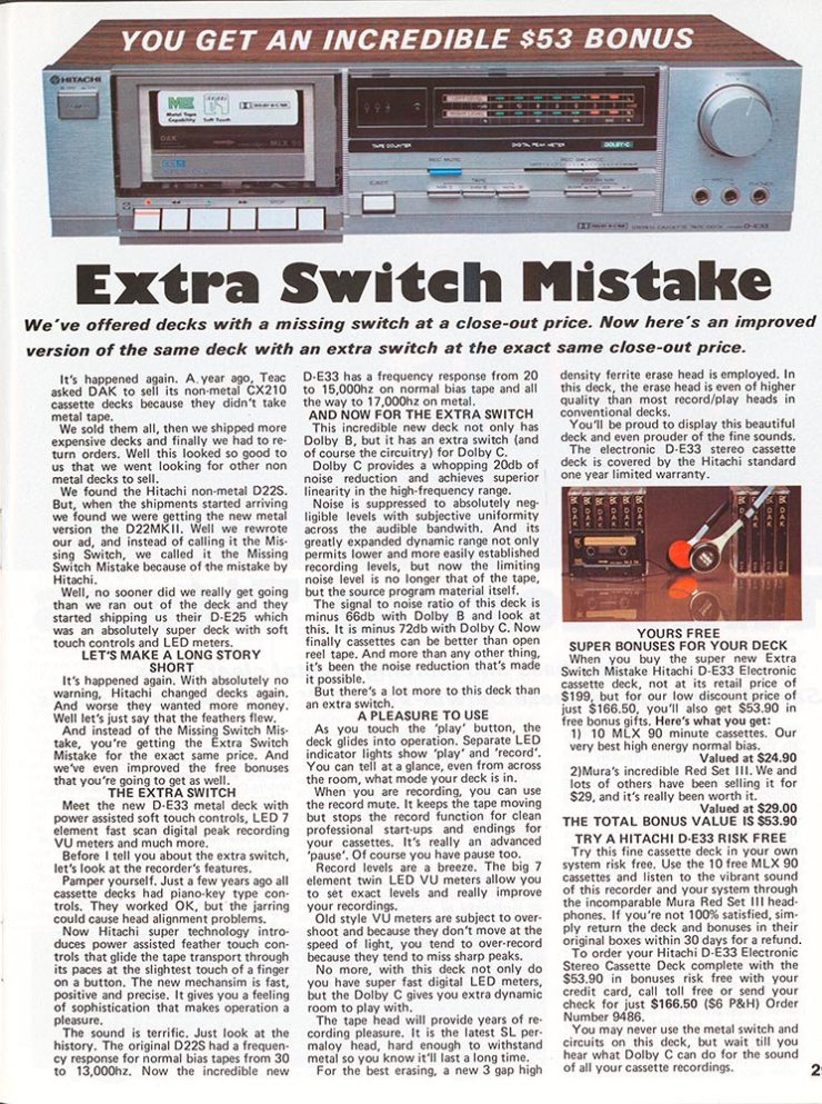
Remember the DAK catalogs?

If you’re a certain age — that is, were around in the ’80s — the DAK catalog was a regular. (Give me one, together with a JC Whitney catalog, and a weekend was gone.) A recent post by Cabel Sasser brought it all back:

The catalog from Summer 1983.

Oh, the products. The explanations. The fun.

I’m not going to spoil the effort put into the story of Drew Alan Kaplan, a.k.a. DAK, Joseph Sugarman, Products That Think, or any of it: go enjoy for yourself.

Beautifully Briefed 23.9: Falling into Brilliance

As summer turns to fall, let’s take a look at Type 1 fonts, a library index, revolutionary posters, posters for “get lectured,” and two different photography contests. Let’s get right into it.

Adobe discontinues a standard: The Type 1 font

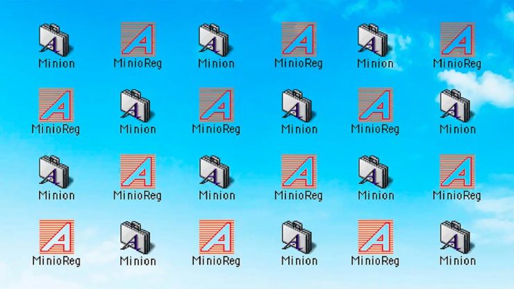
Back in the early days of desktop publishing — up to about the turn of the century, give or take — everything typographic used PostScript, a programming language by Adobe. (Other stuff, too, like Adobe’s vector program, Illustrator.) PostScript fonts were the so-called “Type 1” variety, made up of a bitmapped “suitcase” that housed the standard display sizes and an outline file used by the output device to print clean, what-you-see-is-what-you-get beauty.

The Apple LaserWriter Plus and some vintage Macs: nostalgia! (Note the book — heh.) Image: YouTube.

Companies from Apple to Microsoft didn’t want Adobe to hold a monopoly on output tech, so later fonts evolved into TrueType and then OpenType, the latter of which is the standard today.

So much so that Adobe has now discontinued Type 1, and they, along with Microsoft, have stopped being supported. Which is understandable and yet a shame: some of us still have hundreds of them.

Ars Technica has the best roundup.

Meanwhile, I’m going to investigate a conversion utility. Will report back.

All the Libraries in London

It’s Nice That has a post that reminds us of a library’s central purpose: to leave knowing more than you did when you entered. “The library, in our shared public imagination, is a special place,” the author argues — reminding us of what libraries were established to do, often distinctly different from the modern reality (especially in the United States).

In the library you begin to be convinced that language matters, that words have the power to clarify, to rouse, to make us feel something, to help us understand the political and cultural features of historical and contemporary moments.

Lola Olufemi, It’s Nice That
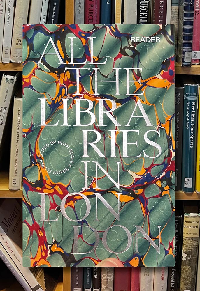
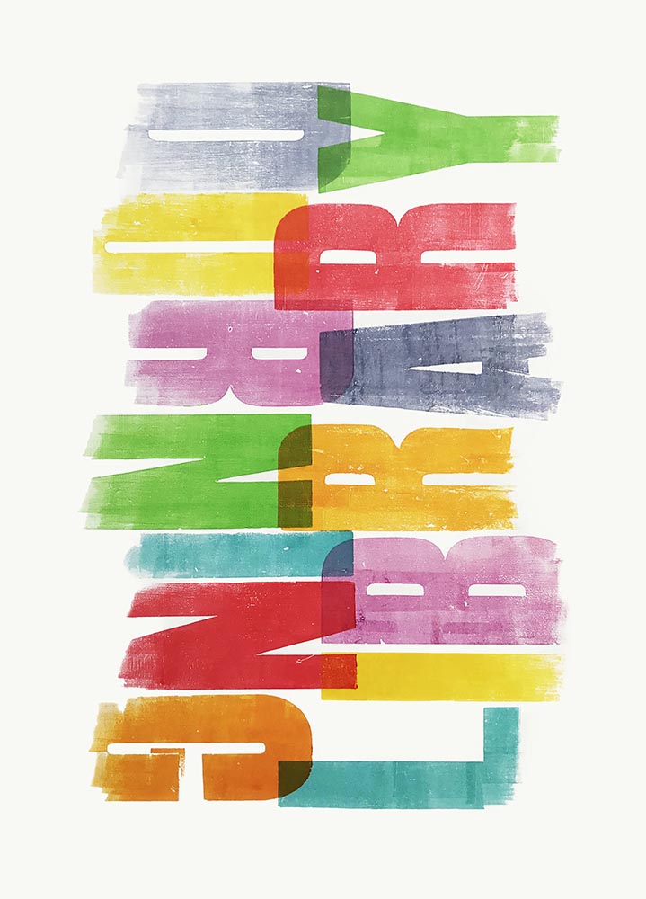
All the Libraries in London. Cover design: unknown. Image via It’s Nice That.
All the Libraries in London does something artistic with a simple listing, elevating it, reminding us how compelling the ideal that libraries represent really is:

This is a political and artistic listing, one that invites the reader to rediscover their own memories of their local library as a site of discovery. The book’s authors invite us to reflect on our personal relationship to libraries as well as the necessity of collectively securing their future existence.

Lola Olufemi, It’s Nice That
Alan Kitching, Durning Library. Image via It’s Nice That.

We need more of this everywhere, but especially here in the States. Meanwhile, check out this great item at It’s Nice That.

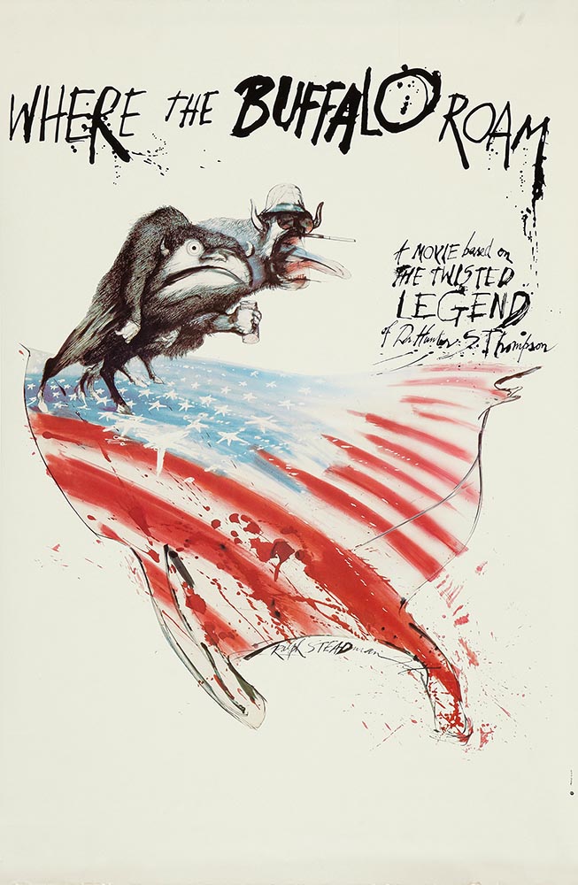
Special Bonus #1: Another British treasure, via the very British Antiques Roadshow (a British original, natch): this incredible poster by Ralph Steadman.

Ralph Steadman’s Where the Buffalo Roam (1980) poster. Image via Wikipedia.

Special Bonus #2: British book designer Steve Leard has launched a new book design podcast, Cover Meeting, featuring interviews between Leard and fellow book designers on the work, the industry, and more. The Bookseller has more.

Cuban Movie Posters. No, Really.

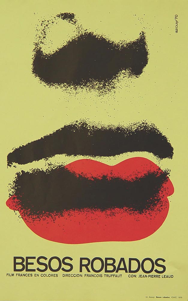
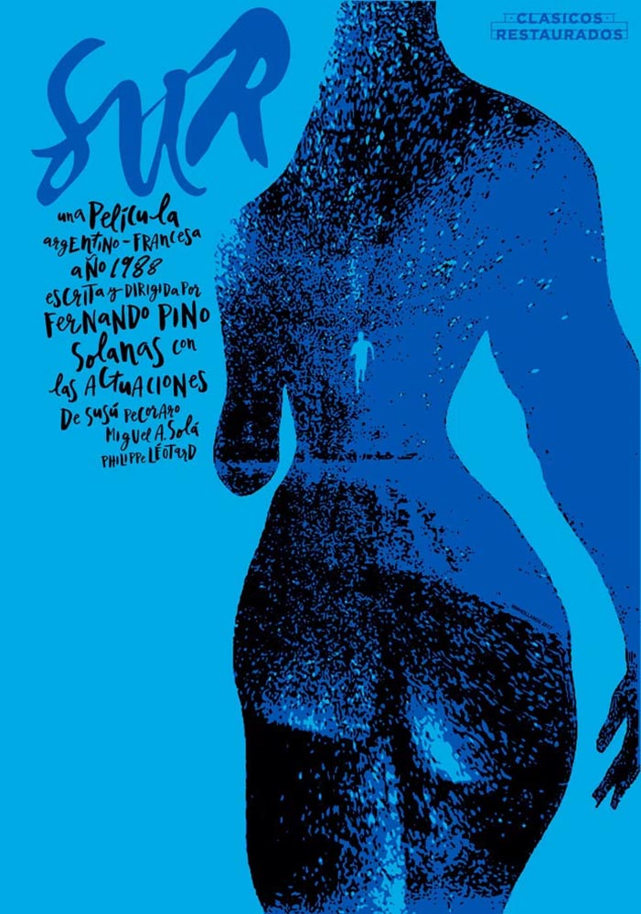
While we’re on the subject of great posters — and It’s Nice That — let’s talk about how Cuba’s revolution-era political posters transformed their poster design for films. Appropriately enough, a new film, El Cartel Cubano, highlights these amazing (and, likely, never seen before) items.

Besos Robados, ICAIC, by Sotolongo & Carole Goodman. Image via It’s Nice That.

How come our posters in the US aren’t this beautiful? What did this say about the priorities of the revolution? What did the medium or choices in the scarcity of materials used say about the economic situation in Cuba?” It’s these questions which form the bedrock of El Cartel Cubano, a fascinating and tender tribute to the artists on the island.

Adrienne Hall, co-director, El Cartel Cubano
Sur, by Michael Myiares Holland. Image via It’s Nice That.

I have to admit: this isn’t a subject I would have leapt at, but It’s Nice That sold it. Awesome.

Get Lectured (on Architecture)

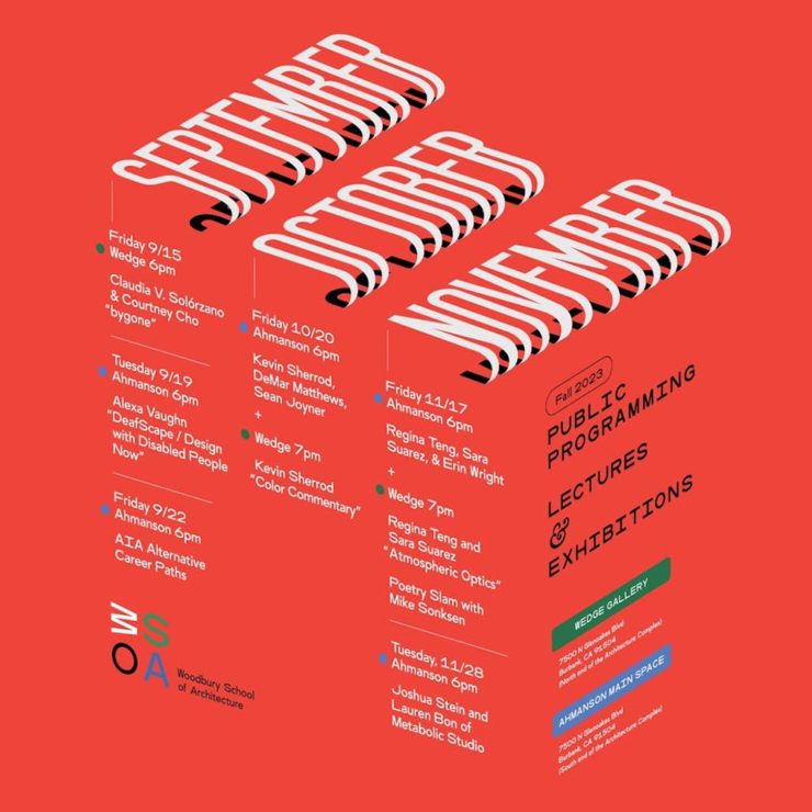
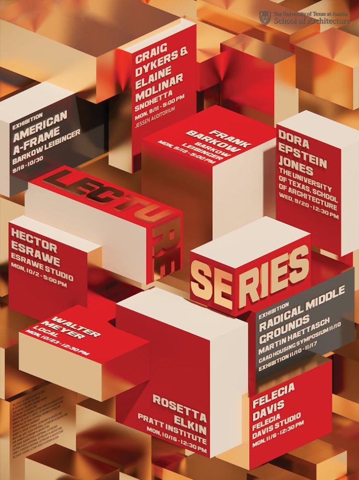
Closing out our trifecta of great posters, Archinect‘s Get Lectured series brings us these fantastic items from their Fall 2023 series:

Woodbury University School of Architecture’s Fall 2023 lecture series.
The University of Texas at Austin School of Architecture’s Fall 2023 lecture series

Some real gems: see more.

Finalists of the 2023 Urban Photography Awards

Going to soapbox a little here: pay-to-enter photo contests aren’t usually something I want to spread the word about. So ArchDaily‘s basically-a-press-release, “URBAN Photo Awards 2023 has announced its list of Finalist Photographers, marking the penultimate stage of the international contest,” was guaranteed a pass.

But there’s a problem: some of the photographs are really compelling.

Untitled, by Claudia Costantino

This one’s my fave:

Back to the 70s, by Stephane Navailles

See the contest website, or ArchDaily‘s post.

Winners of the 2023 Black and White Photography Awards

Another contest, yes. They’re everywhere. But … wow.

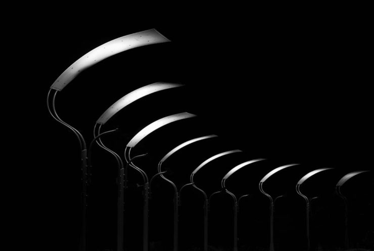
Street Lights – Ottawa, by Gareth Jones, category winner, architecture
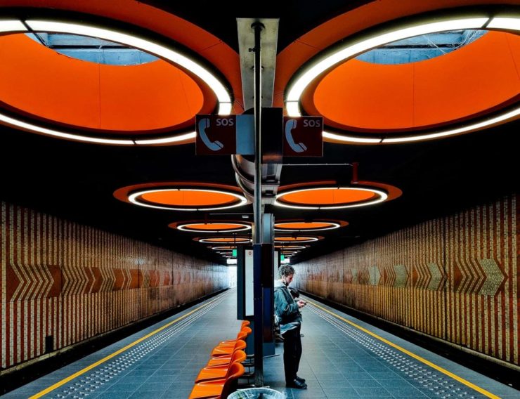
Another mushroom? By Hector Ballester Ballester. Silver mention, architecture.
Alamillo bridge, by Manuel Ponce Luque. Finalist.
The concert, by Helena García Huertas. Finalist.
Reflections on the stairwell, by Max Dobens. Finalist.

And that’s just the buildings/architecture — there are portraits, street photography, landscapes, and more. A reminder to aspire, every day, with every image.

The Black and White Photo Awards (2023). (Via PetaPixel.)

Beautifully Briefed 23.3: Kottke’s 25, The Book Cover Review, B&N Back to its Roots, The End of Type 1 Fonts, and I Don’t Want to Log In

This time, the twenty-fifth anniversary of one of my favorite websites, a new book cover review site, an interview with B&N’s CEO, the end of Type 1 fonts, and a world-class rant.

Kottke Turns 25
“Fine Hypertext Products,” indeed.

Jason Kottke has been publishing a blog continuously for twenty-five years — more than half his life — and along the way, earned many an eye. (It’s been a full-time job since 2005.) Some of his thoughts from the anniversary post:

My love for the web has ebbed and flowed, but mainly it’s persisted — so much so that as of today, I’ve been writing kottke.org for 25 years. A little context for just how long that is: kottke.org is older than Google. 25 years is more than half of my life, spanning four decades (the 90s, 00s, 10s, and 20s) and around 40,000 posts — almost cartoonishly long for a medium optimized for impermanence.

I had a personal realization recently: kottke.org isn’t so much a thing I’m making but a process I’m going through. A journey. A journey towards knowledge, discovery, empathy, connection, and a better way of seeing the world. Along the way, I’ve found myself and all of you. I feel so so so lucky to have had this opportunity.

— Jason Kottke, Kottke.org

Cited here often, always brimming with interesting items, and a regular source of learning, Jason deserves massive congratulations. Happy 25! Here’s to many more.

Bonus: Kottke was a guest on Daring Fireball’s The Talk Show. Check the links — Textism! — and enjoy a trip down blogging’s memory lane.

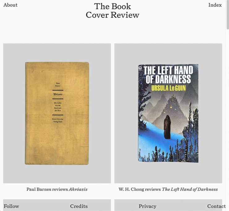
The Book Cover Review
NYT? No, English, actually.

FastCompany points us to a new and interesting cover review site: mostly classic titles, covered in ~500 words “from a range of voices around the world.” Good stuff, with a NYT Book Review look and feel, updated regularly. Give it a try.

The Verge interviews B&N’s CEO
Decode B&N with James Daunt

I’m not a regular listener of The Verge’s Decoder — it’s usually business-centric, going so far as to describe itself as secretly about org charts — but this one’s interesting: an interview between Nilay Patel and Barnes and Noble CEO James Daunt. They cover changes at B&N (with emphasis on why) and, of course, the elephant in any room:

[Amazon is] really terrible at putting a book in front of you that you never thought you’d want to read, that you have no reason to read and no tether to at all. Whereas a bookstore is precisely the place that does that. You pick up the book that you never thought you would want to read, might read, or could even think about reading, by an author you’ve never even heard of until that moment. When a bookseller says, “Look at that,” “Read that when you next come in,” or “I love that,” or whatever it is, all those small, little recommendations are personal and able to attach themselves to books that otherwise have nothing going for them at all.

James Daunt, CEO, B&N

Props to The Verge for providing a full transcript, especially helpful for folks who would rather read the interview than listen to it. Whether you want to read or listen, though, book lovers in the US should take in this interview.

Adobe Discontinues Type 1 Support
Flying Suitcases.

Back in the old days, Type 1 fonts were the backbone of desktop publishing. They were multi-part, often incomplete or corrupted, and always getting in the way of perfect print output — and yet beautiful and opening never-before-appreciated horizons of possibility for your projects.

Now, in these days of OpenType, Google Fonts, and digital output, Adobe has taken the decision to discontinue support for the legacy Type 1 format. TypeNetwork has the full story, along with some options, and there are other converters if you need ’em.

Bonus: TypeNetwork also has all of the Adobe Originals, from back when Adobe was your go-to instead of the corporate behemoth. Classy classics: see the list.

The end of an era. (Via BrandNew.)

The Perfect Rant: Solved
There’s a park calling your name.

One more from The Verge: “I don’t want to log in to your website.” The surge of login and email requests before being allowed to read “free” content is addressed brilliantly:

So what we’re looking at here is creating a worse user experience in order to pursue a variety of scummy money-making schemes. And that sucks because there are no real public spaces on the internet. Here in reality, I can fuck off to a park and hug a tree and sit on a bench and do stuff without ads, without anyone trying to track me, and without having to pay a dime. There was a time within my memory when people tried to make websites feel like semipublic places — you could hang out on someone’s cool blog and enjoy yourself. 

Elizabeth Lopatto, The Verge

Read the whole thing, nod in agreement, and go enjoy that park.

Beautifully Briefed, Holiday Edition (Late December, 2022): Nick Heer, Jason Kottke, Stealing Sheep, a Landscape Photograph, and Some Old Logos

“The Bleak Cycle”

I don’t usually think it’s fair to quote another blog post in its entirety, and I certainly won’t make a habit of it. With that out of the way, the always-interesting Pixel Envy, written by Nick Heer, hits us with a doozy — one that, due to its length and depth, requires the complete quote:

The Bleak Cycle

It’s a cycle. People create something, together, that reflects their energy and weird work; that thing becomes compelling as a result, and that makes it valuable, and at some point someone puts a price on it and someone else pays that price. It is at that moment that the thing begins to change. The new owner will almost always decide that what is most interesting about this thing is not the human essence that gave it value, but The Owner Himself, and will act accordingly. People will come back for the valuable stuff until the owner succeeds in crowding it out; when that crowding is done, the owned thing dies. Until then, what’s left is just what’s valuable—the humanity and brilliance and unpredictability and fun that all that cynical and idiotic and self-serving wealth is always and everywhere busy replacing with itself. There’s nothing to do but look for the good stuff until the looking becomes too challenging, or until it’s gone.

David RothDefector

Heer writes in response: “You may disagree with Roth’s headline thesis — ‘everything is Silicon Valley now’ — or his tie-in with the story du jour, Twitter, or his analysis of baseball’s problems. But the paragraph above? That is something to keep pinned in your brain. For most of us, it is a reminder to be wary of how things are changed in exploitative ways; for those in power, it should be seen as a cautionary pattern.”

Pinned.

Kottke is Back!

After a few months off, Jason Kottke is back in the blogger’s seat to enrich all of our lives. As someone who’s been reading for years — he started in 1998, and I’m certain his site was in the blogroll of the old Foreword, back in the Aughts.

Fine hypertext products indeed: Kottke.org, December, 2022.

We might be waiting a while for his so-called “comically long what I did on sabbatical post,” but his Sabbatical Media Diet post is a gold mine of to-read and to-watch items.

Welcome back, sir. May you blog for many seasons more.

Stop Stealing [Free] Sheep

No, not that — the type book:

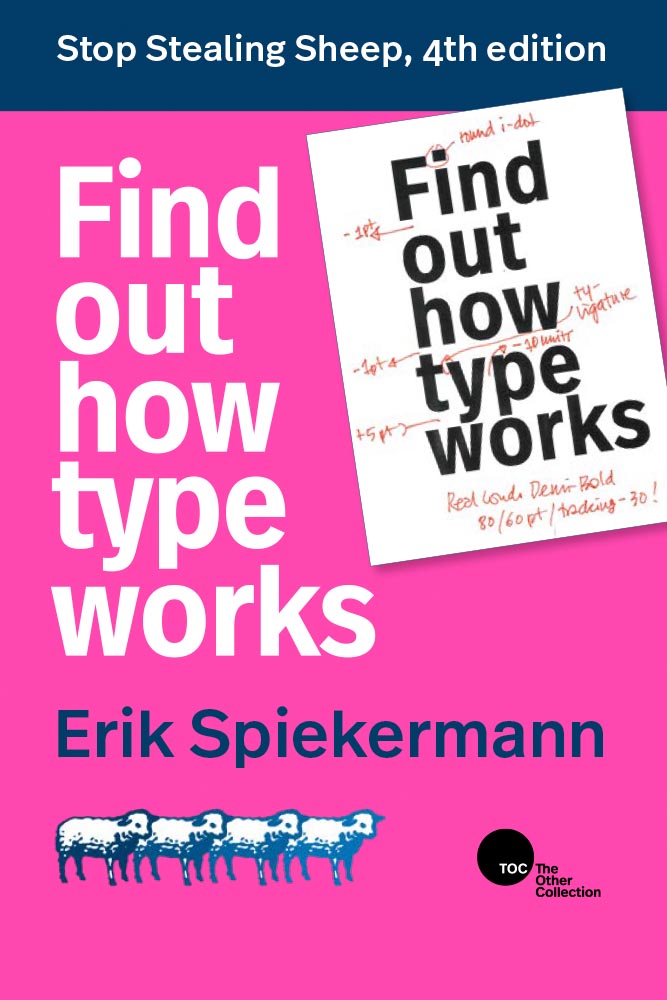
From Kottke, while we’re on the subject, one of his Quick Links from Dec 20th: “Google Fonts is offering a free download of the newly updated 4th edition of Erik Spiekermann’s Stop Stealing Sheep & Find Out How Type Works.” It’s a PDF, available now.

9th Annual Landscape Photography Awards

It’s fair criticism to say that I both decry photography contests and yet sometimes celebrate the results. But…:

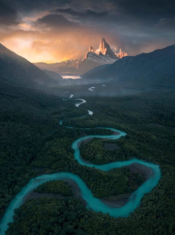
“The Winding Journey” by Max Rive, Border Between Chile And Argentina, Patagonia

Wow. I couldn’t not highlight that photograph.

Many more at the source. (Via DPReview.)

Oldest Logos Still in Use

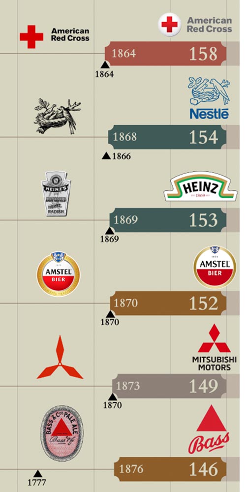
Image Relay has an interesting item showing how long some familiar logos have been used — and, yeah, there’s a reason they’re familiar!

The black triangle is when the company was founded, and the bar indicates how long a logo with elements still used today has been around.

That’s but a sample of the complete listing; shown are nos. 3–8. Coca-Cola, the company I’d probably name if asked for the oldest logo, is no. 12. Click through for the rest.

That’s it for this year

Foreword will be back in January with our annual first-of-the-year best-of: my favorite book covers of 2022. Happy holidays, everyone!

Top image: Tree Lights, December 2020, downtown Macon, Georgia.

Beautifully Briefed, May 2022: Two on Type, Two on Photography, and Kottke

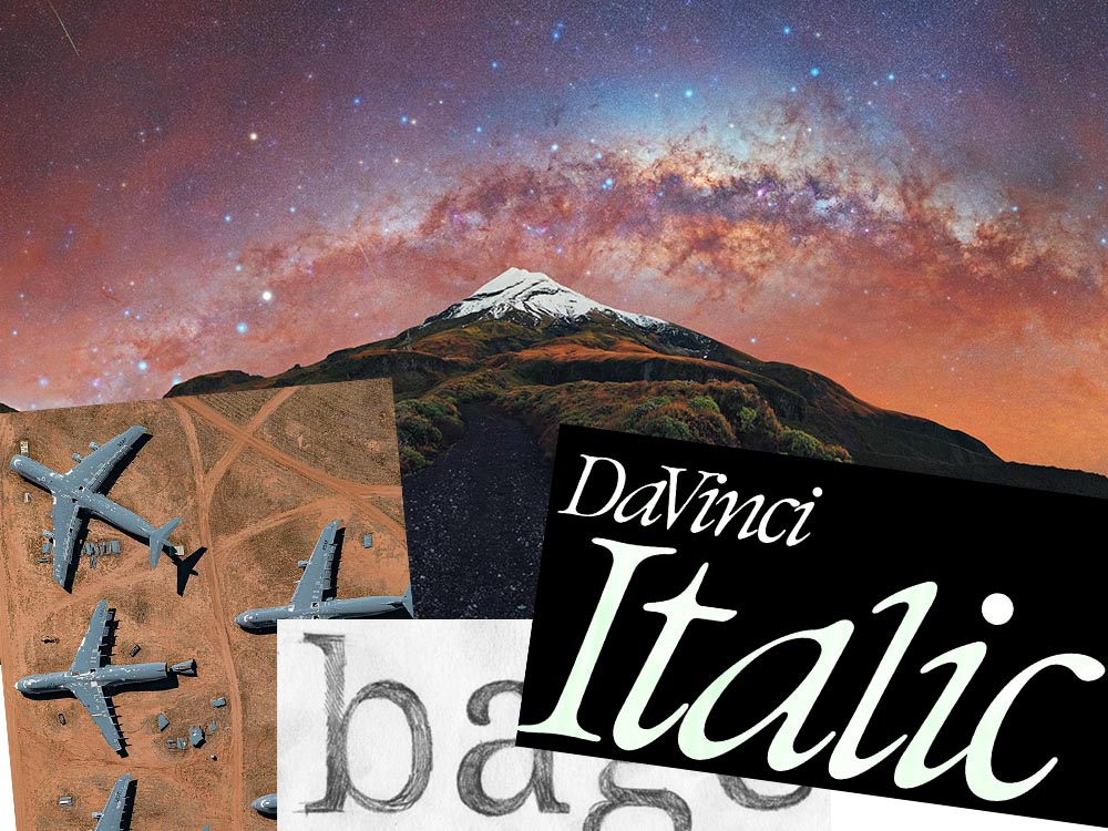
This month’s favorites cover a delightful new extension of the typeface DaVinci, Google’s updated mega-font, Noto, photographs of a desert aircraft boneyard from above, and mega-photographs of the Milky Way.

Before we get there, however, I wanted to wish Jason Kottke — whose 24 years of web sleuthing has been a source for items here on Foreword dating back to its original iteration in the ’90s — good luck on his sabbatical:

“I need some space to think and live and have generative conversations and do things, and then I’ll make something, but I can’t tell you what it is just yet.”1Alexandra Bell, NYT That’s the sort of energy I need to tap into for a few months.

Hear, hear.

The Beautiful DaVinci Italic

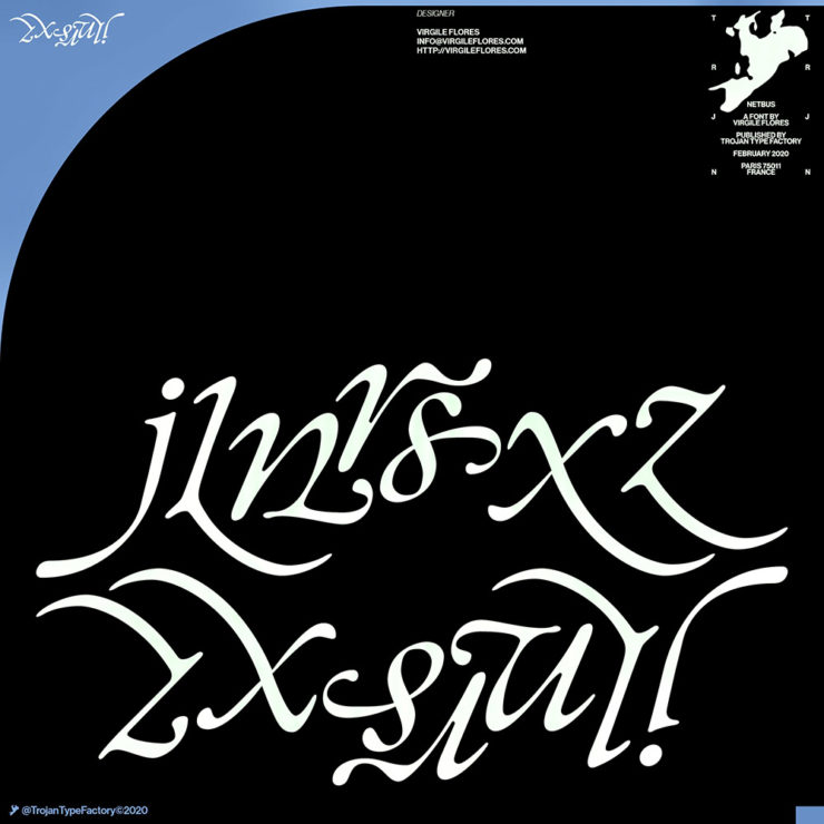
It’s Nice That points us to a new, extended version of the font DaVinci, done for Sydney’s Biennale:

“When you do this sort of type exercise — based on printed letters — it gives a very organic shape and form, in opposition to the very metallic sharp shape from type materials.” Furthering this organic look by pushing the fluidity curse at its maximum, Virgile ended with a design “which is very historical, yet with a contemporary twist.” 

Just look at those glyphs!

Makes you want to find an excuse to use it. But that’s not all: Flores is an incredibly diverse artist whose work both challenges and inspires. See more.

Google’s Noto

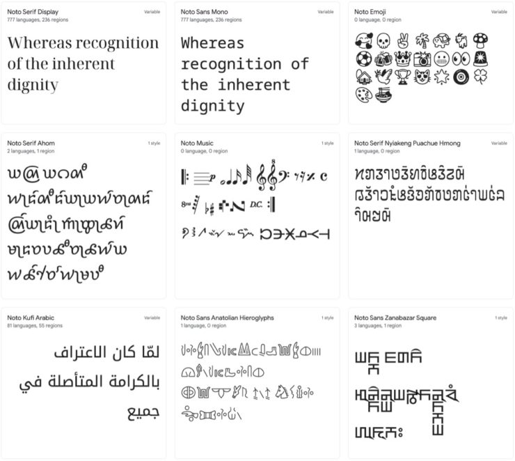
Called “A Typeface for the World,” Google’s Noto defines “megaproject.”

Noto is a collection of high-quality fonts with multiple weights and widths in sans, serif, mono, and other styles. The Noto fonts are perfect for harmonious, aesthetic, and typographically correct global communication, in more than 1,000 languages and over 150 writing systems. 

Google’s Noto font collection.

According to Google,

“Noto” means “I write, I mark, I note” in Latin. The name is also short for “no tofu”, as the project aims to eliminate ‘tofu’: blank rectangles shown when no font is available for your text.

While the font itself has been around for a few years — 2013 seems like yesterday in so many ways! — it’s updated regularly, cover 150 out of the 154 scripts defined in Unicode, and deserves attention from every web designer and type nut. Read more at Google or Wikipedia. (Via Kottke.)

Aircraft Boneyard, From an Aircraft

This is Colossal introduces us to Davis-Monthan Air Force Base in Tucson, Arizona, whose desert conditions are ideal for storing — and scrapping — aircraft:

What happens when the military’s aircraft are end-of-lifed

The photographs are by Bernhard Lang — whom Colossal has highlighted before — and who has an incredible talent for finding patterns from above. See many more at his website.

Milky Way Photography

We don’t get many opportunities here in Middle Georgia, but in other, less populous (read: less light-polluted) places in the world, the Milky Way shines forth from the heavens:

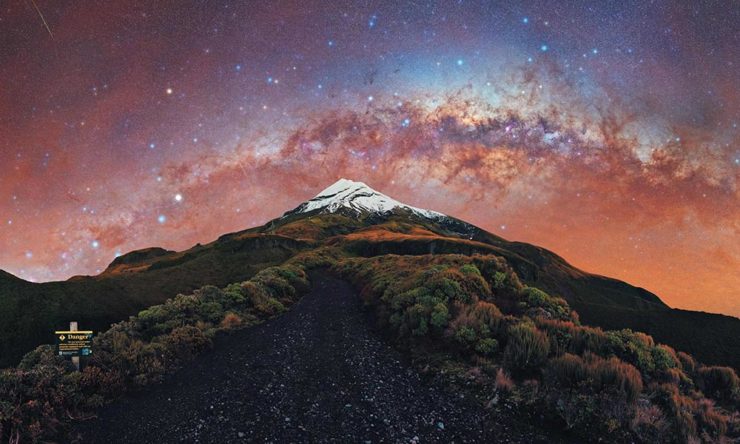
Mountain, redefined.

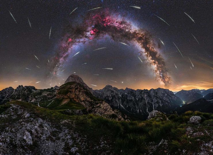
The Guardian points us to the 2022 Milky Way Photographer of the Year, and many just wow:

Take cover . . . in awe!

Check ’em all out, be inspired to take one of your own, or simply be reminded just how big this system we’re a part of is. Enjoy.

Letterpress Typeface from Plymouth Press

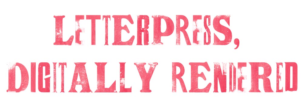
Letterpress type, digitally

James Brocklehurst is leading a new kind of innovation method for typography, harking back to the good old days of the letterpress. The technology uses scanned letterpress prints for each letter, and through scripting, randomly cycl[ing] through a range of alternate letterforms whilst you type.

The font uses OpenType scripting to automatically cycle through a range of alternate glyphs for each character, giving a ‘random’ appearance as you type. (Alternates can also be chosen manually in supported applications.) Very nice, and if you jump through some hoops, some neat results:

Letterpress type, digitally

It’s display only — no numbers, limited punctuation — but absolutely worth the download. And did I mention it’s free? Go!

(Via It’s Nice That. Thank you.)