Beautifully Briefed 23.11: Considerations

A selection of diverse items for this entry in the series: a new publication from The Guardian, open source fonts for your 2023 goodness (along with more for ’24), and the Natural Landscape Photography Award winners. Also: DAK. Let’s get into it.

The Long Read

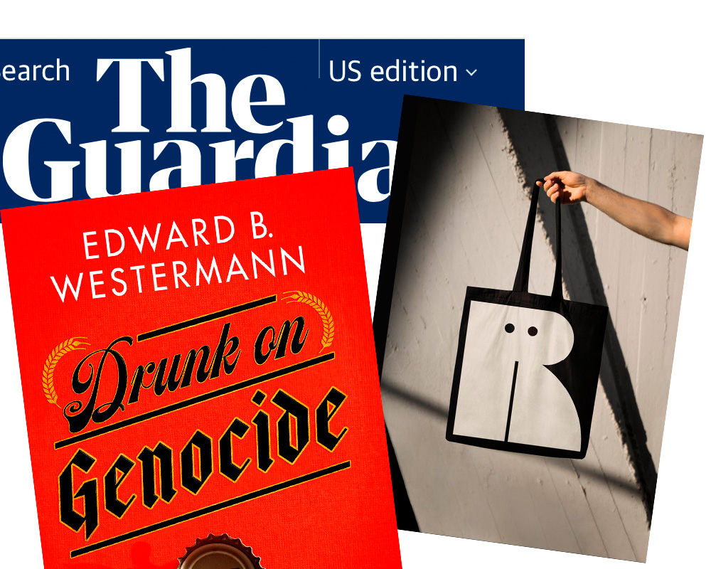
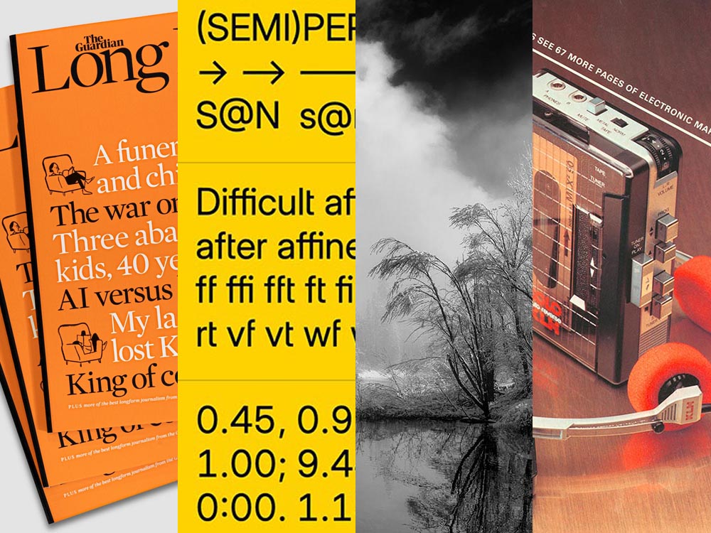
Regular readers will know that I’m a big fan of The Guardian, including its unusual-for-journalism payment model (that, frankly, some outlets in the US would be wise to copy). Now, they’re on newsstands with a “bookazine” called The Long Read.

The back cover. (See the front cover at the left in the header image.)

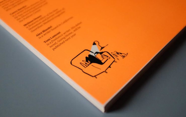
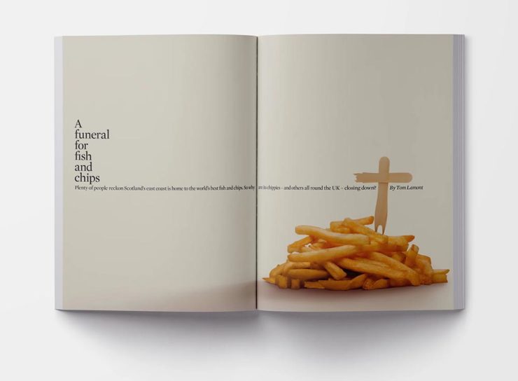
“We know that for many people, myself included, when it comes to long, immersive pieces, reading in print […] is still the most satisfying reading experience, and one that should be cherished in a climate so saturated by disturbance,” quotes It’s Nice That. With most of these more evergreen stories taking months or even years to build, hardy print felt the best way for them to live. [A] ‘bookazine’, it balances all the things we love about magazines (“the drama, the pace, the energy”) with the considered typesetting of a book. A lot of attention was given to packaging its large volume of text – clocking in at 55,000 words – to make the reading experience as relaxing as possible, from body type size to column widths.

Liz Gorny, It’s Nice That
An article title page — indeed, the best of a newspaper magazine in book form.

Read more at It’s Nice That, and give The Long Read a look at The Guardian bookstore or a newsstand near you.

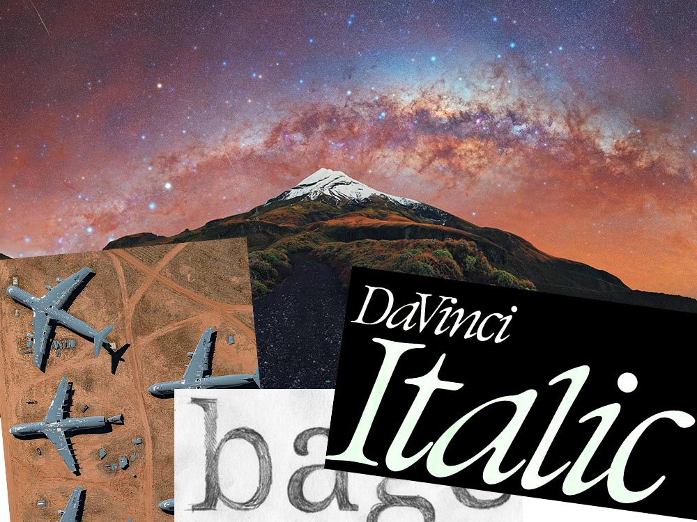
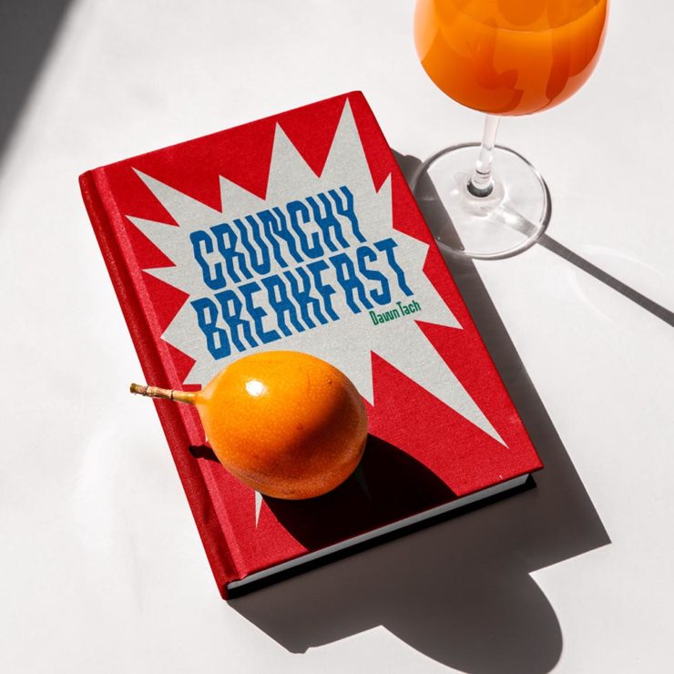
Three Open Source Fonts for 2023, and 50 for ’24

As a self-confessed font junkie, I’m always interested when a new one comes across the bow — but there are so many these days, they’ve unfortunately become almost commodities. (That’s a huge shame, but also a discussion for another time.) So it’s interesting when I see ones that are not only good but also available for everyone, free and open source.

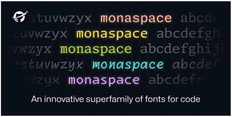
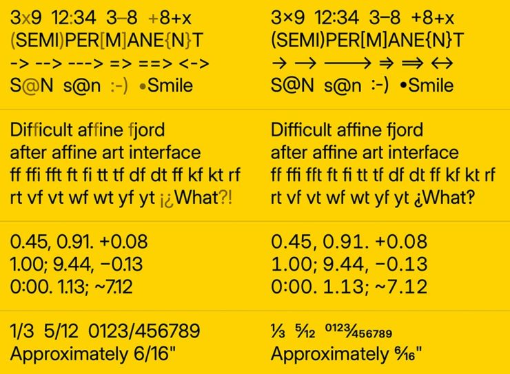
Monaspace is the first of three I want to highlight, “a monospaced type superfamily with some modern tricks up its sleeve.” Designed for code — hence the monospace — it’s a successful answer to the question, “Letters on a grid is how we see our code. Why not make those letters better?”

Get the full story or download from GitHub.

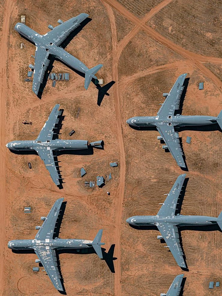
B612 is designed for — get this — the screens on Airbus commercial planes. “[T]he challenge was to improve the display of information on the cockpit screens, in particular in terms of legibility and comfort of reading, and to optimize the overall homogeneity of the cockpit.” Read the back story here.

B612 is available from Google or GitHub.

Inter is described as, “The 21st century standard,” “a workhorse of a typeface carefully crafted & designed for a wide range of applications, from detailed user interfaces to marketing & signage.” One of the world’s most-used font families, it’s perfect when readability is at the fore.

Inter is detailed and downloadable here.

But there’s more!

Brinca by In-House International. (Image via CreativeBoom.)

CreativeBoom has their annual compilation of 50 new fonts for the coming year up, “a comprehensive list of the best fonts that demand your attention in 2024. We’ve compiled this comprehensive list by asking the creative industry for their favourites, analysing work from the last 12 months, and taking on board the design trends emerging right now.”

National Museum in Gdańsk by Tofu Studio. Featuring Migra by Pangram Pangram. (Image via CreativeBoom.)

Great stuff. Creative. Boom!

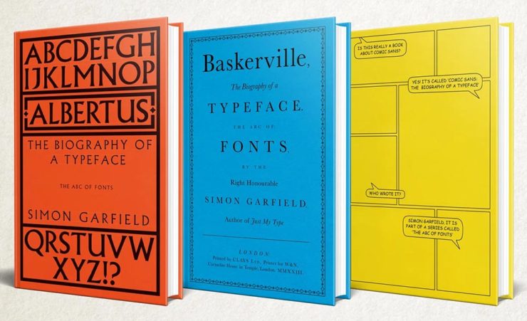
Special Bonus: Simon Garfield publishes biographies on Albertus, Baskerville and Comic Sans. Seriously:

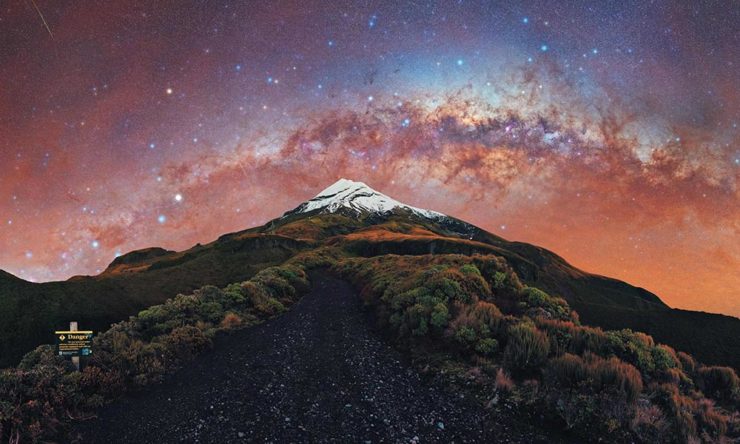
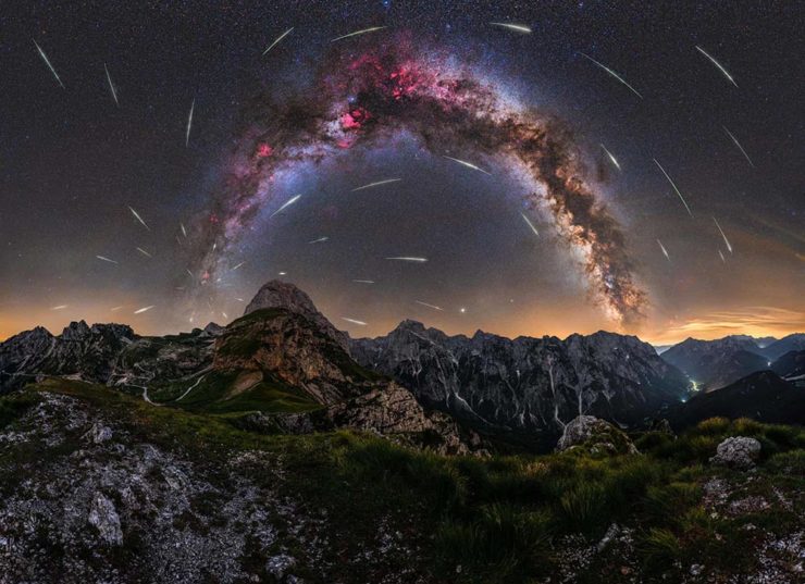
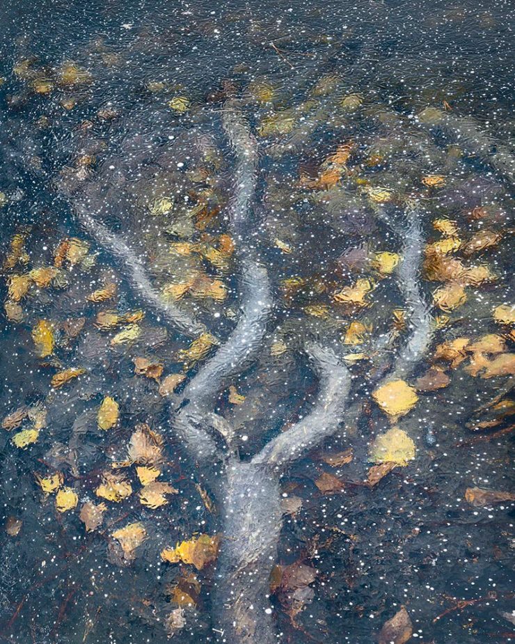
The Natural Landscape Photography Awards

For once: a contest that demands more — like the original RAW files. (Literally the raw image from the camera, before processing, for those who don’t know — think film negatives, rather than the resulting prints.) Okay, sure, it’s not perfect; there are entry fees and it doesn’t have a long track record, but the rules are solid with respect to image integrity.

Of course, the quality of the subject chosen to photograph is, if you’ll pardon the expression, subjective. The overriding theme here seems to be the perfection of dramatic subtlety — not an easy thing to get right.

Photo: Adam Gibbs
Photo: Adam Gibbs

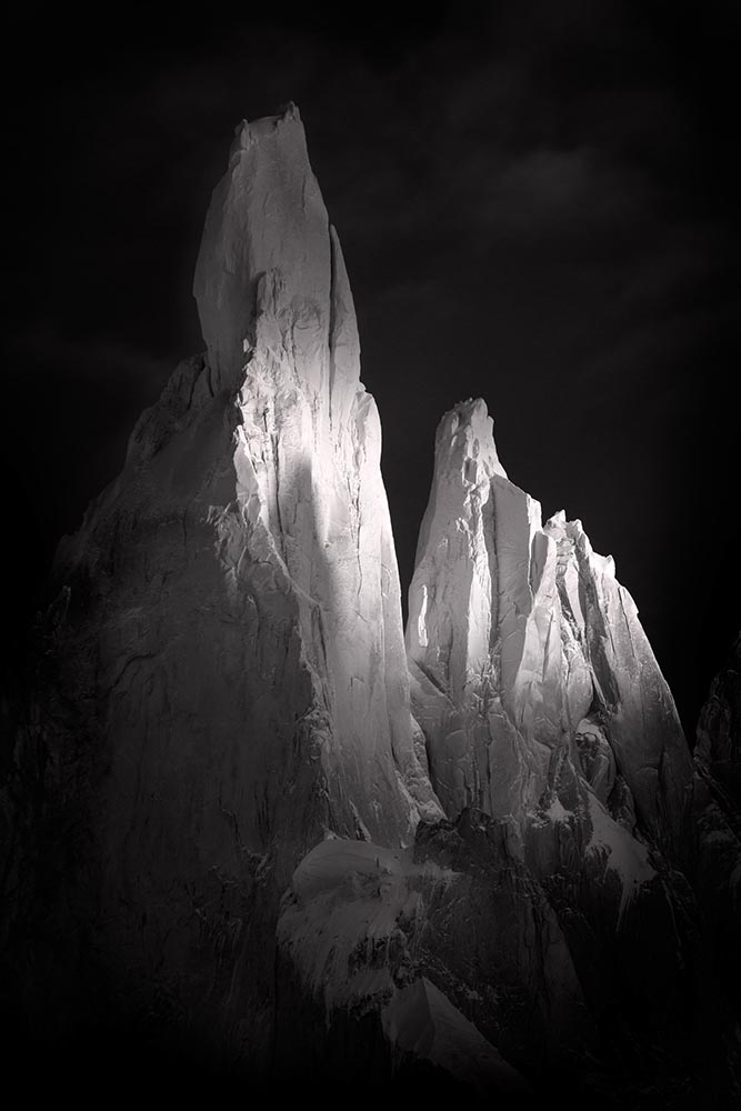
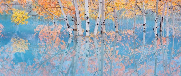
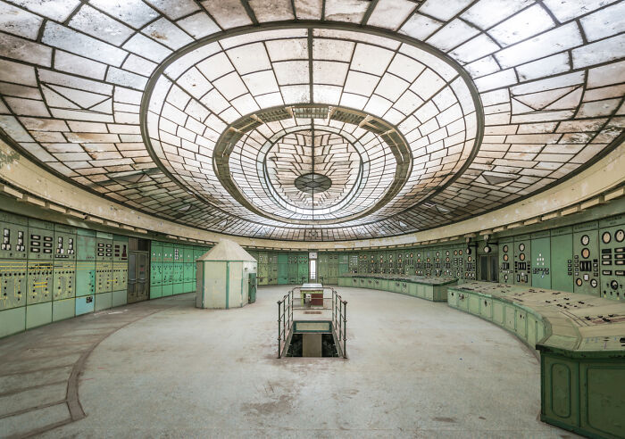
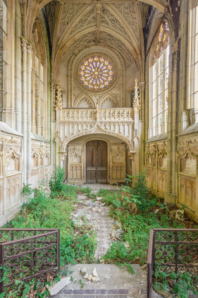
The two photographs above are both by Adam Gibbs and reflect the judges’ desire to reward photographers who display a diverse portfolio of subjects.

Photo: Alberto Rodriguez Garcia
“Once Upon a Time.” Photo: Matt Redfern

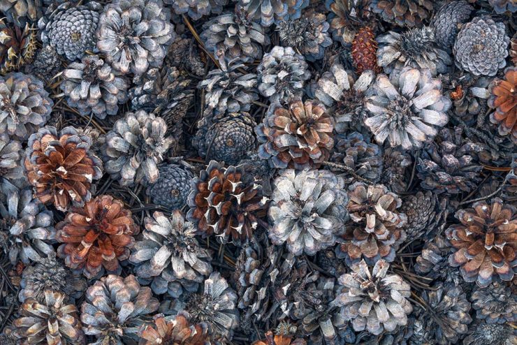
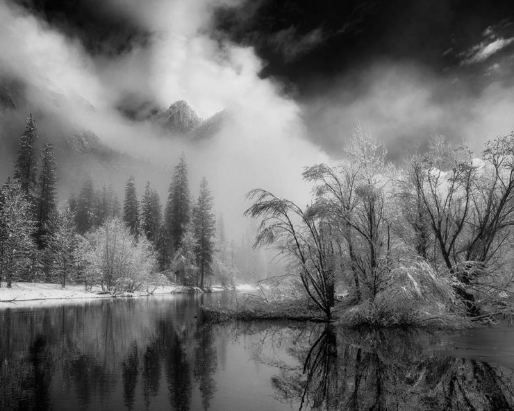
A winner from the “abstracts and details” category for the first and a great title for the second image that does indeed tell so many stories. Rounding it out, another beautiful black-and-white:

Photo: Franka Gabler

See the contest website for the complete selection of 2023 winners. (Via PetaPixel.)

Remember the DAK catalogs?

If you’re a certain age — that is, were around in the ’80s — the DAK catalog was a regular. (Give me one, together with a JC Whitney catalog, and a weekend was gone.) A recent post by Cabel Sasser brought it all back:

The catalog from Summer 1983.

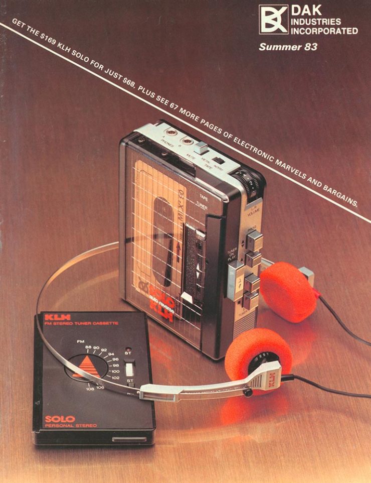
Oh, the products. The explanations. The fun.

I’m not going to spoil the effort put into the story of Drew Alan Kaplan, a.k.a. DAK, Joseph Sugarman, Products That Think, or any of it: go enjoy for yourself.

Beautifully Briefed, May 2022: Two on Type, Two on Photography, and Kottke

This month’s favorites cover a delightful new extension of the typeface DaVinci, Google’s updated mega-font, Noto, photographs of a desert aircraft boneyard from above, and mega-photographs of the Milky Way.

Before we get there, however, I wanted to wish Jason Kottke — whose 24 years of web sleuthing has been a source for items here on Foreword dating back to its original iteration in the ’90s — good luck on his sabbatical:

“I need some space to think and live and have generative conversations and do things, and then I’ll make something, but I can’t tell you what it is just yet.”1Alexandra Bell, NYT That’s the sort of energy I need to tap into for a few months.

Hear, hear.

The Beautiful DaVinci Italic

It’s Nice That points us to a new, extended version of the font DaVinci, done for Sydney’s Biennale:

“When you do this sort of type exercise — based on printed letters — it gives a very organic shape and form, in opposition to the very metallic sharp shape from type materials.” Furthering this organic look by pushing the fluidity curse at its maximum, Virgile ended with a design “which is very historical, yet with a contemporary twist.” 

Just look at those glyphs!

Makes you want to find an excuse to use it. But that’s not all: Flores is an incredibly diverse artist whose work both challenges and inspires. See more.

Google’s Noto

Called “A Typeface for the World,” Google’s Noto defines “megaproject.”

Noto is a collection of high-quality fonts with multiple weights and widths in sans, serif, mono, and other styles. The Noto fonts are perfect for harmonious, aesthetic, and typographically correct global communication, in more than 1,000 languages and over 150 writing systems. 

Google’s Noto font collection.

According to Google,

“Noto” means “I write, I mark, I note” in Latin. The name is also short for “no tofu”, as the project aims to eliminate ‘tofu’: blank rectangles shown when no font is available for your text.

While the font itself has been around for a few years — 2013 seems like yesterday in so many ways! — it’s updated regularly, cover 150 out of the 154 scripts defined in Unicode, and deserves attention from every web designer and type nut. Read more at Google or Wikipedia. (Via Kottke.)

Aircraft Boneyard, From an Aircraft

This is Colossal introduces us to Davis-Monthan Air Force Base in Tucson, Arizona, whose desert conditions are ideal for storing — and scrapping — aircraft:

What happens when the military’s aircraft are end-of-lifed

The photographs are by Bernhard Lang — whom Colossal has highlighted before — and who has an incredible talent for finding patterns from above. See many more at his website.

Milky Way Photography

We don’t get many opportunities here in Middle Georgia, but in other, less populous (read: less light-polluted) places in the world, the Milky Way shines forth from the heavens:

Mountain, redefined.

The Guardian points us to the 2022 Milky Way Photographer of the Year, and many just wow:

Take cover . . . in awe!

Check ’em all out, be inspired to take one of your own, or simply be reminded just how big this system we’re a part of is. Enjoy.

Beautifully Briefed, October 2021: Architecture Photography

Arch Photo Oct 21

Two very different yet very impressive architectural photography items caught my eye this month.

Hélène Binet’s Architecture Photography

Let’s start with an article in the Guardian (UK) on Hélène Binet:

“It’s like being a musician in front a big audience. You can’t get it wrong. In that instant, you have to be the best of yourself, you bring your mind to a place, not to lose that unique moment.” Hélène Binet is explaining her commitment to working with the venerable techniques of analogue, as opposed to digital, photography[…].”

She manages to capture exactly the kind of thing I strive for — potentially abstract, detail-oriented, yet somehow . . . different:

HB3740

And:

HB3k

Beautiful. If you’re in the UK, check out Light Lines: The Architectural Photographs of Hélène Binet, at the Royal Academy, London W1, 23-October-23 January.

Romain Veillon’s Architecture Photography

Meanwhile, from France, we have another: award-winning photographer Romain Veillon with architectural “decay:”

RV1

Brilliant. More:

RV5
RV2
RV4
RV3

He’s got a book out — Green Urbex: The World Without Us (French-language only, alas) — but the photographs don’t need translation. Learn more on ArchDaily.