AIGA once again surprises and delights in their annual competition of book design.
Since its inception in 1923 as the Fifty Books of the Year competition, this annual event highlights AIGA’s continued commitment to uplifting powerful and compelling design in a familiar format we know and love. As book jackets became more prevalent, the competition evolved with the field to acknowledge excellence in cover design. Beginning in 1995, the competition became known as 50 Books | 50 Covers.
AIGA Press Release
The jury and I were very impressed with both the quantity and quality of the entries this year, which made choosing only 50 extremely difficult. Among the trending techniques this year were use of exposed bindings and elaborate page sequencing and mixed paper choices. For me, there was a greater overall sophistication in book design, with a mix of aesthetically beautiful and graphically brash approaches in the final choices.
Andrew Satake Blauvelt, Director, Cranbrook Art Museum (Chair)
As usual, there’s some overlap with various lists of “best of 2022” — here’s Foreword’s — but, as LitHub puts it, these are the best book [designs] of 2022 that you (probably) haven’t seen.
A selection of my favorites, in alphabetical order:
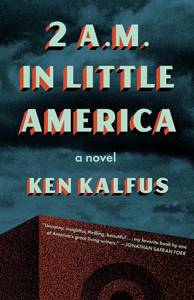
Simplicity itself — along with some awesome block type — add up to a great cover. (Love the angled blurb, too.)
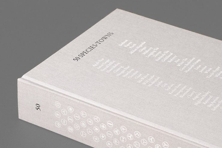
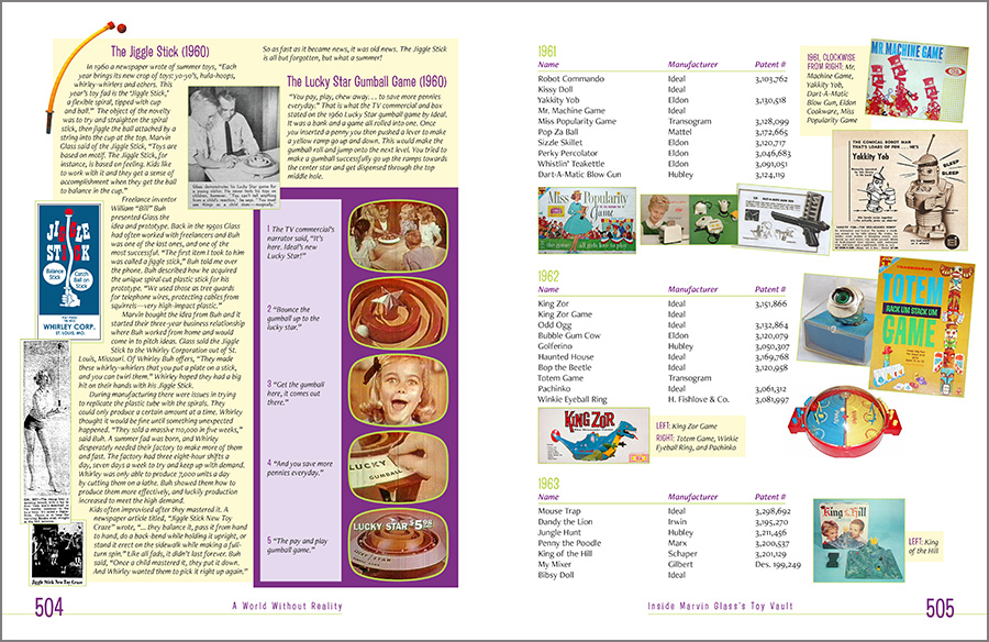
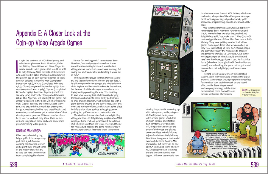
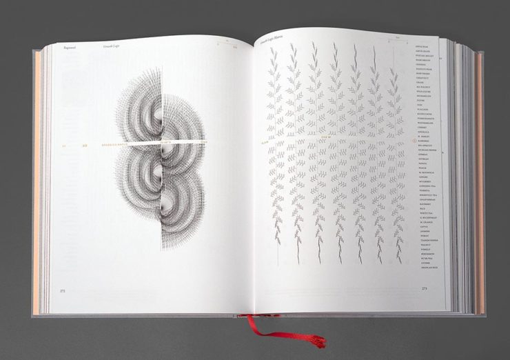
One of the great things about this post is the “50 Books” part; this cover’s okay, and the spine more than okay, but it’s the interior design that really wins in my book (pardon the expression):
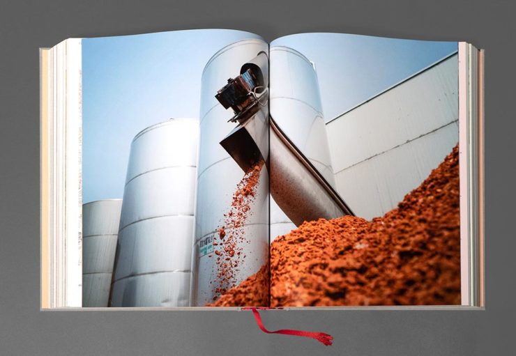
Kudos: the photography is great, but the spread above is artistic in wonderful way.
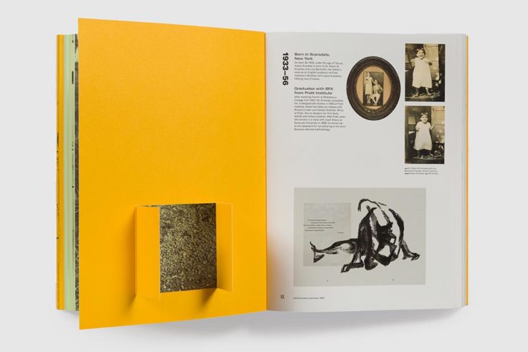
The trend, mentioned above, to mix paper stocks and styles is shown to full effect here. This book has too many great examples to post; see more.
Meanwhile, Uncovering Singapore’s Traditional Chinese Puppets may not be a title you’d automatically reach for, but…:
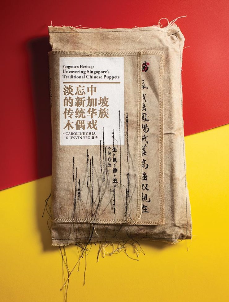
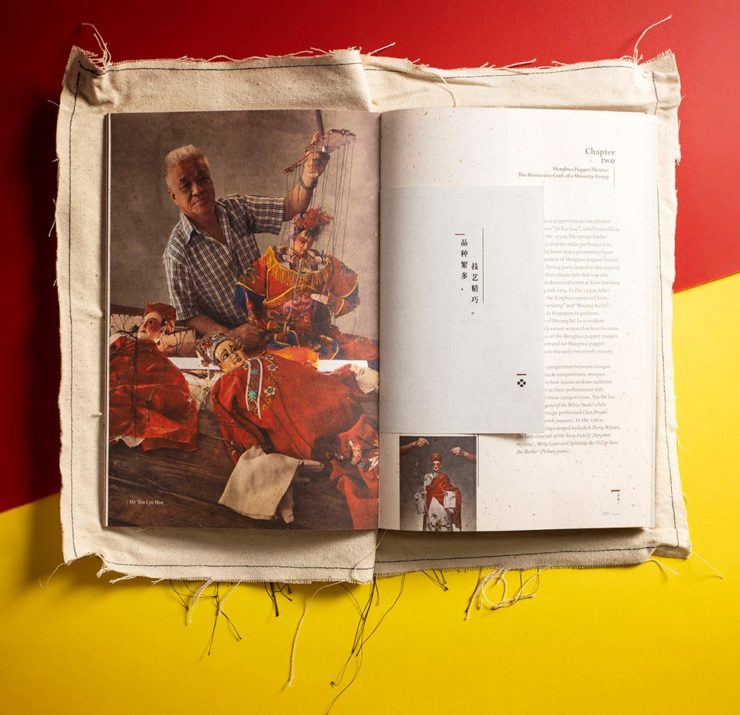
More mixed papers (sizes, too), more great stuff. (See additional examples.)
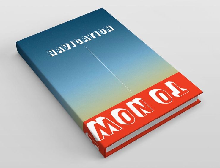
This is an interesting, compelling cover and jacket design as shown above. However, once again, rather than post it all here, I’m just hoping to whet your appetite — you need to see this one unfold (literally).
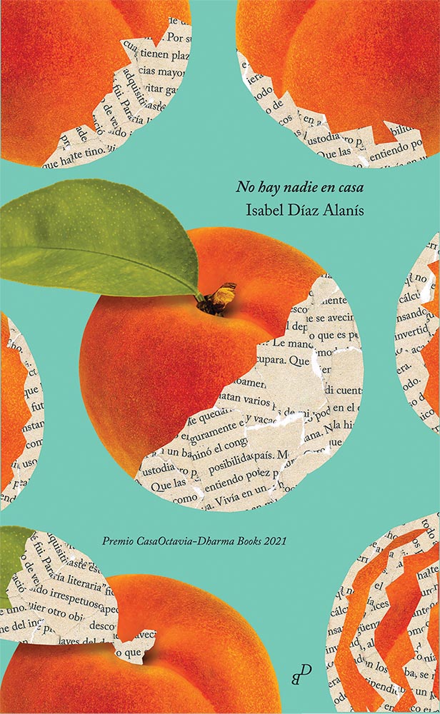
Great colors, great combinations, great cover.
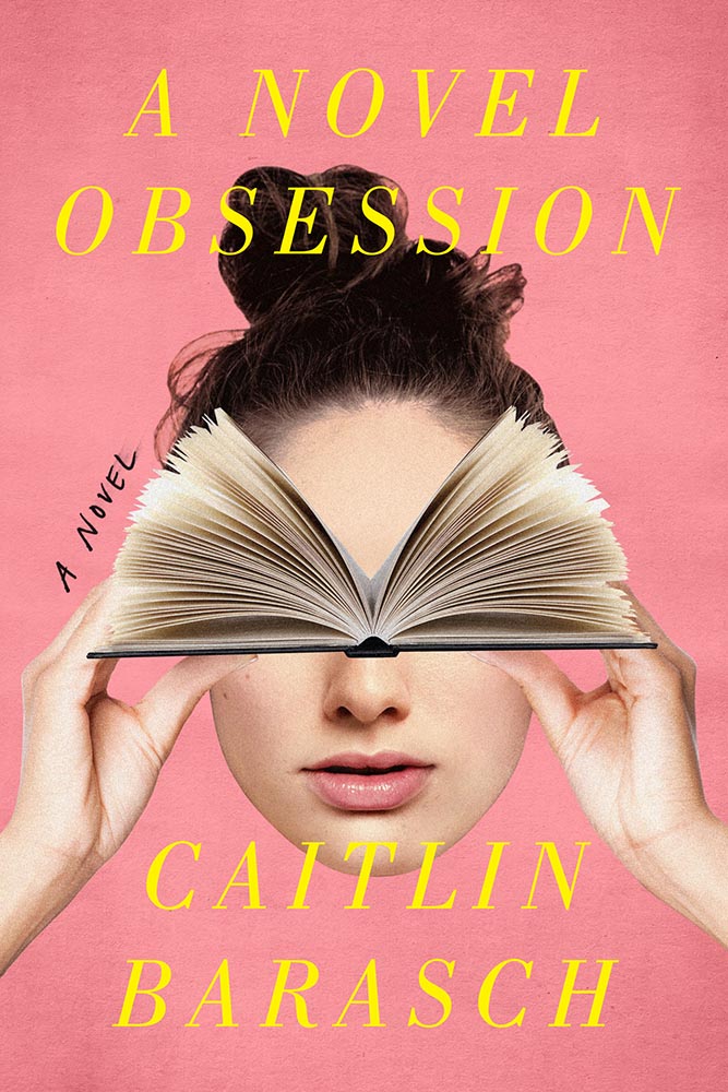
I’m always a sucker for photographs of practical items used in ways that make book covers great, and this one’s a shining (pink) example.
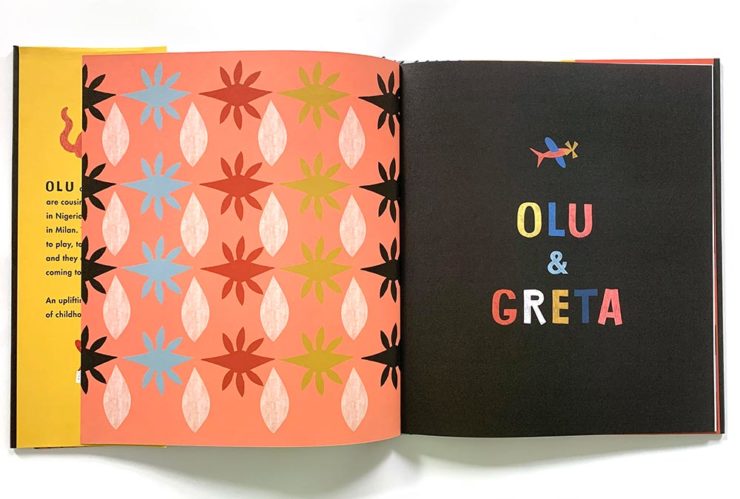
There’s so much great design work done in the children’s book market it’s not even funny. The first of two great examples. (See more from this title.)
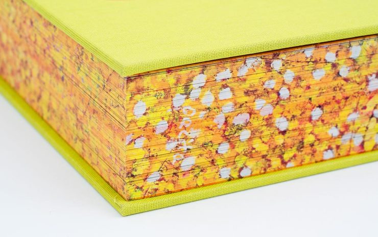
A book’s edges are so often a canvas left unexplored. Not with this book, Pacita Abad. (See examples from this title’s wonderful interior, too.)
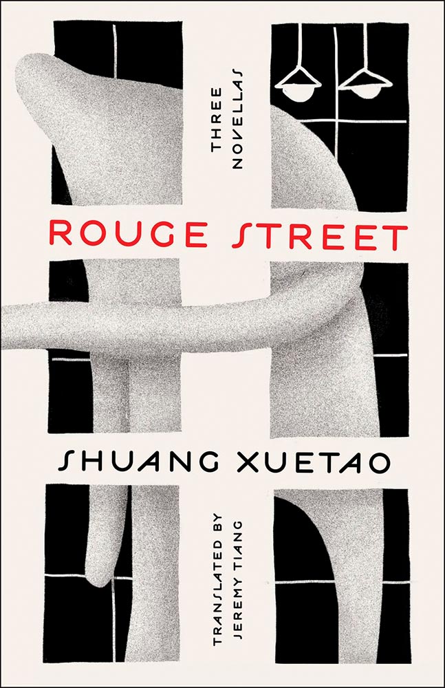
I’ve highlighted this design before, but every time I see it I like it more. Glad to see it as an AIGA 50 Covers winner.
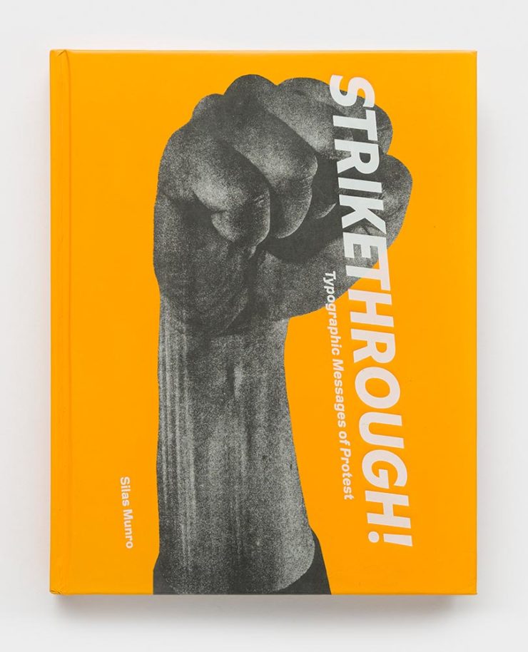
Typographic Messages of Protest, indeed — done in an appropriately powerful way. The suggestion of motion is a great touch.
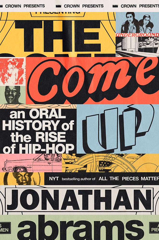
“Block party,” defined. Excellent.
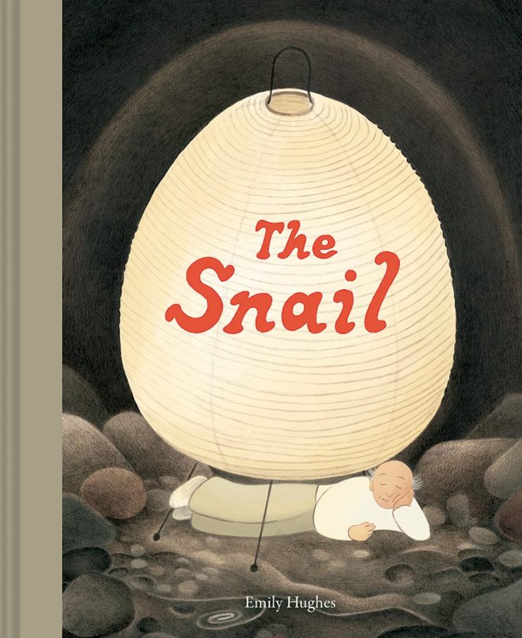
The second children’s title on this list, including an interesting and distinctive style. (See the interior of this book.)
Again, these are only some of my favorites — there are many more, all of which deserve a look. Congrats to all the designers who made these title happen and thanks to the AIGA for this annual delight.
See also: Last year’s winners. Via: It’s Nice That.

