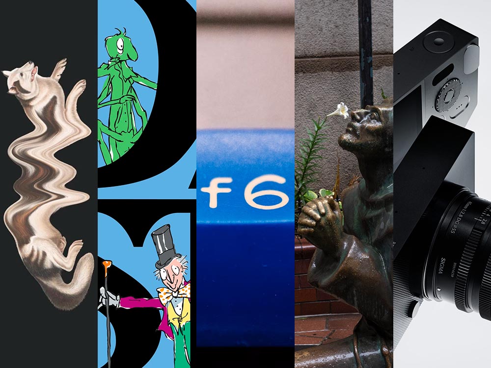
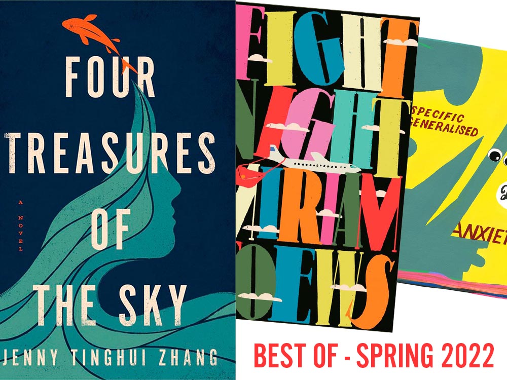
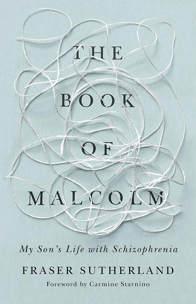
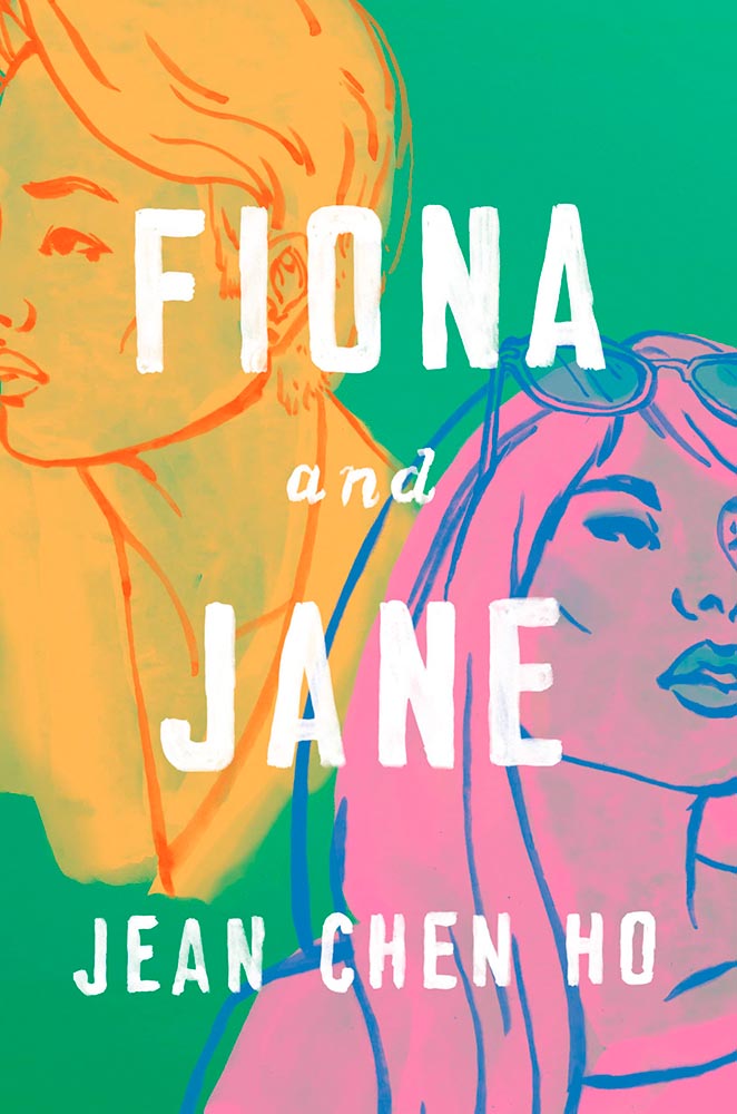
A bunch of tasty ingredients in this month’s post — from friendly identities and open-source typefaces to feel-good photography. Once past the minor rant we’re that covers the other meaning of stew, that is. Read on.
It’s Nice That on Copyright and Reuse
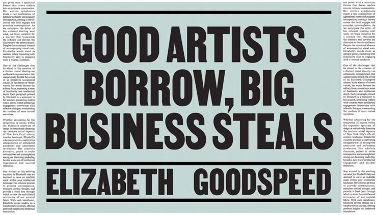
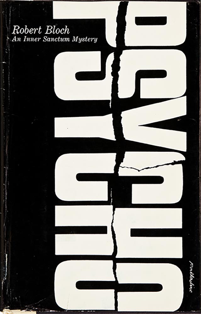
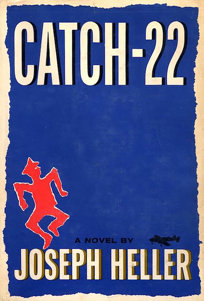
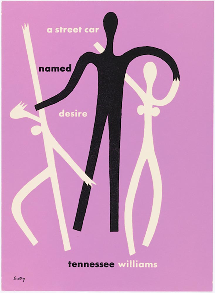
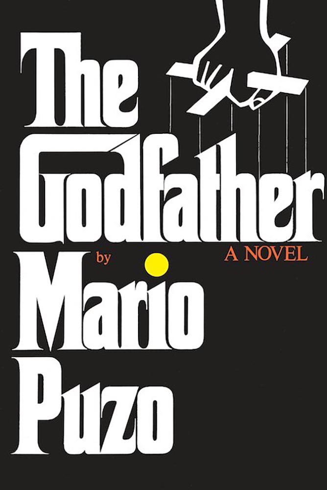
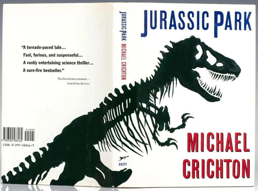
Elizabeth Goodspeed, editor-at-large for It’s Nice That, has a great column up regarding copyright and the current — and trending — business climate, especially with regard to copyright: it’s become the norm, she argues, for companies to mine open-source and expired-copyright imagery instead of hiring an artist, a trend exacerbated by the rise of AI. “Instead of safeguarding creators, copyright now favors whoever has the resources to outlast their opponent in a legal battle,” she writes. “Since public domain material already looks polished, using it also eliminates the time, effort, and expense of creating something new from scratch (not to mention the time spent building its associative meaning from the ground up). But why would anyone ever commission an illustrator when they can just pull something free from an archive?”
She’s done it herself:
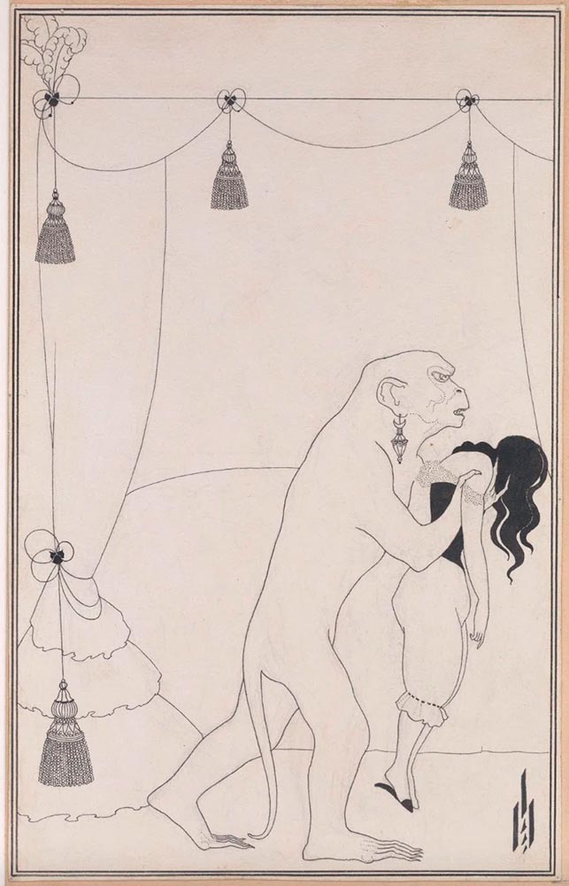
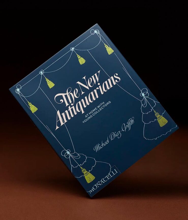
She also points to a new UK proposal for a data mining exemption to be given to AI companies. “[I]t would lead to a “wholesale” transfer of wealth from the creative industries to the tech sector,” Sir Paul McCartney argues. (Source.) But isn’t that true of the larger picture these days, no matter the country?
Not all borrowing is the same. Copying is often more about power than propriety. When working with archival material myself, I like to think in terms of the stand-up comedy rule: punching up vs. punching down. Picking up visual motifs from a billion-dollar corporation that’s built its empire on copyright hoarding? That’s punching up. Repackaging the work of a living artist from a marginalised background without credit or compensation? Likewise, using found material for an indie zine is a far cry from pulling from the same source for a corporate client that could easily afford to commission something new.
— Elizabeth Goodspeed, It’s Nice That Editor-at-large
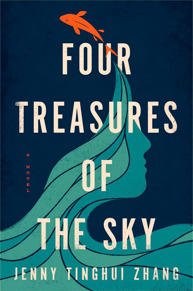
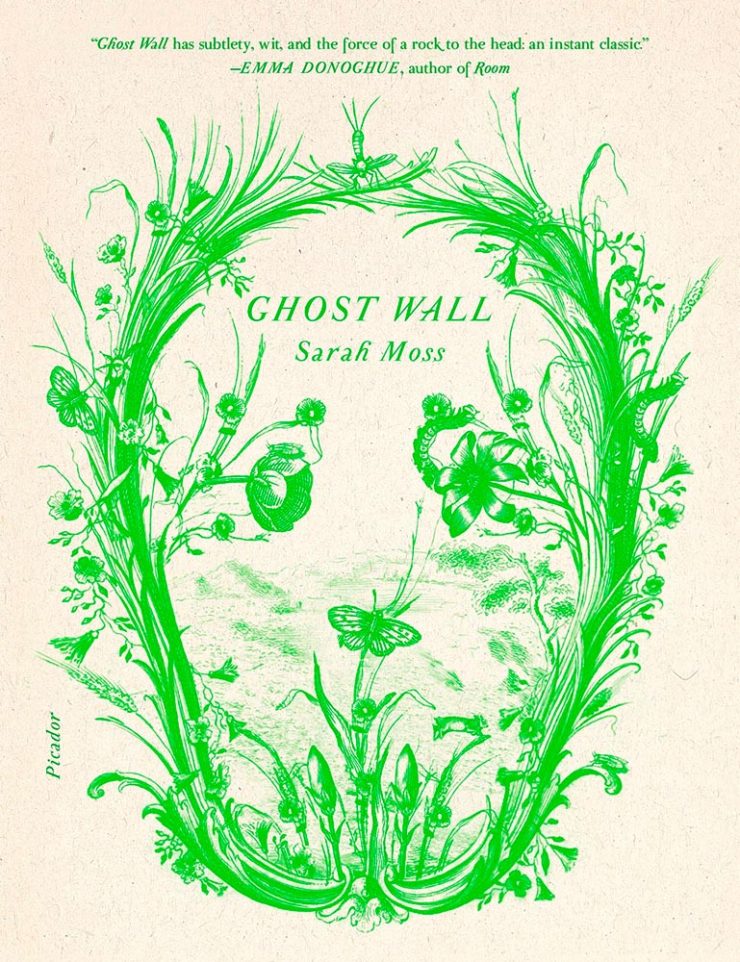
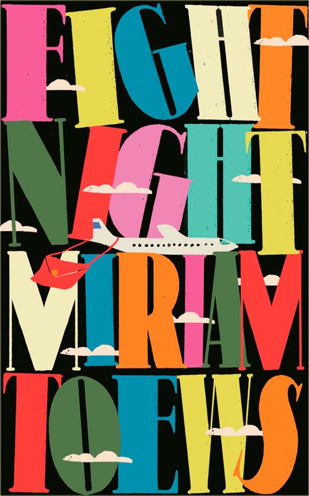
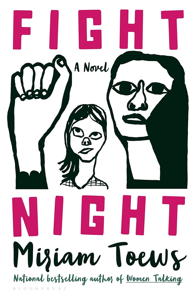
It is most certainly a trend in book design — but the bigger question here is one she states as fact: “[r]ather than referencing the past, designers are stripping it for parts.” It’s worth stepping back, as designers, and consider how we source — and use — imagery.
The entire article, only part of which is discussed above, is worth a read. And more than a moment’s thought.
Okay, on to the fun stuff.
An author on her own book design
Mary Childs, a co-host of the Planet Money podcast on NPR, writes on LitHub what it’s like to tackle the cover design for the book she’d written:
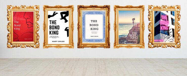
“This very slight, low-stakes request for ‘inspiration’ became an all-consuming assignment. My brain started spitting out cover ideas. And then more cover ideas. I was sure I would break through and create the Great American Finance-book-that-reads-like-a-Novel Cover,” she writes — and, better still, backs up with illustrations.

In the end, she left it to the professionals — but the trip is absolutely worth the read. (Be sure to follow the Na Kim link, too.) Via Kottke.
Special Bonus #1: Speaking of Na Kim, and also via Kottke, she’s somehow found time to start painting. “Be careful what you’re good at, you’re going to get stuck doing that.”
The Fantastic Mr. Font (and other big Dahls)
“Pluckish and playful” is more than a description of the wonderfully-named Fantastic Mr. Font, it’s the description of the new identity for the Roald Dahl Story Company. (Which is, unfortunately, a division of Netflix — but we’ll leave that for another day.)

Just right. So, too, it the font’s interaction with various illustration elements:
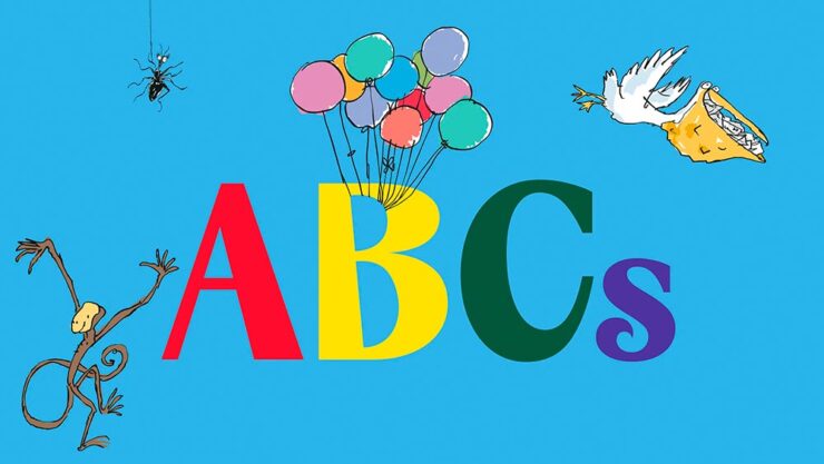
The typeface was “developed in collaboration with type foundry Pangram Pangram, the font is a customisation of its existing font PP Acma, turning its already unconventional characteristics into something ‘more mischievous,’” Ellis Tree — another great name — writes at It’s Nice That.
Read the full, well-illustrated story.
Special Bonus #2: While we’re on the subject of branding, check out the new look for Publisher’s Weekly:
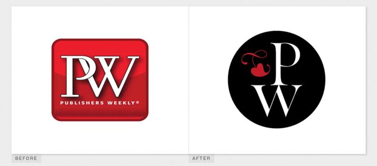
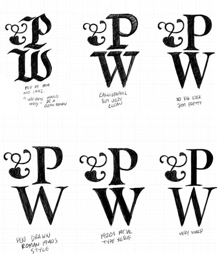
It’s actually a return to an older form, but updated. Their website has a brief explanation. (Via BrandNew.)
Some Fantastic Fonts
Lettra Mono
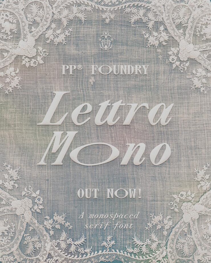
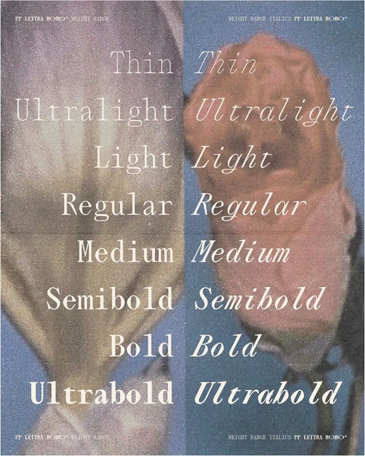
Speaking of Pangram Pangram, let’s start there: their Lettra Mono was the standout of Creative Boom’s roundup of new fonts for February. Monospaced serif fonts are unusual, but good ones….
Inclusive Sans
CB also chose the incredible update to Inclusive Sans, which was also the subject of an article at It’s Nice That — and, better still, free, open-sourced, and now available in five-weight goodness at Google Fonts.
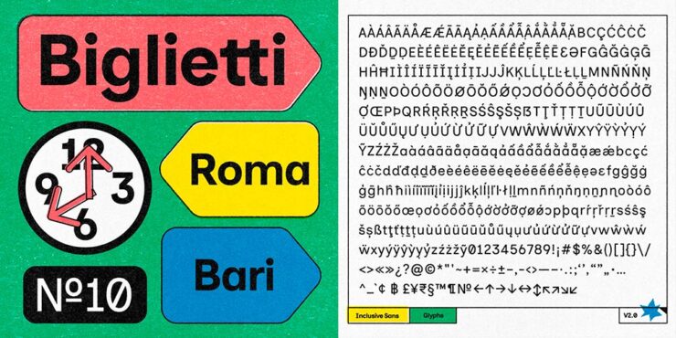
“Inclusive Sans is a new typeface from Olivia King that puts accessibility at the forefront,” It’s Nice That writes. “It’s arisen from the type designer’s research into typographic accessibility and readability – from highly regarded traditional guides and papers to more modern approaches to letterform legibility.”

Gorton
Marcin Wichary — he of Shift Happens fame — pens (heh) an comprehensive and incredibly well-illustrated article on Gorton, a typeface you’re undoubtedly seen but don’t know.
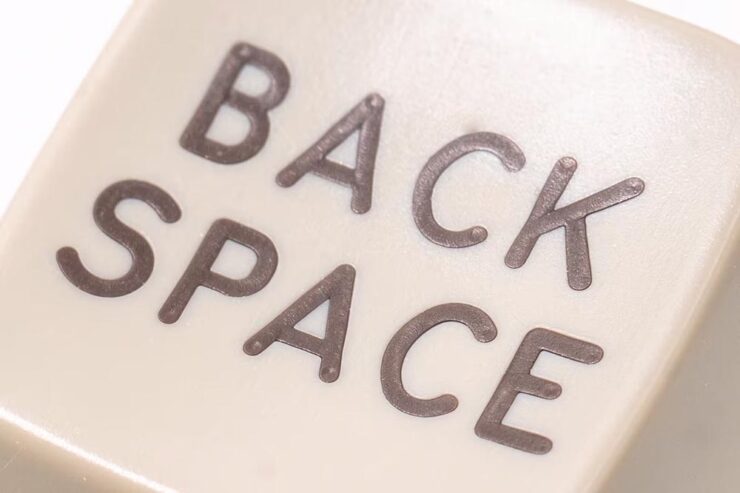
“One day,” he writes, “I saw what felt like Gorton on a ferry traversing the waters Bay Area. A few weeks later, I spotted it on a sign in a national park. Then on an intercom. On a street lighting access cover. In an elevator. At my dentist’s office. In an alley.”
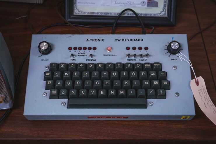
It’s a long post, so save it for when you’ve a minute to enjoy — but 110% worth it.
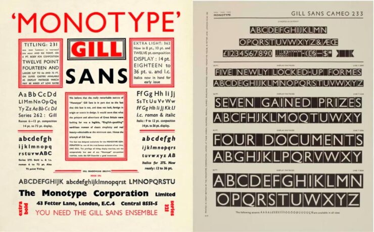
Special Bonus #3: Creative Bloq has a list of the best typography of the 1920s — “from Futura to Industria Gravur” — as chosen by designers. My fave? Gill Sans, of course.
Special Bonus #4: Nick Heer at Pixel Envy comments on a list posted by Robb Knight: “Something very useful from the Atlas of Type: a huge list of type foundries.” A good Canadian citizen, he reminds us that Pangram Pangram is, in fact, Canadian. More: “I was particularly excited to learn about Tiro Typeworks. They have a vast library of type for scientific and scholarly works [… I]f you are reading this on MacOS, you probably have STIX Two installed.”
Some Great Photography
Comet G3 visits every 600,000 years, they say. Hmph.

Great stuff. See more at PetaPixel.
Meanwhile, on the subject of space — and PetaPixel — a reminder that one of the most infamous photographs in history turned 35 on Valentine’s Day:

Aaaand one more from PetaPixel: a book. Eight photographers documented 24 hours at the Vienna Airport, offering up more than a few behind-the-scenes shots — in celebration of its 70th anniversary:

“The project was overseen by Lois Lammerhuber,” PetaPixel writes, “a publisher and photographer, who has since turned the collection of images into a book titled The Dream of Flying.”

The project was “about showing the people who use the airport as well as highlighting the staff who ensure all the airplanes depart and land safely.” My favorite shot:

I’m an airport and large/commercial plane junkie — and old enough to remember when all-access at the local airport wasn’t a big deal — so it was great to see these.
Lastly, from This is Colossal, another round of the “coincidental” style of Eric Kogan:
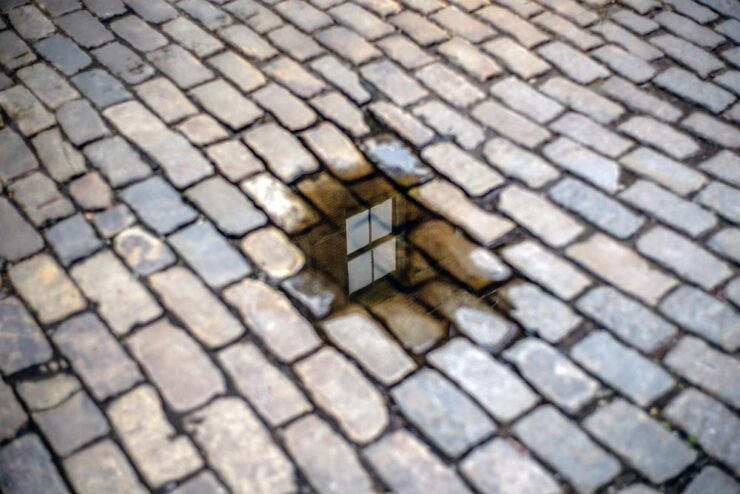
All NYC this time. Check ’em out.
Special Bonus #5: Art News notes that Paul Rudoph’s Walker Guest House is for sale for the bargain price of $2 million. It’s a kit home that’s been assembled in various places, including the grounds of the Ringling Museum in Sarasota, Florida. (It’s currently in storage in Rhinebeck, New York. Shipping is not included.)
So why is in the photography section, you ask?

That’s why. Check out more of my photography from Ringling and Sarasota. (The Walker images are near the top.)

Sigma: a new BFF?
No, that’s just BF — it stands for “beautiful foolishness,” after a line from a poem in Okura Tenshin’s The Book of Tea — but, as usual for them, something different. Something good.
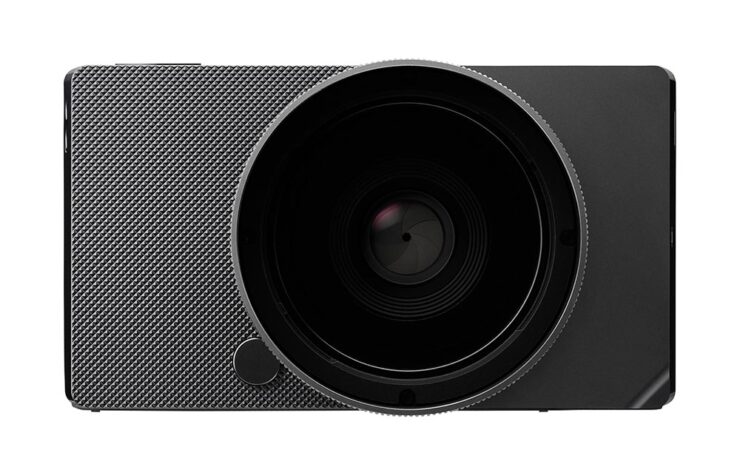
Like the FP before it, there’s nothing you don’t need, bordering perhaps on a minimalism that’s … stark? No viewfinder, no stabilization, no mechanical shutter, built-in memory (so no card slot), haptic interface. But style for days, a great shape and texture, and absolutely the right size.

It’s made at the rapid clip of nine per day, because it’s made from a single billet of aluminum — shades of the Leica T/TL/TL2 (something I maintain was before its time, and discontinued short-sightedly) — except full-frame. And, of course, supported by Sigma’s extensive catalog of L-mount lenses. (Another commonality with the TL.)

At $2000, it’s the right price, too. Read more here or here or here.
Oh, and one more thing: Sigma has a new identity to go with the BF:

Slightly more formal, slightly on-trend typography, which is fine — but the logo is clever in being both a letter and a lens. More of that just right to close out the day.
Special Bonus #6: Sigma’s CEO Kazuto Yamaki is charismatic, interesting, and dedicated, as seen in the videos PetaPixel has introducing their new HQ building in 2022. Love the library-wrapped staircase.
Update, 4 March 2025: PetaPixel has posted a YouTube podcast/interview with Kazuto Yamaki, in which he talks about the BF and possibly a new, “serious” camera to compliment their 300-600mm lens. (This is probably a better intro to Sigma’s CEO than the above.)
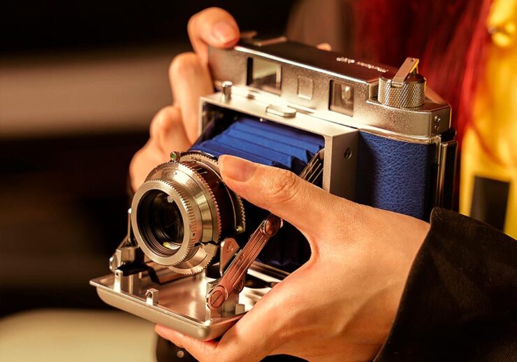
Special Bonus #7: TTArtisan, the Chinese manufacturer making interesting L-mount lenses — I have two, both solidly in the cheap-and-cheerful category — is about to introduce their first camera … and “interesting” is, in fact, the best way to describe it:
See you in the spring!

