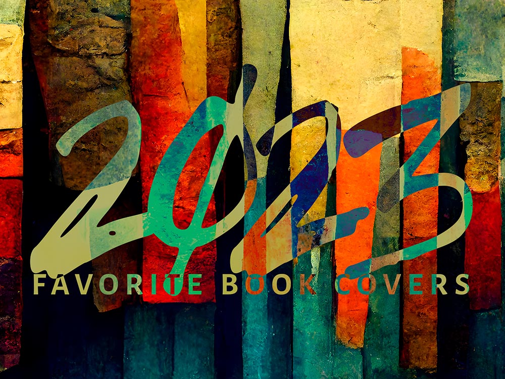
2023 seemed to go by with greater speed than normal, meaning the process of accumulating my favorite book covers occurred more hastily than I would have sometimes preferred — after all, perusing the best of the new releases is tremendously enjoyable. It’s just that, due to this year’s hefty undertakings, I was not able to make as much time as I’d have liked.
So I was surprised when, in early January, the tally of candidates in the favorites folder was over two hundred items. A bounty of goodness.
Narrowing those down to the list below was exceptionally difficult. I tried to get to last year’s limit of 70 titles, but failed; I managed to narrow it to 80, then 78, but just couldn’t winnow any further.
Pull up a chair. This one’s gonna take a minute.
Please remember that these are my favorites — others might say “best,” but I’ve been in this business long enough to know that there’s always another title you haven’t seen or read about, and I don’t want to disrespect any of the talented book designers not on this list. I’ve tried to include design credit where I could — special thanks to the folks who answered emails with that information — and wish to stress that any mistakes in the list below are mine.
Note: If you’re on Foreword’s main page, please click on the post title, above, to view this list. You’ll get larger covers for your viewing pleasure.
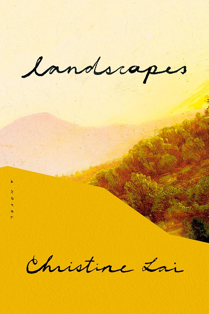
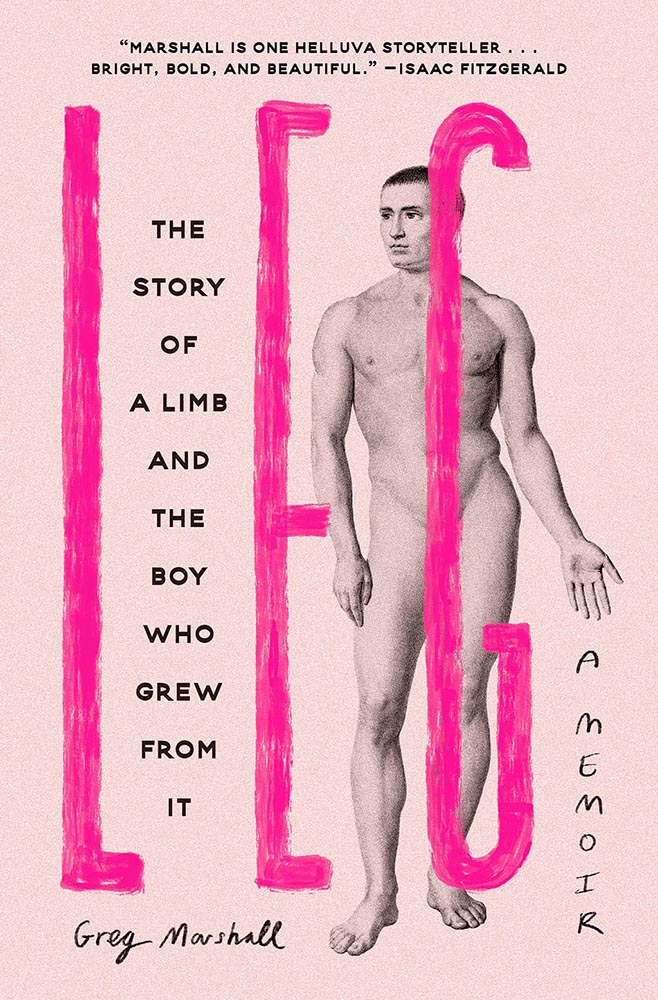
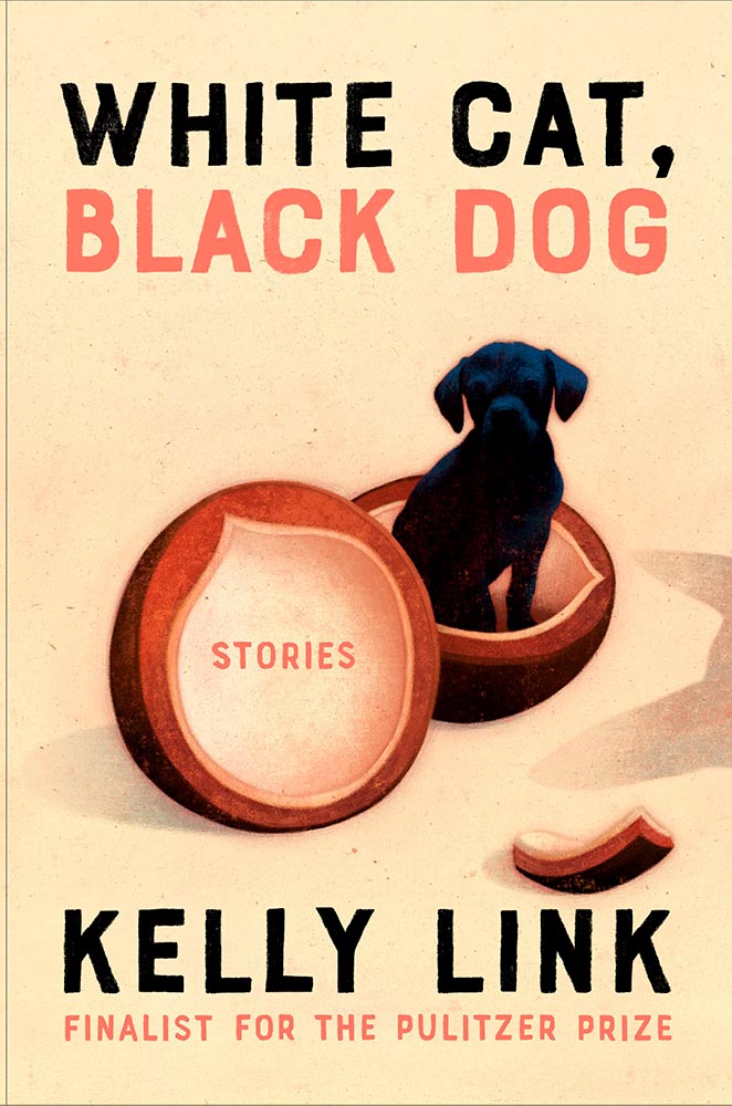
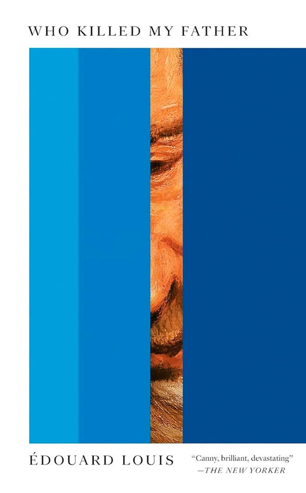
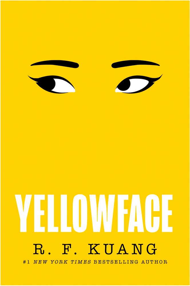
My Favorite Book Covers of 2023 (three-way tie)
“Find a gateway to the underworld. Steal a soul out of hell. A simple plan,” the Amazon description starts, and it’s a sequel of magic, secret societies, and whatever else.
But never mind all that. This cover grabbed my attention in a way few do, with its combination of art, shadow, and type, all carved to perfection.
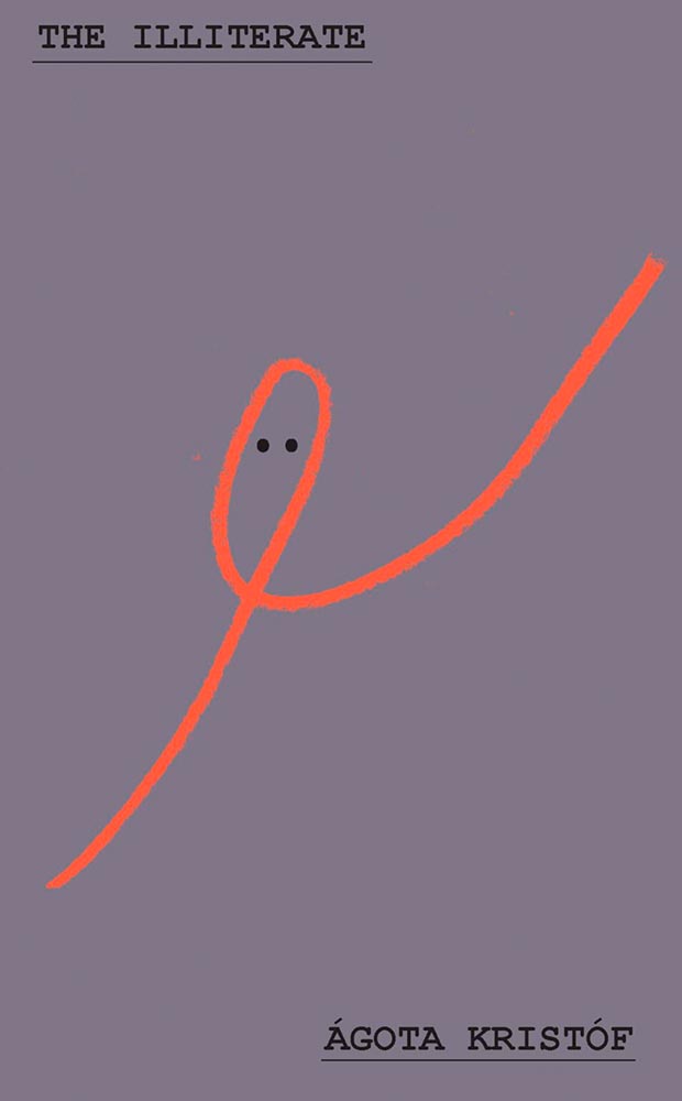
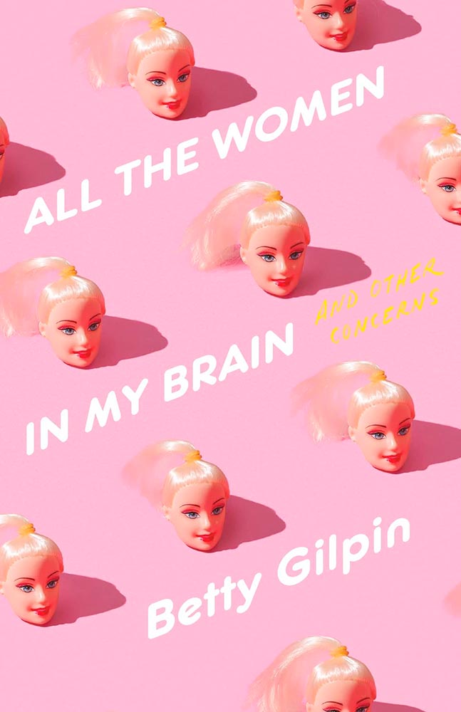
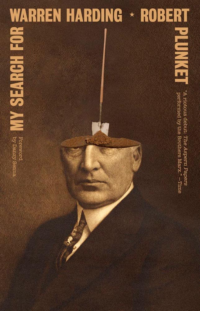
I dare say that only Oliver Munday could have done this expression of so much with so little. Enormously appropriate, then, for a memoir only 64 pages long.
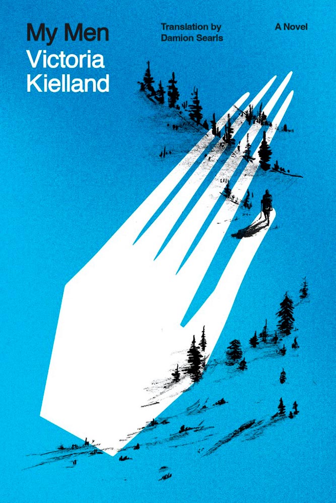
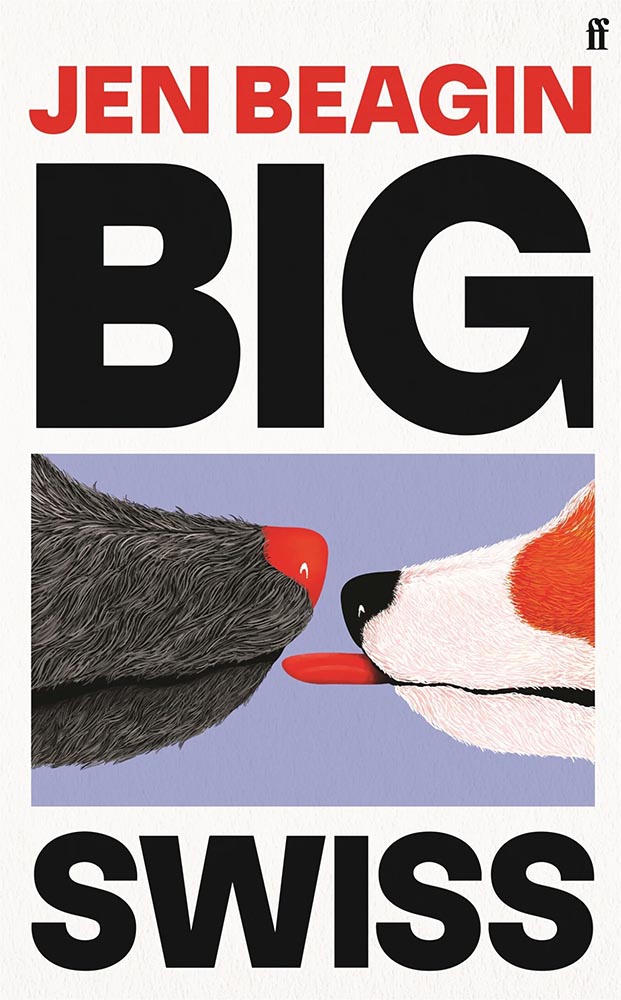
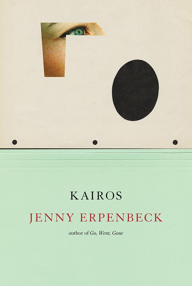
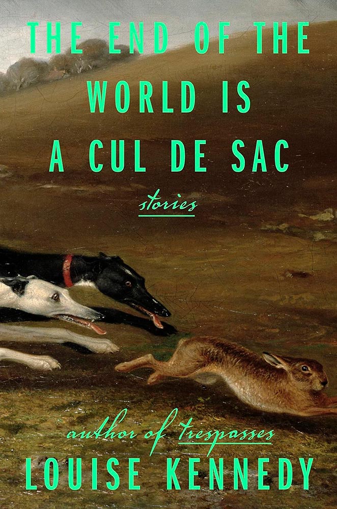
From The Illiterate‘s Hungarian refugee in Switzerland we move to a Norwegian immigrant seeking freedom in America. Alas, she turns out to be our first (known) serial killer — giving this hand a quiet, eerie yet somehow classic quality that quietly compels like few others. Outstanding.
Other 2023 Favorites, in alphabetical order:
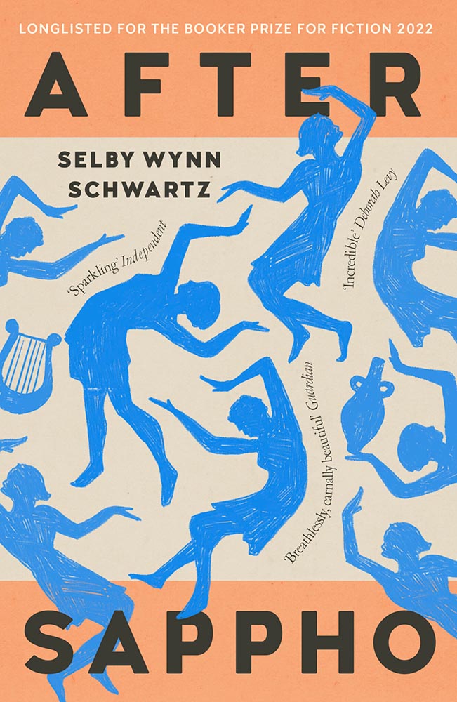
Impressive sense of movement from these figures, whose interplay with the title type combines with quotes-on-a-path (something of a trend this year) and great color choices to provide something memorable.
Such a simple concept. Such superlative results. No other concerns.
There is another version of this on one of the “best of” lists, but I much prefer this one, with the circling birds and hand-done lettering. A two-color triumph.
Oooollllliiiiivvvvvveerr!
One of those examples where the art just shouts off the shelf, although the type treatment works exceptionally well, too. Better still, it’s one of the rare US versions that bests its UK treatment:
Not at all bad — in several “best of” lists, in fact. Just not mine.
I’m not sure whether the items on the page are models, made (or found) objects, or some extremely well-done Photoshop work, but ultimately it’s combination of the simple graphics and brilliant typographic treatment that earned this title its spot. Fantastic.
The ’70s are hot right now, but this is 2023, aged to perfection. Very nearly made the “best of,” not just the “best of the rest.” Horrifically good.
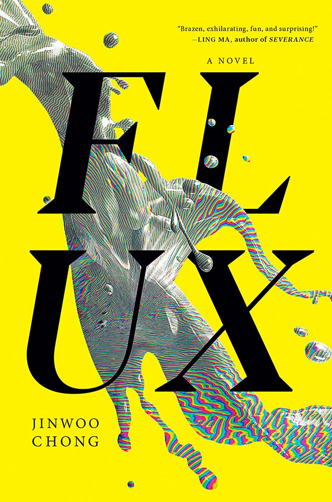
Type, color, pattern, brilliance. Must be a Munday.
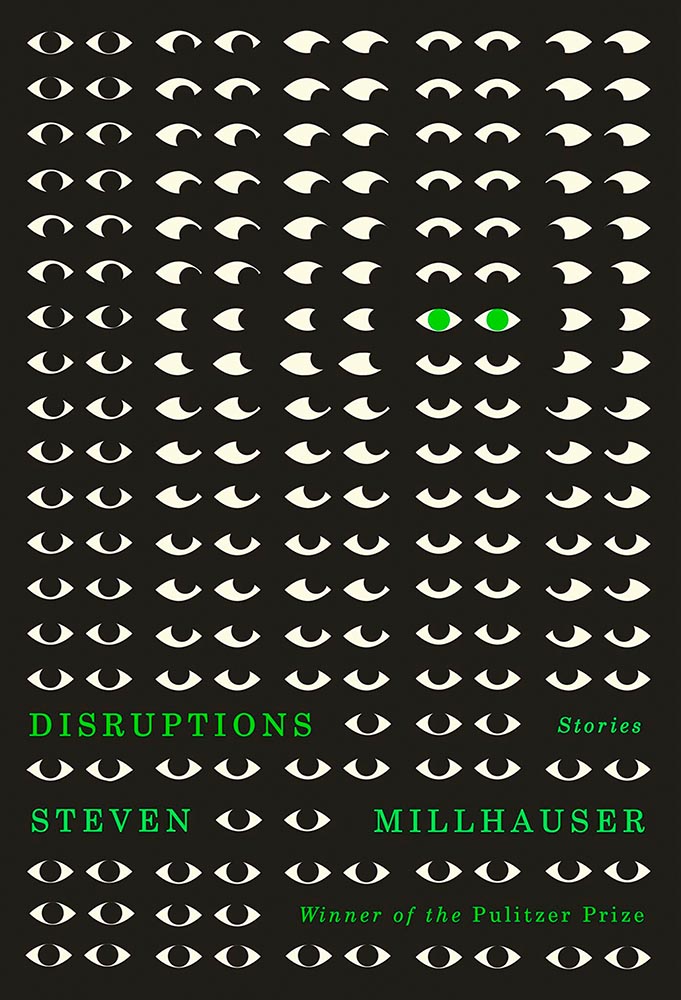
Eyes are a frequent guest on book covers. Rarely so many, though, and rarely in two-color. Winner of more than a Pulitzer.
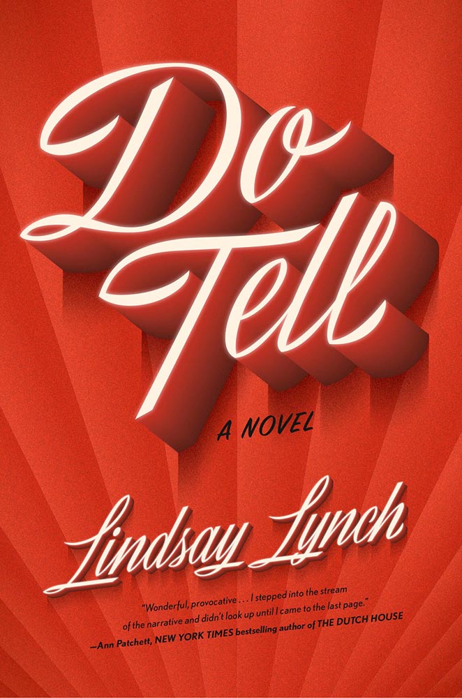
Edie O’Dare does tell, it turns out. “Cinematic” might be a cliché, but….
I’m a sucker for a great woodcut-style illustration. Great type treatment propels it into a standout book cover.
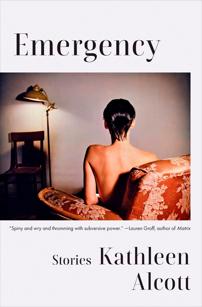
There’s something decidedly non-emergency about this, yet once you understand, it works perfectly: simple, yet so very not.
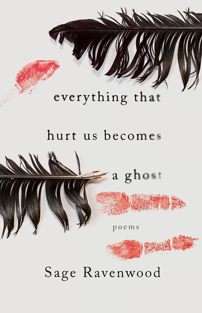
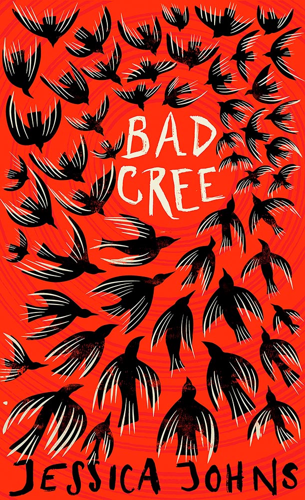
This book of Native poetry ranges from Missing and Murdered Indigenous Women (MMIW) to reverence to the natural world to “the machinations of colonialism,” a cover assignment that could border on impossible. Yet, here . . . absolutely brilliant. Expressive and so much more, including possibly my favorite type treatment of all on this list.
Danger: UXB. (The pink is an inspired choice, too.)
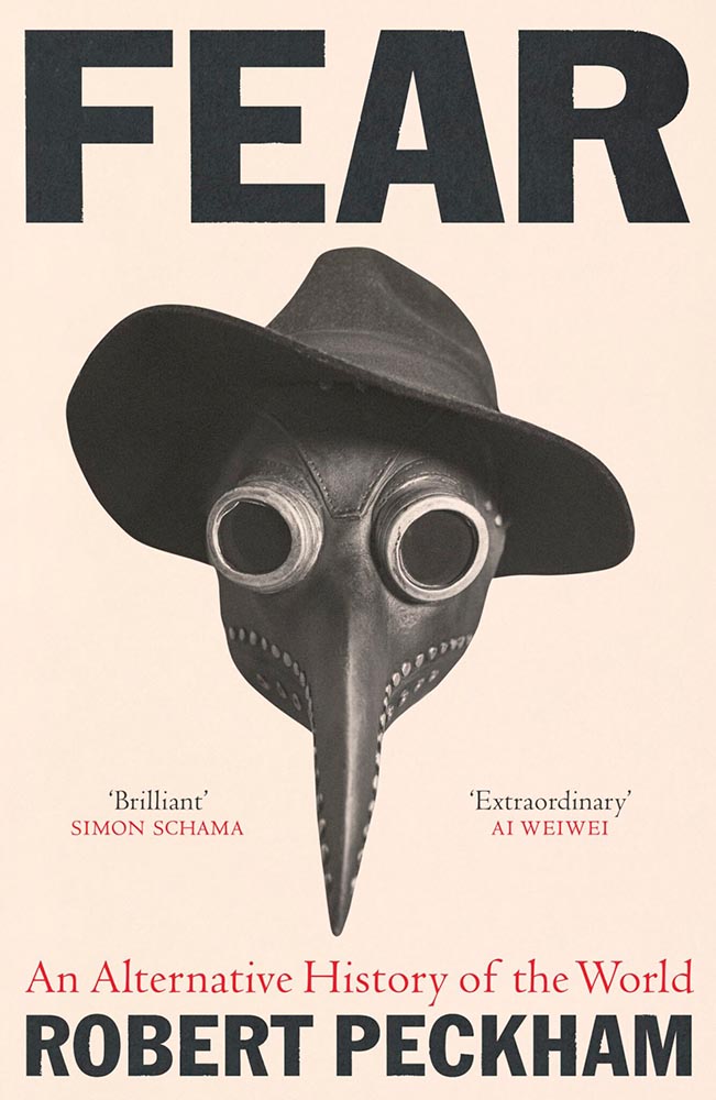
Fear knows no bounds, only stylish hats. (On the LitHub list, someone said it has “serious 2024 vibes,” which I’m concerned may turn out to have some truth to it.)
Rarely have photo and type worked so well together. Fantastically well done, with plenty of room for the soon-to-be-added kudos, quotes, and awards.
Who splits a four-letter word onto two lines? Someone after great results, as it turns out — with bonus points for the pattern and color in the “splash.” Nice.
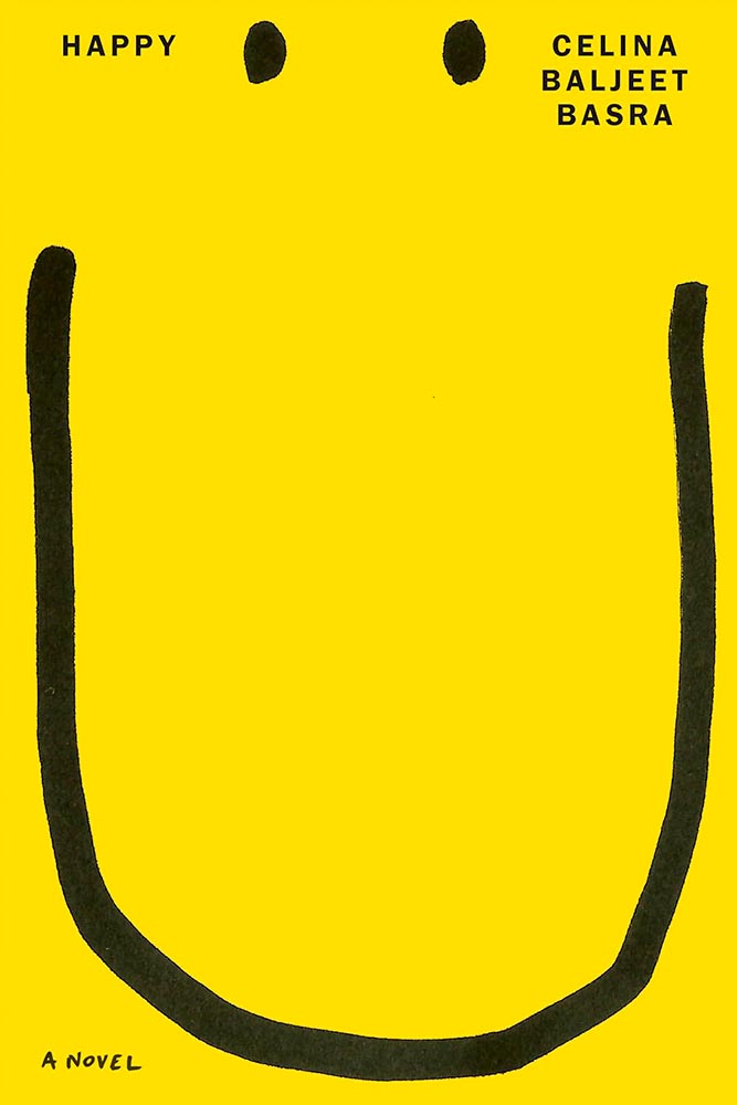
Smile-inducing. Sometimes simple is best.
Junior theatre critic gets senior designer’s knockout hit. The audience goes wild.
I’m at a bit of a loss to describe why I like this so much, except that every time I look at it, I like it even more.
Perfect execution of a simple concept, from colors to art to type.
Wins the “best-placed title” award, among so many others.
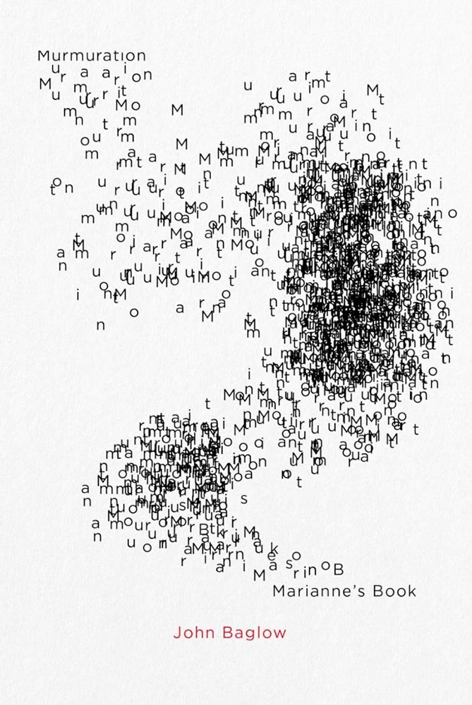
A reminder that something done often can still be done with originality — and incredibly well.
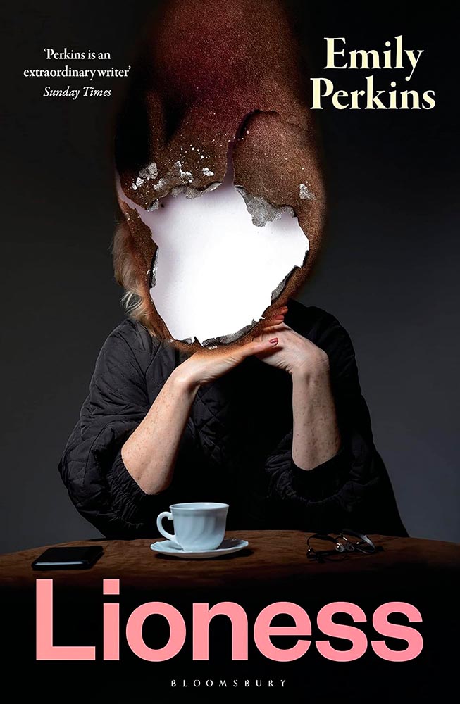
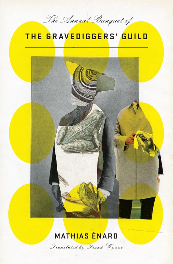
The collage-as-book-cover is another (perhaps) overused item, but when in the hands of Emily Mahon, this one looks you in the eye and won’t let go.
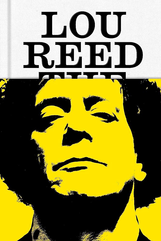
The jacket that covers The King of New York with . . . Lou Reed. “Well played” seems like an undersell.
From the textured paper to the type choices, this cover’s great. But with that photo choice, it’s vaulted into “best” category.
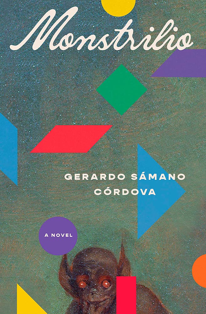
The combination of geometric shapes and unexpected typography mean this little guy will never get painted into a corner.
“Type here,” someone said.
Type-as-a-border is a trend — one I’m surprised to see on a Munday — that’s actually a great counter to the purposely irreverent illustration. I dig it.
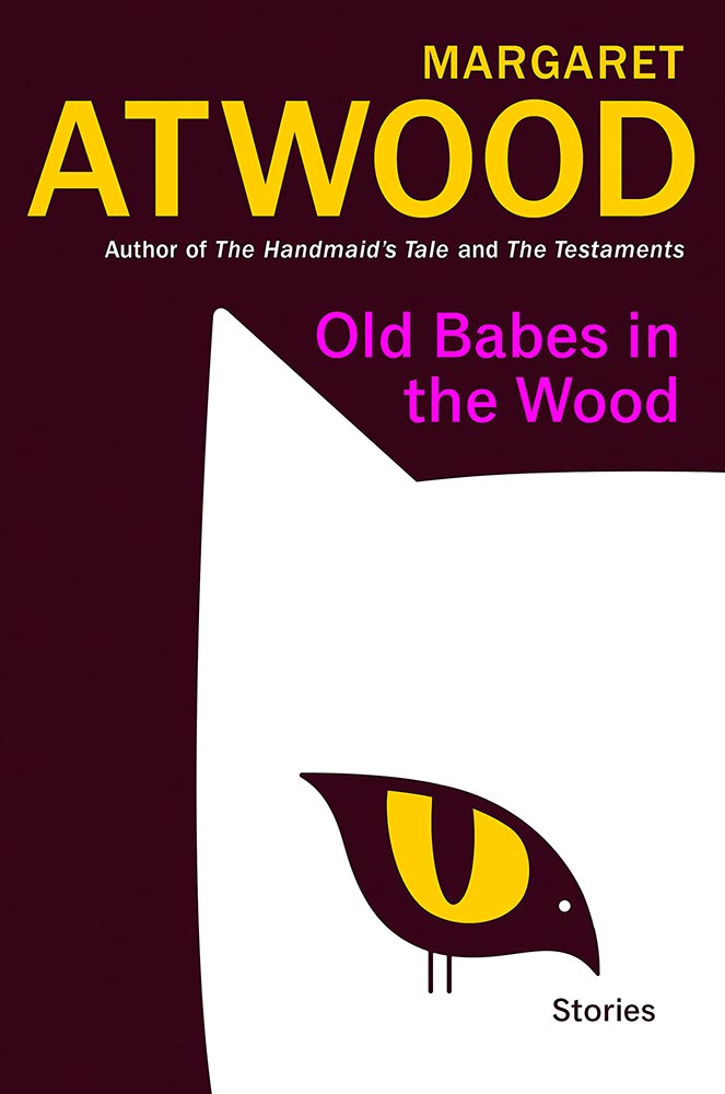
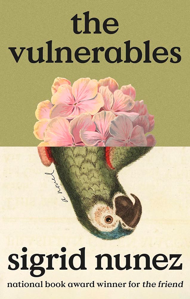
Bird-as-cat’s-eye. On a Margaret Atwood. ’Nuff said.
Brilliantly, uh, substantive: a lesson in how-to.
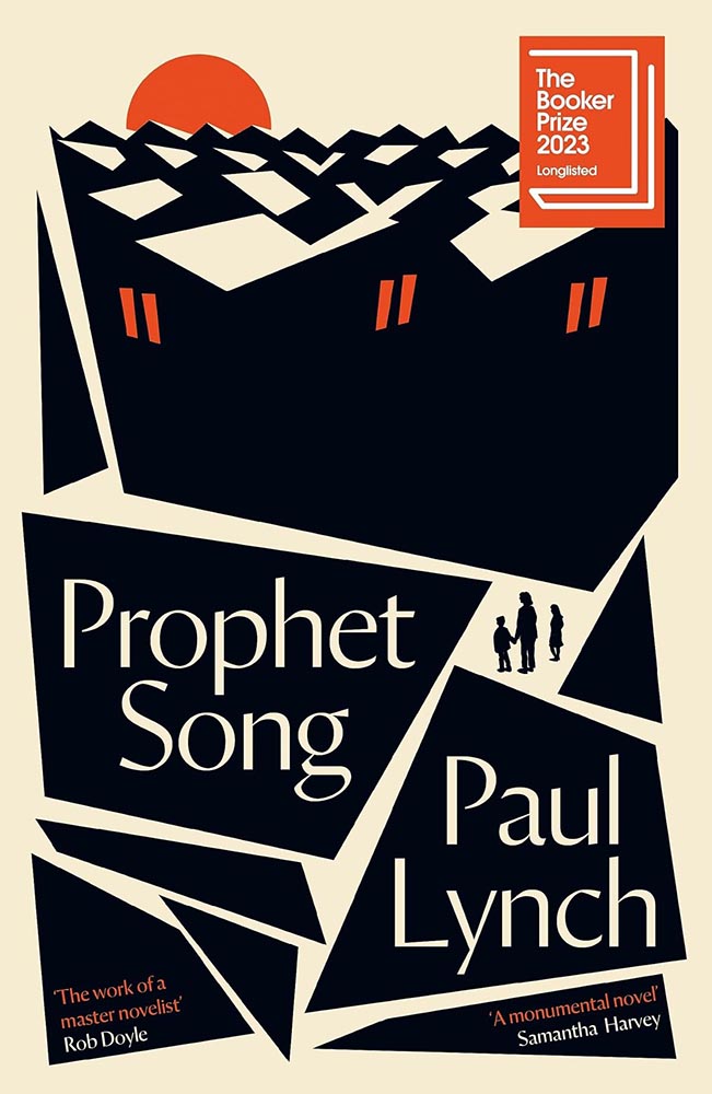
The rooftops alone make this, but avoiding the stereotypical Irish colors is a huge bonus, too. (This title went on to win the 2023 Booker Prize, by the way.)
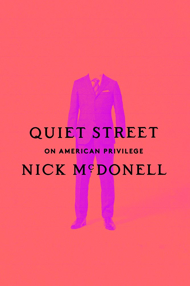
A triumph of the less-is-more approach, starring a headless human and superlative typography. Fantastic.
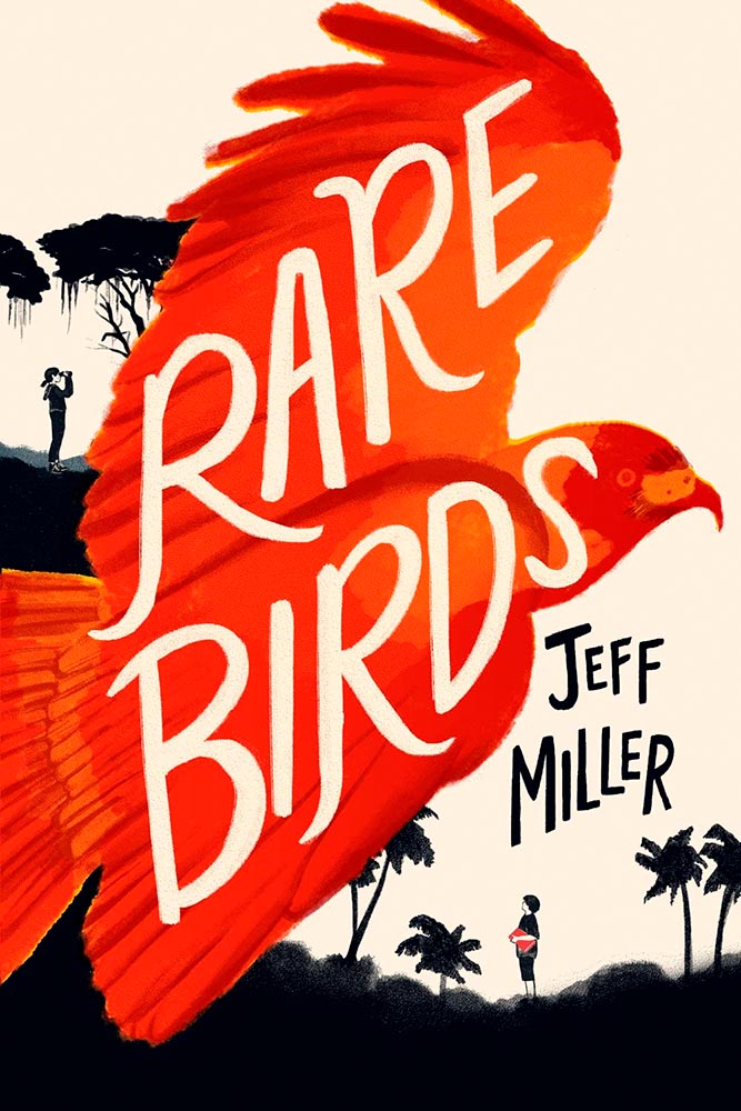
It’s rare to see children’s literature graced with such a great cover — this one literally flies off the shelf to grab your attention. A rare bird, indeed.
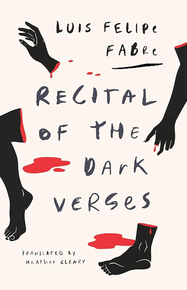
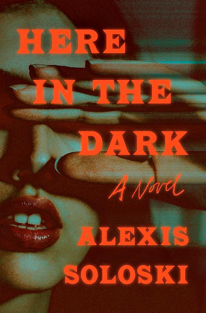
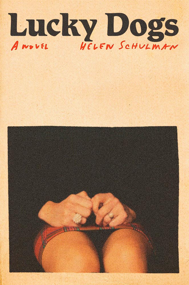
St. John called: this cover is fabulous, from evocative body parts to hand-lettering to die for. Awesome.
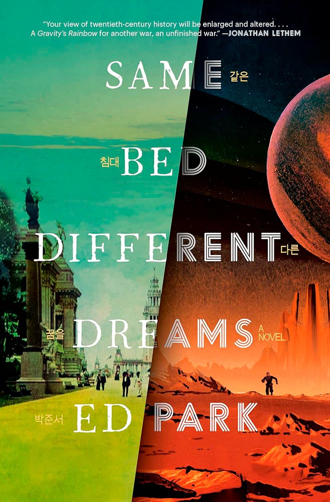
A novel on the Korean Provisional Government — and so very much more. The split treatment, with both halves running at 11, get fantastic typography and the Korean characters (in gold, obvious in person) are a great touch.
Bonus: Read the author’s reaction at LitHub.
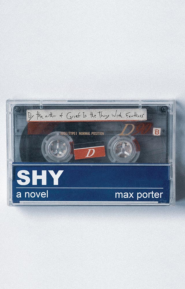
Another where the US version shines, especially as cassettes are coming back into fashion. (Special points for the subtitle-as-label.) A B-side no longer.
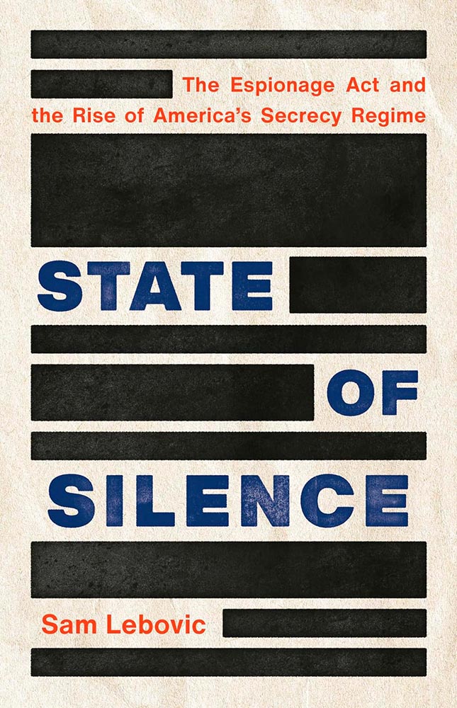
Brilliant comment redacted.
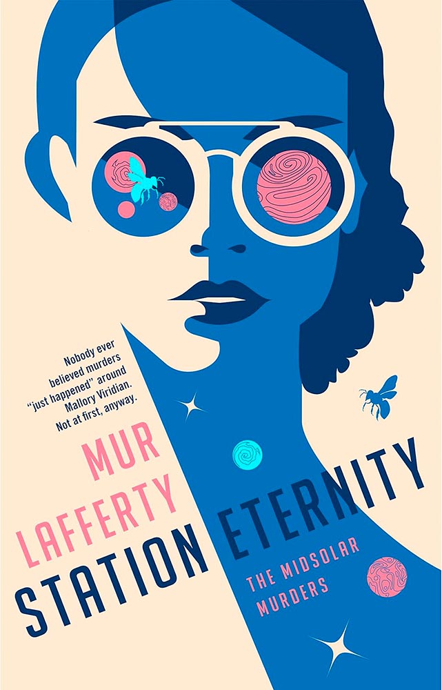
Mallory Viridian is an amateur detective on an extraterrestrial (and sentient!) space station — perfectly sold with this line-art-only cover. Fantastic.

Dead birds wouldn’t ordinarily be my go-to for cover excellence. But this one, with its painterly quality and hand lettering, perfectly hints at the haunting, slightly bizarre adventure within. Perhaps I should study more; as many will testify, it’s certainly not an obedience thing. (Read the Booker Prize listing.)
One of those instances where the graphic just sells the cover. Brilliant.
The continuing stigmatization of the LGBTQ+ population in the United States is so perfectly summarized here. (I’m curious how this cover was done, too: white paint, then watercolored? Gouache? Either way, the colors serve the overall so very well.)
This collage jumps through my psyche: sophisticated, off-kilter, and yet, somehow, completely right.
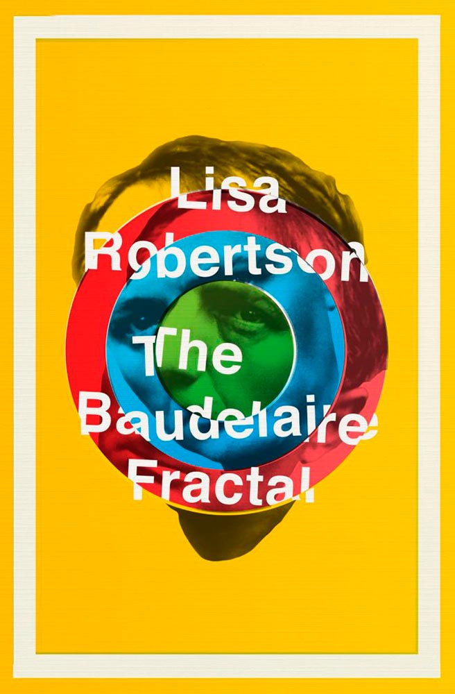
I had to look up Charles Baudelaire, I have to admit — but didn’t need to know in order to get the disjointed, colorful appeal of this cover.
Leaving a trail, all right. (Also: the text colors.) This version is mercifully short of Booker notifications, too — sometimes, I wish all the callouts and clubs would just go away.
Type on a path can be fraught, as can simple illustrations on off-white. Except when simple ideas are translated into compelling book design. Completely different from the above, yes, but just as accomplished.
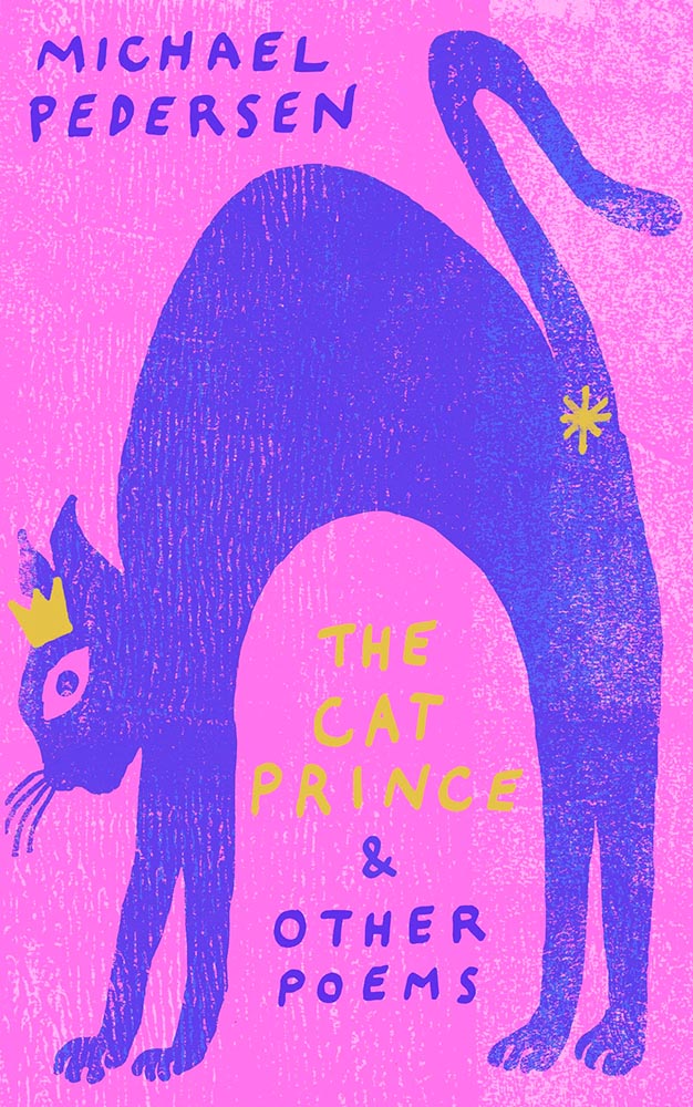
Crown. Asterisk. Print!
As the risk of repeating myself: “Type on a path can be fraught, as can simple illustrations on off-white. Except when simple ideas are translated into compelling book design. Completely different from the above, yes, but just as accomplished.”
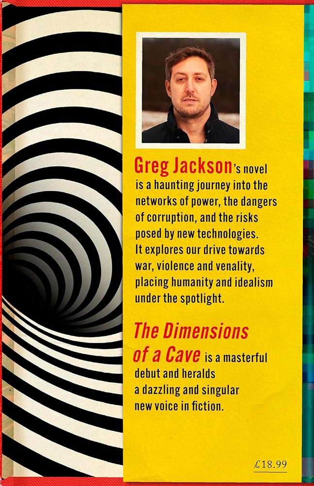
This trick can only be pulled once, and book designers everywhere are envious downright jealous. Here’s the cover — uh, flap:
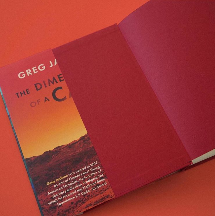
“Continued on rear flap,” it doesn’t say.
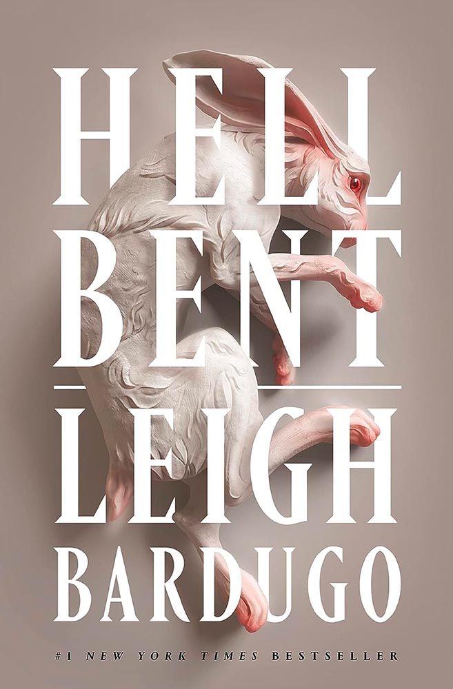
Brilliance in titling aside, check the glint in the rabbit’s eye. Wonderful.
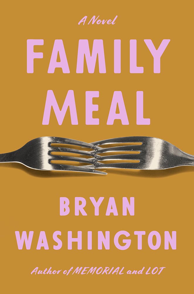
Interlocking forks, LOL. (Also, color choices.)
This has gotten a bunch of well-deserved attention: from the embossed type to the gradually-increasing repetition of the artwork, Alex Merto scores and scores then repeats. Great stuff.
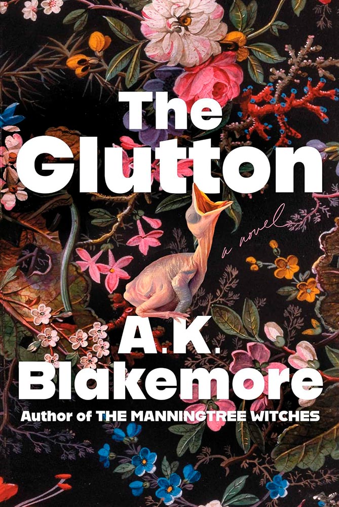
Gluttonously hits a bunch of high notes, and keeps coming back for more — until:
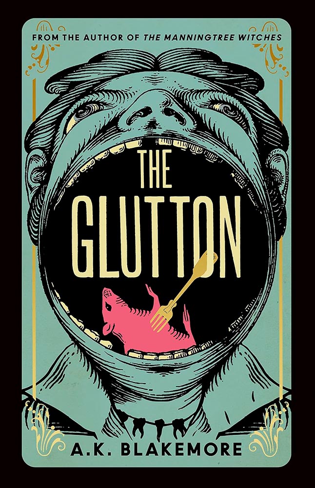
Yeah. Score one for the UK.
Is it possible for something Escher-esque to be soothing? Yes, it turns out.
Perfectly abstract, brilliantly pulling together the remarkably disparate stories within.
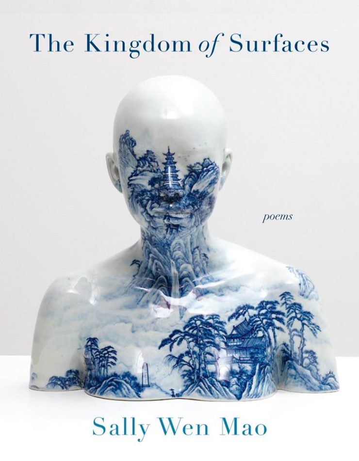
“Kingdom of surfaces,” so very indeed.
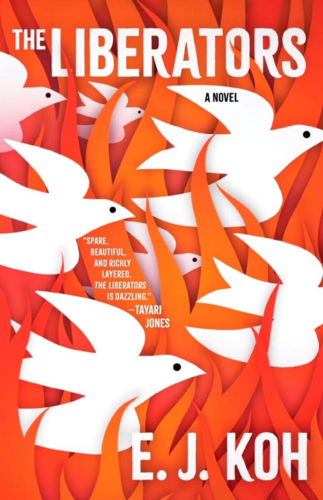
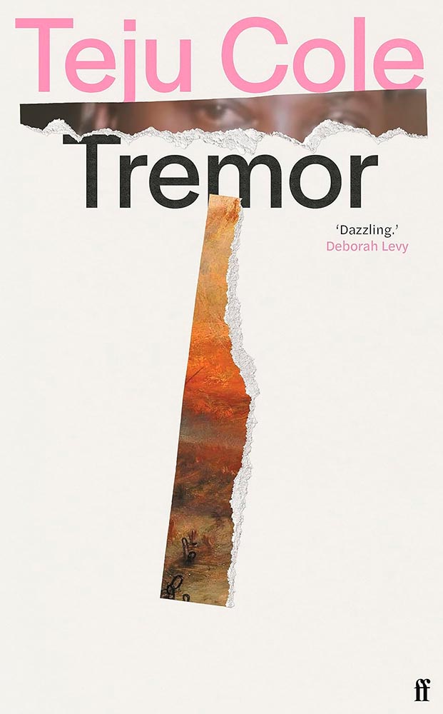
“Spare, beautiful, and richly layered, the [book’s cover] is dazzling.” —Foreword
Another of those too-simply concepts that checks out on every level. Awesome.
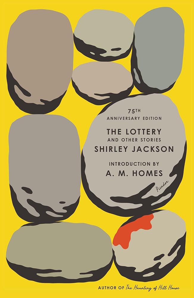
Rarely does so much text take up so little space yet work so well — this 75th anniversary reprint stacks up. (Imagine inspiring a school-aged Stephen King, by the way. That’s “The Lottery.”)
“A novel” has never played so well.
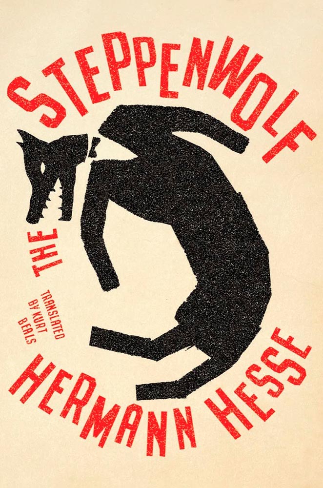
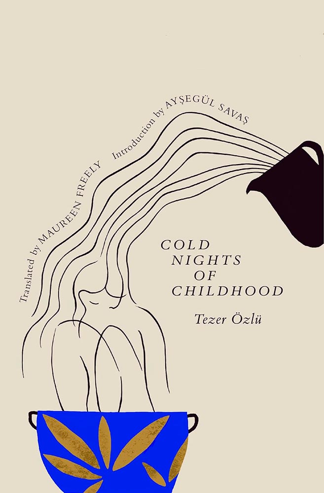
Steppen-out: this new translation gets new meaning. (In the text, too, I understand.)
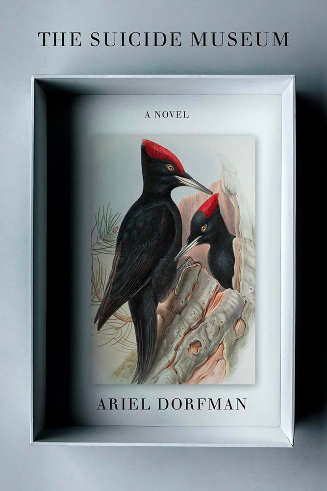
Multi-layered shadowboxing. Nice.
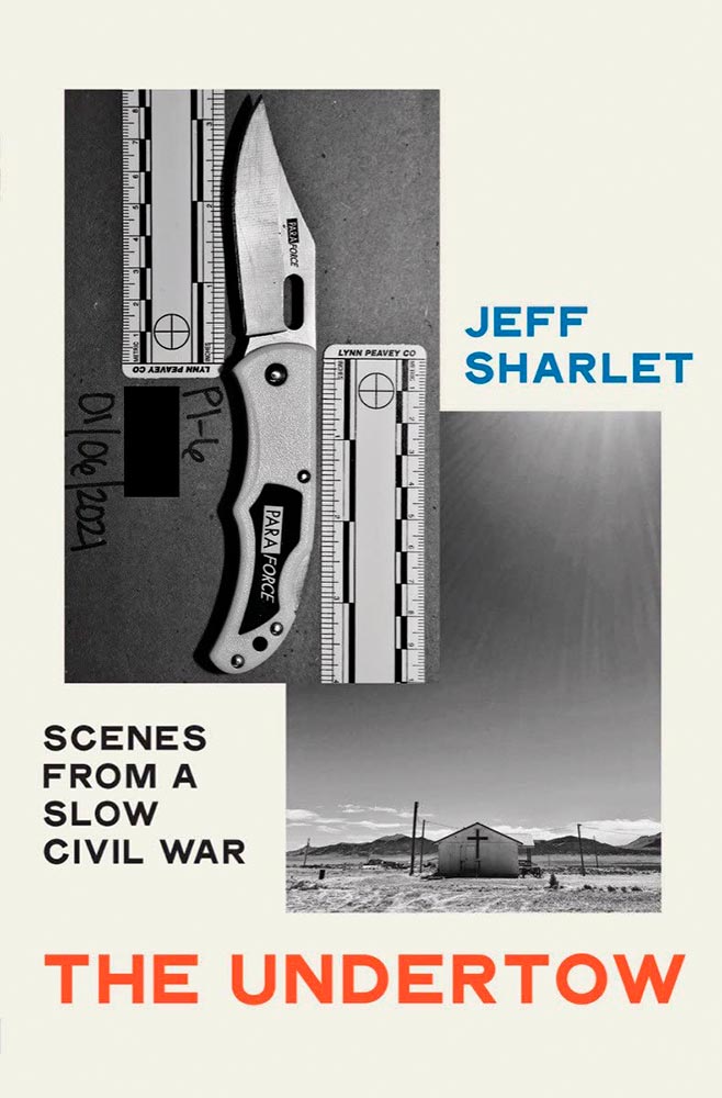
A study in simple perfection. For a book examining heightening fascism, toning down the cover speaks volumes. Great choices on every level.
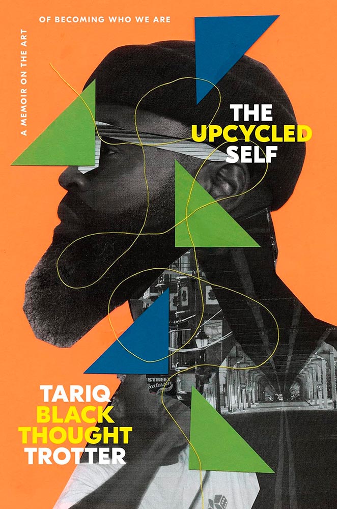
To collage in a way that the resulting product is of higher value than the original items: upcycling, indeed. (“The thread tying the cover together is a masterstroke,” he said.)
“The humor of a great conversation,” one of the reviews said, and better words could not be found for the cover. Masterful.
The woodcut-style illustration is back, in two-color and aged to perfection. (The paperback kept the illustration but changed out and dulled the colors, to a much less satisfying effect. Curses.)
“Permeable boundaries,” illustrated brilliantly, with perfect texture and typography.
“Sings,” someone said. “Seconded,” I said.
Stories told in a triumph of less is more. (The US version is good — another that’s one some others’ “best of” lists — but here’s another one where I think the UK slam dunks.)
This is one of those covers that keeps giving, a three-color triumph of telling the book’s story. (Also: typographically counter-riffic.)
The Book of Goose was one of my top three covers last year, but high expectations are nothing when Na Kim is covering it. Storied, indeed.
I was going to go on for a minute, again, about how the UK gets all the good covers — and this one earned a spot in this post — but…:
…the more I look at this US version, the more I like it. The hint of cat, the red shading, the paper’s tone and texture, and the type treatment stand in direct contrast with the fabulously literal interpretation of the UK version. Given both, I literally couldn’t choose.
“There’s a painting at the door,” in the most amazing state. (Political pun intended.)
There are so many ways to get this design wrong — but wow: someone took a cliché and literally flew in the face of it, to brilliant, memorable effect. I wish I could give appropriate credit.
• • •
Dan Wagstaff over at The Casual Optimist comments that,
[I]t’s like we’re stuck in a holding pattern, circling the same design ideas. Trends have stuck around. A lot of covers feel safe. Some of this was the books themselves. I’m not sure exactly how many celebrity memoirs is too many, but I’m pretty sure we reached that point and sailed right past it in 2023. No doubt some of it is sales and marketing departments sanding down all the edges and demanding the tried and true (see Zachary Petit’s alternative best of 2023 piece on killed covers for Fast Company). But I would not be surprised if it designers were just getting caught up in the churn — too many books, too many covers, and too much other stuff to worry about.
— Dan Wagstaff, The Casual Optimist
I think he’s right. Despite growing the number of selected covers this year over last, I feel that despite the outstanding items above, the majority of the book covers and jackets — almost certainly by publishers’ explicit direction — are playing it safe. After all, here in the Roaring Twenties, rocking the boat brings nothing short of vilification.
Thankfully, the designers on this list have battled the committees bent on mediocrity and overcome with great talent, great design, and great perseverance. Power to them, and I wish them — indeed, all of us — continued success in 2024.
’Cause, y’know, it’s gonna be a great year.
How this list was compiled
My selections stem from books I’ve seen in person; the “best of” lists from NPR, The Guardian, and the BBC (among others); and the best book cover lists from Spine, The Casual Optimist, The Book Designer, Creative Review, Kottke, PRINT, The New York Times (gift link), and LitHub. See how my list compares with those, and enjoy: a great many more outstanding examples of book cover creativity await.
Please note: I somehow missed the 2023 University Press Design Show — usually linked here — so please stay tuned for that post soon (and then again in July for the ’24 Show). Apologies.