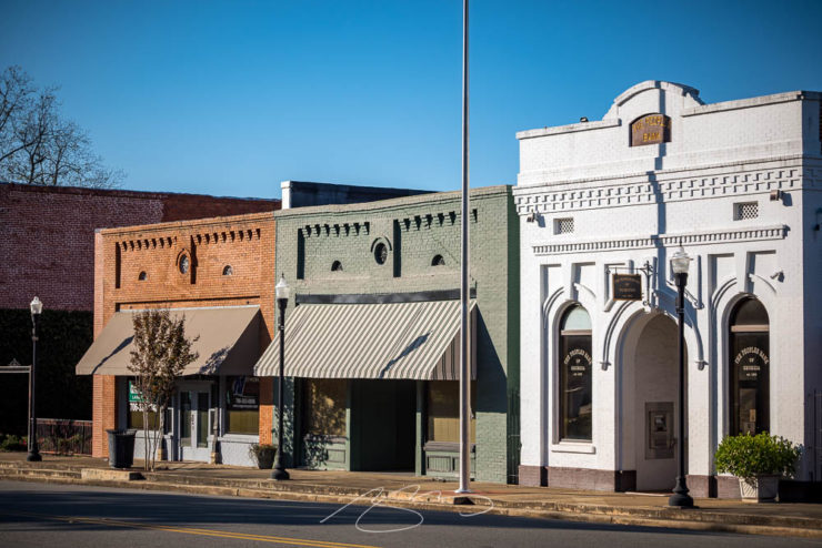
The county seat of Talbot (Wiki) was the primary destination of our recent photostroll, another of those places that are often passed through without stopping. A small, poor town — and county — its rich history absolutely deserves a home here amongst the galleries of Georgia.
Monroe Street Storefonts, Downtown
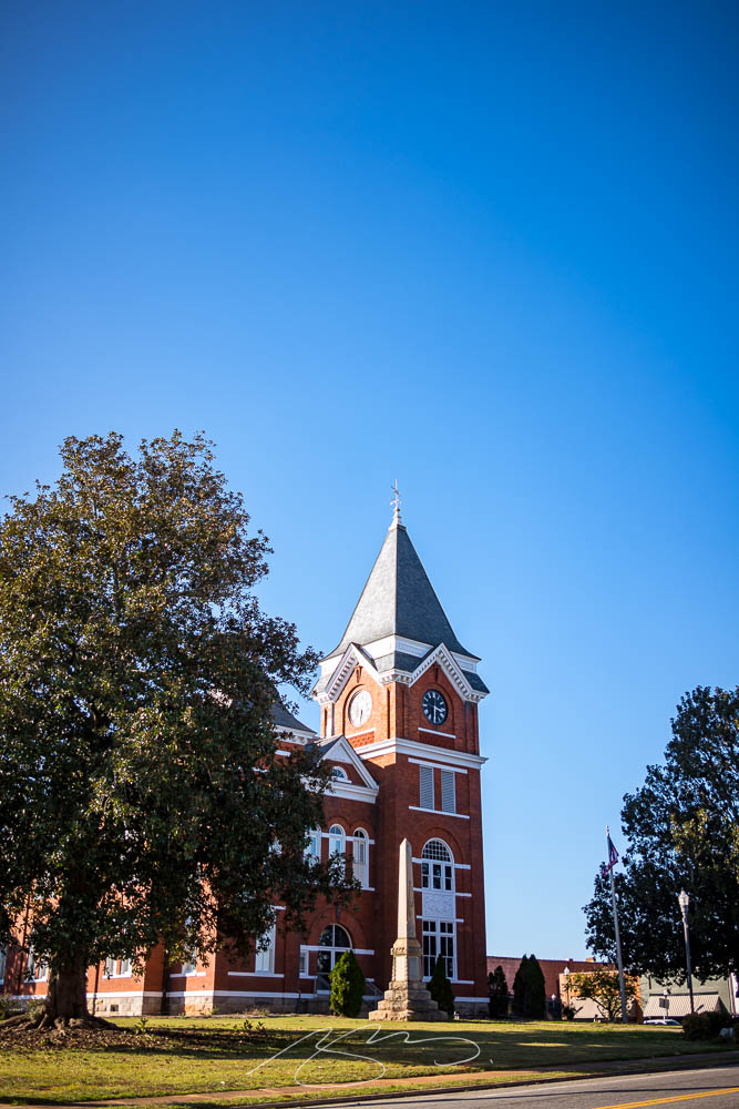
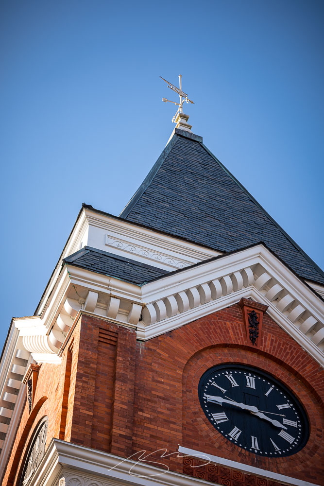
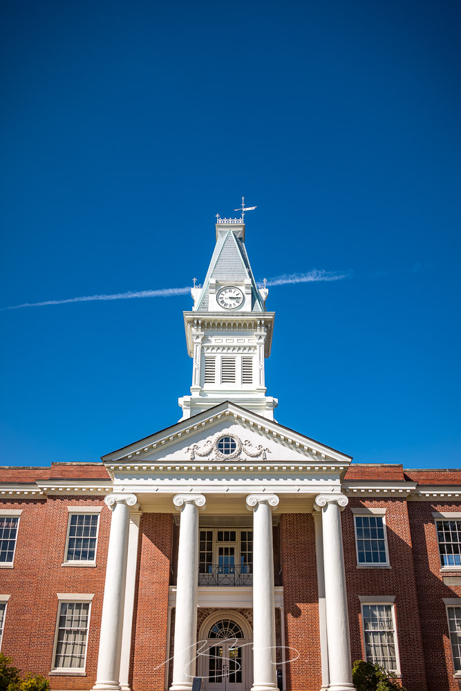
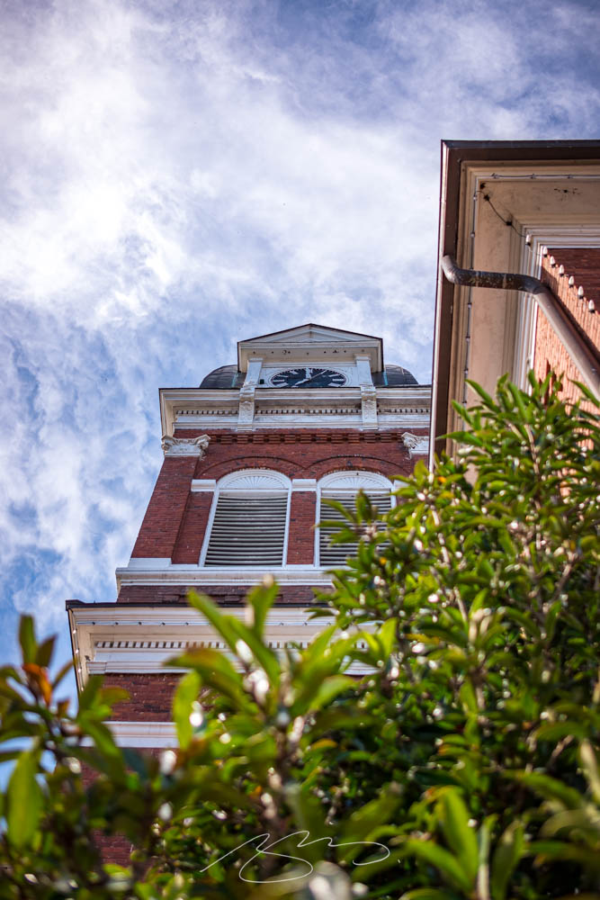
Founded in 1828, Talbotton was a center of education for the area; its architectural splendor reflects a wealth no longer present. Even the later courthouse (1892) is a beautiful structure:
Talbot County Probate Court, 26 Washington Ave.Talbot County Court Tower #3
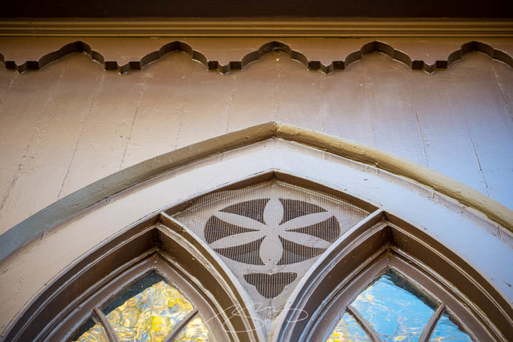
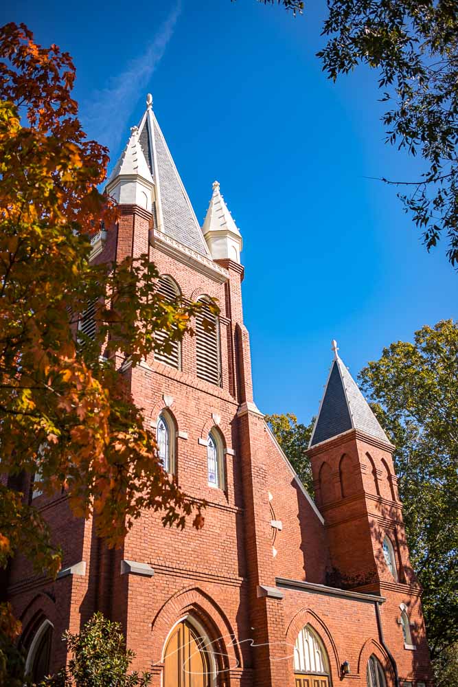
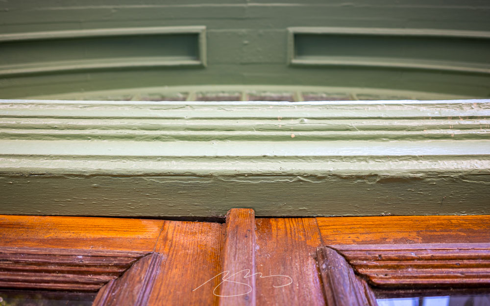
There was one structure in particular that I wanted to visit: the Zion Episcopal Church, an 1848 wooden item, painted dark brown with white shutters:
Historic Zion Episcopal Church, Circa 1848
Unfortunately, Georgia’s early- and mid-century legacy survives intact. From the Zion Church’s Historical Marker:
The choir loft at the east end of the structure opposite the sanctuary, above the narthex, is flanked on each side by a gallery, where slaves worshipped prior to the conflict which many believed temporarily destroyed Southern culture.
Georgia Historical Commission, 1955
The church is still beautiful, it’s still beautifully preserved and maintained, and I’m glad that we can, in 2022, look at it in the historical context it deserves.1Read more about Zion Episcopal and its place in Talbotton here.
Zion Episcopal Church (Window Detail #2)
See the church and all of Talbotton — 34 photographs in all — in the new gallery here.
Thanks to Gerald for a pleasant Sunday of fine photography.
1
Read more about Zion Episcopal and its place in Talbotton here.
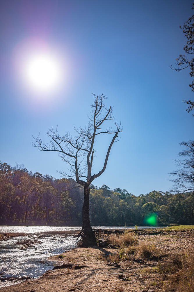
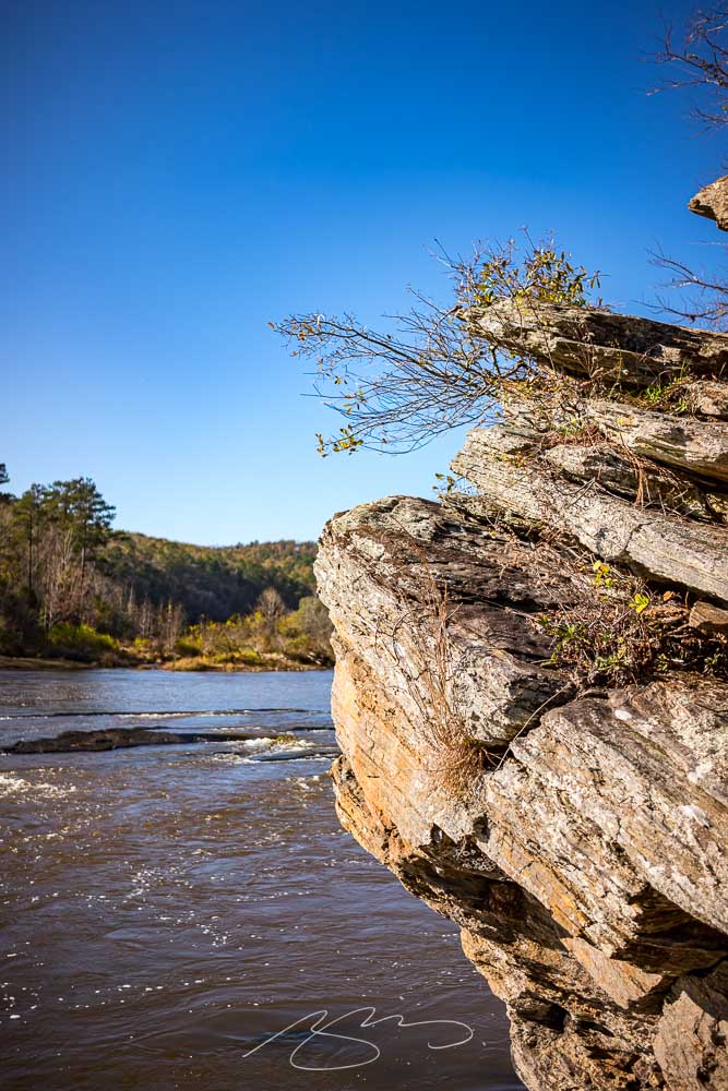
Despite the leaves pretty much, well, leaving us, yesterday was too nice a day to not do a photostroll — or three, in our case. First up: Sprewell Bluff Park. Located in rural Upson County on a lovely bend in the Flint River, the park has long been one of those places that was driven by and not visited.
Flint River from Sprewell Bluff #1
Glad to have fixed that! Better still, it’s more than just a bluff with a view:
River and Tree in Afternoon Sun, Sprewell Park (#2)Cairn on the Riverbank, Sprewell ParkFlint River Shoals at Sprewell (#2)Bluff Base, Flint River
As it’s technically located there, the Thomaston gallery has grown by nineteen photographs — check it out. (As always, once in the gallery, click on any photograph to start a slide show.)
Stay tuned for Talbotton and Fickling Mill, which will be posted as soon as possible.
As most of you know, I’m not a huge fan of photography competitions. Like I did last year, though, there’s an exception for this one: not because it’s better than some — there’s still the problem with rights, methods of compensation, etc. — but because it’s so up my alley. (Pun intended.)
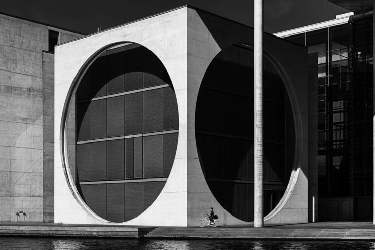
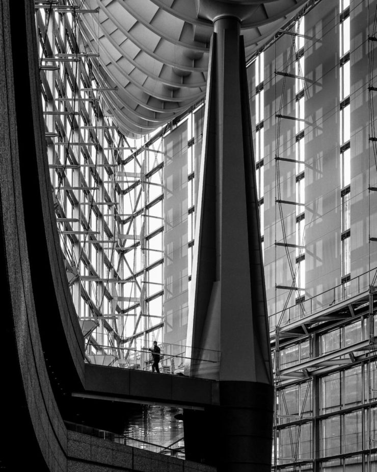
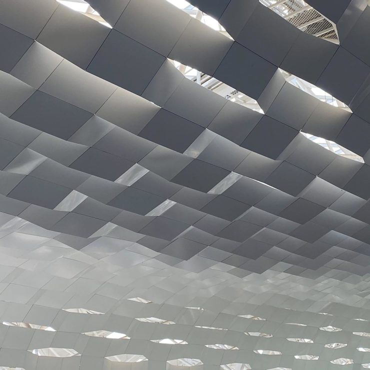
If you’ll pardon the cliché, great architectural photography is more than the sum of the building’s parts. These great shots show just that:
Cycling Under the Circles, Berlin, Germany, by Marco Tagliarino (Exterior)Shapes of Soul, Milan, Italy, also by Marco Tagliarino (Interior)
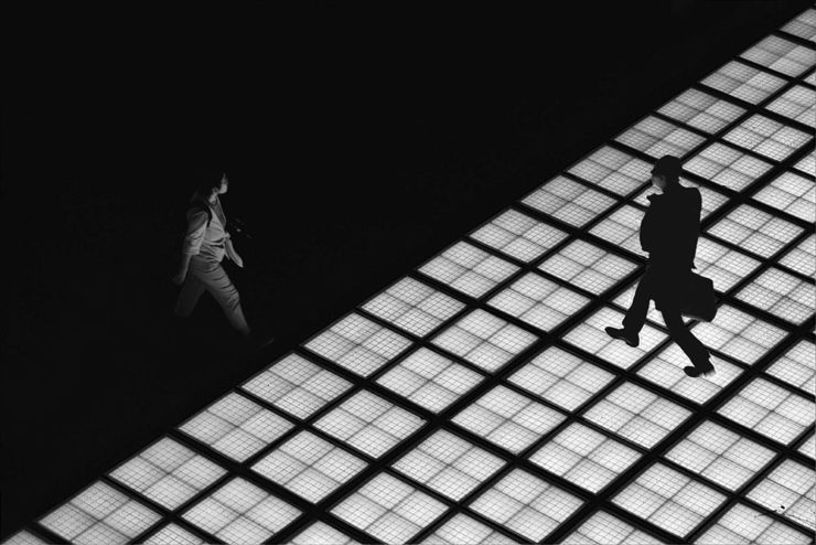
Entry photographs are divided into six categories: Exterior, Interior, Sense of Place, Buildings in Use, Mobile (with Bridges being this year’s theme), and Portfolio (focusing on the theme of Transport Hubs).
Glass Floor, Tokyo, Japan, by Tom Ponessa (Buildings in Use)Architecture 1, location not listed (but pretty cool, IMHO), by Stephane Navailles (Bridges)Shenzhen Bao’an International Airport, China, by Kangyu Hu (Transport Hubs)
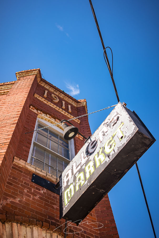
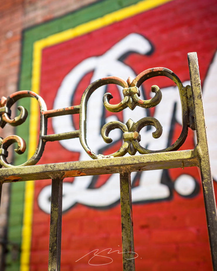
The small city of Milledgeville, on the banks of the Oconee River in nearby Baldwin County, is a favorite for photography. In this case, Gerald and I stopped on our way home from Sandersville, and spent some time wandering the historic district.
Aged Signage, 101 W. Mcintosh St., Circa 1911Fall Color, First Presbyterian Church (#1), S. Wayne St.(Extended) Weathervane, Old Courthouse Building, 201 W. Hancock St.
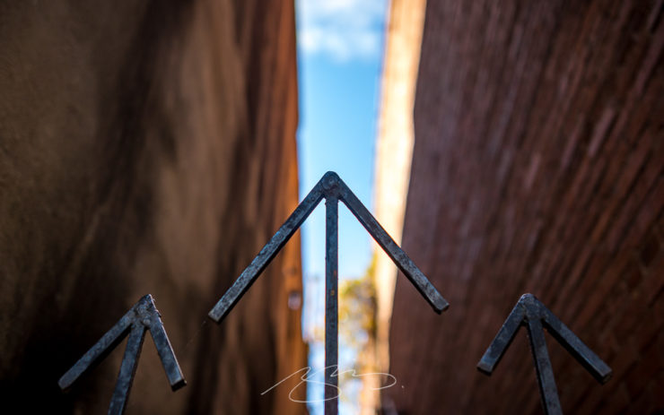
I especially liked this gate:
Gate and Stairs (Going Up), 129 S. Wayne St.
We were these the day after (part of) the Deep Roots Festival, which meant some street decorations lingered:
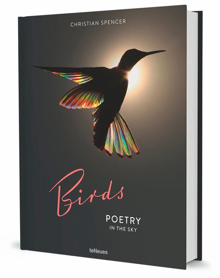
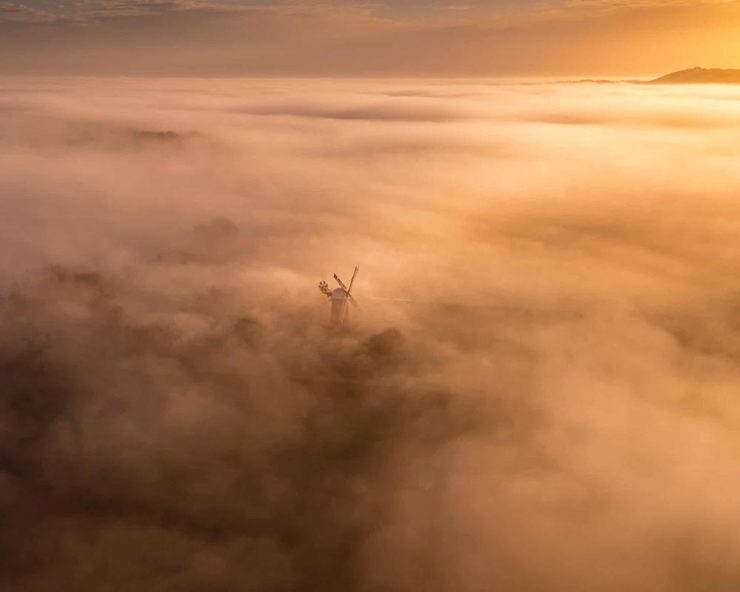
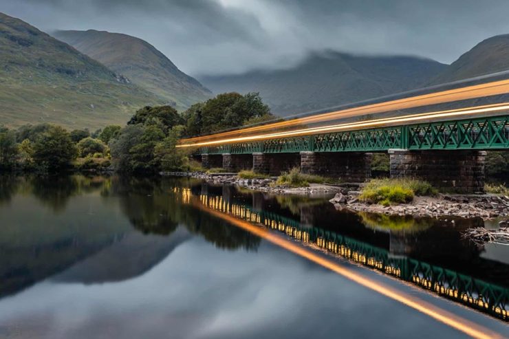
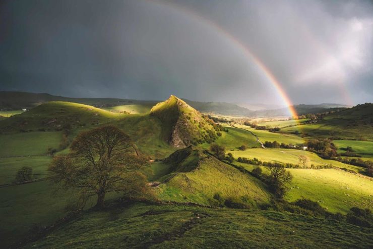
In this edition: Hummingbirds, the UK’s 2022 Landscape Photography of the Year 2022, a potential new logo treatment from Honda, and something just in time for Halloween.
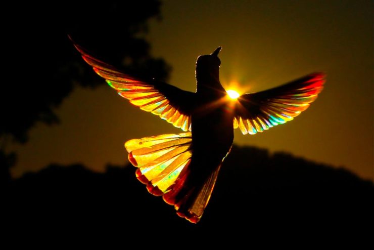
Who Knew: Hummingbird Edition
Wow.
Taken when the creatures are mid-flight and beating their wings at incredible speeds, Spencer’s striking photos capture sunlight as it filters through their feathers, emitting a full spectrum of color. The opalescent phenomenon is caused by diffraction and transforms their limbs into tiny, ephemeral rainbows.
This is Colossal
Let’s set aside for the moment the time and energy get these photographs and just celebrate that Australian photographer Christian Spencer worked to get these shots. Better still, there’s a book:
Like the typography in addition to the photograph, too. Thanks to This is Colossal for pointing us in this pretty wonderful direction.
New Honda Logo?
This hasn’t been reported anywhere, so I don’t know whether there’s a shift ahead for Honda (pardon the expression), but…:
This is a photograph — well, graphic — of the 2024 Prologue EV. Note that instead of the classic “H” seen on every Honda since I don’t know when, the name is spelled out.
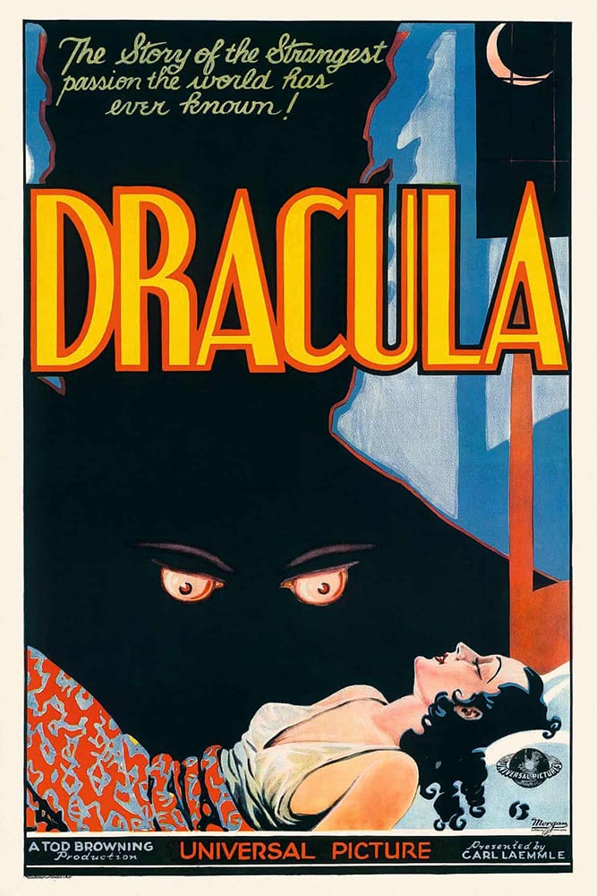
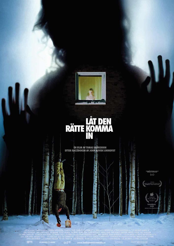
Speaking of slideshows on The Guardian, they had a great subject just in time for Halloween: “Cinema’s unquenchable thirst for vampires celebrated in posters.”
A classic.A future classic — scary-great.
Unquenchable thirst, indeed. Enjoy.
1
The aptly-named Dragon’s Back is in the Brecon Beacons National Park, Black Mountains, Wales. Take a walk.
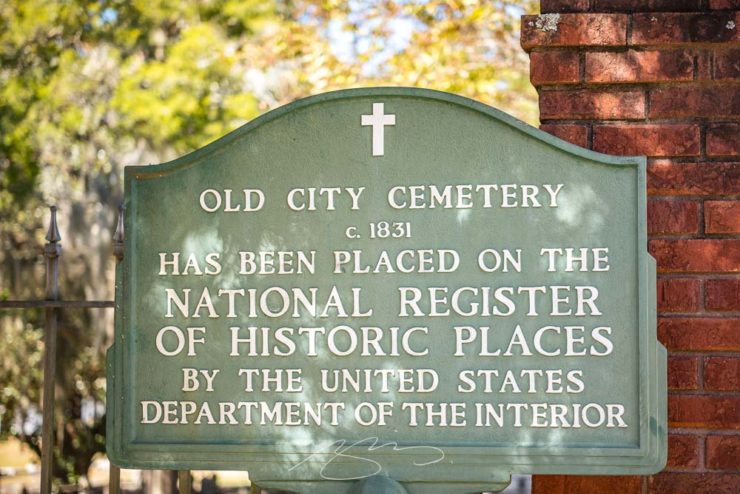
As promised yesterday, there’s more from Sandersville. This time, the City Cemetery, which is listed on the National Register of Historic Places:
Sandersville’s City Cemetery National Register Sign
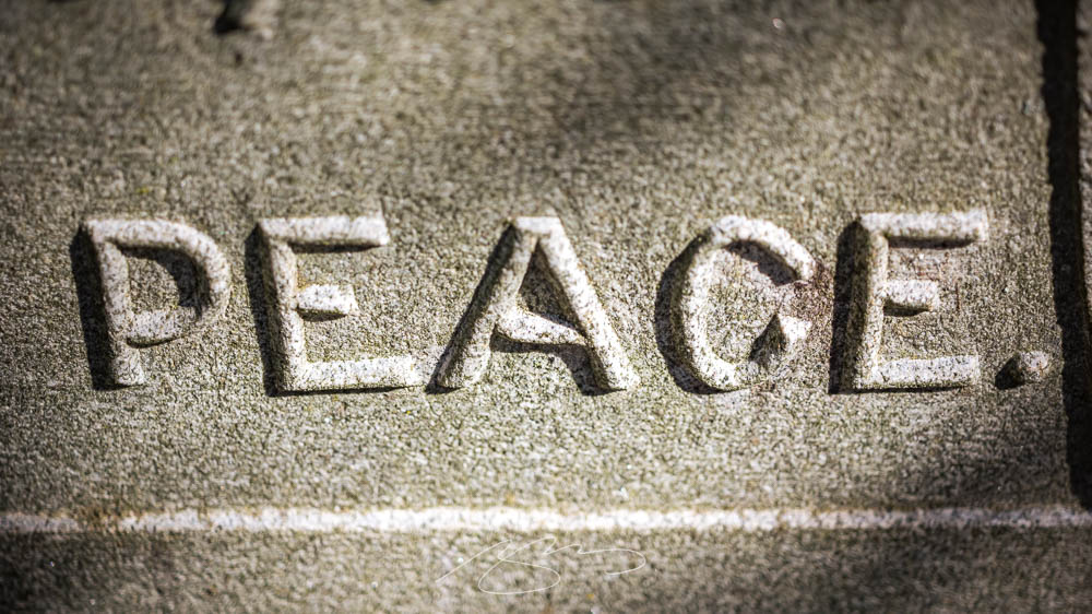
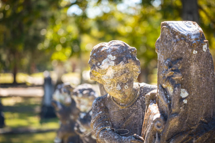
Some beautiful statuary within:
Not all of the plots are marked with statuary, but some have beautiful markers.
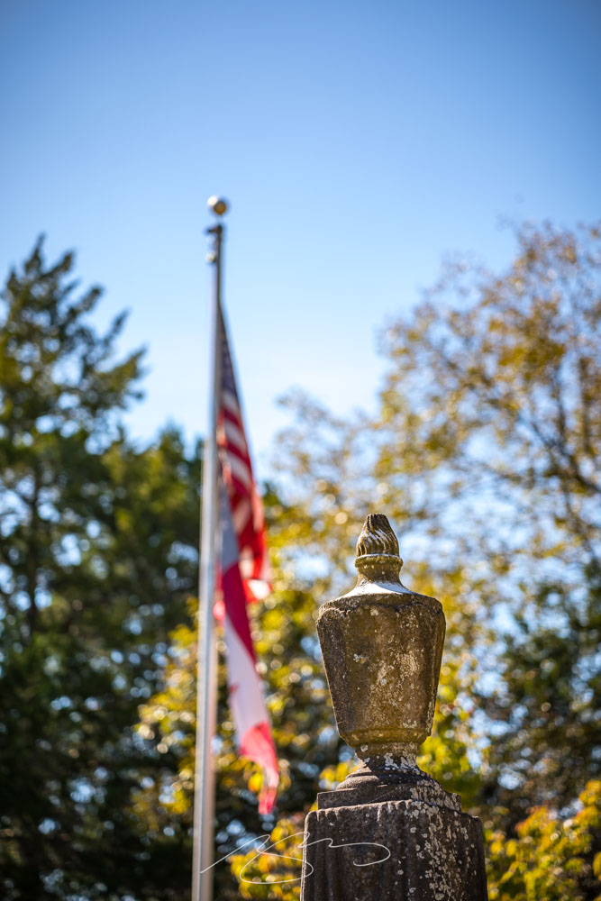
Sandersville the site of a skirmish on Sherman’s March to the Sea, and according to the official history, probably took place in the cemetery grounds itself.
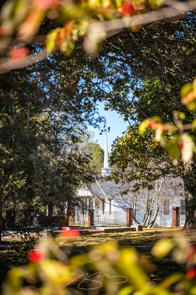
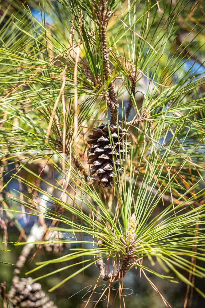
A plot marker in marble, together with the U.S. and Georgia flags.The St. Paul AME Church, seen through the fall foliage.Long-leaf pine is typical of this area, and provides some lovely shade.
An enjoyable time on a beautiful fall day. See all of the photographs from Sandersville in the updated gallery here.
Sandersville, seat of Washington County, was the photography destination this past weekend. Gerald and I wanted to get out and enjoy this beautiful stretch of fall weather, and this small city — with its National Register-listed cemetery (more on that tomorrow) — hadn’t yet been explored.
Dr. Gate, W. Haynes St.
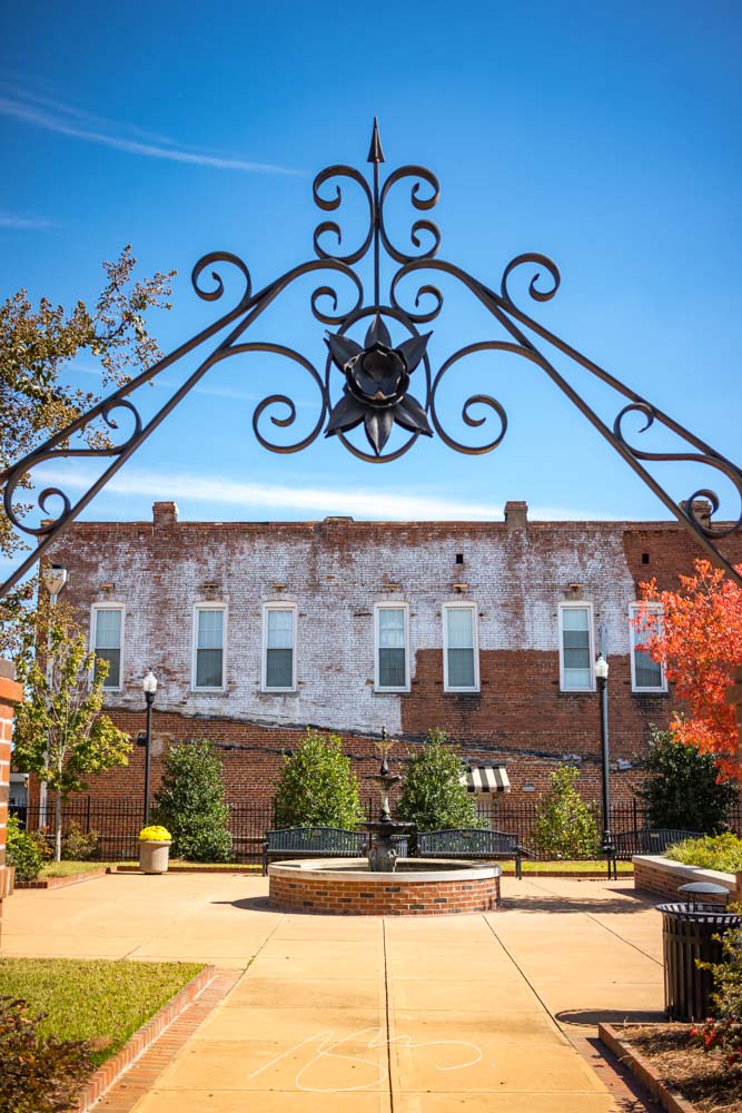
There was a pleasant little park off what I’m calling Courthouse Square (it doesn’t seem to actually be named that):
Park Arch, S. Harris St.Park in the Square, S. Harris St.
The Washington County Courthouse is a beautiful and historic building, like many here in Georgia:
This time, we’ve got some great book design (with a bonus), Hoefler educates on typography (with a bonus), and two updated car company logos. Let’s get right to it!
Print Magazine on the design of Lyrics
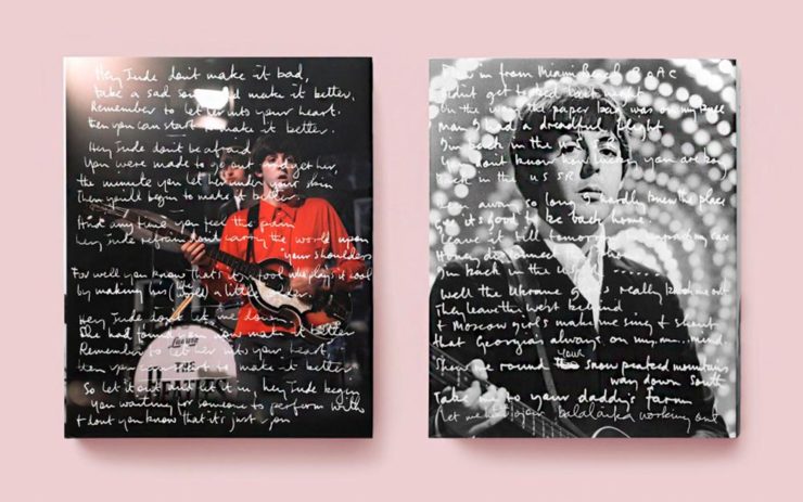
The still-very-relevant-in-2022 Print Magazine brings us a great feature on the design of Paul McCartney’s book, Lyrics:
Front and back covers of Paul McCartney’s Lyrics, by Triboro Design.
Turns out it was designed by an outfit called Triboro Design, from Brooklyn (appropriately). Print brings us an interesting interview with David Heasty, the principal:
I […] found him to be sharp, quick, articulate, and modest. Below, we discuss Paul’s involvement with the project, the book’s gorgeous bespoke typeface, and the importance of staying true to a legend’s vision.
Ellen Shapiro, Print Mag
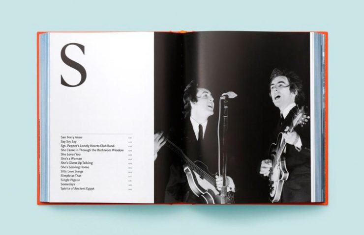
The “S” spread of Paul McCartney’s Lyrics, by Triboro Design.
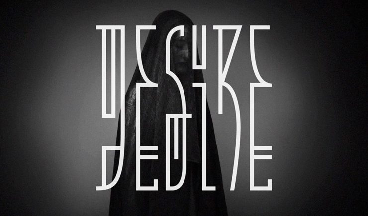
Bonus: Looking at Triboro’s website, this lovely piece of typography stood out:
Triboro Design’s Zolo Jesus album typography creates desire.
Hoefler Discusses Daggers
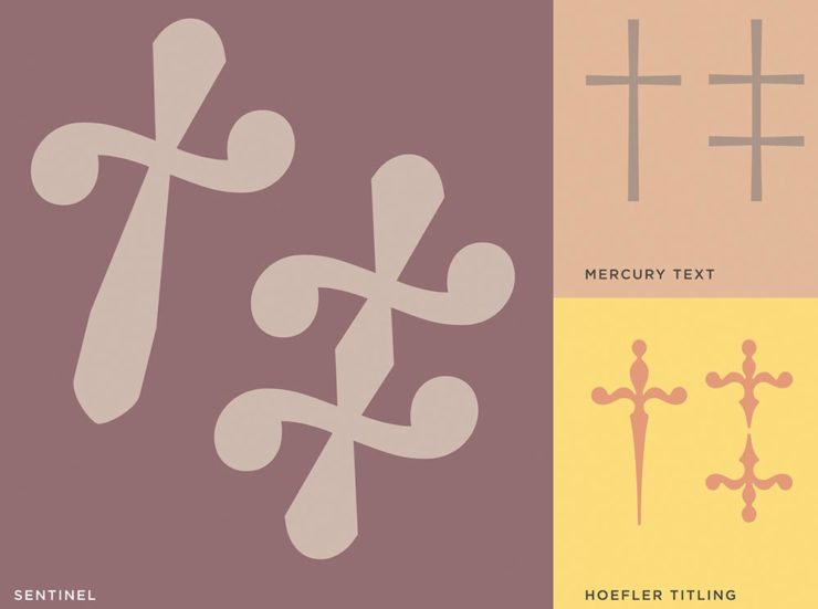
In “House of Flying Reference Marks,” Jonathan Hoefler talks about daggers, or, what you use when an asterisk isn’t enough:
Hoefler on daggers.
Beautiful examples, complete with a phrase you don’t hear everyday: “twisted quillon.” Read and enjoy. (If the opportunity presents, follow on with the ampersand article — which, uh, takes a stab at where the word came from. Nice.)
It seems like nearly all of the major car manufacturers have introduced a new logo in the past couple of years, but here are two more. One’s best described as “an update,” while the other … goes a little farther.
Skoda, for those that don’t know, is a Czech company and part of the massive VW Group. Frankly, it shows:
Skoda’s 2022 Kodiaq, a thoroughly VW Group product.
For 2023, they’re introducing a push to separate themselves from VW a little, resisting the downmarket image. As is (now) normal with updated car company identities, there’s a concept:
Skoda’s Vision 7s concept.
It’s … not inspiring. Maybe the actual updated logo will turn the corner:
Skoda’s 2022 logo.
Solid. (Pardon the pun.) But seriously, even an avid car nut like me didn’t know that represents a winged arrow — and I’m not sure the new version helps. At least they get points for consistency:
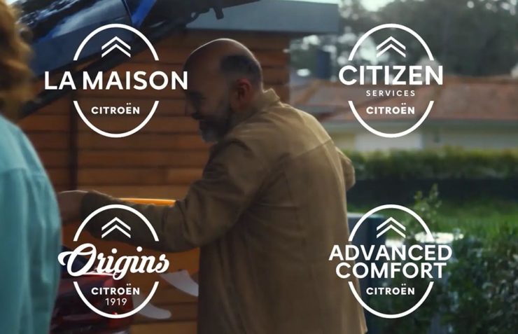
Then there’s Citroen. Even under the potentially-smothering corporate blanket that is Stellantis (there’s a name!), the pioneer of decades past still manages to actually thrive. First their new logo:
Citroen’s 2022 logo.
They’re not quite as consistent — the dual chevrons have varied a bit. This time, they’ve literally gone back to their roots, pulling the 1919/1921/1936 version out and dusting it off for modern use:
History of Citroen’s logos, 1919–2022.
Points to them for hinting at what’s to come, too:
Citroen’s 2022 logo, with just a slice of concept car showing.
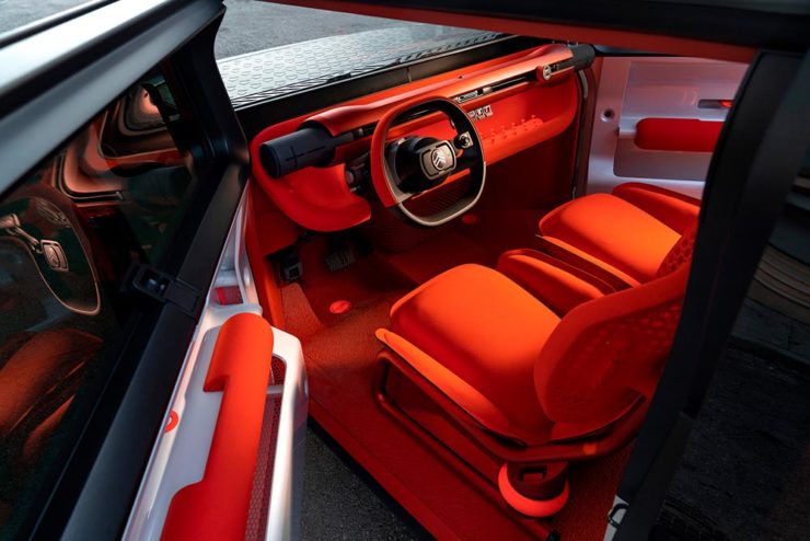
…Which turns out to be something with, ahem, Oli bits:
Citroen’s Oli: the antithesis of a Skoda.
“Nothing moves us like Citroen,” they say. The Oli moves me, to a point where I truly wish Citroen was once again available in the ’States. Cool and radically innovative, without losing sight of something VW has truly lost: fun. Well done.
Updated, 19 October, 2022:Brand New adds to Citroen’s new logo story, with a slightly-less-than-enthusiastic take on the logo and has frankly unkind things to say about the new, custom typeface (custom typefaces are now de rigueur — a policy as much related to rights ownership than creativity, alas).
I really like the cursive in this Vimeo screenshot:
YouTube? What YouTube? Citroen posts to Vimeo. Ahh, the French.
BN also includes a number of extra photographs of the simply awesome Oli, too. Here are a couple, for your enjoyment:
Plug-and-Citroen.
Note the removable Bluetooth speakers (the black tubes with “+” and “-“) and, especially, the seats:


![Beautifully Briefed, Late October 2022 [Updated X2]: Translucent Hummingbirds, Honda, Landscape Photography, and … Vampires!](https://www.gileshoover.com/wp-content/uploads/2022/10/BB-late-oct-2022.jpg)


![Beautifully Briefed, Early October 2022 [Updated]: Triboro’s Lyrics, Hoefler’s Daggers, and Skoda and Citroen Provide Contrast](https://www.gileshoover.com/wp-content/uploads/2022/10/BB-2022-early-oct.jpg)