“A collection of free tools for demonstrating typographic phenomena, for anyone teaching or studying typeface design.”
Great stuff from Hoefler & Co., stemming from an episode of the Netflix series on design. Enjoy.

Book Design and Fine Photography
“A collection of free tools for demonstrating typographic phenomena, for anyone teaching or studying typeface design.”
Great stuff from Hoefler & Co., stemming from an episode of the Netflix series on design. Enjoy.
“Emily Mahon has been Art Director at Doubleday Books since 2006, and has also done freelance work for a wide range of publishing clients, including St. Martin’s Press, HarperCollins, Farrar, Straus and Giroux, Henry Holt and Company, Alfred A, Knopf, Little, Brown and Company, Simon & Schuster, among others.
I asked Mahon about her approach to book cover design, the design process, working with outside artists, and updating classics like Frankenstein.“
Interesting interview with an accomplished book designer and art director, courtesy of Forbes Magazine.
“Rochester Institute of Technology is celebrating the 50th year anniversary of its internationally renowned collection of books and artifacts dedicated to the history of the printed word.
The Cary Graphic Arts Collection is hosting a retrospective exhibition, “The Founding Collection and Beyond,” displaying pieces from the library that belonged to printer Melbert B. Cary Jr. and later acquisitions that have shaped the collection since its inception in 1969.
A public reception will be held at 4 p.m. Oct. 9 in the Cary Collection on the second floor of Wallace Library on the RIT campus.”
If you’re in/near Upstate NY, this might be worth attending.
“The rhythmic sounds of paper being cut, the letterpresses being used and the scent of ink drying — this world and program is hidden to most students at the U, but it is more than worth your attention. […] A wide range of classes are offered to students on all things book: bookbinding, letterpress printing, book design, paper making, artist books and several typography courses.”
Better late than never: LitHub’s round-up of the best university press book designs of 2018 (see previous post, as well).
Spine, my favorite book design site, has “a new feature in which notable book cover designer Jordan Wannemacher periodically highlights a selection of recent university press cover designs. Please enjoy this celebration of amazing work.”
As they say, “Learning to print with rare book school.” This seems like a great opportunity to explore:
Rare Book School at the University of Virginia is dedicated to studying the history of the book as a cultural artifact and all that goes into making books (even digital texts), including the printing process. The school offers a range of courses in Charlottesville during the summer, as well as in several other major cities, to spread the “knowledge and expertise essential to the responsible stewardship of the historical archive in all its richness and pluriformity[.]”
Actual university courses in book design, the history of bookmaking, even letterpress. Good stuff.
My new favorite book design site. Well done!
An Australian group of photographers called The Light Collective has an interview in the Aussie pro photography magazine Capture. Aside from the great imagery, there’s an excellent discussion regarding what landscape photography is about, and why working together with a group can result in a sum greater than the parts.
For all interested in taking their photography to the next level, especially folks who aspire to great landscapes, its a great read.
As part of the new web site, I’ve redone the media.gileshoover.com section to better highlight the more than 5000 photographs available.
Note that those items are available as prints, framed or unframed, starting at a very reasonable $5. My web commerce provider, Zenfolio, also offers museum-quality fine prints, also framed or unframed, and a variety of other merchandise, from card sets to mousepads, pins, and mugs.
Explore and purchase today. Thanks for your support!
Update, Jun 25, 26, and 28: More galleries updated. Check for new photographs from Alabama, Florida and North Carolina!
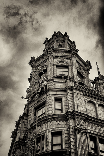

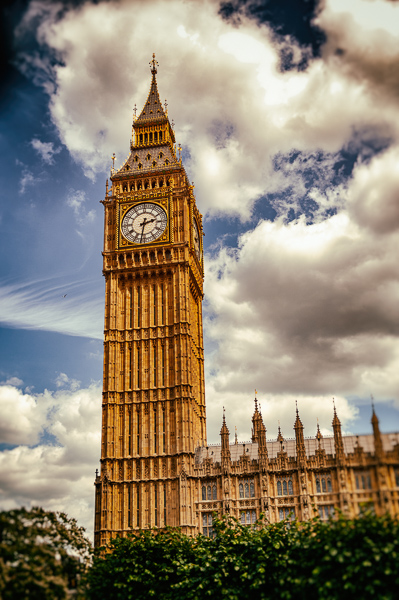
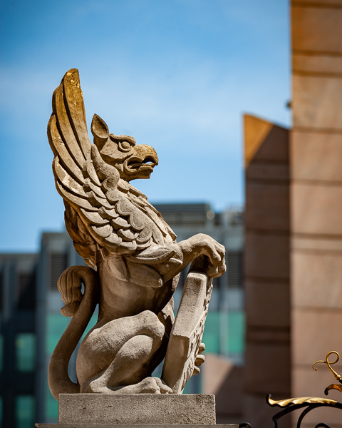
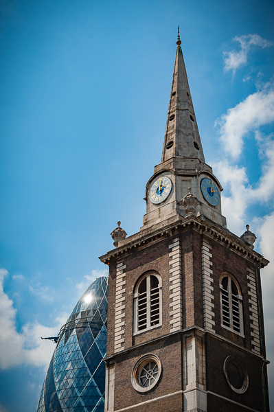
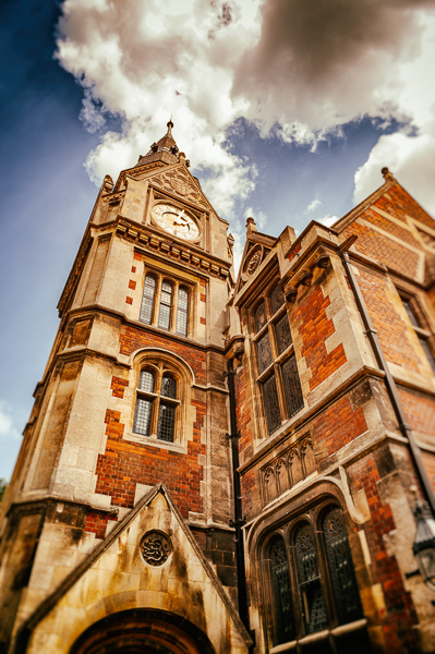
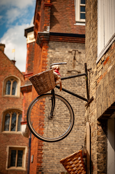
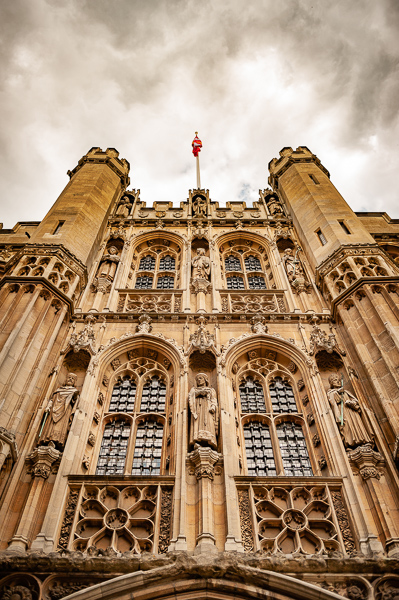
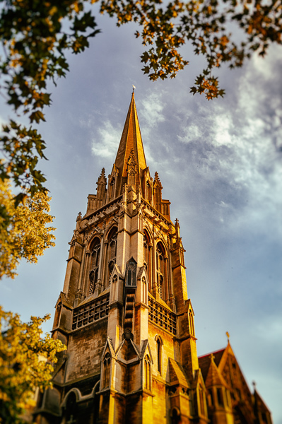
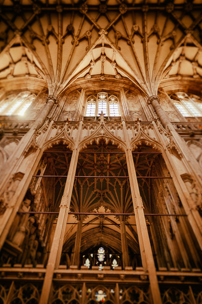
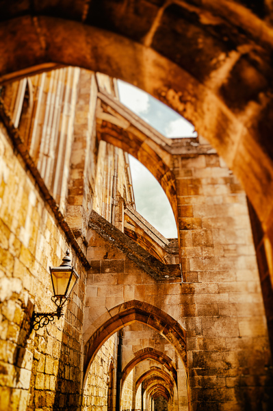
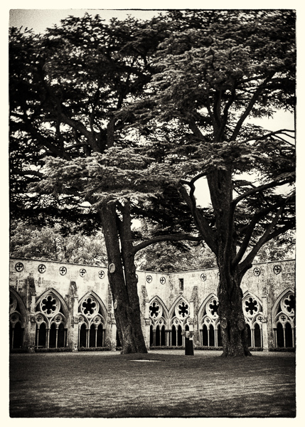
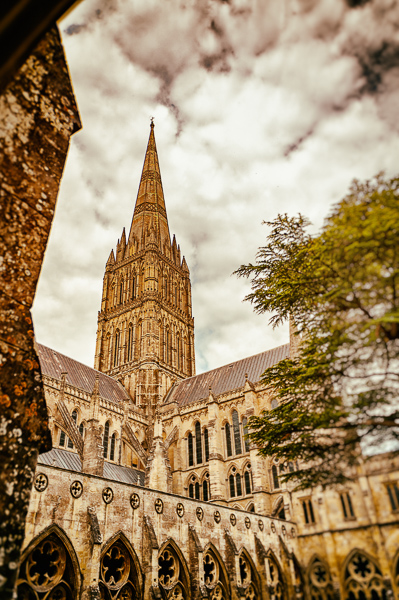
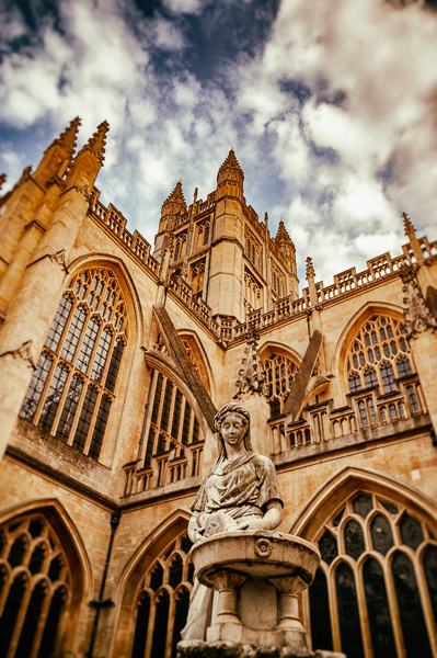
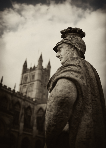
In 2011, my good friend Gerald Lucas gave me an irresistible opportunity: almost a week in England. He was teaching there that summer, and there was University housing available — which meant a visit for the price of a plane ticket, food, and a rental car. One word: absolutely.
Needless to say, I went with camera in-hand — Nikon back then, specifically a D3 with 24-70 and 70-200 lenses — and made it into one large photostroll.
Today, thanks to migrating my Aperture libraries to Lightroom, I had the excuse to revisit some of these images, re-edit some, and repost — a new total of 357 photographs. Take a trip to London, Cambridge, Winchester, Salisbury, and Bath with me. Enjoy!
Apple’s Aperture photography software debuted in 2005, as a sort of hi-end iPhoto; it combined sorting and editing into one application, using libraries to keep large collections. It was almost immediately followed by Adobe’s Lightroom, which performed basically the exact same functions — and came with better integration with Adobe’s own Photoshop, as well.
Aperture was developed through several versions, but a change in Apple’s strategy led to a end to development in 2015; however, it’s still been useable in every new version of the MacOS since. Until now — with the debut of MacOS Catalina in September of this year, Aperture will cease to work.
That’s led me — and likely many others — to migrate our Aperture libraries into Lightroom. Now let’s be clear: I’ve been using Lightroom for several years now (I pay the $53 per month Adobe subscription, which offers all applications Adobe currently makes, including Photoshop, InDesign, and Illustrator in addition to Lightroom) and have gotten quite used to the workflow. So when the announcement was made that Aperture was going to stop working, I went into Aperture and . . . was lost. Migrating was necessary.
In the long run, though, it’s been a good thing. Since Lightroom doesn’t import all of the changes and corrections that Aperture makes into Lightroom, I’ve had cause to revisit some of the libraries with a fresh eye.
The first of these is the England library from 2011. Check it out soon.
If you had Aperture, here’s the info from Apple on what to do with your libraries, and the info from Adobe about how to import Aperture libraries into Lightroom (Classic version only).
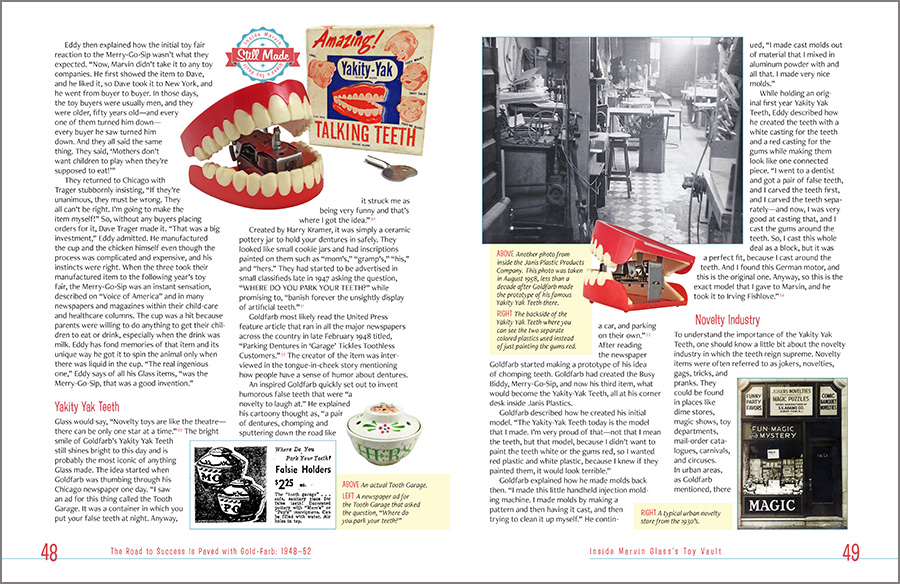
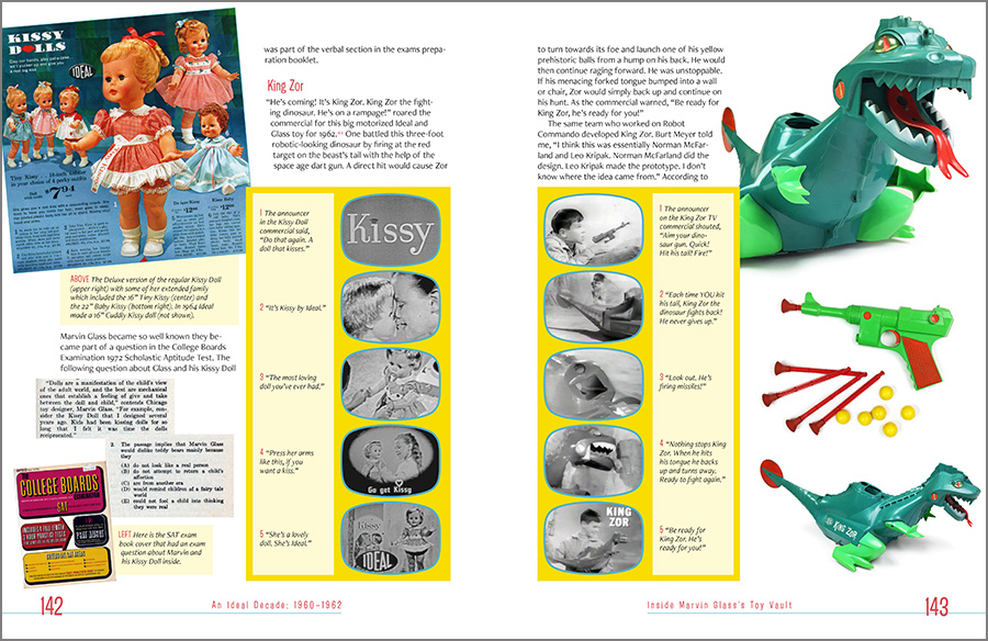
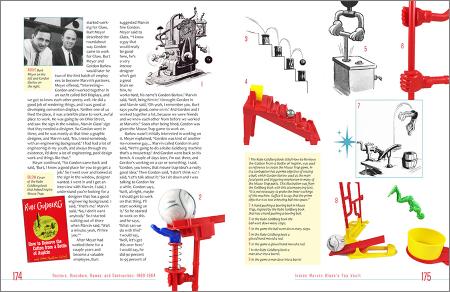
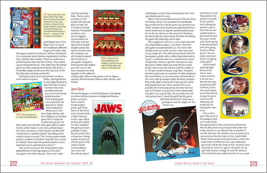
This large interior design project, recently finished, was one of those — 600+ pages, huge numbers of illustrations and photographs, lots of customization, and lots of fun. Good stuff, that I’m now happy to share with the world.
It was designed with a mid-century-yet-contemporary vibe, with custom icons, specific color selections for the various sections, a custom “look” for the televisions advertisements, and full bleed (that is, the ink runs of the edges of the pages), all in support of the author’s story of one of America’s great toy designers and his, shall we say, eclectic life. As he says, “A World Without Reality.”
Some samples from the main body of this comprehensive title:
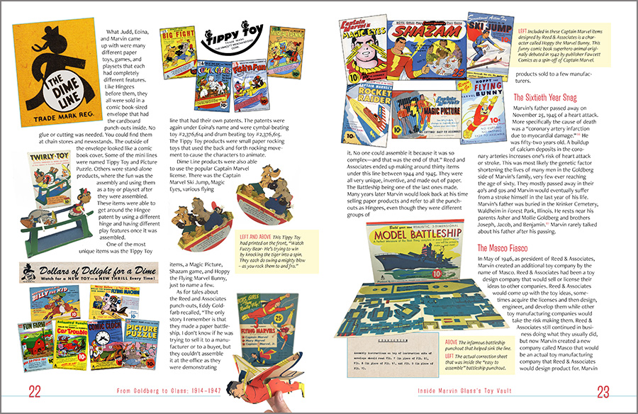
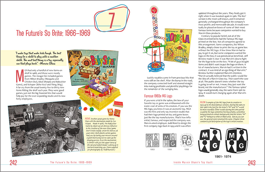
…And some from the back matter (note the different color scheme for this section):
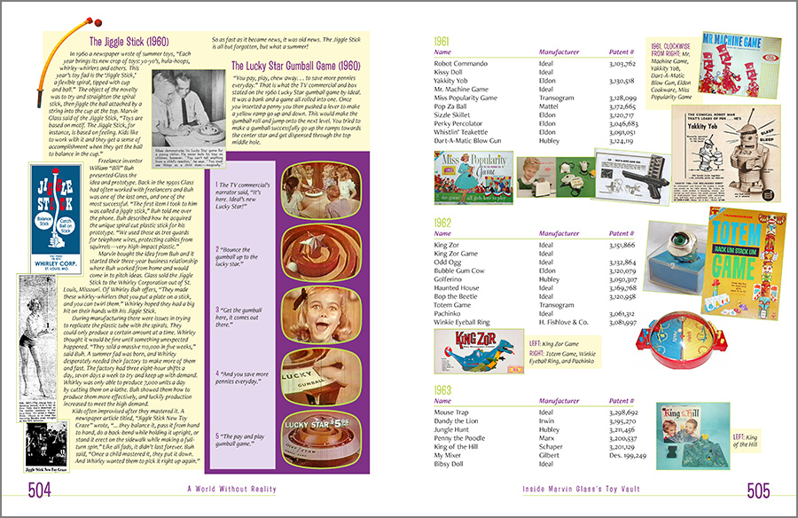

The author/publisher, Bill Paxton, called the book design “amazing.” Works for me! Check out more or purchase a copy at marvinglassbook.com.
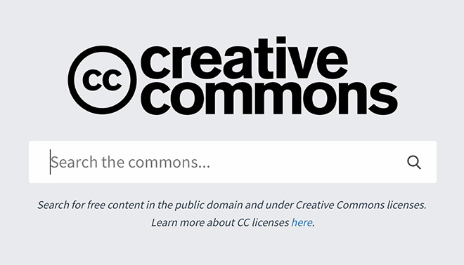
Looking for imagery for your book cover? Creative Commons features a library of more than 300 million images, indexed from 19 different collections, including the Cleveland Museum of Art, Metropolitan Museum of Art, DeviantArt, Behance, and Flickr. Images can be searched using keywords and filter the results based on the license type and/or the collection from which the content is sourced, essential for book design — as the vast majority of covers require commercial licenses.
Publisher’s Weekly says:
Ever heard of “design by committee?” The worst results, well . . . result. Read the article.